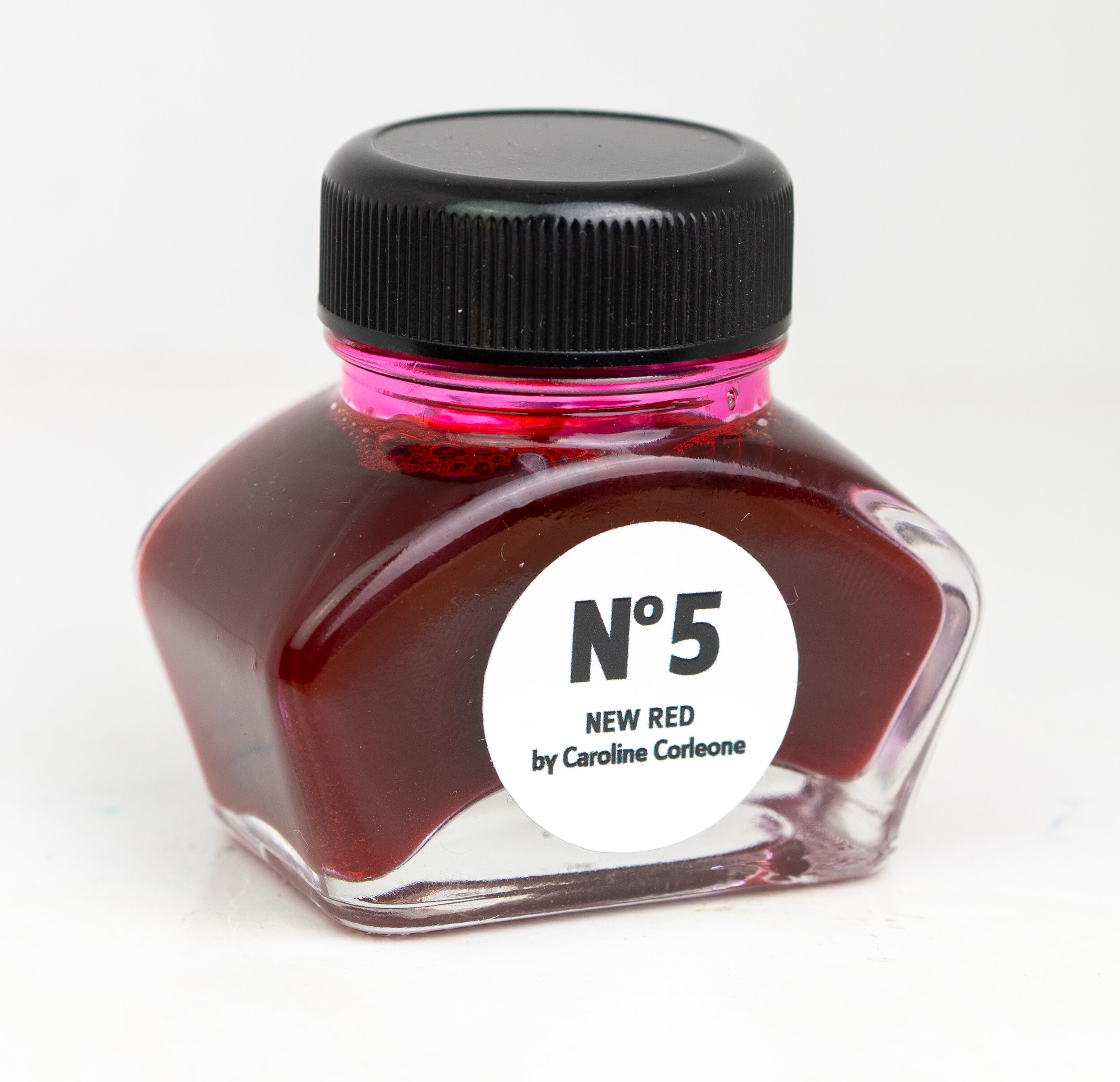
A little over a year ago I bought and reviewed Berlin Notebook No. 1 Blue. It was a deep and rich blue ink with a lot of copper sheen on certain papers. It was a beautiful blue and different from the more common super sheening inks. I mentioned in the review that Berlin Notebook also have a Black Label reformulation of the ink to achieve the same ink colour with much less sheen. Recently Berlin Notebook sent me a bottle of both the Black Label of No. 1 Blue and their most recent ink No. 5 New Red. While the two Blue inks were created in collaboration with artist Viktor Walter, No. 5 New Red has been created in collaboration with Caroline Corleone. Both artists use pinks or blues in their recent works Berlin Notebook also sell artwork made with the inks. A green ink is on the way as well!
This review is the first of my refreshed review design that I mentioned on my last ink review. I’m only using Lamy Safari’s moving forward because it is easier to change nibs, I have a more consistent feel for the use of an ink, and there will be more nib options. The comparison writing will still be written with a James Finniss Serendipity (from Pensive Pens). A flex would be nice and I’ll look into a good option for that at some point. This design is derived from my ink overview paper designs and with a bit from my Instagram minireviews. If you have any suggestions please let me know!
UPDATE: use code MACCHIATOMAN to get 20% off your first order (one use per customer)!

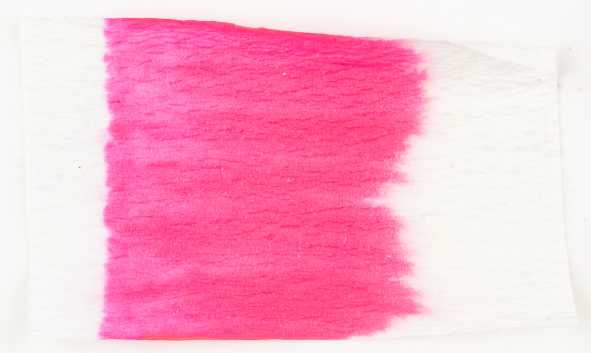
Berlin Notebook No.5 New Red is… obviously not a red. And Berlin Notebook aren’t blind; they are well aware, in fact. It is described at a “very rich pink color with a light golden sheen”. A fairly apt description. More specifically the ink is quite hot in colour but a lot of this hotness comes from the pervasive sheen (which I wouldn’t describe as light). The base ink colour is very saturated but it has a bit of magenta to is softening it a little.
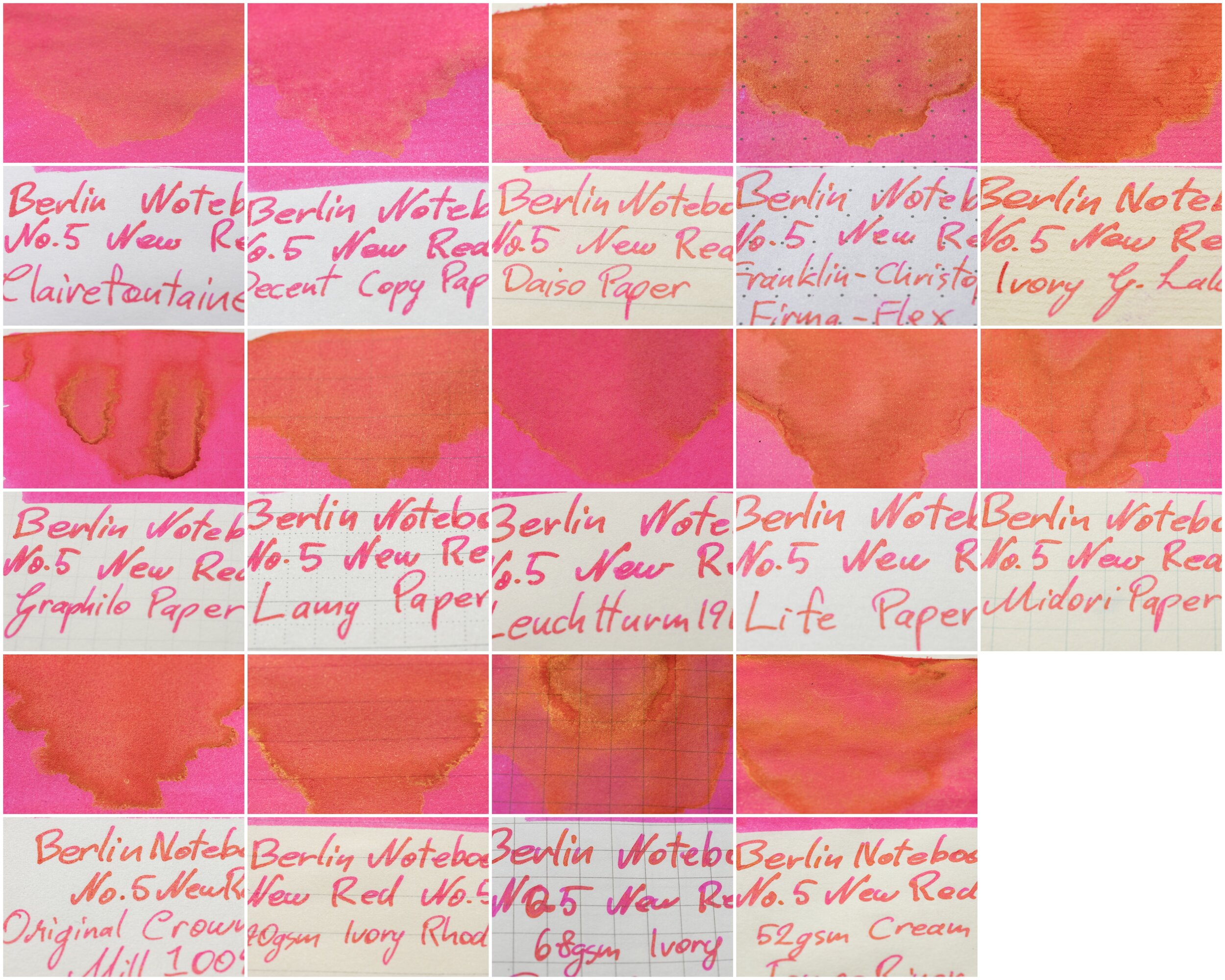
The ink is quite wet but not quite a gushing ink. This means it is quite controllable but smooth with good flow. This ink performs very well on all paper types. It isn’t perfect on poor quality paper but it does a very decent job and even produces a hint of sheen (in the swatch) of a copy paper. Not bad! Berlin Notebook No. 1 Blue was a beautiful ink but it sometimes feathered a little on Rhodia and some other papers. This is excellent, however. The colour of the ink is fairly consistent throughout most paper types however yellower paper does make the ink look warmer in tone. Examples of the ink on 16 different paper types is at the end of the review.
The bottle comes in a pretty standard modern European ink bottle. This shape is used by Pelikan, Diplomat, Kaweco and others. Maybe it’s more German than European then!) Berlin Notebook have taken a minimalist approach to their bottles with a simple white round label reading “No 5 NEW RED by Caroline Corleone”. The ink comes in a brown box with the same sticker on it.
Nib and Pen details
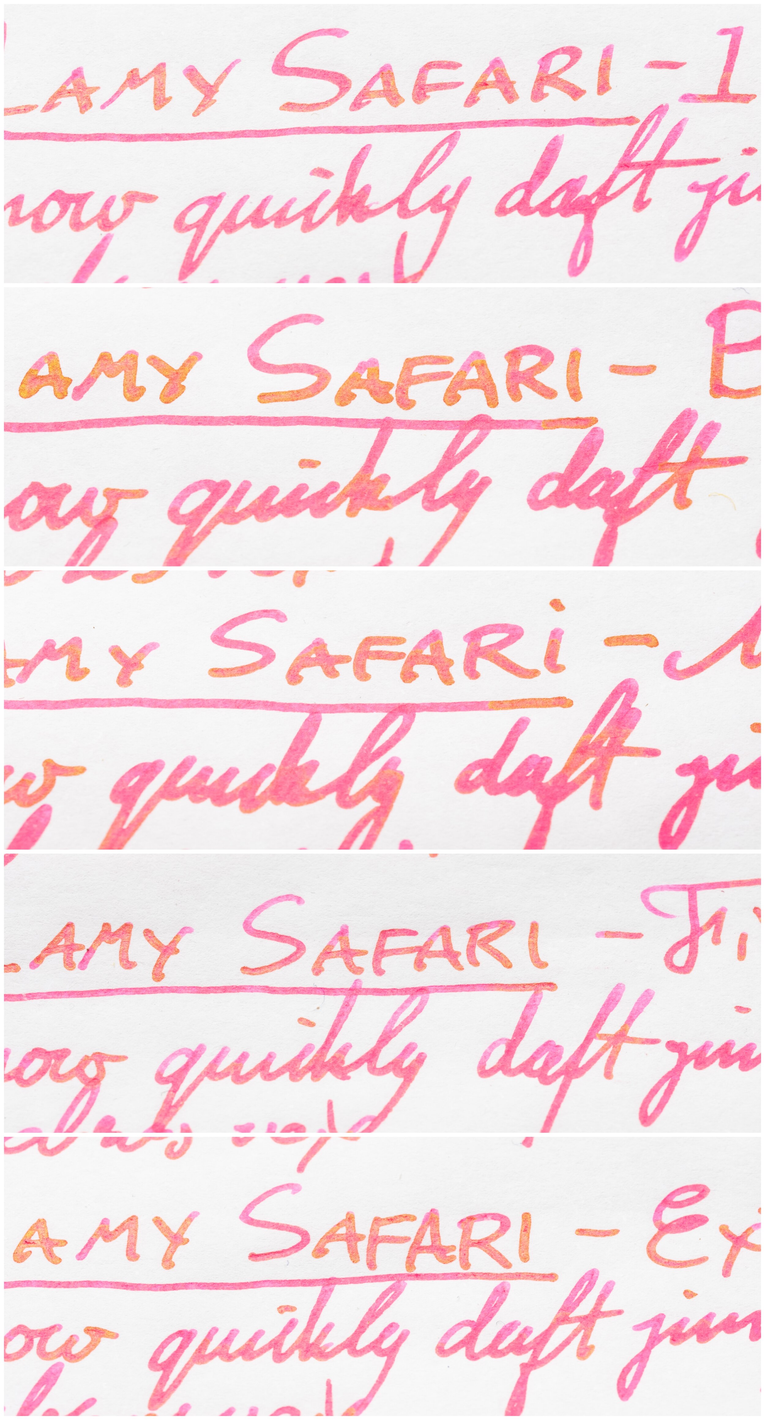
I used a Lamy Safari Rose Powder pen for this review and six different stainless steel Lamy nibs on that pen. The choice of pen (be that Safari, AL-Star, Vista or Studio) will have little impact in the writing performance. I will not use a Lamy Dialog because there is the rare chance of the nib drying out slightly which might affect the writing performance.
Lamy 1.5 Stub: this nib is moderately wet to write with (this is used for the brand and ink name title);
Lamy 1.1 Stub: this nib is on the drier side;
Lamy Broad: this is a wet;
Lamy Medium: this is a very wet nib;
Lamy Fine: this nib is moderately dry; and
Lamy Extra Fine: this nib is moderately wet.
I also use a fine JoWo nib attached to a James Finniss Serendipity (from Pensive Pens) for the comparison ink names. This nib’s wetness is moderate but the feed is primed which gives it a wetter character than would be a normal writing experience. This generally as the effect of reducing shading and luminosity, while increasing sheen and saturation. The possibility of feathering and bleeding is also slightly increased. This is still more accurate than a dip pen or a glass pen in my experience.
52gsm Ivory (White) Tomoe River

Hue changes
On Tomoe River Paper the ink takes on a completely different hue depending on how saturated the swatch is and thus how much sheen shows. The ink gets decidedly warmer the more sheen there is. The sheen is very matte in colour (not very shiny) so it affects the look of the ink colour rather than looking like a layer of a different colour over the top.
Graf von Faber Castell Electric Pink: is less saturated, cooler and a smidge darker;
Lamy Vibrant Pink: has similar warmth but less saturated and darker;
Montblanc Pink: is very similarly warm but a bit less saturated and a touch darker;
Krishna Sakthy: is slightly warmer in tone, and perhaps a touch more saturated;
Sailor Ink Studio #131: is cooler, lighter and a hair less saturated';
Sailor Ink Studio #431: is more saturated and a hair cooler but otherwise fairly similar; and
Noodler’s Rachmaninov: this is a similar hue and warmth but slightly less saturated.
Montblanc Pink isn’t too far off, and neither is Krishna Sakthy. Sailor Ink Studio #431 would probably be the closest on Tomoe River Paper.


This ink has some decent shading with relatively consistent frequency, and moderate contrast but a smooth gradient most of the time but still with a sudden luminosity change at times. The shading is exacerbated at times by the sheen that changes the tone and hue of the ink to a warmer colour. There is no halo on this ink.
The sheen is quite strong and frequent. It does generally require a wetter pen to full show the sheen. This sheen, while saturated and somewhat bright isn’t ‘shiny’ like you’d see on most inks known for their sheen. It is somewhat matte. It looks like a different colour rather than a shiny colourful refraction. As a result the ink almost seems to be dichromatic with it changing from a pink to an orange colour. Because of this as well while I’d normally call a sheen in this hue ‘gold’ like on Sailor Ink Studio #431 below, I’d actually call this ‘orange’. Very interesting sheen!
Graf von Faber Castell’s Electric pink doesn’t have much of a sheen and Lamy Vibrant Pink is a dull yellow-green. Montblanc Pink has a slightly green tinted sheen that is pretty strong for a Montblanc Ink.Krishna has a bright shiny and vibrant sheen that is again tinted very slightly green. Only the two Sailors have a gold sheen comparable in hue to No. 5 New Red but these are more the shiny sheen.
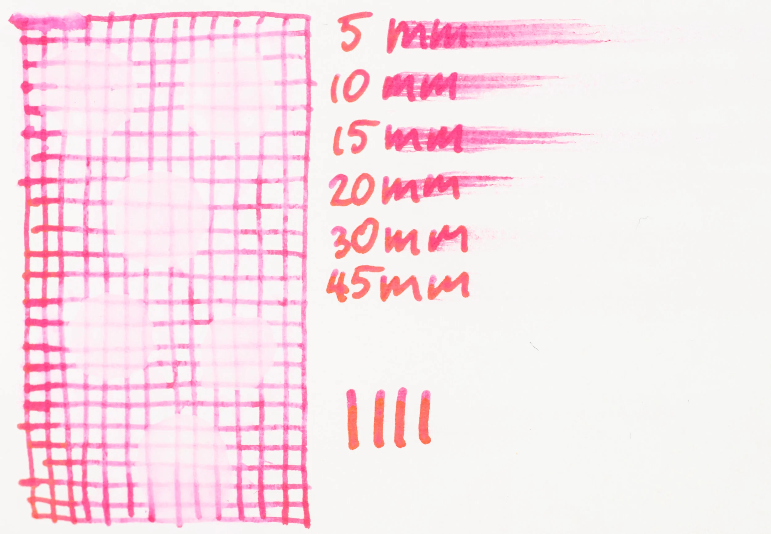
The chromatography is extremely boring! it is just a simply gradient and barely that! Water Resistance is non-existent and the dry time is on the slightly quicker side. There is also no smearing (represented by the four upright lines | | | |.
80gsm White Rhodia
On Rhodia the colour is a little warmer and a little more saturated. We still see the hue changes that we get from the sheen.
Graf von Faber Castell Electric Pink: Is much too coo and dark;
Lamy Vibrant Pink: is also much too dark and too cool;
Montblanc Pink: is a little too dark and a little too cool;
Krishna Sakthy: is warmer and more saturated;
Sailor Ink Studio #131: is only a little lighter and a touch cooler;
Sailor Ink Studio #431: is more saturated but otherwise a similar hue;
Noodler’s Rachmaninov: is a touch cooler but is a pretty similar hue overall.
I would probably pick between Ink Studio #431 and Noodler’s Rachmaninov for pure hue similarity. Noodler’s Rachmaninov otherwise performs and looks quite different, however so probably Ink Studio #431.


The shading is less pronounced on Rhodia with less contrast, especially on the wetter nibs, the gradient is almost always smooth, more so than with Tomoe River, and the frequency is a little less as well. No haloing here either.
The sheen is very high for Rhodia paper. You don’t get anywhere near this amount of sheen from even Organics Studio Nitrogen Royal blue, no Berlin Blue No. 1! The same matte orange sheen that is present on Tomoe River is present here on all the written lines, even the finer drier nibs. Very impressive. If you like sheen, pink and use less sheeny papers this is a good ink for you!
While some of the inks present some limited sheen in the swatch (Lamy Vibrant Pink, surprisingly, and Sailor Ink Studio #431) the only ink that shows any hint of sheen in the writing is Krisha Sakthy and it does present in a similar orange-matte way.
Water resistance is slightly improved but it also got quite messy. Dry time is on the snappy side with it coming close to dry at 10 seconds and completely dry at 30. There is no smearing.
Conclusion
⭐️ = One Star
★ = Half a Star
☆ = No Star
🚫 = None/Not Applicable
(Star ratings are a rough and glanceable indication and are more quantitative than qualitative. They are not saying that something is ‘good’ or ‘bad’ but rather that, of the particular characteristic, the ink has a ‘high’ or ‘low’ amount)
80gsm White Rhodia
Shading:⭐️★☆☆☆
Sheen:⭐️⭐️⭐️⭐️⭐️
Shimmer: 🚫
Halo:🚫
Saturation:⭐️⭐️⭐️⭐️☆
Luminosity: ⭐️⭐️★☆☆
Feathering:🚫
Bleeding:🚫
Flow:⭐️⭐️⭐️★☆
Dry time:⭐️⭐️⭐️★☆
Smear:🚫
Water Resistance:★☆☆☆☆
52gsm Ivory (White) Tomoe River
Shading:⭐️⭐️★☆☆
Sheen:⭐️⭐️⭐️★☆
Shimmer: 🚫
Halo:🚫
Saturation:⭐️⭐️⭐️⭐️☆
Luminosity: ⭐️⭐️⭐️☆☆
Feathering:🚫
Bleeding:🚫
Flow:⭐️⭐️⭐️★☆
Dry time:⭐️⭐️⭐️☆☆
Smear:🚫
Water Resistance:🚫
This is a bold change from their first two releases, both different formulations of a rich neutral and somewhat darker blue (one sheeny and one less sheeny). It’s a bright, vibrant and eye catching pink that performs exceptionally well on all paper (relative to the what you’d expect on each paper type) and has some very interesting and somewhat unique sheen that is also present on paper types you wouldn’t expect (certainly not in this amount). I say that this is a bold change because pink can be a divisive ink colour and it certainly isn’t an ink colour that is generally accepted in more professional environments. If you like your somewhat hot pink inks I definitely recommend considering this ink!
This ink costs €13.50 which is slightly higher than both Blue inks from Berlin Notebook but still an average price for many inks and on the cheaper side for a more artisan ink brands.
Thanks again for Berlin Notebook for sending this bottle of No. 5 New Red for review.
UPDATE: use code MACCHIATOMAN to get 20% off your first order (one use per customer)!
✒︎ ✑ ✒︎ ✑
Thanks for reading! If you have any questions, comments or suggestions please let me know in a via the comments, Instagram, or contact me directly.
You can find my ink collection here and my pen collection here. Is there something you’d like reviewed? Let me know!
For blog updated you can follow @macchiato_man on Twitter, subscribe via email, or like my Facebook page. Check out the sponsors of this blog as well!
I was not compensated for this review and everything here is my own honest opinion. There are no affiliate links in this review. I was sent this ink for the purpose of an honest review.