• Blog
  • About
    • My Inks (on Fountain Pen Companion)
    • My Pens
  • Archive
  • Contact
Menu

Macchiato Man

  • Blog
  • About
  • My Collection ☟
    • My Inks (on Fountain Pen Companion)
    • My Pens
  • Archive
  • Contact
The @madebyendless Cotton Wallet arrived the other day! I’m a sucker for these sorts of practical inserts for notebooks. The cotton fabric suites the simple style of the Explorer. 
⠀
While I love these and always get them whenever I can I never
First test of the Regalia paper in the Endless Explorer than I was sent by @madebyendless. Really impressed by the paper. Very smooth, nice sheen and nice shading! Finger prints or hand oil seem to affect the writing a little but nothing out of the o
New Pen Review: Esterbrook Camden (Premium Edition) - 𝙻𝚒𝚗𝚔 𝚒𝚗 𝙱𝚒𝚘!

I’ve been eager to try the Camden for a while now. I love my flat end pens and the overall shape of this one is subtly unique. While there are some differences between
New friend from @esterbrook_official! Camden Manitoba Blue. 
⠀
Love flat end pens so looking forward to digging into this (so review incoming).
 
Flat or round ends?✑
⠀
⠀
⠀
⠀
#fountainpen #fpgeeks #fountainpenaddict #fpn #fountainpengeeks  #fountainp
New Ink Review: @birminghampens Antique Sepia (link in bio)
⠀
In line with the recent trend of soft pastel dichromatic inks but Birmingham’s version is an interesting dust grey version with low saturation that I find quite interesting don&rsquo
New Ink Day! Haven’t had one of these for a while but I received these from a friend at the last Perth Pen Meet. 
⠀
All sailor and the first tall bottle in a while (bringing the number of those to 86). 
⠀
Didn’t realise it at the time but
New Ink Review: La Couronne du Comte Vert Sapin (link in bio)
⠀
The final of LCdC’s initial set of four exclusive inks from Diamine. A lovely rich sheeny green-teal.
✑
⠀
⠀
⠀
⠀
#fountainpen #fpgeeks #fountainpenaddict #fpn #fountainpengeeks  #fo
I don’t know if I’ve ever shared this before but my city has a set of five dip nibs as an artwork. 

They are called “Memory Markers” by Anne Neil and represent early-ish colonial stories of the gardens where they are.

We als
⚠️Update: Why I have been so radio silent! 📻🤫 A lot of large personal changes, essentially (read on for details)!

There have been three main reasons for why I haven’t been able to do much here or on my blog. 

1) 🎓 I had to finish of my Mas
Ink Ink Comparison: Discontinued Iroshizuku and New Iroshizuku! Thanks to @penclassics for allowing this to happen. See link in bio!
⠀
The old: Tsuyu-kusa, Tsukushi, and Ina-ho.
The New: Sui-gyoku, Hana-ikada, and Hotaru-bi.
⠀
This is a long review b
NPD: @esterbrook_official LE Estie “Candy” in Oversize with a Kirk Speer Needlepoint nib!
⠀
Thanks to Esterbrook for sending this through to me for review. I’ve reviewed a couple of Esties now and two of the custom nibs (which are a
Out with the old in with the new?

I just received the new Pilot Iroshizuku Inks in the little bottle ink pack from @penclassics for review. I plan on doing an overview review of the three new and the three old ones!

I feel like Ina Ho was quite a u
New Pen Review (see link in bio): Platinum Curidas courtesy of @penclassics (check them out!)
⠀
This is certainly a curiously designed pen with it's quirks but it has bee a delight to write with and a great pen to through in a pocket. I've been using
New Ink Review! @wearingeul_global Kyonghui! See link in bio!

Kyonghui is a vibrant earthy orange from Wearingeul's series on Korean Female Modern Writers. It is also a great performing ink!

Wearingeul's global push is fairly new; has anyone tried
It has been a little while since I posted here so I thought I'd give a little update!

Firstly I think I just needed a little break at the end of the year! It has been a busy year for me. I have been taking my photography more seriously and I also ha

Subscribe

Sign up with your email address to receive news and updates.

We respect your privacy. Unsubscribe at any time.

Thank you!
Blog RSS

☛ Twitter feed

✉ Email Subscription

☞ Fountain Pens Australia (Facebook Group)

☛ Sailor Pens & Inks (Facebook Group)


Sponsors

10% off code: MACCHIATOMAN


Click here for sponsorship information


Featured Posts:

Featured
Ink Review: Pennonia Pokoltuz (Pokoltűz)
Aug 1, 2019
Ink Review: Pennonia Pokoltuz (Pokoltűz)
Aug 1, 2019
Aug 1, 2019
Notebook Review: Pebble Stationery Pocket Tomoe River Notebook
Nov 10, 2018
Notebook Review: Pebble Stationery Pocket Tomoe River Notebook
Nov 10, 2018
Nov 10, 2018
Ink Review: Krishna Brown Pink
Jan 20, 2018
Ink Review: Krishna Brown Pink
Jan 20, 2018
Jan 20, 2018


Archive
  • November 2024
  • October 2023
  • December 2022
  • October 2022
  • June 2022
  • May 2022
  • April 2022
  • February 2022
  • January 2022
  • December 2021
  • November 2021
  • October 2021
  • September 2021
  • August 2021
  • July 2021
  • June 2021
  • May 2021
  • April 2021
  • February 2021
  • January 2021
  • December 2020
  • November 2020
  • October 2020
  • September 2020
  • August 2020
  • July 2020
  • May 2020
  • April 2020
  • March 2020
  • February 2020
  • January 2020
  • December 2019
  • November 2019
  • October 2019
  • September 2019
  • August 2019
  • July 2019
  • June 2019
  • May 2019
  • April 2019
  • March 2019
  • February 2019
  • January 2019
  • December 2018
  • November 2018
  • October 2018
  • September 2018
  • August 2018
  • July 2018
  • June 2018
  • May 2018
  • April 2018
  • March 2018
  • February 2018
  • January 2018
  • December 2017
  • November 2017
  • October 2017
  • September 2017
  • August 2017
  • July 2017
  • June 2017
  • May 2017
  • April 2017
  • February 2017
  • January 2017
  • December 2016
  • November 2016
  • September 2016
  • August 2016
  • July 2016

Ink Review: Berlin Notebook No. 1 Blue

March 15, 2020

Berlin Notebook Blue No. 1 is a curious name! The brand is Berlin Notebook and the ink is called Blue No. 1. The ink is a ‘super sheener’ but most interestingly the ink also can be bought sans sheen! Berlin Notebook Blue No. 1 BLACK LABEL is a reformulation of the ink colour (almost) without the sheen. I don’t have this sans-sheen ink but I might look into it down the track. Berlin Notebook also, unsurprisingly, make notebooks but I haven’t tried those! Berlin Notebook Blue No. 1 (with sheen) also comes in a tiny 5ml bottle.

UPDATE: use code MACCHIATOMAN to get 20% off your first order (one use per customer)!

Blue No. 1 is a ver rich dark blue. It isn’t a blue-black because it is very much a saturated blue ink but it’s still quite dark. I believe it’s due to how much dye is in the ink. The blue is fairly neutral not leaning that green or that purple but if it leant any direction it would be green. The ink is wet and lubricated and feels lovely to write with.

View fullsize  OLYMPUS DIGITAL CAMERA

The shading is gradual gradient but is more sudden on Tomoe River than on Rhodia. The ink also shows much lighter on Rhodia than it does on Tomoe River. Unfortunately there is a bit of feathering on Rhodia with the wetter Medium nib on the Aurora Duocart. You hate to see this, especially with such a pretty blue. Fortunately the ink is really pretty on Tomoe River with some gorgeous blues and some noticeable red-copper sheen.

View fullsize  OLYMPUS DIGITAL CAMERA

Speaking of sheen, the sheen is very strong and vibrant on Tomoe River with a rich red-coppery colour. While this in in the league of super sheener it still isn’t in the realm of Nitrogen Royal Blue as the ink colour below the sheen is still very much visible, especially on the Fine OPUS 88 nib. The wet Medium Aurora Duocart shows much more sheen but you can still see the shading and the colour beneath! The perfect ‘strong sheen’ ink for me!

View fullsize  OLYMPUS DIGITAL CAMERA

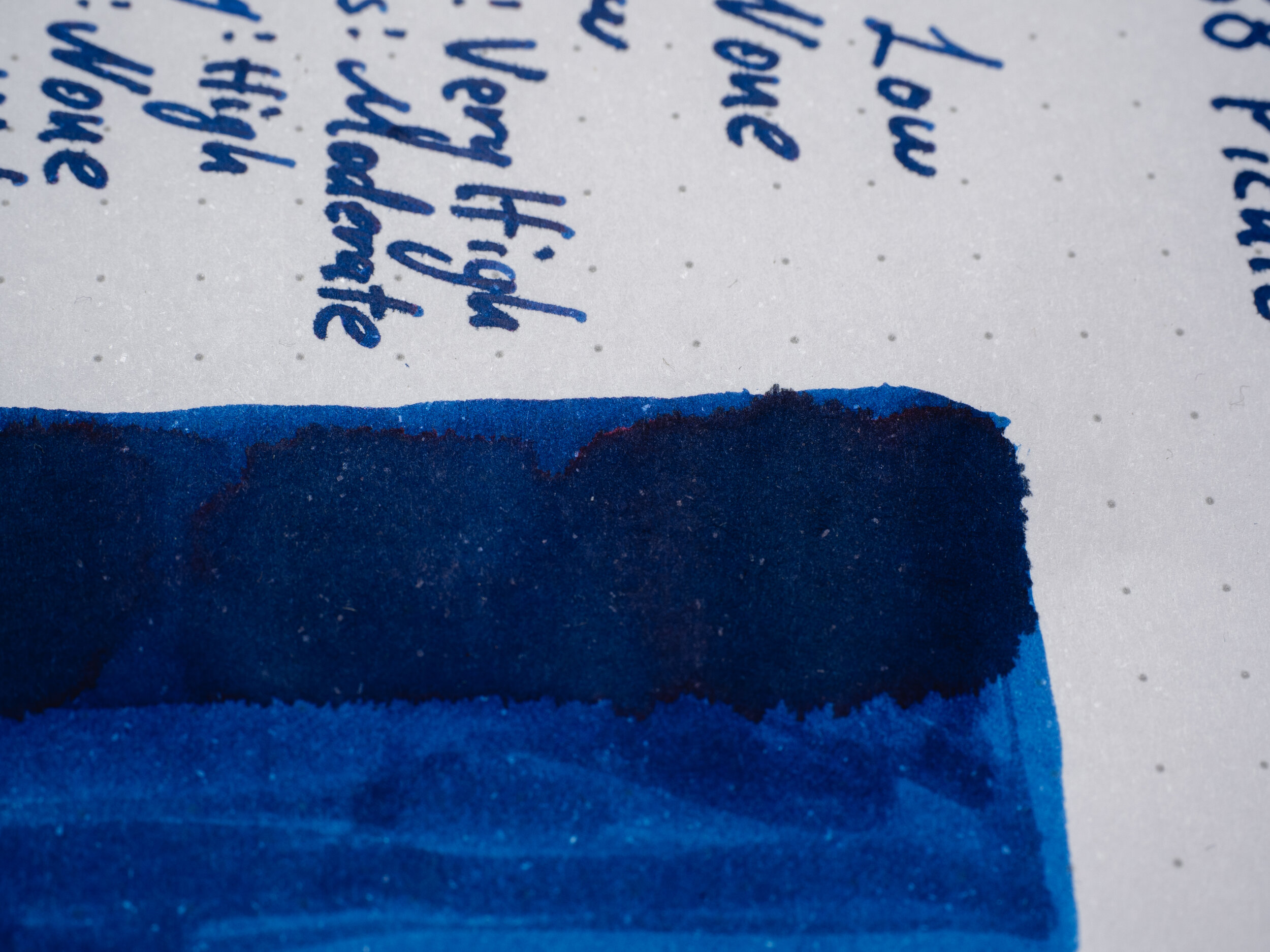
A side effect of the feathering, which related to the ink absorbing into the paper, is no sheen on Rhodia. There is the very tiniest hint on the edge of the swatch but it really doesn’t actually present with sheen in any practical sense.

As for other papers, many of the perform much like Tomoe River. The sheen gets flatter on Original Crown Mill 100% Cotton paper and Ivory G. Lalo paper but otherwise is still a bright vibrant sheen on the papers that present with it!

View fullsize  OLYMPUS DIGITAL CAMERA

The chromatography is fairly basic but it does start with a grey line where the ink is drawn on. There’s some bright vibrant turquoise ink at the start that quickly disappears into a blue gradient that end with a very dark blue line.

Again, due to the absorbent nature of the ink on Rhodia, dry time is super quick on the paper. On Tomoe River it’s on the slower side but not too bad.

The ink, I would expect due, again, to how it absorbs into Rhodia, is fairly water resistant on the paper but is much less so on Tomoe River, only leaving behind a faint get line.

The ink is rich and dark on Rhodia but is a little lighter than on other papers. It is still richly saturated. It is flatter on Rhodia as well.

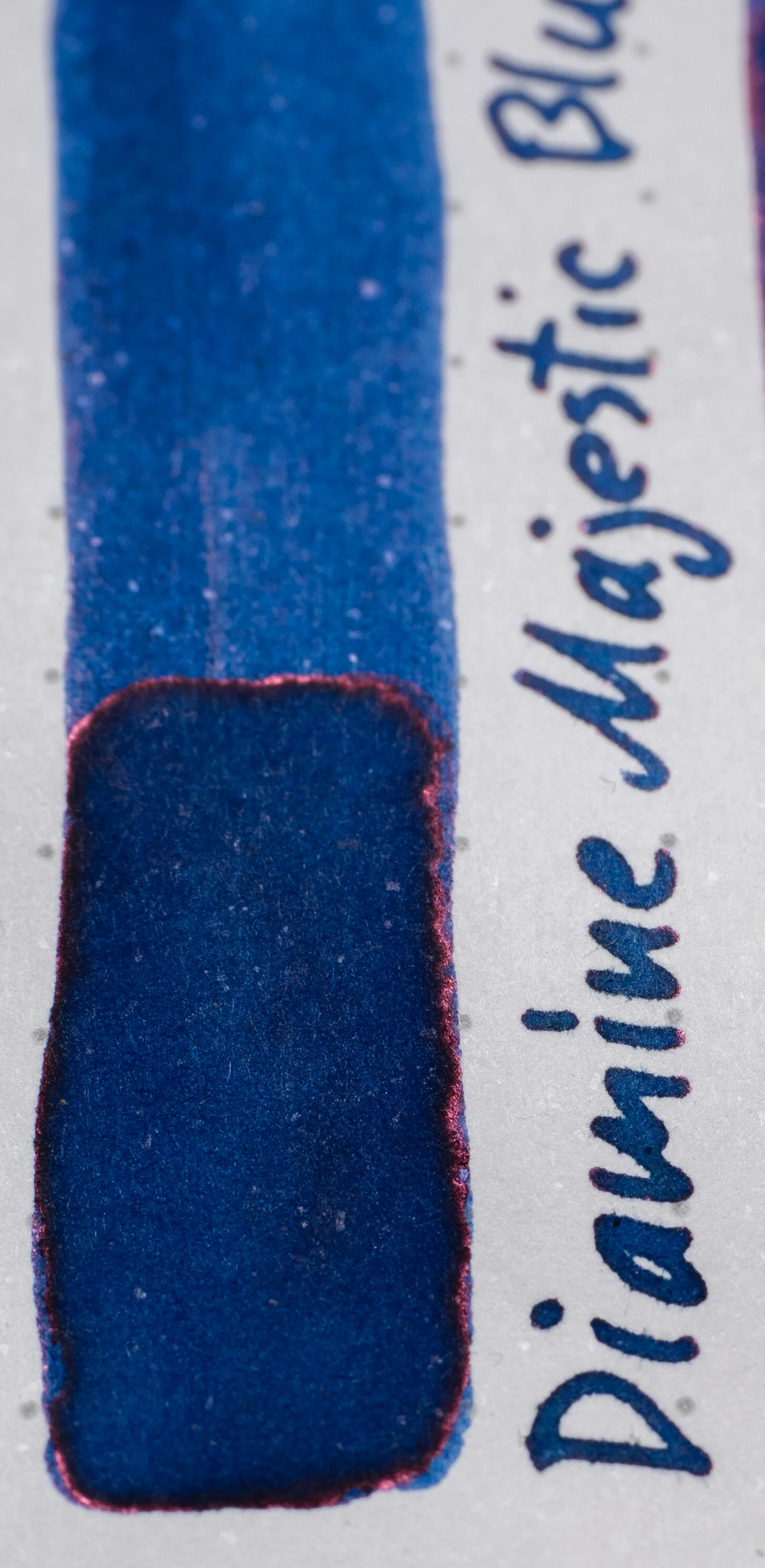
  • Diamine Majestic Blue: is greener and a little less flat;

  • Diamine Skull & Roses: is darker and richer and greener;

  • Diamine Maureen: is much darker and a hint greener;

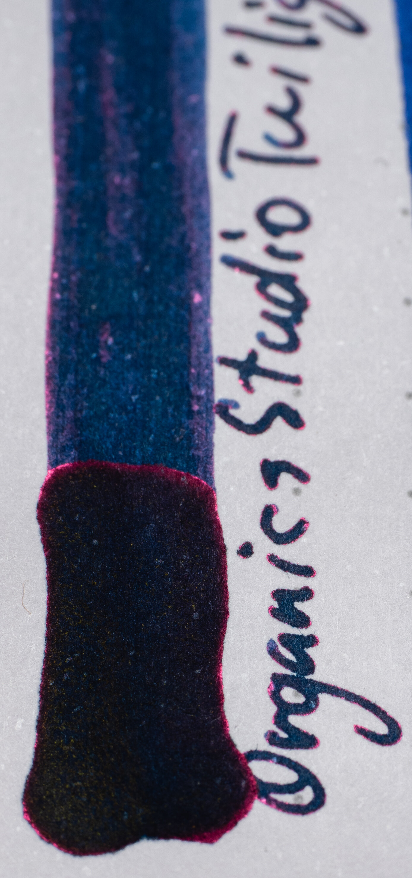
  • Organics Studio Twilight Blue: is noticeably more green and dark!

  • KWZ Chicago Blue: Is a fairly similar colour but less saturated;

  • Kobe #37 Island Blue: Is also close but greener and a tad less saturated and a tad darker; and

  • Diamine Jalur Gemilang: Is flatter in the swatch but high contrast in the writing and much greener!

View fullsize  OLYMPUS DIGITAL CAMERA

Rhodia isn't a strong sheening paper but the closest ink, in terms of sheen on Rhodia, to Blue No. 1 is KWZ Chicago Blue… which doesn’t really sheen! The rest are all stronger, especially Diamine Maureen and Organics Studio Twilight Blue. Diamine Skull & Roses has a similar red-copper colour.

The ink is beautiful on Tomoe River (to me at least!). Rich and dark, especially in the writing, with good contrast and sheen.

  • Diamine Majestic Blue: is darker, less saturated and less green, surprisingly;

  • Diamine Skull & Roses: is less saturated and also less saturated and less green;

  • Diamine Maureen: is getting closer in saturation but still lacking on Tomoe River, also getting more green leaning but not there yet;

  • Organics Studio Twilight Blue: is all sheen. Seems to be green underneath but less saturated? Difficult to tell!

  • KWZ Chicago Blue: is darker and just as rich but less green;

  • Kobe #37 Island Blue: is darker and rich with more green than Chicago blue but still not enough!

  • Diamine Jalur Gemilang: is lighter but the closest hue on Tomoe River!

View fullsize  OLYMPUS DIGITAL CAMERA

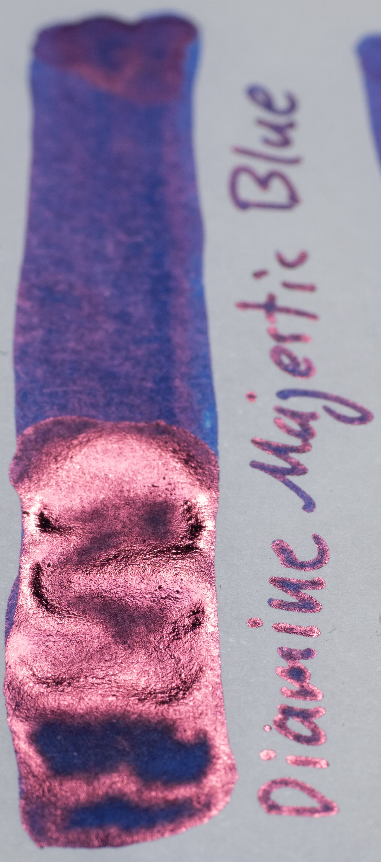
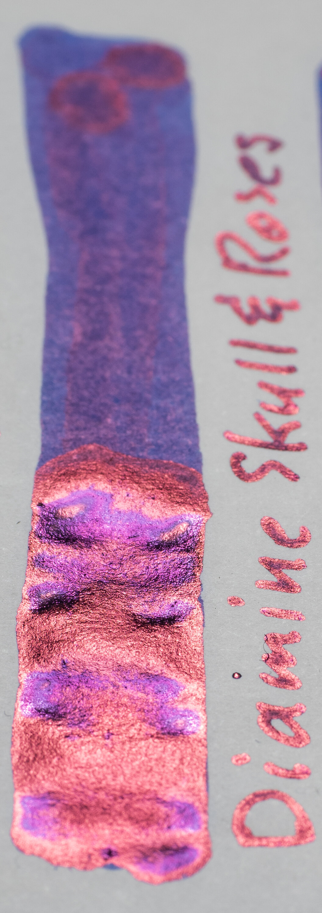
Some beautiful colours here, especially the almost purple sheen that accompanies the red-copper sheen on Skull & Roses and Kobe #37 Island Blue’s dual green and pink sheen. Diamine Jalur Gamilang, Organics Studio Twilight Blue (which is only sheen) and Diamine Maureen have very rich pink sheen with less copper in them compared Berlin Notebook Blue No. 1. Diamine Majestic Blue is also pinker but not as richly saturated as the other pink sheening inks mentioned above. Diamine Skull & Roses is definitely the closest with its mostly red-copper colour!

I really love this ink on Tomoe River, and indeed any paper where it sheen on it looks and performs excellently on! Unfortunately the feathering on Rhodia, and some other papers (see below) might be a dealbreaker for some. It isn’t for me as I usually use Tomoe River paper. Interestingly it performs OK on poorer papers (such as copy paper). I love the rich colour, the shading, the contrast, and the right amount of sheen for me. The red-copper colour also compliments the ink colour very nicely for me. The ink also feels very nice to write with. It’s definitely a shame about the feathering on Rhodia but I’ll still be using it on Tomoe River and I’ll be enjoying it!

The ink is fairly affordable at €11.99 (AU$21.60, US$13.3, £10.9) for the 30ml sheening ink and €12.99 (AU$23.40, US$14.5, £11.8) for the non-sheening black label ink (not reviewed here) and €2.99 (AU$5.4, US$3.3, £2.7) for the 5ml bottle.

I bought this ink from Berlin Notebook but the ink is also available from Pen Classics NZ.

UPDATE: use code MACCHIATOMAN to get 20% off your first order (one use per customer)!

✒︎ ✑ ✒︎ ✑

I've listed all my inks and all my pens in their respective pages. Please let me know which inks you'd like to review next via the comments, Twitter, Instagram, or contact me directly.

For blog updated you can follow @macchiato_man on Twitter, subscribe via email, or like my Facebook page.

I was not compensated for this review and everything here is my own honest opinion. There are no affiliate links in this review.

← Pen Review: Pilot V-PenNotebook Review: Desk Bandit A5 Tomoe River Notebook with Cover →
Back to Top

Blog RSS

✉ Email Subscription

☞ Fountain Pens Australia (Facebook Group)

☛ Sailor Pens & Inks (Facebook Group)