

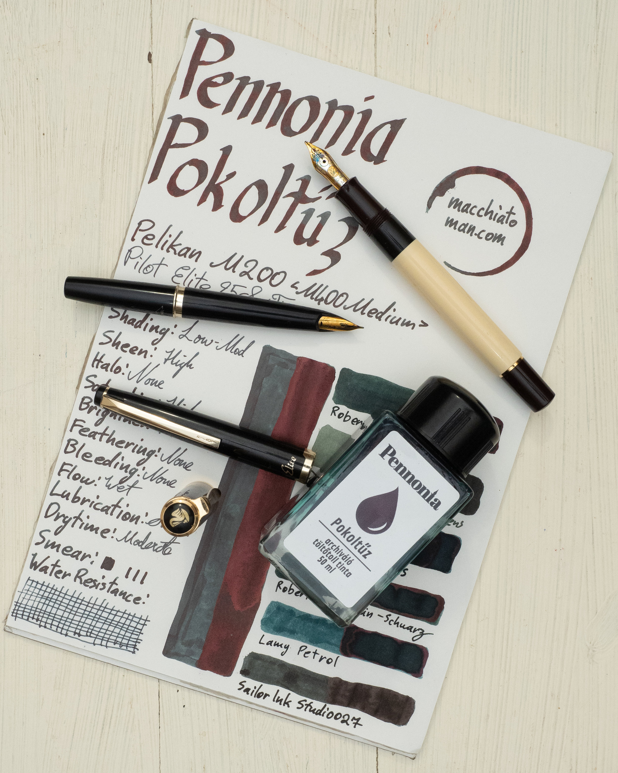
Pennonia is a Romanian pen store and they (though it’s just one person, Matt, running it all!) also have their own inks they make. I reviewed (in a mini review) their glade-green Tisztás ink on my Instagram not too long ago.
Matt was kind enough to send me some inks to try and review. The one I was initially most interested in was Vízláng (‘Waterflame’), a permanent blue with lovely sheen. But when I saw this unique ink I knew I had to review it first!

Pokoltűz is an archival green leaning dark grey ink and translates to ‘Hellfire’. This is what Pennonia has to say about it:
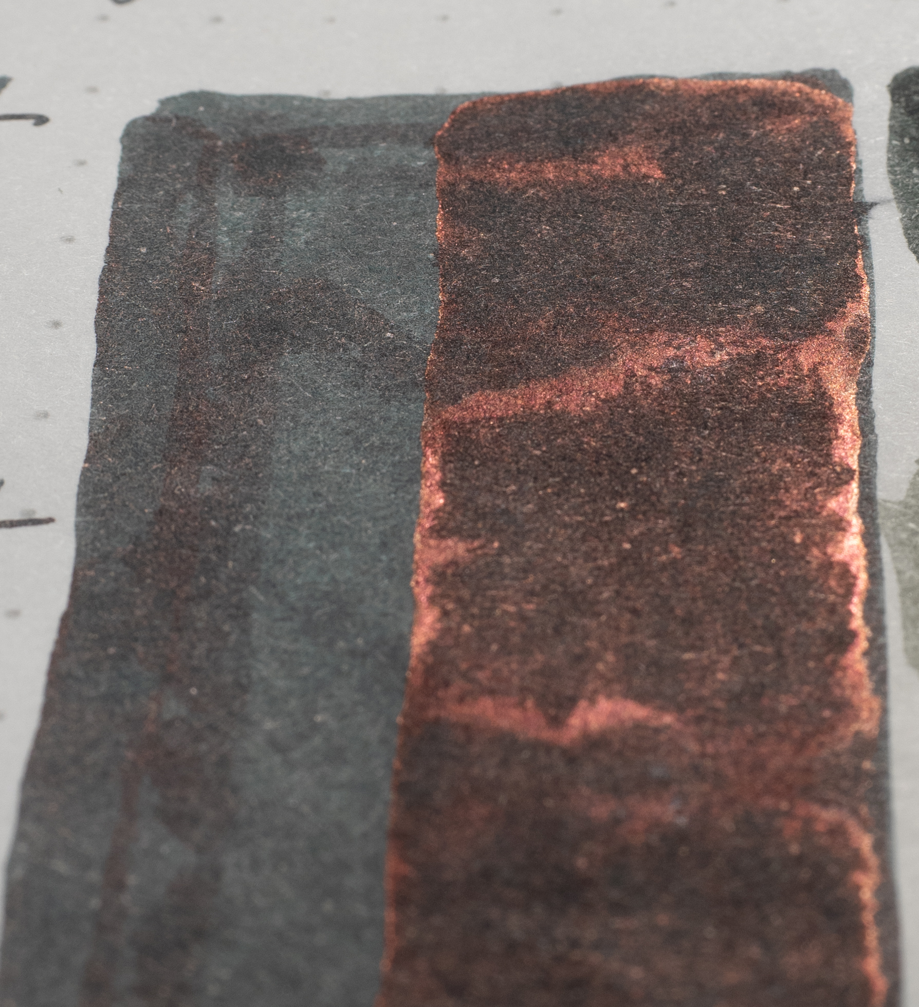
50 ml glass bottle of Pennonia Pokoltűz (Hellfire) fountain pen ink. Continuing with the theme of the Devil, this ink is called Hellfire not because it’s red, but instead because it’s black, has a red sheen but when looked at in the glass it colors it blue. It’s also archival ink which means it’s also nasty if you pour it out by accident but great if you want your writing “burned” into your pages for eternity.
I’d definitely describe this as more of a dark grey than a black but it does have a blue-teal look in the bottle and a lovely fiery sheen! There is some variety with the ink colour depending on the paper with it being bluer (68gsm Ivory Rhodia), greener (Ivory G. Lalo) or far less saturated (Midori). But overall it still stays a green leaning darker grey.
The ink performs well on nearly all papers. It’s decent on poor performing papers as well. There is a little feathering and spreading but it isn’t too bad. The ink is quite smooth and very wet. I really enjoy writing with this ink in fine nibs and wet broad nibs.


The shading isn’t bad. There’s a decent amount on Rhodia but there’s more contrast of the shading on Tomoe River so it’s more obvious. It’s quite visible shading on both even if there isn’t a whole heap of shading.


The sheen is where this ink shines (ha). It’s a bright and vibrant coppery-red sheen and it covers a lot of the written line and certainly a saturated swatch depending on the paper. On Tomoe River with a wet nib it’s present in most of the written line. It’s not so strong that it blocks the ink colour underneath but it’s prominently visible. For a grey coloured archival ink, this much sheen is pretty unique and special!


Sheen on Rhodia is few and far between for most inks and this is no exception. There is some visible sheen on the wetter writing but it’s not obvious. It is still there on the fine nib but it’s barely noticeable at all. There’s a decent amount on the wet swatch but that’s not a practical use, is it‽ Still, there is some sheen here and on Rhodia you don’t complain about ‘just a little sheen’.
Due to problems with my RSS feed for the blog I’ve included a collage of the sheen on different papers here. If you want to see the higher definition individual photos please check out the Flickr album here. On most papers There is a decent amount of sheen. On Franklin-Christoph (an underrated paper!) there’s some gold sheen peaking though as well. Clairefontaine, as expected, has very little sheen. Again, very impressive for both a grey ink but also and archival ink.
Pokoltűz’s water resistance is almost 100% effective. There is a little colour wash off but it’s barely noticeable. What’s extremely impressive is how the sheen is somehow also water resistant! In these photos I washed the the paper and the ink under a tap for a good amount of time, let it dry and the sheen is still strong as ever! There’s strong sheen on the swatch, the thick wet written line and also the thin written line.


The chromatography is very plain and uninteresting but I’m not overly surprised as many archival inks don’t have much variety in their chromatography. Dry time is pretty average for both Rhodia and Tomoe River. 30 and 60 seconds is pretty normal in my experience. As mentioned above the water resistance is almost 100% with only a little colour wash.
Pennonia Pokoltűz is a little higher in saturation and a little greener on Rhodia 80gsm white paper when compared to Tomoe River below. There is no smearing on Rhodia.
Robert Oster Graphite: is a similar brightness though darker and less saturated but it has some green to it;
De Atramentis Charles Dickens: is way too light and too yellow leaning;
Noodler’s USS Texas: Is too dark and too blue and saturated (though there is still green to the hue);
Robert Oster Grün-Schwarz: Is darker than Graphite but otherwise fairly similar;
Lamy Petrol: Is a little too dark and too saturated with a bit too much of a blue lean; and
Sailor Ink Studio 127: has some green tint but is’ pretty much a black here on Rhodia.
I believe the closest option of these inks would be Robert Oster Graphite on Rhodia.
On Tomoe River 52gsm Ivory (white) there is a little less saturation and accordingly the ink is a little lighter but is also darker in the darker areas! What is a pleasant surprise is that there is no smearing here even with the strong sheen. I reckon this goes hand in hand with the sheen being able to be washed away.
Robert Oster Graphite: is more saturated than on Rhodia and is more saturated than Pokoltűz
De Atramentis Charles Dickens: is a little closer in the hue (more green) but still too yellow and way too light;
Noodler’s USS Texas: still too dark, saturated and blue;
Robert Oster Grün-Schwarz: is again a darker version of Graphite;
Lamy Petrol: still too blue and a little to dark and saturated; and
Sailor Ink Studio 127: is a bit closer this time. It’s darker but the hue is fairly similar if less saturated.
This is more difficult than on Rhodia. I think it depends on whether you mind it darker and less saturated (Sailor Ink Studio 127) or more colourful and blue (Robert Oster Graphite).


Only Sailor Ink Studio 127 has the same amount of sheen as Pennonia Pokoltűz but the sheen is a silvery sheen (with only a slight hint of yellow-copper). The closest sheen colour would be Robert Oster Graphite (if a little less vibrant). Grün-Schwarz and Petrol are also similar. I was surprised to see sheen on the De Atramentis and USS Texas!
I’m a big fan of this ink! I usually prefer my greys to be very neutral but I think this is dark enough for me to still like it as a grey plus the strong sheen, archival quality, wetness and smoothness with writing, and lack of smearing ticks a lot of boxes for me (not that I care too much about archival quality but it doesn’t hurt!). I think the ink is unique and interesting, especially for a dark grey!
The ink is €10 (US$11, AU$16) for the 50ml bottle (before shipping). Usually the archival inks are pricier than their non-archival brethren but that isn’t the case here. I don’t think you can go wrong with this ink on the price of the ink itself! Where the price does start to fall apart is on international shipping. It’s currently pretty eye-watering, however, Matt has told me that this should be improving pretty soon!
Thanks again for Matt from Pennonia for sending the ink for review!
As usual, below as the ink on various papers. But this time as a single image collage. For individual images please see this Imgur album.
✒︎ ✑ ✒︎ ✑
I've listed all my inks and all my pens in their respective pages. Please let me know which inks you'd like to review next via the comments, Twitter, Instagram, or contact me directly.
For blog updated you can follow @macchiato_man on Twitter, subscribe via email, or like my Facebook page.
I received this ink free of charge for the purpose of giving an honest review. I was not otherwise compensated and everything here is my own honest opinion. There are no affiliate links.
