• Blog
  • About
    • My Inks (on Fountain Pen Companion)
    • My Pens
  • Archive
  • Contact
Menu

Macchiato Man

  • Blog
  • About
  • My Collection ☟
    • My Inks (on Fountain Pen Companion)
    • My Pens
  • Archive
  • Contact
The @madebyendless Cotton Wallet arrived the other day! I’m a sucker for these sorts of practical inserts for notebooks. The cotton fabric suites the simple style of the Explorer. 
⠀
While I love these and always get them whenever I can I never
First test of the Regalia paper in the Endless Explorer than I was sent by @madebyendless. Really impressed by the paper. Very smooth, nice sheen and nice shading! Finger prints or hand oil seem to affect the writing a little but nothing out of the o
New Pen Review: Esterbrook Camden (Premium Edition) - 𝙻𝚒𝚗𝚔 𝚒𝚗 𝙱𝚒𝚘!

I’ve been eager to try the Camden for a while now. I love my flat end pens and the overall shape of this one is subtly unique. While there are some differences between
New friend from @esterbrook_official! Camden Manitoba Blue. 
⠀
Love flat end pens so looking forward to digging into this (so review incoming).
 
Flat or round ends?✑
⠀
⠀
⠀
⠀
#fountainpen #fpgeeks #fountainpenaddict #fpn #fountainpengeeks  #fountainp
New Ink Review: @birminghampens Antique Sepia (link in bio)
⠀
In line with the recent trend of soft pastel dichromatic inks but Birmingham’s version is an interesting dust grey version with low saturation that I find quite interesting don&rsquo
New Ink Day! Haven’t had one of these for a while but I received these from a friend at the last Perth Pen Meet. 
⠀
All sailor and the first tall bottle in a while (bringing the number of those to 86). 
⠀
Didn’t realise it at the time but
New Ink Review: La Couronne du Comte Vert Sapin (link in bio)
⠀
The final of LCdC’s initial set of four exclusive inks from Diamine. A lovely rich sheeny green-teal.
✑
⠀
⠀
⠀
⠀
#fountainpen #fpgeeks #fountainpenaddict #fpn #fountainpengeeks  #fo
I don’t know if I’ve ever shared this before but my city has a set of five dip nibs as an artwork. 

They are called “Memory Markers” by Anne Neil and represent early-ish colonial stories of the gardens where they are.

We als
⚠️Update: Why I have been so radio silent! 📻🤫 A lot of large personal changes, essentially (read on for details)!

There have been three main reasons for why I haven’t been able to do much here or on my blog. 

1) 🎓 I had to finish of my Mas
Ink Ink Comparison: Discontinued Iroshizuku and New Iroshizuku! Thanks to @penclassics for allowing this to happen. See link in bio!
⠀
The old: Tsuyu-kusa, Tsukushi, and Ina-ho.
The New: Sui-gyoku, Hana-ikada, and Hotaru-bi.
⠀
This is a long review b
NPD: @esterbrook_official LE Estie “Candy” in Oversize with a Kirk Speer Needlepoint nib!
⠀
Thanks to Esterbrook for sending this through to me for review. I’ve reviewed a couple of Esties now and two of the custom nibs (which are a
Out with the old in with the new?

I just received the new Pilot Iroshizuku Inks in the little bottle ink pack from @penclassics for review. I plan on doing an overview review of the three new and the three old ones!

I feel like Ina Ho was quite a u
New Pen Review (see link in bio): Platinum Curidas courtesy of @penclassics (check them out!)
⠀
This is certainly a curiously designed pen with it's quirks but it has bee a delight to write with and a great pen to through in a pocket. I've been using
New Ink Review! @wearingeul_global Kyonghui! See link in bio!

Kyonghui is a vibrant earthy orange from Wearingeul's series on Korean Female Modern Writers. It is also a great performing ink!

Wearingeul's global push is fairly new; has anyone tried
It has been a little while since I posted here so I thought I'd give a little update!

Firstly I think I just needed a little break at the end of the year! It has been a busy year for me. I have been taking my photography more seriously and I also ha

Subscribe

Sign up with your email address to receive news and updates.

We respect your privacy. Unsubscribe at any time.

Thank you!
Blog RSS

☛ Twitter feed

✉ Email Subscription

☞ Fountain Pens Australia (Facebook Group)

☛ Sailor Pens & Inks (Facebook Group)


Sponsors

10% off code: MACCHIATOMAN


Click here for sponsorship information


Featured Posts:

Featured
Ink Review: Pennonia Pokoltuz (Pokoltűz)
Aug 1, 2019
Ink Review: Pennonia Pokoltuz (Pokoltűz)
Aug 1, 2019
Aug 1, 2019
Notebook Review: Pebble Stationery Pocket Tomoe River Notebook
Nov 10, 2018
Notebook Review: Pebble Stationery Pocket Tomoe River Notebook
Nov 10, 2018
Nov 10, 2018
Ink Review: Krishna Brown Pink
Jan 20, 2018
Ink Review: Krishna Brown Pink
Jan 20, 2018
Jan 20, 2018


Archive
  • November 2024
  • October 2023
  • December 2022
  • October 2022
  • June 2022
  • May 2022
  • April 2022
  • February 2022
  • January 2022
  • December 2021
  • November 2021
  • October 2021
  • September 2021
  • August 2021
  • July 2021
  • June 2021
  • May 2021
  • April 2021
  • February 2021
  • January 2021
  • December 2020
  • November 2020
  • October 2020
  • September 2020
  • August 2020
  • July 2020
  • May 2020
  • April 2020
  • March 2020
  • February 2020
  • January 2020
  • December 2019
  • November 2019
  • October 2019
  • September 2019
  • August 2019
  • July 2019
  • June 2019
  • May 2019
  • April 2019
  • March 2019
  • February 2019
  • January 2019
  • December 2018
  • November 2018
  • October 2018
  • September 2018
  • August 2018
  • July 2018
  • June 2018
  • May 2018
  • April 2018
  • March 2018
  • February 2018
  • January 2018
  • December 2017
  • November 2017
  • October 2017
  • September 2017
  • August 2017
  • July 2017
  • June 2017
  • May 2017
  • April 2017
  • February 2017
  • January 2017
  • December 2016
  • November 2016
  • September 2016
  • August 2016
  • July 2016
Logo 1.png

Ink Review: Shosaikan Syosaikan Seiran Blue

May 06, 2021 in Ink Review

Shosaikan-Syosaikan Seiran Blue is one of two Sailor-made inks from the Shosaikan pen shop based in Tokyo with the other being a green-yellow. They are both in the lovely Sailor Tall or Vase bottles. I visited the store in 2018 on my trip to Japan; it’s a beautiful and spacious store with lots to offer (and lots of high end pens!). Before visiting the store, I acquired this ink via a forwarding service.

Title.png

This ink is decently saturated (but not high) blue-black like ink. There’s some depth to the darkness and the hue is a nice dark cerulean or metallic blue. The colour changes slightly with the paper leaning more green on yellower paper types and slightly more purple on some paper as well.

The lubrication and flow is both on the high end with the ink being a delight to write with. A very smooth and glossy feeling. On less fountain friendly paper the ink performs pretty well but loses some saturation. Examples of this ink on 16 different paper types is at the end of the review.

As mentioned the ink comes in the very beautiful and well regarded Sailor Tall bottle (also sometimes called a Vase bottle). On the top of the cap is a round blue logo of Shosaikan and on the side of the bottle is a gradient strip with Japanese text identifying the ink.

View fullsize Chromatography.jpg
View fullsize TR Dry Time.jpg
View fullsize Rho Dry time.jpg
View fullsize TR Water.jpg
View fullsize Rho Water.jpg

The chromatography is pretty and interesting for a blue-black ink. Starting with a blue- green it breaks into a magenta-pink that ends with a very dark blue before again breaking into a vibrant azure. Dry time is on the slower side for both inks but not much higher than normal.

Water resistance isn’t strong but a pink-grey line is left behind.

52gsm Ivory (White) Tomoe River

On Tomoe River the ink is well saturated with a little brightness to it, when compared with Rhodia. There is also no smearing on Tomoe River.

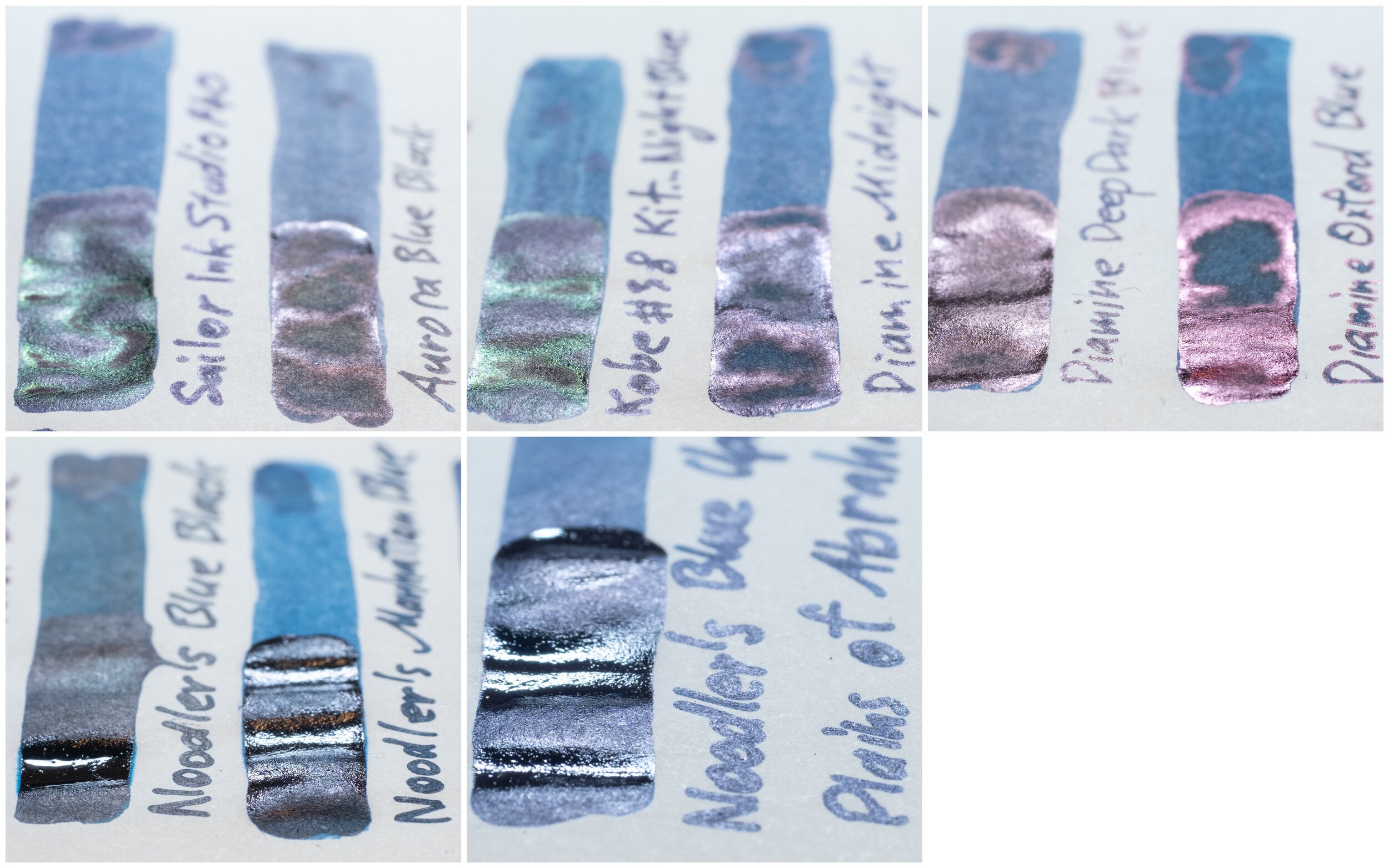
  • Sailor Ink Studio #940: this ink is very similar but a hair greener;

  • Aurora Blue Black: is too much less saturated;

  • Kobe #38 Kitanozaka Night Blue: is less saturated and a little greener;

  • Diamine Midnight: is also quite similar but darker and a hair less saturated;

  • Diamine Deep Dark Blue: is darker, more purple leaning, and a little less saturated;

  • Diamine Oxford Blue: is darker and noticeably more saturated;

  • Noodler’s Ink Blue Black: is more teal than blue and is darker and more saturated;

  • Noodler’s Ink Manhattan Blue: is lighter, more less teal leaning and a little less saturated; and

  • Noodler’s Ink Blue Upon the Plains of Abraham: is quite similar but darker and more teal.

Sailor Ink Studio #940 is by far the closest but Diamine Midnight isn’t far off! If you are just after the colour then you can’t go wrong with #940 as an alternative. Made by Sailor it will write similarly as well.

View fullsize Shading
Shading
View fullsize Sheen
Sheen

Sheen

The shading is fairly low with low frequency and low contrast. The gradient can be a little more sudden on the finer nib. Not a high shading ink on Tomoe River for sure. There’s no haloing.

This is a dual sheening ink with a dull pink-silver sheen being the default colour and a brighter more saturated green developing on the wetter lines and swatches. Not the strongest dual sheening ink but a pretty one nonetheless.

TR Sheen Comparison.jpeg

Both the Sailors have similar sheen with #940 being the closest and Kobe #38 showing stronger green sheen. Aurora and the diamines have coppering or pink sheens and the Noodler’s have Noodler’s strange silvery sheen.

80gsm White Rhodia

Rho Ink Comparison.jpg

On Rhodia the ink is darker and a little less saturated plus slightly less teal leaning. No smearing here either.

  • Sailor Ink Studio #940: isn’t as similar on Rhodia being lighter and more teal leaning;

  • Aurora Blue Black: is too much less saturated;

  • Kobe #38 Kitanozaka Night Blue: is very close on Rhodia but a hair more teal leaning;

  • Diamine Midnight: is lighter and less saturated;

  • Diamine Deep Dark Blue: is less saturated;

  • Diamine Oxford Blue: is darker and noticeably more saturated;

  • Noodler’s Ink Blue Black: is more teal than blue and is darker and more saturated;

  • Noodler’s Ink Manhattan Blue: is fairly similar but lighter, and a little less saturated; and

  • Noodler’s Ink Blue Upon the Plains of Abraham: is quite similar but darker and more purple this time.

Kobe #38 shines on Rhodia as the closest with #940 not far off and neither is Diamine Midnight.

View fullsize Shading
Shading
View fullsize Sheen
Sheen

Sheen

The shading isn’t improved on Rhodia, if anything it’s a little less. Very low here.

The sheen has also decreased to almost none and what little there is is the full red sheen. No green on Rhodia.

Similarly essentially none of the comparison inks have any sheen.

A beautiful bottle with a tasteful label and a rich useful blue-black with some pretty dual sheen on the right paper. Perhaps not the most unique blue ink (especially within Sailor’s output) but if given the option I’d pick it over the Ink Studio and I, personally, think the bottle is worth the extra cost. You should be able to buy the ink via a forwarding service from Shosaikan.

Moving forward I’ve decided to change up my reviews a little mixing the look of these with the look of the overview designs like here and here. This should result in more consistent and more useful visual examples of the ink. I’ll be using Lamy pens that take Safari-like nibs for the review and I’ll be using the same six nibs every time. This will mean consistency for me between reviews and a better understanding by me of the performance of the nib (that I can then convey in text) as well as a consistent visual rendition. Everything is the same between reviews so you can see how an ink is wet or dry or sheeny or shady. The review will present all visual information on the one page; water resistance, smearing, dry time, chromatography, writing samples and swatch samples. The comparison writing will still be written with a James Finniss Serendipity (from Pensive Pens). The only loss will be Shading, Sheen, Flow, Bleeding (etc.) list and accompanying quality/quantity hybrid indicators such as high, low or moderate. These indicators are, however, somewhat vague. While I will still be describing this stuff in the text review, a consistent experience with nibs will result in a better indicator of these things in the photos themselves. I look forward to the next step in these reviews!

✒︎ ✑ ✒︎ ✑

Thanks for reading! If you have any questions, comments or suggestions please let me know in a via the comments, Instagram, or contact me directly.

You can find my ink collection here and my pen collection here. Is there something you’d like reviewed? Let me know!

For blog updated you can follow @macchiato_man on Twitter, subscribe via email, or like my Facebook page. Check out the sponsors of this blog as well!

I was not compensated for this review and everything here is my own honest opinion. There are no affiliate links in this review.

Tags: Shosaikan, Seiran Blue, Shosaikan Syosaikan Seiran Blue, Sailor, Sailor Tall Bottle, Blue, Dual Sheen, Green Sheen, Red Sheen
← Ink Review: Berlin Noterbook No. 5 New RedPen Review: Esterbrook Estie with Journaler nib and Vintage nib (+ Nook giveaway) →
Back to Top

Blog RSS

✉ Email Subscription

☞ Fountain Pens Australia (Facebook Group)

☛ Sailor Pens & Inks (Facebook Group)