
Sailor’s Manyo Series is a two-set series of inks available to the international market, not the Japanese market (there’s enough there already)! The series is based off Man'yōshū, or “Collection of Ten Thousand Leaves” which is a set of 4,516 Classical Japanese poems compiled from a variety of source and people in 759. The first set contains eight inks and was released late 2019; the second was released late 2020 and also contained eight inks. This overview is part 1 of 4 starting with the 2019 release in in alphabetical order with four inks per article. Part 2 is here, and Part 3 is here.
A big thank you to Pen Classics NZ for discounting the inks. Go check them out!
Credit given below under each individual photo.
Nature and especially flowers are significant for Japanese culture and art and around one third of all the Man'yōshū poems mention 160 different plants and fifty different flowers. I don’t know much about flowers but I’ve done my best, not knowing Japanese, to find approximate flowers or at least approximate genus (hopefully!). I tried to match photos of the flowers with the artwork of the flowers on the bottles as well as starting with google searches of the name of the ink.
Akebi
“Akebia quinata” (H. Zell - CC BY-SA 3.0)
Manyo Akebi is probably the closest ink colour to the photo I have of the relevant flower, Akebia quinata. The flower is probably a little less saturated here but you can certainly see the same hue!
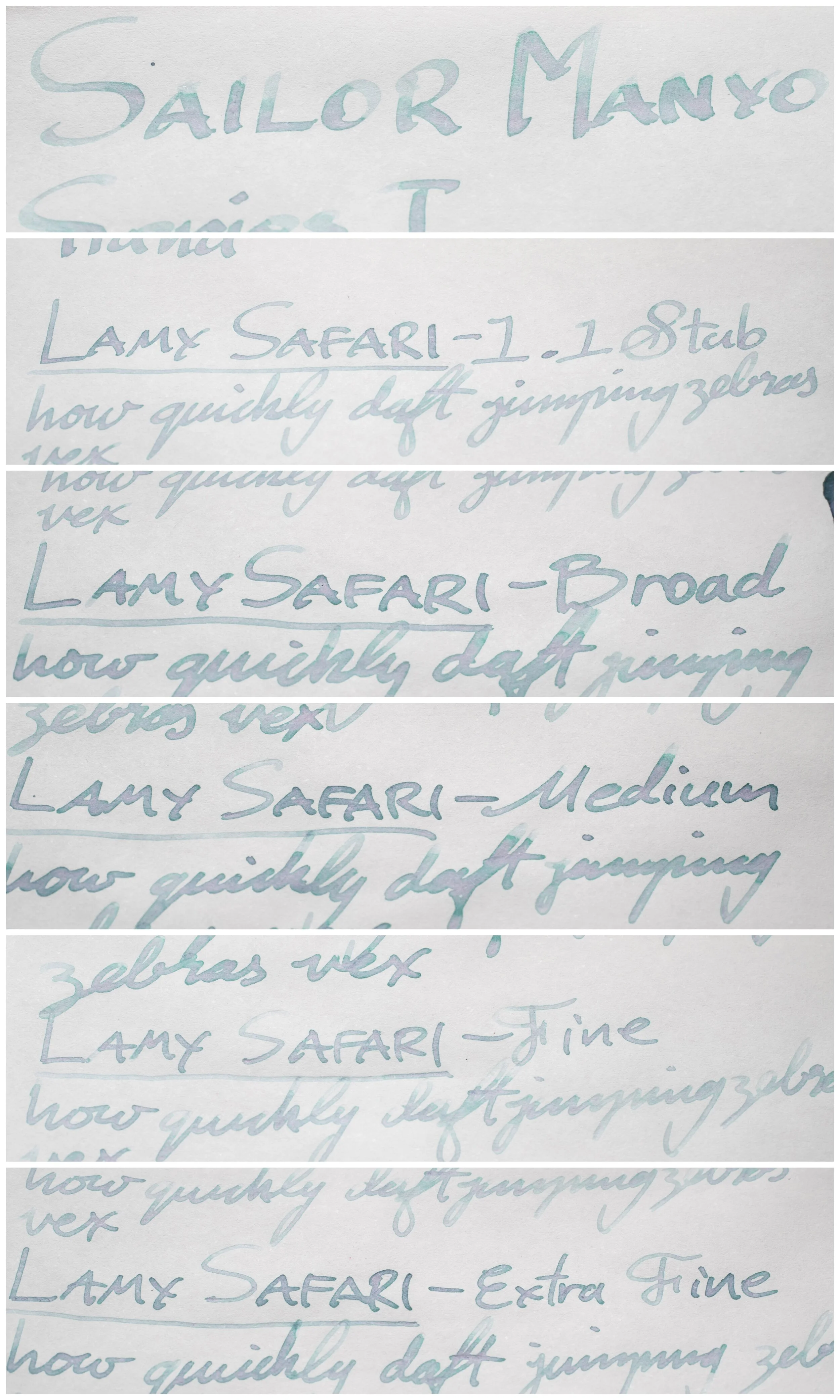
Review on 52gsm Ivory (White) Tomoe River (old paper)
Akebi is a rich deep ruby fuchsia. It leans a little purple, at least mores than it does red. There’s decent starvation and vibrance but there’s some softness to it. As with most sailor inks, this ink is wet and smooth with no feathering or bleeding. Dry time is slightly quicker for Tomoe River. Water doesn’t wash the line away entirely (though close) but it makes a mess.
Pilot Iroshizuku Yama-budo is more pink and magenta than Akebi while both Sailor Ink Studio #735, and Bungubox L’Amant are both bluer.
Shading
Sheen


The shading isn’t very strong but it is there on every nib. The gradient is smooth and the contrast is slight. The ink is a fairly strong sheener with a gold-green throughout, even (though not strongly) on the drier fine-nib. There isn’t really any halo. The chromatography is pretty but nothing unique; a pink gradient that becomes more saturated before becoming a purple and then breaking into an azure blue.
Yama-budo’s stunning gold sheen is quite different from the gold-green of all three sailor inks.
Review on 80gsm White Rhodia
On Rhodia the ink is very similar in hue. Water resistance seems even worse, surprisingly. Dry time is again fairly decent. No feathering of bleeding.
Here the purple of Ink Studio 735 really contrasts with the less-blue hue of Akebi. Yama-buko looks quite strikingly saturated and colourful!
Shading
Sheen?


The shading is stronger on Rhodia with more contrast and a sharper gradient with a similar frequency. Rhodia doesn’t show much sheen and it’s the same case here. A little muted gold-green sheen on the swatch and the barest hint on some of the writing, though I wouldn’t practically classify this as sheen.

Not unexpectedly there is comparatively no sheen on these either on Rhodia.
Haha
“Fritillaria verticillata” (titanium22 - CC BY-SA 2.0)
“Fritillaria japonica” (Alpsdake - CC BY-SA 4.0)
EDIT: NOPE! Definitely not this! “Cyanea angustifolia” (David Eickhoff - CC BY 2.0)
I’m not 100% sure about this flower. My googling found Haha to be a Hawaiian flower. I’m sure I’m wrong with this, but I couldn’t find anything else! Definitely do not quote me!
EDIT: I was right! In that I knew I had to be wrong, and indeed I was wrong…
“Sailor fan” in the comments has very kindly provided an explanation for this flower (thanks heaps!):
“I just thought I'd leave some information on the Haha flower, since it seems to be difficult to find outside of the Japanese internet. "Haha" is an old name for Fritillaria verticillata, which is more commonly known as "amigasa-yuri" (woven hat lily) in Japan. "Haha", or "mother" was used as a poetic name for the flower because the shape looks like a mother embracing her children. This seems to originate from the Chinese name for the plant, which is made up of the characters "shell" and "mother". It was a medicinal plant, and thus not a popular choice for writing poems about--apparently the Manyoshu is the only set of poems that mentions it.”
I also, upon some digging, found “Fritillaria japonica”, another variant of the flower, also from Japan but this time the colours are a little closer to the Haha ink colour. Provided for context!
Review on Ivory (White) 52gsm Tomoe River (old paper)
Clearly this is the happiest of the inks! Haha is impossible to classify as a certain ink colour. I’ve seen these types of inks called dichromatic, bichromatic, and dual-colour. Dichromatic works the best for me. This particular dichromatic ink, Haha, is mostly a pale blue-teal with a centre of pale lavender. This is consistently how the ink presents with grey-green-blue on the edge and grey-lavender on the inside. The same with the writing! The ink is a bit dryer than other Sailor inks but is still moderate at the worst. There’s no bleeding of feathering and the water resistance is non existent. The dry time is relatively normal for Tomoe River.
Chromatography is a lovely pastel complex set of colours! A blue-grey (all colours a pale) with streaks of pink moved to a blue-leaning-green ending with a yellow. It reminds me of the 90s “Jazz” aesthetic!
Sailor Ink Studio 162 is fairly similar but darker (without becoming more saturated) so it seems a bit muddier. Both Vinta inks are a pale inks that almost become dichromatic but don’t quite make it. There’s a hit of an orange in Perya and a yellow in Sirena but that don’t quite break through.
Shading
Sheen?


The shading isn’t very frequent but when it is there it’s quite a strong contrast and quite sudden. This ink has a very strong halo and the halo is of the green-turquoise colour different from the pink interior of the written line. There’s no sheen.
Surprisingly there’s almost a muted grey sheen on Ink Studio 162! Overall there’s no sheen in these inks though.
The ink is less complex and dichromatic on Rhodia with the green-turquoise becoming much more prominent and the lavender becoming much more subtle. You can still see the dichromaticism but only barely on the written line - it has become more grey. Dry time is decent on Rhodia and there’s still no water resistance.
The darker muddiness of Sailor Ink Studio #162 is more prominent on Rhodia. The more green-turquoise colour of Haha makes Perya much closer this time!
Shading
Sheen?


Even more limited shading but the same characteristics apply on Rhodia as well. What little shading there is is fairly contrasting and sudden. Definitely no sheen on Rhodia!
And definitely none for these inks as well!
Kikyou
“Platycodon grandiflorus” (Kurt Stueber - CC BY-SA 3.0)
Kikyou/Kikyō is related to bellflowers and is called sometimes known as a Chinese Bellflower. The flower here is a light purple-leaning blue which is quite different from the dark green-leaning blue of the ink!
Review on Ivory (White) 52gsm Tomoe River (old paper)
Kikyou is similar to a Prussian blue. It is a dark moderately saturated blue that leans more teal than purple and a bit of grey. Kikyou is nicely wet and smooth with no feathering or bleeding. There some water resistance; it isn’t strong but it is there. Dry time is on the quicker side of moderate.
Sailor Yonaga is darker and more saturated and less green leaning. The red sheen (there ‘s also green) makes the ink seem rather purple but it’s fairly neutral. Diamine Blue/Black is a similar darkness and hue but a hair more green leaning. Noodler’s Blue Black is darker and a little less saturated.
Shading
Sheen


There’s very little shading except on the drier (the fine nib) and thinner (fine and extra fine nibs). On these drier and thinner nibs the contrast is higher and the gradient sharper. With the wetter and fatter nibs the gradient is very smooth and the contrast is low. There’s not much of a halo.
The ink has a fairly strong copper sheen that’s prevalent on all the writing (though on the drier nib the cursive writing has less sheen). It isn’t a strong sheening ink but it’s a nice noticeable sheen.
The chromatography is rather plain. There’s a grey line where the ink was written on the paper but the rest of the ink is a gradient from a blue-grey to a richer blue ending with a deeper darker blue.
Sailor Yonaga’s dual-sheen is stronger and is the wrong colours. Diamine Blue/Black is a similar sheen but more muted and much more subtle. Noodler’s a muted brown-silver sheen and also subtle.
Review on White 80gsm Rhodia
These inks are fairly consistent between Rhodia and Tomoe River and it’s the same here. The Hue and shade are very close. Water resistance is a little stronger, possibly. Dry time is pretty snappy!
Sailor Yonaga is still less blue but because of the lack of sheen on Rhodia it no longer looks purple. Diamine Blue/Black is a little more saturated but very similar! Noodler’s Blue Black is darker and more green.
Shading
Sheen


Practically no sheen on Rhodia! The shading is much stronger, however, with more contrast and frequency even if the gradient is still somewhat smooth.
Yonaga has a similar amount of meaningless sheen on the swatch (a little less even) the rest are sheen free apart from a general brownness to the Noodler’s?
Kuzu
“Kudzu” (Peggy Greb - public domain)
Kuzu or Kudzu, are pretty little flowers from a vine covering plant. There’s definitely some red to the flower in this photo but it is, overall, more purple.
Review on Ivory (White) 52gsm Tomoe River (old paper)
Kuzu is a dark magenta ink that has a bit of smokiness to it with moderate to high saturation. The ink is decently wet and smooth, typical for Sailor. Dry time is moderate if not slightly quicker. The water resistance isn’t non existent but it’s pretty messy!
Kyo-no-oto No.00 Azuki-iro (which is what my bottle is called, it’s now called No.06 Adzuki-iro) is more orange and a little lighter. Parker Penman Ruby is less saturated, lighter but a compare able hue. Bungubox is definitely the closest but is a touch more purple leaning.
Shading
Sheen


Shading isn’t that strong but slightly stronger than Kikyou. The dry nib has more contrast but there is limited frequency and a very smooth gradient. Sheen is quite strong with a green-gold sheen throughout the written lines.
The chromatography starts with a bluish grey line where the ink was written onto the paper after which there’s a steady gradient of magenta that suddenly becomes dark before breaking into a brilliant yellow.
Kyo-no-oto Azuki-iro’s sheen is a nice silver-gold sheen but there’s no green to it and it is less saturated than the sheen of Kuzu. Parker Penman Ruby is a more green sheen and Bungubox Tears of a Clown is essentially the same sheen.
Review on White 80gsm Rhodia
On Rhodia the ink is slightly redder and a little darker and with a touch less saturation. It’s still quite rich but not as much as on Tomoe River. Water resistance is a little stronger with a grey-line left behind; it is still a little messy. No Bleeding or feathering and the dry time is rather quick.
Kyo-no-oto is more saturated while Parker Penman is still less saturated and Tears of a Clown is is a little bluer and darker.
Shading
Sheen


Shading is again, like Kikyou, a little better on Rhodia with the wetter inks showing more shading. Sheen is minimal but there’s specks of gold-green sheen on some parts of the writing. Close to practically none, however.
Kyo-no-oto is surprisingly the strongest sheener! But none of these show much sheen, or any real sheen, on Rhodia!


.jpg)
Essentially this first part has two magentas and two blues. Each series contains two dichromatic inks and alphabetically it splits them into one per each part of review. I’m a big fan of these new dichromatic inks, and the trend, and these ones are pretty strong and noticeable, even in the writing. I do like these magenta inks as well, some of my favourite colours. The Blue-black is also a strong contender. All of them have Sailor’s general characteristics of good paper performance and feel performance. Only Haha is a little drier than the average but certainly not bad. Sailor do love their blues though so there’s more to come!
Thank you again to Pen Classics NZ for discounting the inks!
✒︎ ✑ ✒︎ ✑
I've listed all my inks and all my pens in their respective pages. Please let me know which inks you'd like to review next via the comments, Twitter, Instagram, or contact me directly.
For blog updated you can follow @macchiato_man on Twitter, subscribe via email, or like my Facebook page.
I bought these stationery items at a discounted rate for the purpose of giving an honest review. I was not otherwise compensated and everything here is my own honest opinion. There are no affiliate links. Nota bene: Pen Classics NZ are also a sponsor of this blog.