
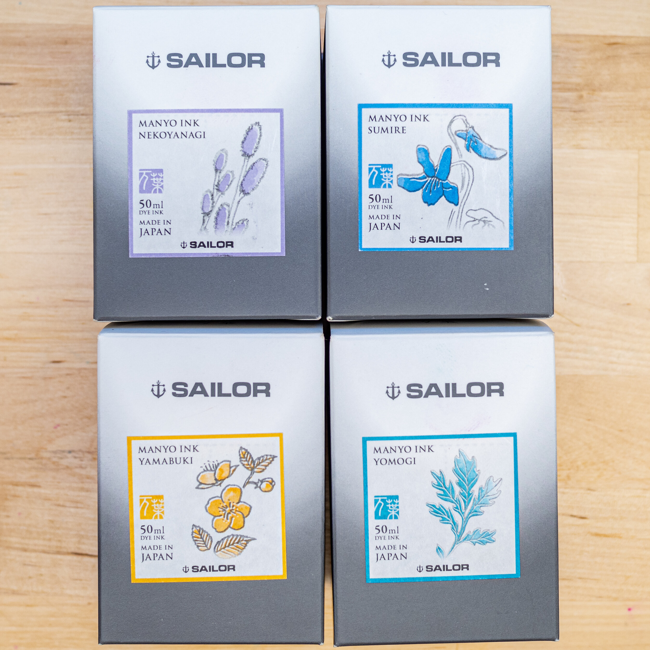
Sailor’s Manyo Series is a two-set series of inks available to the international market, not the Japanese market (there’s enough there already)! The series is based off Man'yōshū, or “Collection of Ten Thousand Leaves” which is a set of 4,516 Classical Japanese poems compiled from a variety of source and people in 759. The first set contains eight inks and was released late 2019; the second was released late 2020 and also contained eight inks. This overview is part 2 of 4 finishing off the 2019 release in in alphabetical order with four inks per article. Part 1 is here, and Part 3 is here.
A big thank you to Pen Classics NZ for discounting the inks. Go check them out!
Nature and especially flowers are significant for Japanese culture and art and around one third of all the Man'yōshū poems mention 160 different plants and fifty different flowers. I don’t know much about flowers but I’ve done my best, not knowing Japanese, to find approximate flowers or at least approximate genus (hopefully!). I tried to match photos of the flowers with the artwork of the flowers on the bottles as well as starting with google searches of the name of the ink.
Nekoyanagi
“Salix gracilistyla (female)” (National Institute of Ecology - Korea Open Government License Type I: Attribution)
“Salix gracilistyla (male)” (National Institute of Ecology - Korea Open Government License Type I: Attribution)
Salix gracilistyla is a shrub-like species of willow native to Japan, Korea and Japan know in English “as rose-gold pussy willow”. The photos of the plant supplied by the South Korean National Institute of Ecology shows the female plant with silver hair-like things among black and green tinges. The male flower shows red and yellow stamen as well. My interpretation of these flowers when compared to the ink is taking the green from the female flower and the red from the male flower. But this is just one photo and perhaps other photos show a colour closer ink!
Review on Ivory (White) 52gsm Tomoe River (old paper)
Nekoyanagi is another dual-colour or dichromatic ink. Both the 2019 and 2020 sets have two dichromatic inks, and coincidentally, when splitting the two sets into to parts alphabetically (within the set) each of the four parts contains one. Nakoyanagi is probably the strongest of the set, especially within the written line. The ink is predominantly a pink-magenta ink with a light green-turquoise edge. The saturation is stronger with the pink than the blue but several it isn’t the strongest saturation ink. The ink is a little on the drier side for Sailor inks. This is mainly noticeable with the dry Fine nib only. No feathering or bleeding. Dry time is on the faster side of moderate and there’s no water resistance.
Kobe #57 Hydrangea has a hint of dichromaticism to it but is pretty much a simple soft blue leaning pink - the hue is similar to the pink of Negoyanagi but much more saturated. Sailor Ink Studio #123 is duller and darker (especially with the blue/green hue) but otherwise similar. Ink Studio #243 has much less pink and the blue is less teal leaning.
Shading
Sheen?


The shading isn’t super strong. The gradient is smooth and low contrast and the frequency is low. Shading actually takes away from the dichromatic nature of the ink though. There’s a very strong halo (which is where most of the light teal resides). There’s no sheen anywhere here.
The chromatography starts purple/pink steams amongst blue that becomes more blue before a teal-green comes out and it ends wit ha pale yellow. Interesting!
There’s actually some sheen in all the swatches but nothing practical!
Review on White 80gsm Rhodia
As usual the dichromaticism is weaker on Rhodia. There’s less saturation overall but the blue is even less prominent on the written line. No feathering or bleeding. Dry time is on the relatively snappy and there’s still no water resistance.
Kobe #57 is even more saturated now. Sailor #123 is still darker and less saturated but the blue is more green now. Ink Studio #243 also less dichromatic with only a hint of pink amongst the greyish blue.

Shading
Sheen?


The green edges are more blue on Rhodia and it's also less prominent. The Halo isn’t as strong but the shading is a little stronger. No Sheen, unsurprisingly.
No sheen!
Sumire
“Viola mandshurica” (E-190 - CC BY-SA 3.0)
Viola mandshurica or Sumire is a perennial violet. The colour is clearly, well, violet. Purple! The ink, however, is a blue with a hint of teal. I know there are blue violets so it must be referencing those instead.
Review on Ivory (White) 52gsm Tomoe River (old paper)
Sumire is a very rich turquoise blue. It’s the type of colour that doesn’t display well on computer screens. The ink is, in reality, more saturated than it shows on the screen! The ink is fairly wet, normal for Sailor. Dry time is moderate. There’s some water resistance but it isn’t strong.
Waterman Inspired Blue is a little lighter and more green leaning as is Robert Oster Blue Lagoon. Sailor Souten is bluer and darker.
Shading
Sheen


Sumire has moderate-to-low shading . The ink has some subtle sheen on Tomoe River. The sheen is a normal bright red/pink and is mostly an edge sheen. It’s still a subtle sheen with it only really presenting on the wetter nibs. There’s a little bit of haloing.
Chromatography is very plain; just a gradient of the ink colour becoming darker and more saturated.
Sailor Souten’s sheen is much stronger while Waterman and Robert Oster present in similar subtle ways.
Review on White 80gsm Rhodia
The ink doesn’t really change on Rhodia. The colour and shade is the same. There’s no feathering or bleeding, the dry time is quick and the water resistance is low but present still.
Waterman Inspired Blue is much closer on Rhodia. It is still a littler more teal leaning but less so than on Tomoe River. Sailor Souten still leans more blue and less teal but isn’t as dark or saturated. Robert Oster Blue Lagoon is still too green leaning.
Shading
Sheen


Shading is stronger with a little more frequency, contrast and a sharper gradient. There’s no sheen on Rhodia.
Practically no sheen on Rhodia for these as well!
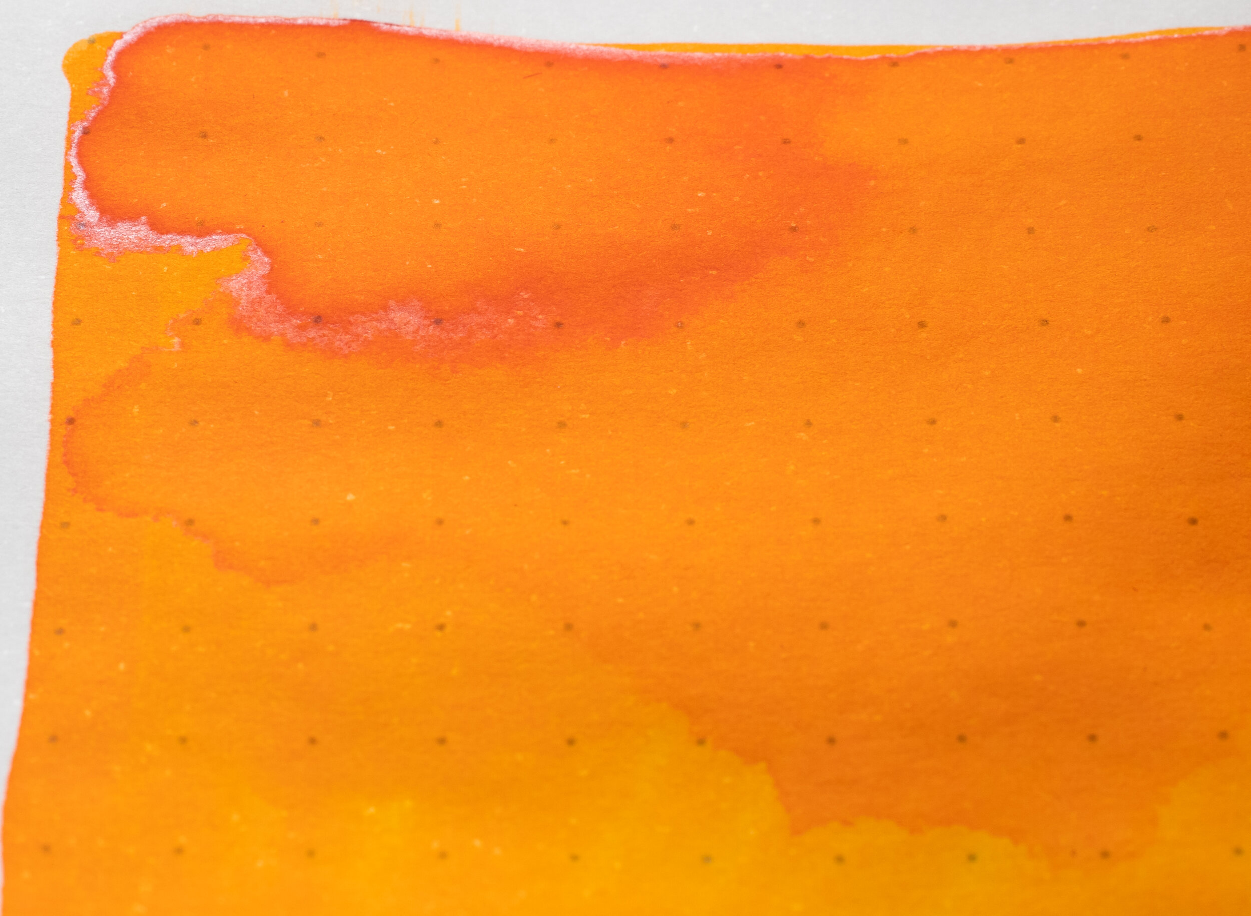
Yamabuki
“Kerria japonica (natural not cultivated form)” (Jeffdelonge - CC BY-SA 3.0)
Kerria japonica Alsop known as Japanese marigold bush or Yamabuki and presented in its natural form on the ink bottle artwork, is a golden yellow flower. It isn’t as orange as the ink though, at least in this photo.
Review on Ivory (White) 52gsm Tomoe River (old paper)
Yamabuki is in-between a lighter orange and a darker yellow. Either way it’s extremely saturated! The ink is decently wet but less than normal for Sailor (though not their driest). Dry time is pretty normal on Tomoe River, if a touch slower. Water resistance is completely non existent! There’s no feathering or bleeding.
Colorverse Golden Leaves is a little lighter and less saturated and looks more yellow than orange. Montblanc Golden Yellow is fairly similar but a little more yellow and flatter. Pennonia Öszi Täj is the same.
Shading
Sheen


The shading is fairly frequent but mostly it’s low contrast with a smooth gradient. The drier fine nib shows a bit more contrast. The sheen is present throughout and is a simple white-silver sheen. There’s no colour to the sheen here! There’s no haloing.
The chromatography leaves a subtle grey line where the ink was drawn onto the paper but quickly turns into a pale pink/orange which, half way through, becomes a yellow gradient that gradually gets darker and more saturated until ending with a thin line or orange.
None of these inks show as much sheen as Yamabuki. MontBlanc Golden Yellow shows the strongest while the others are fairly sheen-free.
Review on White 80gsm Rhodia
As is generally consistent with Manyo inks (outside of the dichromatic colours), the colour is fairly consistent between Rhodia and Tomoe River. There’s still no bleeding, feathering, or water resistance. Dry time is moderate to slow on Rhodia.
All the comparison inks are a little flatter on Rhodia and a little less saturated.
Shading
Sheen

Shading is definitely stronger on the wetter nibs with more contrast and a similar frequency and gradient. Sheen is non existent apart from a subtle sheen on the swatch.
No sheen from these on Rhodia!
Yomogi
“Artemisia princeps” (Mrs. Gemstone - CC BY-SA 2.0)
Artemisia princeps also known as Japanese mugwort is a plant that is used in food and tea. The flowers seem to be somewhat reddish but its the leaves that are shown on the box art, not the flowers.
Review on Ivory (White) 52gsm Tomoe River (old paper)
Yomogi is a rich highly saturated moderately shaded teal. Like Sumire, it is the type of colour that doesn’t display well on computer screens. The ink is, in reality, more saturated than it shows on the screen! It’s always disappointing to review these because of that. This ink is quite wet and smooth with no feathering or bleeding. The dry time is fairly moderate for Tomoe River. There is absolutely no water resistance.
Robert Oster Fire & Ice is a little bluer but rather similar. Sailor Yama Dori is darker and a toucher more green. Lamy Amazonite is a bit greener and a little darker.
Shading
Sheen


Shading is’t very frequent but when it is there it is high contrast and a sudden gradient. There is a decent and noticeable halo. Sheen is subtle but noticeable throughout except on the drier fine nib.
Chromatography is a little plan with a faint teal-green becoming more saturated before breaking into an azure and ending with a dark saturated azure.
Robert Oster Fire & Ice is probably the closest sheen. It is a little more vibrant but it is a similar frequency. Yama Dori is simply too much and Lamy Amazonite is too little.
Review on White 80gsm Rhodia
On Rhodia the ink has the same colour and shade. The ink doesn’t feather or bleed and dry time is quite fast. The water resistance is a little better but is still practically non-existent and is messier.
Robert Oster Fire & Ice is again the closest with the others too dark and too green.
Shading
Sheen


There’s no sheen Rhodia but the shading is quite nice with the same high contrast sudden gradient but a hefty bump in frequency. Brings some nice character.
These inks are all completely sheen free on Rhodia!


.jpg)
.jpg)
.jpg)
.jpg)
A teal, a blue, a yellow (or orange) and… a pink? Lavender? The dichromatic Nakoyanagi is one of the more difficult to put into one colour. While Haha in the previous overview was definitely more turquoise than pink, this one is less obvious; certainly the edge goes to the pink parts. As I said before, I love this trend of dichromatic inks but a lot of them are in the blue-pink range. I hope we can find some more variety! Yamabuki is a strong and definitely useable yellow and the blue and teal are quite nice as well. The shading of Yomogi helps give it some nice character. All of them have Sailor’s general characteristics of good paper performance and feel performance.
Thank you again to Pen Classics NZ for discounting the inks!
✒︎ ✑ ✒︎ ✑
I've listed all my inks and all my pens in their respective pages. Please let me know which inks you'd like to review next via the comments, Twitter, Instagram, or contact me directly.
For blog updated you can follow @macchiato_man on Twitter, subscribe via email, or like my Facebook page.
I bought these stationery items at a discounted rate for the purpose of giving an honest review. I was not otherwise compensated and everything here is my own honest opinion. There are no affiliate links. Nota bene: Pen Classics NZ are also a sponsor of this blog.