
Sailor’s Manyo Series is a two-set series of inks available to the international market, not the Japanese market (there’s enough there already)! The series is based off Man'yōshū, or “Collection of Ten Thousand Leaves” which is a set of 4,516 Classical Japanese poems compiled from a variety of source and people in 759. The first set contains eight inks and was released late 2019; the second was released late 2020 and also contained eight inks. This overview is part 3 of 4 starting the 2020 release in in alphabetical order with four inks per article. Part 1 is here. Part 2 is here.
A big thank you to Pen Classics NZ for discounting the inks. Check them out!
Nature and especially flowers are significant for Japanese culture and art and around one third of all the Man'yōshū poems mention 160 different plants and fifty different flowers. I don’t know much about flowers but I’ve done my best, not knowing Japanese, to find approximate flowers or at least approximate genus (hopefully!). I tried to match photos of the flowers with the artwork of the flowers on the bottles as well as starting with google searches of the name of the ink.
Chigaya
“Imperata cylindrica” (Keisotyo - CC BY-SA 3.0)
Imperata cylindrica, also known as cogongrass or kunai grass, is a grass that is prolific throughout much of the world and has been introduced to most areas where it isn’t native. The colour of the grass is either, well, green, of a white-tan colour for the seed part. I can’t see anything that’s essentially black, maybe the seeds? That said, Wikipedia says that the grass is highly flammable and can cause wildfires so maybe the black colour represents the ash after a bush fire?
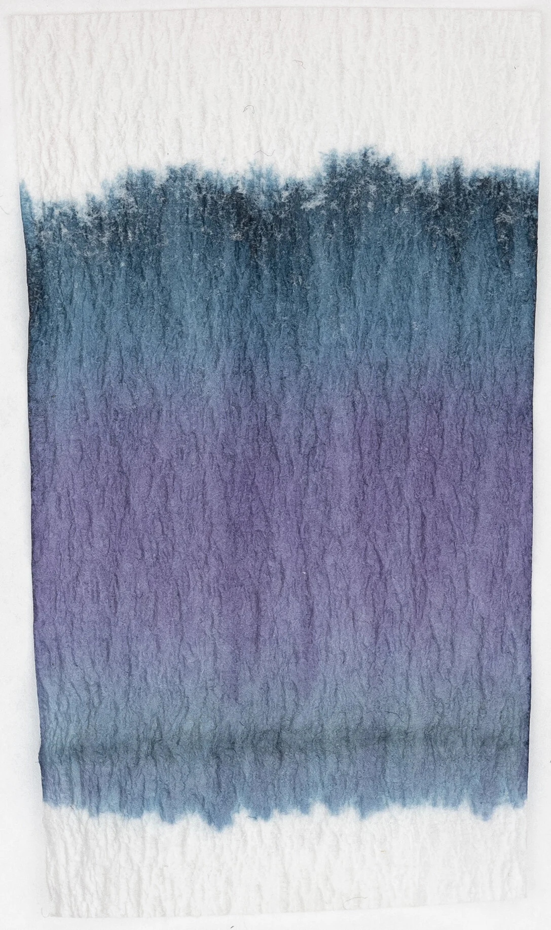
Review on Ivory (White) 52gsm Tomoe River (old paper)
Chigaya is close to a black but has very dark subtle hints of a blue-teal. This blue-teal colour isn’t really that visible on the written line, only on the swatch, when washed away on in the chromatography. The ink is quite dark but because of the prominence of the golden-silver sheen the ink has a brown tone to it when the light reflects off it. The ink is very saturated and is very wet. Dry time is on the fast side of normal for Tomoe River, and the water resistance is quite decent leaving behind a grey line behind. No feathering or bleeding!
J.herbin has less sheen so it the ink seems darker. It has less of a blue hue to it. Pelican Edelstein is a little paler and also lacking any hue to it. Sailor Ink Studio is ‘browned’ by sheen and has a more green-leaning teal hue to the base colour.
Shading
Sheen


Chigaya is very saturated and very wet which leads to very little shading. This ink is almost completely flat. The sheen is very strong on Tomoe River with the golden-silver sheen present on all the written lines.
Chromatography has the slightly blue-tinted grey that leads to a black before a very subtle very light yellow line right at the end.
All the inks share the same colour sheen with Sailor Ink Studio 027 having the same amount as Chigaya, with J.Herbin Perle Noire showing the least sheen and Edelstein Onyx in the middle
Review on White 80gsm Rhodia
On Rhodia Chigaya, with less sheen, should be darker but the ink is presents more grey on this paper so it isn’t darker! The hint of blue is present but more subtle. Dry time is decently quick and the water resistance is a little better but is also a little messier. There’s no feathering of bleeding.
Perle Noire is is definitely darker, as is Edelstein Onyx. Even Sailor Ink Studio 027 is a little darker than Chigaya here!
Shading
Sheen


Because of the more grey presentation on Rhodia, there is actually some shading on Rhodia as well. The contrast is low, and the gradient is smooth but it’s fairly consistent. The gold-sliver sheen is less shiny and seems more brown on Rhodia and the frequency is a lot lower but, for Rhodia, this is a pretty strong sheen.
None of these show any sheen on Rhodia.
Kakitsubata
“Iris laevigata” (Dennis L. Lindwall - CC BY-SA 3.0)
Iris laevigata, also known as Japanese iris, is, well, an iris! The colour is noticeably brighter, much more purple, and much more saturated than the ink, for whatever reason.
Review on Ivory (White) 52gsm Tomoe River (old paper)
Kakitsubata is a low saturation darker blue- that leans purple on Tomoe River. It looks like what a common lighter blue black ink might look like but with a subtle purple tint. The ink is wet but not the wettest in the set. Dry time is decently quick on Tomoe River and the water resistance is surprisingly strong. There’s no feathering of bleeding.
Lamy Blue black is too green and way too desaturated. Pilot Iroshizuku Shin-kai is more green leaning and too saturated. De Atramentis Sherlock Holmes is the closest but not quite purple leaning and a little darker.
Shading
Sheen


The ink shades pretty well with moderately decent contrast with a smooth gradient. The consistency isn’t bad with some shading on all the nibs. There is a halo but it is very subtle. The ink has a coppery-brown sheen that isn’t terrible strong. It only really presents on the wetter broader nibs on Tomoe River.
The Chromatography is starts with a grey line where the ink was put down, that becomes a light purple before moving into a darker grey-blue that ends with a dark-desaturated blue line. More interesting that I expected!
All of these sheens are slightly different than Kakitsubata’s brown-silver-gold sheen. Lamy Blue Black is a pink-copper-silver sheen that isn’t particularly shiny. Iroshizuku Kon-peki has a magenta sheen which De Atramentis also has but is less saturated and a little more silver (and more subtle overall).
Review on White 80gsm Rhodia
On Rhodia, Kakitsubata is more purple and less blue but also noticeably less saturated! Definitely one of the larger changes between papers for inks from the Manyo sets. While the swatch is indeed more purple the written line doesn’t show quite is purple but still more so than on Tomoe River. Water resistance is decent, slightly stronger than on Tomoe River, but a lot of the darkness is washed away. Dry time is fairly quick as well.
All the comparison inks are noticeably less purple on Rhodia. De Atrementis is not very similar this time though it is still the least green leaning.
Shading
Sheen


Shading is fairly similar but slightly more. Slightly more contrast, slightly sharper gradient, and a slightly more frequency. The subtle halo that was on Tomoe River is no more, and the sheen that was subtle on Tomoe River is more of an echo on Rhodia. There’s practically none here.
None of these have any practical sheen on Rhodia.
“Pontederia vaginalis” (Jeevan Jose - CC BY-SA 4.0)
It took me a while to find Konagi. Most of the searched returned something anime related (I think?). I did eventually stumble upon this blog post which mentions Konagi as being the aquatic Heartleaf False Pickerelweed and it looks like the flower on the bottle! The flower colour from wikipedia is a little more purple leaning than the ink and less saturated.
Review on Ivory (White) 52gsm Tomoe River (old paper)
Konagi is a rich, neutral sky blue. If anything it leans more green than purple but not by that much. The saturation is moderate to high which is a nice change for this type of blue. Konagi is quite we and smooth, water resistance isn’t much to write home about but you can see where the lines were and it’s a little messy. Dry time is quite decent on Tomoe River. No feathering of bleeding.
Again this ink is on the edge of the colour that start to drop off in sRGB colour spaces including monitors. It ends of looking a little flat and missing subtle colour changes.
Iroshizuku Kon-Peki is very slightly darker, more saturated, and more green leaning. Diamine Mediterranean Blue is paler and a hair greener. Diamine Florida Blue is fairly similar but again a touch greener.
Shading
Sheen


The shading of this ink is fairly frequent but the gradient is very smooth and the contrast isn’t that high at all. There is a noticeable halo on Tomoe River.
The sheen is decent and shows a coppery-red sheen on the wetter parts of the written line (so not the cursive in the drier nibbed ‘fine’).
The chromatography has a fairly steady pale blue gradient that gets darker before it ends wit ha line of lower-saturation darker purple.
Only Iroshizuku kon-pek has any meaningful sheen, and slightly less than Konagi still. The sheen with Kon-peki is more magenta than the coppery-red of Konagi.
Review on White 80gsm Rhodia
On Rhodia Konagi is a little less saturation and is very slightly less teal leaning and is so a little more neutral and very slightly darker. Water resistance is similarly messy and leaves some pale lines behind. Dry time is pretty quick! Almost dry at twenty seconds.
Iroshizuku Kon-peki is darker on Rhodia but keeps the stronger saturation that’s from Tomoe River. Diamine Mediterranean Blue is also a little darker but both it and Diamine Florida Blue haven’t changed much from Tomoe River.
Shading
Sheen


Shading is definitely stronger on Rhodia with noticeably more contrast and a sharper gradient. The frequency is slightly higher as well. There is a very subtle halo but only barely.
Sheen is barely noticeably present but only on the wetter written liens such as the Broad and Medium nibs. It is there but you need to look for it.
No sheen whatsoever!
“Dianthus superbus” (David Short - CC BY 2.0)
I’m not sure which specific flower Nadeshiko is but it is a type of Dianthus. There is a Dianthus Japonicus but that looks nothing like the flower design on the bottle which doesn’t have spiky-looking petals (that’s how I am describing it, anyway). There’s Dianthus Superbus which Wikipedia calls Nadeshiko and also says the following about it:"
The yamato nadeshiko, (D. superbus longicalycinus), is metaphorically associated with traditional, idealized feminine beauty, in Japanese culture.
This flower also doesn’t look the same as the flower design on the bottle though as it is still spiky! Either way, I couldn’t find a Dianthus with blue and pink like the ink but several with pink.
Review on Ivory (White) 52gsm Tomoe River (old paper)
Nadeshiko is the dichromatic ink from this set of four. Series 1 Part I had Haha, which was a green-turquoise with subtle pink. Series 1 Part II had Nekoyanagi which was similar to Haha but with more pink and less green (retaining the Turquoise). Nadeshiko is a mostly blue colour going a little turquoise in parts with a purple-pink colour where the pink pools. The ink isn’t the wettest but it isn’t a dry ink. The dry time is fast-moderate on Tomoe River and there is practically no water resistance.
Sailor Ink Studio #143 is very similar to this; it is perhaps a little darker and a little more blue but certainly not a big difference! Noodler’s Periwinkle is a similar amalgamation of the pink and blue but is otherwise a pale neutral blue without dual colours. Organics Studio Wedding Bell Blue is a little desaturated in the blue and the pink sheen gives it the illusion of something similar to dichromaticism but ultimately it’s just a pale neutral blue that looks similar from afar.
Shading
Sheen


The shading is moderately frequent and with a sharp gradient at times with decent contrast emphasised by how the the darker parts of the shading have the pink. There is a pretty and decent halo as well. There’s no sheen on Tomoe River at all!
The chromatography isa mottled pink/blue gradient getting slightly more saturated before breaking out into a pale turquoise.
Technically Sailor Ink Studio #143 has some matte silver sheen but not practically. Noodler’s has a strange silver sheen that Noodler’s often has and Organics Studio has a nice somewhat subtle pink sheen.
Review on White 80gsm Rhodia
Nadeshiko, as with other dichromatic inks, loses a lot of it’s other colour on Rhodia. The ‘other’ colour being the colour that shows where the ink pools (similarly to circumstances that make sheen appear). In this case the ‘other’ is pink and so this ink appears much more blue with bits of purple on Rhodia. Dry time is on the slow end being the same as it is on Tomoe River, surprisingly. There is no water resistance here as well!
Sailor Ink Studio #143 is a little bluer and a little more turquoise with again less pink. Noodler’s Periwinkle again feels like the average colour of the Nadeshiko swatch and Organics Studio, missing out on the sheen on Rhodia, is more of a plane pale blue here.
Shading
Sheen


Obviously no sheen on Rhodia but the shading has much sharper gradients but the frequency is slightly less than on Tomoe River! The halo that was strong on Tomoe River doesn’t manifest on Rhodia, unfortunately.
There’s a tine amount of sheen on the Organics Studio Wedding Blue but only the swatch. All of these are practically sheenless!


_(30389744122).jpg)
This half-set, the first half from the second series, is a very blue set of four inks. A black that very slightly leans blue, a desaturated darker blue-purple, a vibrant neutral-to-green-leaning blue, and a nice blue with pink dichromatic ink. I think This set looks the most different between Tomoe River and Rhodia. On Rhodia Chigaya is flatter and lacks the sheen, Kakitsubata is darker, less saturated and more purple. Konagi is greener and more saturated on Tomoe River but darker and more neutral on Rhodia and Nadeshiko has noticeably less pink dichromaticism to it. To be perfectly honest, this isn’t the most exciting half-set to me but my problem is I already have way too many blue inks! These inks all perform well, just light you’d expect from Sailor. They have interestingly characteristics, some great shading and some noticeably halos on some.
Thank you again to Pen Classics NZ for discounting the inks!
✒︎ ✑ ✒︎ ✑
I've listed all my inks and all my pens in their respective pages. Please let me know which inks you'd like to review next via the comments, Twitter, Instagram, or contact me directly.
For blog updated you can follow @macchiato_man on Twitter, subscribe via email, or like my Facebook page.
I bought these stationery items at a discounted rate for the purpose of giving an honest review. I was not otherwise compensated and everything here is my own honest opinion. There are no affiliate links. Nota bene: Pen Classics NZ are also a sponsor of this blog.