
The Serendipity Hybrid Pen is a collaborative pen between James Finniss of Pensive Pens and Robert Oster. The Serendipity is a hybrid between a dip pen and a fountain pen where it functions without a filling mechanism and only operates with whatever ink is in it from dipping the pen. Because, however, it has a standard #6 nib and feed it will hold a lot more ink than a dip nib, even one with a reservoir. Lake of Fire is a new ink in the same colour family as Fire & Ice from Robert Oster's new line of InkArt inks. It came bundled with the Serendipity pen for the first 50 purchasers (but won't be released until later in 2017 on its own).

Because the Hybrid Pen and the ink are bundled together (and because Lake of Fire is not available separately as of this review) I've bundled the two reviews together. The first half will be dedicated to the Serendipity Hybrid Pen and the last bit will be more focused on the ink.

Serendipity
Hybrid Pen
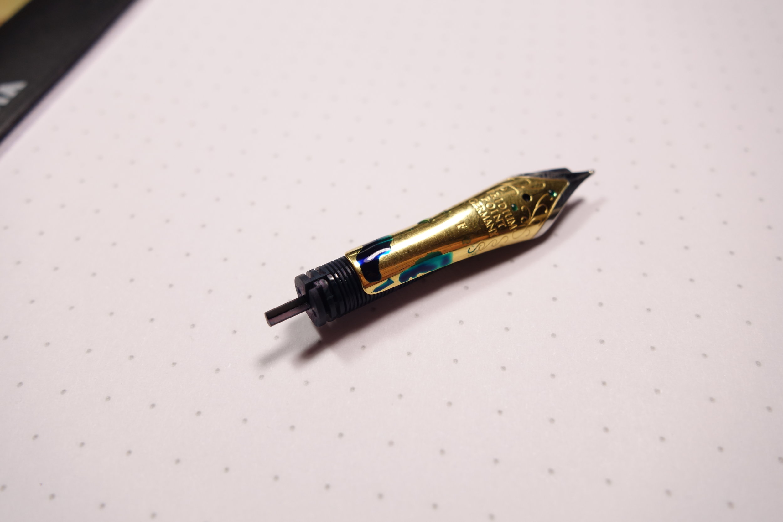
When it first came I was a little surprised by the size of the pen. It isn't a large pen. At 144mm long with a 124mm long body it is a lot shorter than all my dip pens I have but it is still longer than all my fountain pens (including the rather long Franklin-Christoph Model 65). As you can see below it looks tiny compared to Dip Nibs but still rather long compared to fountain pens. It does have a somewhat narrow section at 9mm diameter at its narrowest and 11mm at is widest but it's still comfortable for me. The pen itself, with a feed and steel nib, weighs 8-9g so it's very light.
124mm = 4.99"
144mm = 5.67"
9mm = .35"
11mm = .43"
8-9g = .28-.32oz

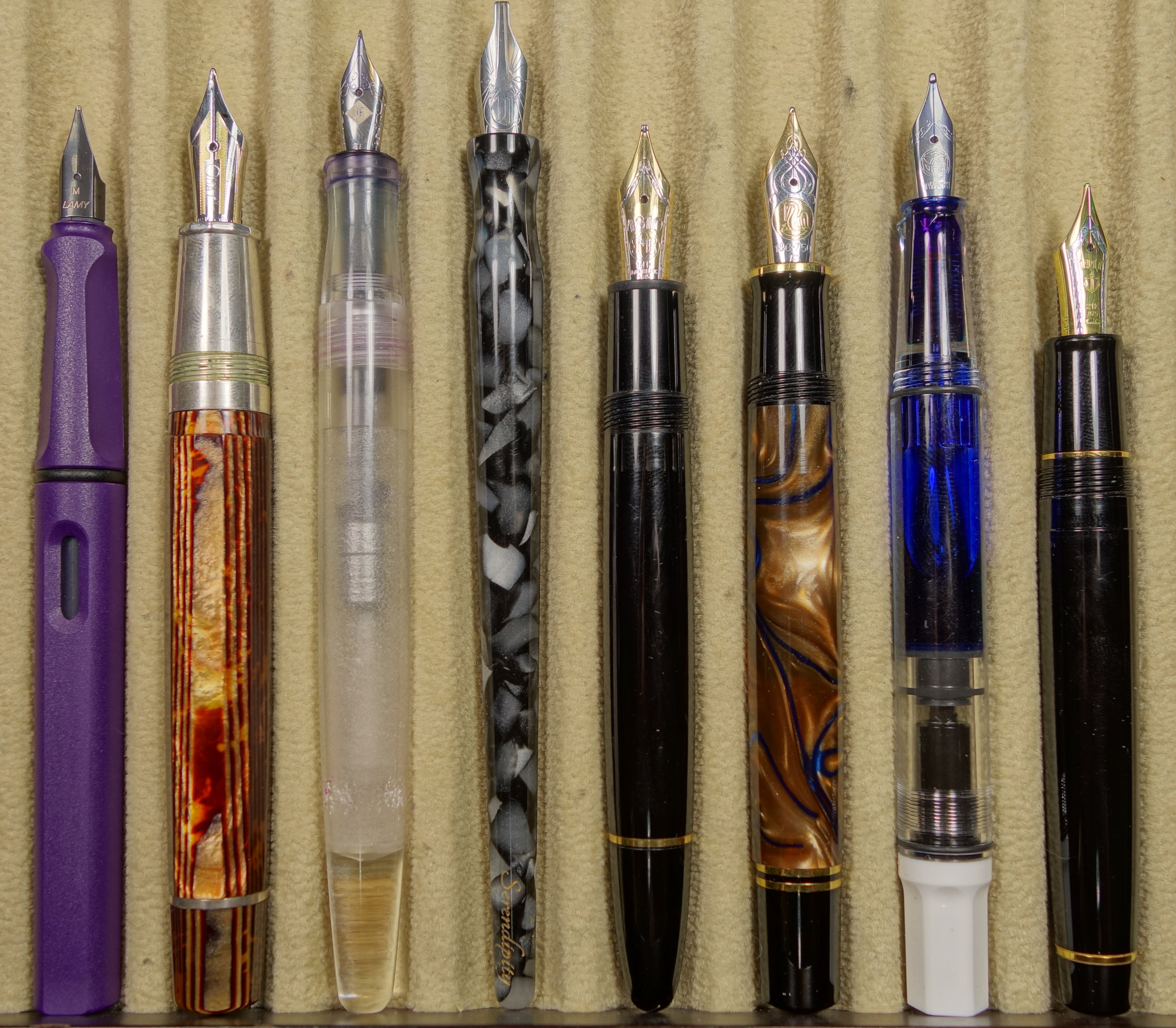
The Pen is adorned with "James FInniss | Robert Oster" on one side and "Serendipity" on the other. It reminds me of how pencils are labeled. It's subtle and doesn't take away from the pen at all. The Acrylic material the pen is made from is translucent around the section where you can see the base and body of the nib. The pen, as of this review, comes in seven different colours including two blues, two greys, a red, a brown and a green. However, you are sent a randomly selected colour when you order.
The Pen works nicely with a wide selection of inks. Dip nibs are often over saturated and don't present a completely accurate depiction of an ink in a typical writing experience. I expected this to present a more accurate depiction of an ink (and it does!) but I was worried that it would also present (at least initially) with an over-primed feed. I talked to James about my concerns and he recommended just quickly dipping it and the capillary action will prevent an overly-primed feed and this does work in my experience.
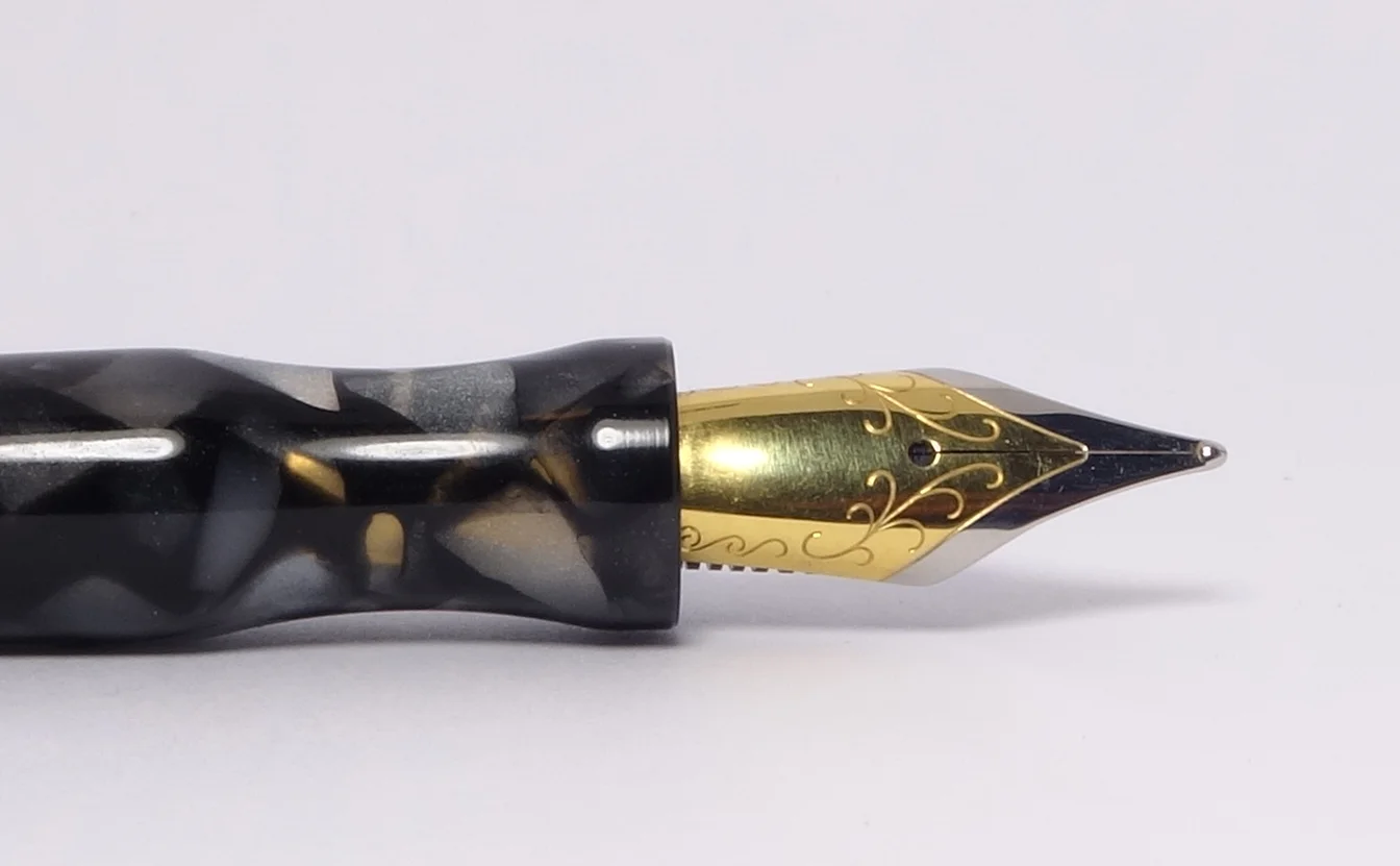
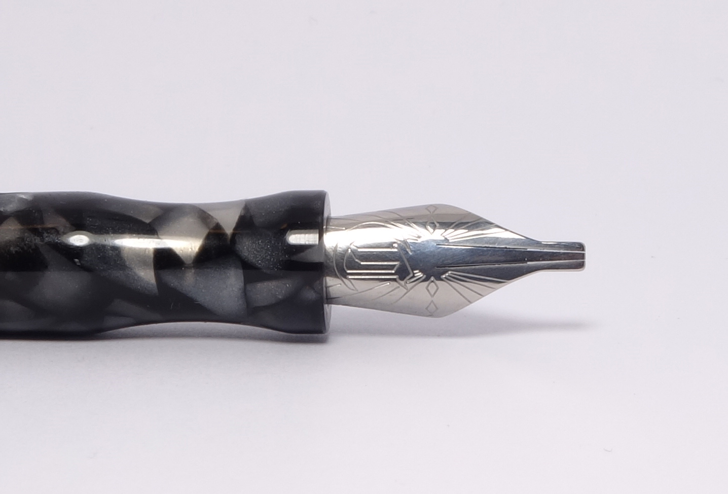

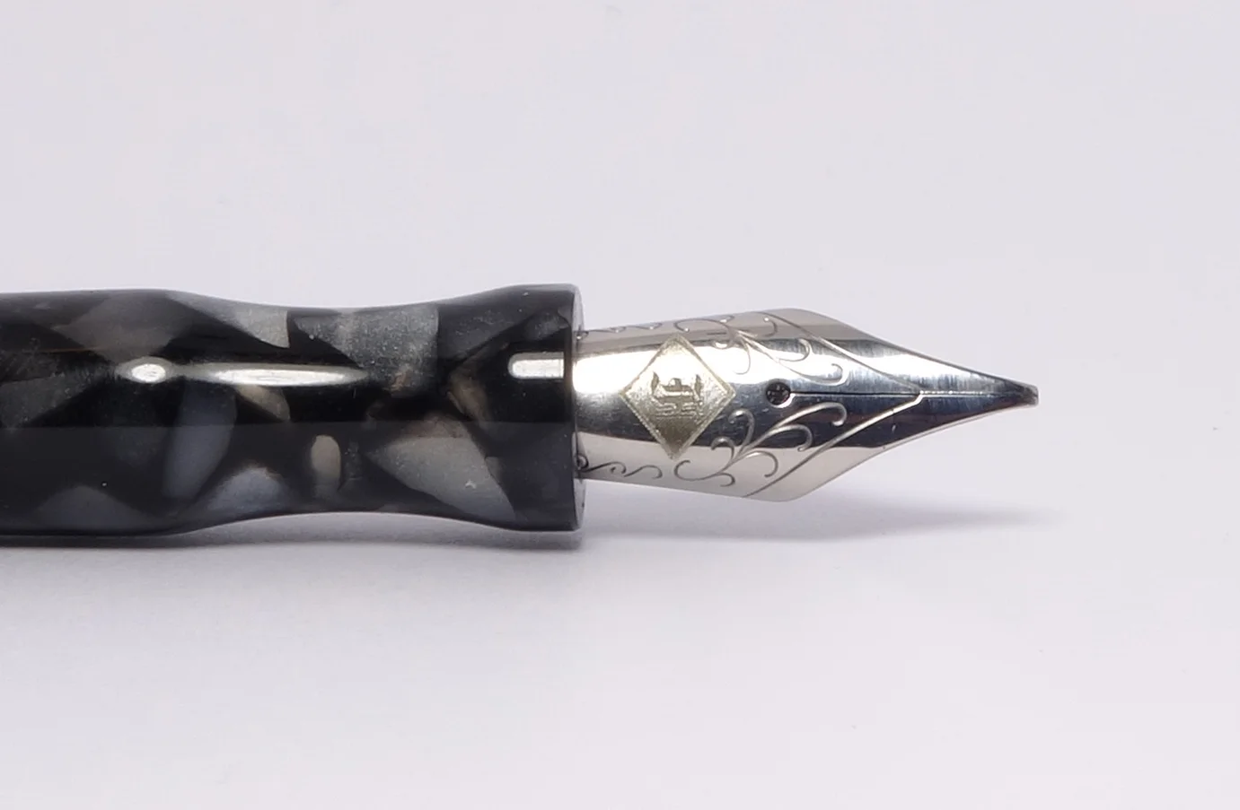

A benefit of having a standard #6 nib attached is that there is a wealth of options for substitute nibs to attach to the Hybrid Pen. From soft Noodler's "Flex" Nibs to Masuyama ground Franklin Christoph nibs; from stock JoWo to Music nibs. There is a large variety out there (and indeed you can get any stock nib custom ground by a nibmeister to get an architect, stub or needlepoint etc.).


Being able to swap nibs and inks quickly is really great for me. I have so many inks that I'm trying to get through and test (and even just to try) and while I'll probably still stick with proper fountain pens for ink reviews, I think this Hybrid Pen provides the perfect consistency for me to use it with ink comparisons. I can quickly change nibs and somewhat quickly clean the ink out. If I have a comparison that involves ten inks or so it would be unfeasible with a proper fountain pen but easy with this.


One long dip and the pen easily writes for one whole A4 page before running out. The above (on A5 paper) was written with a somewhat wet JoWo stock fine nib. The first 3 lines or so were somewhat over-primed (I didn't do the technique James recommended for here as I wanted to get as much ink in the feed as possible) but after that the lines are consistent until the scribbles on the last page.

As for cleaning, it is a lot easier to clean than a fountain pen but not as easy as a dip pen. With a dip pen all I need is a paper towel and a glass of water that I refill every now and then. With a fountain pen it's a whole rigmarole of cleaning all the parts.
The Serendipity doe not clean by merely swishing the nib and section in a glass filled with clean water like a normal dip pen. Even after refilling the water and cleaning it a second time (with the water staying mostly clean and clear) the above photos show that inks was still kept in the back of the feed and nib. This means that cleaning the pen involves removing the nib and the feed and cleaning them either in a single use amount of water or under a tap. This is more difficult than a dip pen, but still much quicker and more efficient than a fountain pen.
I really like this pen. It's almost certainly going to be extremely useful to what I do here and on Instagram as well as simply trying out inks myself. I'm planning on buying a second one of these as two have to be even more useful than one, right? I highly recommend this pen for testing inks, for desk writing and I imagine it would be great for artists (thought I can't comment about the latter with authority).

Lake of Fire is from Rob's new line or InkArt inks that are designed for artists as well as calligraphers and writers. The inks are still safe for Fountain Pens and now also offer more UV resistance.
The ink has good performance and is nicely lubricated with a wet feel to it. There is no bleeding and no feathering. Shading is decent but not high.
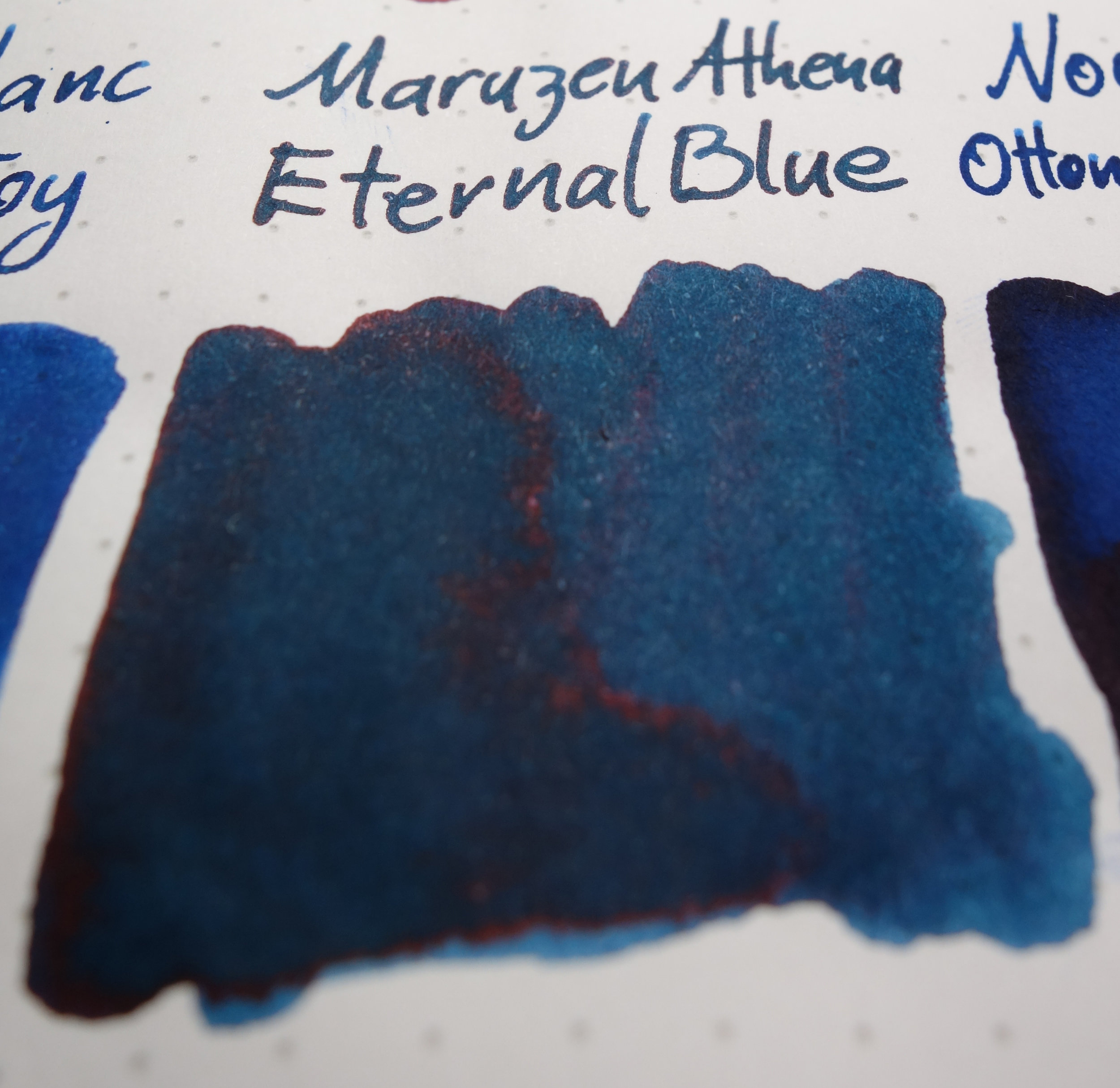
Lake of Fire, like Fire & Ice, has a bit of yellow in it tinting the colour ever so slightly green. On Rhodia there is little sheen (but that is true for the rest as well). Bungubox Omaezaki Sea is less vibrant and lighter and Robert Oster Fire & Ice is lighter. Ottoman Azure and Montblanc Leo Tolstoy, while they have some green to them (compared to a Royal Blue at least) they have much less than Lake of Fire. The closest of the three are Noodler's Blue Steel, Maruzen Athena Eternal Blue and L'Artisan Pastellier Callifolio Equinox (6). Eternal Blue has a little more green and Blue Steel is a little lighter (and with poorer performance). Callifolio Equinox (6) is probably the closest but it's a little less vibrant.
Tomoe River obviously brings the sheen out considerably more than Rhodia. Because Noodler's Blue Steel has absolutely no sheen to it I substituted Blackstone Sydney Harbour Blue for it and it turned out to be a very comparable colour to Lake of Fire; a little more green and a little darker (and with more sheen) but definitely similar. Because of the copper sheen of Callifolio Equinox (6) (compared to Lake of Fire's sharp red sheen) which is brought to the fore due to Tomoe River, the similarity between it and Lake of Fire is thus a little less strong on this paper. The sheen of Eternal Blue is a different type of sheen to Lake of Fire but on this paper the colour of the ink is even more comparable.


By comparison to Tomoe River Rhodia has much less sheen, even with very sheeny inks like Omaezaki Sea. Because of the darker colour of the ink, the contrast between the sheen and the ink makes the sheen slightly less visible but the ink still sheens as much as Fire & Ice.


This is a lovely blue and I actually prefer the darker colour of it to that of Fire & Ice. The darker colour also makes the shading a little more obvious. I am not a visual artist so my perspective of this pen and ink is likely different from someone who approaches the ink and/or the pen from an artistic perspective so I look forward to seeing how people use these inks in art projects.
The Hybrid Pen can be purchased from Pensive Pens and when the ink is available for individual purchase you should check your local reseller.
I've listed all my inks and all my pens in their respective pages. Please let me know which inks you'd like to review next via the comments, Twitter, Instagram, or contact me directly.
I received this ink and pen free of charge for the purpose of giving an honest review. I was not otherwise compensated and everything here is my own honest opinion. There are no affiliate links. I do sell Robert Oster inks at my café but I am not allowed to sell the inks online, only in shop.