• Blog
  • About
    • My Inks (on Fountain Pen Companion)
    • My Pens
  • Archive
  • Contact
Menu

Macchiato Man

  • Blog
  • About
  • My Collection ☟
    • My Inks (on Fountain Pen Companion)
    • My Pens
  • Archive
  • Contact
The @madebyendless Cotton Wallet arrived the other day! I’m a sucker for these sorts of practical inserts for notebooks. The cotton fabric suites the simple style of the Explorer. 
⠀
While I love these and always get them whenever I can I never
First test of the Regalia paper in the Endless Explorer than I was sent by @madebyendless. Really impressed by the paper. Very smooth, nice sheen and nice shading! Finger prints or hand oil seem to affect the writing a little but nothing out of the o
New Pen Review: Esterbrook Camden (Premium Edition) - 𝙻𝚒𝚗𝚔 𝚒𝚗 𝙱𝚒𝚘!

I’ve been eager to try the Camden for a while now. I love my flat end pens and the overall shape of this one is subtly unique. While there are some differences between
New friend from @esterbrook_official! Camden Manitoba Blue. 
⠀
Love flat end pens so looking forward to digging into this (so review incoming).
 
Flat or round ends?✑
⠀
⠀
⠀
⠀
#fountainpen #fpgeeks #fountainpenaddict #fpn #fountainpengeeks  #fountainp
New Ink Review: @birminghampens Antique Sepia (link in bio)
⠀
In line with the recent trend of soft pastel dichromatic inks but Birmingham’s version is an interesting dust grey version with low saturation that I find quite interesting don&rsquo
New Ink Day! Haven’t had one of these for a while but I received these from a friend at the last Perth Pen Meet. 
⠀
All sailor and the first tall bottle in a while (bringing the number of those to 86). 
⠀
Didn’t realise it at the time but
New Ink Review: La Couronne du Comte Vert Sapin (link in bio)
⠀
The final of LCdC’s initial set of four exclusive inks from Diamine. A lovely rich sheeny green-teal.
✑
⠀
⠀
⠀
⠀
#fountainpen #fpgeeks #fountainpenaddict #fpn #fountainpengeeks  #fo
I don’t know if I’ve ever shared this before but my city has a set of five dip nibs as an artwork. 

They are called “Memory Markers” by Anne Neil and represent early-ish colonial stories of the gardens where they are.

We als
⚠️Update: Why I have been so radio silent! 📻🤫 A lot of large personal changes, essentially (read on for details)!

There have been three main reasons for why I haven’t been able to do much here or on my blog. 

1) 🎓 I had to finish of my Mas
Ink Ink Comparison: Discontinued Iroshizuku and New Iroshizuku! Thanks to @penclassics for allowing this to happen. See link in bio!
⠀
The old: Tsuyu-kusa, Tsukushi, and Ina-ho.
The New: Sui-gyoku, Hana-ikada, and Hotaru-bi.
⠀
This is a long review b
NPD: @esterbrook_official LE Estie “Candy” in Oversize with a Kirk Speer Needlepoint nib!
⠀
Thanks to Esterbrook for sending this through to me for review. I’ve reviewed a couple of Esties now and two of the custom nibs (which are a
Out with the old in with the new?

I just received the new Pilot Iroshizuku Inks in the little bottle ink pack from @penclassics for review. I plan on doing an overview review of the three new and the three old ones!

I feel like Ina Ho was quite a u
New Pen Review (see link in bio): Platinum Curidas courtesy of @penclassics (check them out!)
⠀
This is certainly a curiously designed pen with it's quirks but it has bee a delight to write with and a great pen to through in a pocket. I've been using
New Ink Review! @wearingeul_global Kyonghui! See link in bio!

Kyonghui is a vibrant earthy orange from Wearingeul's series on Korean Female Modern Writers. It is also a great performing ink!

Wearingeul's global push is fairly new; has anyone tried
It has been a little while since I posted here so I thought I'd give a little update!

Firstly I think I just needed a little break at the end of the year! It has been a busy year for me. I have been taking my photography more seriously and I also ha

Subscribe

Sign up with your email address to receive news and updates.

We respect your privacy. Unsubscribe at any time.

Thank you!
Blog RSS

☛ Twitter feed

✉ Email Subscription

☞ Fountain Pens Australia (Facebook Group)

☛ Sailor Pens & Inks (Facebook Group)


Sponsors

10% off code: MACCHIATOMAN


Click here for sponsorship information


Featured Posts:

Featured
Ink Review: Pennonia Pokoltuz (Pokoltűz)
Aug 1, 2019
Ink Review: Pennonia Pokoltuz (Pokoltűz)
Aug 1, 2019
Aug 1, 2019
Notebook Review: Pebble Stationery Pocket Tomoe River Notebook
Nov 10, 2018
Notebook Review: Pebble Stationery Pocket Tomoe River Notebook
Nov 10, 2018
Nov 10, 2018
Ink Review: Krishna Brown Pink
Jan 20, 2018
Ink Review: Krishna Brown Pink
Jan 20, 2018
Jan 20, 2018


Archive
  • November 2024
  • October 2023
  • December 2022
  • October 2022
  • June 2022
  • May 2022
  • April 2022
  • February 2022
  • January 2022
  • December 2021
  • November 2021
  • October 2021
  • September 2021
  • August 2021
  • July 2021
  • June 2021
  • May 2021
  • April 2021
  • February 2021
  • January 2021
  • December 2020
  • November 2020
  • October 2020
  • September 2020
  • August 2020
  • July 2020
  • May 2020
  • April 2020
  • March 2020
  • February 2020
  • January 2020
  • December 2019
  • November 2019
  • October 2019
  • September 2019
  • August 2019
  • July 2019
  • June 2019
  • May 2019
  • April 2019
  • March 2019
  • February 2019
  • January 2019
  • December 2018
  • November 2018
  • October 2018
  • September 2018
  • August 2018
  • July 2018
  • June 2018
  • May 2018
  • April 2018
  • March 2018
  • February 2018
  • January 2018
  • December 2017
  • November 2017
  • October 2017
  • September 2017
  • August 2017
  • July 2017
  • June 2017
  • May 2017
  • April 2017
  • February 2017
  • January 2017
  • December 2016
  • November 2016
  • September 2016
  • August 2016
  • July 2016

Ink Comparison: Sailor Dark Reds

July 20, 2017 in Ink Comparison

Sailor Inks are one of my favourite brands of ink – this is no secret. In general the characteristics their inks are what I look for in an ink. Reds are not my favourite colour but Maroons, Burgundies, Bordeauxs (etc.) are shades of red I really like, in fact they are one of my favourite colour families. The range of colours in this family move from inks with more blue, to more brown and more yellow. They also vary quite dramatically depending on the paper. This is by no means a complete account of Sailor's offering in this colour gamut but I think it still has a decent selection (but I clearly need more!)

Tomoe River 52gsm (white)

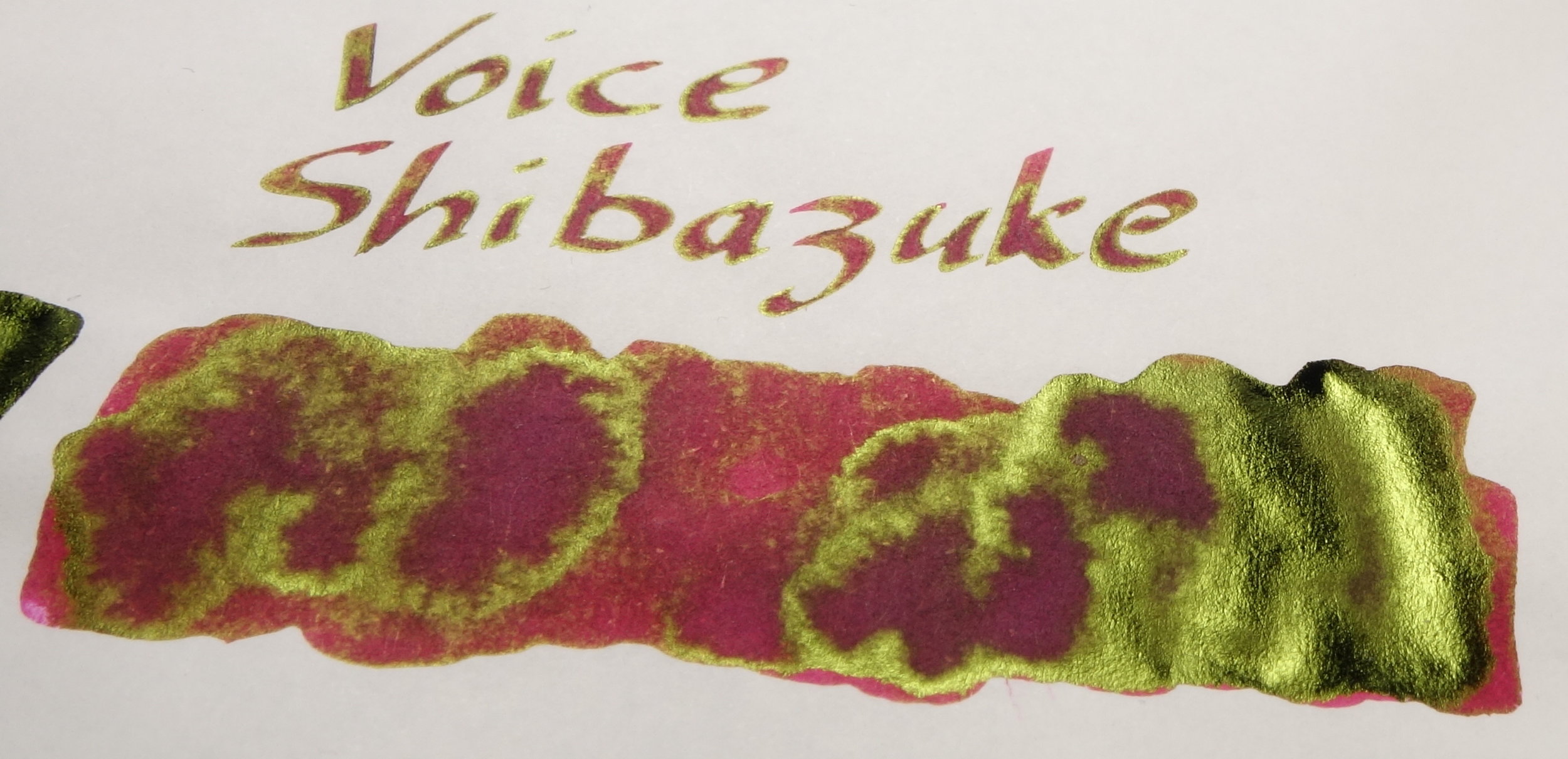
The written lines are written using a Franklin-Christoph Music nib in a James Finniss | Robert Oster Serendipity hybrid dip pen. 

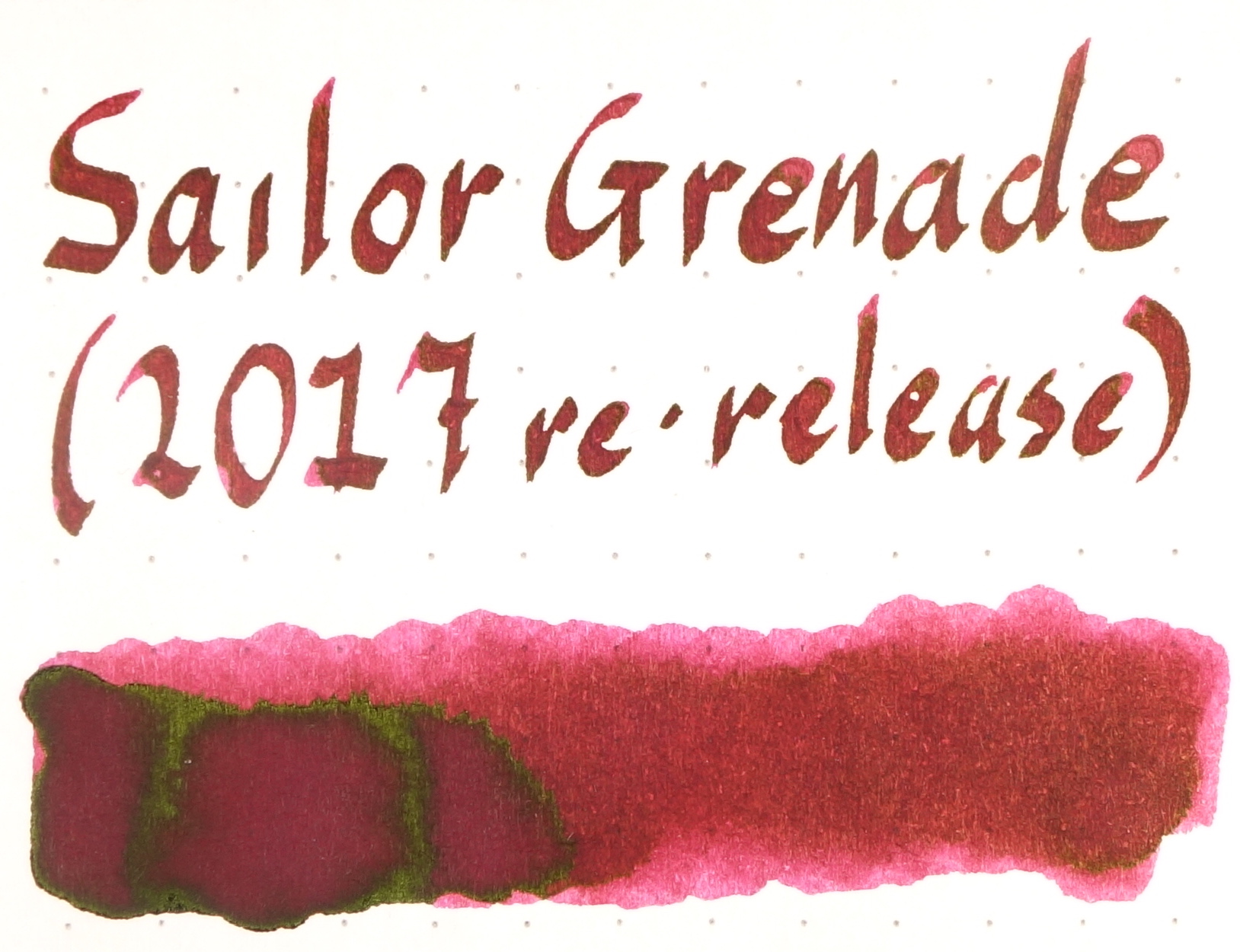
On Tomoe River the two Sailor Grenades look fairly identical with perhaps a slight edge to the original release of Grenade in the sheen department. On the written lines they are indiscernible but on the swatch the 2017 re-release is looking a little pinker. Oku-Yama is a little less vibrant and a little less sheeny and Kobe #27 Kounan Maroon takes it a step further with even less sheen and also less saturation. Kobe #6 Bordeaux is looking quite purple here and the sheen doesn't show up meaningfully in the text. Bungubox Piano Mahogany is a browner version of Kobe #27 and has a similar amount of sheen. Surprisingly Sweet Potato Purple and Tears of a Clown, both Bungubox, are looking very similar here with both showing a rich amount of blue. Pen + Message Old Burgundy has practically no sheen, and a deep low saturation brown-purple colour. It's a very moody ink. Hankyu Maroon is almost looking magenta but only if you can see through the sheen which is very strong as it is Voice Shbazuke which has the most yellow out of all the inks but is still showing a hint of blue-ish pink.

Rhodia 80gsm (white)

Looking at how the inks perform on Rhodia there is a clear difference compared to on Tomoe River. The original release of Sailor Grenade is now a little bit more brown than the 2017 re-release and also darker than Oku Yama. The 2017 re-release is a little more magenta and less dark than the original as well. Kobe #27 Kounan Maroon is noticeable brown and #6 Bordeaux is dark and still shows a decent amount of blue or purple. Bungubox Piano Mahogany is almost a proper red-brown and Sweet Potato Purple is a good shade more blue than Tears of a Clown. Pen + Message old Burgundy is still a professional looking deep brown red and the magenta-like colour of Hankyu Maroon is showing a very nice amount of shading. Shibazuke is looking quite pink.

Sailor Grenade is interesting because on The Tomoe River it they looks practically the same, but on Rhodia there does seem to be a difference. It seems to be a slightly different hue to the original and I don't know if that's something Sailor is doing different of it's that my bottle of original (which has been kept in a cool dry and dark place) is somehow showing some age. At any rate, it's worth noting that there might be a slight difference but it isn't deal breaker, in my opinion.

Comparing each ink next to itself on Rhodia and Tomoe River paper (see bellow) it shows that Tomoe River is really bringing out the blue in these inks Tears of a Clown which is relatively brown on Rhodia is, relatively, very purple on Tomoe River. So much so, even, that it's colour more closely resembles Sweet Potato Purple but on Rhodia it's closer to Piano Mahogany, Conversely, Shibazuke is showing less yellow on Rhodia and slightly more blue than on Tomoe River. There really are some very drastic changes of colour between the papers. Hankyu Maroon and Voice Shibazuke seem to be the least affected. On a whole I'd say that Rhodia really brings out the browns and Tomoe River really brings out the blues.

Shading also seems to more obvious on Rhodia. Bungubox Sweet Potato Purple and Piano Mahogany have a fair amount of shading on Rhoda but the line is a little flatter on Tomoe River. Similar to how they maintain their colours across the papers well, Hankyu Maroon and Voice Shibazuke also carry their shading between papers relatively well.

View fullsize Tomoe River
Tomoe River
View fullsize Rhodia
Rhodia
View fullsize Tomoe River
Tomoe River
View fullsize Rhodia
Rhodia
View fullsize Tomoe River
Tomoe River
View fullsize Rhodia
Rhodia
View fullsize Tomoe River
Tomoe River
View fullsize Rhodia
Rhodia
View fullsize Tomoe River
Tomoe River
View fullsize Rhodia
Rhodia
View fullsize Tomoe River
Tomoe River
View fullsize Rhodia
Rhodia
View fullsize Tomoe River
Tomoe River
View fullsize Rhodia
Rhodia
View fullsize Tomoe River
Tomoe River
View fullsize Rhodia
Rhodia
View fullsize Tomoe River
Tomoe River
View fullsize Rhodia
Rhodia
View fullsize Tomoe River
Tomoe River
View fullsize Rhodia
Rhodia
View fullsize Tomoe River
Tomoe River
View fullsize Rhodia
Rhodia

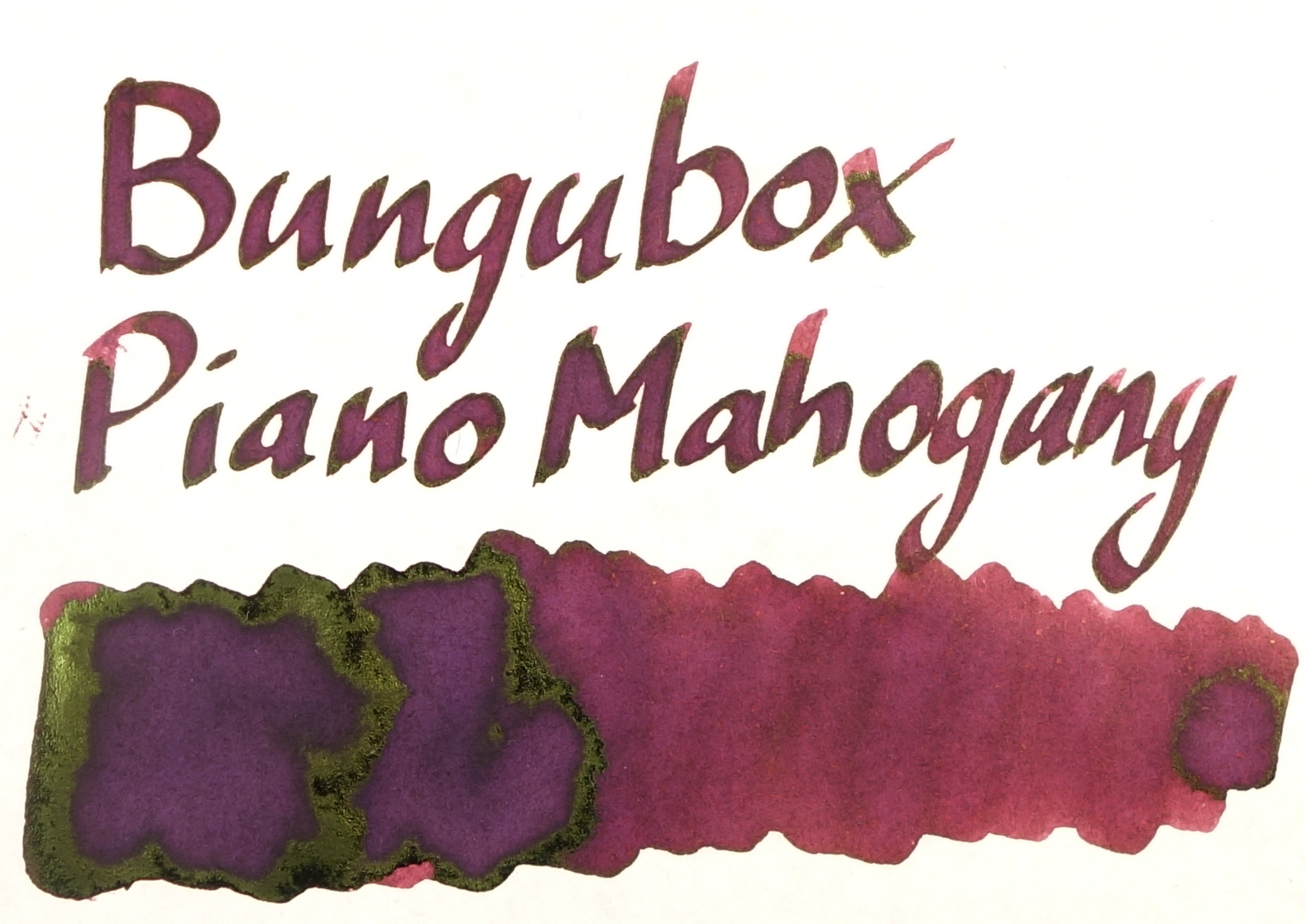
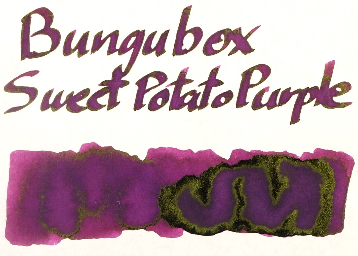
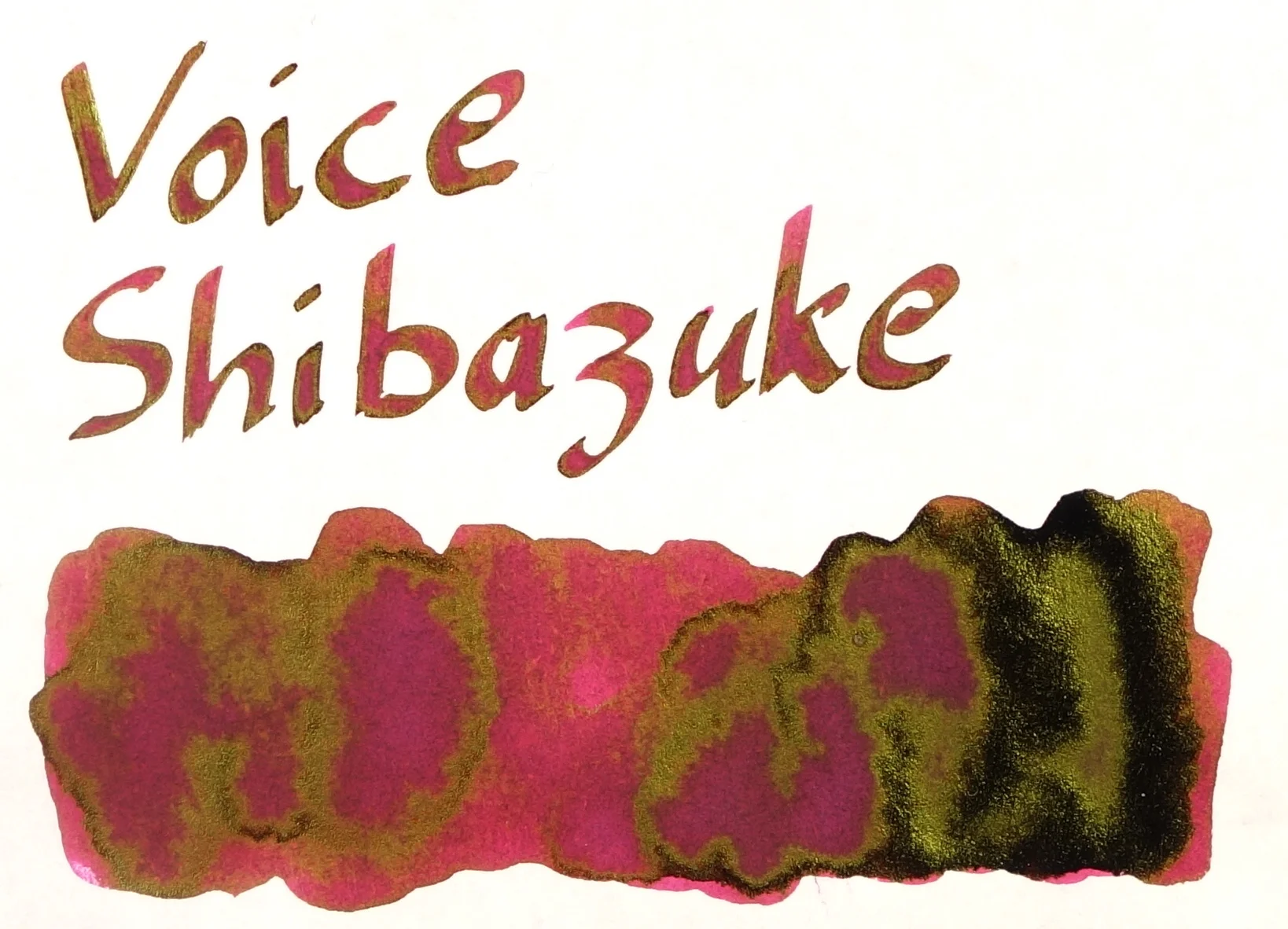
Sheen is obviously a characteristic of ink that I look specifically for. This colour family of ink seems to exclusively a green-gold colour (at lest all the sailors in this colour family do!). Hankyu Maroon and Voice Shibazuke steal the show with massive amounts of sheen on the swatch and the written line. Shobazuke also seems to have the most yellow sheen of the set. Both The Grenades have a very respectable amount of sheen and you need a very wet nib to get any noticeable sheen out of Kobe #6 Bordeaux or Pen + Message Burgundy. Bungubox Sweet Potato Purple and Sailor Oku-Yama have a decent amount of sheen and the rest – Kobe #27 Kounan Maroon, Bungubox Piano Mahogany, and Bungubox Tears of a Clown have a relatively similar amount of somewhat subtle sheen.

View fullsize Sheen Sailor Grenade Original.JPG
View fullsize Sheen Sailor Grenande (new).JPG
View fullsize Sheen Sailor Oku Yama.JPG
View fullsize Sheen Kobe #27 Kounan Maroon.JPG
View fullsize Sheen Kobe #6 Bordeaux.JPG
View fullsize Sheen Bungubox Piano Mahogany.JPG
View fullsize Sheen Bungubox Sweet Potato Purple.JPG
View fullsize Sheen Bungubox Tears of a Clown.JPG
View fullsize Sheen Pen + Message Old Burgundy.JPG
View fullsize Sheen Hankyu Maroon.JPG
View fullsize Sheen Voice Shibazuke.JPG

I'm a big fan of this colour range and I love what Sailor is doing within it. My personal favourites here are, in no order, Hankyu Maroon, Pen + Message Burgundy, the original Sailor Grenade and Bungubox Sweet Potato Purple but I do still love them all. Inks like Bungubox are buyable from Vanness, Voice inks via Rakuten, Kobe inks via Rakuten or Vanness, and Hankyu Maroon was last years LE from the Hankyu department store in Japan (which I was told was the last bottle they had – and I'm not sure if they'll restock) and I purchased via White Rabbit Express.

I've listed all my inks and all my pens in their respective pages. Please let me know which inks you'd like to review next via the comments, Twitter, Instagram, or contact me directly.

You can follow @macchiato_man on Twitter for blog updates.

I was not compensated for this review and everything here is my own honest opinion. There are no affiliate links and all inks were purchased with my own funds.

Tags: inkcomparison, ink comparison, sailor, sailorinks, sailor jentle, jentle ink, sailor grenade, sailor grenade 2017, grenade, sailor oku-yama, Oku-Yama, kobe #27, kobe kounan maroon, kounan maroon, kobe #06, kobe #6, bordeaux, maroon, burgundy, dark red, sheen, Bungubox, Kobe, bungbox, Bungubox Piano Mahogany, Piano Mahogany, Sweet Potato Purple, Tears of a Clown, Pen + Message, P+M, Old Burgundy, Hankyu Maroon, Voice Shibazuke, Voice, Shibazuke
← Pen Review: Nakaya Piccolo WriterPen & Ink Review: Robert Oster + James Finniss Serendipity ✑ Robert Oster Lake of Fire →
Back to Top

Blog RSS

✉ Email Subscription

☞ Fountain Pens Australia (Facebook Group)

☛ Sailor Pens & Inks (Facebook Group)