
I never fully appreciated Nakaya pens (or any of the artisan Japanese pen makers) but I've found myself looking at them closer and closer this year. I recently ordered a Nakaya Decapod Aka-tamenuri (it takes many months for them to be made) but in the mean time this Nakaya Piccolo Writer was very generously lent to me by a friend on the other side of Australia from where I am. It's a beautiful and subtle pen that feels surprisingly light and is a very comfortable writer.
UPDATE: I've received my Nakaya Decapod Writer Aka-tanemuri and reviewed it here.
The Nakaya Piccolo Writer Kuro-tamenuri (or Kurotame) has black (Kuro) urushi over the red shu urushi base which you can see peaking through in places where the pen makers have polished the black urushi away. The Nakaya website describes the process and provides some definitions:
"Tame" means "pool" and "nuri" refers to the lacquer coating process. You can actually see through the layers of clear urushi lacquer as if you were looking into a pool. Wajima artists use "shu urushi" (red color) for the base urushi on the barrel, and "shu-ai-urushi" (mixtures of red and clear lacquer) for the finish coats. When the process is finished, you can still see the base surface of red urushi. After this coating process, craftsmen polish the surface over and over by hand for months in order to attain greater transparency, allowing you to clearly see the underlying red usurshi surface.
The Nakaya Piccolo Writer's urushi finish feels smooth but feels quite hard to the touch. It's a reflective surface and it does attract fingerprints somewhat easily. The red of the lower layer of the urushi, especially where the barrel and the cap meet, it's beautifully subtle and very successfully breaks up the simple black cigar shaped pen that would otherwise look uninspiring (to me). The pen material is ebonite below the urushi finish.
The red urushi base has a a subtle gradient and isn't particularly even. This isn't necessarily a bad things and contributes to the handmade quality of the pen for me. The extreme of the finial has a red dot that is so subtle in it's gradient from black to red that it's difficult to tell if a camera is in focus or not from directly in front.
The pen is not a long pen but neither is it a thin pen. It's somewhat short and squat. The pen feels fairly light but in the end, at 24grams, it's around the same weight as a Platinum Century #3776, Sailor Pro Gear and is 4grams heavier than a Lamy Safari. These aren't heavy pens but I expected it to be lighter. The section is slightly short at 16mm until the threads start; this is only 2mm shorter than the Platinum Century #3776's section length but I could feel the difference. The threads weren't sharp but because of the small section I did find myself holding onto them a fair bit.
| Capped | Uncapped | ||
|---|---|---|---|
| Nakaya Piccolo Writer | 24g/0.84oz | 16g/0.56oz | |
| Lamy Safari | 20g/0.70oz | 11g/0.39oz | |
| Platinum Century #3776 | 25g/0.88oz | 14g/0.49oz | |
| Sailor Pro Gear | 24g/0.84oz | 15g/0.53oz |
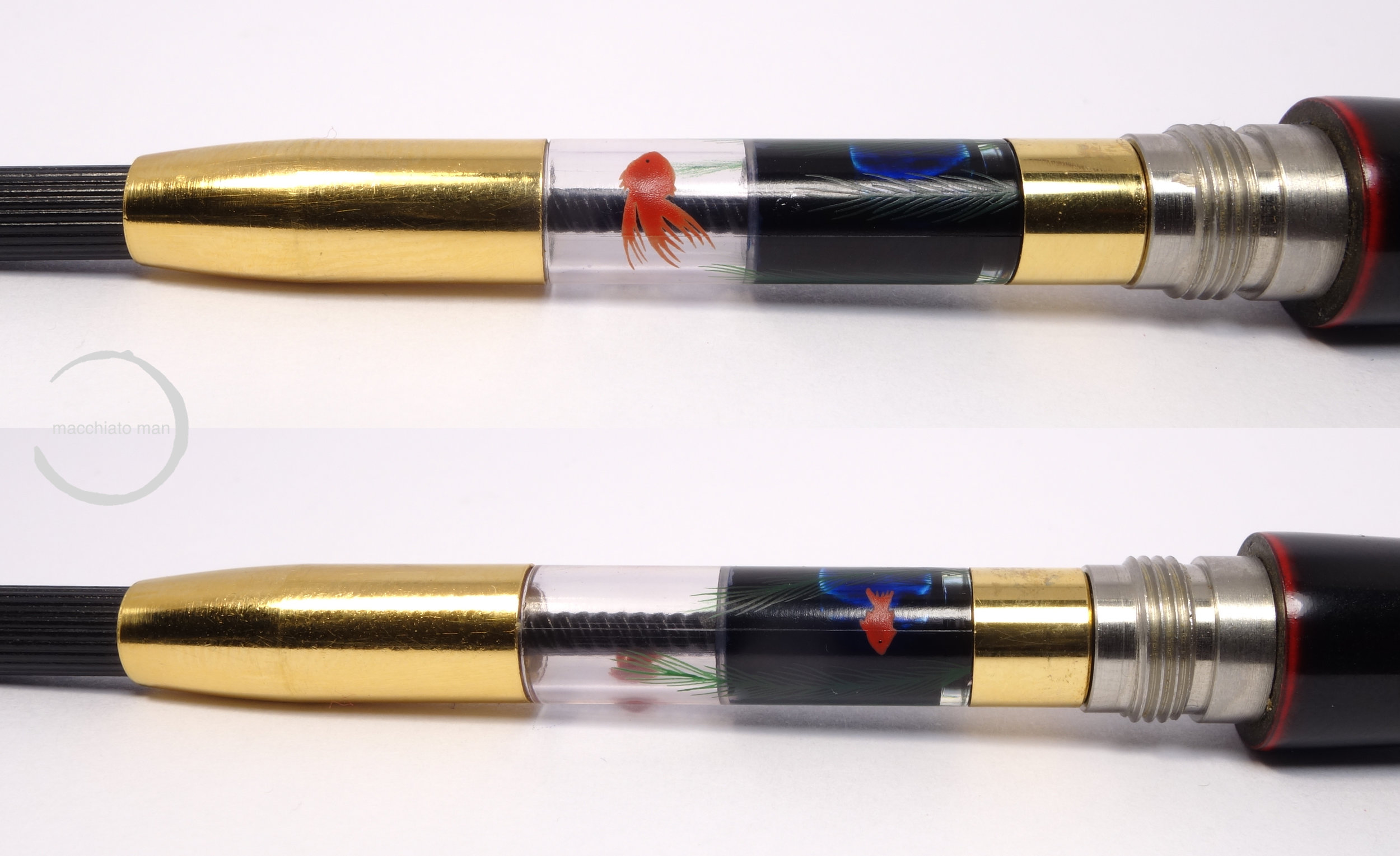

While the pen itself doesn't have an Maki-e on it, the converter does (this is an optional extra). The converters displays two Maki-e fish along with some seaweed. It's nice knowing it's there and certainly pleasant to see when I unscrew the barrel to fill the pen, but it is somewhat lost in an opaque pen.
The medium nib has the Nakaya symbol on a globe with some standard flourishes running to the point. It displays 14k and 585 as as well as "JAPAN" on the shoulder. It doesn't display the nib size much like how Montblanc doesn't.
Nakaya provides you, when you buy a pen, with a form to fill out regarding writing performance. This Piccolo Writer has had no modifications to the default (the bold choices in the form above). The writing performance is, appropriately, very neutral. It's moderately wet (my preference is for wetter pens than this); it has some feedback, and so isn't butter smooth but isn't at all scratchy; and it puts down a proper Japanese medium line. No issues as all. No hard starts, no skipping.
On 80gsm Rhodia Paper
I've inked this pen with Shosaikan Seiran Blue; it's a lovely dark blue that sheens slightly red but in the wetter areas sheens green as well.
I find the pen very comfortable to write with for long sessions. I contribute this to the relatively light weight of the pen and the diameter of the section both of which I, personally, find very comfortable.
On Ivory Tomoe River Paper
Comparing it to the written lines of other pens, the Nakaya Piccolo Writer is, understandably, very similar to the the Platinum Century nib. Both the Platinum and the Nakaya nibs are untouched. The Sailor nib is a little wider but I believe I may have worked on the nib to make it more to my liking. Not unexpectedly the Lamy's Western Medium is much broader than the Nakaya.


Nakaya is, of course, a subsidiary of Platinum. Many of the staff of Nakaya are in fact ex-platinum employees. Because of this they clearly share a lot between the companies which can be seem with the nibs and the clips at least. The clip on my Platinum Century #3776 "Gengetsu" is exactly the same as the clip on this Nakaya Piccolo Writer. The nib on the Nakaya is also exactly the same shape as the Platinum but it does differ greatly in etching (obviously) but also colour. The Nakaya's 14k nib is much redder and darker than the lighter and almost greener Platinum 14k nib. They write very similarly with a similar line width but also a very similar amount of feedback.


I can't really explain it but the pens feels like it's made of a thin, smooth, and hard wood to me; that was my initial feeling when I picked up the pen and it still is. It has a warm natural feeling to the material and although the urushi is very hard (for example compared to the plastic used with a Pilot Custom 823 which feels soft to me) it feels comforting to hold.
After trying this pen I think I made the right choice in ordering my Nakaya Decapod Aka-tamenuri. I'm also glad I asked for the flow to be a little wetter as I prefer wet-to-very-wet pens. I might also smooth the nib out a little as my preference is for smooth nibs rather than nibs with feedback. This isn't a flashy pen; it's a subtle pen. It's not going to turn heads but it is something I'd appreciate writing with whenever it picked up.
I've listed all my inks and all my pens in their respective pages. Please let me know which inks you'd like to review next via the comments, Twitter, Instagram, or contact me directly.
You can follow @macchiato_man on Twitter for blog updates.
I was not compensated for this review and everything here is my own honest opinion. There are no affiliate links.