

I like to keep swatches of all my inks in a binder. In the past I've used Rhodia 80gsm but paper never felt right; too flimsy and I was never good at cutting accurate and consistent rectangles. In the past there was Maruman Mnemosyne Word Cards (which I never used), this year (2017) there is the new Col-o-ring cards, Robert Oster has some swatch cards as well and I have also found some good card stock myself. I'll be comparing these 4 different card stocks with Rhodia 80gsm and Tomoe River (as baselines). They all often perform quite differently and bring different attributes to the table! This is a very image heavy comparison with over 135 images!
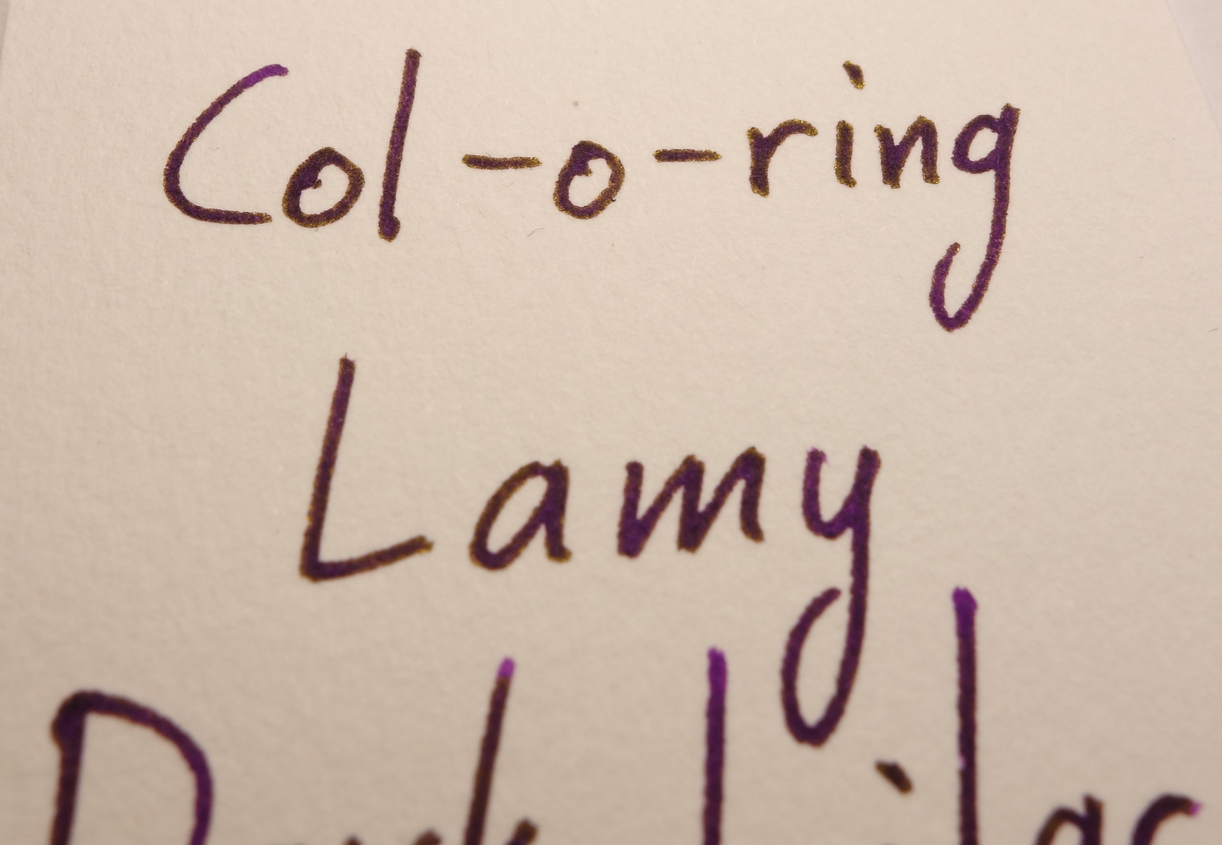
Ana Reinert from The Well Appointed Desk announced Col-o-ring in March this year and it has slowly arrived in many stores around the world. People were fond of Maruman Mnemosyne Word Cards but they were discontinued in late 2015 (special thanks to a friend in Canada for getting me some of these for this review!) and so the Col-o-ring cards were created to fill the hole in the market for swatch cards. Reviews for the Col-o-ring were consistently glowing but I was unconvinced but still very curious. I couldn't find many high-definition images of the card stock and some of the photos I did see made the edges of the written line seem quite rough and I couldn't tell whether that was feathering or just the rougher surface of the card. In September 2016 there was the Pelikan Hubs (the 2017 Pen Hub is coming up soon too) and in the pen hub Pelikan provided notebooks and postcards (as well as ink bottles and a pen sleeve). You would have thought that the notebook would have bested the postcard in terms of fountain pen friendliness but that wasn't the case at all. The notebook was actually pretty disappointing but the postcard had really spectacular card stock. I emailed Pelikan and they were gracious enough to do some digging and find the name of the card stock for me: "240 g/m² Chromocard Performa White/ RS uncoated" (many thanks to Pelikan!). I have found the card stock on papyrus.com (which doesn't have an English translation), but I haven't attempted to ship any to Australia (I imagine shipping is expensive and I also don't love the idea of buying bulk which I expect I'd have to). In attempting to find a local alternative I contacted Bookbinders Online here in Australia to ask whether they could source the Chromocard stock or find an alternative. They weren't able to get Chromocard but they were able to do their magic and find an alternative: "Sumo Hi Bulk (in 240 or 230 g/m²)". I ordered 1000 business card sized cards and I am using it as my main card stock now. I'm not sure whether Robert Oster's swatch.ink card stock is for general sale (I don't believe they are) but I have managed to get a hold of some so I'll be including this here too.
I've decided to test these inks on a variety of inks that have different characteristics and different brands. Noodler's Baystate Blue, Noodler's Hunter Green, Robert Oster Bondi Blue, Organics Studio Nitrogen Royal Blue, Sailor Kin-Mokusei, Montblanc Burgundy Red, Lamy Dark Lilac, Platinum Citrus Black, and J. Herbin Rouge Hematite.
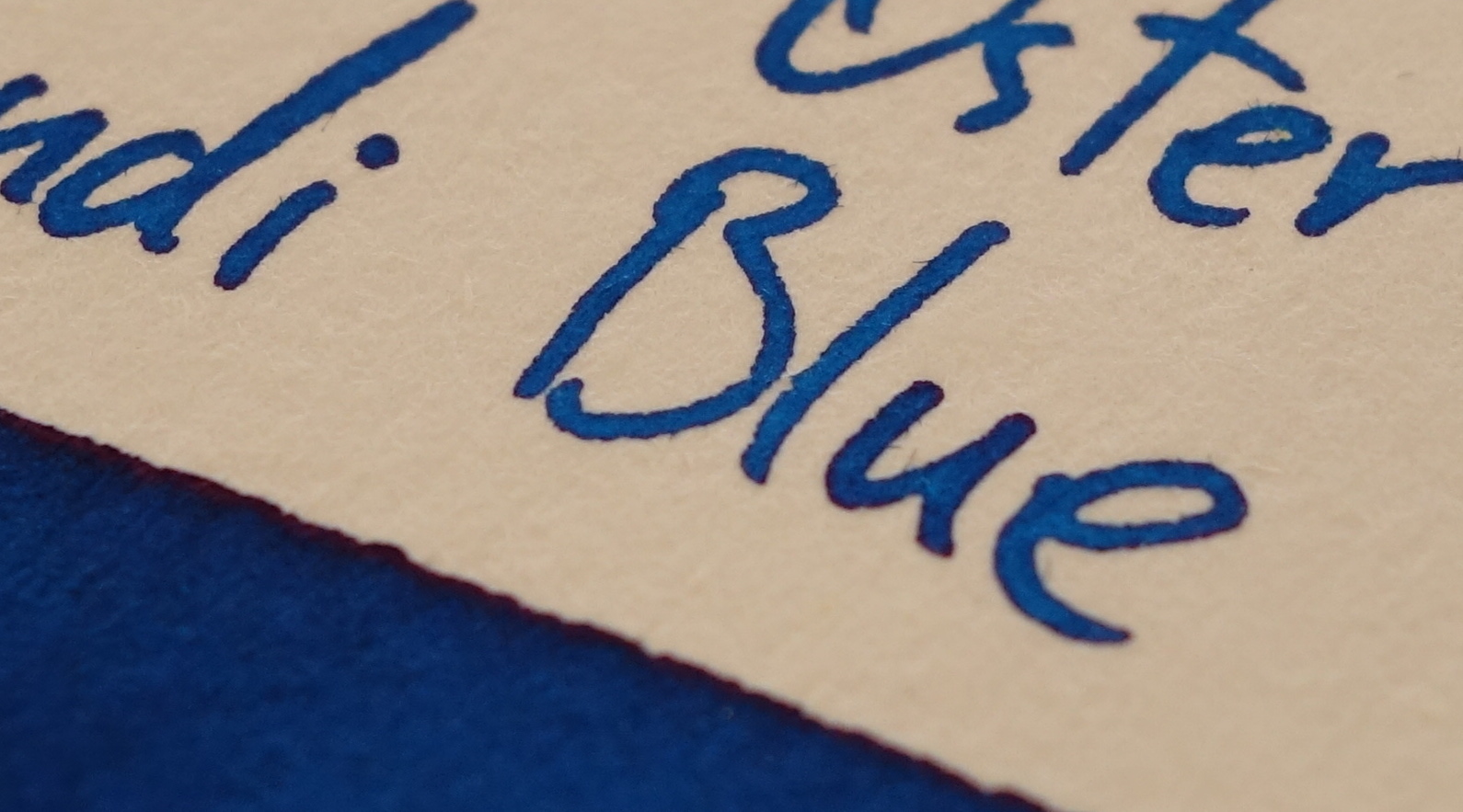
Robert Oster Bondi Blue
I chose this ink because it has some sheen but also has nice shading and is a very good performer all 'round.


Bondi Blue has a fair consistency base colour across the board. Tomoe River is a little lighter and Chromocard has a splotchy texture, however. As will show to be somewhat consistent, Col-o-ring, Mnemosyne, and swatch.ink all have comparable and darker colours.


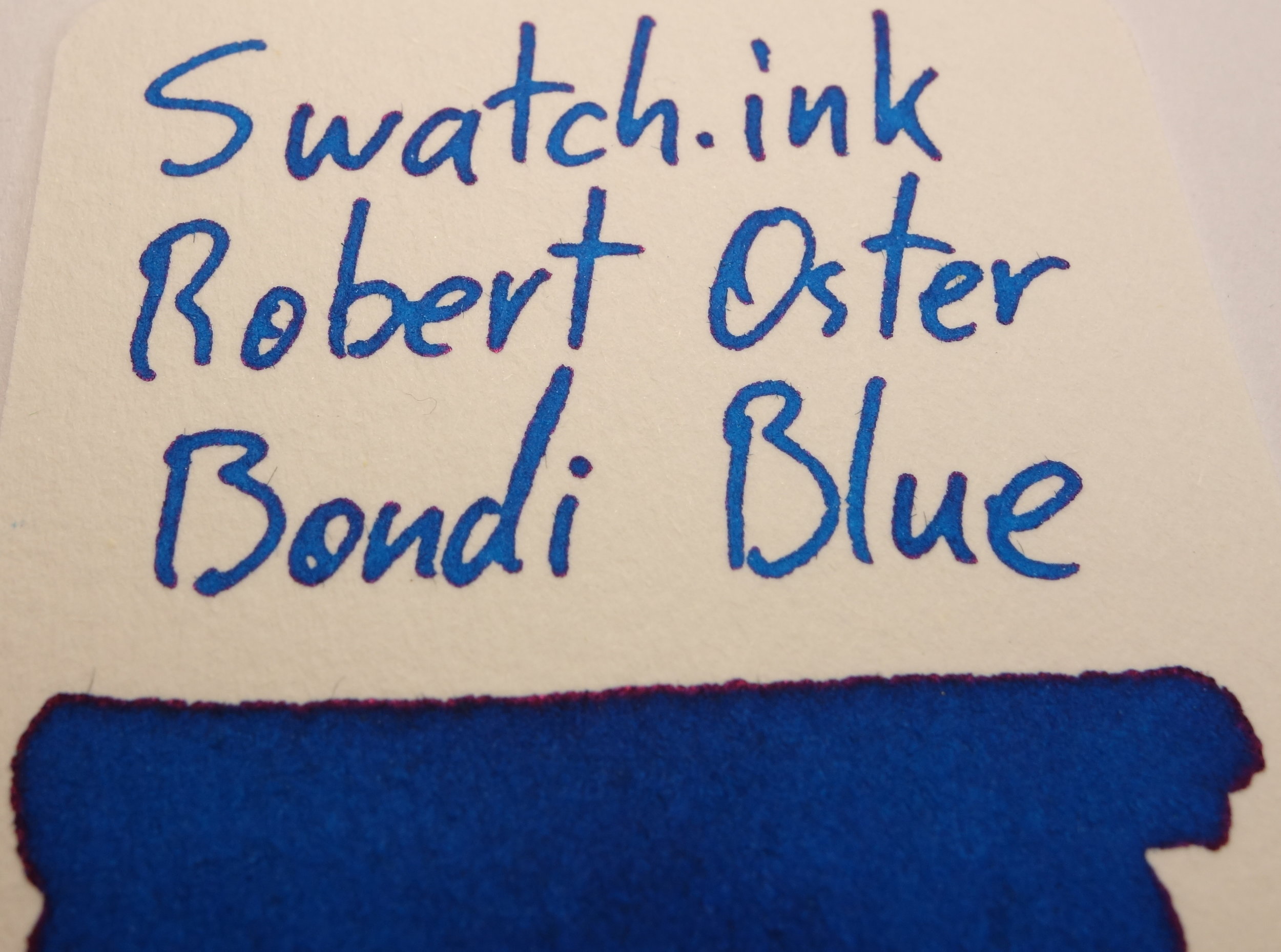

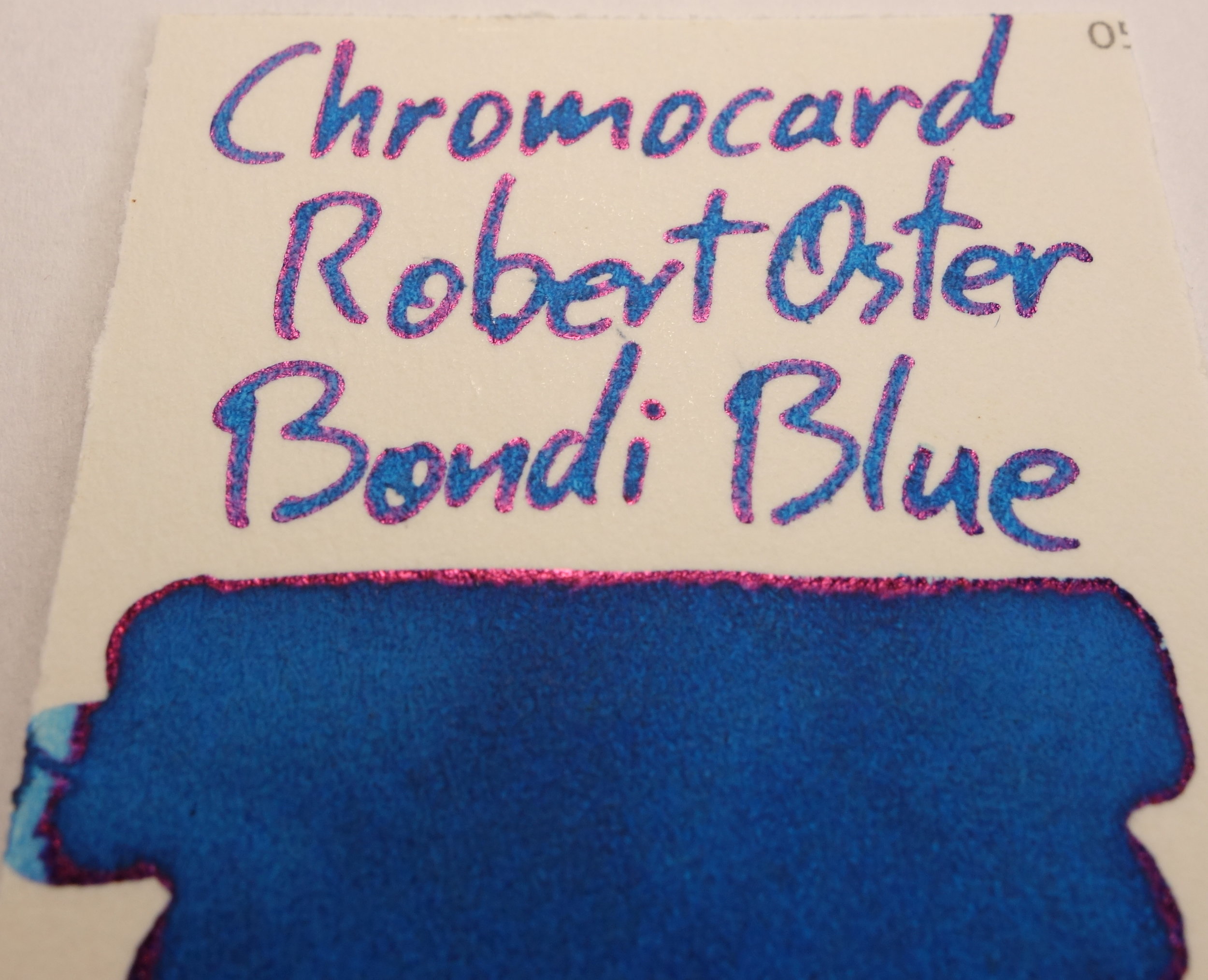


A lot of pink sheen from Chromocard. Limited sheen for the rest. The rougher card stock (Col-o-ring, Mnemosyne, and Swatch.ink) all have the uneven lines (more so with Robert Oster Bondi Blue than some other inks, for some reason).
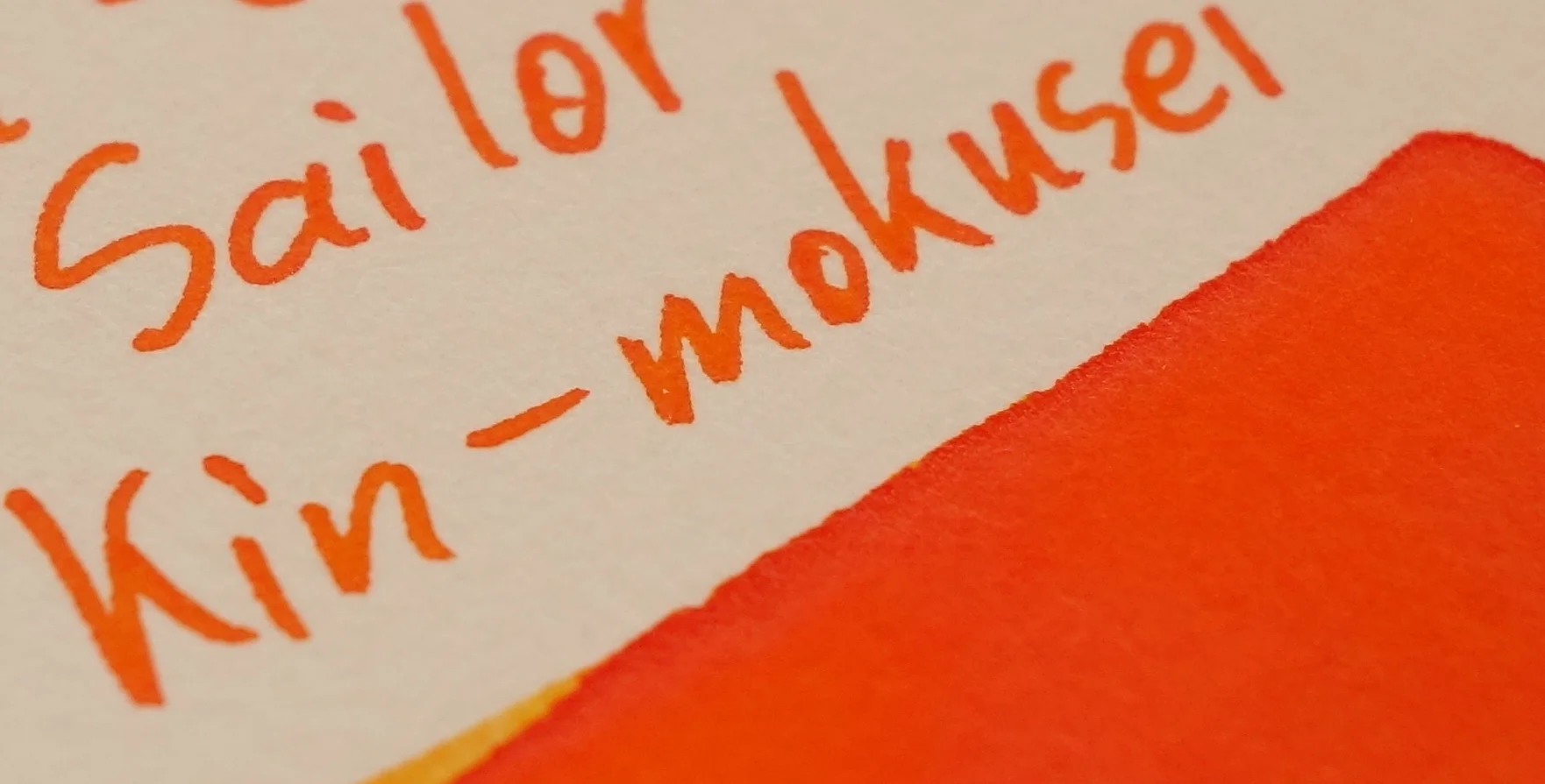
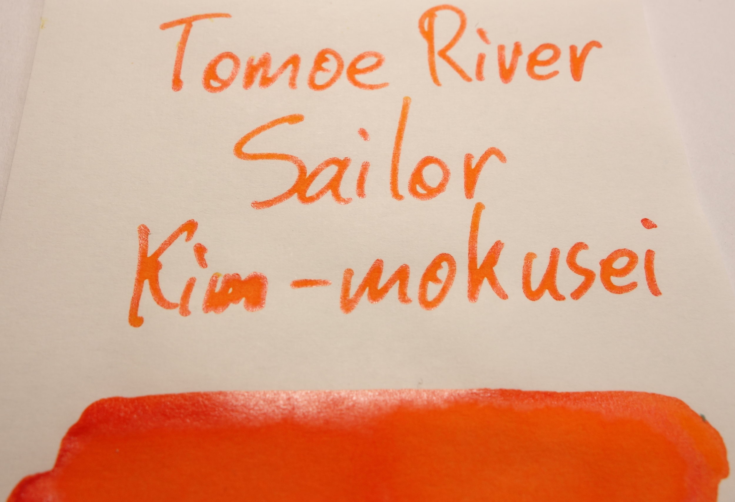
Sailor Kin-Mokusei
This ink was chosen because of its silver sheen and the less saturated (though still vibrant) colour.


Again, fairly consistent colour across the board. Chromocard, however, is not showing as much yellow as the other cards and papers.

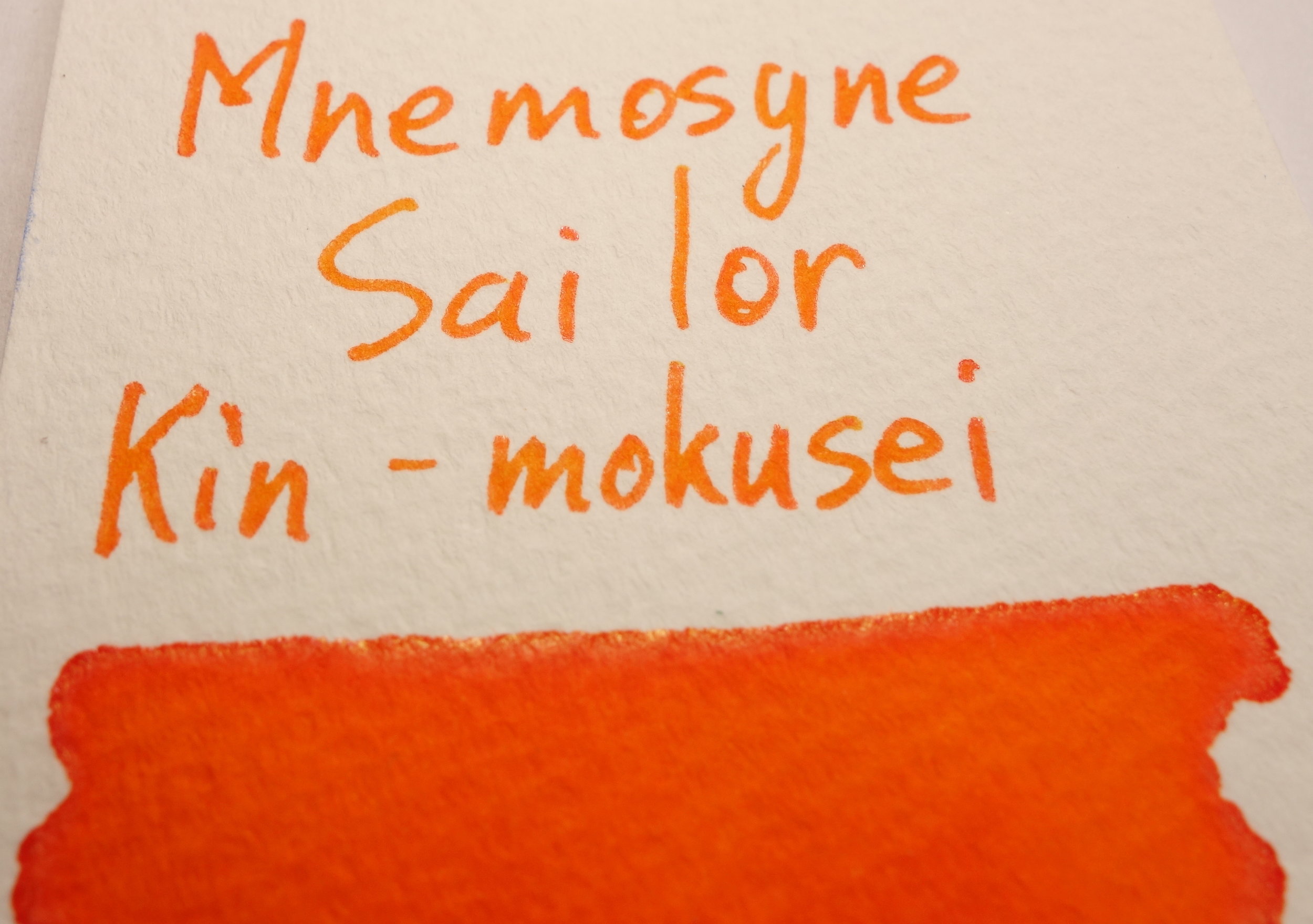


A descent amount of sheen is present on Tomoe River and a lot on Chromocard but not very much on the rest. Mnemosyne, surprisingly, is showing gold sheen rather than the silver sheen the rest are presenting with.
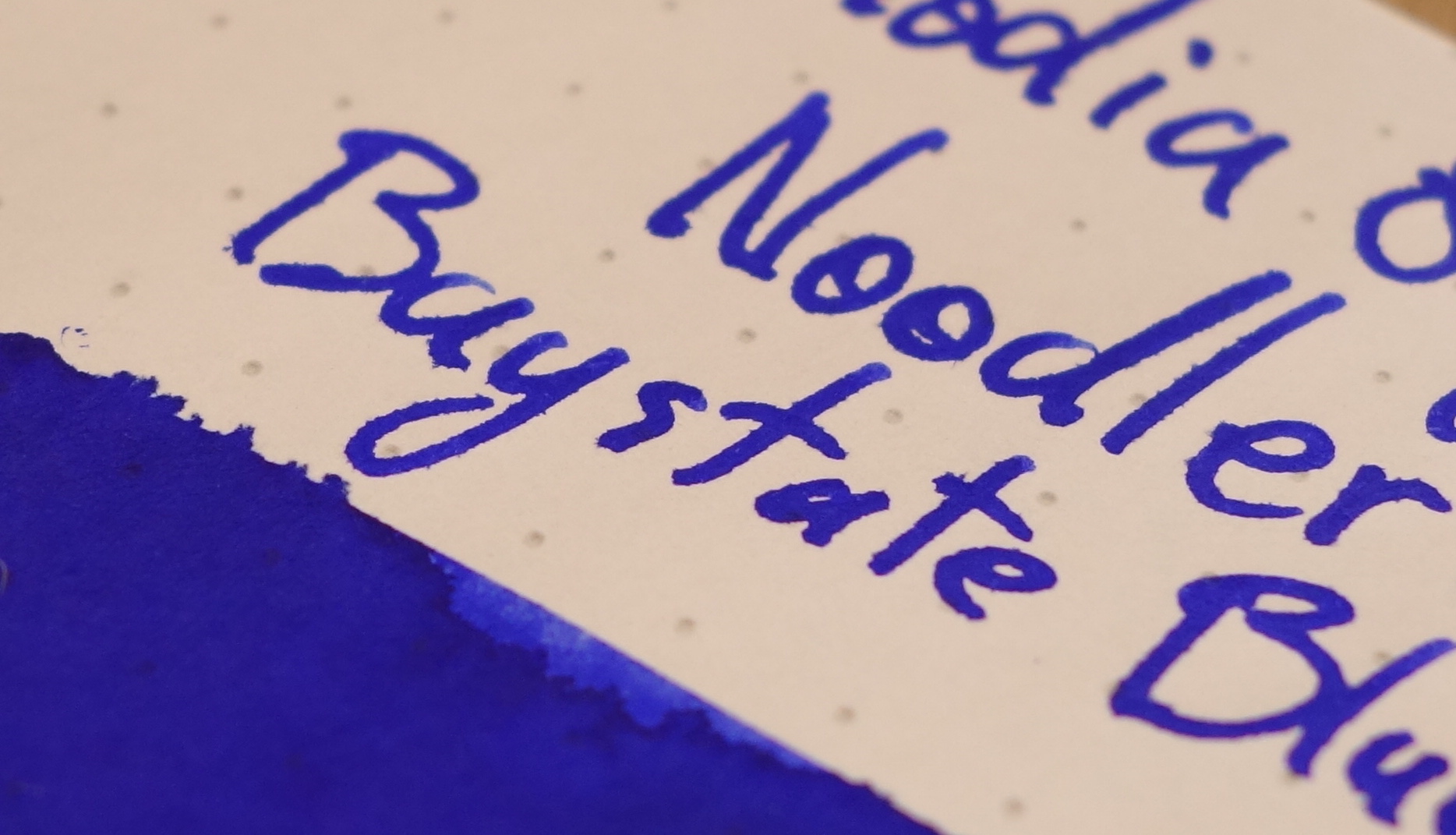
Noodler's Baystate Blue
This ink was chosen because it can behave somewhat poorly (it feathers and bleeds a little on Rhodia 80gsm) and because it is an extremely saturated ink.


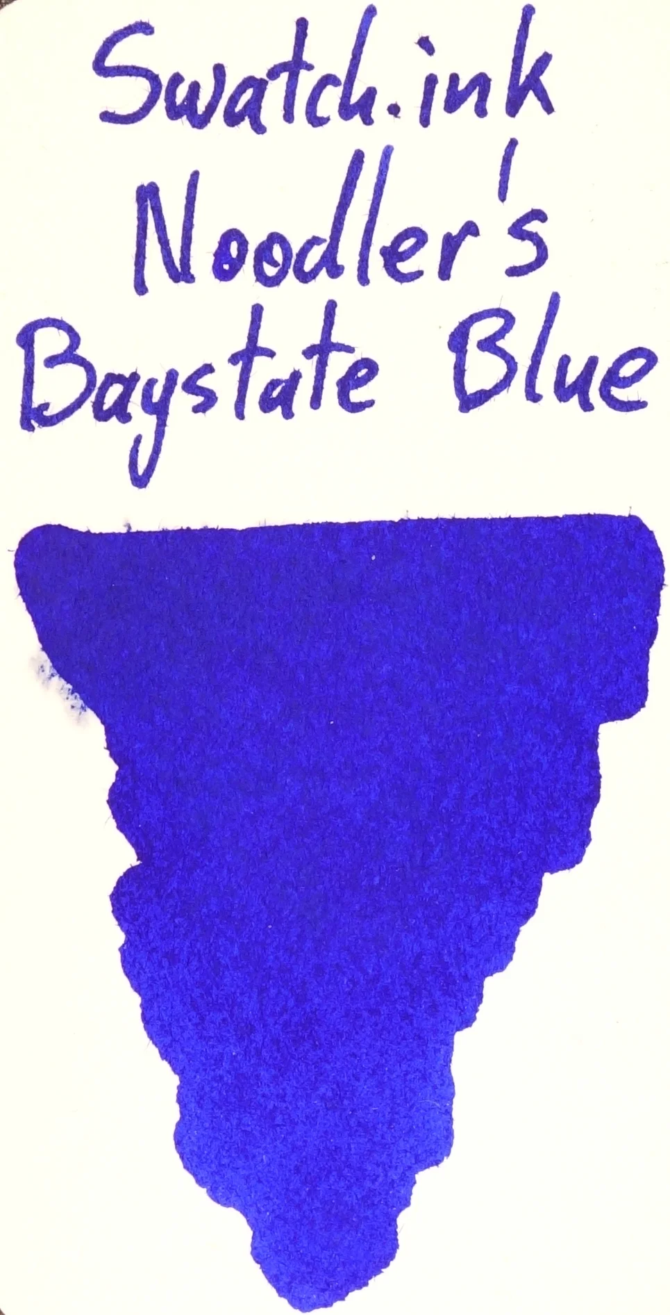


Some changes of colour here. The purple side of Baystate Blue is coming out more with Col-o-ring, Sumo Hi Bulk, Chromocard, and Tomoe River, but a more "true-blue" is present in Menomsyne, Swatch.ink and Rhodia. The ink is somewhat dull and lifeless on Rhodia, and the ink is feathering badly on Mnemosyne.


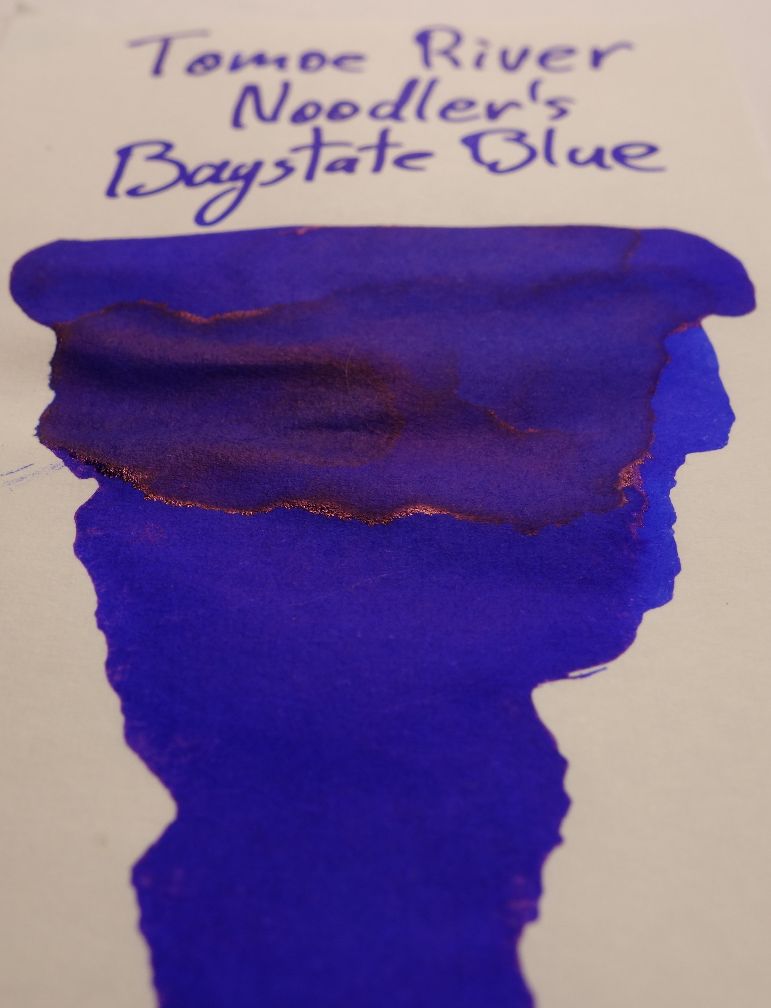
Baystate Blue doesn't sheen much from a pen but it does in a wet swatch. It's interesting to see such different types of sheen here. On col-o-ring and Chromocard the ink presents with a matte sheen that covers the whole of the swatch (where it was wet long enough to form) but on Tomoe River, and especially Sumo Hi Bulk, a lot of the sheen only happened on the edge. It's also a much shinier sheen with Sumo Hi Bulk.
Montblanc Burgundy Red
This ink was chosen because it has decent shading but it also performs differently on Tomoe River.


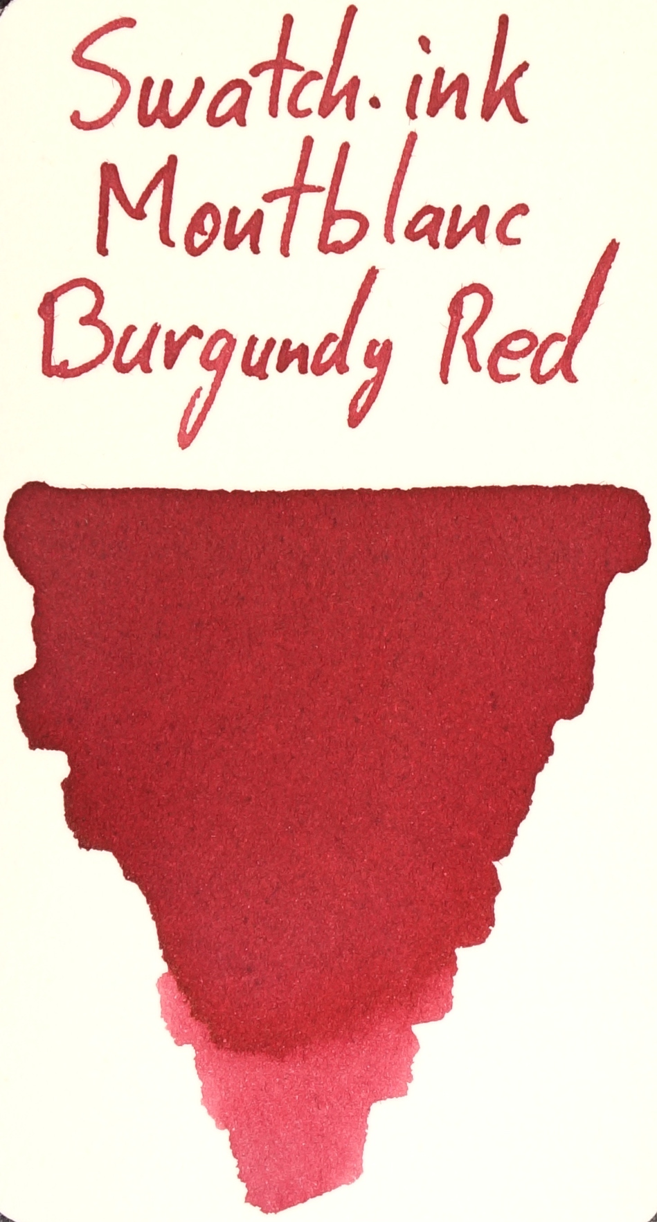


No sheen on this ink and some very different changes in colour. The ink is its most vibrant on the rougher cards: Col-o-ring, Mnemosyne, and Swatch.ink. Rhodia is pretty neutral and the colour drains from the ink in Chromocard (which is also splotchy), Sumo Hi Bulk, and especially Tomoe River. A lot of Montblanc inks do this on Tomoe River, and so do some Robert Oster and Caran d'Ache inks, especially in the red and orange families.
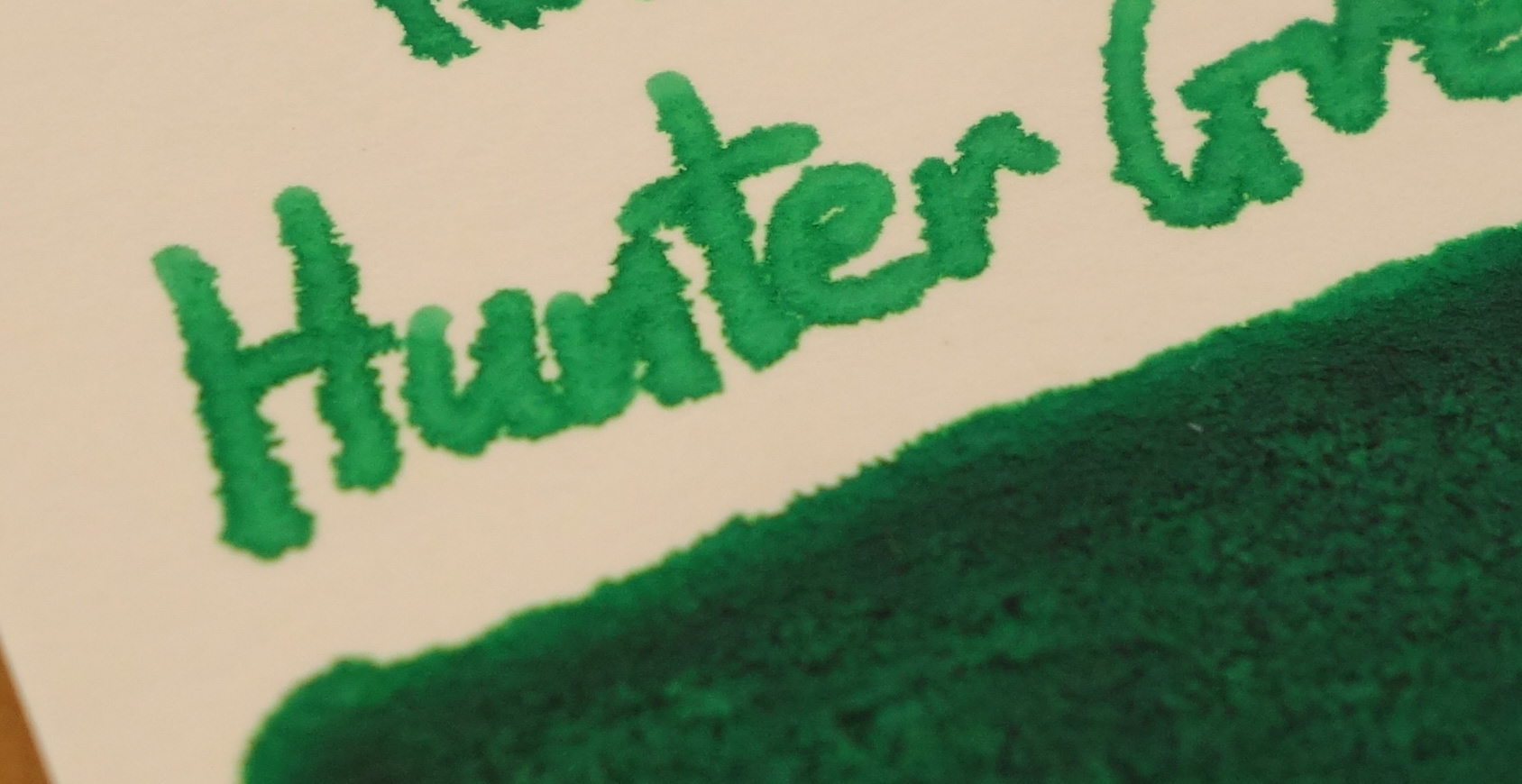
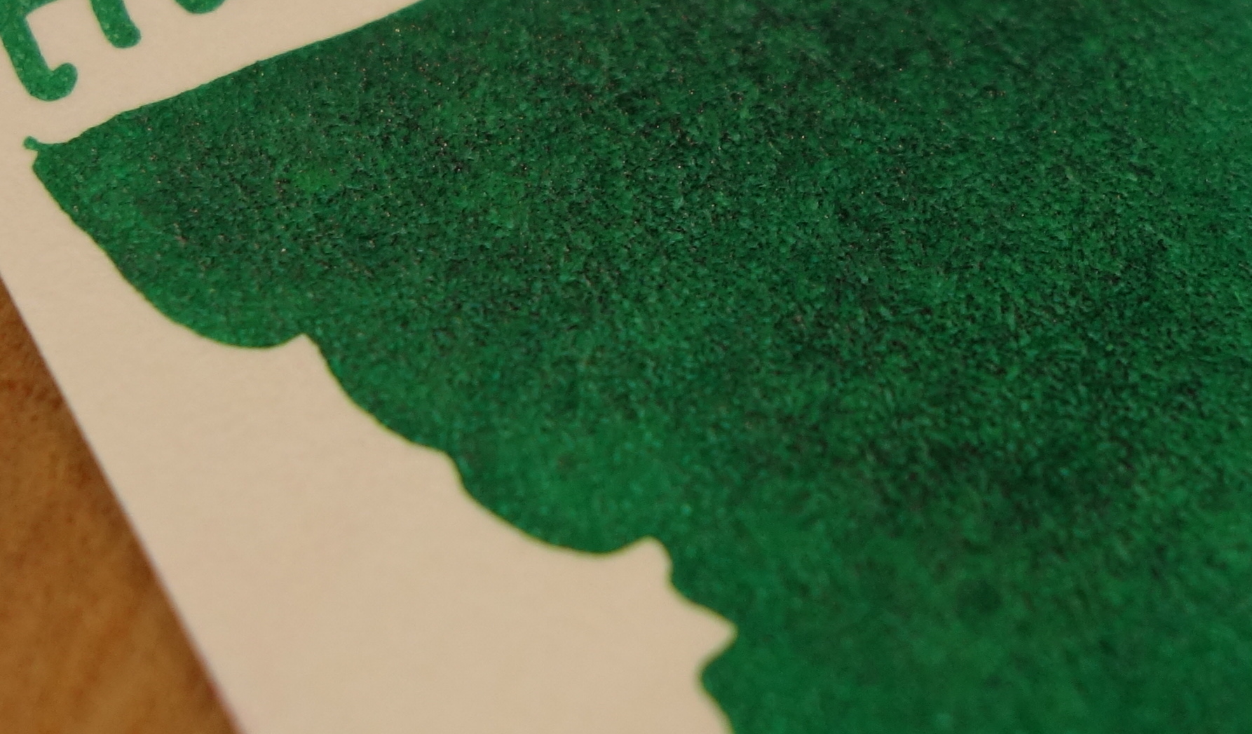
Noodler's Hunter Green
This ink was chosen because it generally performs very poorly on most papers.


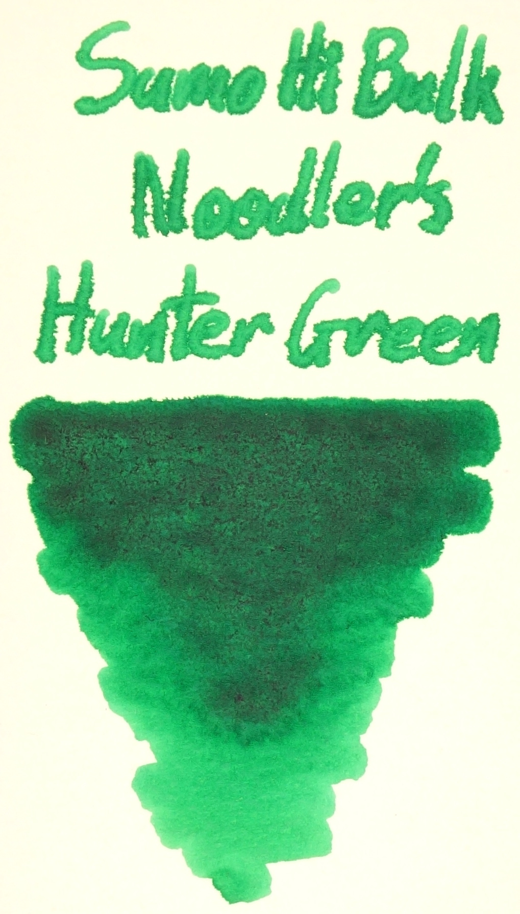


This ink also changes colour a fair amount. The yellow comes out on Rhoda and Swatch.ink, but the blue comes out on Sumo Hi Bulk and Chromocard. The ink is splotchy on Rhoda, Swatch.ink, and Chromo card but performs well on Tomoe River, Col-o-ring, and surprisingly well on Mnemosyne. It performs atrociously on Sumo Hi Bulk. An absurd amount of feathering. A few bulletproof and/or eternal Noodler's inks perform like this.
J. Herbin Rouge Hematite
This ink was chosen because of the shimmering quality of the ink (the sparkles).

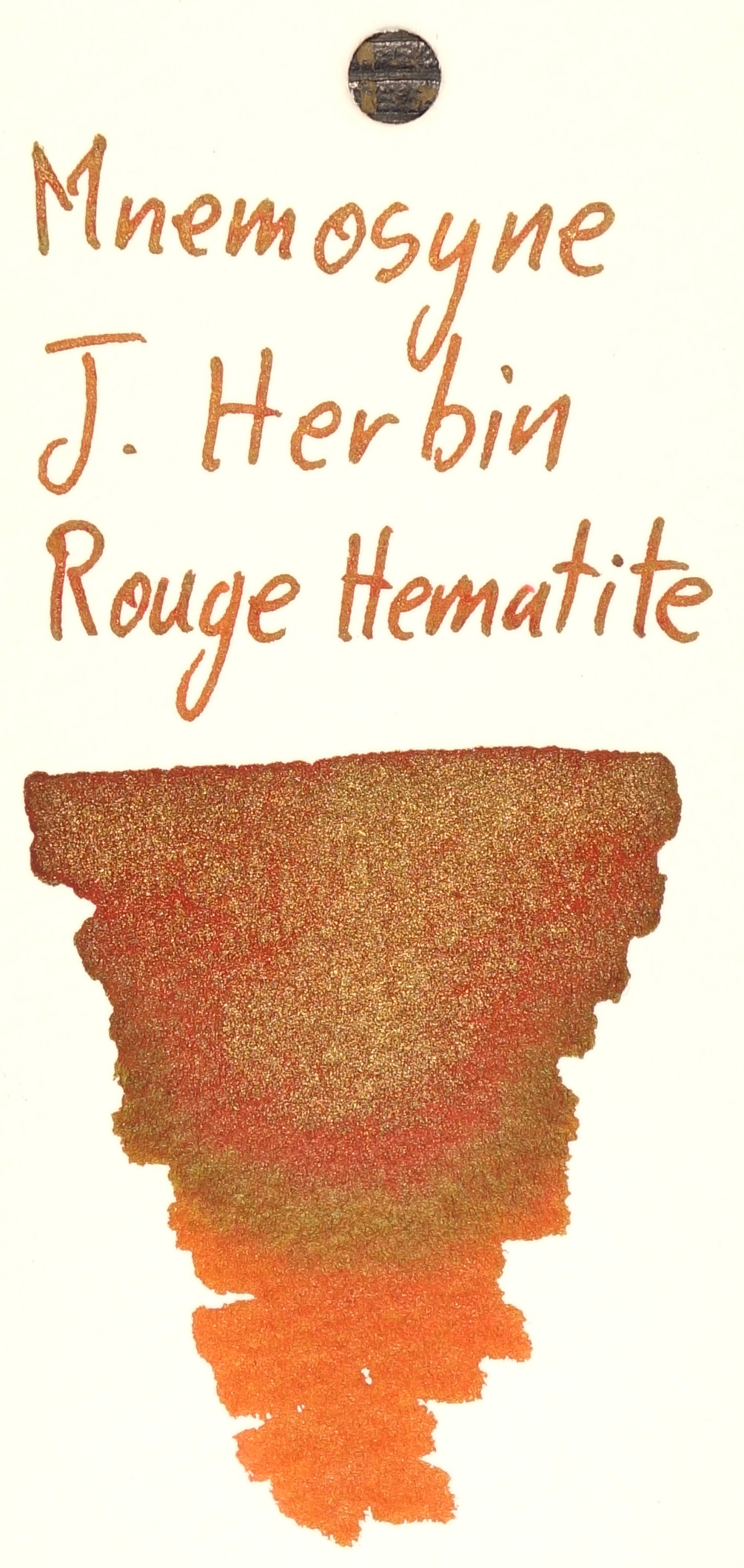


Fairly consistent here with the exception of Rhodia which shows a lot more red than the others.


The green sheen this ink produces is prevalent on most of the cards and papers except, surprisingly, Chromocard, though the sheen present on Col-o-ring and Mnemosyne is rather subtle.
Lamy Dark Lilac
This ink was chosen because it is a dark rich ink with some gold sheen to it and decent shading and a good performer.


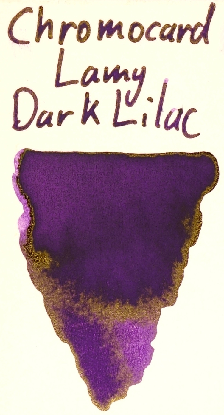


Lamy Dark Lilac shows to be decently consistent colour. Tomoe River, Chromocard and Sumo Hi Bulk aren't as 'Dark' as the other cards and paper but are still a similar hue. Good performance across all cards and papers as well.


Sumo Hi Bulk and Tomoe River have a fairly similar amount of sheen just ahead of Col-o-ring but all of them are well behind Chromocard which again steals the show with sheen. Swatch.ink, Mnemosyne and Rhodia show limited sheen.
Platinum Citrus Black
This ink was chosen because it's a very unsaturated ink, somewhat dry, and also Iron Gall.


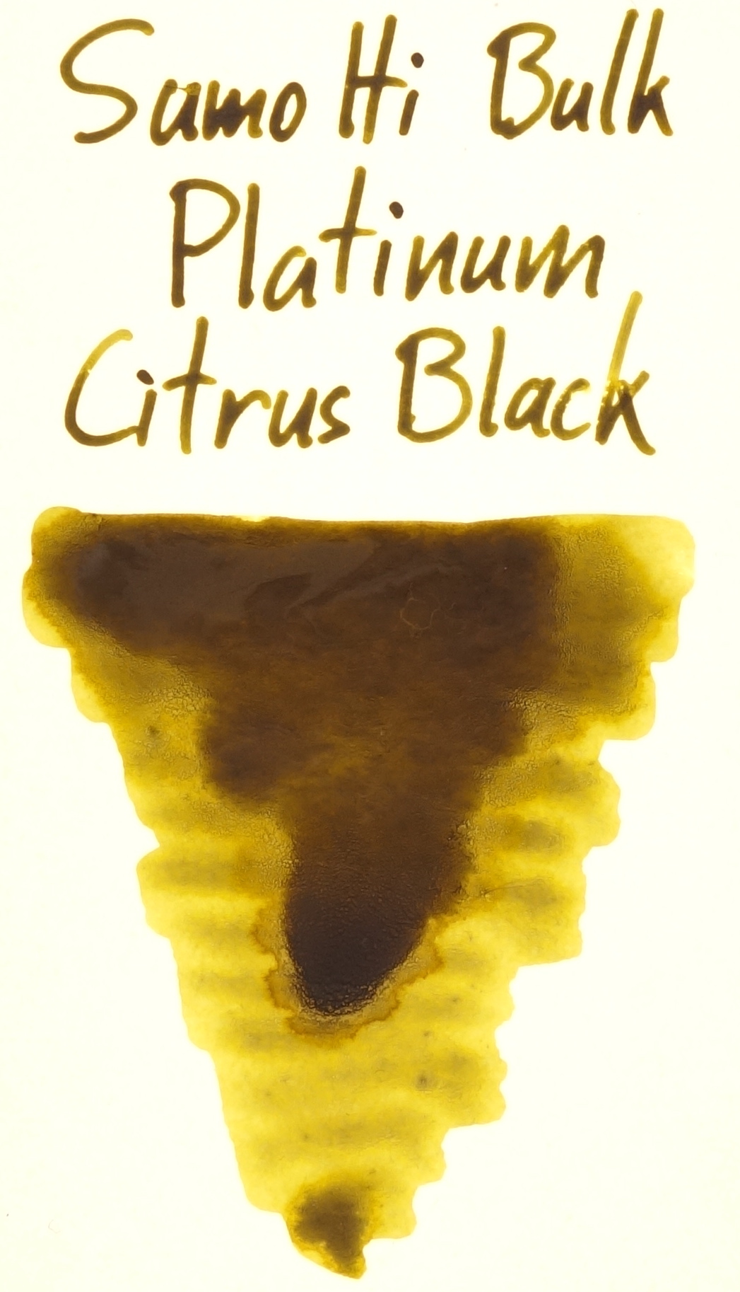


In a reversal from some of the inks above, here the ink is darker and richer not on the rougher cards. In fact the oxidisation of the Iron Gall is much less prevalent in Col-o-ring, Mnemosyne, and Swatch.ink and accordingly the ink is not very "Black"; Col-o-ring in particular is very light. On Sumo Hi Bulk, Chromocard, and to a certain extent, Rhodia, the ink dries quite dark and presents with very attractive shading. Tomoe River is less saturated than the other inks and in between in terms of oxidisation of the Iron Gall. Where the ink pooled it got very dark, however. Photos were taken almost two hours after being made
Organics Studio Nitrogen Royal Blue
This ink was chosen simply because of it's stunning amount of sheen.


This mostly-pink "blue" ink performs well across all the cards and papers. I think it has consistent colour but it's difficult to tell.


A decent amount of sheen in Col-o-ring and I'm surprised that Mnemosyne and Swatch.ink comfortable beat out Rhodia in sheen. Sumo Hi Bulk and Tomoe River are comparably sheeny and, yet again, Chromocard is just blindingly sheeny. Just a reminder that this is a blue ink (at least theoretically).
Col-o-ring
I mentioned above that I wasn't convinced when I first saw photos of Col-o-ring (that isn't to say that I thought it was bad, but I couldn't tell). Well I was wrong to doubt it! The card displays a good amount of sheen and performs very well even with poor performing inks.
The card does feather a little with Noodler's Baystate Blue: slightly more so than on Rhodia but much less than on Mnemosyne but it also shows the ink better than Rhodia. Tomoe River, Chromocard and Sumo High Bulk do not let Baystate Blue feather by comparison. Col-o-ring card stock also has a slightly rough surface. What this means is that sometimes the line is sometimes uneven. This seems to be prevalent mores in some inks than others as Robert Oster Bondi Blue has a more uneven line than Sailor Kin-mokusei. Col-o-ring did perform very well with Noodler's Hunter Green which just looks terrible on most paper (except Tomoe River).


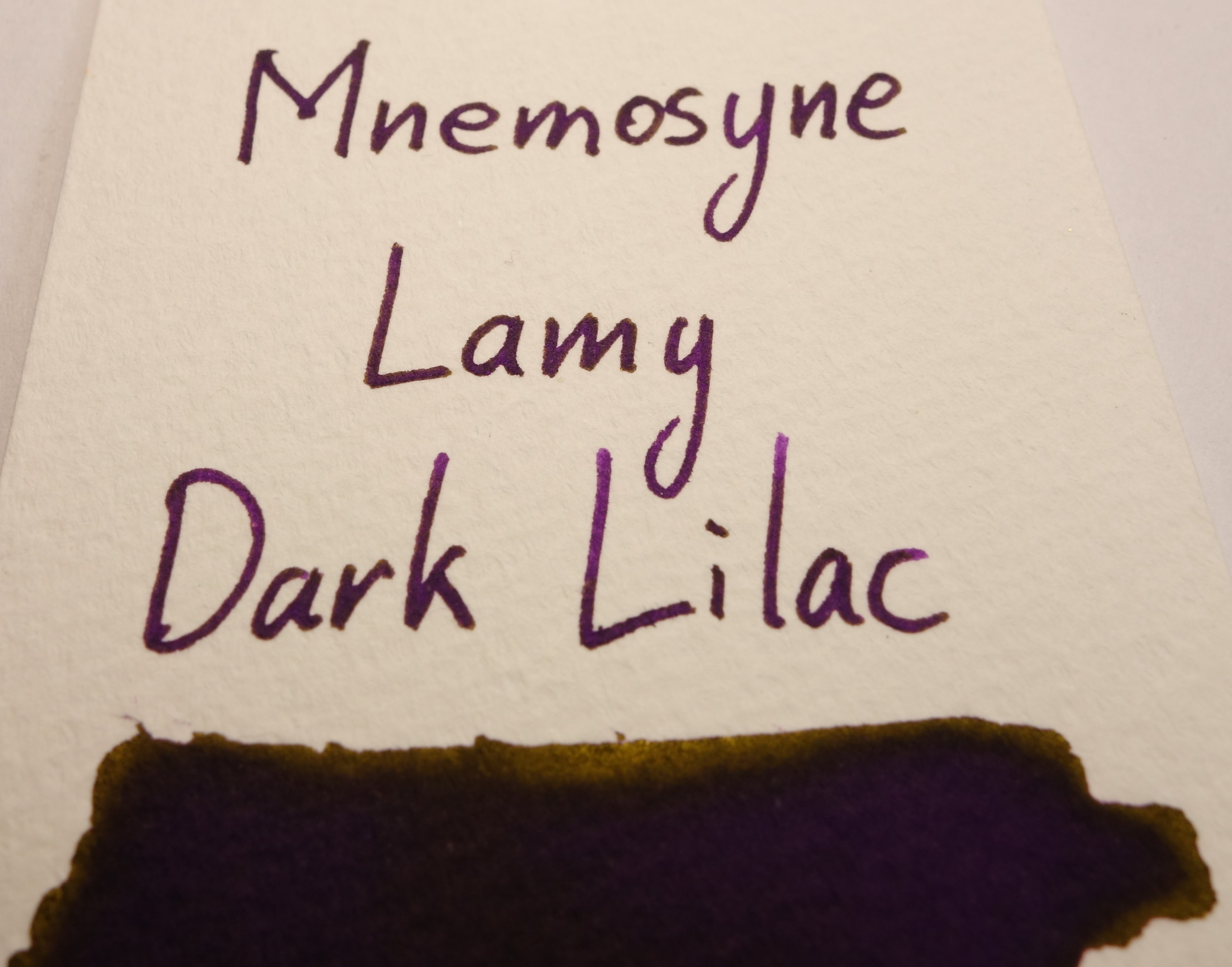
Maruman Mnemosyne Word Cards
Mnemosyne's card stock performs very poorly with Noodler's Baystate Blue; lots of feathering here. Surprisingly, however, it performs rather decently with Noodler's Hunter Green. Like Col-o-ring this Mnemosyne Word Cards have a rough surface which can present lines as uneven. This card stock isn't that bad with sheen (but it's anything like Tomoe River either) but surprisingly, while all other papers and card stocks I have tested show a silver sheen with Sailor Kin-mokusei, this shows a gold sheen which is very interesting.


Robert Oster Swatch.ink
This card stock is rather absorbent. This means that it doesn't do a great job at showing sheen and it can present the ink with less shading as well. It does seem to do a good job of presenting a rich colour, however, and while it does feather a little it doesn't feather that much (neither with Baystate Blue nor Hunter Green). It does show Hunter Green as splotchy, however, and like Mnemosyne Word Cards and Col-o-ring it has a rough surface than can mean uneven lines.


Sumo Hi Bulk 230gsm
This card stock presents very similarly to Tomoe River. Similar amount of sheen, similar effect on the colour of some inks, similar smoothness. I will say that this card stock is an absolute delight to write on. Very smooth fine-grained feedback and I love it! Where it differ's slightly is that it often makes the ink looks very smooth and almost plastic-like. I like this look, personally, it really brings out the colour and makes it pop. Like with Tomoe River it can also suck the life and the colour out of an ink sometimes (frequently with Montblanc inks). Here the somewhat-rich red of Montblanc Burgundy Red is turned into a unsaturated low-vibrancy pink. This is similar to what Tomoe River does with the same ink. Similarly it also brings out colours from an ink that might otherwise not be present such as with Sailor Rikyu-cha which is a green-brown but on both Tomoe River and Sumo Hi Bulk it shows a lot of blue. While the ink performs well with Baystate Blue, where the ink falls down is with poor performing inks like Hunter Green. This ink simply doesn't work on this card stock. The feathering on either side of a line is actually thicker than the original line itself. I have only found this with certain Noodler's inks (often eternal or bulletproof), however.


Chromocard Performa White/ RS uncoated 240gsm
This is my favourite card stock. It doesn't feather on Baystate Blue or Hunter Green, it doesn't lose as much colour on Montblanc Burgundy Red, it is a little splotchy sometimes, but what it does do is put even Tomoe River to shame with sheen! Unbelievable amounts of sheen in this ink. Lamy Dark Lilac is almost more gold than purple, Robert Oster Bondi Blue has so march pink, and the silver sheen on Sailor Kin-mokusei is so strong that the words almost blend into the white paper! With Organics Studio Nitrogen Royal Blue, the paper was more prone to smudges than the other card stocks. I say more because Organics Studio Nitrogen Royal Blue is very smudgy on most paper.


Even though it presents some inks a bit splotchy, my favourite card is still Chromocard. It doesn't feather and it sheens more than anything else! It also doesn't kill the colour as much as Tomoe River and Sumo Hi Bulk can do with some inks. I do like Sumo Hi Bulk but the extremely poor performance on some Noodler's inks is disappointing. I think I'll use Col-o-ring for my personal swatch collection for inks that perform poorly (like Hunter Green does). Mnemosyne is certainly not great card stock; it may have been the go-to card stock from a few years ago but it doesn't hold up today, in my opinion. Swatch.ink card stock is pretty absorbent and does feather ever so slightly with even with good performing inks but doesn't ever really perform badly. It does show colour well and doesn't sheen but is still decent for swatching.
With regards to writing experience I'm not fond of the feel of the rougher cards. Col-o-ring, Mnemosyne, and Swatch.ink are all too rough for my liking. Chromocard is fairly neutral with a little fine-grained feedback but Sumo Hi Bulk actually feels good to simply be writing on it. Great texture.
If anyone has a line on how to affordably acquire Chromocard I'm all ears and, as with Chromocard, if you want Sumo Hi Bulk ask some local paper printing places to see if they stock them. Col-o-ring is available from a few stores around the world now. I don't believe the Swatch.ink cards are available for purchase anywhere, unfortunately.
I've listed all my inks and all my pens in their respective pages. Please let me know which inks you'd like to review next via the comments, Twitter, Instagram, or contact me directly.
You can follow @macchiato_man on Twitter for blog updates.
I was not compensated for this review and everything here is my own honest opinion. There are no affiliate links.