The Reserve Bank of Australia is releasing a new $10 note on the 20th of September this year. Featured on this note is a couple of fountain pen nibs to represent the fact that the people featured on the note both wrote. There was a suggestion somewhere that an ink should be made to commemorate the inks and so I semi-seriously prompted Rob to make said ink. Recently he released the inkArt Australian Ten Dollar Note Colour Pack. This pack is listed as a 2-pack of Blue and Green but comes with a Teal as a bonus colour. The bottles are 15ml and, I should stress, do not cost $10; they are just commemorating the new Australian $10 note!
Australian Ten Dollar Note Blue
As the real $10 note is mostly blue, I see Australian Ten Dollar Note Blue as the quintessential ink of the pack. The ink is a light, slightly dusty, Turquoise blue. To the eye it does a decent job of replicating the colour of the note.
The ink is pretty low shading, and no sheen to speak of in normal writing. It isn't a wet ink but it isn't at all dry, especially given that in my experience low saturation colours usually feel dryer. There is no poor performance to speak of (feathering nor bleeding). The ink does produce a decently pronounced Halo which is good to see. Robert Oster inks seem to be prone to Halo more than other brands. It dries moderately quick and at a surprisingly similar pace on both Tomoe River and Rhodia.
There's a bit of Green to the ink making it a more Turquoise colour than Ishida Bungu Hakodate Hachimanzaka Blue (a Sailor store exclusive ink), Montblanc Jazz Blue and Diamine China Blue. The latter two have a hint of red to to them (putting them in a similar category as Royal Blues but with less saturation and vibrancy) and are just too unsaturated. The Bungubox New Years Exclusive Hatsuyume Aofuji doesn't have enough green in it and is more vibrant. Aqua Lagoon is the closest but is also too vibrant (and also too green). Ishida Bungu Hakodate Hachimanzaka Blue share's a similar vibrancy.
On Tomoe River Montblanc Jazz Blue seems even more washed out, as does Diamine China Blue. Hatsuyume Aofuji is a little lighter as well. As with Rhodia, Aqua Lagoon is the closest colour (but too green and too vibrant) but Hakodate Hachimanzaka Blue has a similar vibrancy and saturation level.
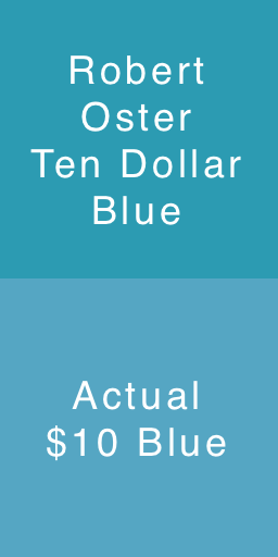
Above is the new $10 note. As I said I think the ink does a very commendable job at replicating the colour. More difficult too is that there are multiple blues in the note. I ran a part of the blue section that is above the hat (on the first photo above) of the note through this average colour finder. Bellow is how Robert's Blue (averaged again) and the average of that portion of the note compare. Even here, it's a pretty decent job in my opinion.
Australian Ten Dollar Note Teal (Bonus Colour)
Robert has a fair few colours in this sort of colour range (dare I say too many!). This is a little lighter, less saturated, and less vibrant than many of Rob's other offerings in the range. This ink is wetter than the other two, and feels nicely lubricated. Again, there's little shading in regular writing, and no practical sheen. There's no negative characteristics (such as bleeding, or feathering) but this ink again stands out with even more halo. I love that these inks make such a noticeable halo as it's a very attractive characteristic of an ink for me that few inks offer.
Robert Oster Tranquility is the closest ink colour-wise though it is slightly greener and more vibrant. Diamine Aqua Lagoon and Bungubox June Bride Something Blue are both too blue and slightly too light. J. Herbin Emerald Of Chivor (note I didn't shake the bottle so no sparkles are present) is too dark and slightly too blue. Pelikan Edelstein Aquamarine is too dark, too blue, and too unsaturated.
On Tomoe River Pelikan Edelstein Aquamarine is closer and less dark but still too blue and unsaturated. Robert Oster Tranquility is still the closest but has more sheen than Australian Ten Dollar Note Teal. The rest are pretty similar to how they compared on Rhodia.
Australian Ten Dollar Note Green
Likewise, Robert Oster has a lot of greens as well. This one is a light green not too dissimilar to Robert Oster Green Lime, Light Green, or Green Green. This one felt a touch less lubricated and less wet than the other two but not too much so. It has no sheen but does have a little more shading than the other two. Again, it has no poor attributes such as bleeding or feathering. I would say this one has a prominent Halo which is very welcome! While there other two inks had somewhat surpisingly similar dry-time on both Tomoe River and Rhodia, Australian Ten Dollar Note Green was very slow to dry on Tomoe River while still being moderately slow on Rhodia.
On Rhodia, Blackstone Daintree Green is a tad too blue and too dark. Diamine Meadow, and Bookbinder's Emerald Boa are too yellow and Emerald Boa is slightly less Vibrant. Diamine Golden Oasis is a closer hue but its still too yellow and not vibrant enough (and it has gold sparkles in it!). Robert Oster Light Green is actually very similar to Golden Oasis's hue and as such is a little to yellow but is also lighter than Australian Ten Dollar Note Green. Robert Oster Light Green seems closest here.
There aren't much changes on Tomoe River apart from Australian Ten Dollar Note Green losing some of it's saturation and vibrancy but all the other comparative inks also lose some of their saturation and vibrancy. Diamine Golden Oasis seems closest here.
Sheen
I've said that none of these inks have sheen. In writing with a pen on Tomoe River paper that is the case. That doesn't mean that with extremely wet dip pens there isn't some sheen. Australian Ten Dollar Note Blue and Teal have a a very little amount of sheen in some places where the ink pools. Green, however, seems to just be a more pronounced Halo.
Halo
The halo effect (also called outline) on these inks is pretty great. What Halo (or outline) is almost hybrid of sheen and shading. It's occurs where sheen often does; along the outside edge of the written line but it appears as a darkened version of the ink itself, similar to shading, and without any of the shininess. Not too many inks show this as prominently in normal writing as these three.
These are cute bottles. I'm not huge fan of small bottles (even though I have over 650 bottles of ink for sample reason I feel like I need the bigger bottles) but I know this sized bottle is a popular option. I wouldn't hold your breath for all of the standard inks being offered in this size but there might be some options coming and they are available in the inkArt collection in packs of 4.
100ml bottle, 50ml bottle, 15ml bottle
I think Rob's done a great job with the blue and I think the green and teal make sense. These aren't the type of colours that I personally love (that is that my taste in colours is for vibrancy and rich saturation rather than lighter less vibrant colours) but I do love that there's an ink based of the Australian $10 note that features a fountain pen nib. I'm also a big fan of the halos in these inks and for a light ink these are decently lubricated and with good flow. In my experience lighter inks are often dry so this is a welcome change!
The Australian Ten Dollar Note 2-pack (plus bonus bottle of Teal) can be purchased from Pensive Pens and directly from Robert Oster when the ink is available for individual purchase you should check your local reseller.
I've listed all my inks and all my pens in their respective pages. Please let me know which inks you'd like to review next via the comments, Twitter, Instagram, or contact me directly.
I received this ink and pen free of charges a gift and not for review. I was not otherwise compensated and everything here is my own honest opinion. There are no affiliate links. I do sell Robert Oster inks at my café but I am not allowed to sell the inks online, only in shop.


