Van Dieman’s are an Australian company run by a two-person team based in Tasmania. They have broadened their ink making a lot recently and now have five different series of inks: The Original Colours of Australia (the inks they first made), The Hollywood Series, The Midnight Series, The Wilderness Series (where this ink is from), Tassie Seasons, and Harvest. 70 inks in total! I reviewed Bonfire Night in 2019.
Anthony van Diemen, a Explorer, in an effort to explore the "Great South Land” - subsequently named "Nieuw Holland” and eventually Australia - sent Abel Tasman on an exploration mission. When Abel Tasman discovered the large island below the mainland of Australia he, thinking it was a large territory, named it Van Dieman’s Land after his patron. Eventually it would be renamed Tasmania.
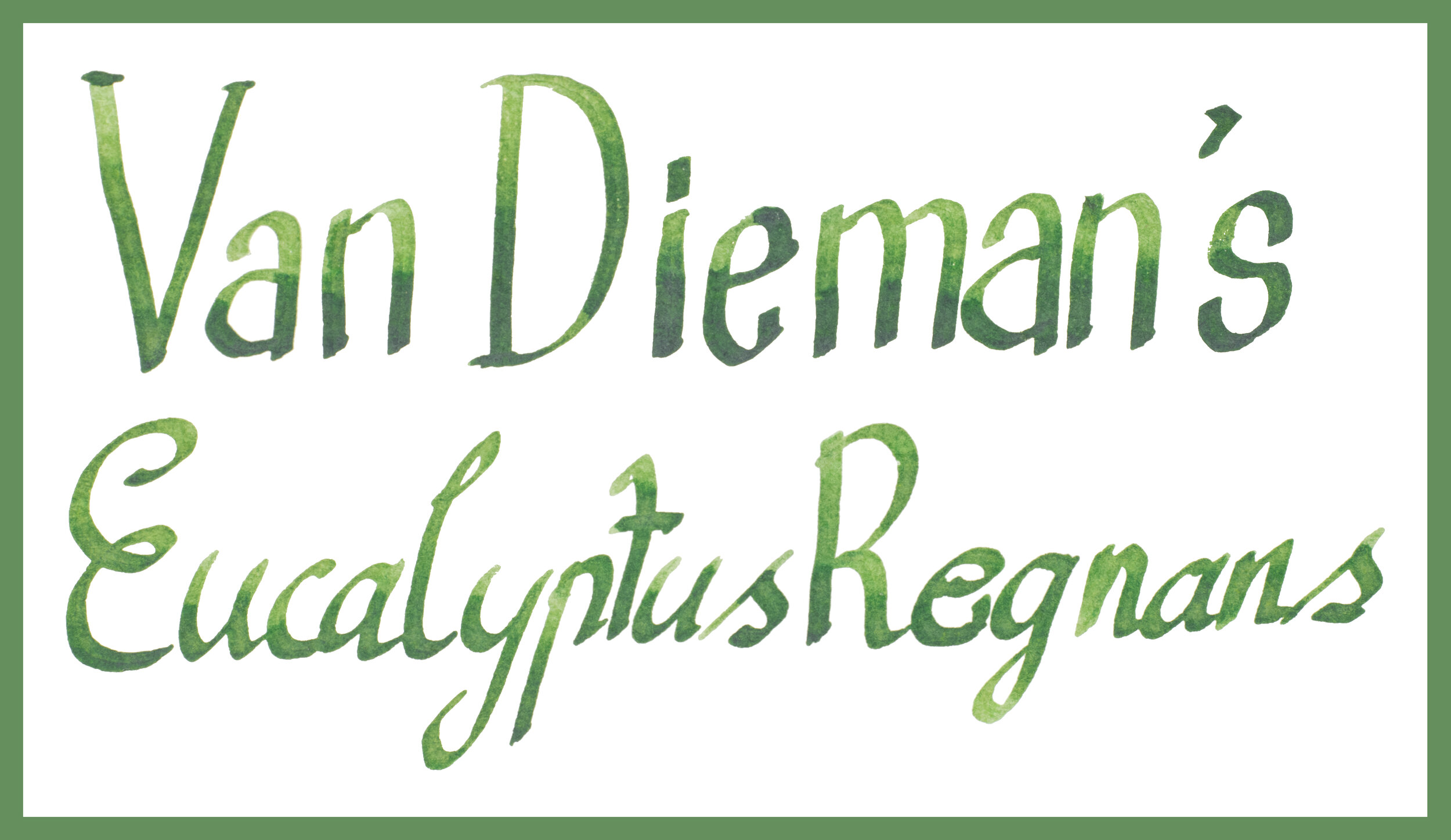
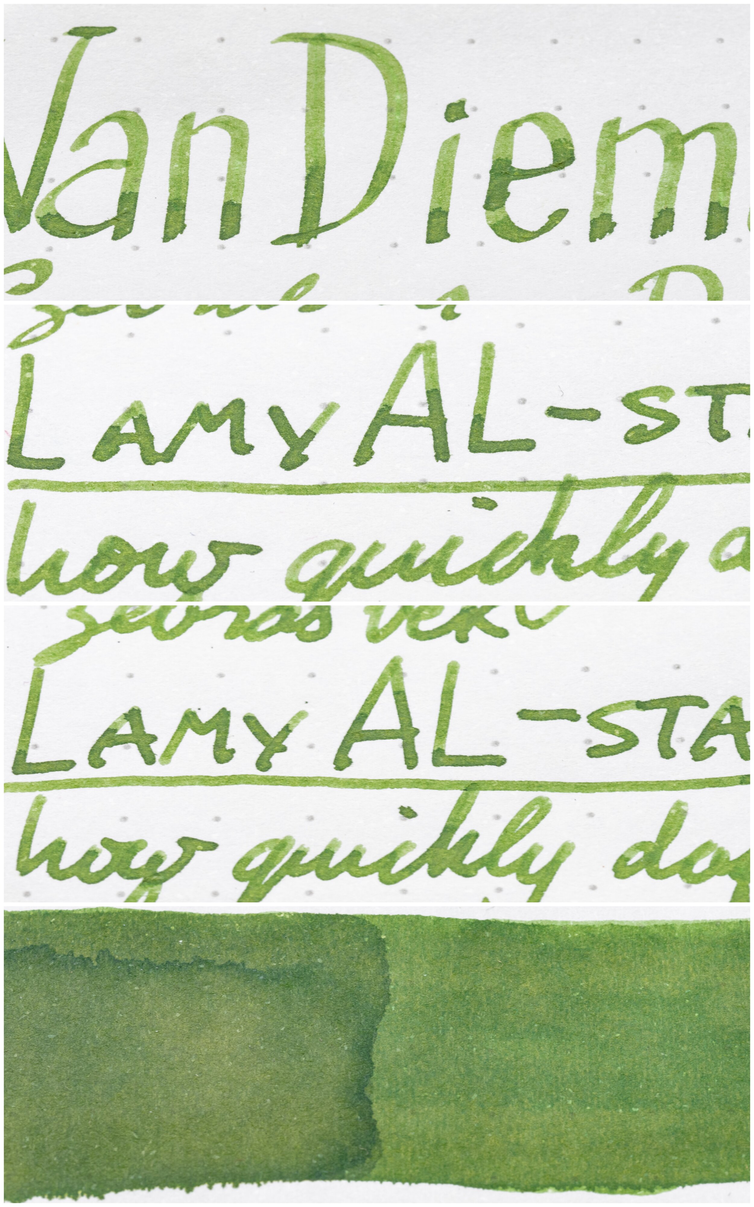
Van Dieman’s Eucalyptus Regnans is a well saturated, moderately light, and mostly warm green. It changes colour a little depending on the paper becoming warmer or cooler in tone.
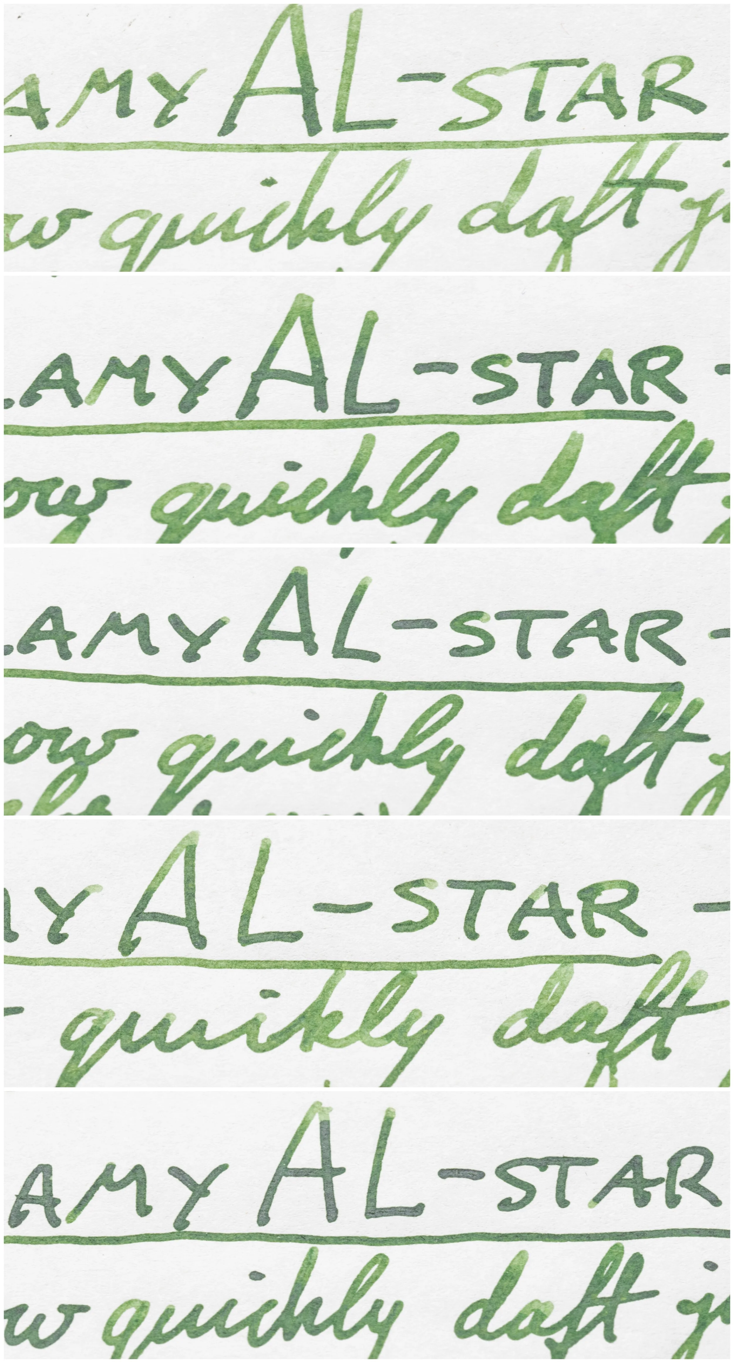
The ink is moderately to decently wet and lubricated giving a smooth writing experience. It isn’t as wet as your average Iroshizuku or Sailor ink but it’s far from dry and wetter than average. On fountain pen friendly paper there is no poor performance characteristics such as feathering, bleeding or spread. On unfriendly paper it still performs quite well. Examples of the ink on 16 different paper types is at the end of the review.
My bottle of the ink comes in what looks like a Parker Quink bottle which isn’t my personal favourite look! However, Van Dieman’s have changed their bottles a few times and seem to have settled on a simple square bottle - simple but nice!
Nib and Pen details
I used a Lamy AL-star Black pen for this review and six different stainless steel Lamy nibs on that pen. The choice of pen (be that Safari, AL-Star, Vista or Studio) will have little impact in the writing performance. I will not use a Lamy Dialog because there is the rare chance of the nib drying out slightly which might affect the writing performance.
Lamy 1.5 Stub: this nib is moderately wet to write with (this is used for the brand and ink name title);
Lamy 1.1 Stub: this nib is on the drier side;
Lamy Broad: this is a wet;
Lamy Medium: this is a very wet nib;
Lamy Fine: this nib is moderately dry; and
Lamy Extra Fine: this nib is moderately wet.
I also use a fine JoWo nib attached to a James Finniss Serendipity (from Pensive Pens) for the comparison ink names. This nib’s wetness is moderate but the feed is primed which gives it a wetter character than would be a normal writing experience. This generally as the effect of reducing shading and luminosity, while increasing sheen and saturation. The possibility of feathering and bleeding is also slightly increased. This is still more accurate than a dip pen or a glass pen in my experience.
52gsm Ivory (White) Tomoe River
On Tomoe River Paper you get some variation with the warmth of the tone of the ink. When the line or swatch is light then the ink presents on the warmer side but when the ink is thicker or more saturated then it becomes cooler (before eventually losing a lot of saturation with the third application of ink on the swatch - not uncommon with inks on Tomoe River).
Pen + Message Quadrifoglio: is a little darker and a touch cooler;
Pelikan Olivine: is less saturated, lighter and much cooler;
Kyo no oto 08 Unahairo: is also much cooler, less saturated and much lighter';
Diamine Mistletoe: a similar lightness but less saturated;
Robert Oster Eucalyptus Leaf: darker and warmer;
Robert Oster Lemon Grass: lighter and a little less saturated; and
Robert Oster Avocado: much lighter and also desaturated but a similar hue.
Diamine Mistletoe is probably the closest on Tomoe River with Lemon Grass and Quadrifoglio not a long way behind.
Sheen
This ink has some lovely shading! Decent contrast with moderate frequency and a varying gradient depending on the writing and nib. There is a very subtle halo if you look very closely but in practice not much.
The sheen is essentially non-existent; if you ever see some it is silvery.
Robert Oster Avocado is the closest in that it presents with no sheen at all. The rest have a dull muddy silver or a dull copper (and even then mostly just in the swatches).
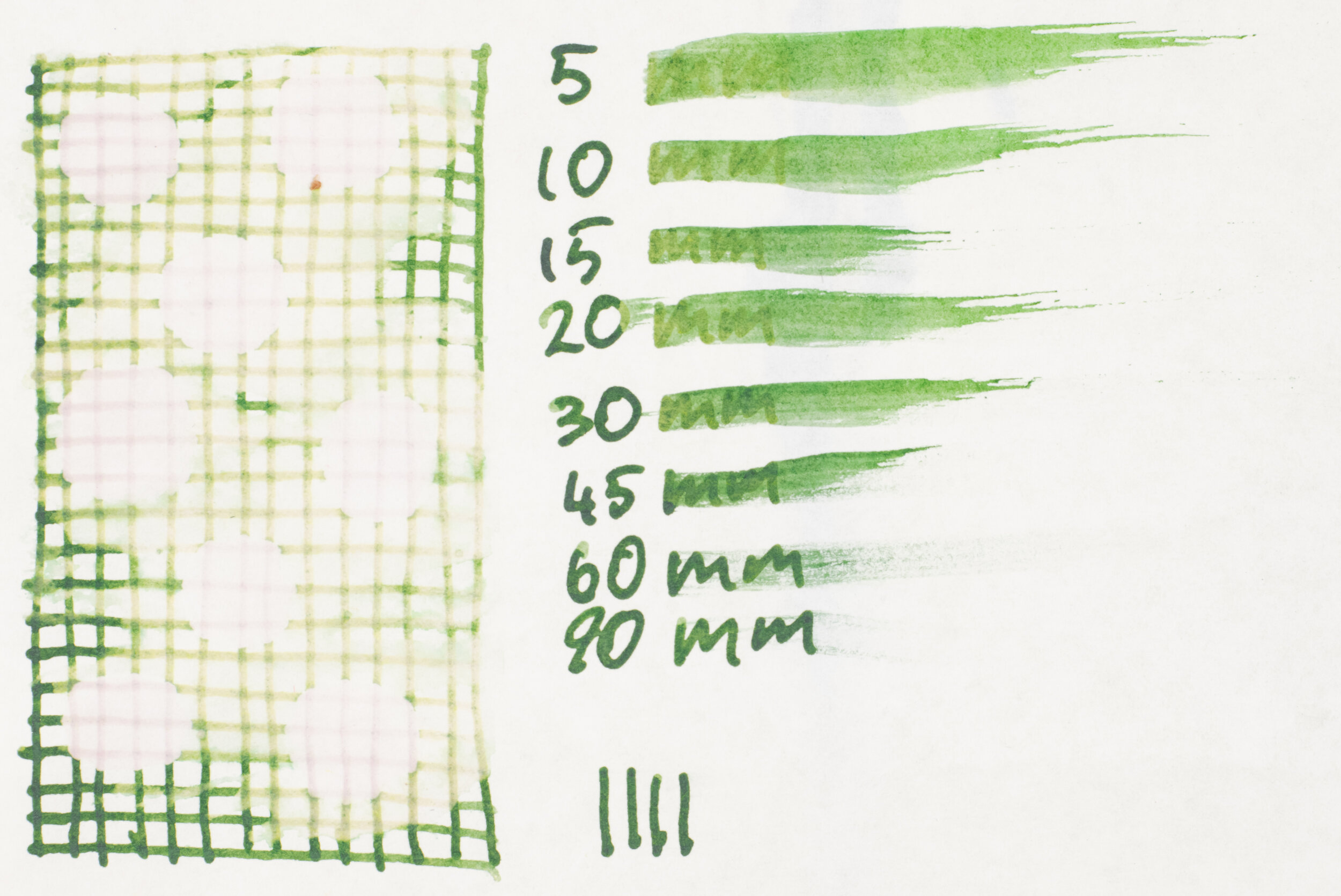
The chromatography is pretty and complicated for what looks like a simple colour. Starting with a pale dusty pink it becomes a dirty yellow-green before becoming a light saturated green that becomes darker before ending with a thin strip of vibrant azure.
Water resistance is non-existent apart from some very faint pink lines. There is no smearing and the ink takes a little longer than normal for Tomoe River to dry.
80gsm White Rhodia
On Rhodia the opposite happens to Tomoe River; the thicker and more saturated the warmer it gets! The ink also starts a little warmer and darker than Tomoe River.
Pen + Message Quadrifoglio: is cooler and darker;
Pelikan Olivine: is much cooler and a little darker;
Kyo no oto 08 Unahairo: a little lighter, less saturated and much cooler;
Diamine Mistletoe: a little cooler but fairly similar;
Robert Oster Eucalyptus Leaf: Darker and a hair less saturated;
Robert Oster Lemon Grass: a little cooler but not too far off; and
Robert Oster Avocado: lighter and less saturated.
I feel that Diamine Mistletoe is again the closest with Lemon Grass not too far off.
The shading is a touch weaker on Rhodia because the gradient and contrast on the cursive writing is much more subtle. There still decent shading but not quite as strong as Tomoe River. As expected there is no sheening on Rhodia either.
Similarly, none of the comparison inks show any practical sheen on Rhodia.
Water Resistance is also less than Tomoe River with no faint pink line left behind just an even fainter green line. There is no smearing. Dry time is a touch longer than normal but essentially around average for Rhodia.
Conclusion
⭐️ = One Star
★ = Half a Star
☆ = No Star
🚫 = None/Not Applicable
(Star ratings are a rough and glanceable indication and are more quantitative than qualitative. They are not saying that something is ‘good’ or ‘bad’ but rather that, of the particular characteristic, the ink has a ‘high’ or ‘low’ amount)
80gsm White Rhodia
Shading: ⭐️⭐️⭐️☆☆
Sheen: 🚫
Shimmer: 🚫
Halo:🚫
Saturation: ⭐️⭐️⭐️★☆
Luminosity: ⭐️⭐️★☆☆
Feathering: 🚫
Bleeding: 🚫
Flow: ⭐️⭐️⭐️★☆
Dry time: ⭐️⭐️☆☆☆
Smear: 🚫
Water Resistance: ★☆☆☆☆
52gsm Ivory (White) Tomoe River
Shading: ⭐️⭐️⭐️★☆
Sheen: 🚫
Shimmer: 🚫
Halo:🚫
Saturation:⭐️⭐️⭐️★☆
Luminosity: ⭐️⭐️⭐️☆☆
Feathering: 🚫
Bleeding: 🚫
Flow: ⭐️⭐️⭐️★☆
Dry time: ⭐️⭐️☆☆☆
Smear: 🚫
Water Resistance: ★☆☆☆☆
A lovely green ink the good performance and nice shading. There’s some interesting colour variation on different papers as well as good performance on unfriendly paper. Van Dieman’s Eucalyptus Regnans is well worth trying out and is AU$12.95 for 30ml and AU$19.95 for 50ml from the maker. Van Dieman’s ink is well stocked throughout Australia and is also available from Pen Chalet in the US for US$12.95 for 30ml.
If buying from Van Dieman’s directly use “MACCHIATOMAN10” for 10% off and if buying through Pen Chalet use “MACCHIATOMAN” for 10% off as well!
✒︎ ✑ ✒︎ ✑
Thanks for reading! If you have any questions, comments or suggestions please let me know in a via the comments, Instagram, or contact me directly.
You can find my ink collection here and my pen collection here. Is there something you’d like reviewed? Let me know!
For blog updated you can follow @macchiato_man on Twitter, subscribe via email, or like my Facebook page. Check out the sponsors of this blog as well!
I was not compensated for this review and everything here is my own honest opinion. There are no affiliate links in this review. I purchased this ink myself but I was given a 15% off code to use.
