Van Dieman’s Ink is an Australian two-person team ink manufacturer that somewhat new to the market who, like Robert Oster, started on eBay. They were the Jinhao Australia distributor back then and were branded as such but now they have broadened out to their own brand with a decently large selection of inks. There are five series of inks: The Original Colours of Australia (the inks they first made), The Hollywood Series, The Wilderness Series (the latest release), Pigment Inks, and The Midnight Series which Bonfire Night is from.
Anthony van Diemen, a Explorer, in an effort to explore the "Great South Land” - subsequently named "Nieuw Holland” and eventually Australia - sent Abel Tasman on an exploration mission. When Abel Tasman discovered the large island below the mainland of Australia he, thinking it was a large territory, named it Van Dieman’s Land after his patron. Eventually it would be renamed Tasmania.
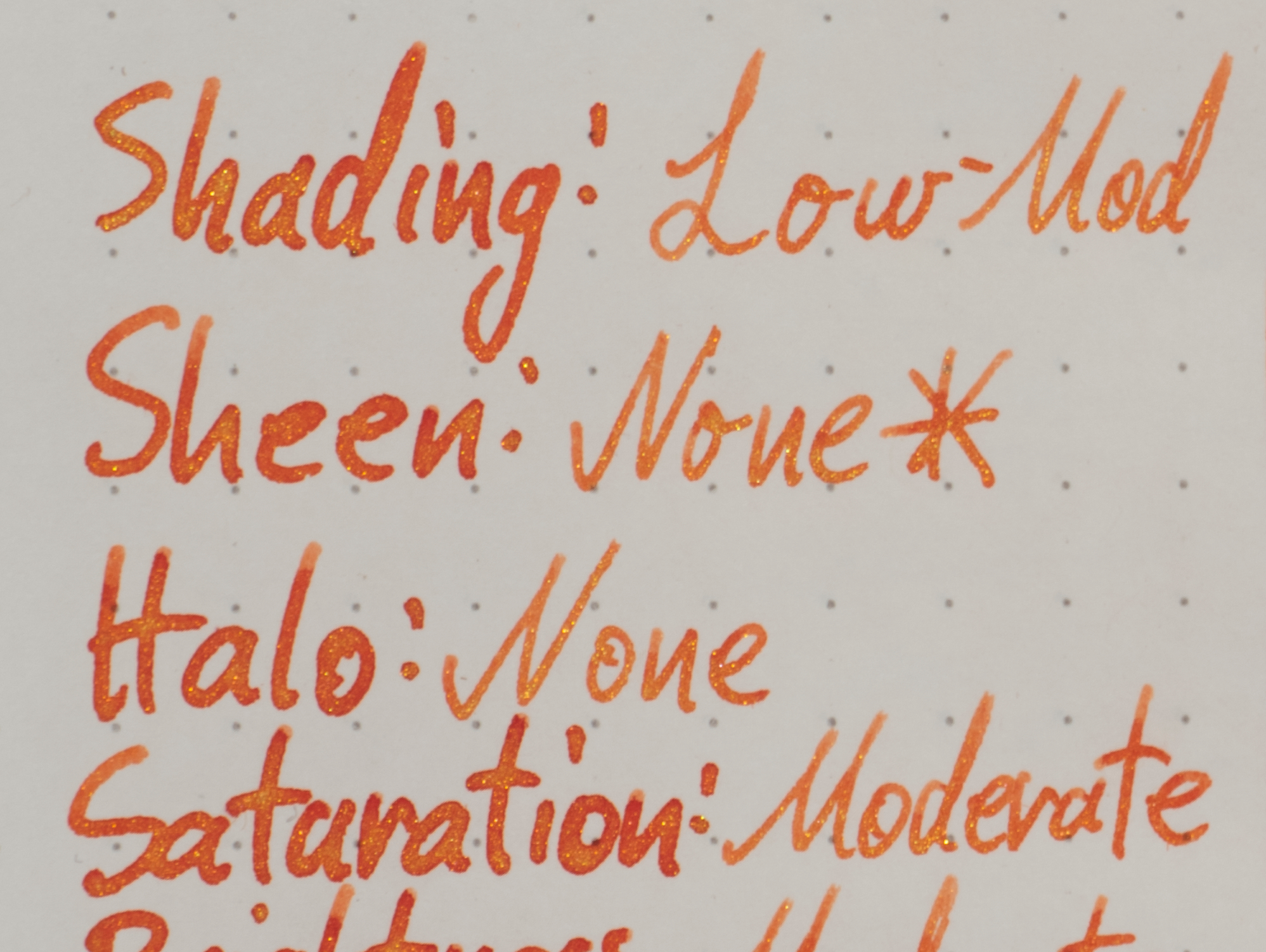
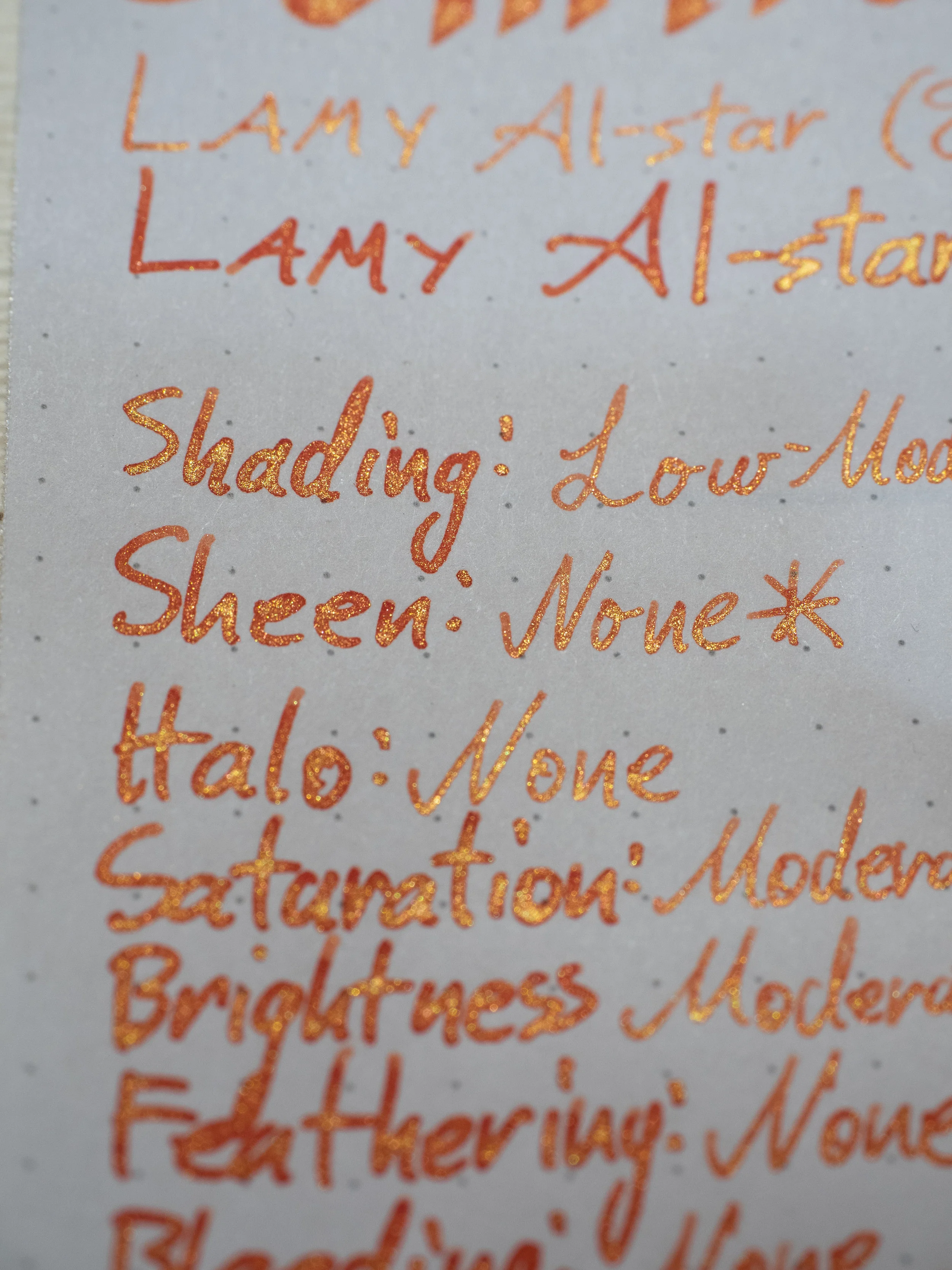
Bonfire Night, from the Midnight series (described as “eight fountain pen inks inspired by the dark and sombre hues that come out when the sun has gone away”), is a red-orange ink with yellow-gold shimmer (not sheen). The ink colour changes somewhat depending on what paper it is on with some papers looking more red or more yellow and some showing more saturation or contrast than others. The gold-yellow shimmer makes the ink look like a highly saturated pure orange but it’s the combination of the red-orange and the gold-yellow that gives that impression rather than the colour of the base ink itself.
The ink is moderately wet and lubricated and on the lower side for a shimmering ink. Most shimmering inks have quite a bit of lubricant in them and this doesn’t feel like it has quite as much. That doesn’t mean the ink feels dry to write with, however; it’s relatively moderate. The ink performs well on most papers with only a little feathering and some spread on poor quality paper. One of the benefits of shimmer over sheen, however, is that you get it regardless of the paper; you can see the shimmer just as strong on Tomoe River as Copy Paper! There is no clogging, even after days of non-use. No hard starting and appropriate flow.
Shading generally ranges from low to moderate. There isn’t a whole heap. There’s definitely some but the contrast isn’t high. As expected there is less shading on Tomoe River.
This is the section where I usually talk about the sheen if there is any. There’s is absolutely no sheen on this ink whatsoever. However, there is quite a lot of shimmer! With a wetter nib the ink can be quite sparkly. As with most sparkling inks priming the nib and agitating the ink in the pen creates more shimmer on the written line but at no point did the shimmer stop flowing even after days of non-use. On finer nibs the shimmer is less prominent (and this is coming from the same pen but a drier nib).
As mentioned one of the benefits of shimmer over sheen is that you don’t need anything special in terms of paper. Usually Rhodia paper is quite conservative regarding sheen but with shimmer it displays as much has it did on Tomoe River and other papers.
There is a very faint pink line left behind from the water but it’s not strong. You might be able to see some of the written line after water has washed most of the colour away but I wouldn’t want to rely on it.
The chromatography is interesting! The shimmer particles stay where the line was written, expectedly, and there’s a pink gradient that gets more saturated ending in a vibrant pure yellow.
Dry time is moderately quick on Rhodia but very slow on Tomoe River. You expect longer dry times on Tomoe River but it’s a surprise when the difference is this large!
On Rhodia the inks has more shading and saturation when compared with Tomoe River and and the base ink colour appears as a a more yellow-orange. There almost no smearing but there is a very slight amount of smearing of the particles. Better than I expected!
I don’t have many shimmering inks and only two that come close to the colour range of this ink, unfortunately!
Diamine Inferno Orange: is more yellow leaning;
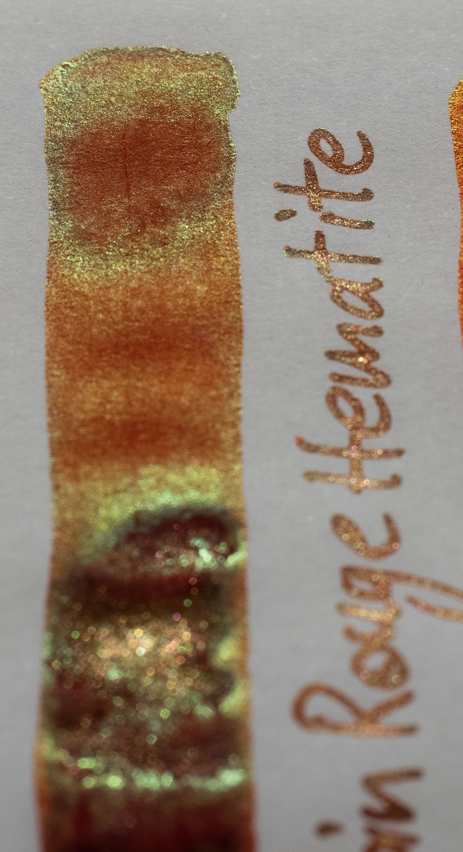
J. Herbin Rouge Hematite: is darker, redder, and less saturated;
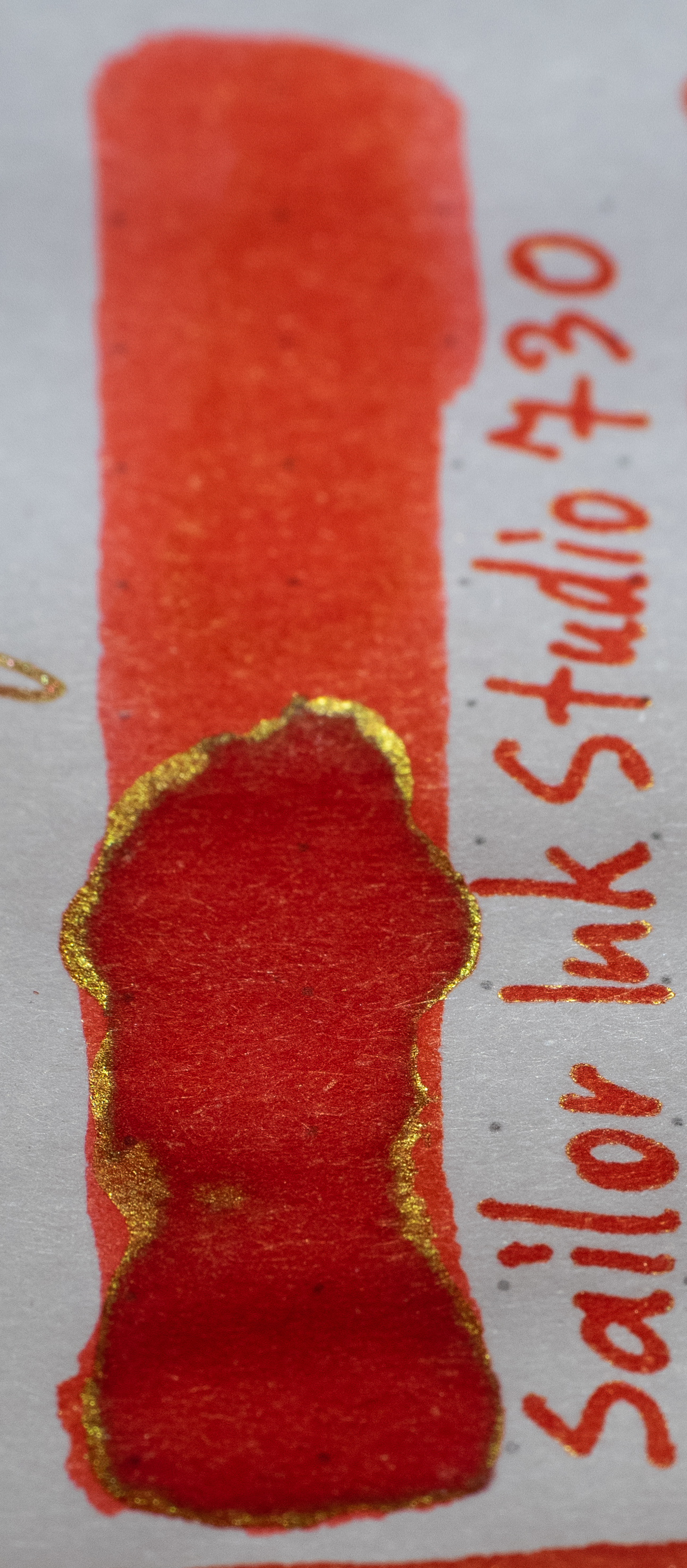
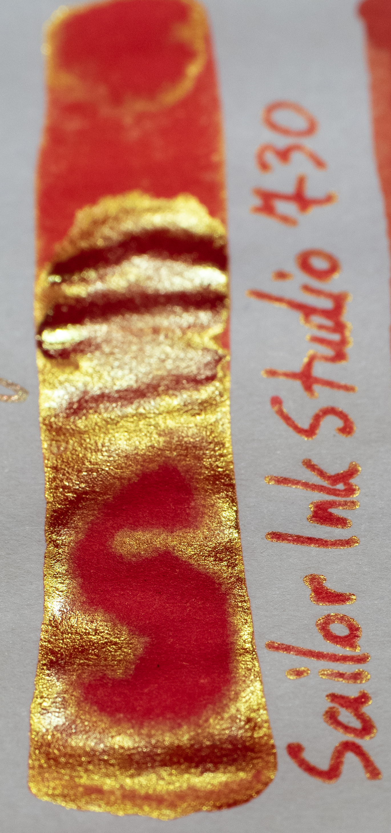
Sailor Ink Studio 730: Is redder (or pinker);
Robert Oster Direct Sun: Is darker and redder;
Robert Oster Fire Engine Red: is darker and redder; and
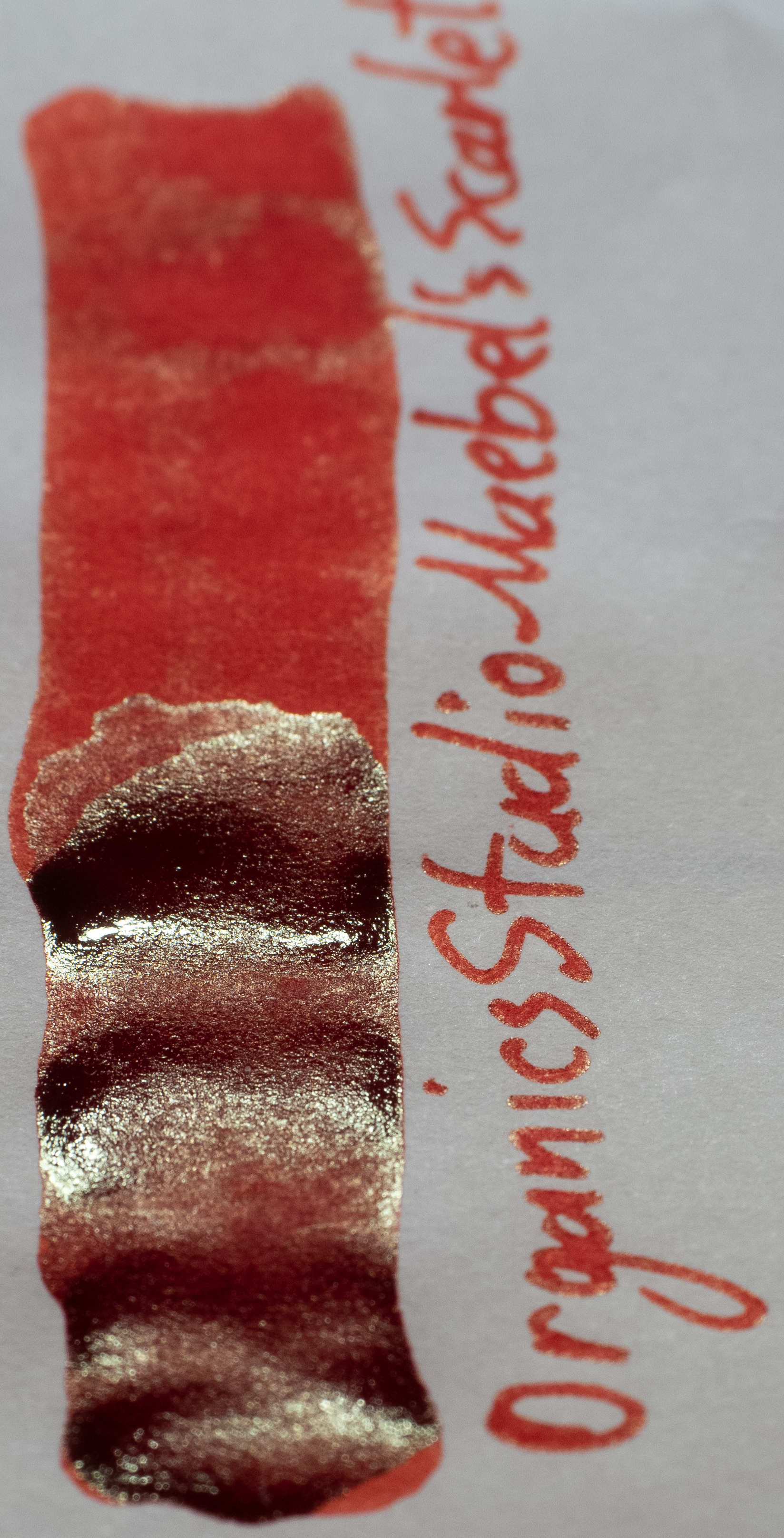
Organics Studio Maebel’s Scarlet: which his also darker and redder!
The obvious choice from this limited list is Diamine Inferno Orange!
The shimmer on Diamine Inferno Orange is the same colour and a similar amount. I also feel the shimmer has finer particles than J. Herbin Rouge Hematite (which has less shimmer than Bonfire Night) . Sailor Ink Studio has some gold sheen but it presents quite differently to shimmer and is less obvious on Rhodia.
On Tomoe River the ink is less saturated and also redder. There is the same amount of smearing of particles and lack there of for the base ink.
Diamine Inferno Orange: is move noticeably yellower and also more saturated now;
J. Herbin Rouge Hematite: is still darker but not as much so;
Sailor Ink Studio 730: is redder and much more saturated but not as pink;
Robert Oster Direct Sun: is fairly similar but a little darker;
Robert Oster Fire Engine Red: is also somewhat similar but darker and redder; and
Organics Studio Maebel’s Scarlet: is more saturated and a bit darker.
Again the obvious similar ink is Diamine Inferno Orange but it’s even less similar on Tomoe River. Robert Oster Direct Sun is not too dissimilar in hue but isn’t the same brightness. As we see below the amount of sheen from Sailor Ink Studio 730 makes it a little closer this time.
The shimmer is the same here as on Rhodia, naturally. The green sheen from J. Herbin Rouge Hematite is more obvious here which isn’t very similar. Sailor Ink Studio 730 has very strong gold sheen which is now comparably in its effect to the shimmer of Van Dieman’s Ink Bonfire Night. The rest of the inks have a subtle silver sheen that is not that reminiscent of Bonfire Night.
As expected with a shimmering ink cleaning took more effort than usual. I lost patience using the bulb syringe as I could still see shimmer in the feed. Removing the feed and cleaning it that way made it a lot quicker. I’d definitely prioritise pens that can be cleaned easily!
I’ve never been a huge fan of shimmering inks - I much prefer sheen - but sheen has it’s benefits over sheen in that it doesn’t matter what pen, nib or paper you use; you will always get some shimmer. Sheen is very fussy with regards to the circumstances required for sheen to develop. Shimmer is a fun and somewhat ostentatious look. it isn’t a subtle look but that isn’t a down side; it’s just something to consider. You probably wouldn’t use this ink for the board room meeting’s minutes but this is great for journaling, letters and notes. Things were having fun is allowed! I like that this ink is more complicated than a yellow-orange ink with yellow-gold sheen. The red leaning base ink makes the ink a little more interesting. This is a fun ink and it’s fun to use (even though I’ll still stick to sheen!).
I received this ink at a discounted rate but I did pay for the discounted ink with my own money. Van Dieman’s Ink were also kind enough to offer readers of this blog a 10% off code: “MACCHIATOMAN10. I think they are interested
As usual, below is the ink on various papers but this time as a single image collage.
I've listed all my inks and all my pens in their respective pages. Please let me know which inks you'd like to review next via the comments, Twitter, Instagram, or contact me directly.
For blog updated you can follow @macchiato_man on Twitter, subscribe via email, or like my Facebook page.
I was not compensated for this review and everything here is my own honest opinion. There are no affiliate links in this review.
