Last year when I traveled to Japan I generally wanted to avoid buying stuff I knew I could easily get outside Japan. This included Sailor Ink Studio which I had heard was eventually going to be available to retailers outside Japan. Nevertheless I still wanted to try them out so and I grabbed Ink Studio 935 and 941 as they caught my eye the most (it was still a difficult decision!). I love purples and this reminded me of Dark Lilac (one of my favourite every inks) so I think it was a good choice. If you are interested in how Ink Studio sits within the rest of the 100 total inks check out this extensive overview of all inks!
The ink is a dark purple that definitely leans a little magenta and isn’t a blue-leaning purple. It’s a deep and relatively rich colour but I wouldn’t consider this extremely high saturation, just high saturation. It’s got some nice darkness to it. It’s a saturated sailor ink so it performs just the same as almost every other saturated sailor ink. Sailor inks are wet, well lubricated and have no issues on any fountain pen friendly paper (and expected results on poor quality paper).
The ink comes in the beautifully minimalistic small 20ml Sailor bottle. This was something I didn't ’t really cover much in my overview of the 100 was the bottle. Sailor recently changed their ink line up to these 20ml bottles but what I love about the bottles is the design of the label. They use minimalism to get utility rather than minimalism for aesthetic reasons only (which, arguably, isn’t real minimalism). You get the number (which is the ink name) printed clearly on top, you get a very simple approximation of the ink colour (but, to be honest, it’s a pretty poor approximation some of the time), and then the brand down the bottom. Very simple and nice but you get all the info you need. The decision to not bother to give the inks a mostly arbitrary name also fits the nice minimalistic approach.
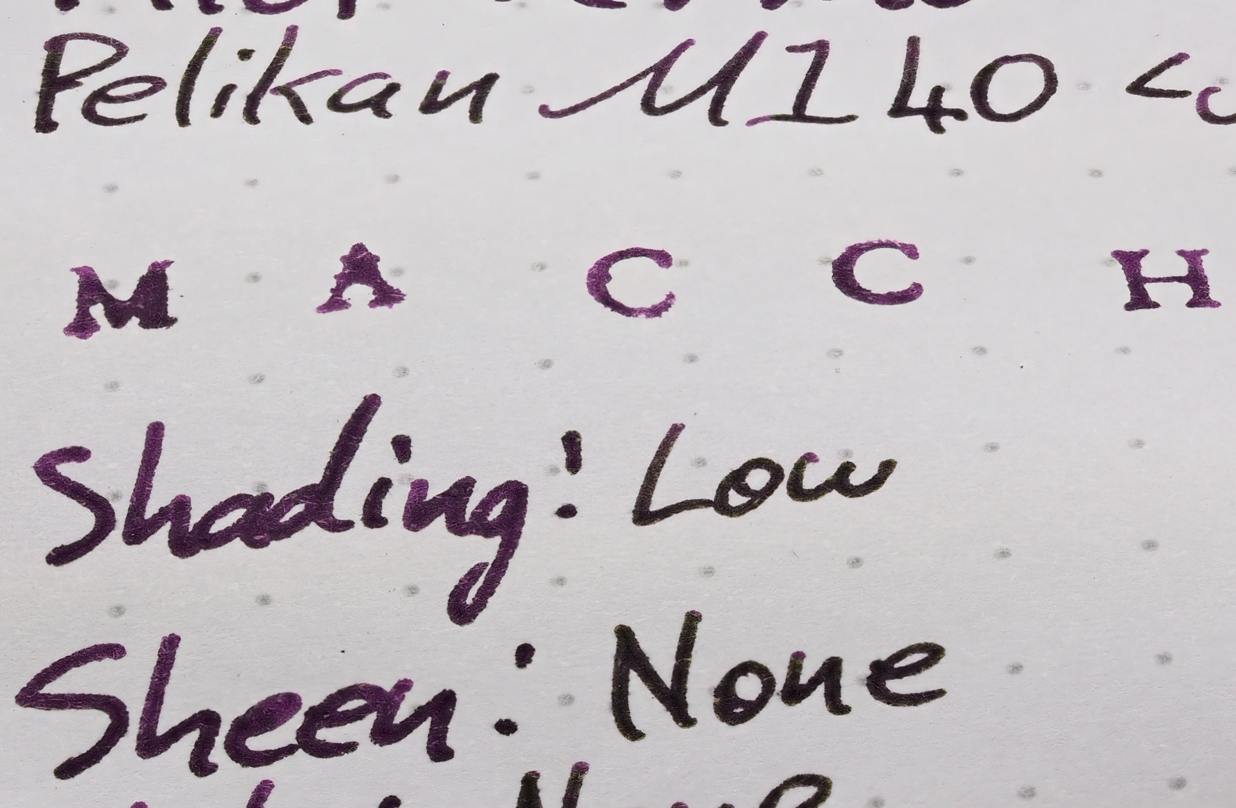

There is some shading but as with a lot of sailor inks, especially the higher saturation and wet inks, the shading isn’t that contrasting. It’s still there and you can see it but it’s not much. Dryer inks do a much better job with shading but they are also dryer so that’s the compromise you need to choose. I choose a nicely lubricated ink.
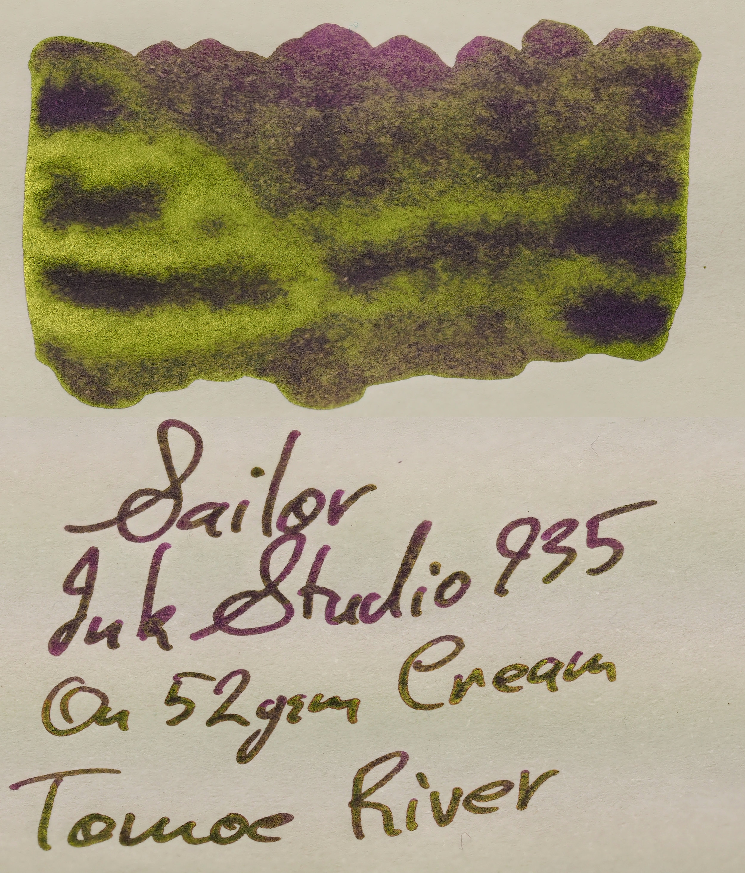
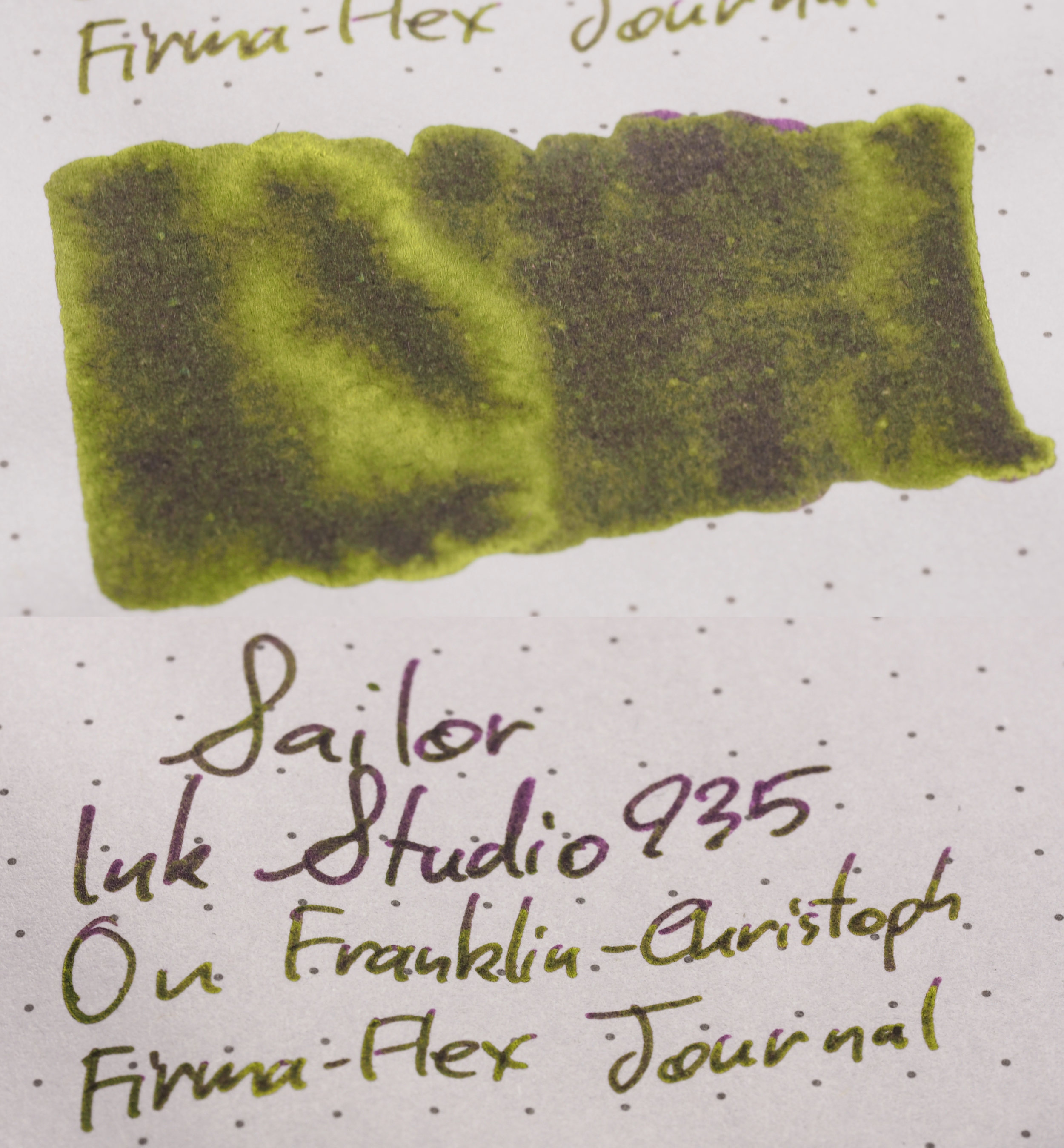
Sheen on Ink Studio 935 is very high but only on the right paper. The sheen is green that leans golden. On Tomoe River the sheen covered pretty much the entire line on the Pelikan M140 Medium (which writes more like a European Fine). This is wet pen and the thin line means the ink pools quite a lot and so more sheen develops. There is still a decent amount of sheen in the Pilot Fermo which is a little dryer and a bit broader.
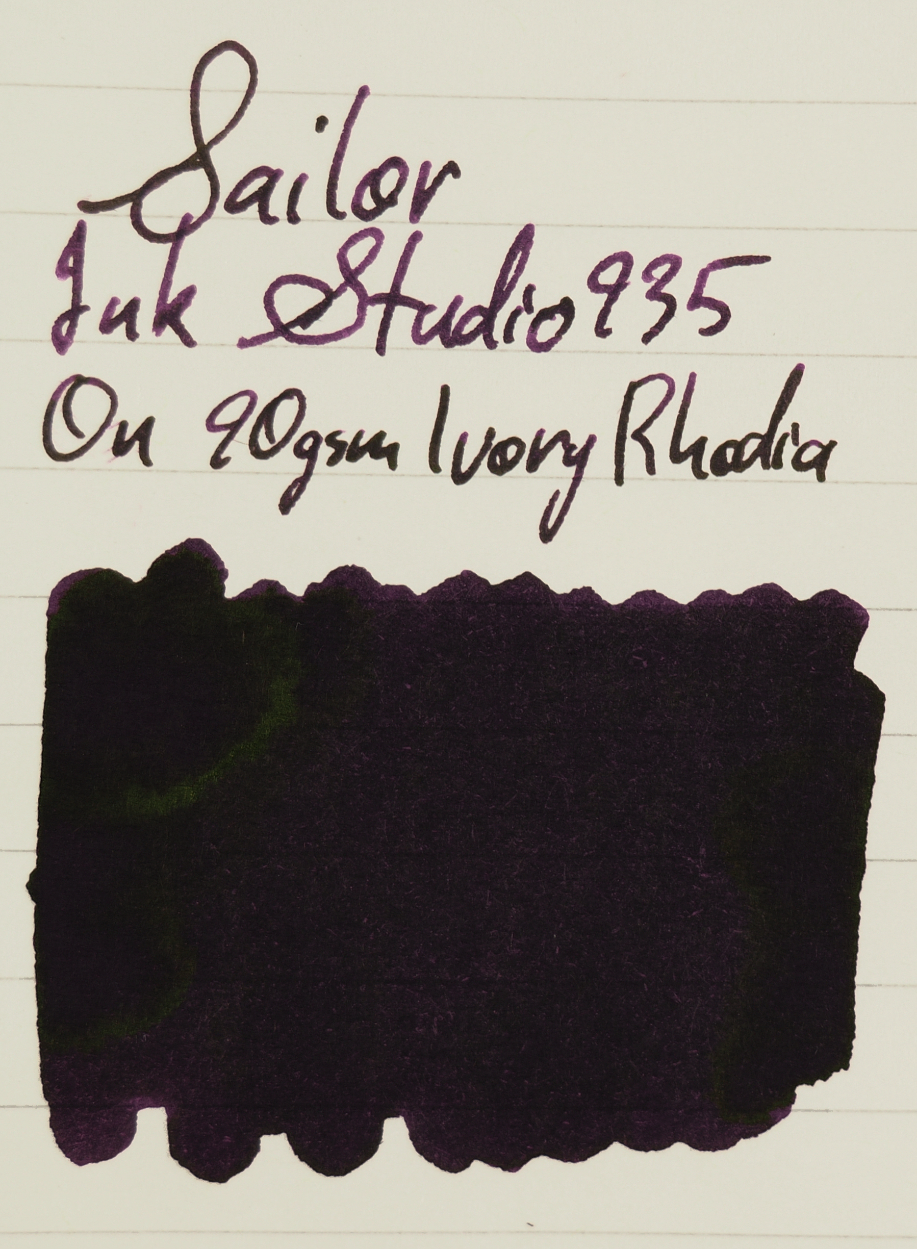
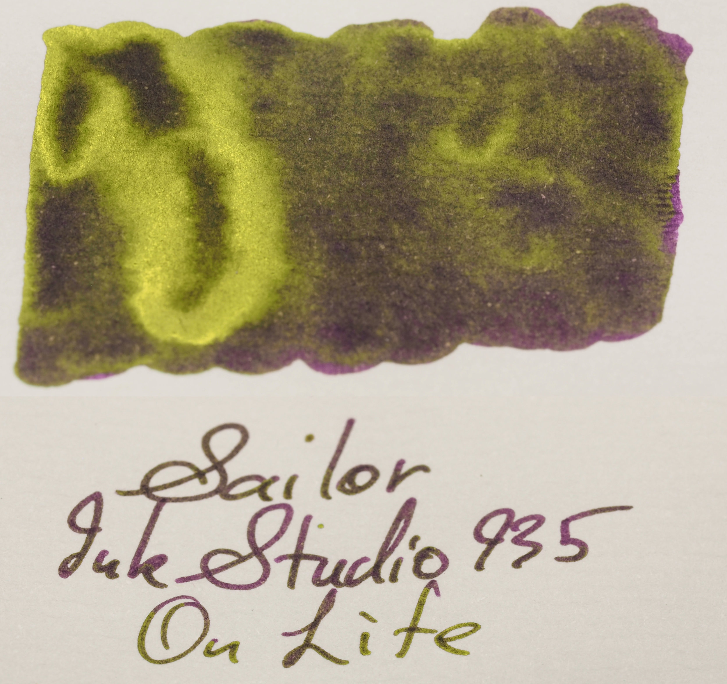
On Rhodia, however, there is very little sheen (as you can see above on the photo where shading is discussed). There is the slightest hint in some places but from a practical sense I’d say there is no sheen which is a surprise. Most of the other fountain pen friendly papers showed sheen.


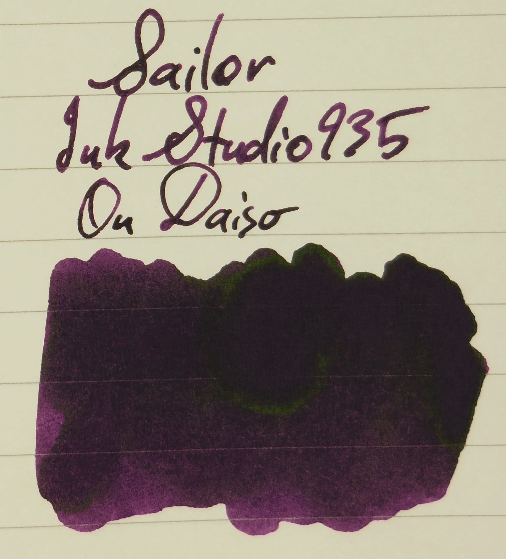
Even this older Leuchtturm1917 (which I believe is poor quality paper, newer Leuchtturm1917 papers are better) shows sheen. The 90gsm Rhodia paper has some sheen and certainly more than the 90gsm white Rhodia the review is on. The ivory 80gsm Rhodia only really has sheen on some areas of the swatch. There is no sheen on Daiso paper (which is a bit of a surprise) and Clairefontaine (which isn’t; this paper often flattens ink and is somewhat absorbent).


Chromatography is not unexpected but it’s pretty. The mostly magenta colour which goes from a light to a dark shade with the turquoise to introduce some blue seems a common dye combination for these types of inks. The dark somewhat permanent-looking blue-grey line at the top is interesting!
Dry time is about average on Rhodia but is slower on Tomoe River - I find around 60 seconds to be around average for 52gsm Tomoe River.
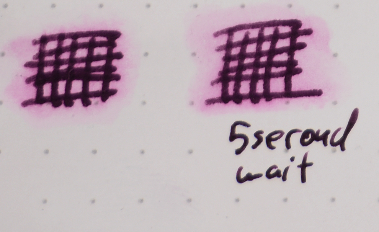

Water resistance is surprisingly decent with the full line still being easily readable after spilling water on it. It even keeps its colour for the most part. The dye does spread over the paper but if you spill water over you writings they won’t be lost!
The colour of the ink remains mostly consistent on various papers though there is some variation in shading. The ink is nice and dark on Rhodia paper though it is a little flat. As mentioned there is almost no sheen here at all which I think contributes to the flatter looks as well. There is no smearing and the paper doesn’t feel as smooth and wet as on Tomoe River. All these things are because the paper absorbs the ink quicker.
I have a few darker purple inks but the main comparison is definitely with Lamy Dark Lilac which is a now rare ink with a hefty price tag on the second hand market.
Diamine Cult Pens Deep Dark Purple: is too dark and too red leaning;
Diamine Flower Set Pansy: is a little to blue leaning but similarly shaded;
Lamy Dark Lilac: Is darker and richer in shading and colour (ignore the feathering it must have been hand oils);
(Sailor) Giftionery Delta Tsuyuten Murasame: is quite similar to 935 is shading and colour. If anything it’s a little less saturated (ignore the feathering it must have been hand oils);
Krishna Anohki: Surprisingly similar again but also again is less saturated;
Krishna Snake Boat: like Deep Dark Purple is way too dark and too red leaning but this time is lacking a bit of saturation as well.
I think the closest to this is Giftionery Delta Tsututen Murasame but as that ink is pretty difficult to get outside of Osaka, Japan the best option would probably be Krishna Anohki as it fairly close to the characteristics of Sailor Ink Studio 935.
As for Lamy Dark Lilac, I consider this to be a decent alternative. It doesn’t quite have the “Dark” of Lamy Dark Lilac, and it isn’t quite the same hue but it isn’t bad. Especially on Rhodia.
Ink Studio 935 is a little lighter on Tomoe River than on Rhodia. It also feels less flat both because of the obvious sheen but also there’s more shading. This is usually not the case as Tomoe River often flattens inks compared to Rhodia.
On Tomoe River the compared inks are a little more varied than when they were on Rhodia.
Diamine Cult Pens Deep Dark Purple: is still too dark and too red but much less so than on Rhodia;
Diamine Flower Set Pansy: is still a little too blue leaning but also is too saturated;
Lamy Dark Lilac: feels closer in hue but is still too dark and too richly coloured;
(Sailor) Giftionery Delta Tsuyuten Murasame: iis darker than Ink Studio 935 now but otherwise still fairly similar;
Krishna Anohki: has noticeably more sheen and is difficult to see the ink colour under neither but from what we can see it looks fairly similar in hue and shade;
Krishna Snake Boat: is… no longer a purple. It is now only a green-gold sheen. Wow!
Would have to pick Krishna Anohki again even though it has a stronger sheen than 935. Krishna Snake Boat is amazing here though. Not at all similar but that is a lot of sheen!
Dark Lilac is still too dark and too rich and because 935 is lighter on Tomoe River I feel the difference between the two is even stronger. Still not a terrible alternative but it wouldn’t satisfy me (I am picky though!).


As for sheen, Ink Studio 935 has a gold-green sheen that is very similar to that of Giftionery Delta Tsuyuten Murasame which isn’t exactly a surprise because they are both Sailor made inks. Krishna Anohki is similar but more lime green and less gold-green. Diamine Flower Set Pansy is a green-gold coloured sheen (meaning it seems more gold leaning than 935 seems green leaning). Diamine Cult Pens Deep Dark Purple is a straight green ink with no gold at all - actually quite nice! Lamy Dark Lilac has one of the truest “gold” sheens of inks out there. Perfectly compliments the ink colour. This might be a major difference for you when trying to find alternatives to Lamy Dark Lilac. Finally Krishna Snake Boat is just all gold. It isn’t as purely gold coloured as Lamy Dark Lilac as there is a hint of green but it’s literally all that colour!
If you like wet smooth ink and you like darker purples then you really can’t go wrong with this ink. It’s a beautiful dark purple with some lovely (but not over the top - looking at you Krishna Snake Boat!) sheen. There is some shading but I wish there was more (though I understand why there isn’t!). It isn’t the cheapest ink but the label design is lovely. As for whether it’s a good-enough alternative to Lamy Dark Lilac it depends on what caveats you can accept. It’s in the ball park but it isn’t as dark, isn’t as saturated and has the wrong coloured sheen. For me the most important aspect of Dark Lilac is the “Darkness” of it. For me this ink comes close but not quite. I don’t mind the green vs gold sheen (but I know others do). So you have to decide whether the differences are too much for you or not. Ignoring Lamy Dark Lilac, it’s still a solid ink and is really quite eye-catching on ivory (white) Tomoe River paper (both 52gsm and 68gsm).
I purchased this ink from Itoya in Tokyo but as part of the whole set I bought it from Pen Classics NZ. As always, photos of the ink on various papers are below.
✒︎ ✑ ✒︎ ✑
I've listed all my inks and all my pens in their respective pages. Please let me know which inks you'd like to review next via the comments, Twitter, Instagram, or contact me directly.
For blog updated you can follow @macchiato_man on Twitter, subscribe via email, or like my Facebook page.
I was not compensated for this review and everything here is my own honest opinion. There are no affiliate links in this review.