Hakase Real Sepia Dark is an ink I’ve been intrested in for quite a while and late last year I pulled the trigger. The ink isn’t a particularly exciting colour but the ink is unique because it is, as the name suggests, real sepia. It is made from actual cuttlefish ink which is one of the oldest forms of inks. The colour sepia is based on the colour of cuttlefish ink (which is this brown colour) and the name is from the Latinised Greek name for cuttlefishfish, “sepia”. Because of this I don’t believe the ink is vegan!

The ink is made from cuttlefish ink, as mentioned, which is based in pigments. Hakase’s page on the ink has the following quote about Sepia ink (it’s long but worth the read):
So the ink, which is also edible and sometimes used to color and flavor pasta in southern Italy, was a natural byproduct of the ancient fishing industry and prized by the ancient, literary cultures of Greece, Egypt, Rome and commonly used as an ink source right up until the turn of the twentieth century. Socrates, Plato, Aristotle, Solon, the Four Evangelists who wrote the Christian Gospels, Leonardo DaVinci, Rembrandt, Beethoven, Marie Antoinette, Napoleon -- sinners and saints -- all wrote with sepia ink which they would use with a variety of dip pens made from reeds, wood, feathers or metal. Some of these documents written with sepia ink which still exist today are over 2,000 years old!
In 1920, British potter Bernard Leach (1898-1972) came to Tottori, Japan with a bottle of French sepia ink. A friend of Mr. Leach, Dr. Syoya Yoshida, together with Professor Takeshi Kawasaki of Tottori University became interested in sepia ink and developed a version for production and sale in Japan. In 1936, Tottori Sepia, Inc., was patented under the name of "Sepia Ink" and sold until 1960. The ink was sold as a powdered concentrate meant to be mixed with water.
However, despite being a natural pigment with excellent light fastness and water resistance, the advent of fountain pens meant the decline of the use of sepia ink because the particles of the ink clogged the capillaries of fountain pens.
In 1970, Mr. Masaaki Yamamoto, the second generation to lead our firm, taught to make sepia ink by Dr. Yoshida and Professor Kawasaki sought to revive the production of sepia ink.
In 1985, Ryo Yamamoto, the third generation to lead our firm, extracted the ink from the cuttlefish under the guidance of Masaaki Yamamoto, creating an ink with a chemical stabilization process. However, the capillary clogging effects of the ink -- precisely the reason why sepia ink had been abandoned -- remained problematic. In 1995, Mr. Ryo Yamamoto began a decade long study, consulting paint specialists, on how to process ultrafine particles culminating in a 2005 limited edition of 100 bottles of sepia ink with a special cedar wood bottle cover.
We now have developed two varieties of sepia ink: dark and light. The light sepia ink provides for a more dry ink flow from the pen. The dark sepia ink provides a wetter ink flow. This is a way to adjust the wetness of the nib without actually adjusting the nib!
Our revised version of sepia ink is made by hand, no more than 20 bottles per month, and provides the same excellent resistance to light and water of it's ancient predecessor without the unfortunate problems of clogging which have been solved by processing the ink into ultrafine particles.
Because we can only make 20 bottles per month, our sepia ink is occasionally out of stock and generates a short waitlist. Don't worry. We'll post your shipment as soon as we make more. Included with our ink is a Material Safety Data Sheet (MSDS) in English.
The ink is very pricy at ¥7,000 (US$63/AU$88/€56/£48) for the Dark variant (¥6,000 for the Light) and that’s before shipping which is between ¥1699 and ¥2943 depending on your location. It cost me AU$118 in total (US$85/€75/£65) and that was without any import tax (which didn’t apply). That price isn’t something many will be willing to pay, I expect. That’s probably OK, though, as Hakase can only make 20 bottles per month, which they make by hand, so the price is understandable.
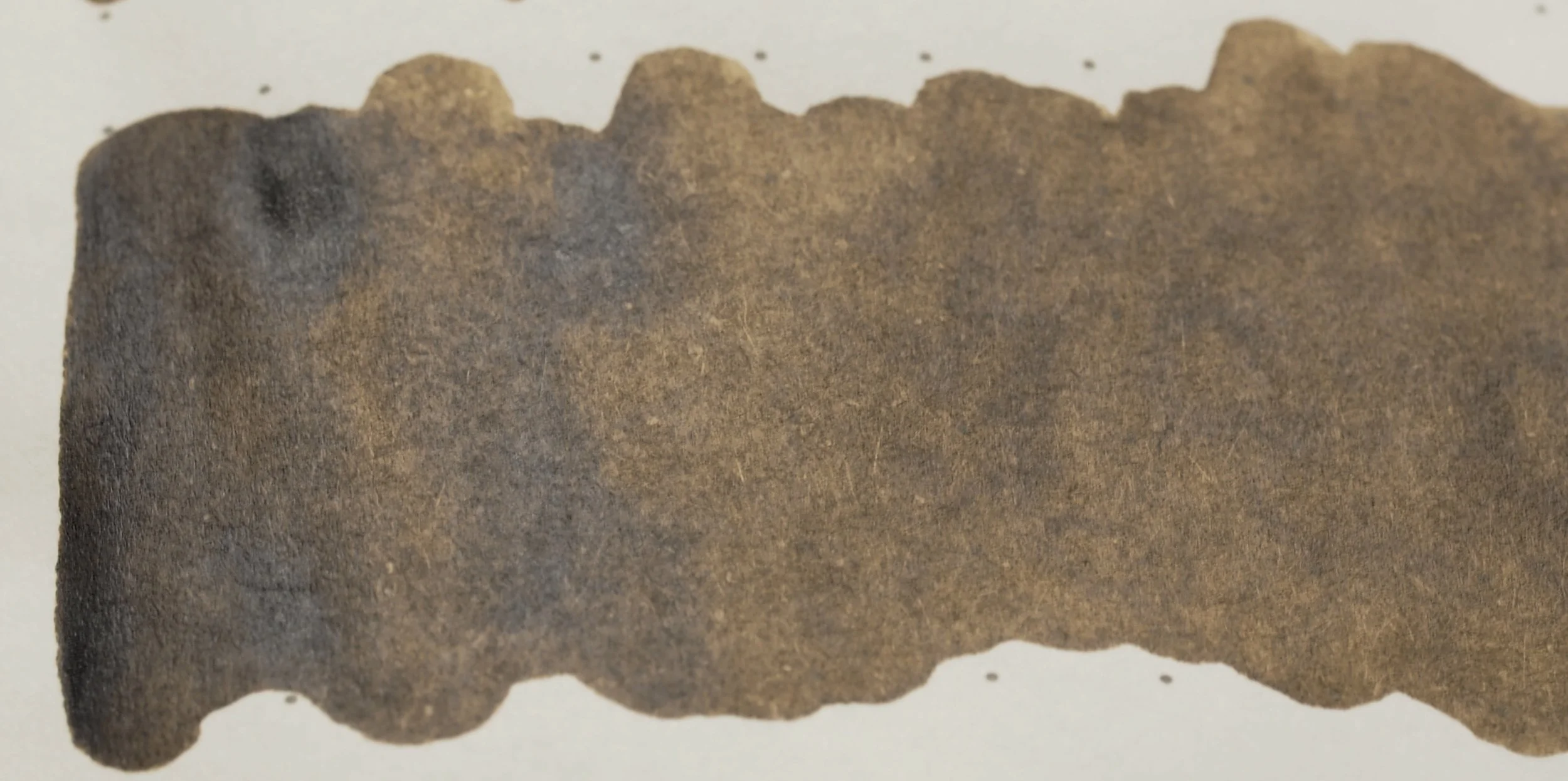
The ink has to be described as a sepia colour by default but many “sepia” named inks you will see (which are not from cuttlefish based pigments like this) often look more orange coloured and more saturated. This ink is rather desaturated, not always very dark and also has a very subtle tinte towards green and away from orange. You can see some similarities with sepia tone which is a certain type of treatment for analog black and white photographs but they are often a little redder still. As such this doesn’t really fit modern interpretation of the sepia colour.
I don’t have the Light variant of the ink, only Dark, but I find the dark, which is meant to be a wetter ink flow, to be on the dry to moderate in flow. I wouldn’t describe this as a wet ink at all (but it still isn’t dry). There’s no feathering and no bleeding.
The ink does, however, smell… It’s made from, essentially, seafood and unfortunately smells accordingly. I don’t have the best olfactory senses but people I’ve let borrow the TWSBI Eco when inked with Hakase Real Sepia Dark had to bring the feed to their nose to smell it and that’s the same for me. The bottle is very pungent in close proximity to the nose and the smell is definitely present when you bring the nib to your nose but I can’t personally smell it under normal use. The smell I would describe as a very condensed fish-like smell. It doesn’t smell rotten and and it isn’t pervasive but in close proximity it is strong.
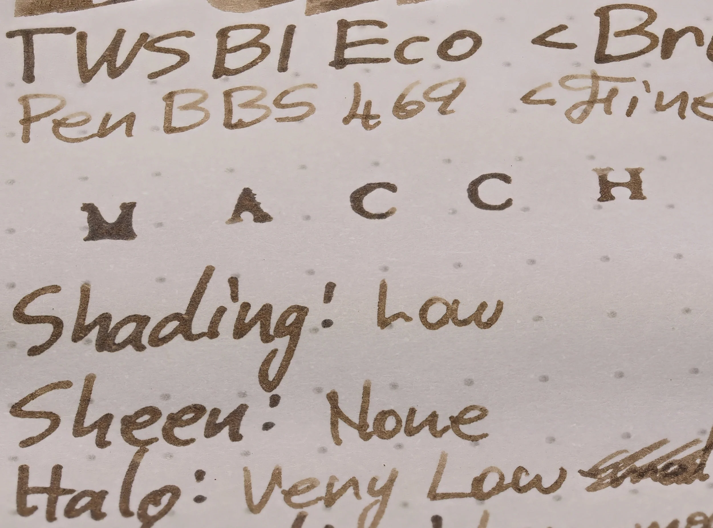

The shading is not very high and I had the ink in both a relatively wet TWSBI ECO Broad and a relatively dry PenBBS469 Fine so I should have seen some.


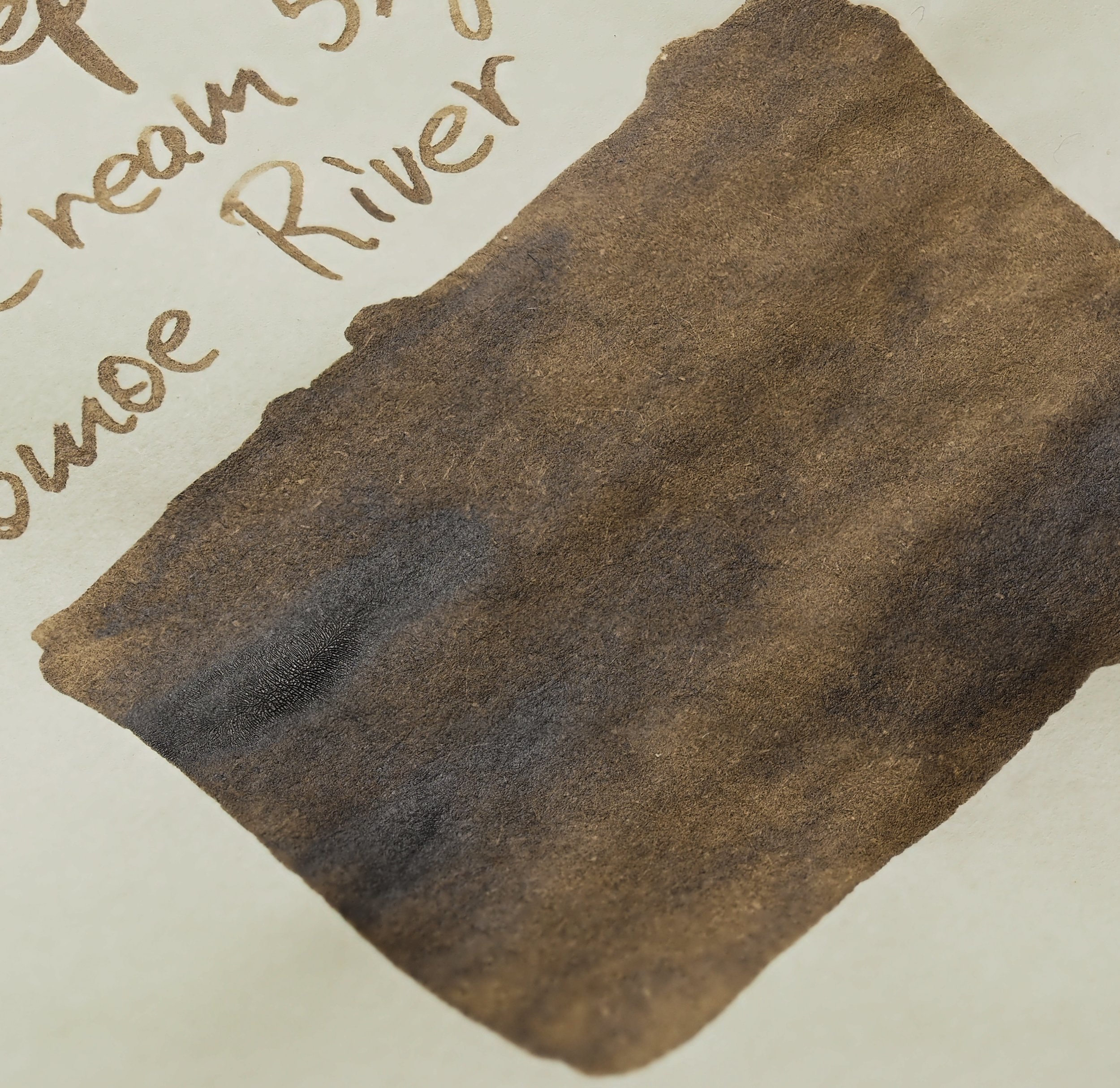
The sheen is… interesting. Not in general terms because it’s just a faint silver sheen that’s only slightly present, with Tomoe River, on the written line and mostly presents on the swatch. Where it gets interesting is the strange fingerprint-like pattern that forms on the very wet parts of the swatch. Assuming for the moment that sheen is a form of crystallisation (which it may or may not be but it seems most likely), this pattern also appears to be some form of crystallisation. It’s not sheen in the visual sense as it’s not producing a colour but it might from in a similar manner. It’s very weird looking and almost trypophobic!


As mentioned there is some sheen on the written line on Tomoe River and some other papers but mostly it’s just on the swatch in the wettest areas.


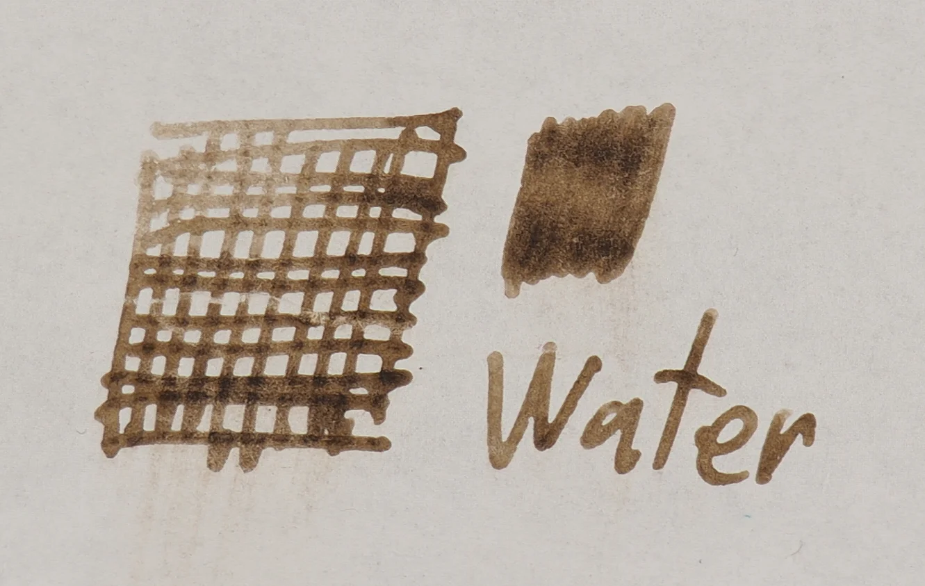
Chromatography is rather uninteresting apart from the slightly odd fern pattern of presumabling the larger pigmented parts of the ink because they seem to get stuck on the paper quickly.
Dry time is surprisingly slow. And I mean extremely slow! 1.5 minutes on Rhodia and 5 (five!) whole minutes on Tomoe River! What‽ Extreme!


The Hakase website says the following about the inks permanence and safety:
please note
· It is necessary to dry for several days in order to obtain water resistance effect. About 3 days.
· Please do not mix with other inks.
· If you do not use it for a while, please return the ink to the bottle, then repeat sucking tap water (cold water) in the same way as sucking the ink using the converter, please clean.
· Please note that it will be hard to fall off when clothes and ink stick.
This is definitely something I experienced. The ink was pretty much completely water resistant one day after and Hakase recommend three days but most of the ink washed off when water was applied shortly after it dried.
It’s interesting that they recommend returning unused ink back into the bottle when common practice is to not do this. Personally I’d just make sure to run it down and clean it out very thoroughly or eject leftover ink down the sink before putting it back int the bottle.
In the ordering page for the ink it states “We recommend you to exchange the converter once every 3 years.” It doesn’t state why you should but I can’t help but think it can be traced to the organic origin of the ink but it could also just be a result of the pigment and plastic. Either way it seems this might not be an ink you would to leave in a pen for a long time even with use.
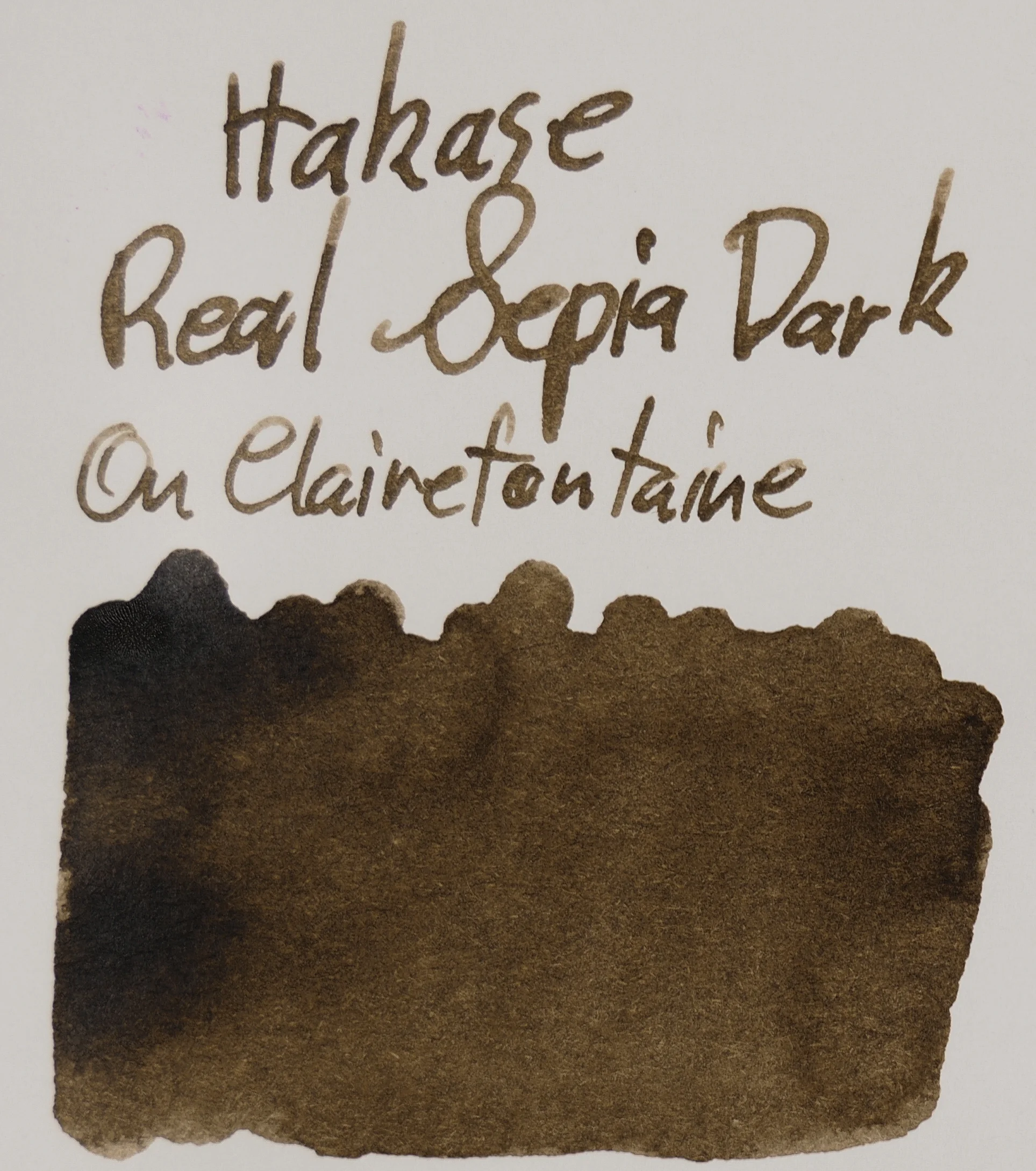
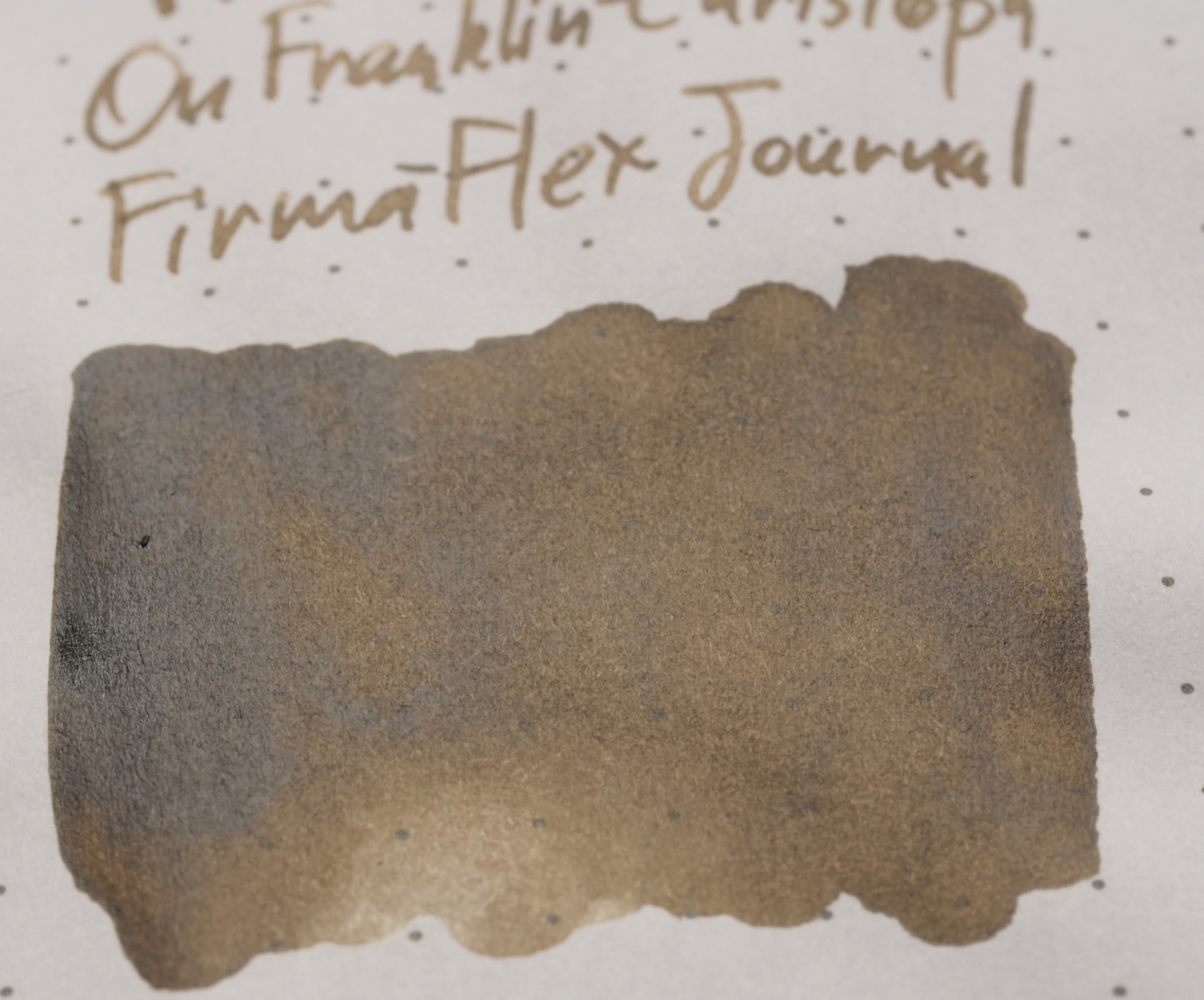
80gsm White Rhodia
The colour, most likely because it’s a pigment, is very similarly coloured on all papers. There was no smearing and the water test was done several days after drying so there is complete water resistance. The ink does feel less lubricated and more dry on Rhodia than Tomoe River. There is practically no sheen on Rhodia as well.
I struggled to find any ink similarly coloured that also had similar colour saturation. The colour saturation is crucial top this colour as a similarly coloured tan ink that’s more colourful doesn’t look similar at all. On 80gsm white Rhodia:
Rorher & Klingner: is too dark and too red but similar saturation;
Kyo-iro Stone Road of Gion: has a similar amount of yellow and saturation but is too dark;
Caran d’Ache Grand Canyon: is way too dark and too red;
Sailor Ink Studio 373: has some yellow but also some red (it’s an interesting ink) but is only slightly too dark in the written line with a similar saturation;
Montblanc Swan Illusion Plume: Is too dark and even less saturated but still with some yellow but also some red; and
Parker Penman Mocha: is way too red, too saturated and too dark.
My choice for Rhodia would be Kyo-iro Stone Road of Gion for the colour and Sailor Ink Studio 373 for the saturation and brightness, sacrificing some colour accuracy.
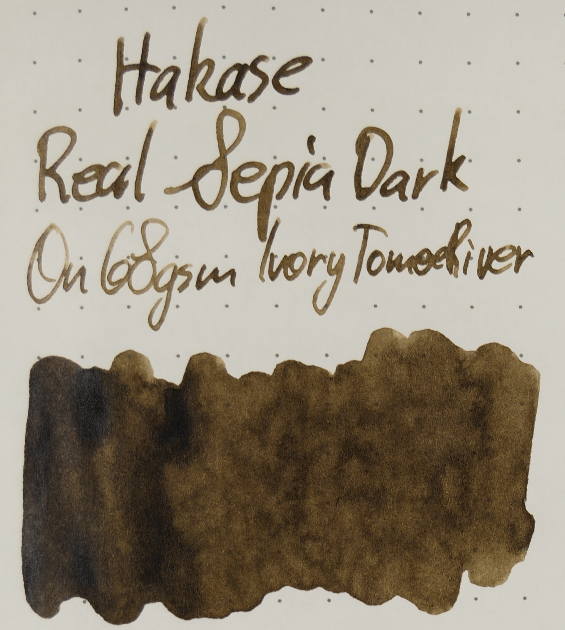
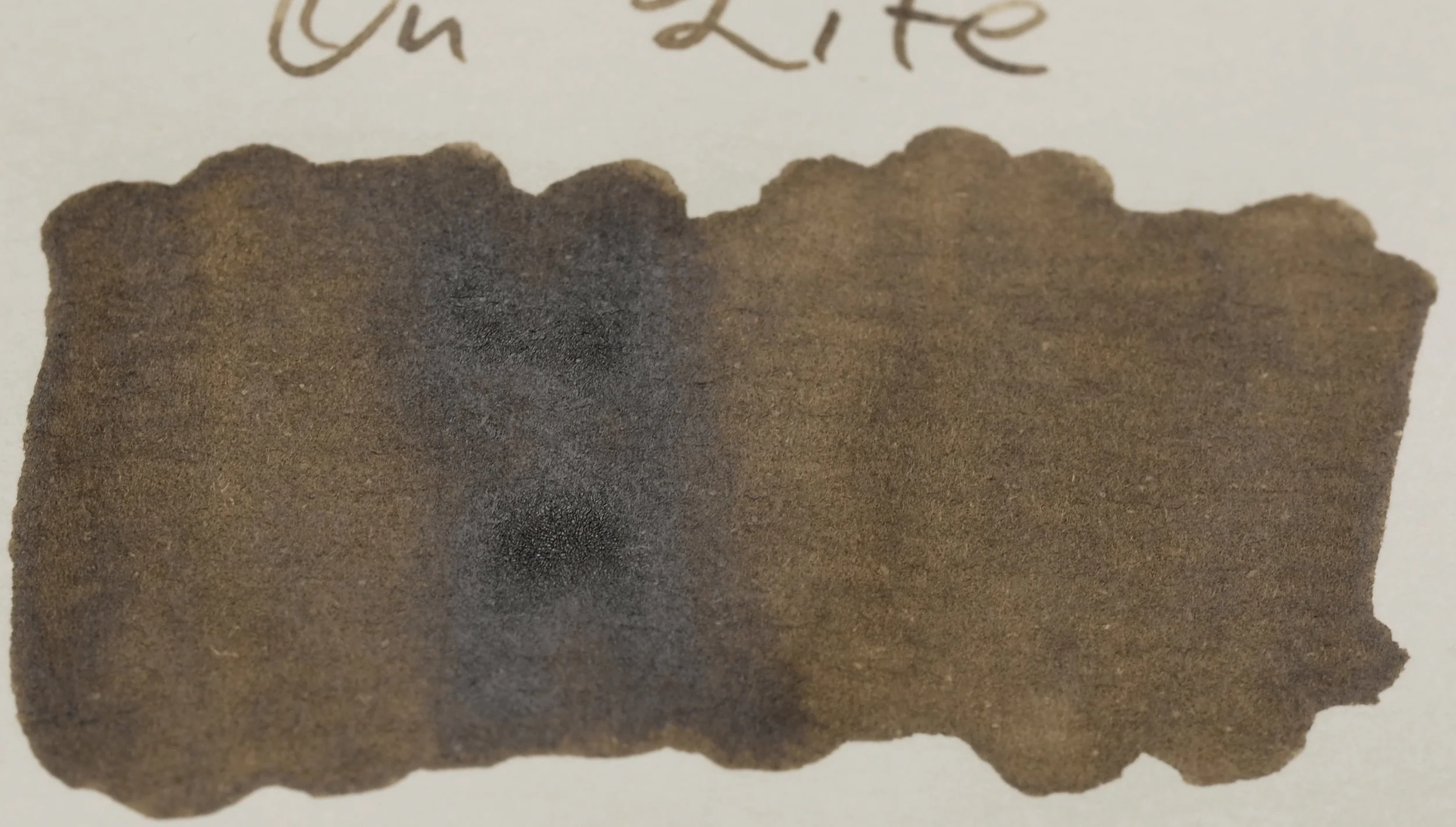
52gsm Ivory Tomoe River
On Tomoe River the ink moves smoother and wetter. I believe this is because Tomoe River is soft and thin and moulds to the nib better which created more flow. Still no smearing and the saturation is slightly stronger but otherwise the ink looks fairly similar.
Rorher & Klingner: is too dark and still a similar saturation but is now yellower and less red;
Kyo-iro Stone Road of Gion: has faded a bit on Tomoe River and is now a similar brightness level but now less saturated;
Caran d’Ache Grand Canyon: isn’t as dark now but is still too dark the saturation is less but there isn’t much yellow;
Sailor Ink Studio 373: has a pink colour coming out of the ink. There is still some yellow on the edges of where the ink pools but colour-wise the ink doesn’t look that similar anymore;
Montblanc Swan Illusion Plume: Is lighter now and still less saturated than Hakase Real Sepia Dark; and
Parker Penman Mocha: is still way too red (more so even), too saturated (also more so) and too dark.
My only choice, this time, would be for Kyo-Pro Stone Road of Gion which is probably even closer on Tomoe River.
This definitely isn’t a must-have ink. It’s not a bad ink and the colour is somewhat unique but it won’t stand out. It does have good permanence (eventually) but it comes with a smell and possibly riskiness in pens for a long time. Performance is moderately decent. It is also very pricy. So why would you buy this ink? Because of its history (Socrates used squid ink to write with!), because it comes in a great bottle (reminiscent of Sailor’s tall/vase bottles), and because it’s hand-made by craftsmen from natural ingredients. This ink has a story behind it. That’s no a reason to buy for most people but it’s a good enough reason for around 20 people per month! I don’t regret it and I’m glad I have it as part of my collection.
You can order the ink from Hakase and they ship worldwide (it seems). As always, photos of the ink on various papers are below.
✒︎ ✑ ✒︎ ✑
I've listed all my inks and all my pens in their respective pages. Please let me know which inks you'd like to review next via the comments, Twitter, Instagram, or contact me directly.
For blog updated you can follow @macchiato_man on Twitter, subscribe via email, or like my Facebook page.
I was not compensated for this review and everything here is my own honest opinion. There are no affiliate links in this review but Desk Bandit is a sponsor of the blog.