In September 2019 La Couronne du Comte, a stationery store based in Tilburg, Netherlands (and sponsor of this blog) released Comte d’Or (“Count of Gold”), a gold ink made by Diamine exclusively for their store and the first from what will become their Les Couleurs du Comte (“The Colors of the Count“) ink series. La Couronne du Comte describe the series as “a range that focuses on special colours, rich in colour intensity, with a wonderful shading and/or sheen”. A year later they released three more inks, Bleu Cuivré (“Copper Blue”), a blue ink; Pan d’Epices (“Gingerbread”), a red ink; and Vert Sapin (“Pine Green”), a green ink . I’ll be reviewing all the ink in the series alphabetically.
I received Comte d’Or as part of a general promotion from La Couronne du Comte and I purchased Bleu Cuivré, Pain d’Epices, and Vert Sapin myself. You can find the inks here and use code “MACCHIATOMAN10” for 10% off!
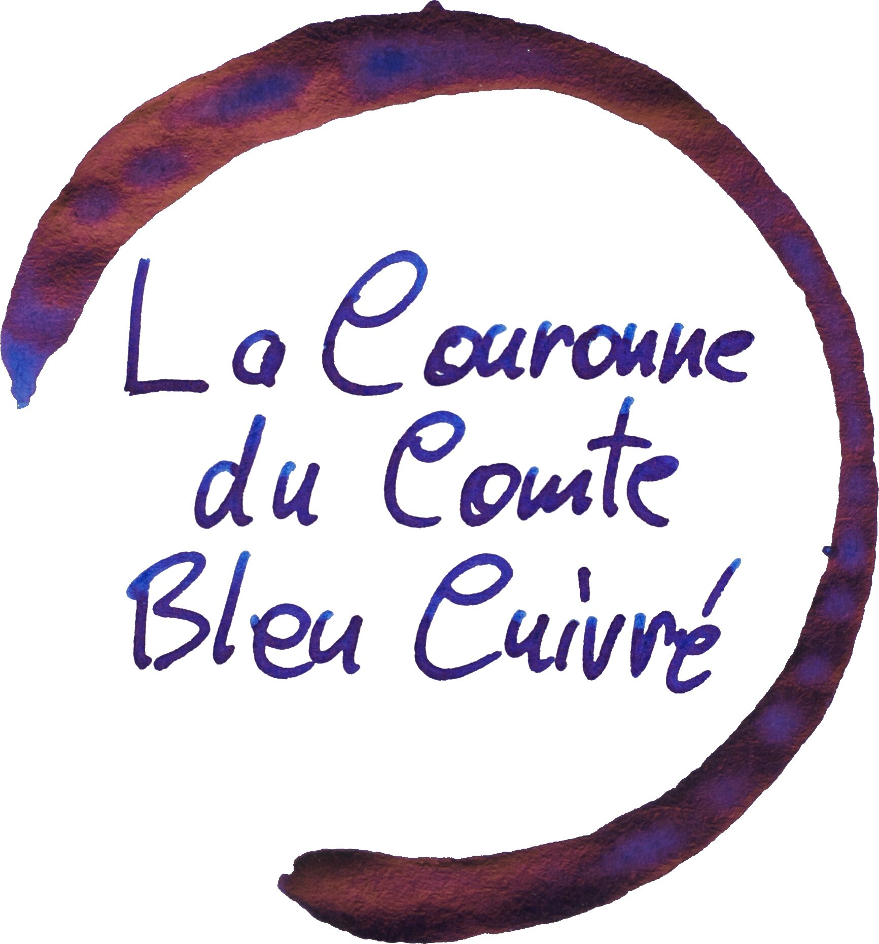
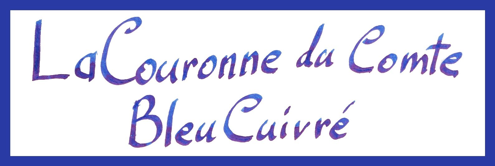
Diamine/La Couronne du Comte Bleu Cuivrés, or ‘Copper Blue’ is named after its blue colour and its copper sheen. is a rich deep sheeny blue. An ink that feels right at home as a Diamine ink. The colour is an imperial or indigo like blue. It’s very high in saturation and is a very neutral blue without too much red or green pushing it purple or teal. As will be shown, the ink has high sheen but it isn’t quite as sheeny as the modern super sheening inks like Organics Studio Nitrogen Royal Blue or its’ ilk. This also means it isn’t quite as saturated as that (but not far off).
As should be expected with rich Diamine blues the ink is very well lubricated but because it isn’t as saturated as the modern super sheening inks it still has good flow as well. The ink performs well on all papers, even less fountain pen friendly paper although it does lose saturation on these. The colour remained pretty consistent on all papers as well staying a neutral blue except for Clairefontaine and Lamy paper where it gets a hair more purple. Examples of the ink on 16 different paper types is at the end of the review.
The ink only comes in 30ml and not the glass 80ml bottles that Diamine inks usually also come in. 30ml is still a decent amount of ink these days and it is priced as a 30ml Diamine ink usually would be priced. The plastic is fairly soft on the sides and otherwise unremarkable. It does come with a unique sticker that features a swatch of the colour, the La Couronne du Comte crown logo and the name of the ink.
Nib and Pen details
I used a Lamy Safari Blue Macaron pen for this review and six different stainless steel Lamy nibs on that pen. The choice of pen (be that Safari, AL-Star, Vista or Studio) will have little impact in the writing performance. I will not use a Lamy Dialog because there is the rare chance of the nib drying out slightly which might affect the writing performance.
Lamy 1.5 Stub: this nib is moderately wet to write with (this is used for the brand and ink name title);
Lamy 1.1 Stub: this nib is on the drier side;
Lamy Broad: this is a wet;
Lamy Medium: this is a very wet nib;
Lamy Fine: this nib is moderately dry; and
Lamy Extra Fine: this nib is moderately wet.
I also use a fine JoWo nib attached to a James Finniss Serendipity (from Pensive Pens) for the comparison ink names. This nib’s wetness is moderate but the feed is primed which gives it a wetter character than would be a normal writing experience. This generally as the effect of reducing shading and luminosity, while increasing sheen and saturation. The possibility of feathering and bleeding is also slightly increased. This is still more accurate than a dip pen or a glass pen in my experience.
52gsm Ivory (White) Tomoe River
The lighter (lower) part of the swatch doesn’t represent the colour of the ink in writing as much as the middle swatch does. Fairly dark on original Tomoe River 52gsm but still definitely not a ‘dark’ blue or a blue-black.:
Diamine Skull & Roses: is a very similar colour toe Bleu Cuivrés;
Diamine 150th Anniversary Blue Velvet: is also quite similar but a little flatter and lighter;
Monteverde Horizon Blue: much lighter and a touch more teal leaning;'
Monteverde ‘18 DC Supershow Blue: similar hue but lighter and less saturated;
Private Reserve American Blue: also lighter and less saturated;
Private Reserve DC Supershow Blue: a bit lighter, a little less saturated;
Noodler’s Liberty’s Elysium: a similar colour and only a little lighter and a little less saturated; and
Visconti Blue: much darker, a little richer and possible a little more purple leaning (an underrated ink!).
Of these inks I think Diamine Skull & Roses is the clear winner. It is almost the same in ink hue (just barely more teal leaning) and shade but it is a little different with the sheen as will be shown below.
There isn’t much shading for this ink. Because it is such a lovely wet writing ink it doesn’t produce the lighter parts of more impressive shading inks. Only with the drier Fine nib is there and shading. With this it is a fairly soft gradient with neutral contrast but decent consistency. There is no haloing.
The sheen is indeed a nice coppery sheen different from the bright hot pinks of some blue sheening inks. Personally I prefer this colour sheen. The sheen is strong on all the nibs but it never completely covers the written lines so you still easily see the ink colour underneath. I think this is a good amount of ‘high sheen’ as it still compliments rather than takes over the colour.
Where Diamine Skull & Roses is different is that it does show a more hot pink sheen and the sheen is also stronger covering more of the written lines. Diamine Blue Velvet, Monteverde Horizon Blue, Monteverdi ‘18 DC Supershow Blue, Private Reserve American Blue and Private Reserve DC Supershow Blue all have the same copper sheen but none are as strong as Bleu Cuivrés. Noodler’s Liberty’s Elysium has a weird thing going on (see below) and Visconti Blue has a more rose-gold sheen colour.
The elusive blue sheen popped up where Skull & Roses pooled the most! Unrelated to this review. Also unrelated is the very weird cracked tired-mud like ‘sheen’ on the Noodler’s. Reminds me of the sheen on Hakase Real Sepia Dark (but still not as weird as that).
The chromatography is a very dull gradient blue and nothing more.
The water resistance is extremely limited and very messy. It doesn’t wash everything away immediately (though it will if you let it soak more) but the blue goes everywhere. I wouldn’t call this a water resistant ink by any stretch.
The dry time is on the slightly slower side. I don’t quite know why the forty-five second and sixty second are so different (I suspect the sixty second might be the outlier - more ink put down somehow maybe?). It’s definitely dry by ninety seconds.
I expected some smearing and there is a tiny amount but it does a fairly good job with this, especially with how much sheen there is!
80gsm White Rhodia
On Rhodia there is less contrast to the ink with the darker parts becoming a little lighter and the whole thing being flatter. It' is also a touch less saturated.
Diamine Skull & Roses: isn’t as similar on Rhodia as it is quite a bit more teal now;
Diamine 150th Anniversary Blue Velvet: is less saturated and a little purple leaning;
Monteverde Horizon Blue: lighter and less saturated but a similar hue;
Monteverde ‘18 DC Supershow Blue: A very similar colour and only a little lighter;
Private Reserve American Blue: very similar to Monteverde ‘18 but a touch lighter ;
Private Reserve DC Supershow Blue: lighter still but a similar hue;
Noodler’s Liberty’s Elysium: is very similar but not quite as saturated; and
Visconti Blue: much darker, a little richer.
I think the closest on Rhodia is either Noodler’s Liberty’s Elysium or Monteverde DC Supershow Blue but both are a little lighter and the Noodler’s is a touch less saturated.
The shading is a little stronger on Rhodia but not that much and the shading is still only really obvious on the drier Fine nib. Here still it is consistent but a soft gradient and low contrast shading. There is no haloing.
The sheen is quite low (as is the case for Rhodia) but it is still in the written lines every now and then. Even the swatch has very low sheen.
Only Diamine Skull & Roses shows any sheen on Rhodia and it’s a similarly low amount to Bleu Cuivrés
Water resistance seems a little stronger than on Tomoe River but it is as if not more messy with the blue dye going everywhere. Dry time is decent for Rhodia at almost thirty seconds.
There is no smearing as should be expected with such little sheen.
Final Remarks
⭐️ = One Star
★ = Half a Star
☆ = No Star
🚫 = None/Not Applicable
(Star ratings are a rough and glanceable indication and are more quantitative than qualitative. They are not saying that something is ‘good’ or ‘bad’ but rather that, of the particular characteristic, the ink has a ‘high’ or ‘low’ amount)
80gsm White Rhodia
Shading: ⭐️☆☆☆☆
Sheen: ★☆☆☆☆
Shimmer: 🚫
Halo: 🚫
Saturation: ⭐️⭐️⭐️★☆
Luminosity: ⭐️⭐️☆☆☆
Feathering: 🚫
Bleeding: 🚫
Flow: ⭐️⭐️⭐️⭐️★
Dry time: ⭐️⭐️⭐️☆☆
Smear: 🚫
Water Resistance: ⭐️★☆☆☆
52gsm Ivory (White) Tomoe River
Shading: ★☆☆☆☆
Sheen: ⭐️⭐️⭐️⭐️☆
Shimmer: 🚫
Halo: 🚫
Saturation: ⭐️⭐️⭐️⭐️☆
Luminosity: ⭐️★☆☆☆
Feathering: 🚫
Bleeding: 🚫
Flow: ⭐️⭐️⭐️⭐️★
Dry time: ⭐️⭐️★☆☆
Smear: ⭐️⭐️⭐️⭐️☆
Water Resistance: ⭐️☆☆☆☆
La Couronne day Comte Bleu Cuivrés by Diamine and from the Les Couleurs du Comte series is probably my favourite type of blue. Very neutral, richly coloured, deep (but not dark) and with a good amount of coppery sheen. if you have Skull & Roses you maybe don’t need this but I still prefer the more neutral and less teal colour of this ink and the less ‘hot pink’ sheen. There are certainly plenty of other colours in the ball-park of this but they are still different in their own ways. This might not stand out as a particularly unique ink but I still couldn’t find a duplicate and I quite like it. Good performance amongst different papers and on fountain pen friendly paper.
The ink is really affordable too, like most Diamine inks. It is €3.50 (including VAT) and €2.89 outside Europe. Before any importation fees or taxes this is roughly AU$4.50, US$3.5, or £2.5. For 30ml of ink that is excellent value for money in my opinion! If you are ordering anything from La Couronne du Comte (which so often has great prices) just throw one of these in the cart (or all of them)!
Use code “MACCHIATOMAN10” for 10% off your order from La Couronne du Comte! Check out their website, sales and new releases as well as their socials: Instagram, Facebook, and Twitter.
✒︎ ✑ ✒︎ ✑
Thanks for reading! If you have any questions, comments or suggestions please let me know in a via the comments, Instagram, or contact me directly.
You can find my ink collection here and my pen collection here. Is there something you’d like reviewed? Let me know!
For blog updated you can follow @macchiato_man on Twitter, subscribe via email, or like my Facebook page. Check out the sponsors of this blog as well!
I was not compensated for this review and everything here is my own honest opinion. There are no affiliate links in this review. I purchased this ink myself .


