
Sailor’s Manyo Series is a two-set series of inks available to the international market, not the Japanese market (there’s enough there already)! The series is based off Man'yōshū, or “Collection of Ten Thousand Leaves” which is a set of 4,516 Classical Japanese poems compiled from a variety of source and people in 759. The first set contains eight inks and was released late 2019; the second was released late 2020 and also contained eight inks. This is the final overview (for now?) and is part 4 of 4 starting the 2020 release in in alphabetical order with four inks per article. Part 1 is here. Part 2 is here. Part 3 is here.
A big thank you to Pen Classics NZ for discounting the inks. Check them out!
Credit given below under each individual photo.
Nature and especially flowers are significant for Japanese culture and art and around one third of all the Man'yōshū poems mention 160 different plants and fifty different flowers. I don’t know much about flowers but I’ve done my best, not knowing Japanese, to find approximate flowers or at least approximate genus (hopefully!). I tried to match photos of the flowers with the artwork of the flowers on the bottles as well as starting with google searches of the name of the ink.
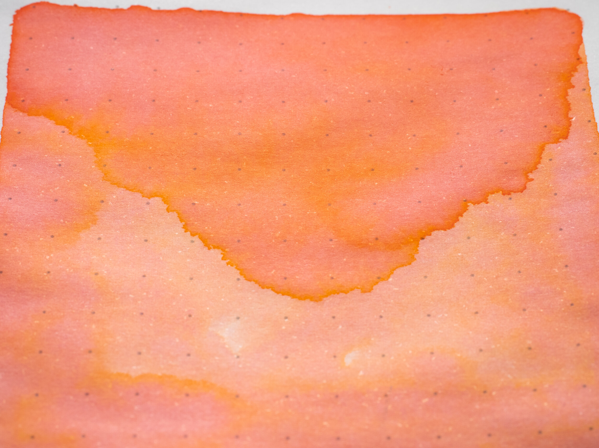
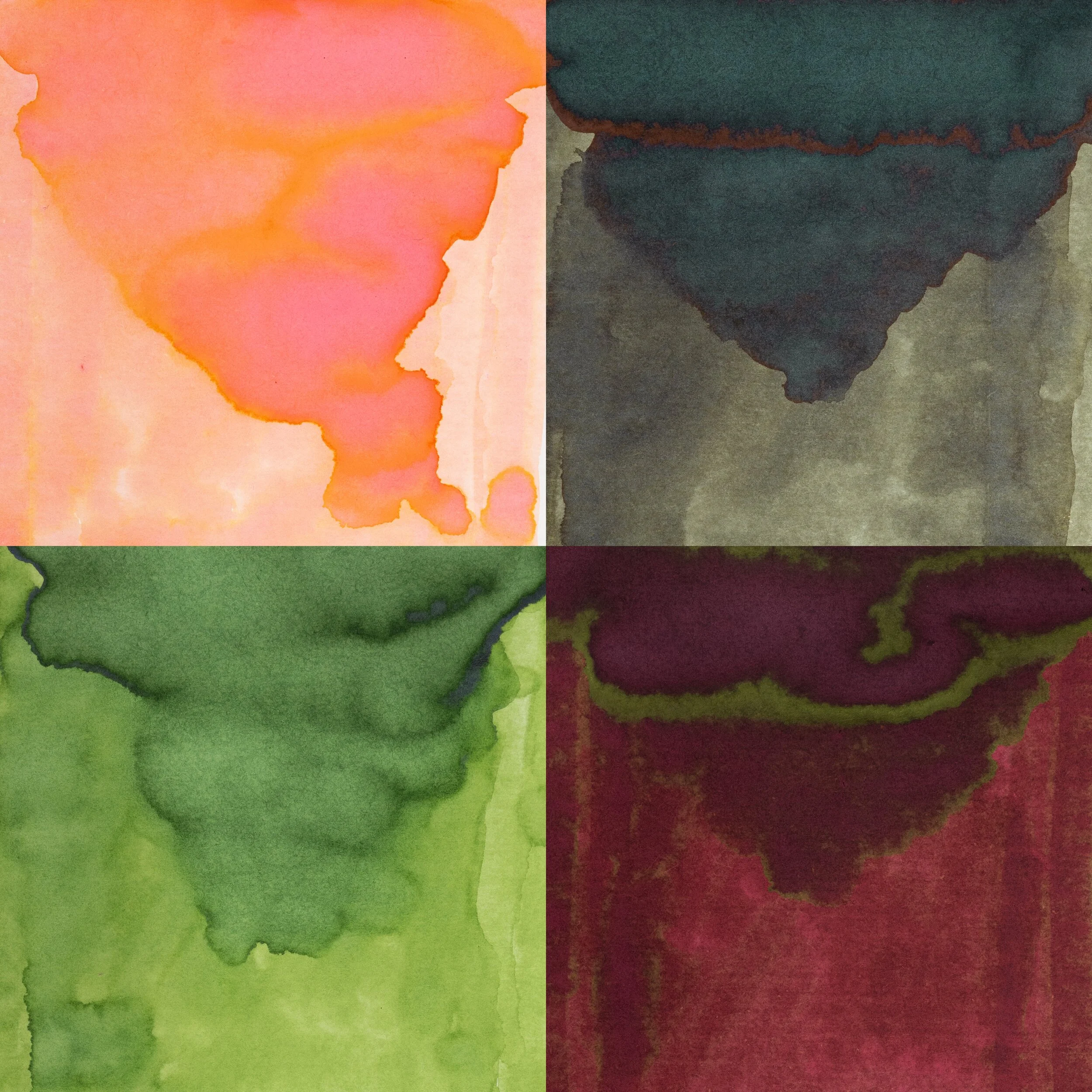
Sakura is obviously the Cherry blossom. As far as I know cherry blossoms are generally a soft pink and while Manyo Sakura does have pink in it, it is dominated by an orange colour. We don’t really get Cherry blossoms where I am so maybe there is a more orange variant or stage!
Review on 52gsm Ivory (White) Tomoe River (old paper)
Manyo Sakura is one the last of the four dichromatic inks featured in the first two series of Manyo inks. It is also the first that isn’t a mostly blue colour paired with a pink colour. Sakura keeps the pink, which shows up amongst the dominant colour, just like in the blue and pink dichromatic inks, but instead of blue Sakura has a pale yellow-orange dominant colour. The ink is probably the driest of the set but generally this translates to a moderate wetness. There’s no feathering or bleeding. Water resistance is non-existent and the dry time is moderate for Tomoe River.
Lamy Neon Coral is an ink colour that is a bit pink and a bit orange but isn’t dichromatic. On Tomoe River paper J. Herbin Corail des Tropiques loses a lot of saturation! A little bit or orange remains but not mcc hand also no dichromatic. Sailor Ink Studio #173 is very similar to Manyo Sakura however it is slightly more saturated in both the pink and the orange. Sakura has a softer look to it.
Shading
Sheen


The shading isn’t strong but it’s frequent; low contrast, slow gradient but a consistent frequency. This gives the ink some nice variation on the written line. Like the other dichromatic inks there is some nice noticeable haloing that is accentuated but the colour change as well. There is absolutely no sheen. The chromatography is pretty interesting actually with a pale mauve line where the ink was put down that quickly moves into a pink patch that merges and turns into a bright yellow patch.
Lamy Neon Coral actually has some gold sheen but none of the rest do.
Review on 80gsm White Rhodia
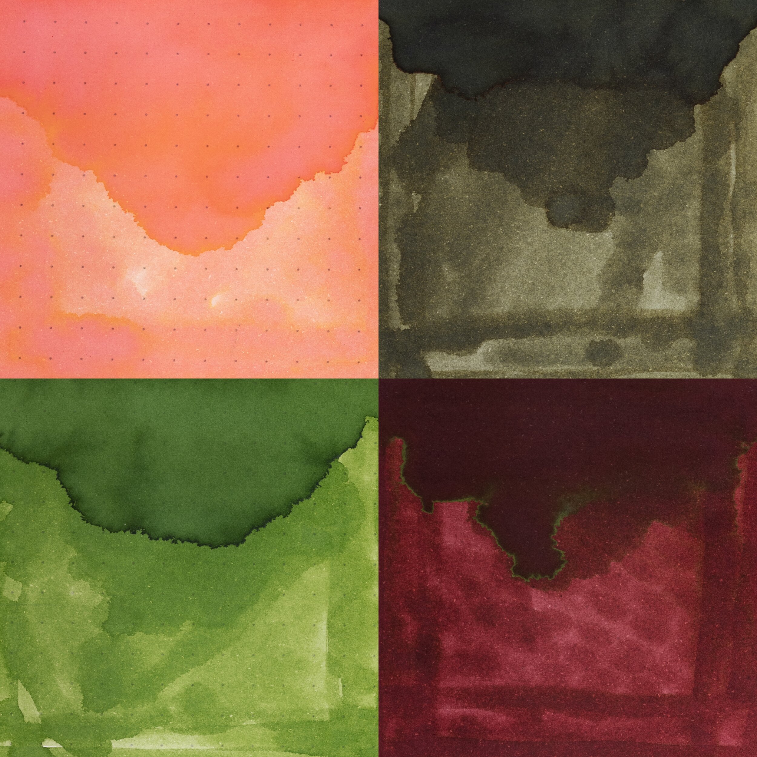
On Rhodia the ink overall is a little more saturated and the orange dominates even more over the pink (just like the more blue hues of the other dichromatic inks dominate more on Rhodia). Water resistance is similarly non-existent but dry time is on the fast side of moderate for Rhodia.
Lamy Neo Coral has come to life on Rhodia as has Corail des Tropiqes but of which are more saturated and blur the line between pink and orange. Sailor Ink Studio #173 is still more saturated on Rhodia, more noticeable so as well.
Shading
Sheen

The contrast of the shading is much stronger on Rhodia and the frequency is bumped up a bit as well as the gradient being more sudden at times. A very nice shader on Rhodia. The halo is less noticeable but still there. Still no sheen!
Also no sheen on Rhodia for any of the other inks!
“Quercus ilex” (ghjandi gland - GPLv3)
Manyo Shirakashi represents an Evergreen Oak. The leaves seem to be a little greener but they have a yellow-brown tint to the green and is in the very loose ball park of the ink colour.
Review on 52gsm Ivory (White) Tomoe River (old paper)
Shirakashi is another of Sailor’s drab green brown inks that I’m quite fond of like Ricky-cha or Pen + Message Cigar. This one is a little paler and less saturated though as well asa bit more green leaning, especially on Tomoe River. It’s a soft green here. The ink is moderately wet for Sailor. It isn’t as wet as some but not as dry as the dichromatic inks, for example. Water resistance leaves a light blue line behind so it is still visible dry time is a little on the slow side of average for Tomoe River.
Sailor Rikyu Cha is darker and browner and more saturated but definitely the closest of the three here. Noodler’s El Lawrence is a similar green but slightly more green and doesn’t have much brown. Robert Oster Melon Tea is browner with less green
Shading
Sheen


Shirakashi has limited shading. It is slightly strong on the dryer pens but generally it’s a low contrast smooth gradient with low to moderate frequency. There is a very subtle halo. There is some brow-red-orange sheen that looks somewhat like rust that does subtle present on the written line.
The chromatography is interesting it starts with a mute greyish blue that breaks into a brown-green before breaking into a dull yellow orange. There’s a very thin lime green before a light sky blue that ends it.
All the inks have a form of sheen with Sailor Rikyu Cha having the same rusty sheen but it is definitely strong with Ricky Cha. Noodler’s has it’s strange silvering sheen that makes it look wet and Melon Dea has a dull grey sheen.
Review on 80gsm White Rhodia
On Rhodia the Shirakashi becomes browner and less saturated and also a little darker. Water resistance is similar and dry time is pretty moderate.
Rikyu Cha is a little greener this time and darker. El Lawrence is not too dissimilar but a touch greener and Melon Tea is still browner.
Shading
Sheen


The shading is definitely stronger on Rhodia with increased frequency and contrast and even a more sudden gradient on the dryer pens. There’s no sheen on Rhodia
…and no sheen on Rhodia with any of these.
“Lemna minor” (Barbarossa - CC BY-SA 3.0)
Ukikusa represents some sort of Duckweed with Common Duckweed used in the above photo. I’m unsure which, specifically, but it definitely seems to be an aquatic plant that floats on the water. Pretty similar colour if a little paler for the ink.
Review on 52gsm Ivory (White) Tomoe River (old paper)
Ukikusa is a fairly light yellow leaning apple or grape green. It is moderate-to-wet for sailor and has not feathering of bleeding. Dry time is average to slow and there is no water resistance what-so-ever.
Sailor Hankyu Wakaba is a flatter more uniform green that’s also less yellow leaning on slightly more saturated. Diamine Meadow is even more saturated and also less yellow leaning. Robert Oster Jade has a bit of brown going on and is darker.
Shading
Sheen


On the wettest pens there is a subtle amount of silver sheen but it’s not something you can really rely on, even on Tomoe River. The shading is very decent with good contrast, especially on wetter nibs and decent frequency as well as sudden gradients. The halo is also quite strong; it is even very strong on the wet nibs.
Chromatography is pretty and starts with a light cyan that moves into a slightly muddy green before breaking into a yellow that gets more saturated.
Hankyu Wakaba has a similar silver sheen and is similarly low in sheen. Diamine Meadow has a weird matte yellow “sheen” and Robert Oster Jade has a similar matte sheen but this time it is grey.
Review on 80gsm White Rhodia

On Rhodia Manyo Ukikusa is darker and more saturated and slightly less yellow leaning. There is no feathering of bleeding. Dry time is on the slower side and there is no water resistance at all.
Hankyu Wakaba is a liter closer in colour now but still flatter. Diamine Meadow is similarly flat but still more vibrant and Robert Oster Jade is also darker and more brown still.
Shading
Sheen


The shading has more contrast than on Tomoe River which gives it stronger shading but the frequency and gradient, which were already strong on Tomoe River, are still strong. There is much less haling but for Rhodia it is still quite strong on the wetter lines. There’s no sheen on Rhodia.
No sheen here either!
“Prunus mume” (Gil-Ggalad - CC BY-SA 2.0)
Ume represents the Japanese plum which was introduced to Japan from China. And while the colour of the flower can be vibrant pink coloured, as pictured above, which is also the artwork on the bottle but it is quite different from the ink’s actual burgundy colour. The ink’s burgundy colour, however, is much closer the plum fruit.
Review on 52gsm Ivory (White) Tomoe River (old paper)
Manyo Ume is an excellent plum colour hit is a rich deep red with a little bit of purple leaning burgundy but still some orange somehow showing. When the ink pools, such as on the top of the swatch, it becomes more purple leaning. It is a nice and wet ink with no feathering or bleeding. Water resistance isn’t bad (though not strong) but is a bit messy. Dry time is fast for Tomoe River.
Diamine Burgundy Rose is a little more orange and a touch less saturated. Diamine Oxblood is a little darker and a little more burgundy. Montblanc Velvet Red is more orange leaning.
Shading
Sheen


Shading isn’t strong on Tomoe River with low low contrast and a slow gradient although the frequency is OK. There is essentially no haloing. The sheen has a fairly strong gold-green that is present on all the written lines, even the dryer Fine nib.
Chromatography has an interesting purple grey that breaks into a pink that gets darker and richer breaking into a brown, an orange, a yellow and finally a very fine light green.
I missed the Sheen shot of Diamine Oxblood but regardless none of these have similar sheen. Diamine Burgundy Rose has a matte, dull brown sheen, Diamine Oxblood has rusty dull gold Shen and MontBlanc Velvet Rose has a dull silver sheen. For all of them the sheen is fairly week on the written line.
Review on 80gsm White Rhodia
On Rhodia Ume is darker and richer but with less colour variety. There is still no feathering or bleeding
Diamine Burgundy Rose is darker but fairly similar. Diamine Oxblood is darker and less saturated. Montblanc Velvet Rose is similar but a little more saturated and a little more orange leaning.
Shading
Sheen


Shading is definitely stronger with more contrast but the frequency and smooth gradient are the same as on Tomoe River. There is no effective sheen on the written line but there is some green sheen on the swatch.
Diamine Burgundy Rose has a and Montblanc Velvet Red have a dull sheen on the swatch but none have any on the written line.


This half-set, the second half from the second series, and the last overall (for now?) has the most variety of all the half sets. Part 1 is two (mostly) blue inks and two red leaning inks, Part 2 has an orange amongst three (mostly) blue inks, and Part 3 is all blue but this Part 4 has an orange/pink, a brown, a green and a red (and no blue)! An interesting half set. I’m a fan of Sakura; it is similar to Ink Studio 173 but softer and I’ve become a fan of paler inks lately. I always like the drab green browns from Sailor as well as their maroons.
Both sets are unique yet both sets have lots of blues. The good thing is you don’t have to buy them in a set and can pick and choose!
Thank you again to Pen Classics NZ for discounting the inks!
✒︎ ✑ ✒︎ ✑
I've listed all my inks and all my pens in their respective pages. Please let me know which inks you'd like to review next via the comments, Twitter, Instagram, or contact me directly.
For blog updated you can follow @macchiato_man on Twitter, subscribe via email, or like my Facebook page.
I bought these stationery items at a discounted rate for the purpose of giving an honest review. I was not otherwise compensated and everything here is my own honest opinion. There are no affiliate links. Nota bene: Pen Classics NZ are also a sponsor of this blog.