

This is Part Two of the Ink Comparison: Carpink set of five sheening inks. Part One here!
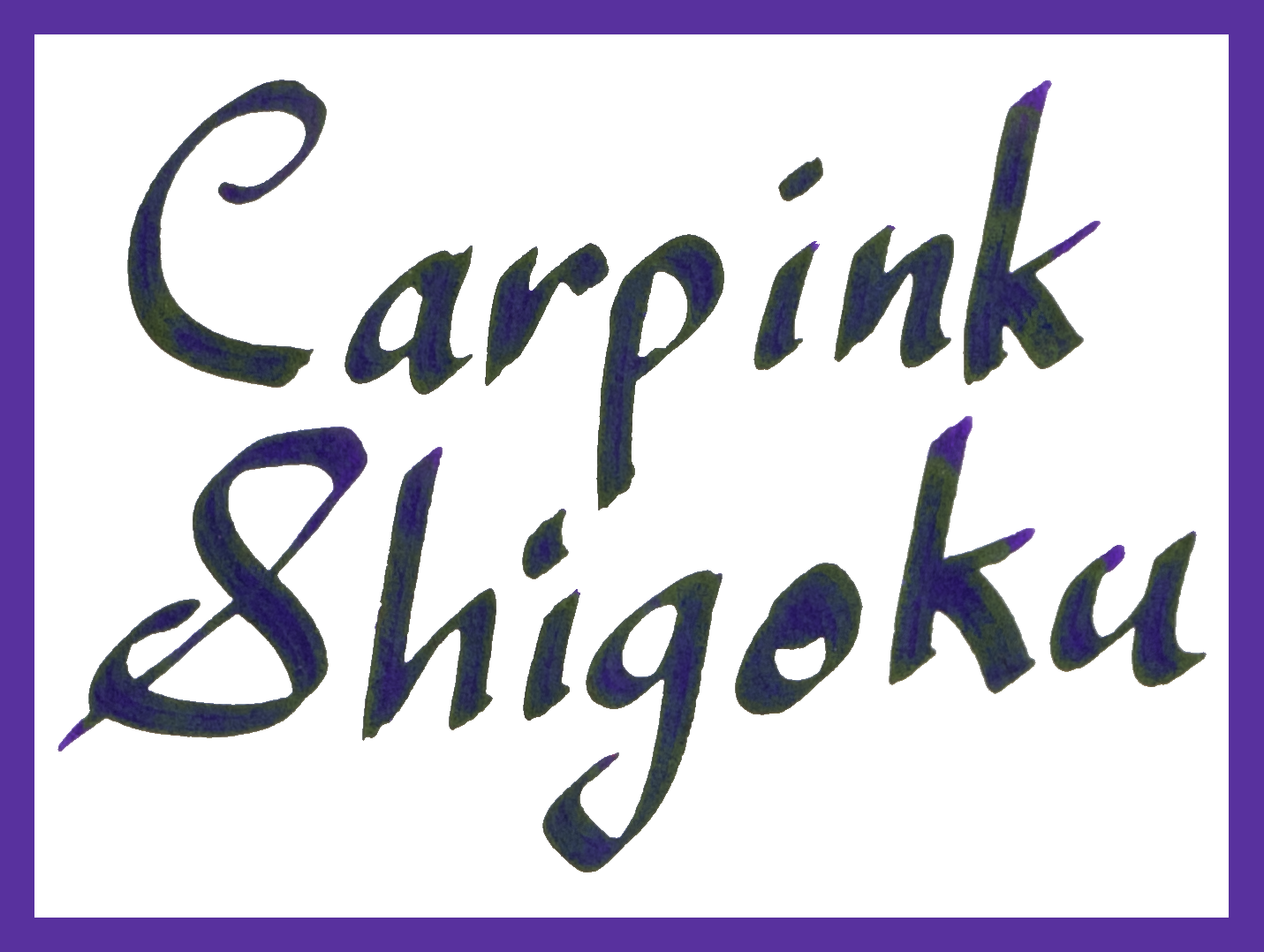
I was generously gifted a bottle of Carpink Prussian Blue and Shigoku in July last year. I knew nothing about the brand and I’d, in fact, never heard of them but the inks were super sheeny and that always piques my interest! In December last year I was gifted the full set for the purpose of review (the benefactor would like to remain anonymous but was a store; this store is not a sponsor of this nor do they sell these inks; I did purchase other inks from the store). It is a set of five inks: Black Square, a sheeny black; Deep Space Green, a sheeny teal; Electrooptic Violet, a pink violet; Prussian Blue, a super sheeny blue; and Shigoku, a sheeny dark purple.

The inks are Taiwanese in origin and the only place I know where they can be purchased (outside the region they are from) is Desk Bandit. The inks come in 20ml glass bottles (though they say 20±2ml which I don’t rightly understand). The boxes also say “change magically” which I assume is a reface to the sheen!
This overview or comparison is done with lite-reviews (serendipity pens rather than complete fountain pens) and there is no samples of the inks on many different paper types. The lite-reviews are still done on 80gsm white Rhodia paper and 52gsm Ivory (white) Tomoe River paper. This took a surprising amount of time to complete!

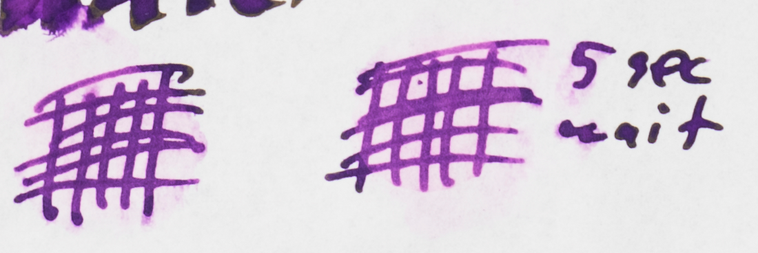
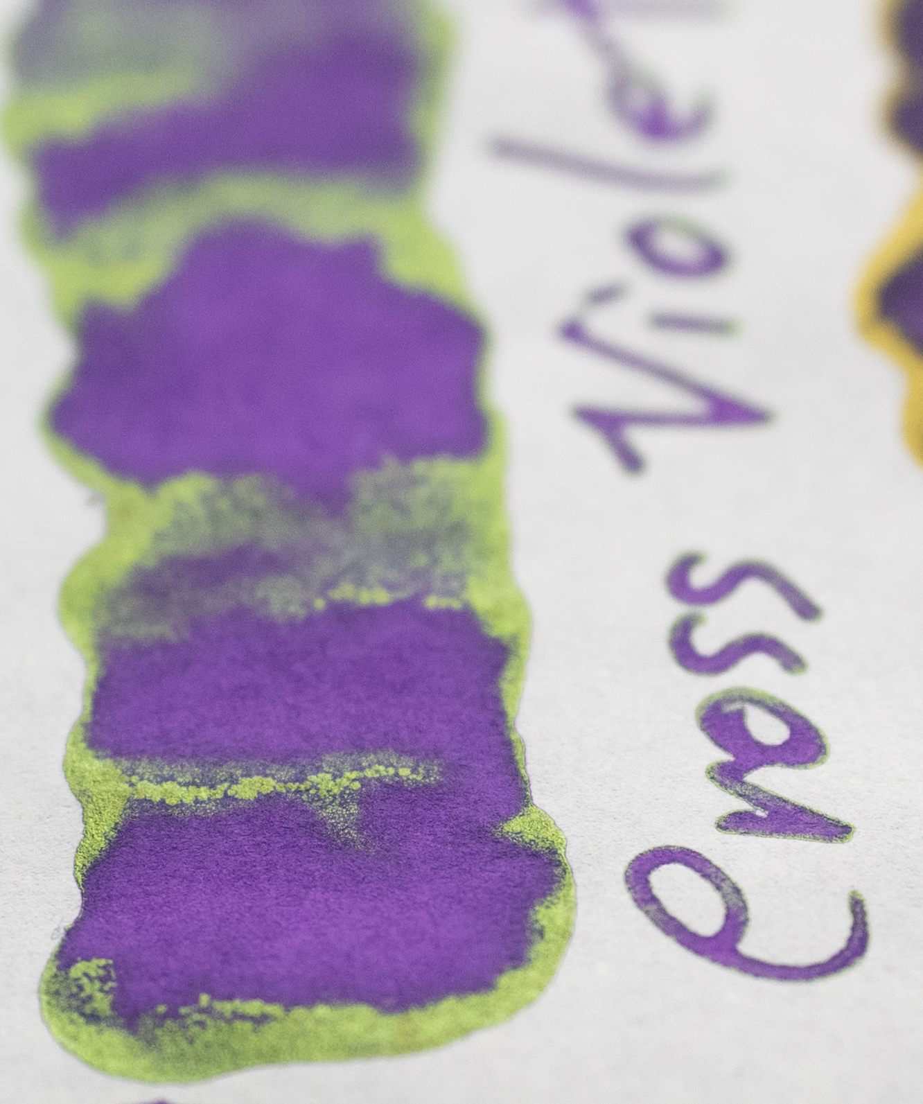
Carpink Electrooptic Violet is a magenta-leaning violet. It’s quite saturated but the sheen is surprisingly lacking.T he ink is not dry but only moderately wet (certainly the driest of this set) and has no issues with bleeding or feathering on Tomoe River but is quite poor on Rhodia. The ink is some feathering on the written lines and some pretty poor bleeding. A surprise because the rest of the inks are good with this!


Shading is low on both papers. There is a touch more with the music nib but not much. The ink is pretty flat. There is the slightest hint of a halo but still very little.


The sheen, which is only on Tomoe River, is a lovely rich gold that appears on the edges of very wet portions of the ink. It’s a shame it isn’t more prevalent because it’s a lovely sheen!


The chromatography well represents the ink in a predictable way. its a thing line of deep blue that leads immediately to a purple than gradients into a magenta. The dry time on Rhodia is very quick (which might relate to the lack of sheen and the feathering with quick absorption of the ink into the paper). Dry time on Tomoe River is surprisingly slow with it again being 2 minutes. Water resistance is decent on both papers.
Review on 80gsm White Rhodia
Carpink Electrooptic Violet is darker, bluer and more more saturated on Rhodia. There is no smearing at all.
Cross Violet: is flatter more saturated and more magenta;
Lamy Dark Lilac: is darker, more saturated and more megenta;
Noodler’s Purple: is slightly more magenta but a similar darkness and only a hint less saturation;
Noodler’s Baystate Concord Grape: is noticeably bluer flatter and more saturated; and
Montblanc Psychedelic Purple: is lighter and noticeably more magenta - almost pink - and a little more saturated.

Review on 52gsm Ivory (white) Tomoe River


The ink takes on a more magenta hue is a little lighter and less saturated. I quite like the hue on Tomoe River. There is a little smearing but it’s not too bad.
Cross Violet: is still more vibrant and more magenta and the sheen is green rather than gold and more prominent;
Lamy Dark Lilac: Is only a little darker but still more magenta and the gold sheen is more prominent;
Noodler’s Purple: is a very similar hue and saturation but a little lighter;
Noodler’s Baystate Concord Grape: is flatter, much bluer and darker; and
Montblanc Psychedelic Purple: is still noticeably pinker, a touch more saturated and a touch lighter.

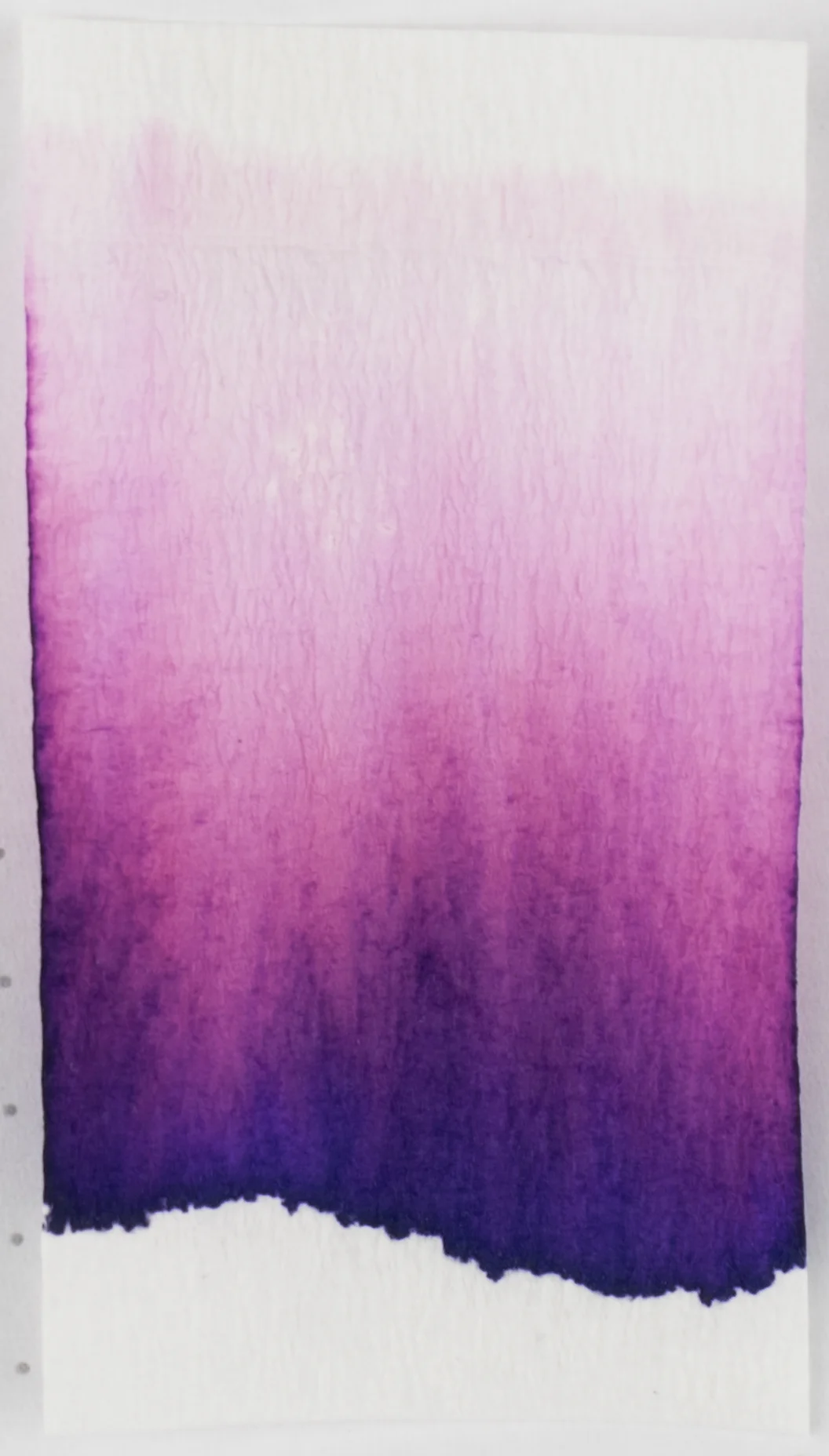
Carping Prussian Blue is a supersheener with an extremely bright and rich Azure-like blue. What it isn’t is a muted darker green-leaning blue as it’s name, Prussian Blue, would suggest. The ink is very wet and smooth to write with, similar to Black Square and there are no issues with feathering or bleeding.

Shading is decent on the Music Nib but not very impressive on the Medium Nib. The shading is also more noticeable on Rhodia. There’s an OK amount of Halo on the Rhodia and less on Tomoe River.


The sheen isn’t very high on Rhodia. It’s there and you do notice it but it’s low relative to Tomoe River. On Tomoe River you are met with a blinding brilliant pink sheen almost everywhere on the written lines.


The chromatography is uninteresting and just a gradient of the blue losing saturation. Dry time, like Black Square is extremely slow two full minutes on Rhodia and four full minutes on Tomoe River. Very extreme. Water resistance is better on Rhodia but average on both; there is so much blue that washes everywhere even if the lines are still visible.
Review on 80gsm White Rhodia


As is usual with these inks the hue is a little darker but this time is a touch less saturated on Rhodia. The blue leans more to the green than purple but is still a “blue”. There is little to no smearing.
Krishna Moonview: is quite a bit darker, flatter and more purple leaning;
Organics Studio Nitrogen Royal Blue: is a little greener but is otherwise comparable;
Diamine Cult Pens Maureen: is darker and noticeably more purple and is a touch sheenier (on Rhodia);
Ink Institute Snowy Starry Night: is lighter and a little greener;
Blackstone Barrier Reef Blue: is lighter, greener, and flatter; and
Diamine Skull & Roses: is richer, darker and a touch less green leaning.
Review on 52gsm Ivory (white) Tomoe River


Supersheen and super saturation. The ink isn’t that dark but it’s a beautiful high saturation blue (again leaning more green than it does purple). There is little smearing but there is some; again a surprise.
Krishna Moonview: is difficult to see the ink below the sheen but is darker and more purple leaning still;
Organics Studio Nitrogen Royal Blue: is almost impossible to see the ink below the sheen but seems a darker;
Diamine Cult Pens Maureen: is darker but the same richness;
Ink Institute Snowy Starry Night: is very similar;
Blackstone Barrier Reef Blue: is also quite similar but a little greener; and
Diamine Skull & Roses: is quite a bit darker and more purple.
Carpink Shigoku is a rich, dark purple that sits neutrally between blue and magenta. It has a nice green sheen and is pretty wet and well lubricated (though not as much as Black Square and Prussian Blue) and has no issues with bleeding or feathering.
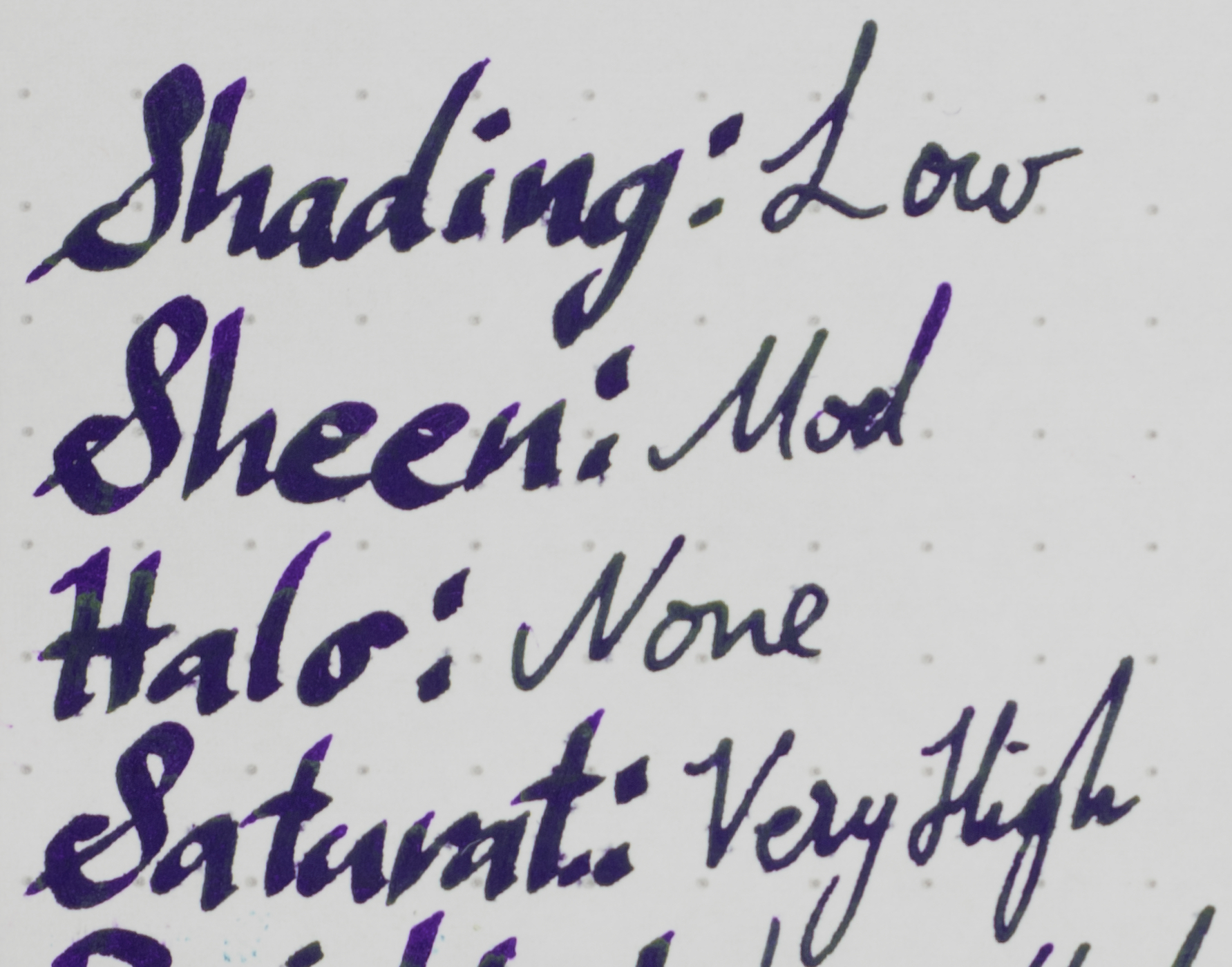

The ink is pretty flat with only a hint of shading and no halo. The ink is too dark, saturated and wet for much shading.


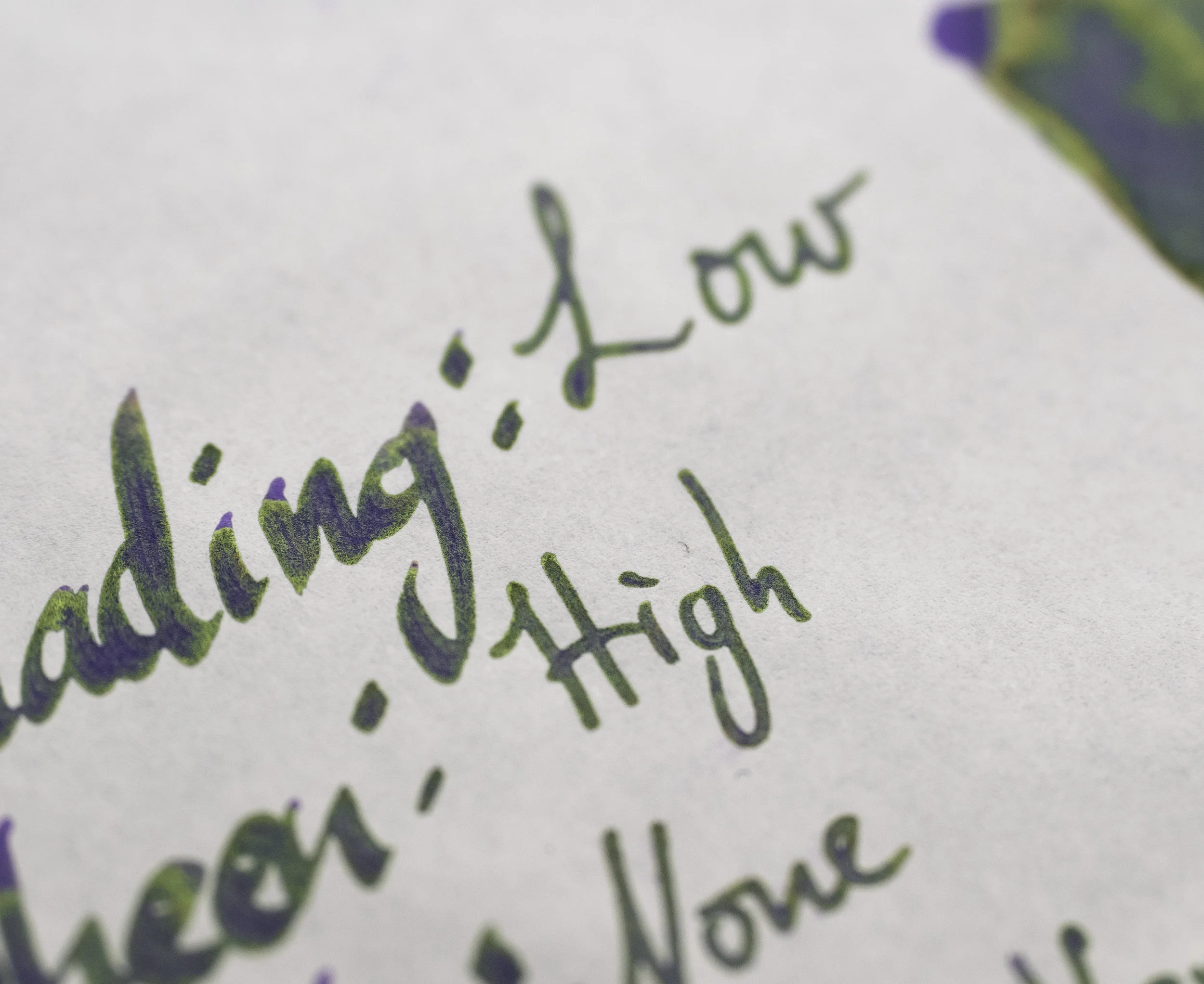

The sheen is a little strange in that it appears muted at a glance but is quite saturated at closer inspection. I think it’s a combination of it not being overly reflective and the dark purple behind it. It’s not brilliant but it is colourful. There’s not a whole heap of sheen on Rhodia but it’s noticeably present on the written lines. On Tomoe River it’s almost everywhere on the written lines and on the swatch there’s a bit of gold sheen in places.


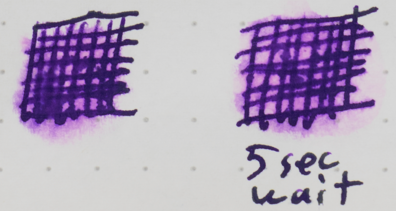

As with all others in the set the chromatography is predictable and not particularly interesting. It is a dark deep blue that progresses to a dark purple and finally a light pink. The dry time isn’t too bad on Rhodia but is a touch unsavoury on Tomoe River at two full minutes. Water resistance is also not too bad but will wash pink everywhere.
Review on 80gsm White Rhodia
As with every other ink in the set, Shigoku also presents as darker on Rhodia and this time a little more saturated as well. There is not much smearing.
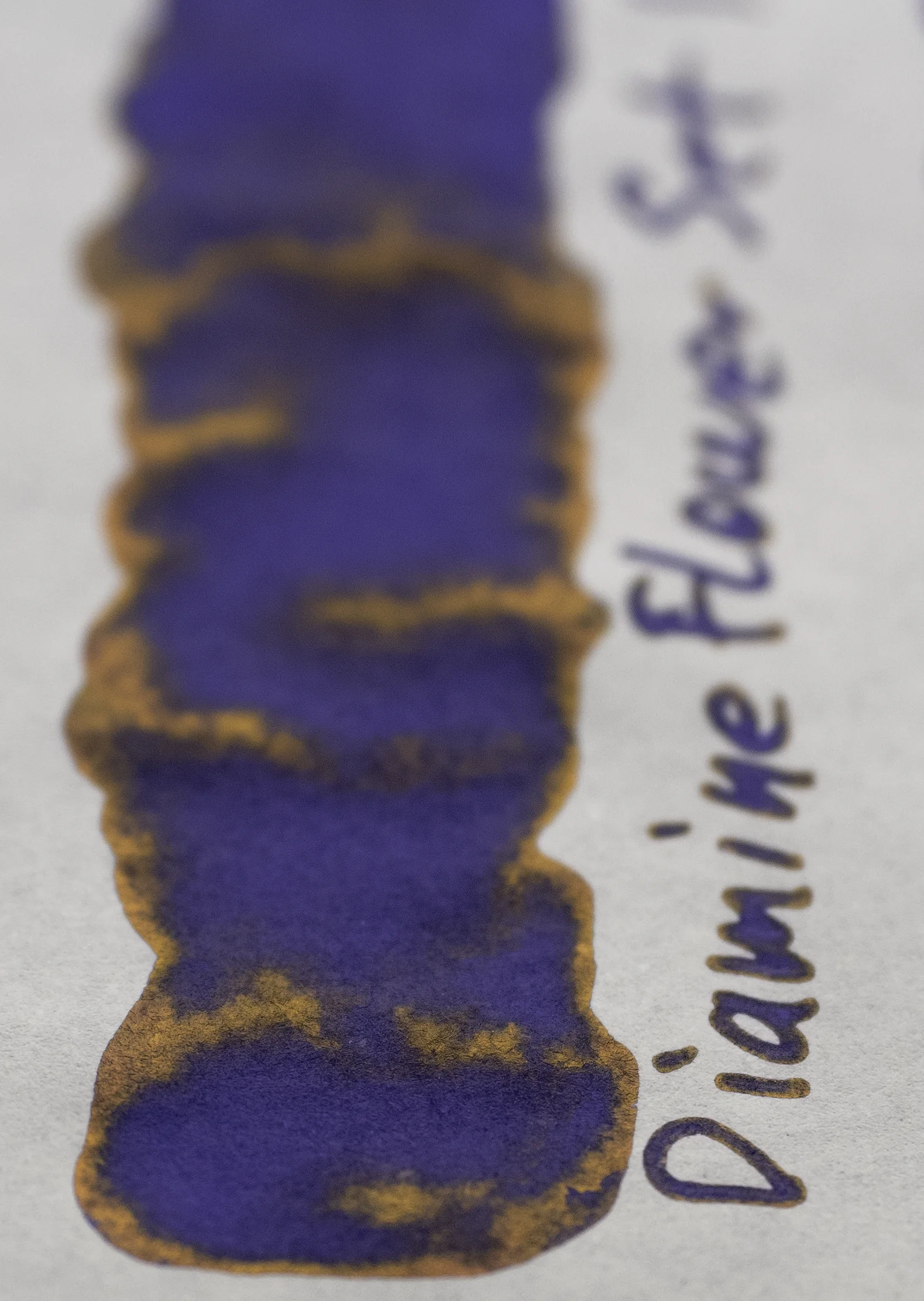
Diamine Flower Set: is bluer and flatter;
Noodler’s Baystate Concord Grape: is a similar hue but more vibrant, darker, and flatter;
Sailor Ink Studio 450: is lighter, flatter and a touch more magenta;
Diamine Purple Rain: is surprisingly darker and also less saturated; and
Bungubox Imperial Purple: is darker and aa bit more blue.
Review on 52gsm Ivory (white) Tomoe River


The sheen makes the ink seem quite a bit lighter than it actually is and also less saturated that it actually is. It’s still a little lighter here and a hair more magenta leaning than on Rhodia. There is a quite a lot of smearing here and this is what I expected from the rest of the inks in the set!
Diamine Flower Set: Is darker, richer and still flatter and the sheen is gold;
Noodler’s Baystate Concord Grape: is no sheen, is darker but now less saturated;
Sailor Ink Studio 450: is quite a bit more magenta a little less saturated and the green sheen is more muted;
Diamine Purple Rain: is quite a bit darker and and bluer and the sheen is yellow; and
Bungubox Imperial Purple: has the same green sheen with yellow hints at times (but the yellow is more prominent here). The ink is richer and bluer and darker.

If you have only read this Part Two, make sure to read Part One so you don’t miss out!
I’m a fan of sheeny inks so I’m a fan of these inks. It’s a shame that Electroopic Violet doesn’t have the same shinning abilities and not the best performance. I’m not a huge fan of blacks being sheeny because I want my blacks to just be black. But with the exception of the performance issues of Electrooptic Violet this is just subjective. There isn’t a whole heap of variety with the inks as all the inks have at least a slight hint of blue in them. There is no orange, red, yellow and even if there’s a green it leans blue rather than yellow. I’d like more variety but I’m happy with what is here. Shigoku is lovely and I’m quite fond of Deep Space Green. Prussian Blue is stunning but not entirely unique any more (though it doesn’t flake like Organics Studio supersheeners do!).
What is extremely annoying is the packaging. It is nigh on impossible to open the cardboard box without ripping it with just your hands. I find Stationery Tag and KWZ boxes are susceptible to this problem as well but these Carpink bottles are more than susceptible; you need to use a knife or something to slip them open. You can see that the Black Square box above is already ripped! Very Frustrating. Fortunately the inks aren’t frustrating.
A huge thank you top the anonymous benefactor that sent me these inks. I’m glad I’ve finally published this comparison (it went through a few iterations). As mentioned above I know of only one place that sells these inks which is Desk Bandit.
✒︎ ✑ ✒︎ ✑
I've listed all my inks and all my pens in their respective pages. Please let me know which inks you'd like to review next via the comments, Twitter, Instagram, or contact me directly.
For blog updated you can follow @macchiato_man on Twitter, subscribe via email, or like my Facebook page.
I was not compensated for this review and everything here is my own honest opinion. There are no affiliate links in this review.