• Blog
  • About
    • My Inks (on Fountain Pen Companion)
    • My Pens
  • Archive
  • Contact
Menu

Macchiato Man

  • Blog
  • About
  • My Collection ☟
    • My Inks (on Fountain Pen Companion)
    • My Pens
  • Archive
  • Contact
The @madebyendless Cotton Wallet arrived the other day! I’m a sucker for these sorts of practical inserts for notebooks. The cotton fabric suites the simple style of the Explorer. 
⠀
While I love these and always get them whenever I can I never
First test of the Regalia paper in the Endless Explorer than I was sent by @madebyendless. Really impressed by the paper. Very smooth, nice sheen and nice shading! Finger prints or hand oil seem to affect the writing a little but nothing out of the o
New Pen Review: Esterbrook Camden (Premium Edition) - 𝙻𝚒𝚗𝚔 𝚒𝚗 𝙱𝚒𝚘!

I’ve been eager to try the Camden for a while now. I love my flat end pens and the overall shape of this one is subtly unique. While there are some differences between
New friend from @esterbrook_official! Camden Manitoba Blue. 
⠀
Love flat end pens so looking forward to digging into this (so review incoming).
 
Flat or round ends?✑
⠀
⠀
⠀
⠀
#fountainpen #fpgeeks #fountainpenaddict #fpn #fountainpengeeks  #fountainp
New Ink Review: @birminghampens Antique Sepia (link in bio)
⠀
In line with the recent trend of soft pastel dichromatic inks but Birmingham’s version is an interesting dust grey version with low saturation that I find quite interesting don&rsquo
New Ink Day! Haven’t had one of these for a while but I received these from a friend at the last Perth Pen Meet. 
⠀
All sailor and the first tall bottle in a while (bringing the number of those to 86). 
⠀
Didn’t realise it at the time but
New Ink Review: La Couronne du Comte Vert Sapin (link in bio)
⠀
The final of LCdC’s initial set of four exclusive inks from Diamine. A lovely rich sheeny green-teal.
✑
⠀
⠀
⠀
⠀
#fountainpen #fpgeeks #fountainpenaddict #fpn #fountainpengeeks  #fo
I don’t know if I’ve ever shared this before but my city has a set of five dip nibs as an artwork. 

They are called “Memory Markers” by Anne Neil and represent early-ish colonial stories of the gardens where they are.

We als
⚠️Update: Why I have been so radio silent! 📻🤫 A lot of large personal changes, essentially (read on for details)!

There have been three main reasons for why I haven’t been able to do much here or on my blog. 

1) 🎓 I had to finish of my Mas
Ink Ink Comparison: Discontinued Iroshizuku and New Iroshizuku! Thanks to @penclassics for allowing this to happen. See link in bio!
⠀
The old: Tsuyu-kusa, Tsukushi, and Ina-ho.
The New: Sui-gyoku, Hana-ikada, and Hotaru-bi.
⠀
This is a long review b
NPD: @esterbrook_official LE Estie “Candy” in Oversize with a Kirk Speer Needlepoint nib!
⠀
Thanks to Esterbrook for sending this through to me for review. I’ve reviewed a couple of Esties now and two of the custom nibs (which are a
Out with the old in with the new?

I just received the new Pilot Iroshizuku Inks in the little bottle ink pack from @penclassics for review. I plan on doing an overview review of the three new and the three old ones!

I feel like Ina Ho was quite a u
New Pen Review (see link in bio): Platinum Curidas courtesy of @penclassics (check them out!)
⠀
This is certainly a curiously designed pen with it's quirks but it has bee a delight to write with and a great pen to through in a pocket. I've been using
New Ink Review! @wearingeul_global Kyonghui! See link in bio!

Kyonghui is a vibrant earthy orange from Wearingeul's series on Korean Female Modern Writers. It is also a great performing ink!

Wearingeul's global push is fairly new; has anyone tried
It has been a little while since I posted here so I thought I'd give a little update!

Firstly I think I just needed a little break at the end of the year! It has been a busy year for me. I have been taking my photography more seriously and I also ha

Subscribe

Sign up with your email address to receive news and updates.

We respect your privacy. Unsubscribe at any time.

Thank you!
Blog RSS

☛ Twitter feed

✉ Email Subscription

☞ Fountain Pens Australia (Facebook Group)

☛ Sailor Pens & Inks (Facebook Group)


Sponsors

10% off code: MACCHIATOMAN


Click here for sponsorship information


Featured Posts:

Featured
Ink Review: Pennonia Pokoltuz (Pokoltűz)
Aug 1, 2019
Ink Review: Pennonia Pokoltuz (Pokoltűz)
Aug 1, 2019
Aug 1, 2019
Notebook Review: Pebble Stationery Pocket Tomoe River Notebook
Nov 10, 2018
Notebook Review: Pebble Stationery Pocket Tomoe River Notebook
Nov 10, 2018
Nov 10, 2018
Ink Review: Krishna Brown Pink
Jan 20, 2018
Ink Review: Krishna Brown Pink
Jan 20, 2018
Jan 20, 2018


Archive
  • November 2024
  • October 2023
  • December 2022
  • October 2022
  • June 2022
  • May 2022
  • April 2022
  • February 2022
  • January 2022
  • December 2021
  • November 2021
  • October 2021
  • September 2021
  • August 2021
  • July 2021
  • June 2021
  • May 2021
  • April 2021
  • February 2021
  • January 2021
  • December 2020
  • November 2020
  • October 2020
  • September 2020
  • August 2020
  • July 2020
  • May 2020
  • April 2020
  • March 2020
  • February 2020
  • January 2020
  • December 2019
  • November 2019
  • October 2019
  • September 2019
  • August 2019
  • July 2019
  • June 2019
  • May 2019
  • April 2019
  • March 2019
  • February 2019
  • January 2019
  • December 2018
  • November 2018
  • October 2018
  • September 2018
  • August 2018
  • July 2018
  • June 2018
  • May 2018
  • April 2018
  • March 2018
  • February 2018
  • January 2018
  • December 2017
  • November 2017
  • October 2017
  • September 2017
  • August 2017
  • July 2017
  • June 2017
  • May 2017
  • April 2017
  • February 2017
  • January 2017
  • December 2016
  • November 2016
  • September 2016
  • August 2016
  • July 2016
Logo 1.png

Ink Comparison: Carpink set of five sheening inks Part One

June 13, 2019 in Ink Review, Ink Comparison

This is Part One of Ink Comparison: Carpink set of five sheening inks. Please read Part Two here!

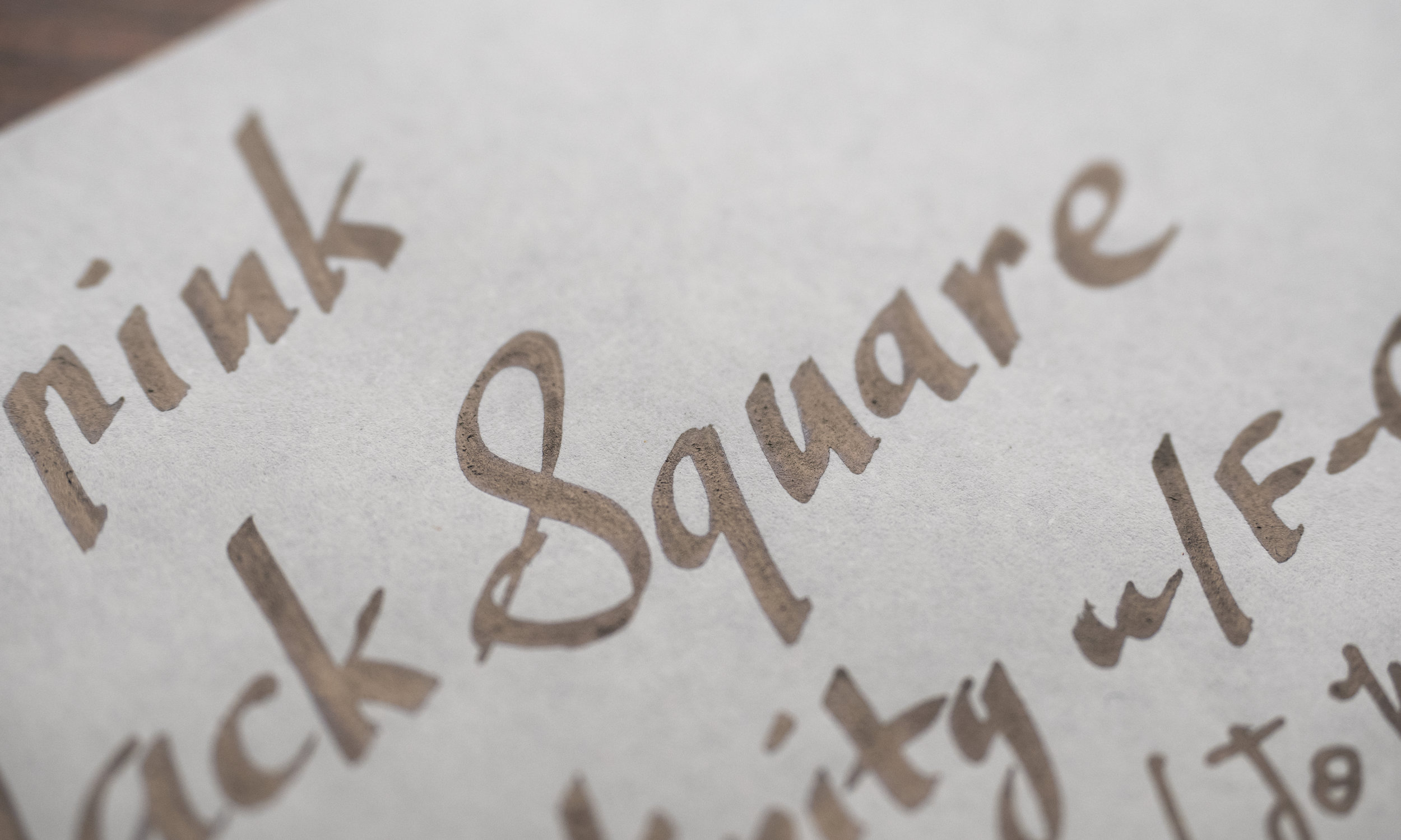
I was generously gifted a bottle of Carpink Prussian Blue and Shigoku in July last year. I knew nothing about the brand and I’d, in fact, never heard of them but the inks were super sheeny and that always piques my interest! In December last year I was gifted the full set for the purpose of review (the benefactor would like to remain anonymous but was a store; this store is not a sponsor of this nor do they sell these inks; I did purchase other inks from the store). It is a set of five inks: Black Square, a sheeny black; Deep Space Green, a sheeny teal; Electrooptic Violet, a pink violet; Prussian Blue, a super sheeny blue; and Shigoku, a sheeny dark purple.

Carpink Title.png

The inks are Taiwanese in origin and the only place I know where they can be purchased (outside the region they are from) is Desk Bandit. The inks come in 20ml glass bottles (though they say 20±2ml which I don’t rightly understand). The boxes also say “change magically” which I assume is a reface to the sheen!

This overview or comparison is done with lite-reviews (serendipity pens rather than complete fountain pens) and there is no samples of the inks on many different paper types. The lite-reviews are still done on 80gsm white Rhodia paper and 52gsm Ivory (white) Tomoe River paper. This took a surprising amount of time to complete!

Black Square Title.png

Carpink Black Square is surprisingly dark and black. It would give many of these black inks a run for their money! What is stopping it from being black, moreso on Tomoe River than Rhodia, is the massive amounts of mutes gold/silvery sheen. The ink is very wet and well lubricated and has no issues with bleeding or feathering.

View fullsize Shading Rhodia
Shading Rhodia
View fullsize Shading Tomoe River 52gsm
Shading Tomoe River 52gsm

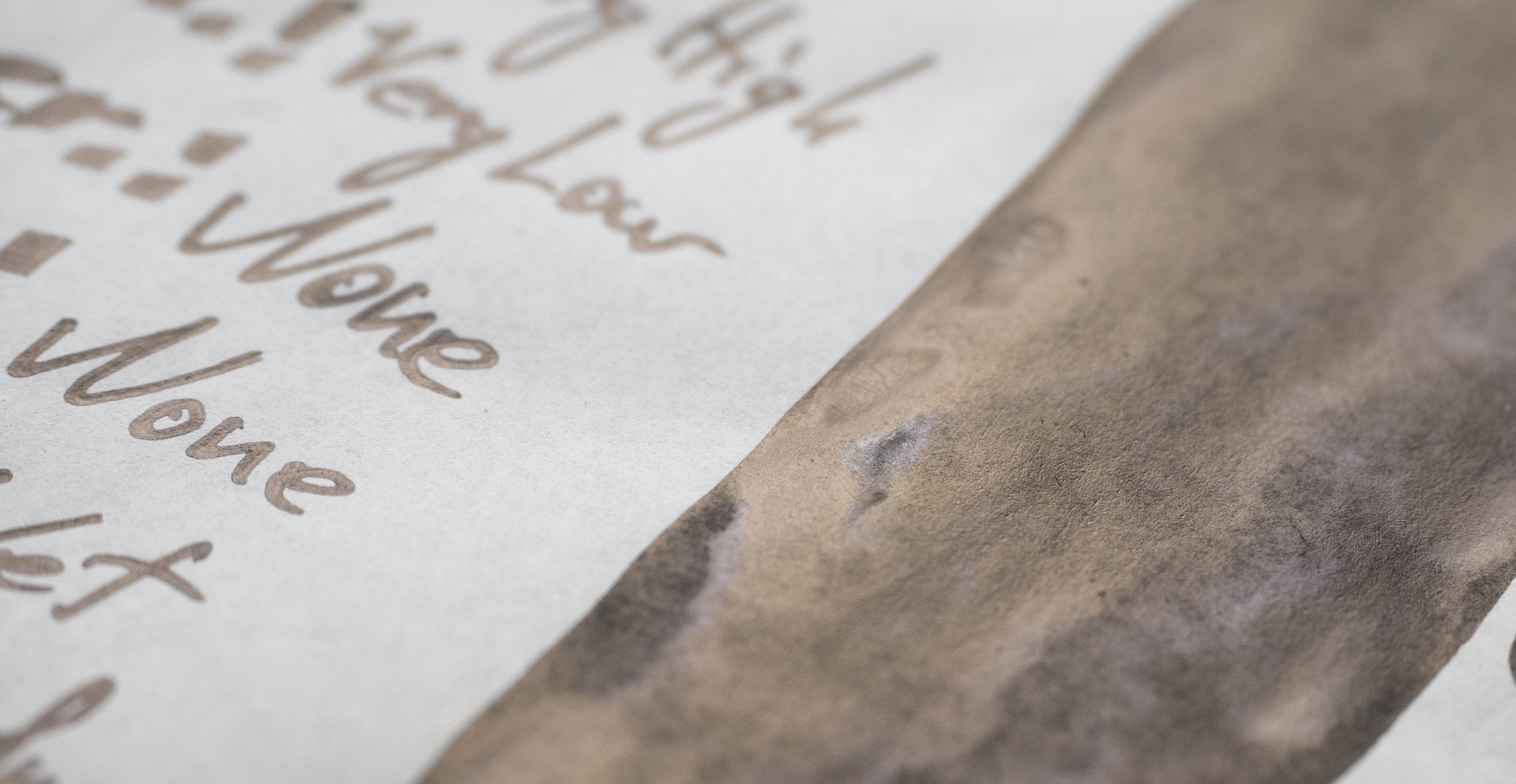
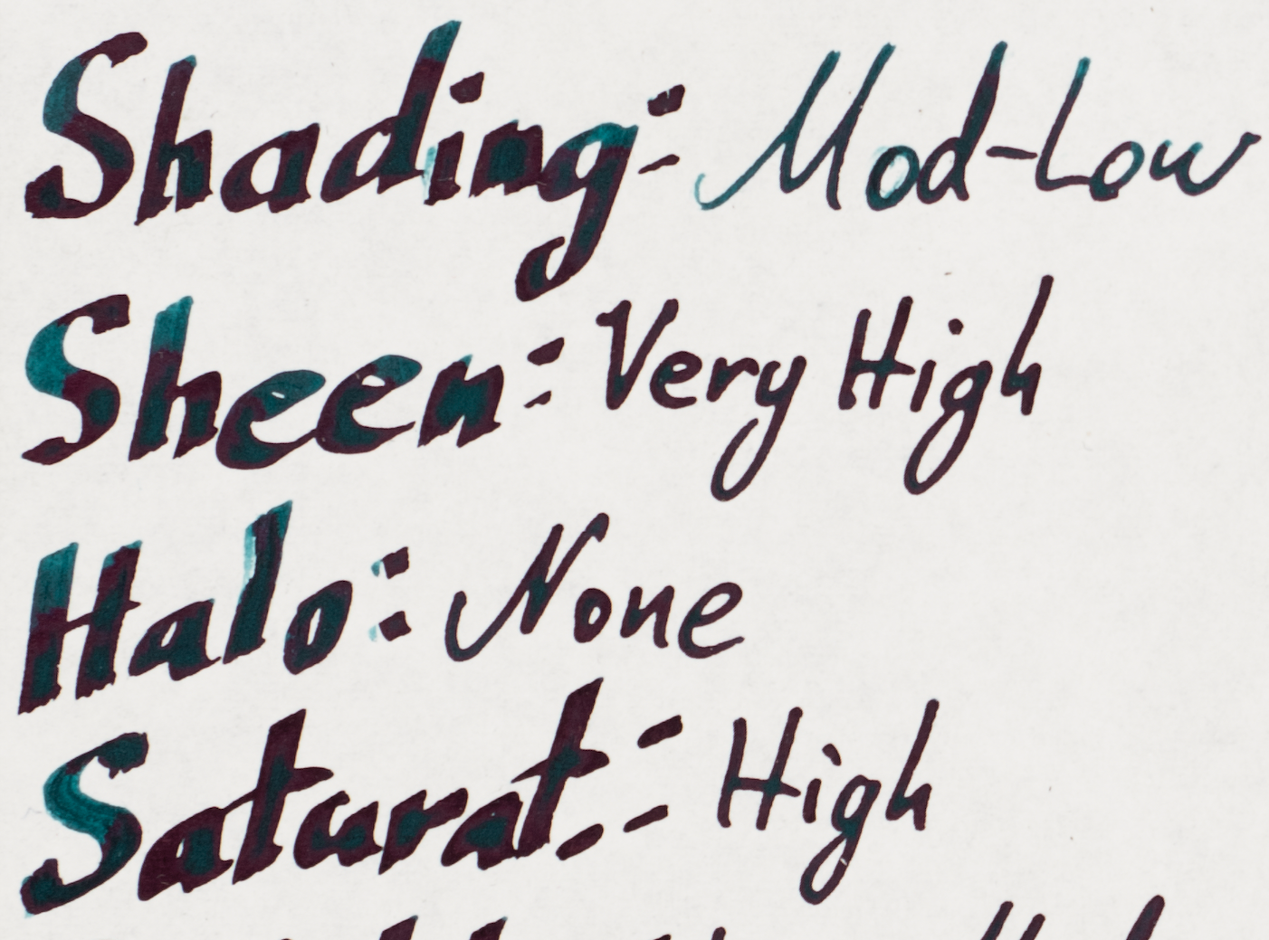
There is no shading what ever (which I think is a good thing for a black ink, otherwise it’s really just a dark grey). There is, similarly, no halo.

Sheen Rhodia
Sheen Rhodia
Sheen Rhodia
Sheen Rhodia
Sheen Rhodia
Sheen Rhodia
Sheen Rhodia
Sheen Rhodia
Sheen Rhodia
Sheen Rhodia
Sheen Tomoe River
Sheen Tomoe River
Sheen Tomoe River
Sheen Tomoe River
Sheen Tomoe River
Sheen Tomoe River

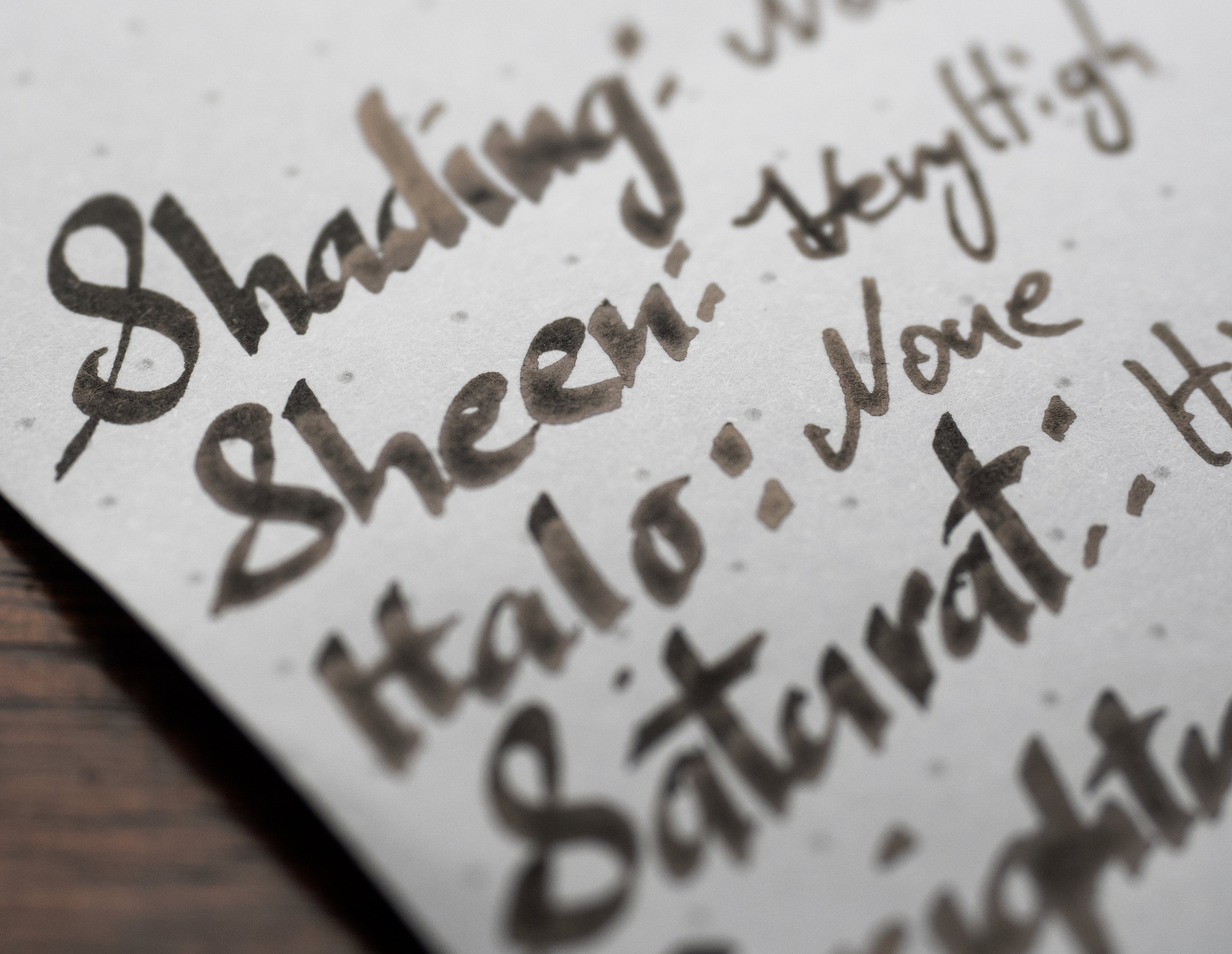
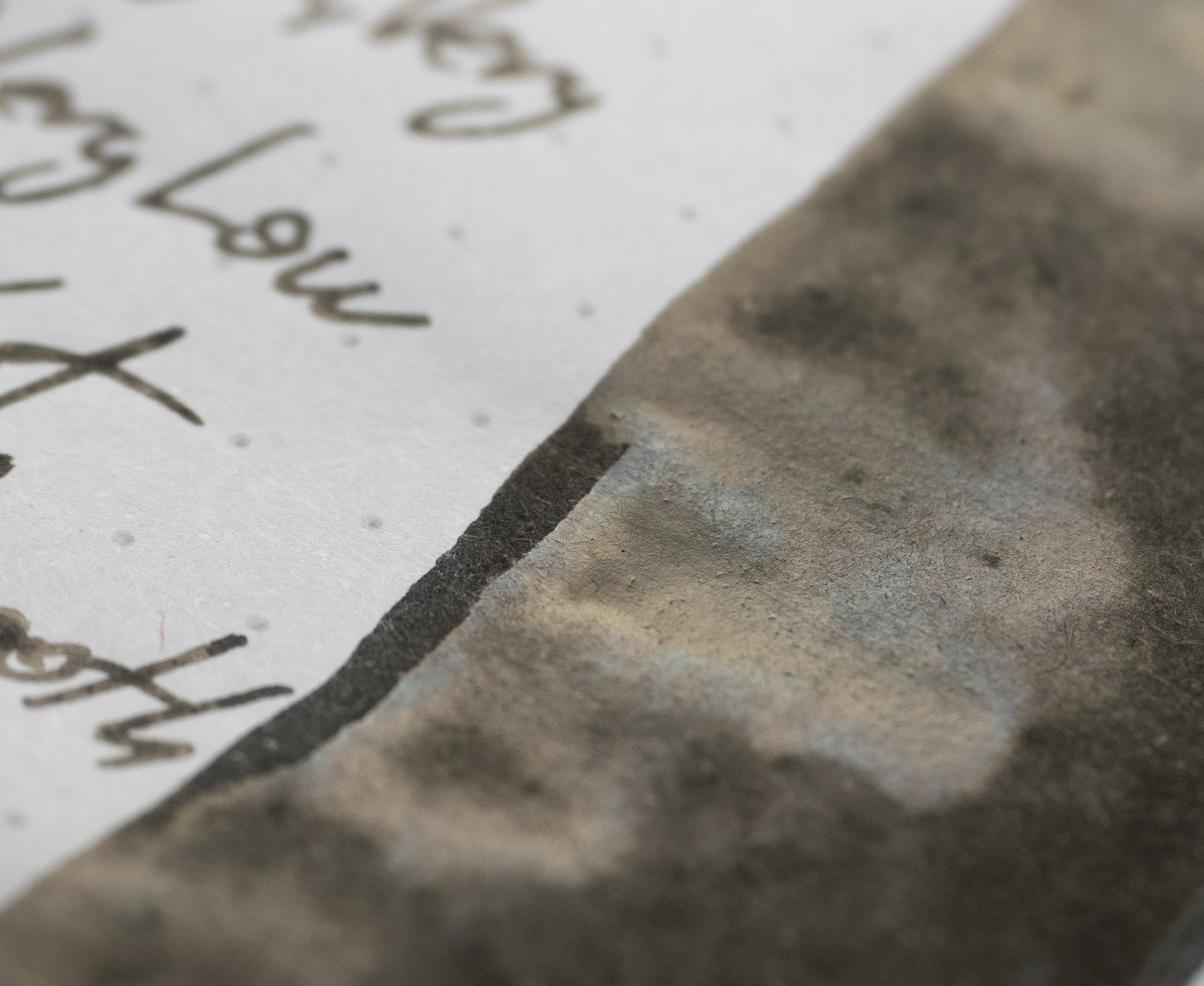
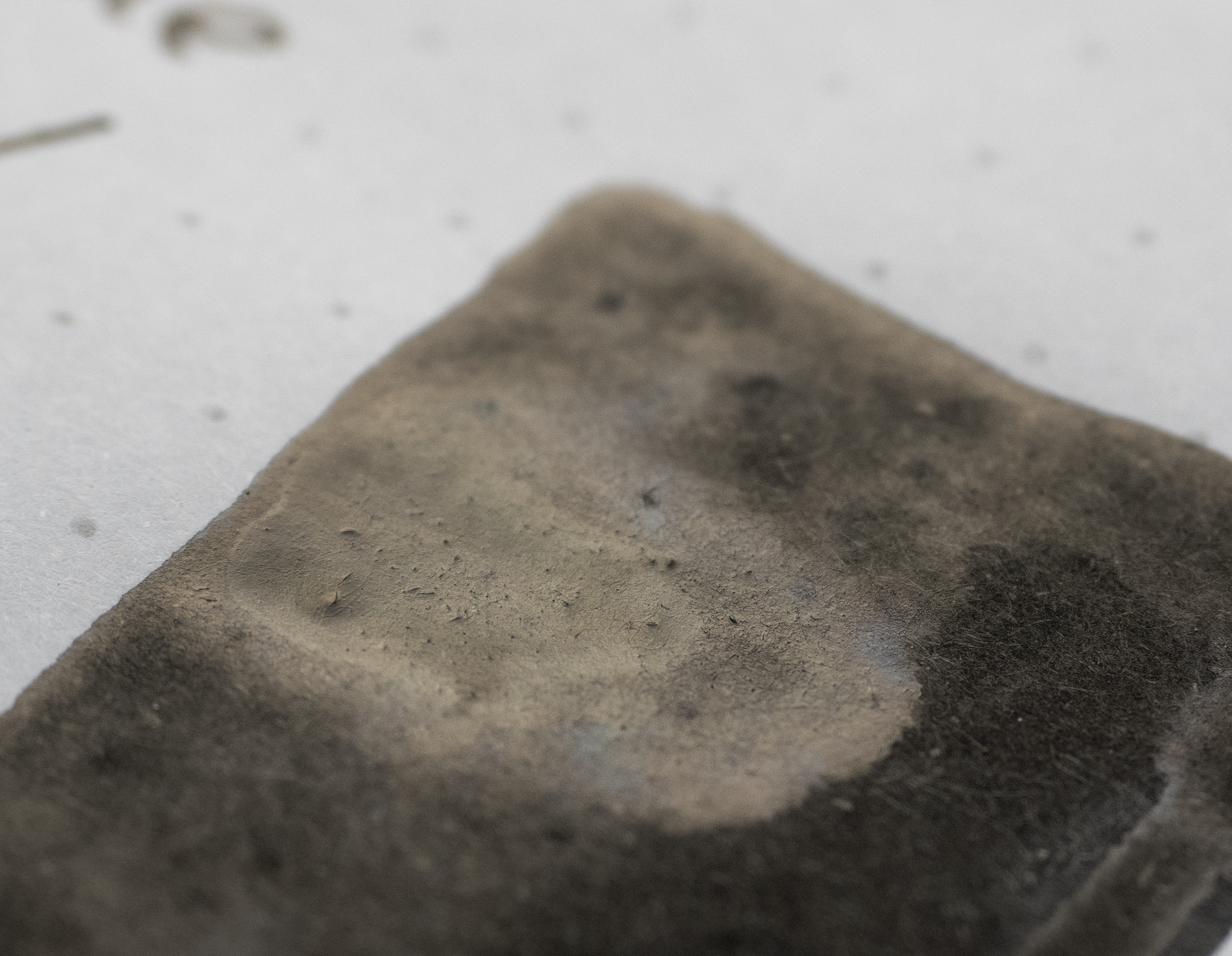
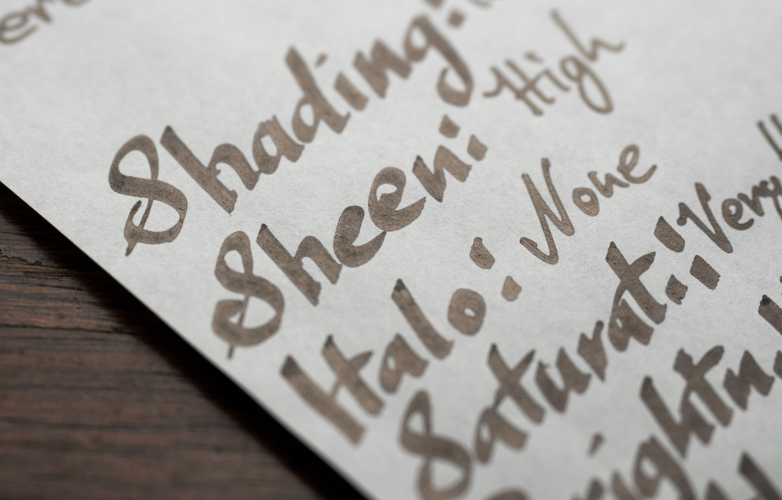
The sheen is very high for Rhodia and also Tomoe River. The colour is a tan colour - somewhat in between gold and silver and also muted. It’s prevalent but not brilliant. In places where the ink pooled for a long time there is a silvery sheen with almost a blue tint to it.

View fullsize Chromatography
Chromatography
View fullsize Dry Time Rhodia
Dry Time Rhodia
View fullsize Dry Time Tomoe River 52gsm
Dry Time Tomoe River 52gsm
View fullsize Water Resistance Rhodia
Water Resistance Rhodia
View fullsize Water Resistance Tomoe River
Water Resistance Tomoe River

The chromatography is uninteresting. There’s some green to the grey areas but mostly it’s a grey to black gradient. Dry Time is extremely slow on both Rhodia and Tomoe River. Two full minutes until dry on Rhodia and four on Tomoe River! Insane! Water Resistance isn’t too bad. The lines are still very visible even if the black washes everywhere.

Review on 80gsm White Rhodia

View fullsize Sheen Diamine Quarts Black and Noodler's Bernanke Black
View fullsize Sheen Aurora Black and Bungubox Black of Score
View fullsize Sheen Sailor Kiwa-guro

Carpink Black Square is a little darker than on Tomoe River due to there being less sheen. The ink’s slight green tint is visible in the swatch. There isn’t much smearing.

  • Diamine Quartz Black: is a lighter and bluer black but the sheen is very similar;

  • Noodler’s Bernanke Black: is darker (mainly due to the lack of sheen), but a comparable hue if a little bluer;

  • Aurora Black: the sheen only appears in the edges of where the ink pools but the hue is similar;

  • Bungubox Black of Score: is much bluer and also darker due to a lack of sheen; and

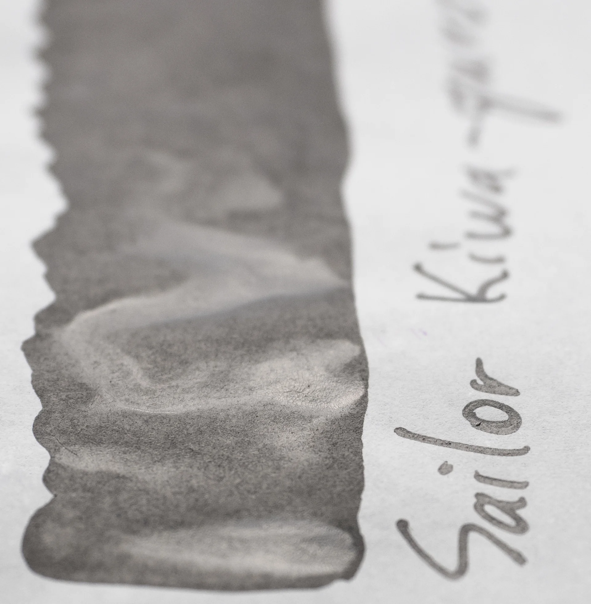
  • Sailor Kiwa-guro: is almost silver or grey due to it’s sheen.

Review on 52gsm Ivory (white) Tomoe River

View fullsize Sheen Diamine Quartz Black and Noodler's Bernanke Black
View fullsize Sheen Aurora Black
View fullsize Sheen Bungubox Black of Score
View fullsize Sheen Sailor Kiwa-guro

The Green tint is a little less apparent on Tomoe River and the sheen make the ink seem less black. There is surprisingly little smearing!

  • Diamine Quartz Black: the ink’s blue tint and lightness is more apparent here but the sheen is still very similar;

  • Noodler’s Bernanke Black: There’s a bit of sheen here now but it’s more yellow and less gold/tan coloured;

  • Aurora Black: the sheen is more apparent but still on the edge;

  • Bungubox Black of Score: very similar sheen and similar all around; and

  • Sailor Kiwa-guro: still just a silver ink for me!

Deep Space Green Title.png

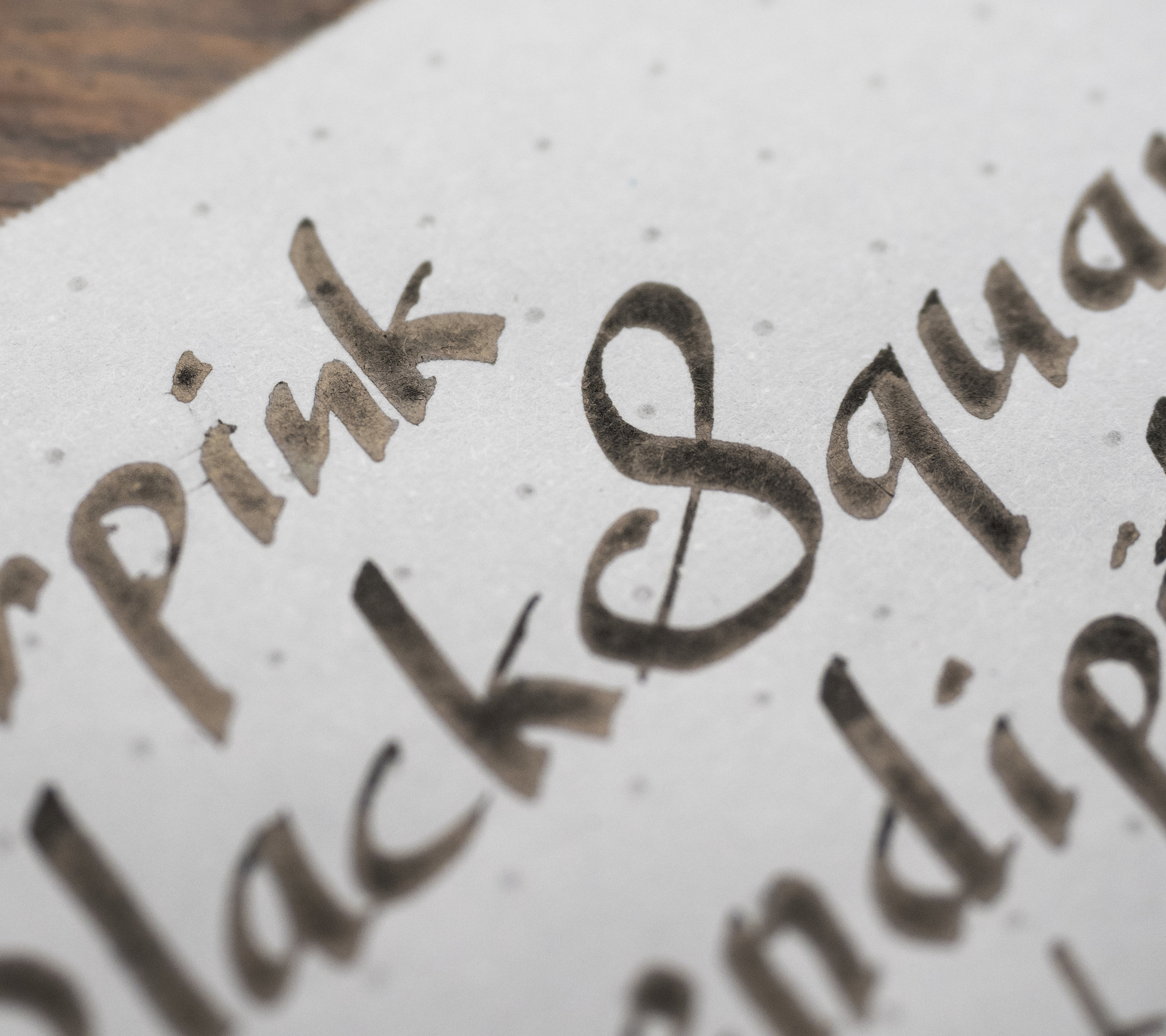
Carpink Deep Space Green is a rich highly saturated teal that sits nicely in-between green and blue. The sheen is a pervasive bright red sheen on Tomoe River but there isn’t much of it on Rhodia. The ink is pretty wet and well lubricated (though not as much as Black Square) and has no issues with bleeding or feathering.

View fullsize Shading Rhodia
Shading Rhodia
View fullsize Shading Tomoe River
Shading Tomoe River

Shading is quite decent and pretty on the music nib but on the medium nib is somewhat low. There is no halo here.

View fullsize Sheen Rhodia
Sheen Rhodia
View fullsize Sheen Rhodia
Sheen Rhodia
View fullsize Sheen Rhodia
Sheen Rhodia
View fullsize Sheen Tomoe River
Sheen Tomoe River
View fullsize Sheen Tomoe River
Sheen Tomoe River
View fullsize Sheen Tomoe River
Sheen Tomoe River
View fullsize Sheen Tomoe River
Sheen Tomoe River

The sheen is a vibrant pink-red and it covers most of the line (but the music nib and the medium) on Tomoe River but is barely there at all on Rhodia. It is there but you need to look for it.

View fullsize Chromatography
Chromatography
View fullsize Dry Time Rhodia
Dry Time Rhodia
View fullsize Dry Time Tomoe River
Dry Time Tomoe River
View fullsize Water Resistance Rhodia
Water Resistance Rhodia
View fullsize Water Resistance Tomoe River
Water Resistance Tomoe River

Chromatography is as expected but still pretty; a blue that moves through green to a yellow- green. Daytime is not too bad on Rhodia - a little slow, maybe - but on Tomoe River it’s a very slow 2 minute wait. Water Resistance isn’t too bad but is a little worse on Tomoe River.

Review 80gsm White Rhodia

View fullsize  OLYMPUS DIGITAL CAMERA

The ink is darker and a little greener on Rhodia. There’s very little smearing.

  • Diamine Smoke on the Water: Darker and a touch bluer, with similar levels of sheen;

  • Sailor Yama Dori: lighter and a touch less saturated but a similar hue and comparable sheen;

  • Blackstone Blue Gum: bluer and flatter with even less sheen;

  • Sailor Ink Studio 641: surprisingly flat and sheen-less; and

  • Organics Studio Walden Pond Blue: more saturated (in the minority of the ink that’s visible past the sheen!) but the sheen is insanely high for Rhodia!

Review on 52gsm Ivory (white) Tomoe River

View fullsize  OLYMPUS DIGITAL CAMERA

Carpink Deep Space Green is bluer, and lighter on Tomoe River. There is still not that much smearing.

  • Diamine Smoke on the Water: is still la little bluer and with more sheen;

  • Sailor Yama Dori: still less saturated and a comparable hue but the sheen is more muted;

  • Blackstone Blue Gum: bluer still and the sheen is now very striking;

  • Sailor Ink Studio 641: very muted sheen, and the ink is also a muted comparable hue; and

  • Organics Studio Walden Pond Blue: is just all pink sheen…

Bottles 2.jpg

Please continue to read this overview in Part Two here! Due to RSS feed limitations, I have needed to split this into two reviews rather than a single large one.

✒︎ ✑ ✒︎ ✑

I've listed all my inks and all my pens in their respective pages. Please let me know which inks you'd like to review next via the comments, Twitter, Instagram, or contact me directly.

For blog updated you can follow @macchiato_man on Twitter, subscribe via email, or like my Facebook page.

I was not compensated for this review and everything here is my own honest opinion. There are no affiliate links in this review.

Tags: Carpink, Carpink Black Square, Diamine Quartz Black, Noodler's Bernanke Black, Aurora Black, Bungubox Black of Score, Sailor Kiwa guro, sheen, red sheem, green sheen, gold sheen, pink sheen, Carpink Deep Space Green, Diamine Smoke on the water, Sailor Yama Dori, Blackstone Blue Gum, Sailor Ink Studio 641, Organics Studio Walden Pond Blue, Carpink Electrooptic Violet, Cross Violet, Lamy Dark Lilac, Noodler's Purple, Noodler's Baystate Concord Grape, Montblanc Psychedelic Purple, Montblanc The Beatles, Carpink Prussian Blue, Krishna Moonview, Organics Studio Nitrogen Royal Blue, Diamine Cult Pens Maureen, Ink Institute Snowy Starry Night, Blackstone Barrier Reef Blue, Diamine Skull & Roses, Carpink Shigoku, Diamine Flower Set Iris, Sailor Ink Studio 450, Diamine Purple Rain, Bungubox Imperial Purple
← Ink Comparison: Carpink set of five sheening inks Part TwoRetrospective: Tuesday June 11th →
Back to Top

Blog RSS

✉ Email Subscription

☞ Fountain Pens Australia (Facebook Group)

☛ Sailor Pens & Inks (Facebook Group)