
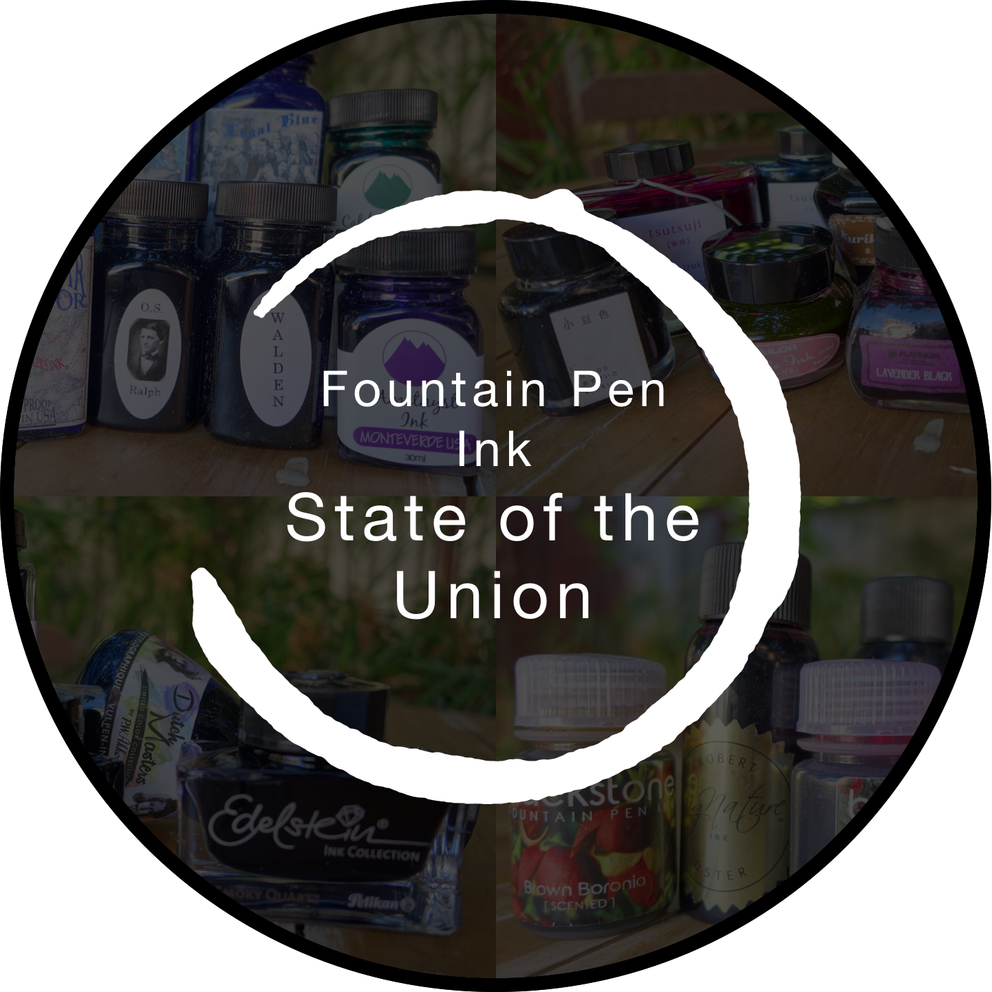
The last few years really have been a renaissance for Fountain Pens and this year is no different. Lots of expansions and additions to lineups and several standout inks. I’m going to be talking about how various brands have performed this year and what I hope for next year. This will be, of course, focused on inks and not pens. I try to keep my posts as objective as possible but this one will probably have a bit more subjectivity than usual.
Australian Inks
Robert Oster
Robert Oster ink have still been steadily increasing in number. From my observations I don’t think there has been a hit like last year’s Fire & Ice but there have still been severel strong releases. Soda Pop Blue seems popular as has Lake of Fire. I still have yet to see a poorly received ink, however, and given how many inks there are and how fast new inks are coming that’s pretty good. Rob also released the ArtInk series of inks. These inks have additional UV resistant properties and were aimed at the art crowd rather than the fountain pen crowd. These don’t seem to be that popular in the fountain pen community and they are a bit expensive. Rob also got into some shimmering inks. I’ve yet to try these but they seem unique (not just gold or silver but 5 different shimmering materials). I still wonder whether shimmering inks are here to stay or whether it’s a fad. I don’t believe it is a fad but I feel interest has plateaued and it’s possible Rob missed the main wave. The Serendipity pen was quite popular this year. I’ve heard several people say they would jump at it in an instant if it was a little cheaper so that might be something for James at Pensive Pens to think about going into next year.
This year has also marked a series of price increases. Some of these only hit locally (in Australia) and I can appreciate why some people might feel a bit annoyed by this but I also think the inks are still good value for money. I’d would not be hoping for many more price jumps next year, however.
What I want from Robert Oster inks next year is some consolidation of colours. There are lots of inks in the collection that are very similar to each other. I think this just creates confusion. If Rob consolidated the lineup by retiring some inks, the collection would still be pretty large but it would be easier on consumers. I’d also like to see more (actually limited) Limited Edition and Store Exclusive inks. I think these would generate some excitement.
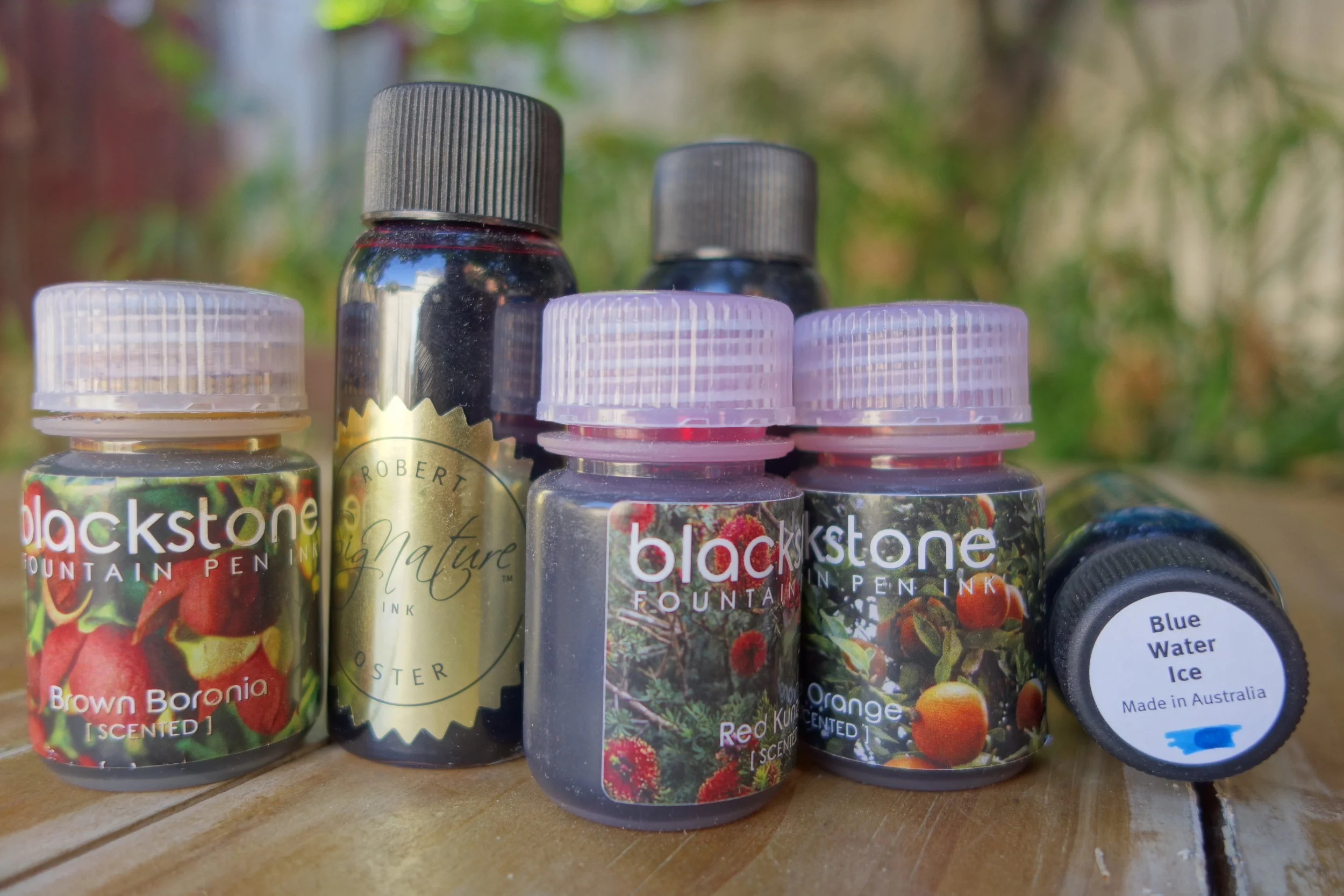
Blackstone
JustWrite’s Blackstone inks released a new line this year with 6 scented inks. I’ve, personally, never cared for scented inks as I’ve never been able to smell them once on the paper (and if so then what is the point?). But regardless, I think these colours look great. Australian Bush is a great green ink and Blue Cypress and Blue Gum are some good sheeners. I think the very ugly polypropylene bottles are holding back these inks. They have released a nice glass bottle for their Barrister Black so I’d hope to see some nicer bottles for the whole lineup (not necessarily glass because shipping glass outside of Australia would be prohibitively expensive). Also released were some mixing inks in CMYK format. Yet to try these but they look interesting.
European Inks
Montblanc
Montblanc’s ink released this year have been a little hit and miss, in my eyes. The misses, for me, were Miles Davis Jazz Blue which is a barely useable watered down looking blue, UNICEF is a very generic turquoise, Year of the Dog Red is also a watered-down pink-red, as well is Ultra Black which isn’t all that black and is almost indistinguishable from their regular line Mystery Black. The hit has definitely been Antoine De Sainte-Exupéry Encre Du Desert which is a pretty unique brown-red ink and The Beatles Psychedelic Purple which is a lovely vibrant magenta/purple. I believe there was also meant to be a circus ink as well that was, earlier in the year, going to be a green tinted yellow ink. Not sure what’s happened with this but disappointing that it didn't happen.
This year Montblanc also increased the size of their bottles by 66% but doubled their price (so the price increased per ml). I used to get 2 bottles of their LE inks but with the increase in price I’m just getting one.
Next year Montblanc will be releasing their Elixir inks that will cost US$65 per bottle and come in Violet, Purple and Azure. These inks are made using some sort a traditional method or using natural ingredients or something to that effect. I find having Violet and Purple a little strange for such a pricy ink. I’m looking forward to Montblanc next year.
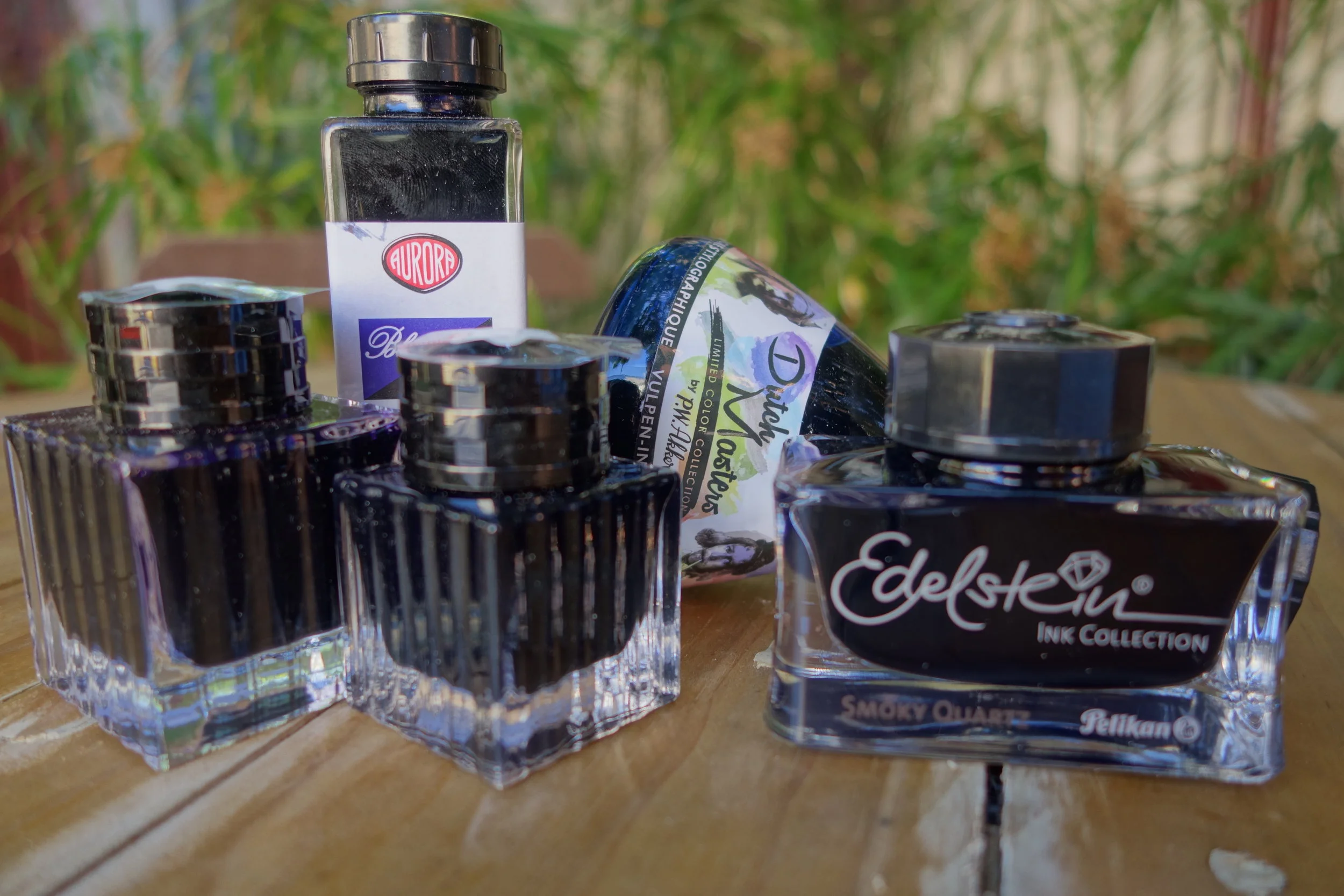
Pelikan
Browns never really seem to gain any hype but also rarely in hate so I think Smokey Quartz has been a success just not anything super exciting. Last year’s Aquamarine seemed pretty divisive but given that Pelikan added it to the regular lineup I might be wrong about that. I would like to point out that I think Pelikan’s LE pen releases have been to a very high standard lately and this year was no exception. Next year’s community chosen olive green ink looks interesting and I expect more universally appreciated as these sorts of greens are often popular. I wonder whether this will be the only LE ink for the year?
Akkerman
Akkerman released the Dutch Masters inks with a smoother body and a higher capacity. These are great collectors inks but I’m still convinced that many/most/all of these inks (and the standard line Akkerman inks) are rebottled Diamine. They are just too identical on paper, in the pen and in chromatography. I want for Akkerman to commission new inks from Diamine (like what Cult Pens does with Deep Dark Blue etc.) rather than rebottle the current lineup.
Aurora
Aurora doesn’t really do much with inks but when they did it generated quite a bit of hype and hype for a blue-black nonetheless. This is a solid ink and a good colour but I don’t expect Aurora to be releasing a bunch more colours next year. Happy for them to prove me wrong, however, as their inks are high quality.

J. Herbin
J.Herbin released the peculiar new lineup dubbed "Jacques Herbin” and with that initially came Amethyste De L'Oural, a purple ink with silver shimmering particles. Well received but dramatically less hype than previous J.Herbin shimmering releases such as Stormy Grey and Emerald of Chivor. Interestingly, Jacques Herbin has also instantly released 10 inks (in addition to Amethyste De L'Oural) exclusive to the Parisian department store Le Bon Marché. Astonishingly they also have inks on tap to refill your bottle once it runs out! Amazing! Accompanying this is some higher end pens, paper and leather products. Very exciting. I hope they expand these releases these next year!
Graf von Faber-Castell
These new additions to the GvFC lineup have somewhat snuck through. Last year there was one or two additions to the ink lineup but late this year there were five new inks released in relatively quick succession. Some, like the Turquoise, are somewhat generic, but others are interesting like Burned Orange and Olive Green.
Lamy
Lamy’s year has been very disappointing all round. Starting off with not taking advantage of the Lamy 2000’s 50th anniversary (seriously, Lamy, just create a Limited Edition Makrolon Lamy 2000 in a different colour each year and basically print money) and then moving onto Lamy Pacific Blue.
The fact that Lamy just rebottled their Turquoise (while giving the blue lid a different colour implying a different ink!) and that they didn’t even tell retailers is pretty inexcusable for me. Sure they were very open that it was the same ink when people asked but that isn’t good enough. Really dropped the ball on this one.
Petrol was well received but it was still no where near as popular as Dark Lilac. It was also less unique than Dark Lilac. I don’t consider this a failure at all and on it’s own it was a good release but when coupled with the disappointing 2000 anniversary, and Pacific Blue it needed to be bigger.
Lamy have announced the a Vibrant Ink to accompany an Al-Star. This ink looks shockingly similar in Goulet Pens' images to Lamy Red but I am told that it is not the same ink (and they did ask).
Diamine
This year Diamine released a bunch more Shimmertastic inks. As I’ve said, I’m not sure whether this is a fad but I do think interest has waned a little. I feel Diamine are definitely draining as much from it as they can and all the best to them. Shimmer and sheen look pretty great together so it’s good to see some of the more recent Diamine Shimmertastics with some sheen. I do think it’d be great to see super-sheening inks like Diamine Grape, Bilberry or Majestic Blue with shimmer. Diamine also released an expanded lineup of the 120th Anniversary inks and this was a pretty colourful and varied release. There wasn’t much in the standard line that got expanded apart from the addition of a /r/fountainpens created ink “Earl Grey”. Personally I found this choice of ink very disappointing (yet another non-grey grey) and while the name is a great pun it has nothing to do with reddit. Obviously I'm being subjective here. Moving forward is a bit of a predicament. I don't want Diamine to stagnate but they already have so many different bottles and colours. I think maybe some regional exclusives, like the Philippines releases, could keep some new interest without oversaturating their brand.
KWZ
Some great pen show exclusives this year with Liquid Words (for the Polish pen show) not only having a great name and label but also being a rich unique colour. KWZ inks have also come to Australia and seem to be expanding stockists yet supply is keeping up with demand (it seems) so that is great news. They recently announced some inks with sheen based on geographical locations in Poland (I’d like to point out that their inks have had sheen in the past but they have rather silvery and subtle). These inks looks great (I only have them on order so I’m, relying on photos and reviews) and the labels really pop. I just want KWZ to keep doing what they’ve done this year in 2018 and I’ll be happy! Maybe some new IG?!
De Atramentis
De Atramentis haven’t really done that much this year apart from releasing some sparkling inks dubbed Pearlescent. These had a huge range because, while the base colours were limited, you could pick between 4 different shimmers (Gold, Silver, Copper and Bronze). I found the Bronze to be pretty unique and attractive and I plan on getting some some time. I’m not sure why these weren’t very successful and weren’t talked about much. I think they can look pretty stunning. Not sure where De Atramentis can go from here. I think they too have far too many inks and it just gets confusing when they rebottle so many of them under themes. Can’t say I’m a fan of that.
North American Inks

Organics Studio
Nitrogen Royal Blue came out late last year (the ink, I believe, was a re-release but the original ink didn’t have the sheen). This year Tyler has followed up with Walden Pond Blue and Emerson Twilight Blue. Both of these follow in the footsteps of Nitrogen Royal Blue and lead the ink world on sheen. I believe Tyler has said he prefers shading to sheen but is making these inks because people love them. They are certainly unique in the levels of sheen they get and while I love it I can appreciate why some believe there is too much sheen here. So far all the three sheeny inks are blues with the same bright pink sheen. I think Organics Studio need to continue with the sheen inks they have successfully made a name for them selves with but what I’d like is some different sheens on different base colours (green on purple, gold on pink etc.). That said, I believe Organics Studio is a one person band and distribution is already an issue. I hope first and foremost that Tyler can find a way to alleviate the bottle necks for his own good and for Organics Studio!
Private Reserve
Nothing to see here. In fact I can’t see this brand lasting much longer. Goulet dropped them, Vanness only have a few cartridges left and La Couronne du Comte are all but empty as well. Few stores stock these somewhat problematic inks (Anderson Pens still do) and that’s a shame. Avocado is a great green and DC Supershow Blue is the closest ink I can find to Parker Penman Sapphire. These are affordable inks but their propensity to grow mould (especially the red inks) has let them down and I believe this is the main reason that brands and selling them any more. I hope they can bounce back, maybe even release new inks, but I’m not holding my breath. I think everyone should stock up on their favourites though…
Noodler’s
Noodler’s has been doing alright for itself in releasing new inks including quite a few show exclusives and standard line up (Polar Purple, Legal Blue (different from original release)). The problem, however, for me, is the quality of these releases. So many of the newest Noodler’s inks perform horribly on all paper except Tomoe River and that just isn’t good enough. I’d like to blame the fact that they are bulletproof and eternal but Nathan has made bulletproof eternal inks in the past that don’t perform poorly. Some of the more gimmicky but still interesting inks such as Pacific Dawn at the Golden Gate (which was last year) which changes colour (slightly) when washed or the more recent House Divided which reacts similarly I find to be impractical and still poor performers; they are show exclusives and I’m glad they aren’t in the standard lineup. Noodler’s inks already have somewhat infamous batch variation (some of which can be attributed to forensic measures) but I feel like the 2016 American Aristocracy really was almost a self-aware joke at the brand's own expense regarding batch variation.
I still like Noodler’s inks. I love the labels and the bottles I just wish the inks were more useable. I hope for more LE releases (and standard line releases) next year but I hope for either non-bulletproof/eternal inks are for Nathan to find a way to make them work well on every-day fountain pen friendly paper.
Monteverde
Monteverde have dramatically stepped up their ink game. They’ve reduced their bottle sizes (and the price dropped as well) but the lineup has grown exponentially. Perhaps it grew too quick because while the response has been positive it hasn’t been that hyped. Some of the inks are also a little generic to my mind. They all seem to be solid but there aren’t many that really stand out. I appreciate the increase though and the small bottles at a cheap price make them easy to throw onto an order to try them out. The Noir series also looks interesting, though I haven’t tried it yet.
Japanese Inks

Sailor
Sailor re-released their old Jentle inks (Grenade, Apricot etc.) I feel this was strange not only because it was so soon (too soon in my opinion) after retiring the inks but also because it was US only. I get that Sailor inks aren’t as popular in Europe (and Australia doesn’t really count) but I don’t understand why they wouldn’t supply to Asia as well. Sailor does seem to be getting more cosy with their US distribution with plenty of US retailers (and not just Vanness as it has been in recent times) now stocking Bungubox and Kobe inks. Bungubox have also re-opened international shipping direct from Bungubox (but shipping isn’t pretty) which had been closed for a while. I think this is a great sign of Sailor taking the international market more seriously and putting more attention to it. That doesn’t mean I expect (or want!) all the Japanese store exclusives to be open to everyone.
A focus of my ink collection this year has been the Japanese store exclusives. They are pricy but they are also fun to track down and find out how to order. It’s a game to hunt them down (and even discover them). This is obviously not something everyone wants to do but I find it fun. There’s also something rewarding about collecting an difficult to acquire ink (and especially a difficult to acquire limited edition ink!).
What Sailor are doing moving forward seems a little up in the air. In Japan they have released some new inks in 20ml bottles (the 20ml Storia bottles) and have also moved all their Jentle inks (apart from Blue, Blue Black, Black, Sei Boku and Kiwa Guro which are in new 50ml square bottles) to these tiny 20ml bottles… and didn’t drop the price. This is a very large increase in price and 20ml, to me, is just way too small. I don’t think a proper bottle of ink should drop bellow 30ml. 20ml is just a sample bottle (think Iroshizuku or J.Herbin) rather than the proper bottle. I am worried about how Sailor will be producing inks moving forward. I hear that the US will continue getting 50ml but what about Japanese store exclusives? If they don’t change, the store exclusives will actually be noticeably cheaper than the standard line. I expect these exclusives to jump up in price and I’m hoping they don’t move them to smaller bottles and get rid of the beautiful vase bottles. Bungubox released a set of inks based on the Tokyo subway that were in the new 20ml bottles but as this is a set of inks I don't think much can be read into it.
I don’t think Sailor’s 2018 is going to be cheap. Especially if you are buying from Japan. Bit of a worry for me about what is my favourite ink brand.
Pilot
Two Tokyo exclusive limited edition additions to the Iroshizuku lineup is all that changed. Pilot initially release the Iroshizuku inks in a series (and not in one go). I’d like them to add an ink to the lineup every now and then to revitalise the set. Maybe even some international limited editions. It’s difficult to get Japanese makers to expand their attention internationally but I can hope (especially as Sailor has started to do so).
Platinum
With the release 6 Iron Gall inks, Platinum made a bit of a splash mid year. I can’t remember Platinum doing much interesting before this (happy to be wrong) so it’s great to see them expanding. Interestingly some or all of the inks weren’t new and they approached “pgary” to use some of the inks he created. I’m not sure how much the inks are modified from the originals that Gary made but this is an interesting approach. I’d love for them to expand this Iron Gall lineup next year.
Kyo iro and Kyo no oto
These inks have been around a little while but really picked up in popularity more recently when they expanded their distribution channels. This is great to see as there are some unique colours in these inks. They are slow to release the new inks to the non-Japanese market and their limited editions don’t make it at all but that’s fine as well, in my opinion. I’m honestly happy with how this brand is moving along. New inks are steadily coming but nothing too fast that it’s difficult to keep up.
Miscellaneous Inks
Krishna seem to be rotating through their inks somewhat frequently. Retiring older inks and introducing new ones and even some limited edition ones. Some of the inks are pretty - damn - impressive but their problem is distribution. The inks are themselves are very cheap at around US$3-4 but the problem is shipping. I believe India Post won’t ship liquids so Krishna inks have to be sent via a courier service like Fedex. The cheapest shipping method they could offer me was US$60 for up to 15 inks. This worked out to be US$6.62 per bottle and .33¢ per ml. This isn’t terrible at all but it is a commitment to buy 15 inks at US$6.62 each and it is disappointing for most of that money to go to Fedex rather than the ink maker! iZods in the UK are selling the inks (at a higher price) so it’s good to see the inks make their way out of India. I do hope they find a way to reduce distribution costs (which I believe they are working on!).
It’s good to see some inks coming from South Korea with Egoistar and Colorverse. The latter looks very interesting (though expensive) and the idea of getting two bottles of the same ink (one big and one small) is certainly unique. Some interesting colours as well. Definitely eager to try these.
2018
I’m somewhat expecting sheen to be the “thing” for next year. The success of sheening inks this year will encourage more to be made. I’m not sure how long ink brands will continue to pursue shimmering inks but I can’t imagine they’d continued to expand exponentially like they have. I’d like for more Iron Gall inks come out from different brands.