• Blog
  • About
    • My Inks (on Fountain Pen Companion)
    • My Pens
  • Archive
  • Contact
Menu

Macchiato Man

  • Blog
  • About
  • My Collection ☟
    • My Inks (on Fountain Pen Companion)
    • My Pens
  • Archive
  • Contact
The @madebyendless Cotton Wallet arrived the other day! I’m a sucker for these sorts of practical inserts for notebooks. The cotton fabric suites the simple style of the Explorer. 
⠀
While I love these and always get them whenever I can I never
First test of the Regalia paper in the Endless Explorer than I was sent by @madebyendless. Really impressed by the paper. Very smooth, nice sheen and nice shading! Finger prints or hand oil seem to affect the writing a little but nothing out of the o
New Pen Review: Esterbrook Camden (Premium Edition) - 𝙻𝚒𝚗𝚔 𝚒𝚗 𝙱𝚒𝚘!

I’ve been eager to try the Camden for a while now. I love my flat end pens and the overall shape of this one is subtly unique. While there are some differences between
New friend from @esterbrook_official! Camden Manitoba Blue. 
⠀
Love flat end pens so looking forward to digging into this (so review incoming).
 
Flat or round ends?✑
⠀
⠀
⠀
⠀
#fountainpen #fpgeeks #fountainpenaddict #fpn #fountainpengeeks  #fountainp
New Ink Review: @birminghampens Antique Sepia (link in bio)
⠀
In line with the recent trend of soft pastel dichromatic inks but Birmingham’s version is an interesting dust grey version with low saturation that I find quite interesting don&rsquo
New Ink Day! Haven’t had one of these for a while but I received these from a friend at the last Perth Pen Meet. 
⠀
All sailor and the first tall bottle in a while (bringing the number of those to 86). 
⠀
Didn’t realise it at the time but
New Ink Review: La Couronne du Comte Vert Sapin (link in bio)
⠀
The final of LCdC’s initial set of four exclusive inks from Diamine. A lovely rich sheeny green-teal.
✑
⠀
⠀
⠀
⠀
#fountainpen #fpgeeks #fountainpenaddict #fpn #fountainpengeeks  #fo
I don’t know if I’ve ever shared this before but my city has a set of five dip nibs as an artwork. 

They are called “Memory Markers” by Anne Neil and represent early-ish colonial stories of the gardens where they are.

We als
⚠️Update: Why I have been so radio silent! 📻🤫 A lot of large personal changes, essentially (read on for details)!

There have been three main reasons for why I haven’t been able to do much here or on my blog. 

1) 🎓 I had to finish of my Mas
Ink Ink Comparison: Discontinued Iroshizuku and New Iroshizuku! Thanks to @penclassics for allowing this to happen. See link in bio!
⠀
The old: Tsuyu-kusa, Tsukushi, and Ina-ho.
The New: Sui-gyoku, Hana-ikada, and Hotaru-bi.
⠀
This is a long review b
NPD: @esterbrook_official LE Estie “Candy” in Oversize with a Kirk Speer Needlepoint nib!
⠀
Thanks to Esterbrook for sending this through to me for review. I’ve reviewed a couple of Esties now and two of the custom nibs (which are a
Out with the old in with the new?

I just received the new Pilot Iroshizuku Inks in the little bottle ink pack from @penclassics for review. I plan on doing an overview review of the three new and the three old ones!

I feel like Ina Ho was quite a u
New Pen Review (see link in bio): Platinum Curidas courtesy of @penclassics (check them out!)
⠀
This is certainly a curiously designed pen with it's quirks but it has bee a delight to write with and a great pen to through in a pocket. I've been using
New Ink Review! @wearingeul_global Kyonghui! See link in bio!

Kyonghui is a vibrant earthy orange from Wearingeul's series on Korean Female Modern Writers. It is also a great performing ink!

Wearingeul's global push is fairly new; has anyone tried
It has been a little while since I posted here so I thought I'd give a little update!

Firstly I think I just needed a little break at the end of the year! It has been a busy year for me. I have been taking my photography more seriously and I also ha

Subscribe

Sign up with your email address to receive news and updates.

We respect your privacy. Unsubscribe at any time.

Thank you!
Blog RSS

☛ Twitter feed

✉ Email Subscription

☞ Fountain Pens Australia (Facebook Group)

☛ Sailor Pens & Inks (Facebook Group)


Sponsors

10% off code: MACCHIATOMAN


Click here for sponsorship information


Featured Posts:

Featured
Ink Review: Pennonia Pokoltuz (Pokoltűz)
Aug 1, 2019
Ink Review: Pennonia Pokoltuz (Pokoltűz)
Aug 1, 2019
Aug 1, 2019
Notebook Review: Pebble Stationery Pocket Tomoe River Notebook
Nov 10, 2018
Notebook Review: Pebble Stationery Pocket Tomoe River Notebook
Nov 10, 2018
Nov 10, 2018
Ink Review: Krishna Brown Pink
Jan 20, 2018
Ink Review: Krishna Brown Pink
Jan 20, 2018
Jan 20, 2018


Archive
  • November 2024
  • October 2023
  • December 2022
  • October 2022
  • June 2022
  • May 2022
  • April 2022
  • February 2022
  • January 2022
  • December 2021
  • November 2021
  • October 2021
  • September 2021
  • August 2021
  • July 2021
  • June 2021
  • May 2021
  • April 2021
  • February 2021
  • January 2021
  • December 2020
  • November 2020
  • October 2020
  • September 2020
  • August 2020
  • July 2020
  • May 2020
  • April 2020
  • March 2020
  • February 2020
  • January 2020
  • December 2019
  • November 2019
  • October 2019
  • September 2019
  • August 2019
  • July 2019
  • June 2019
  • May 2019
  • April 2019
  • March 2019
  • February 2019
  • January 2019
  • December 2018
  • November 2018
  • October 2018
  • September 2018
  • August 2018
  • July 2018
  • June 2018
  • May 2018
  • April 2018
  • March 2018
  • February 2018
  • January 2018
  • December 2017
  • November 2017
  • October 2017
  • September 2017
  • August 2017
  • July 2017
  • June 2017
  • May 2017
  • April 2017
  • February 2017
  • January 2017
  • December 2016
  • November 2016
  • September 2016
  • August 2016
  • July 2016
Logo 1.png

Ink Review: Robert Oster Velvet Storm

December 13, 2017

This ink as some very unique sheen. It doesn't have a lot but what it does have reacts very differently depending on the paper. Robert Oster teased this ink in August and announced the name in September. "Velvet Storm" is a great evocative name for an ink and suites this dark blue-green ink. Thank you to Pen Chalet who sent me this ink to review.

Title.png

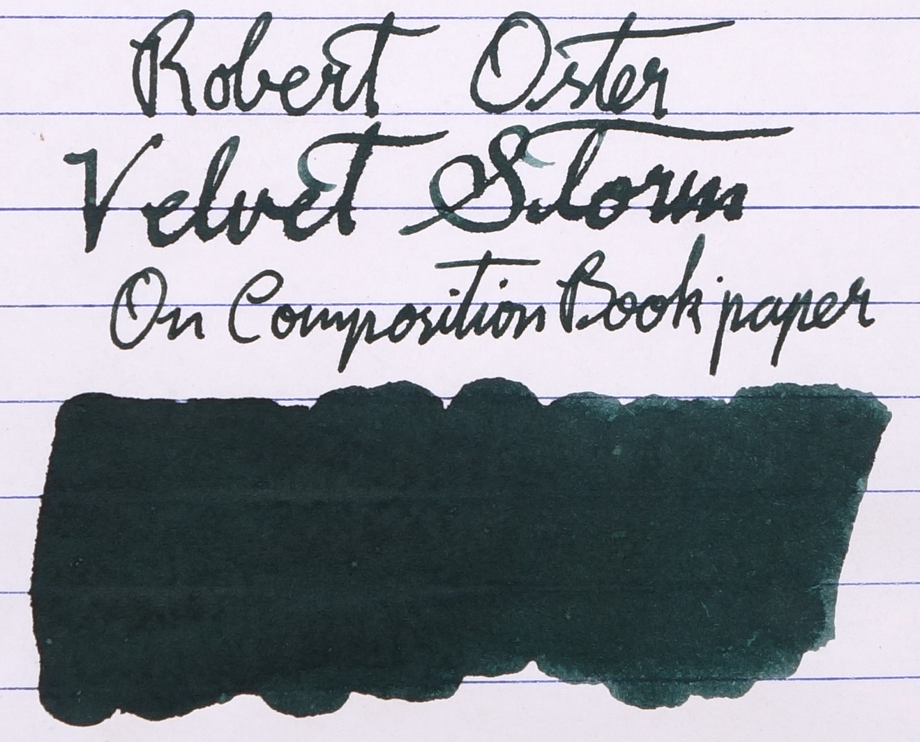
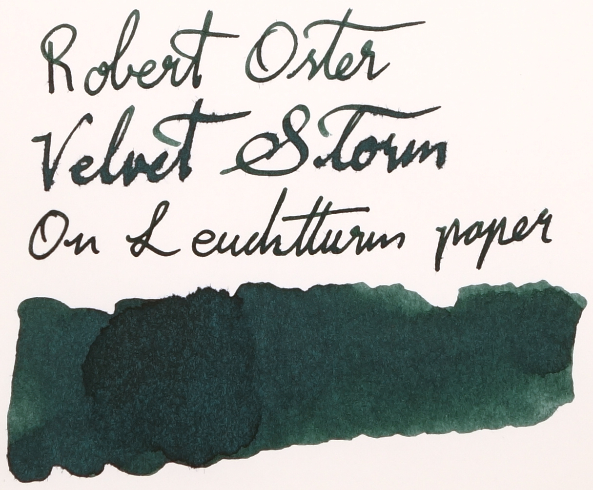
Blue-greens and green-blues are not my favourite colour (which I make no secret of) but I have been acquiring more of them recently. It's difficult to pick whether this is a blue that leans green or a green that leans blue; it's somewhat neutrally in between. It is a darker ink but it still has some shading which is surprising. This ink has no performance issues to speak of. It's decently wet, well lubricated and has not feathering or bleeding. It doesn't perform the best on cheap copy paper or a composition book nor Leuchtturm paper and loses a lot of its darkness (but I blame the paper, not the ink).

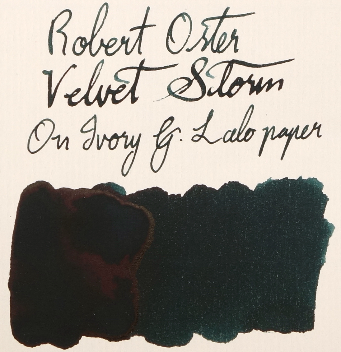
The sheen of Robert Oster Velvet Storm is pretty unique. On Tomoe River or Rhodia there's a slightly dull red sheen. This looks lovely but isn't particularly unique. What's special about this ink is what happens when you put it on other papers. A great example is the sheen on Life paper bellow. There's a hint of red sheen in there but it quickly disperses to a lowly saturated green-gold sheen. I've never seen an ink in this colour family sheen like this. There are other inks that have duel sheen such as Kobe No. 38 Kitanosaka Night Blue and some other sailor inks but none of them are nearly as green - talking about ink colour - as this and are often dark blues that lean slightly purple. It's very unique to have a (albeit slightly) green sheen on a green ink. Likewise a red sheen on a red ink would be unique etc.! The greener sheen is also present (much more subtly and only on the swatch) on Original Crown Mill 100% Cotton Paper. On my card stock the ink presents as very silver with a hint of pink and similarly on G. Lalo Ivory paper. On Midori paper it snaps back to s straight red (and even more prominent here than on Tomoe River!)

View fullsize Red sheen - Tomoe River
Red sheen - Tomoe River
View fullsize Red sheen - Rhodia
Red sheen - Rhodia
View fullsize Red, Yellow, Green sheen - Life
Red, Yellow, Green sheen - Life
View fullsize Yellow, Green sheen - Original Crown Mill
Yellow, Green sheen - Original Crown Mill
View fullsize Silver, Pink sheen - Card Stock
Silver, Pink sheen - Card Stock
View fullsize Pink, Silver sheen - G. Lalo
Pink, Silver sheen - G. Lalo
View fullsize Red sheen - Midori
Red sheen - Midori

Dry times are pretty moderate on Rhodia with it dry at 30 seconds. On Tomoe River it was still rather wet at 45 seconds so on Tomoe River it's a very slow drying ink. The Chromotography of this ink is fairly similar to many Robert Oster inks! Graphite and River of Fire both to have a large portion of ink that isn't otherwise that visible in the ink on the paper and River of Fire's chromatography in general looks fairly comparable the Velvet Storm. Pink leading to green leading to a turquoise. This ink has little-to-no water resistance.

View fullsize Chromotography
Chromotography
View fullsize Rhodia Dry-time
Rhodia Dry-time
View fullsize Tomoe River "Dry"-time
Tomoe River "Dry"-time

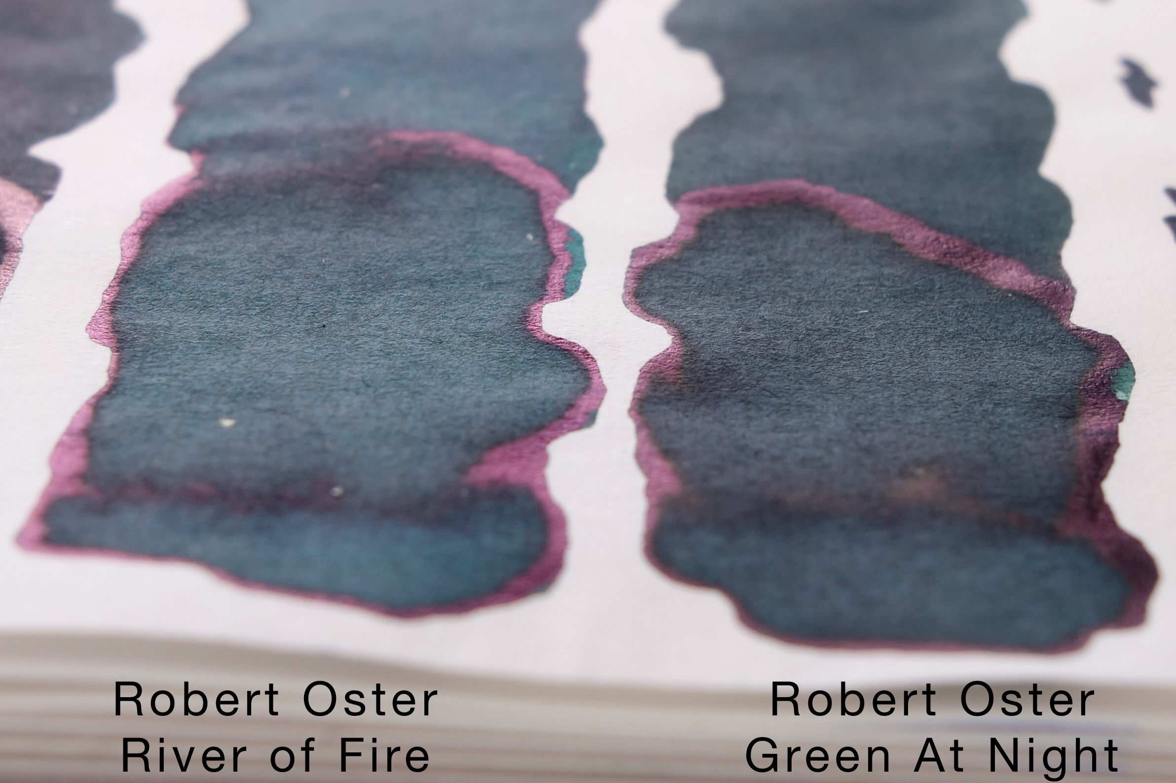
On the review pages I have included the following inks that compare well (top to bottom): Robert Oster Green at Night, Robert Oster River of Fire, Lamy Petrol, Noodler's Dromgoole's USS Texas, Noodler's Air Corps Blue-Black, Noodler's 54th Massachusetts.

My first thought when I saw this ink was "Lamy Petrol" and I think Lamy Petrol is a very good comparable ink to this. On Rhodia it's a little darker but the colour is very similar and in fact I think the closest. As often with Robert Oster inks, many of the comparable inks are his own (especially in the blue and green families!). Robert Oster Green at Night is a similar darkness but lacks a lot of Velvet Storm's blue. Robert Oster River of Fire is too light and also not blue enough. Finishing off with three Noodler's inks Noodler's Dromgoole's USS Texas is another very similar hue to Velvet Storm but is missing the shading, contrast, and just looks a lot flatter. Noodler's Air Corps Blue-Black also compares very well but is more vibrant. Noodler's 54th Massachusetts is much too dull overall.

Top to bottom: Robert Oster Green at Night, Robert Oster River of Fire, Lamy Petrol, Noodler's Dromgoole's USS Texas, Noodler's Air Corps Blue-Black, Noodler's 54th Massachusetts.

On Tomoe River Velvet Storm picks up some vibrancy in the written words but the heavy swatch somehow loses some (Tomoe River can be strange like that). Some of the comparison swatches react similarly losing how vibrant and saturated they are. Green at Night and River of Fire, like on Rhodia, are still too green and River of Fire too light but the vibrancy is much lower. Lamy Petrol is a little greener here but the colour is still a good comparison. USS Texas is gained some life here and is less flat; on Tomoe River I think this is the closest ink. Air Corps Blue-Black hasn't changed but as the swatch of Velvet Storm is less vibrant and saturated by comparison Air Corps is even more so. 54th Massachusetts has also become more vibrant and isn't a bad comparison any more but is definitely darker. 

Top to bottom: Robert Oster Green at Night, Robert Oster River of Fire, Lamy Petrol, Noodler's Dromgoole's USS Texas, Noodler's Air Corps Blue-Black, Noodler's 54th Massachusetts.

The three Noodler's inks to offer a bit of sheen but it's a matte sheen that covers the whole swatch as with Air Corp and 54th, or negligible as with USS Texas. The sheen from the two other Robert Oster inks and Lamy Petrol is very similar. Only on the edges where the inks pool and also a duller sheen (compared to the vibrant bright sheen of, for example, Organics Studio Twilight Blue).

View fullsize Sheen 54th Air Corp.jpg
View fullsize Sheen River of Fire Green at Night.jpg
View fullsize Sheen USS Texas Petrol.jpg
View fullsize Robert Oster Velvet Storm
Robert Oster Velvet Storm

If you use this ink, with wet pens, on different papers you are going to get a very unique sheen experience with this ink. It's a subtle ink that is business appropriate, I believe. The sheen isn't an eye catching sheen and is a subtle sheen. It performs well and you still get some character building sheen out of a relatively wet ink which is great. Even with my Visconti Homo Sapiens 1.3m stub (the definition of a gusher) and on Tomoe River (which is my experience slightly decreases shading) you can get some shading out of this (though not much). It's a subtle ink with character and will be a great alternative to Lamy Petrol when that Limited Edition runs out!

Thanks again to Pen Chalet for sending this ink over to review!

I've listed all my inks and all my pens in their respective pages. Please let me know which inks you'd like to review next via the comments, Twitter, Instagram, or contact me directly.

For blog updated you can follow @macchiato_man on Twitter, subscribe via email, or like my Facebook page.

I received this ink free of charge for the purpose of giving an honest review. I was not otherwise compensated and everything here is my own honest opinion. There are no affiliate links.

View fullsize DSC00690.JPG
View fullsize Swatch 90gsm Rhodia.jpg
View fullsize Swatch Card Stock.jpg
View fullsize Swatch Clairefontaine.jpg
View fullsize Swatch Composition Book.jpg
View fullsize Swatch Copy Paper.jpg
View fullsize Swatch Daiso.jpg
View fullsize Swatch G. Lalo.jpg
View fullsize Swatch Ivory Rhodia.jpg
View fullsize Swatch Leuchtturm.jpg
View fullsize Swatch Life.jpg
View fullsize Swatch Midori.jpg
View fullsize Swatch Original Cron Mill.jpg
Tags: Robert Oster Signature Ink, Robert Oster, robertoster, Velvet Storm, river of fire, Green at Night, Lamy, Petrol, Lamy Petrol, Noodler's, Noodler's Ink, Dromgoole's USS Texas, USS Texas, Aircorp Blue Black, 54th Massachusetts, sheen
← Ink Comparison: 32 Black InksMelbourne Pen Show 2017 →
Back to Top

Blog RSS

✉ Email Subscription

☞ Fountain Pens Australia (Facebook Group)

☛ Sailor Pens & Inks (Facebook Group)