• Blog
  • About
    • My Inks (on Fountain Pen Companion)
    • My Pens
  • Archive
  • Contact
Menu

Macchiato Man

  • Blog
  • About
  • My Collection ☟
    • My Inks (on Fountain Pen Companion)
    • My Pens
  • Archive
  • Contact
The @madebyendless Cotton Wallet arrived the other day! I’m a sucker for these sorts of practical inserts for notebooks. The cotton fabric suites the simple style of the Explorer. 
⠀
While I love these and always get them whenever I can I never
First test of the Regalia paper in the Endless Explorer than I was sent by @madebyendless. Really impressed by the paper. Very smooth, nice sheen and nice shading! Finger prints or hand oil seem to affect the writing a little but nothing out of the o
New Pen Review: Esterbrook Camden (Premium Edition) - 𝙻𝚒𝚗𝚔 𝚒𝚗 𝙱𝚒𝚘!

I’ve been eager to try the Camden for a while now. I love my flat end pens and the overall shape of this one is subtly unique. While there are some differences between
New friend from @esterbrook_official! Camden Manitoba Blue. 
⠀
Love flat end pens so looking forward to digging into this (so review incoming).
 
Flat or round ends?✑
⠀
⠀
⠀
⠀
#fountainpen #fpgeeks #fountainpenaddict #fpn #fountainpengeeks  #fountainp
New Ink Review: @birminghampens Antique Sepia (link in bio)
⠀
In line with the recent trend of soft pastel dichromatic inks but Birmingham’s version is an interesting dust grey version with low saturation that I find quite interesting don&rsquo
New Ink Day! Haven’t had one of these for a while but I received these from a friend at the last Perth Pen Meet. 
⠀
All sailor and the first tall bottle in a while (bringing the number of those to 86). 
⠀
Didn’t realise it at the time but
New Ink Review: La Couronne du Comte Vert Sapin (link in bio)
⠀
The final of LCdC’s initial set of four exclusive inks from Diamine. A lovely rich sheeny green-teal.
✑
⠀
⠀
⠀
⠀
#fountainpen #fpgeeks #fountainpenaddict #fpn #fountainpengeeks  #fo
I don’t know if I’ve ever shared this before but my city has a set of five dip nibs as an artwork. 

They are called “Memory Markers” by Anne Neil and represent early-ish colonial stories of the gardens where they are.

We als
⚠️Update: Why I have been so radio silent! 📻🤫 A lot of large personal changes, essentially (read on for details)!

There have been three main reasons for why I haven’t been able to do much here or on my blog. 

1) 🎓 I had to finish of my Mas
Ink Ink Comparison: Discontinued Iroshizuku and New Iroshizuku! Thanks to @penclassics for allowing this to happen. See link in bio!
⠀
The old: Tsuyu-kusa, Tsukushi, and Ina-ho.
The New: Sui-gyoku, Hana-ikada, and Hotaru-bi.
⠀
This is a long review b
NPD: @esterbrook_official LE Estie “Candy” in Oversize with a Kirk Speer Needlepoint nib!
⠀
Thanks to Esterbrook for sending this through to me for review. I’ve reviewed a couple of Esties now and two of the custom nibs (which are a
Out with the old in with the new?

I just received the new Pilot Iroshizuku Inks in the little bottle ink pack from @penclassics for review. I plan on doing an overview review of the three new and the three old ones!

I feel like Ina Ho was quite a u
New Pen Review (see link in bio): Platinum Curidas courtesy of @penclassics (check them out!)
⠀
This is certainly a curiously designed pen with it's quirks but it has bee a delight to write with and a great pen to through in a pocket. I've been using
New Ink Review! @wearingeul_global Kyonghui! See link in bio!

Kyonghui is a vibrant earthy orange from Wearingeul's series on Korean Female Modern Writers. It is also a great performing ink!

Wearingeul's global push is fairly new; has anyone tried
It has been a little while since I posted here so I thought I'd give a little update!

Firstly I think I just needed a little break at the end of the year! It has been a busy year for me. I have been taking my photography more seriously and I also ha

Subscribe

Sign up with your email address to receive news and updates.

We respect your privacy. Unsubscribe at any time.

Thank you!
Blog RSS

☛ Twitter feed

✉ Email Subscription

☞ Fountain Pens Australia (Facebook Group)

☛ Sailor Pens & Inks (Facebook Group)


Sponsors

10% off code: MACCHIATOMAN


Click here for sponsorship information


Featured Posts:

Featured
Ink Review: Pennonia Pokoltuz (Pokoltűz)
Aug 1, 2019
Ink Review: Pennonia Pokoltuz (Pokoltűz)
Aug 1, 2019
Aug 1, 2019
Notebook Review: Pebble Stationery Pocket Tomoe River Notebook
Nov 10, 2018
Notebook Review: Pebble Stationery Pocket Tomoe River Notebook
Nov 10, 2018
Nov 10, 2018
Ink Review: Krishna Brown Pink
Jan 20, 2018
Ink Review: Krishna Brown Pink
Jan 20, 2018
Jan 20, 2018


Archive
  • November 2024
  • October 2023
  • December 2022
  • October 2022
  • June 2022
  • May 2022
  • April 2022
  • February 2022
  • January 2022
  • December 2021
  • November 2021
  • October 2021
  • September 2021
  • August 2021
  • July 2021
  • June 2021
  • May 2021
  • April 2021
  • February 2021
  • January 2021
  • December 2020
  • November 2020
  • October 2020
  • September 2020
  • August 2020
  • July 2020
  • May 2020
  • April 2020
  • March 2020
  • February 2020
  • January 2020
  • December 2019
  • November 2019
  • October 2019
  • September 2019
  • August 2019
  • July 2019
  • June 2019
  • May 2019
  • April 2019
  • March 2019
  • February 2019
  • January 2019
  • December 2018
  • November 2018
  • October 2018
  • September 2018
  • August 2018
  • July 2018
  • June 2018
  • May 2018
  • April 2018
  • March 2018
  • February 2018
  • January 2018
  • December 2017
  • November 2017
  • October 2017
  • September 2017
  • August 2017
  • July 2017
  • June 2017
  • May 2017
  • April 2017
  • February 2017
  • January 2017
  • December 2016
  • November 2016
  • September 2016
  • August 2016
  • July 2016
Logo 2.png

Ink Review: Organics Studio Ralph Waldo Emerson Twilight Blue: "the third sheeniest ink in the world"

October 19, 2017 in Ink Review

Organics Studio did what only few ink companies have done; made an ink that really creates a buzz. With Nitrogen Royal Blue, Organics Studio made an ink that everyone was (and still is) talking about. The same thing happened with J.Herbin's Stormy Grey and Emerald of Chivor, and also with Robert Oster Fire & Ice. Nitrogen Royal Blue was unique because of the extreme amount of sheen it produced. Organics Studio did the same extreme sheen with the more green Walden Pond Blue, and have now done it again with Ralph Waldo Emerson Twilight Blue. I bought Twilight Blue from Pen Classics in New Zealand (not a paid endorsement; Rene just runs a good shop).

I've recently created a Facebook page for this blog so if you'd like to keep up to date with this blog via Facebook there is now a way.

Title.jpg

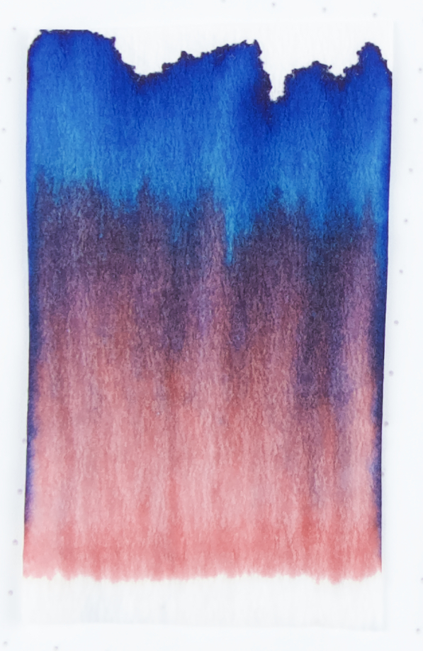
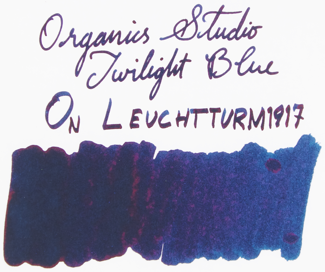
Twilight Blue is a darker blue; much Darker than Nitrogen Royal Blue but it is also a similar hue to Nitrogen Royal Blue. I wouldn't call it a blue-black as it doesn't have much 'black' to it. It's just dark; underneath that darkness it is still rich, vibrant, and saturated. The ink is very well lubricated and flows rather wet. It, like, Nitrogen Royal Blue and Walden Pond Blue do tend to dry out quickly when the nib is exposed and you have stopped writing, at least quicker than you might expect. This might be to do with what appears to be a very high concentration of dye (which the other inks also have). This high dye concentration might also be responsible for the sheen.

The blue is very rich. It, like Nitrogen, leans more green than red (notwithstanding that the ink is more red than blue on some paper due to the sheen!). This is very much a blue ink, I only mean it is slightly more green than it is red. It feels like a very similar hue to Nitrogen but just darker. It shades fairly low on Tomoe River but better on Rhodia. I wouldn't call this a good shading ink.

The ink, like, it's predecessors, fairs well on cheap paper. There's spreading but not much feathering and little bleeding. This ink does smudge but performs better in the regard than Nitrogen Royal Blue does. I also found it less messy, so that's a plus!

Ivory (white) Tomoe River 52gsm

On Tomoe River, the ink looks purple. There's so much sheen at every angle that although the blue peaks through, the red sheen is too strong to truely see the dark blue colour.

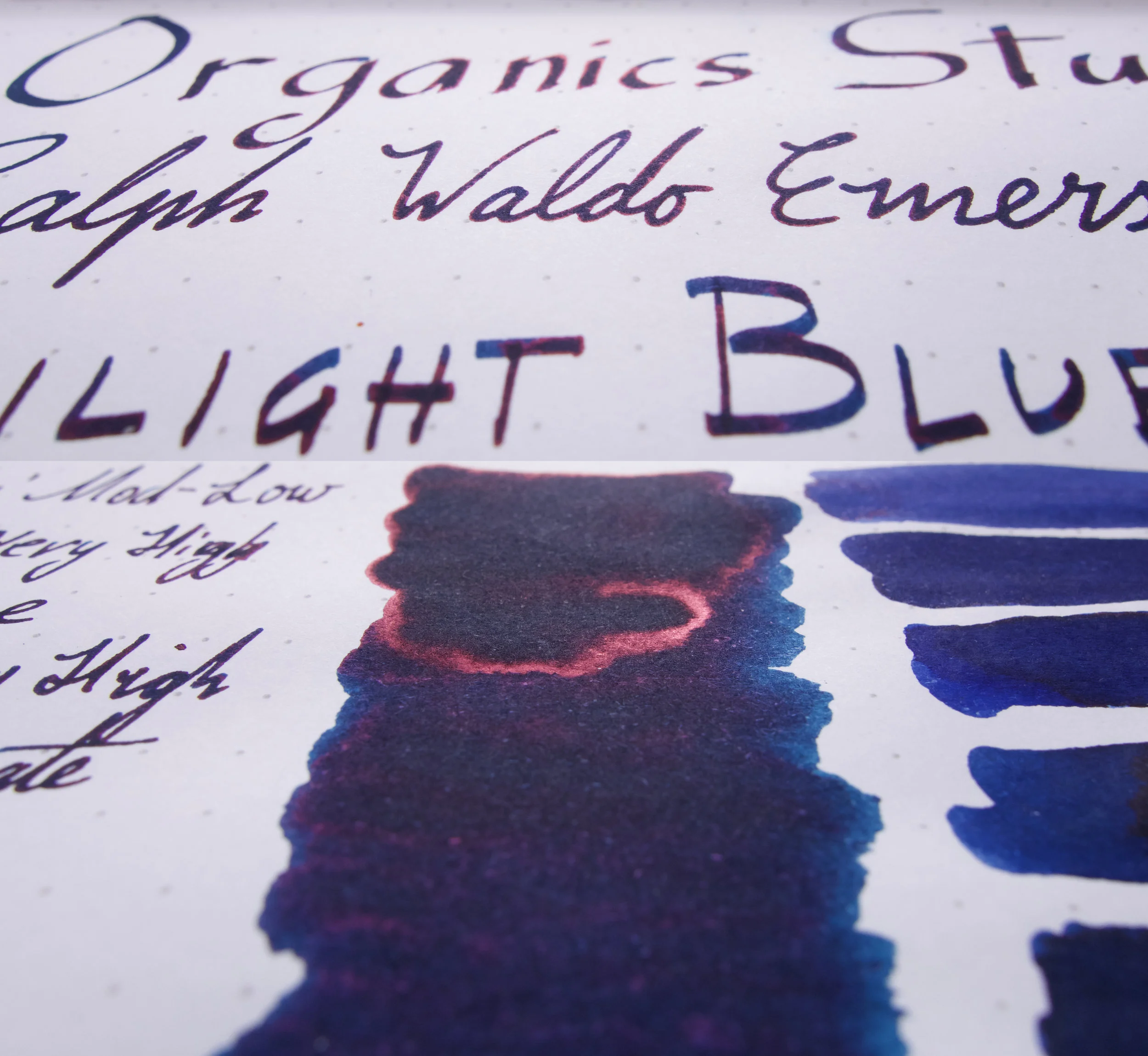
The pens inked here are for "Organics Studio" a Pensive Pens with a Franklin-Christoph Music Nib, for "Ralph Waldo Emerson" a Chartres Blue Platinum Century #3776 with a Broad nib, for "Twilight Blue" a Black Platinum Century with a Dan Smith Architect grind off a C (or Double Broad) nib, and the fine writing is a Pensive Pens with a stock JoWo Fine nib. (These are used for the other writings as well).

The compared inks are, from top to bottom, are Sailor Blue, Kobe Cosmo Blue 135, Diamine Lapis Blue, Noodler's Fountain Pen Hospital Manhattan Blue Black, Pen + Message Vintage Denim, Organics Studio Nitrogen Royal Blue, Organics Studio Walden Pond Blue, KWZ IG Blue #6, and to keep us honest a fluorescent pink (Sailor) Mitsukoshi Hana Hiraku.

Sailor Blue is lacking the green, and is less Saturated and has a copper rather than red sheen. Kobe Cosmo Blue is too dark, lacking in contrast and is slightly more green but still not green enough. Its sheen is also brass coloured. Diamine Lapis Blue is no where near sheeny enough and is lacking the vibrancy of Twilight Blue. Noodler's FPH Manhatten Blue Black is comparably "green" but lacks practically all sheen and still isn't vibrant enough. Nitrogen Royal Blue is obviously much brighter and is more vibrant but is a comparable hue, as mentioned already. Walden Pond Blue has the same sheen but is noticeably greener. KWZ IG  Blue #6 is way too dark (due to that it is an Iron Gall ink) but does have enough green. It lacks sheen vibrancy and saturation as well. Mitsukoshi Hana Hiraku is a little brighter in colour than the sheen of Twilight Blue!

The Sheen is the same colour as Pond Blue; just slightly duller than Nitrogen.
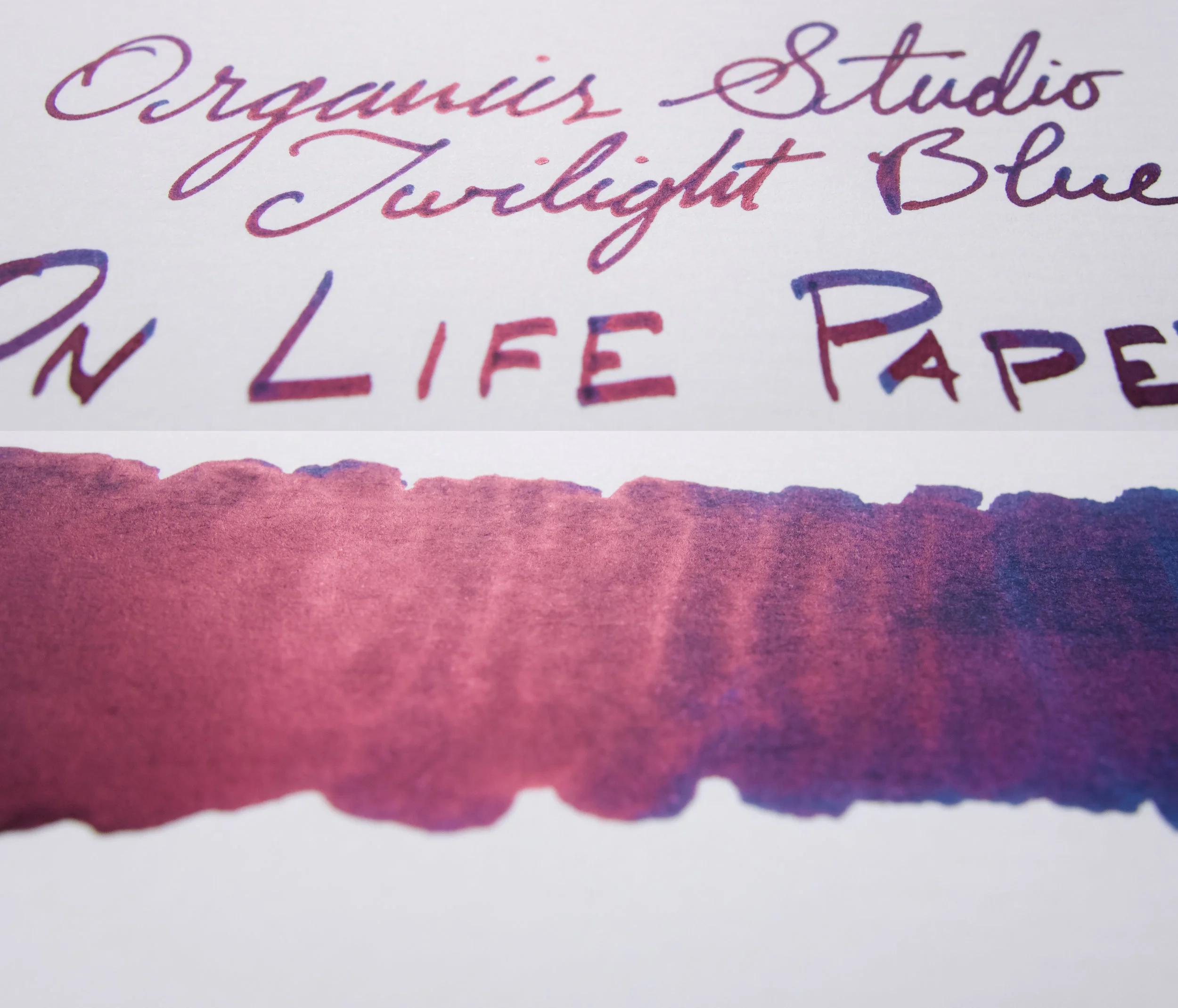
WhiteRhodia 80gsm 

There is not that much sheen on Rhodia so you can see the dark rich blue much easier here. Much of the above comments apply here (with reduced sheen of course). The green of KWZ IG Blue #6 is less darkened here so you can see that the colour is decently comparable.

View fullsize Tomoe River 52gsm
Tomoe River 52gsm
View fullsize Rhodia 80gsm
Rhodia 80gsm
View fullsize Chromotogaphy.jpg
View fullsize Rhodia 80gsm
Rhodia 80gsm

Drytime is much better than I expected! Relatively slow on Tomoe River but decently fast on Rhodia. The ∞ symbol represents a smudge test. Here I let the ink completely dry out before moving my finger over it. Interestingly, although the ink has some green to it, there is a decent amount of pink that comes out of the Chromatography. There is no real water resistance to speak of. 

View fullsize Sheen Card White Rhodia.jpg
View fullsize Sheen Card Swatch Card.jpg
View fullsize Sheen Card OCM Cotton.jpg
View fullsize Sheen Card Life.jpg
View fullsize Sheen Card Leuchtturm.jpg
View fullsize Sheen Card Ivory Tomoe River.jpg
View fullsize Sheen Card Ivory Rhodia.jpg
View fullsize Sheen Card G Lalo.jpg
View fullsize Sheen Card Cream Tomoe River.jpg
View fullsize Sheen Card Composition Book.jpg
View fullsize Sheen Card Clairefontaine.jpg

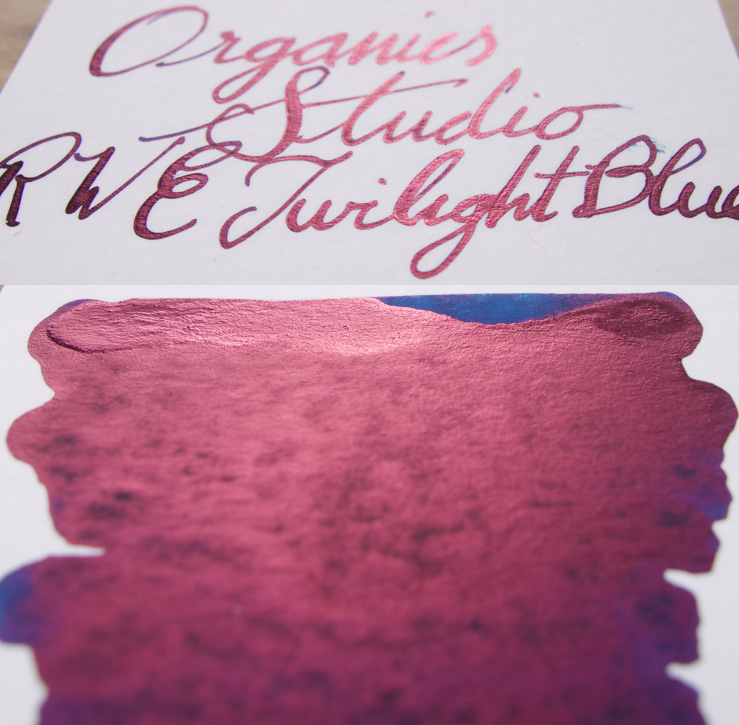
While Nitrogen Royal Blue had the barest hint of sheen on a Composition Notebook, I can't find any here. I'm continually impressed by the sheen on G.Lalo Ivory Paper and Original Crown Mill 100% Cotton Paper. This sheen is constant in that no matter the angle you view it at, no matter where the light source is, it is always pink. Impressive.

View fullsize Swatch Card.jpg
View fullsize OCM Cotton.jpg
View fullsize Live Paper.jpg
View fullsize Leuchtturm.jpg
View fullsize Rhodia Ivory 90gsm.jpg
View fullsize G. Lalo Ivory.jpg
View fullsize Tomoe River Cream .jpg
View fullsize Composition Book.jpg
View fullsize Clairefontaine.jpg

I love the dark blue of this ink. I love rich dark blues and I love sheen. What's not there for me to love! The drying out of the nib can be an issue, some might want an ink that is water-resistant, but these doesn't bother me personally. I'm a fan of this ink more so than Walden (I don't particularly like the hue of the ink colour) and more than Nitrogen (only because I prefer the darker colour here). I have three bottles of Nitrogen and Walden. I'll be picking up another of this sometime too!

I don't know whether it's actually the third sheeniest ink in the world, but these three Organics Studio inks are definitely the three sheeniest inks in the world so it's at least amongst the top three!

As mentioned I bought the ink from Pen Classics in New Zealand but is available from retailers around the world.

I've listed all my inks and all my pens in their respective pages. Please let me know which inks you'd like to review next via the comments, Twitter, Instagram, or contact me directly.

For blog updated you can follow @macchiato_man on Twitter, subscribe via email, or like my Facebook page.

I was not compensated for this review and everything here is my own honest opinion. There are no affiliate links.

Tags: organics studio, Nitrogen Royal Blue, Ralph waldo emerson, twilight blue, OS, Walden Pond Blue, Sailor Blue, Kobe Cosmo Blue 135, Kobe Cosmo Blue, Pen + Message, Pen and Message, Vintage Denim, Noodler's, Noodler's Ink, Fountain Pen Hospital, Manhatten Blue, Manhatten Blue Black, KWZ, KWZ IG Blue No. 6, Mitsukoshi, Mitsukoshi Hana Hiraku, Hana Hiraku, inkreview, sheen
← Notebook Review: Bookbinders Design Cloth NotebookInk Comparison: Diamine Blues →
Back to Top

Blog RSS

✉ Email Subscription

☞ Fountain Pens Australia (Facebook Group)

☛ Sailor Pens & Inks (Facebook Group)