
Late 2021 Wearingeul, a somewhat new South Korean ink maker, reached out to me and others in the Fountain Pen community to introduce their line of inks. I posted swatches late last year of what I received. Wearingeul, itself is a brand within the Able Design family of design brands, has a mixture of shimmer, sheen and normal inks (as well as some dichromatic inks) in their lineup. I love burnt orange-like inks so I was eager to get this in a pen and review it first up!
Thanks to Wearingeul for sending me this ink for review.

Wearngeul is part of the Able Design Entertainment group which also includes Venho (which seems to make decal-like products) and Jacquere (which makes some paper products). The Wearingeul brand is divided into product families currently, all of which are related by their shared theme of ‘literature’. These inks come under “The Color of Literature” but there is also Fragrance, Taste and finally and etcetera defined as “Adding Literature on Daily Life”. The etcetera includes some paper, pencil and other general EDC products.
With regards to Wearingeul’s inks again they are literature themed with many of the inks relating to Korean writers. This ink is from Wearingeul’s Project No. 4 set of three inks relating to Korean Female Modern Writers. In the set is an ink representing Kang Kyeong-ae’s The Human Issue (n.b. Wikipedia translates the work as ‘The Human Problem’), Kim Myung-sun's 'Stonecutter's song' (which I can’t find anything about - only Simpsons!), Ji Ha-ryun’s ‘Path (Dojeong)’ (which I also can’t find much about) and finally this based on Na Hue-Seok’s Kyonghui which “concerns a woman's self-discovery and her subsequent search for meaning in life as a "new woman;" it is the first feminist short story in Korean literature”. The women in this set are all early 19th century authors and as far as I can tell all or most of them are part of early Korean feminist movements.
Kyonghui ranges in colour a little bit from an orange-yellow to a light brown-leaning orange. Different papers can lean more one way or the other as well. For a vibrant highly saturated orange it is quite earthy-toned. On average the ink is fairly average brightness leaning slightly lighter at times. The ink is quite wet and with good flow. In my experience feels quite high in dye content which makes the ink feel more viscous with higher lubricant and dye and less water. This can mean the ink is more susceptible to drying out in pens with poor sealing but I have not experienced any drying out with this ink! The ink performs quite well on all papers, even less fountain pen friendly paper. There is minimal feathering and bleeding on the worst papers and none on good paper. The only real difference is how much orange or yellow shows and whether there is any sheen. Examples of the ink on 15 different paper types is at the end of the review as well as showing sheen on six different paper types.
The bottle is what is becoming quite a common bottle shape; a simple cube. Sailor, PenBBS, 3•Oysters (though with a corner missing), Louis Vuitton, as well as others are all similar cubic shaped bottles. Nothing wrong with that and is presents nicely with a single sticker on the front with the colour of the ink. Unlike the large Sailor cubic bottles, however, this is 30ml rather than 50ml.

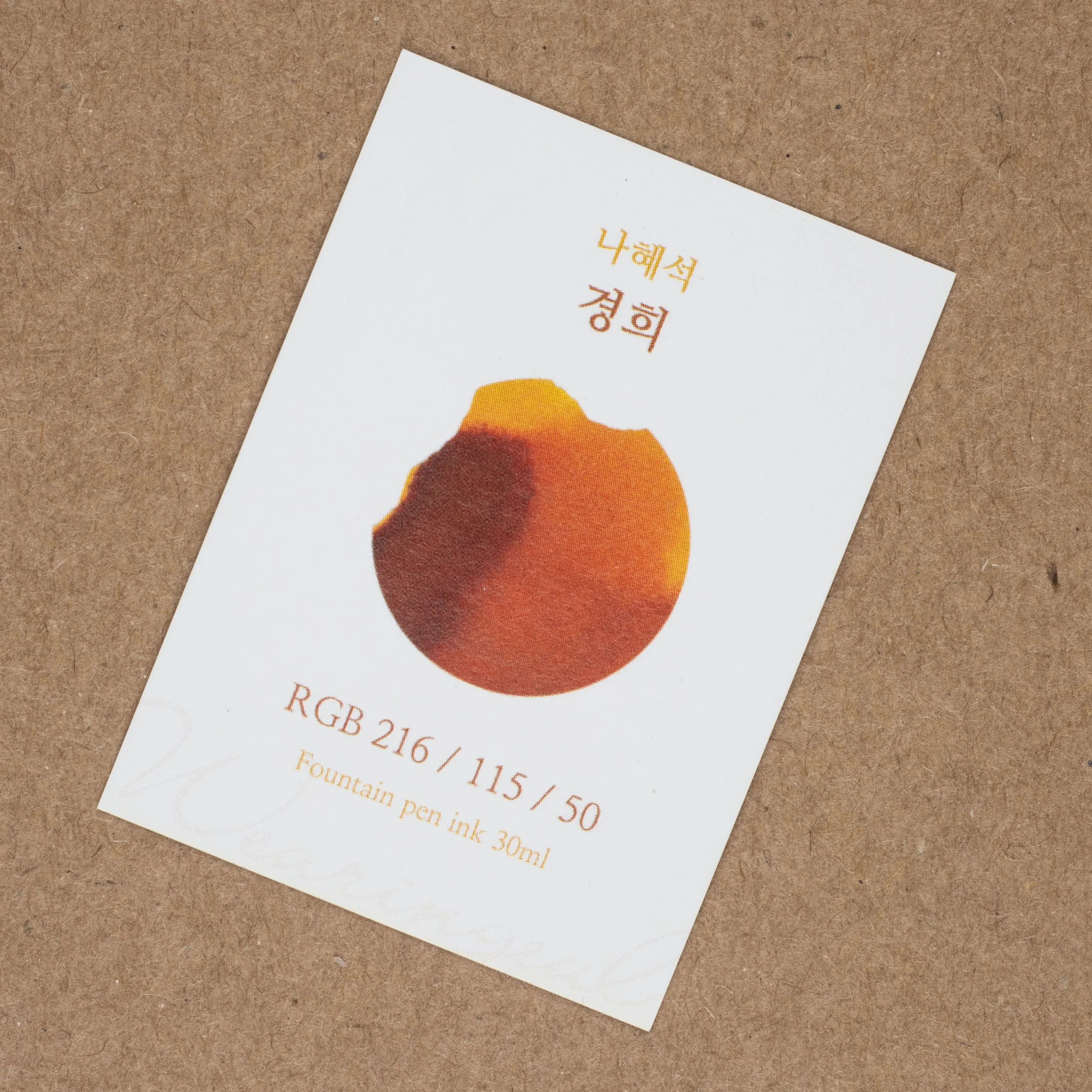

The box is a simple white box with Wearingeul printed onto it and with a label of the inks colour and some details about the ink. Inside is a card with some text in Korean on it and a printed swatch of the ink with some RGB colour numbers which is a nice detail. The average colour I got from the swatch on Tomoe River (all three saturation levels) was 197, 107, 39 (so a little darker).
Nib and Pen details
I used a Lamy Studio in Imperial Blue for this review and seven different stainless steel Lamy nibs on that pen. The choice of pen (be that Safari, AL-Star, Vista, Joy or Studio) will have little impact in the writing performance. I will not use a Lamy Dialog because there is the rare chance of the nib drying out slightly which might affect the writing performance.
Lamy 1.9 Stub: this is a very wet nib
Lamy 1.5 Stub: this nib is moderately wet to write with (this is used for the brand and ink name title);
Lamy 1.1 Stub: this nib is on the drier side;
Lamy Broad: this is a wet;
Lamy Medium: this is a very wet nib;
Lamy Fine: this nib is moderately dry; and
Lamy Extra Fine: this nib is moderately wet.
I also use a fine JoWo nib attached to a James Finniss Serendipity (from Pensive Pens) for the comparison ink names. This nib’s wetness is moderate but the feed is primed which gives it a wetter character than would be a normal writing experience. This generally as the effect of reducing shading and luminosity, while increasing sheen and saturation. The possibility of feathering and bleeding is also slightly increased. This is still more accurate than a dip pen or a glass pen in my experience.
52gsm Ivory (White) Tomoe River
On Tomoe River Kyonghui Presents slightly on the yellower side of this ink’s spectrum and quite saturated. With the high saturation all comes with slightly less earthy tones.
Colorverse Golden Record: too dark, brown and a little less saturated;
Noodler’s Apache Sunset: too yellow, light but a similar saturation and with similar earthy tones;
Robert Oster Burned Orange: redder, darker and flatter;
Robert Oster Orange Rumble: also too red and dark but slightly more saturated;
Bungubox Fresh Orange Mandarin: way too yellow and saturated;
(Sailor) Sankodo Tougokusan Fruits: too dark
Of these inks, on Tomoe River, none seem to have the shading of yellow to orange as strongly as Kyonghui. Orange Rumble and Tougokusan Fruits is similar to a mid-range orange of Kyonghui, Apache Sunset is similar to the lighter areas.
Shading is quite decent and noticeable. The frequency is quite high and the gradient is often fairly sudden the only thing keeping it back is the contrast which, while decent, isn’t very high as the orange is still moderately dark. There is no haloing.
There is some low-gloss - so somewhat matte - silvery sheen. It is present on most of the written lines but it isn’t strong or overly noticeable. On the swatch it really onely really shows on the wettest swatch.
In terms of inks’ sheen similar to Kyonghui’s sheen only really Burned Orange comes that close with a matte silvery sheen. Golden Record has a curious copper sheen, Orange Rumble comes with a red-brown colour, the Bungubox is a glossy silver as is the Sankodo (which also has a green tint to it).
The Chromatography doesn’t really much to what we already know. Apart from a grey line left behind, it is a gradient of yellow to burnt orange. Water resistance is non-existent but the dry time is quite decent for Tomoe River! 30s and almost dry. There is some smearing but it isn’t strong.
80gsm White Rhodia
Rhodia is slightly less saturated, darker and so less yellow. It is also more earthy. On the top wetter part of the swatch there is almost some green peaking through somehow. There is no haloing.
Colorverse Golden Record: is darker but otherwise similar;
Noodler’s Apache Sunset: much lighter and yellower;
Robert Oster Burned Orange: slightly redder but very close;
Robert Oster Orange Rumble: slightly more saturated and more orange';
Bungubox Fresh Orange Mandarin: much more saturated and orange; and
(Sailor) Sankodo Tougokusan Fruits: is slightly less saturated but otherwise similar.
Apart from the lack of shading, Tougokusan Fruits is easily the closest here with Golden Record and Burned Orange not too far off.
The contrast to the shading is a little stronger on Rhodia and gradient a little shorter as well as a slight increase in frequency. All of that means that shading is noticeably stronger on Rhodia.
There is no sheen to see at all on Rhodia.
Similarly no sheen on any written line on Rhodia. Only Golden Record, and the Robert Oster show any hints of sheen on the swatch.
Water Resistance is again essentially non-existent and the dry time is still great; close the dry at 15s and fully dry at 30! There is a hint of smearing but it is much less on Rhodia.
Final Remarks
⭐️ = One Star
★ = Half a Star
☆ = No Star
🚫 = None/Not Applicable
(Star ratings are a rough and glanceable indication and are more quantitative than qualitative. They are not saying that something is ‘good’ or ‘bad’ but rather that, of the particular characteristic, the ink has a ‘high’ or ‘low’ amount)
52gsm Ivory (White) Tomoe River
Shading: ⭐️⭐️⭐️★☆
Sheen: ⭐️☆☆☆☆
Shimmer: 🚫
Halo: 🚫
Saturation: ⭐️⭐️⭐️★☆
Luminosity: ⭐️⭐️⭐️☆
Feathering: 🚫
Bleeding: 🚫
Flow: ⭐️⭐️⭐️⭐️☆
Dry time: ⭐️⭐️⭐️★☆
Smear: ⭐️⭐️★☆☆
Water Resistance: 🚫
80gsm White Rhodia
Shading: ⭐️⭐️⭐️⭐️☆
Sheen: 🚫
Shimmer: 🚫
Halo: 🚫
Saturation: ⭐️⭐️⭐️★☆
Luminosity: ⭐️⭐️★☆☆
Feathering: 🚫
Bleeding: 🚫
Flow: ⭐️⭐️⭐️⭐️☆
Dry time: ⭐️⭐️⭐️⭐️☆
Smear: ⭐️☆☆☆☆
Water Resistance: 🚫
I am a big fan of burned orange colours and especially in an ink and I was very excited to try this ink. For me Kyonghui has lived up to my hopes. Lovely strong shading, a nice range of colours from yellow to orange, subtle sheening, all on top of excellent nib and paper performance. I am quite pleased with this ink!
Wearingeul also have some interesting other inks that are trying to do something a little different. Another Wearingeul ink I was sent that I’m looking forward to trying is the Dr Jekyll to Mr Hyde ink set. The set has two identical bottles of Dr Jekyll ink with one slightly unfilled. A third smaller bottle is also in the set and you are meant to use an included blunt syringe to empty the smaller bottle into the unfilled Dr Jekyll ink. Finally you peal off the Dr Jekyll label on this new ink to reveal Mr Hyde (and a newly mixed ink colour)! Certainly completely unnecessary and not practical but fun and relevant to the theme! Sometimes fun is important.
The ink sells for US$20 on Amazon as well as Wearingeul’s store. It does, unfortunately, have pricy shipping costs which is certainly influenced by current international events.
Thanks heaps to Wearingeul for sending this in for review, more to come!
✒︎ ✑ ✒︎ ✑
Thanks for reading! If you have any questions, comments or suggestions please let me know in a via the comments, Instagram, or contact me directly.
You can find my ink collection here and my pen collection here. Is there something you’d like reviewed? Let me know!
For blog updated you can follow @macchiato_man on Twitter, subscribe via email, or like my Facebook page. Check out the sponsors of this blog as well!
I was not compensated for this review and everything here is my own honest opinion. There are no affiliate links in this review. I was sent these inks for the purpose of an honest review.