
Duotone, dichromatic, or whatever you want to call it. Inks that present on the paper with different colours have been very popular in recent years. The first of these inks that really took off were from Sailor’s Ink Studio set of inks but since then there are many from Sailor, from Troublemaker, Vinta and of course Birmingham Pen Company. Many of the dichromatic inks are based around a pink dye that separated from a blue teal or green dye. That is fundamentally the same combination there! The ink is green with a pink that separates when the ink pools and dries.

The small two-brother run Birmingham Pen Co. have quite a few inks (which certainly made it difficult to pick which I wanted) and they add new inks to the lineup all the time and I believe they retire inks as well. If you see something you really want, it is probably best to jump on it early. As a very general theme, Birmingham inks tend to be lower in saturation and dusty, dirty, or muddy coloured. This ties them all together and also makes them stand out which is a difficult thing to do with the amount of inks we have available to us now. The inks are handmade in Pennsylvania in the US. Birmingham Pen Co. divided their inks into different categories and sub-categories when I bought this ink:
Traditional Ink
Crisp Formula: “Formulated to perform well with a variety of premium, mid range, and discount papers.”
Swift Formula: “Designed to start quickly, write wet, and operate easily within a wide variety of fountain pens.”
Rich Formula: “Built with a unique vehicle and dye combination to produce vibrant color and intermittent sheen.”
Wishy-Washy Formula: “Washable from most fabrics and cleans easily from most surfaces.”
Specialty Ink
Everlasting Formula: “Permanent and highly water resistant.”
Twinkle Formula: “A unique blend of proprietary fountain pen ink formulas and iridescent pigment carefully calibrated for optimal luster and performance.”
But now they are divided into four categories:
Keystone Formula inks are engineered using water-soluble dyes to produce a broad spectrum of colors with a variety of unique and desirable writing properties. Fitting the bill for a traditional fountain pen ink, this series by far the most popular.
Wishy-Washy Formula inks are constructed with dyes selected for both performance and washability. Colors in this series will clean easily from most fabrics and surfaces with soap and water.
Everlasting Formula inks are compounded with pigmented colorants to produce highly water resistant and archival properties on paper.
Twinkle Formula inks are formulated using hybrid dye and pigment combinations to create a unique twinkling luster.
Birmingham also listed the generalised ink ingredients in the bottle (which were different for each category). Antique Copper was a Crisp Formula ink (now Keystone) and has the following ink ingredients:"
Diluent - Highly purified laboratory grade water to ensure consistency
Thickener - Tempers feathering
Humectants - Influences dry-time
Lubricants - Regulates flow & performance
Surfactants - Regulates flow & performance
Preservative - Adds shelf life for safe long-term use & storage
Colorants - Powder dyes to bring colors alive in the solution
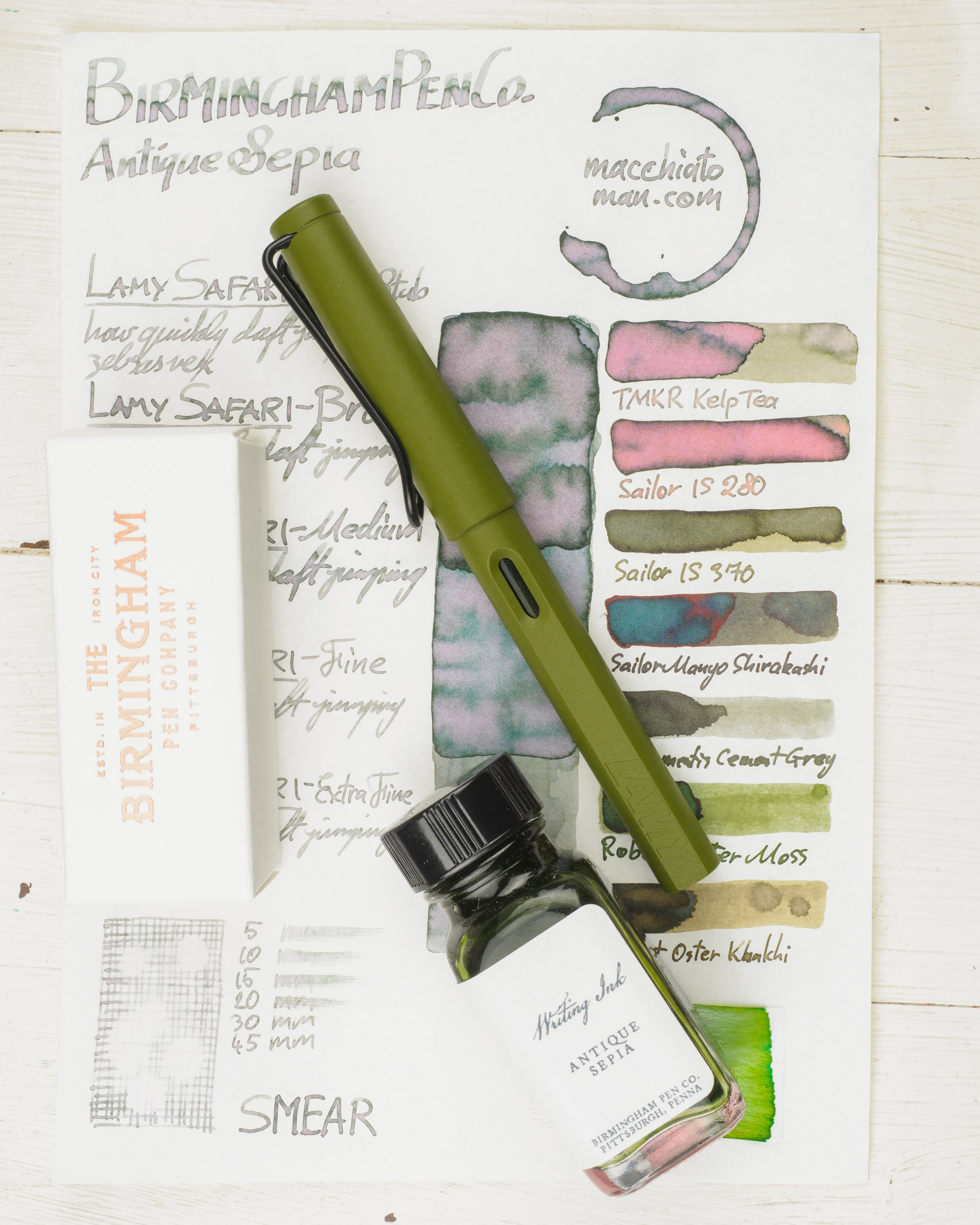
As you can see, in the bottle the fluid of Antique Copper is a fairly green. A fairly cool green, in fact, in the bottle. On paper this green doesn’t come out nearly as strongly. In areas of haloing you can see some of it but generally the green loses a lot of saturation and becomes quite a bit warmer. The pinkness of the dichromaticism also warms of the colour of the ink a lot as well. Overall it still leans more green than otherwise but not as much as what the fluid would suggest.The ink is fairly light and the saturation is low and it has that dustiness that I often associate with Birmingham inks. The ink is a little on the drier side of performance. I definitely would prefer this in a wetter pen. The flow is good but the ink feels a little not highly lubricated..
The ink does have some variance depending on the paper it is on with some papers bringing out the saturation of the green much more that others.
That said, it is difficult to describe the inks actual colour because it changes quite a bit depending on the paper it is on. Whiter papers have a cooler look, unsurprisingly, but they are also greyer with less green saturation overall but the yellower papers have a higher gree saturation. The pink colour also comes out to various degrees depending on the paper. As a swatch, performance of this ink isn’t amazing on poor quality paper but in the written line (which is the important part) the performance is OK to decent on poor quality papers. There is even some shading on decent copy paper. Examples of the ink on 15 different paper types is at the end of the review.
Birmingham inks, with the exception of the Twinkly Formula (shimmering inks) which is only in 60ml bottles, are available in 30ml, 60ml, and 120ml. I’ve come to enjoy 30ml as a size and so all of my inks (bar two because I wanted to have one of each bottle) are 30ml. The 120ml bottle comes with a built in eye dropper just like the larger Noodler’s bottles (in fact this 120ml Birmingham bottle looks very similar to the Noodler’s (but it is different). The bottles are all glass and all of them (especially the smaller ones) have a simple vintage look about them as if they are from the the industrial era. They remind me of Noodler’s in this regard and I love the look.
Nib and Pen details
I used Lamy Safaris in Savannah for this review and seven different stainless steel Lamy nibs on that pen. The choice of pen (be that Safari, AL-Star, Vista, Joy or Studio) will have little impact in the writing performance. I will not use a Lamy Dialog because there is the rare chance of the nib drying out slightly which might affect the writing performance.
Lamy 1.9 Stub: this is a very wet nib
Lamy 1.5 Stub: this nib is moderately wet to write with (this is used for the brand and ink name title);
Lamy 1.1 Stub: this nib is on the drier side;
Lamy Broad: this is a wet;
Lamy Medium: this is a very wet nib;
Lamy Fine: this nib is moderately dry; and
Lamy Extra Fine: this nib is moderately wet.
I also use a fine JoWo nib attached to a James Finniss Serendipity (from Pensive Pens) for the comparison ink names. This nib’s wetness is moderate but the feed is primed which gives it a wetter character than would be a normal writing experience. This generally as the effect of reducing shading and luminosity, while increasing sheen and saturation. The possibility of feathering and bleeding is also slightly increased. This is still more accurate than a dip pen or a glass pen in my experience.
52gsm Ivory (White) Tomoe River
On Tomoe River Birmingham Antique Sepia is lighter, warmer and less saturated. There is quite a bit of pink that shows in the swatch and the the written line. I only have a couple of comparable dichromatic inks.
Troublemaker Kelp Tea: is lighter, more saturated (both colours) and a little warmer;
Sailor Ink Studio 280: is much more yellow (even if the pink has taken over here) and much more saturated;
Sailor Ink Studio 370: is darker, more saturated and a warmer;
Sailor Manyo Shirakashi: is much darker more saturated and a little warmer;
De Atramentis Cement Grey:is slightly greyer with less saturation but isn’t a whole way off;
Robert Oster Moss: is not too far away from what you’d expect this to look like from the fluid colour but isn’t that close on the paper; and
Robert Oster Khakhi: not similar at all.
On Tomoe River Troublemaker Kelp Tea comes the closes with Cement Grey being not too far off!
There is a decent amount of shading with quite a lot of lovely haloing as well (which is where you see the cool green come through). The shading is frequent and fairly contrasting but has a mixture of sudden and smooth gradients which can hide the shading a little.
There is no sheen whatsoever.
Sailor Manyo Shirakashi has some lovely copper sheen, Robert Oster Moss has some dull copper-magenta sheen and Khakhi has some silver. There is a hint of a dull brown-silver sheen on Cement Grey but none of the dichromatic inks have any sheen.
Looking at the chromatography shows a pink gradient at the start that breaks into a little bit of yellow before another gradient of light cool green. You can see two separate dye gradients which is interesting.
There is absolutely no water resistance, dry time is decent and there is no smearing.
80gsm White Rhodia
On Rhodia the ink is darker, cooler with more green saturation and less of the pink showing.
Troublemaker Kelp Tea: lighter and warmer, the pink is much warmer now too';
Sailor Ink Studio 280: more yellow than green and the pink is now orange. Much more saturated;
Sailor Ink Studio 370: a little warmer and more saturated but not too far off;
Sailor Manyo Shirakashi: too dark and desaturated. More brown now;
De Atramentis Cement Grey: again not far off but a little darker and desaturated;
Robert Oster Moss: too green and saturated; and
Robert Oster Khakhi: not even close.
The closest here would surprisingly be either Sailor Ink Studio 370 or, again, De Atramentis Cement Grey.
I feel link the pink comes through on Rhodia less on the swatch compared with Tomoe River but more on the written line! There is a decent amount of pretty pink showing though. Shading isn’t as strong as on Tomoe River with less contrast but a similar frequency and the similar mix of gradual and sudden gradients. There is still a nice halo.
No sheen whatsoever.
None of the comparison inks have sheen.
There is still no water resistance and the dry time is very fast. Almost less than 10 seconds. There is no smearing.
Final Remarks
⭐️ = One Star
★ = Half a Star
☆ = No Star
🚫 = None/Not Applicable
(Star ratings are a rough and glanceable indication and are more quantitative than qualitative. They are not saying that something is ‘good’ or ‘bad’ but rather that, of the particular characteristic, the ink has a ‘high’ or ‘low’ amount)
52gsm Ivory (White) Tomoe River
Shading: ⭐️⭐️⭐️☆☆
Sheen: 🚫
Shimmer: 🚫
Halo: ⭐️⭐️⭐️★☆
Saturation: ⭐️★☆☆☆
Luminosity: ⭐️★☆☆☆
Feathering: 🚫
Bleeding: 🚫
Flow: ⭐️⭐️★☆☆
Dry time: ⭐️⭐️⭐️★☆
Smear: 🚫
Water Resistance: 🚫
80gsm White Rhodia
Shading: ⭐️⭐️★☆☆
Sheen: 🚫
Shimmer: 🚫
Halo: ⭐️⭐️★☆☆
Saturation: ⭐️⭐️☆☆☆
Luminosity:⭐️⭐️☆☆☆
Feathering: 🚫
Bleeding: 🚫
Flow: ⭐️⭐️★☆☆
Dry time: ⭐️⭐️⭐️⭐️★
Smear: 🚫
Water Resistance: 🚫
I’ve been really happy with the Birmingham Pen Co. inks I have put in my pens. I’ve got four reviews prepared (including this and the already published Projector Film) and I’ve inked six inks so far (I think). In general the feel of the inks is slightly drier than I prefer but the colour and and look of this ink makes it easy for me to look past that. They have such unique colours and some subtle dichromaticism as well. I’d definitely recommend looking at their range (they also make some pens periodically)!
I’d also like to commend on the professionalism of this small run ink studio! The second group buy (which was close to AU$1000 - a little of US$700) came in two packages. Because of the pandemic shipping was very slow (this is definitely not Birmingham Ink Co.’s fault!) It actually reached almost 60 days with no tracking and the way Nick and Josh handled this was amazing so I can definitely confirm that you will be treated very well!
The ink is quite decently priced for my mind. The 30ml bottle is US$13, the 60ml is US$16, and the 120ml is US$19. Shipping internationally isn’t very affordable (but you can’t blame them for that - I recommend a group buy!). US shipping is free over US$40 (which should not be difficult to get to) and I should also note that they often have sales that knock a couple of dollars off the ink. I should note that the Twinkly (shimmer) inks are US$29, and the Everlasting inks are US$19, US$29, and US39 for the respective sizes
What are your favourites from their current lineup? If I’m ever part of another group order I need a list!
✒︎ ✑ ✒︎ ✑
Thanks for reading! If you have any questions, comments or suggestions please let me know in a via the comments, Instagram, or contact me directly.
You can find my ink collection here and my pen collection here. Is there something you’d like reviewed? Let me know!
For blog updated you can follow @macchiato_man on Twitter, subscribe via email, or like my Facebook page. Check out the sponsors of this blog as well!
I was not compensated for this review and everything here is my own honest opinion. There are no affiliate links in this review. I purchased this ink myself .