

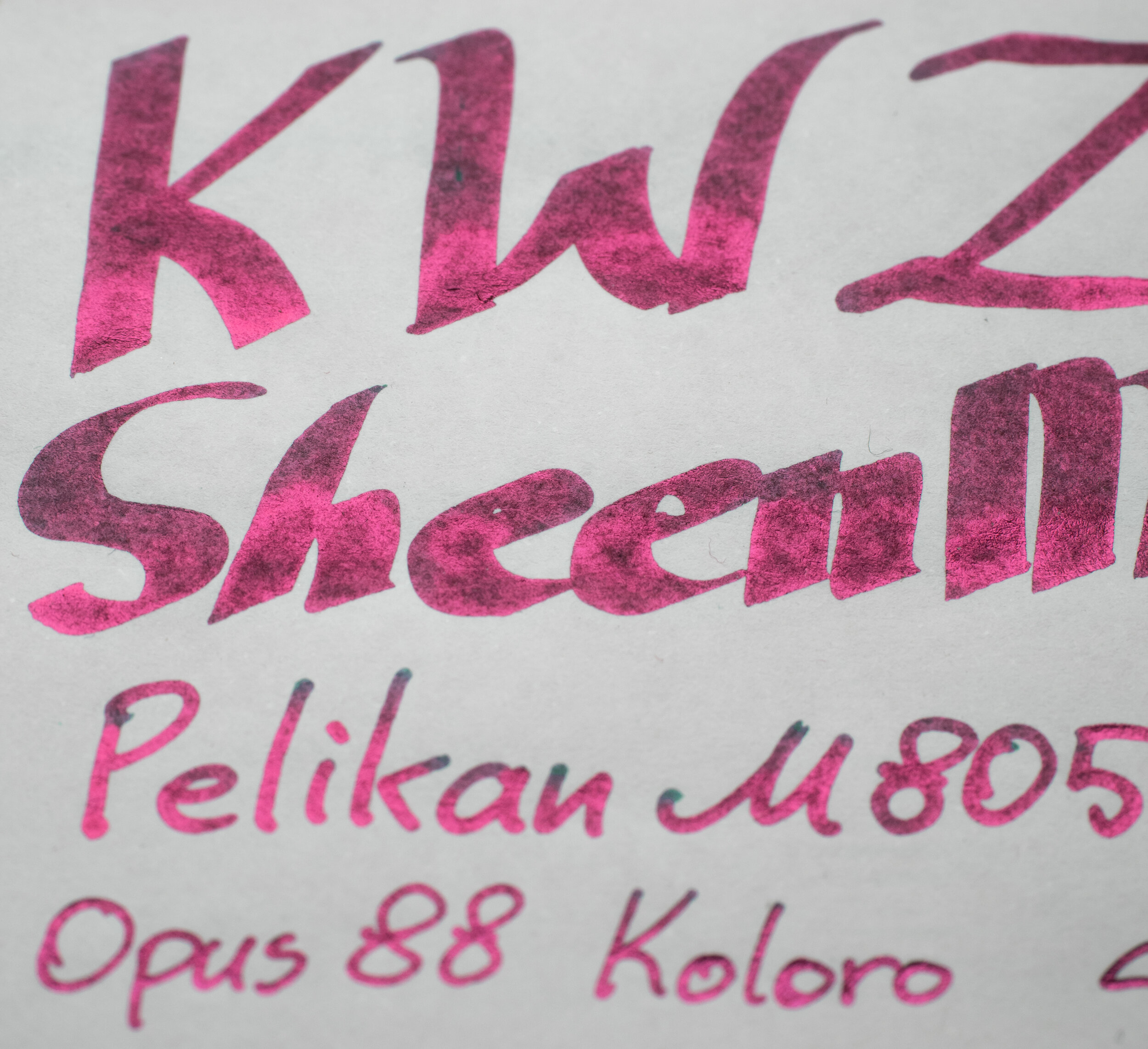
KWZ Sheen Machine 2 Sheen Day is the second instalment in KWZ’s approach to super sheening inks. KWZ Sheen Machine (1) was the classic super sheening azure ink but is less messy and with improved writing characteristics compared to other supersheening inks. KWZ Sheen Machine 2 shares those characteristics but is in now a rich teal ink
Thank you to Bookbinders Design for sending this ink out for review. Bookbinders were only recently able to stock this and some other KWZ inks that were otherwise unavailable in the Australian market.
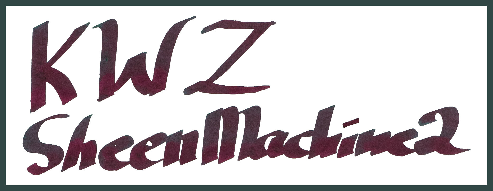
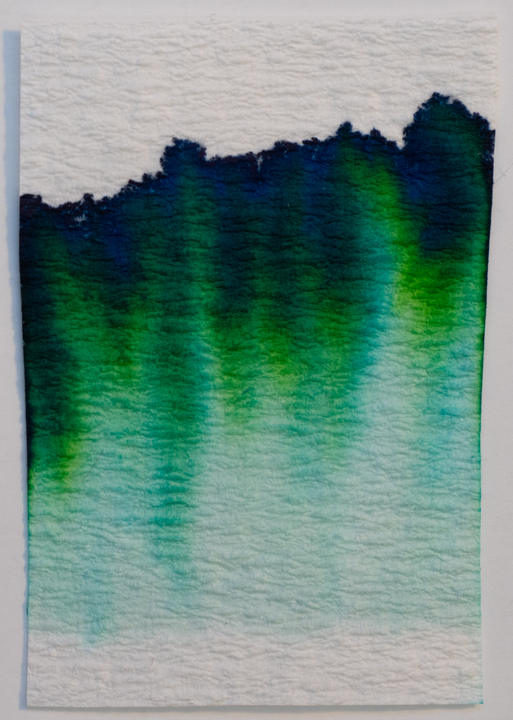
Sheen Machine 2 is a rich teal ink that changes colour a bit depending on the paper. It can be a richer colour that leans strongly green or it can be a slightly greyer teal that has a lot more blue in it. With that in mind it can seem a bit muddy due to the red sheen showing at almost any angle - this makes the saturation appear less than it is and a little dirty sometimes - teal + magenta will give you a brown colour after all. But the ink base is definitely still a well saturated teal ink.
Like Sheen Machine (1) the ink is quite viscous due to the high saturation and high dye content necessary for the high sheen. This can result in the ink being more susceptible to drying out so keep your cap on when not using it where possible. It is still a well lubricated and wet flowing ink which is always good to see.
The ink performs well on nearly all papers. On poorer paper it spreads a bit but doesn’t feather too badly. It does lose saturation but otherwise it still works on these papers. As mentioned already different papers show the ink differently with some papers having a more teal look and some more green with the poorer paper adopting a greener look but with less saturation.

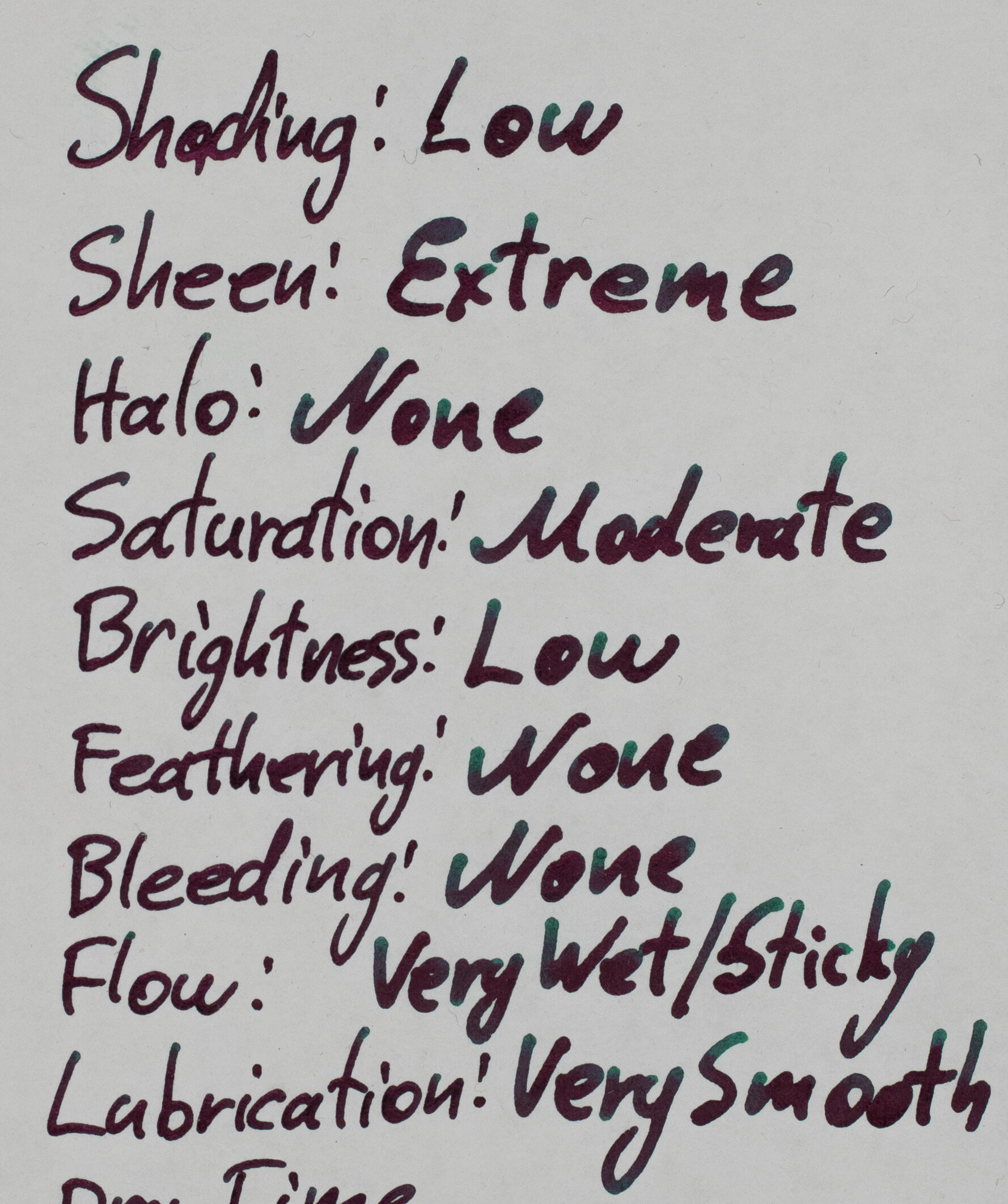
The shading is fairly low on both papers, especially Rhodia as the shading has less contrast on it compares to on Tomoe River.


The sheen is expectedly very strong on Tomoe River with even more sheen than KWZ Sheen Machine (1) I think! It’s the same super vibrant bright pink sheen. There is very little of the base ink visible anywhere. Only the smallest part of the lightly shaded area of the written line and some parts of the less wet swatch. That’s pretty much it! Everything else is sheen.


The sheen on Rhodia is also stronger than the sheen from KWZ Sheen Machine (1) on Rhodia. There’s a noticeable glow about parts of the swatch and you can catch glimpses of it around the written lines. It’s still weak on Rhodia but you can see it without looking for it.
The sheen is either very strong or very subtle with little in between. Most of the papers that do produce a lot of sheen also present the ink with a more blue leaning teal colour with the exception of Original Crown Mill 100% Cotton Paper, Fabriano Rusticus Bianca, and Life Paper which both show quite green.


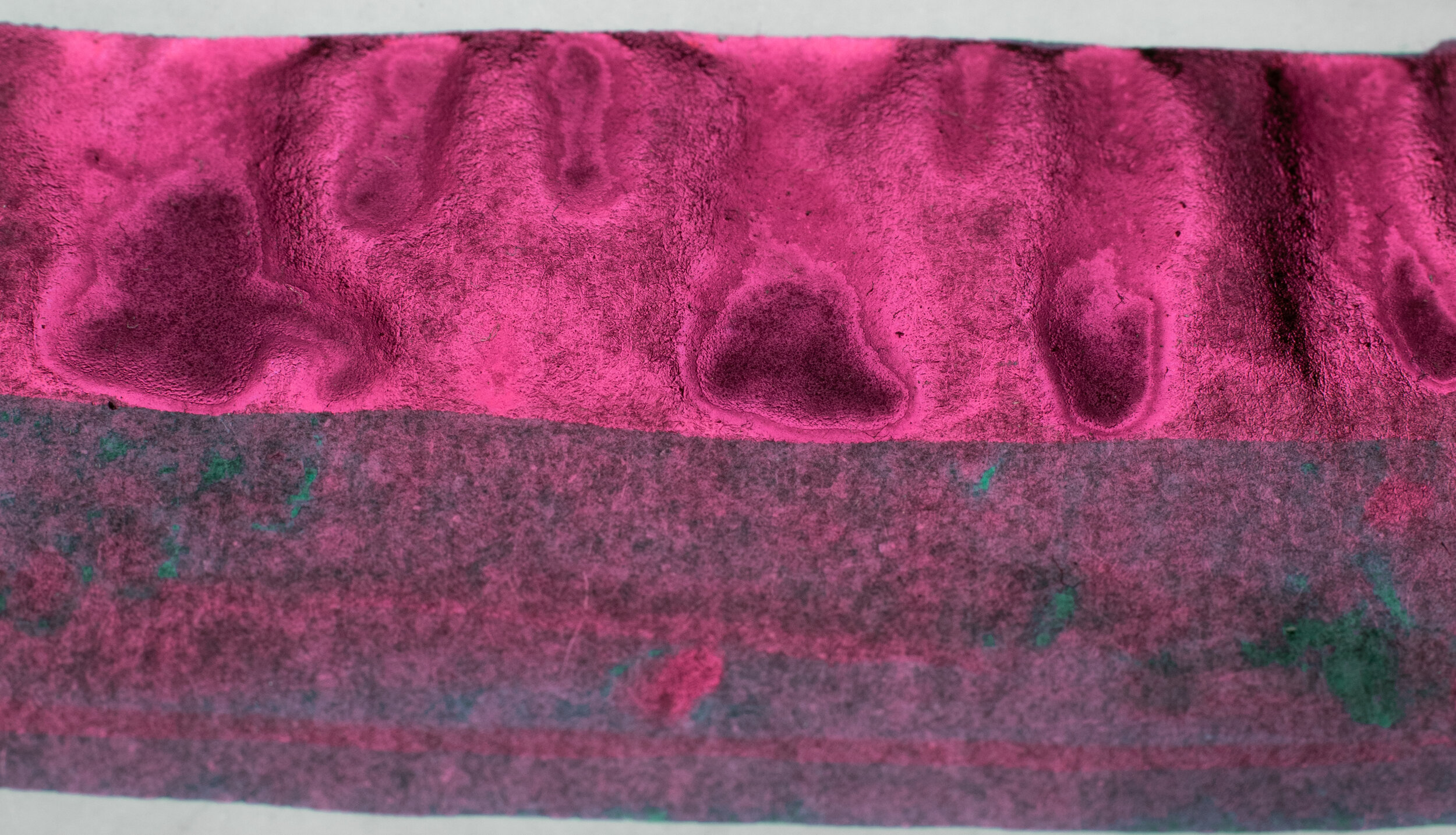
The chromatography has a little bit of interest to it but it’s still fairly obvious. It has a teal that moves to a yellow green before finishing with a dark azure. Dry time isn’t too bad; it’s a little slower than you’d hope, especially on Rhodia. Water resistance is horrible! There’s essentially none but the ink that it does wash away covers the whole area in the colour making the non-wet parts illegible! Not ideal.
As mentioned the ink on Rhodia is much more green leaning. In fact on Rhodia I’d call the ink a green that leans teal. It’ is noticeably darker too and a little higher in saturation. There is no smearing which is nice.
Sailor Ink Studio 764: is lighter and a touch bluer as well as less saturated;
Sailor Ink Studio 864: is a little greener and quite a bit more pale;
Blackstone Blue Cypress: Is a fairly similar colour but much flatter and a little less saturated;
Diamine Bloody Absinth: is a little lighter but not far off;
Diamine November Rain: is much too green with little blue and also a little lighter;
Organics Studio Walden Pond Blue: Is a little bluer but fairly similar overall with some good contrast but a hair less saturation;
Ink Institute Cut Jade: leans an almost yellow green but is a similar saturation and darkness just the wrong colour; and
J. Herbin Emerald of Chivor: not very similar at all. Too light, too blue, too desaturated.
The best choice is Organics Studio Walden Pond Blue but Diamine Bloody Absinth isn’t too far off and neither is Blackstone Blue Cypress.
Diamine Bloody Absinth and Organics Studio Walden Pond Blue are both sheenier than Sheen Machine 2 on Rhodia. The sheen of Sailor Ink Studio 764 is a similar level but a bit less and the colour of the sheen is darker and less saturated. November Rain is also a comparable level.
On Tomoe River is paler, dustier and more of a teal ink that leans a little green. The red sheen obfuscates the colour of the ink a little and can make the colour seem a little dirty. When the light catches the sheen though this becomes less obscured. There is some noticeable smearing, unfortunately, not a heap but it is definitely there.
Sailor Ink Studio 764: is too light and desaturated;
Sailor Ink Studio 864: is pale and greener;
Blackstone Blue Cypress: is lighter and a touch greener;
Diamine Bloody Absinth: is lighter and a little desaturated;
Diamine November Rain: is much too green and possibly a little more saturated but is a similar tone;
Organics Studio Walden Pond Blue: is very similar in colour and tone;
Ink Institute Cut Jade: is much too green but a similar tone; and
J. Herbin Emerald of Chivor: which is way too light.
The only comparable choice on Tomoe River is Organics Studio Walden Pond Blue.
N.B. as I pointed out in the Sheen Machine (1) review with the comparable Organics Studio Nitrogen Royal Blue there is a notable difference between KWZ Sheen Machine 2 and Organics Studio Walden Pond Blue: one of the common complaints with Walden is that it “gets everywhere”. You open the lid and your hands, desk and clothes (or even the floors and the walls) are all at risk of getting ink on them. This is because when Walden dries in the threads of the cap on the bottle it turns into flakes of the ink; very concentrated flakes. These flakes easily float places they shouldn’t when you open the lid. When perfectly dry these flakes will crumble into and onto anything spreading around further and if you introduce any moisture (hand oils, sweat etc.) then it will turn back into a fluid and discolour strongly what it is on. This problem I haven’t notices with KWZ Sheen Machine 2 (or 1) which is very good to see!
The inks with a comparable sheen by colour is Blackstone Blue Cypress, Diamine Bloody Absinth, and Organics Studio Walden Pond Blue. In terms of amount of sheen only Walden and Ink Institute Cut Jade compare. The colours of Sailor Ink Institute 764 is darker and less saturated and the Shen of 864 is almost a pink-silver. Diamine November Rain has a redder sheen (compared to pink of Sheen Machine 2) and Cut Jade is similar but a little less saturated.
This ink is a worthy successor and still lives up to the name as you would expect! It’s even a bit sheenier than Sheen Machine (1). The ink is still a little similar to other inks but it’s a bit more distinct than KWZ Sheen Machine (1) and it is a well behaved ink for this type of ink (a super sheener). Supersheening inks tend to have issues that follow them around but if you keep the cap on when not in use this one there shouldn’t be any issues at all. The ink doesn’t flake, so it isn’t as messy, it’s not as bad at smearing compared to others, and the dry time isn’t that bad (though these last two points are a little better on Sheen Machine (1). It’s a very well performing high sheen ink.
Bookbinders Design have the ink available for AU$24.95. A review of KWZ Sheen Machine (1) can be read here! Thanks again to Bookbinders Design for sending the ink in for review. Check them out!
As usual, there is a paper comparison at the end of this review.
✒︎ ✑ ✒︎ ✑
I've listed all my inks and all my pens in their respective pages. Please let me know which inks you'd like to review next via the comments, Twitter, Instagram, or contact me directly.
For blog updated you can follow @macchiato_man on Twitter, subscribe via email, or like my Facebook page.
I received this ink free of charge for the purpose of giving an honest review. I was not otherwise compensated and everything here is my own honest opinion. There are no affiliate links.