
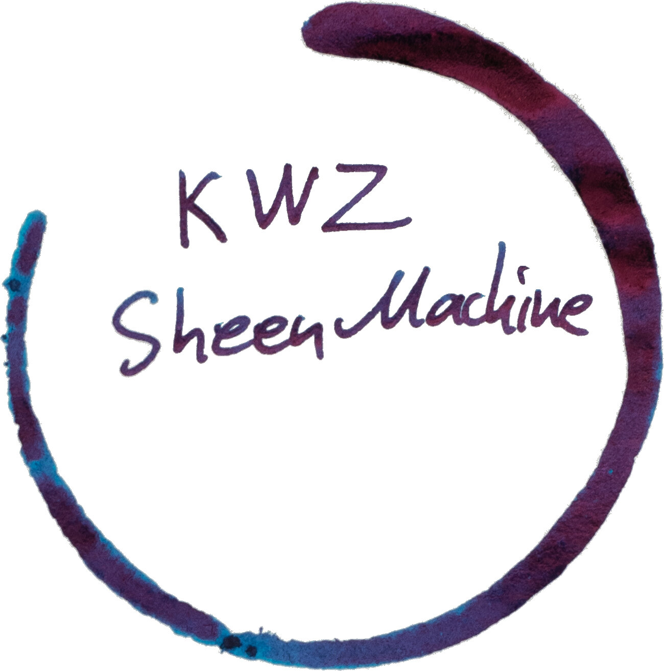
Released in the latter half of 2019, KWZ Sheen Machine was KWZ’s first contribution to super sheening inks, as the name would suggest. KWZ also released a sequel, Sheen Machine 2 “Sheen Day” earlier 2020.
Thank you to Bookbinders Design for sending this ink out for review. Bookbinders were only recently able to stock this and some other KWZ inks that were otherwise unavailable in the Australian market.

KWZ Sheen Machine is simply called that: “Sheen Machine”. For the purpose of clarity, however, I will be calling it Sheen Machine 1 to distinguish it from Sheen Machine 2 (which is coming up as a review soon).
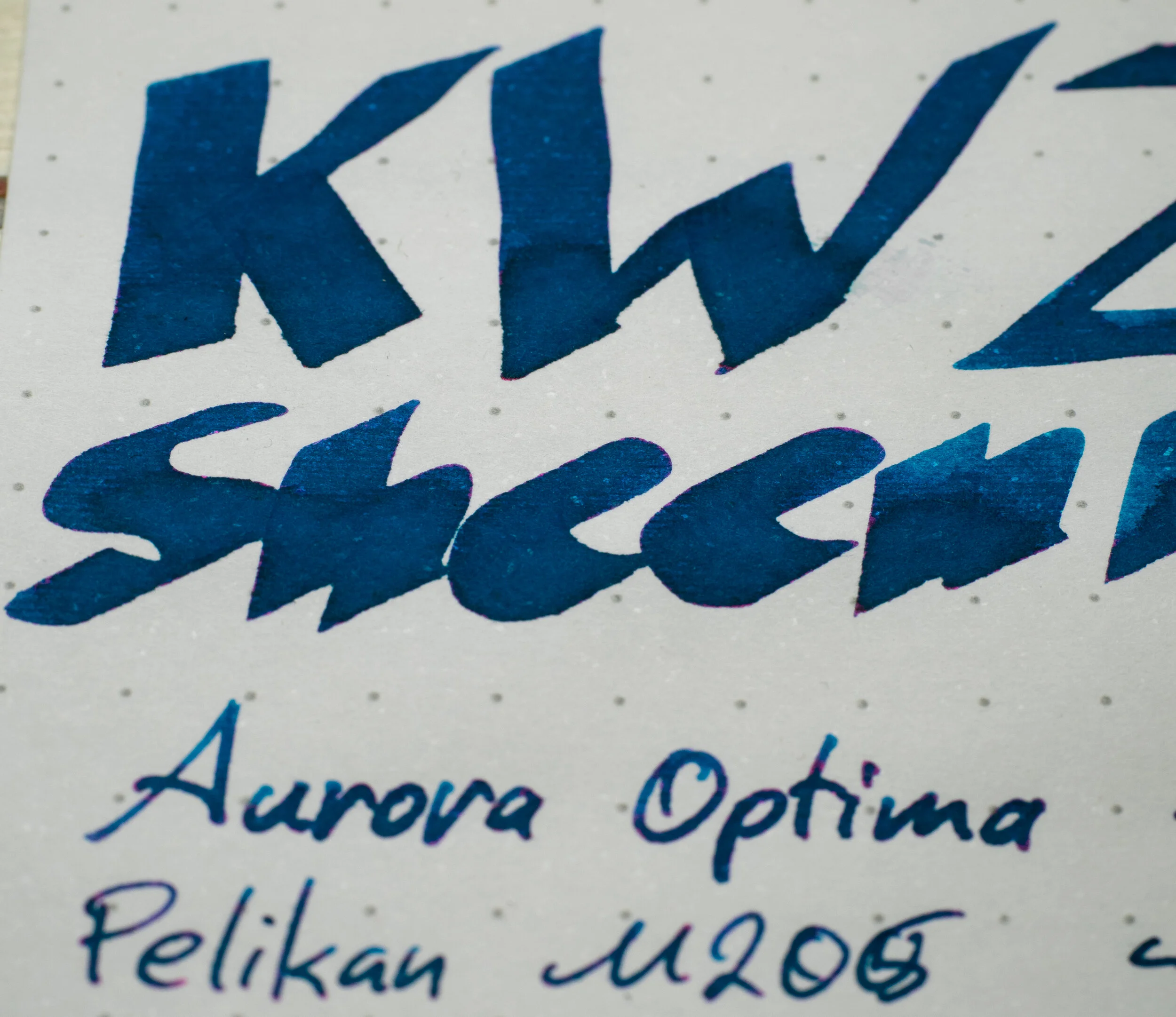
Sheen Machine 1 is your classic super sheening blue ink. It is a teal leaning blue with a lot of saturation - this is a very colourful blue ink. I always like to clarify that this is definitely a strongly ‘blue’ ink but it leans towards a teal more so than it leans to a purple; that is there is more green to it than red. It’s a clean blue with no dustiness or blackness to it. As mentioned it is very saturated which is partially what contributes to the strong sheen.
The ink is noticeably thick and viscous (again, see comments on saturation!). It is well lubricated though but there is more dye content in relation to water. This ink writes smooth and wet but because of it’s viscousness it runs the risk of drying out. This is common amongst all super sheening inks I’ve seen. If you keep the cap on, though, this is a smooth and pleasant ink to write with.
The ink performs very well on all fountain pen friendly paper. It isn’t awful on poor quality paper but it isn’t great either as it looses a lot of colour and does feather and spread a bit (see photos at end of review). The colour does change a bit as well depending on the paper being a lower saturation neutral blue on poor paper, and with other papers showing more or less teal leaning.


The shading is pretty decent for a wet lubricated ink. It isn’t strong but what little there is has some good contrast on Tomoe River. The contrast is a little softer on Rhodia but it’s also a little stronger overall.


The sheen is the whole point of the ink and as expected there is a lot of vibrant sharp pink sheen on Tomoe River. So much so that you can’t see the base ink colour for a lot of it. Even the light swatch is mostly pink; the written lines are mostly pink. The wet swatch is all pink with absolutely no blue showing. Sheen isn’t for everyone, and personally I don’t use these inks that often, but I do love sheen and it’s fun to use a showy ink like this! I consider these high sheening inks to be in the same category as shimmering inks in that regard.


The sheen on Rhodia is much less pronounced. So much less pronounced that you have to really look to find it! Very little on the swatch, only really edges, and similarly on the written line, it is only on the dots, not the strokes. This is pretty normal for Rhodia. Few inks sheen well on it, and rarely are they super sheeners.
There is little to no variability of sheen depending on the paper except for how much it shows. It is the same colour on all of them. Some papers do present the sheen more on the edge while most cover the whole line or swatch but it isn’t that big of a difference here.
Of strange note is the sheen on Leuchtturm1917. This notepad I have here is quite old (I need to get my hand on new stuff!) and the old Leuchtturm1917 was always bad for fountain pens for me but I hear the newer stuff is better. There isn’t a lot of feathering here but the feathering is very noticeable with huge strands of the ink shooting off everyone and then. Interestingly there is still some sheen present (though none on the swatch). Interesting?


Chromatography is fairly bland with it being just a gradient that gets darker. Dry time isn’t too bad with both being just a touch on the slower side. Water resistance is non-existent and in fact the ink really spreads out making the non-wet parts more difficult to read.
On Rhodia the ink is a little darker than Tomoe River and a little less saturated. conspicuously missing is the sheen as well. There is the barest amount of smear but practically none.
Carpink Prussian Blue: I covered this ink here. This ink is a little darker and a touch less saturated;
Diamine Jalur Gemilang: Is less saturated, lighter and with less contrast;
Diamine Skull & Roses: is fairly similar but with a touch less saturation;
Diamine Iridescink Maureen: is darker and flatter;
Ink Institute Snow Starry Night: is lighter, less saturated, and more teal;
Krishna Moonview: is a little darker and more teal;
Organics Studio Nitrogen Royal Blue: I review this ink a while ago here. This ink is very similar overall but a touch darker; and
Sailor Ink Institute 741: much too light and too teal.
The closest here is Organics Studio Nitrogen Royal Blue, with Skull and Ruses and Carpink Prussian Blue not that far behind.
N.B. I should point out here one of the differences between this and Organics Studio Nitrogen Royal Blue: one of the common complaints with Nitrogen is that it “gets everywhere”. You open the lid and your hands, desk and clothes (or even the floors and the walls) are all at risk of getting ink on them. This is because when Nitrogen dries in the threads of the cap on the bottle it terns into flakes of the ink; very concentrated flakes. These flakes easily float places they shouldn’t when you open the lid. When perfectly dry these flakes will crumble into and onto anything spreading around further and if you introduce any moisture (hand oils, sweat etc.) then it will turn back into a fluid and discolour strongly what it is on. This problem I haven’t notices with KWZ Sheen Machine 1 (or 2) which is very good to see!
The “sheen” is all fairly similar in that none of the inks really show much. Only Organics Studio Nitrogen Royal Blue and Krishna Moonview really show any.
On Tomoe River (and similar papers) the ink really “shines” both in the obvious sheen sense but also with the vibrance of the base ink colour. There is some smearing but it’s better than I would have expected.
Carpink Prussian Blue: I covered this ink here. This ink is a little lighter on Tomoe River as well as a hair more teal leaning;
Diamine Jalur Gemilang: is lighter, less saturated and more teal leaning;
Diamine Skull & Roses: is fairly similar but with a touch less saturation (just like on Rhodia);
Diamine Iridescink Maureen: is darker and flatter;
Ink Institute Snow Starry Night: is fairly similar apart from being decently more teal;
Krishna Moonview: is a noticeably darker, is less saturated, and is more teal;
Organics Studio Nitrogen Royal Blue: I review this ink a while ago here. This ink is very similar overall but a touch darker and a hair less saturated; and
Sailor Ink Institute 741: much too light and too teal.
The sheen of most of the inks are fairly comparable in terms of colour with only Diamine Skull & Roses being more yellow leaning and Sailor Ink Studio 741 being less bright and saturated. Organics Studio Nitrogen Royal Blue and Krishna Moonview are the two inks with a comparable amount of sheen throughout the swatch (wetter parts and drier parts) and the writing. The rest lack sheen on the less saturated swatch part.
The ink has no trouble living up to its name; it is indeed a sheen machine. I don’t think the colour is the most unique in the world but this is a well behaved super sheening ink. These super sheeners are fun inks and its well worth having them - if you like sheen, which I do! High sheening inks like this achieve the sheen by having a highly concentrated (compared to normal) dye content. This means the ink is susceptible to drying out but that is the only real downside. The ink otherwise performs well, and better than many alternatives: there is no flaking and thus less messiness, it has little smearing (for a sheening ink) and it dries decently quick for this type of ink with this much wetness to it. It’s a very well performing high sheen ink.
Bookbinders Design have the ink available for AU$24.95. A review of Sheen Machine 2 will be coming shortly! Thanks again to Bookbinders Design for sending the ink in for review.
As usual, there is a paper comparison at the end of this review.
✒︎ ✑ ✒︎ ✑
I've listed all my inks and all my pens in their respective pages. Please let me know which inks you'd like to review next via the comments, Twitter, Instagram, or contact me directly.
For blog updated you can follow @macchiato_man on Twitter, subscribe via email, or like my Facebook page.
I received this ink free of charge for the purpose of giving an honest review. I was not otherwise compensated and everything here is my own honest opinion. There are no affiliate links.