
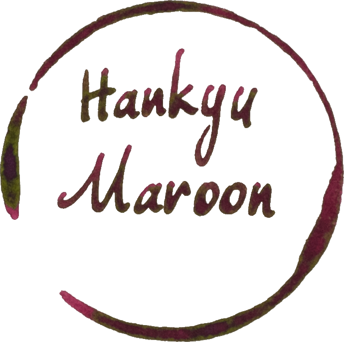
Hankyu Maroon is a Sailor made ink exclusive to the Hankyu Department Store. Hankyu Department Store, which separated from the Hankyu Railway Company in 1947, is a department store who’s main store is located in Osaka. It has further stores nearby and in other cities further away but the only place to buy these inks is from within Osaka, I believe. There are 5 inks under the Hankyu Brand: Wakaba, a light green; Sumire, similar to a light Imperial Purple; Kurikawa, a rich brown; Hanaasagi, a rich dark teal; and this, Maroon.

Sailor Vase/Tall Bottle
Hankyu Maroon is a rich maroon colour (naturally). It’s dark red that leans purple with some hints of brown to dirty the colour a little. There’s some lovely complexity in this colour. The ink is pretty decently saturated and performs as you would expect from any similarly saturated ink from Sailor. This has smooth lubrication and wet ink flow. It works well on all nib sizes. The inks performs well on practically all paper. There’s some obvious deterioration in the performance quality on the worst paper but it is still not that bad there either.
The ink has some colour changes depending on the paper and can look more brown or more pink. Yellow paper tends to make the ink look more brown and whiter paper more pink with poor quality paper taking some saturation out of it and making it seem a little more purple.
The bottle is the very beautiful and sort-after Sailor vase bottle (or tall bottle). These bottles are still available within Japan at some stores (though the number of stores still stocking these tall bottles is, worryingly, dropping of late!). These bottles used to be available internationally from Bungubox at least early 2015 but soon thereafter moved to the shower squatter bottles. At this point a misunderstanding seemed to have formed that the bottles were discontinued. This was never the case; inks in these bottles just weren’t easily available for international (non-Japanese) prospective buyers!


There is some decent and quite beautiful shading on Rhodia 80gsm paper! A nice gradient between the light and dark. On 52gsm Tomoe River the shading is less frequent and more sudden with less of a gradient. It’s still striking!


Sheen Tomoe River 52gsm
The sheen is a vibrant yellow green colour and is quite pervasive on Tomoe River 52gsm. The sheen is quite visible on all the written lines and even on the Japanese Fine nib!


“Sheen” Rhodia 80gsm
On Rhodia there is, for all intents and purposes, no sheen. You can see the slightest hint every now and then but it’s too minimal to count.
Sheen, various papers.
Due to issues with my RSS feed on Squarespace I’m having to move these photos off-site. You can view higher definition photos of each paper type on this Flickr album.
There’s no surprises the the sheen on other papers. Where you expect sheen there is sheen, where you expect less sheen there is less sheen!


The chromatography is pretty! There’s a dark blue-grey line where the line was written on the paper with a light pink becoming darker until there are some dark purple-brown patches that separate into a pale yellow and then a pale blue!
Dry time on Rhodia is on the quicker side at 20 seconds. At 90 seconds, however, Tomoe River is on the slower side.
There is some water resistance. Most of the colour gets washed away (and covers the surrounding paper) but there is a darker grey line that’s visible underneath. Not pretty but visible.
Review: Rhodia 80gsm White
For some reason I got a lot of feathering on Rhodia from the swatch this time. I believe this was because I was putting a wet swatch on top of a less saturated swatch and the paper didn’t like it at all - I’ll be avoiding that in future! You should notice that written parts of the inks don’t feather!
Hankyu Maroon gets pretty dark on Rhodia 80gsm. It’s also less saturated! There’s no smearing at all.
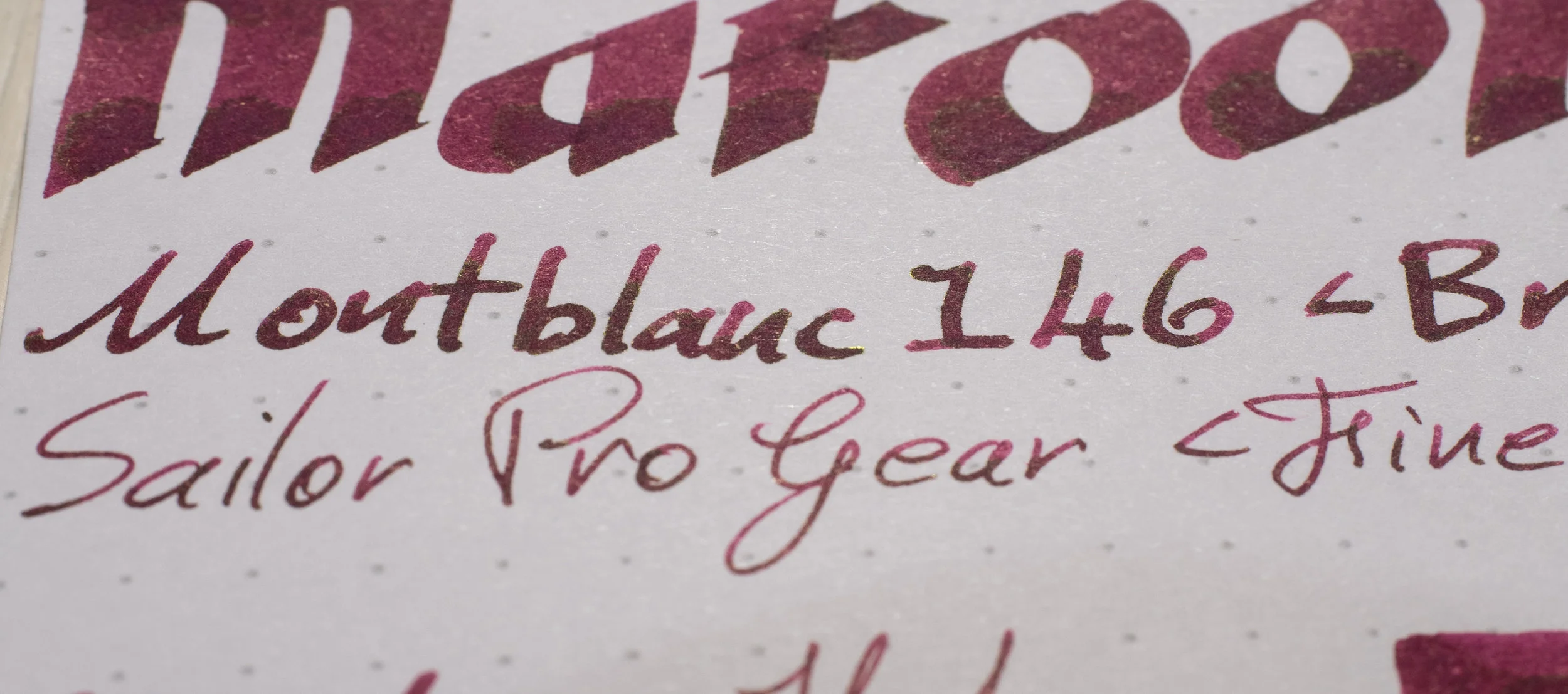
Sailor Ink Studio 931: is more saturated, pinker and lighter;
Bungubox Sweet Potato Purple: Is a touch more saturated but pretty similar;
Sailor Oku-Yama: is much more orange and lighter;
Diamine Velvet Rose: Is more red and saturated;
Diamine Cult Pen Iridescink Robert: is much more saturated;
Diamine Manggis: is more purple;
Taccia Ebi Purple Red: is lighter but a similar saturation; and
Irishozuku Yama-Budo: is much more magenta and higher saturation and lighter.
On Rhodia I’d definitely pick Bungubox Sweet Potato Purple. Easily the closest here.
Review: Tomoe River 52gsm Ivory (White)
52gsm Tomoe River is where this ink really looks its best, in my opinion. Beautifully rich and complex with a nice balance between dark and light, and magenta and brown. There’s only a small amount of smearing here which isn’t that bad.
Sailor Ink Studio 931: is much pinker, more saturated and lighter;
Bungubox Sweet Potato Purple: is a complex colour here but is too purple;
Sailor Oku-Yama: is more red and orange and a little more saturated;
Diamine Velvet Rose: is darker and redder and flatter;
Diamine Cult Pen Iridescink Robert: is darker but a similar hue and is also flatter;
Diamine Manggis: is too purple and a little darker;
Taccia Ebi Purple Red: is too light, a touch too purple and less saturated; and
Irishozuku Yama-Budo: is too magenta, saturated, and light.
Not many similar inks on Tomoe River! The closest might even be Cult Pens Robert!


All the sheens are comparable except Iroshizuku Yama-Budo which is a beautiful rich gold colour compared to the grey-gold of the other inks. The Sheen of Robert seems to have become too much for itself with the sheen almost looking like it flooded itself and is dulled because of it (but is still rich on the written line). There is very little sheen on the Taccia.
This is one of my favourite inks (“top 6”), in my favourite bottle, and by my favourite brand! Rich deep reds, burgundies and maroons are some of my favourite colour families as well. It’s one of the few inks I’ve inked more than twice. It’s got Sailor’s typical smooth-and-wet-writing performance with few downsides apart from a slightly slower dry times on some papers but there is also some nice sheen on some papers as well! This is a pretty flooded colour-family. There are lots of maroons and burgundies on the market and this ink isn’t strikingly unique in any one way. For me it’s a culmination of all it’s characteristics and that I just like this hue a lot. It has decent shading, decent sheen (but not too much), smooth and wet writing experience, and a complex colour (and my favourite bottle of course).
To get this ink you need to do one of three things: 1) Travel to Osaka, Japan; 2) Have a friend travel or live in Osaka, Japan; or 3) use a proxy buying service. I used White Rabbit Express and they purchases the bottles on my behalf from Hankyu, collected the package, and then sent the the package. The bottles cost ¥2,160 (AU$30, US$20.31, EU€18.16) when I purchased this. White Rabbit Express does have fees, however: US$4 per-shop fee, US$1 per-item fee, 9.9% service fee, as well as domestic (within Japan) shipping costs and then finally international shipping costs to me. In the end it cost me US$68.74 for two bottles before International Shipping which, for context only, was US$26.33 for three bottles (it was a combined shipment). This isn’t that bad given all the fees and shipping involved but it still isn’t a cheap ink. In the end it’s somewhat easy to buy (because the proxy service does it for you) - you just have to pay for it.
As usual, below is the ink on various papers but this time as a single image collage. For individual images please see this Imgur album.
✒︎ ✑ ✒︎ ✑
I've listed all my inks and all my pens in their respective pages. Please let me know which inks you'd like to review next via the comments, Twitter, Instagram, or contact me directly.
For blog updated you can follow @macchiato_man on Twitter, subscribe via email, or like my Facebook page.
I was not compensated for this review and everything here is my own honest opinion. There are no affiliate links in this review.
