• Blog
  • About
    • My Inks (on Fountain Pen Companion)
    • My Pens
  • Archive
  • Contact
Menu

Macchiato Man

  • Blog
  • About
  • My Collection ☟
    • My Inks (on Fountain Pen Companion)
    • My Pens
  • Archive
  • Contact
The @madebyendless Cotton Wallet arrived the other day! I’m a sucker for these sorts of practical inserts for notebooks. The cotton fabric suites the simple style of the Explorer. 
⠀
While I love these and always get them whenever I can I never
First test of the Regalia paper in the Endless Explorer than I was sent by @madebyendless. Really impressed by the paper. Very smooth, nice sheen and nice shading! Finger prints or hand oil seem to affect the writing a little but nothing out of the o
New Pen Review: Esterbrook Camden (Premium Edition) - 𝙻𝚒𝚗𝚔 𝚒𝚗 𝙱𝚒𝚘!

I’ve been eager to try the Camden for a while now. I love my flat end pens and the overall shape of this one is subtly unique. While there are some differences between
New friend from @esterbrook_official! Camden Manitoba Blue. 
⠀
Love flat end pens so looking forward to digging into this (so review incoming).
 
Flat or round ends?✑
⠀
⠀
⠀
⠀
#fountainpen #fpgeeks #fountainpenaddict #fpn #fountainpengeeks  #fountainp
New Ink Review: @birminghampens Antique Sepia (link in bio)
⠀
In line with the recent trend of soft pastel dichromatic inks but Birmingham’s version is an interesting dust grey version with low saturation that I find quite interesting don&rsquo
New Ink Day! Haven’t had one of these for a while but I received these from a friend at the last Perth Pen Meet. 
⠀
All sailor and the first tall bottle in a while (bringing the number of those to 86). 
⠀
Didn’t realise it at the time but
New Ink Review: La Couronne du Comte Vert Sapin (link in bio)
⠀
The final of LCdC’s initial set of four exclusive inks from Diamine. A lovely rich sheeny green-teal.
✑
⠀
⠀
⠀
⠀
#fountainpen #fpgeeks #fountainpenaddict #fpn #fountainpengeeks  #fo
I don’t know if I’ve ever shared this before but my city has a set of five dip nibs as an artwork. 

They are called “Memory Markers” by Anne Neil and represent early-ish colonial stories of the gardens where they are.

We als
⚠️Update: Why I have been so radio silent! 📻🤫 A lot of large personal changes, essentially (read on for details)!

There have been three main reasons for why I haven’t been able to do much here or on my blog. 

1) 🎓 I had to finish of my Mas
Ink Ink Comparison: Discontinued Iroshizuku and New Iroshizuku! Thanks to @penclassics for allowing this to happen. See link in bio!
⠀
The old: Tsuyu-kusa, Tsukushi, and Ina-ho.
The New: Sui-gyoku, Hana-ikada, and Hotaru-bi.
⠀
This is a long review b
NPD: @esterbrook_official LE Estie “Candy” in Oversize with a Kirk Speer Needlepoint nib!
⠀
Thanks to Esterbrook for sending this through to me for review. I’ve reviewed a couple of Esties now and two of the custom nibs (which are a
Out with the old in with the new?

I just received the new Pilot Iroshizuku Inks in the little bottle ink pack from @penclassics for review. I plan on doing an overview review of the three new and the three old ones!

I feel like Ina Ho was quite a u
New Pen Review (see link in bio): Platinum Curidas courtesy of @penclassics (check them out!)
⠀
This is certainly a curiously designed pen with it's quirks but it has bee a delight to write with and a great pen to through in a pocket. I've been using
New Ink Review! @wearingeul_global Kyonghui! See link in bio!

Kyonghui is a vibrant earthy orange from Wearingeul's series on Korean Female Modern Writers. It is also a great performing ink!

Wearingeul's global push is fairly new; has anyone tried
It has been a little while since I posted here so I thought I'd give a little update!

Firstly I think I just needed a little break at the end of the year! It has been a busy year for me. I have been taking my photography more seriously and I also ha

Subscribe

Sign up with your email address to receive news and updates.

We respect your privacy. Unsubscribe at any time.

Thank you!
Blog RSS

☛ Twitter feed

✉ Email Subscription

☞ Fountain Pens Australia (Facebook Group)

☛ Sailor Pens & Inks (Facebook Group)


Sponsors

10% off code: MACCHIATOMAN


Click here for sponsorship information


Featured Posts:

Featured
Ink Review: Pennonia Pokoltuz (Pokoltűz)
Aug 1, 2019
Ink Review: Pennonia Pokoltuz (Pokoltűz)
Aug 1, 2019
Aug 1, 2019
Notebook Review: Pebble Stationery Pocket Tomoe River Notebook
Nov 10, 2018
Notebook Review: Pebble Stationery Pocket Tomoe River Notebook
Nov 10, 2018
Nov 10, 2018
Ink Review: Krishna Brown Pink
Jan 20, 2018
Ink Review: Krishna Brown Pink
Jan 20, 2018
Jan 20, 2018


Archive
  • November 2024
  • October 2023
  • December 2022
  • October 2022
  • June 2022
  • May 2022
  • April 2022
  • February 2022
  • January 2022
  • December 2021
  • November 2021
  • October 2021
  • September 2021
  • August 2021
  • July 2021
  • June 2021
  • May 2021
  • April 2021
  • February 2021
  • January 2021
  • December 2020
  • November 2020
  • October 2020
  • September 2020
  • August 2020
  • July 2020
  • May 2020
  • April 2020
  • March 2020
  • February 2020
  • January 2020
  • December 2019
  • November 2019
  • October 2019
  • September 2019
  • August 2019
  • July 2019
  • June 2019
  • May 2019
  • April 2019
  • March 2019
  • February 2019
  • January 2019
  • December 2018
  • November 2018
  • October 2018
  • September 2018
  • August 2018
  • July 2018
  • June 2018
  • May 2018
  • April 2018
  • March 2018
  • February 2018
  • January 2018
  • December 2017
  • November 2017
  • October 2017
  • September 2017
  • August 2017
  • July 2017
  • June 2017
  • May 2017
  • April 2017
  • February 2017
  • January 2017
  • December 2016
  • November 2016
  • September 2016
  • August 2016
  • July 2016
Logo 1.png

Ink Review: Robert Oster Orange Rumble

July 06, 2018 in Ink Review

Orange Rumble is a relatively new addition to the Robert Oster lineup. It looked nice when I first saw photos of the ink from Rob, but upon seeing it in person I was very impressed! Rob describes the ink as a 1970's inspired ink. I can see where this is coming from; browns, burnt oranges, yellow-greens are certainly some popular 70s colours schemes!

Title.png

Orange Rumble is a rich burnt orange but it isn't a dark burnt orange; it's more on the light side. I'd call it somewhat high saturation but with a little hesitation as it's holding back a little here and for me this is a good thing as it makes the ink distinct from other burnt orange inks.

The ink isn't dry but I wouldn't say it's Rob's wettest ink either but I'd place it on wetter side of average. It's got some nice shading, depending on the paper (Rhodia is quite nice but Tomoe River flattens it a bit which isn't uncommon) and the wetness of the pen (too wet or to dry of a pen and the shading will not come through as much). There's no issues for this ink on and fountain pen friendly paper.

View fullsize Sheen: Rhodia
Sheen: Rhodia
View fullsize Sheen: Rhodia
Sheen: Rhodia
View fullsize Sheen: Rhodia
Sheen: Rhodia
View fullsize Sheen: Rhodia
Sheen: Rhodia
View fullsize Sheen: Tomoe River
Sheen: Tomoe River
View fullsize Sheen: Tomoe River
Sheen: Tomoe River
View fullsize Sheen: Tomoe River
Sheen: Tomoe River
View fullsize Sheen: Tomoe River
Sheen: Tomoe River
View fullsize Sheen: 80gsm Ivory Rhodia
Sheen: 80gsm Ivory Rhodia
View fullsize Sheen: 90gsm Ivory Rhodia
Sheen: 90gsm Ivory Rhodia
View fullsize Sheen: Card Stock
Sheen: Card Stock
View fullsize Sheen: Clairefontaine
Sheen: Clairefontaine
View fullsize Sheen: Composition Book
Sheen: Composition Book
View fullsize Sheen: 52gsm Cream Tomoe River
Sheen: 52gsm Cream Tomoe River
View fullsize Sheen: Diaso paper
Sheen: Diaso paper
View fullsize Sheen: decent copy paper
Sheen: decent copy paper
View fullsize Sheen: Franklin-Christoph
Sheen: Franklin-Christoph
View fullsize Sheen: Ivory G.Lalo
Sheen: Ivory G.Lalo
View fullsize Sheen: Life paper
Sheen: Life paper
View fullsize Sheen: Midori paper
Sheen: Midori paper
View fullsize Sheen: 100% Cotton Original Crown Mill
Sheen: 100% Cotton Original Crown Mill

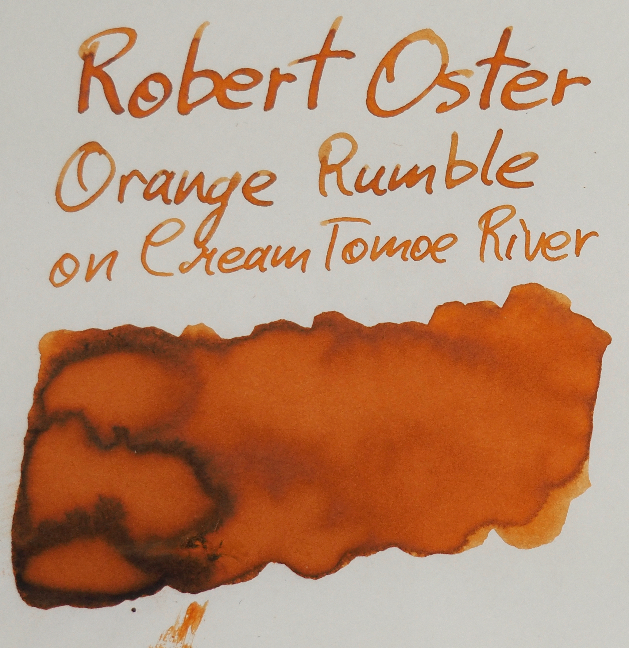
This ink has a health amount of grey-silver sheen to it on the right paper. I say grey because the silvery-ness is not as shiny as the silver sheen on, say, Sailor Apricot. On some papers the grey sheen really stands on on the swatch but isn't that present on the written line but it's definitely visible on Tomoe River with a wetter pen. It gives the ink some extra character without being overbearing. 

View fullsize Chromatography
Chromatography
View fullsize Dry time Rhodia 2.jpg
View fullsize Dry time 52gsm Tomoe River
Dry time 52gsm Tomoe River

Chromatography is straight forward (ignore the blue at the bottom). Just various saturation levels of the inks colour but there is a dark brown colour right at the tip. Dry time is a around average for both 80gsm Rhodia and 52gsm Tomoe River.

Review on 80gsm white Rhodia

There's no smearing on Rhodia 80gsm and the water resistance is non-existent. The ink has a great halo which a fair few Robert Oster inks have but this is nice and visible.

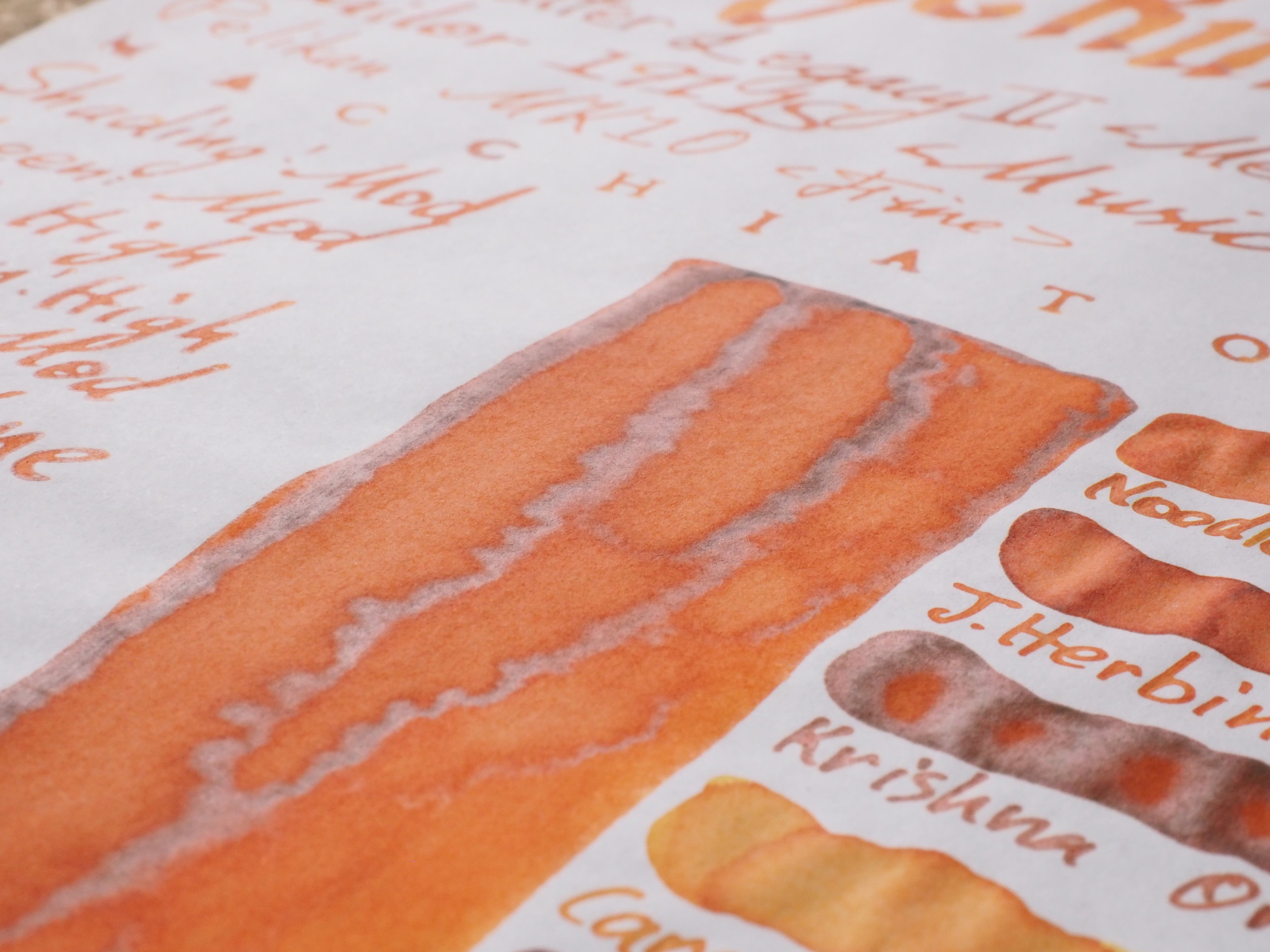
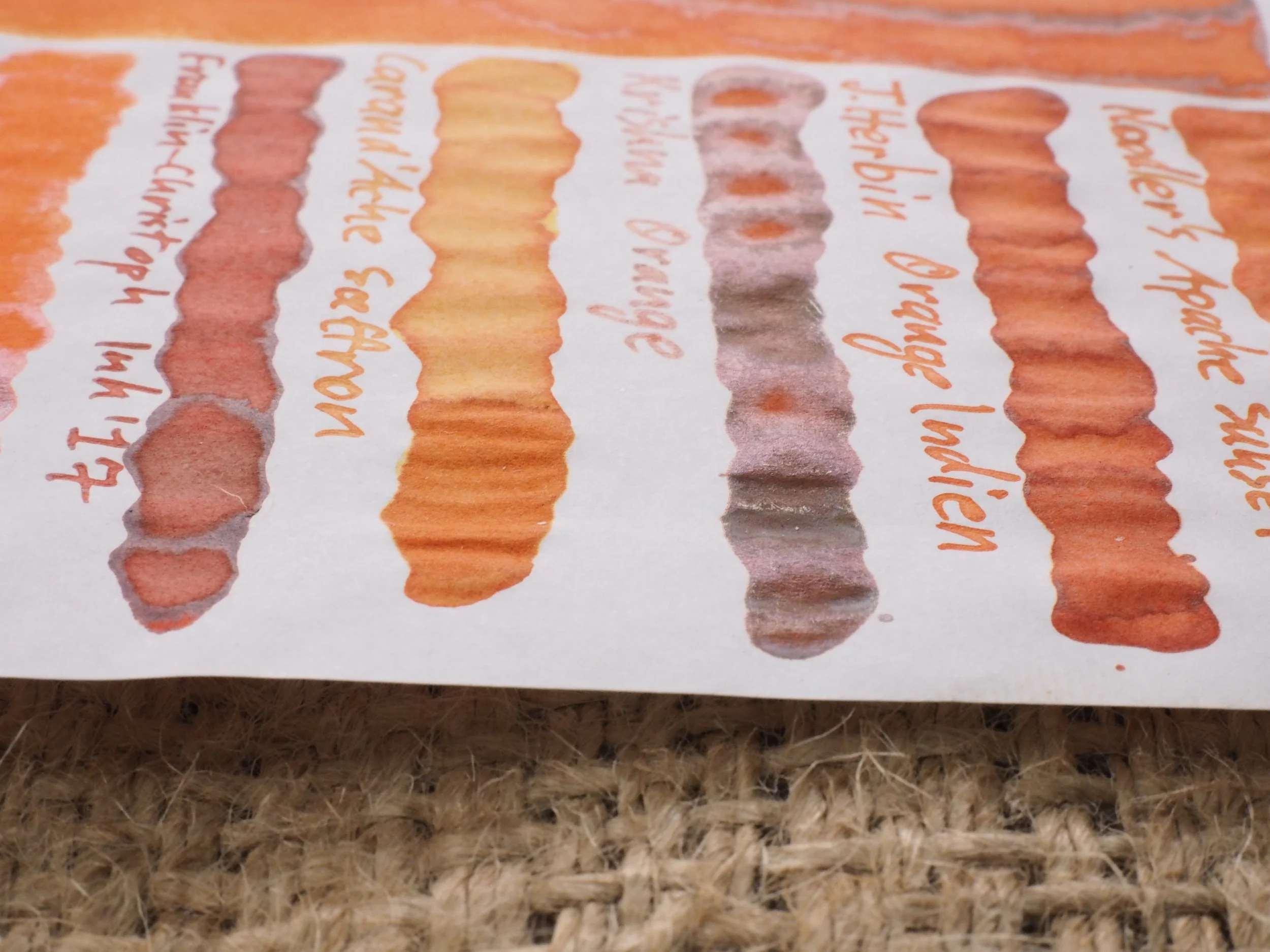
The closest inks in my collection that I have chosen are Noodler's Apache Sunset, J. Herbin Orange Indien, Krishna Orange, Caran d'Ache Saffron, Franklin-Christoph Ink '17, Bungubox Hamanako Fresh Mandarin Orange, and Graf von Faber-Castell Burned Orange. Absent is Kyo-iro Frosting of Arashiyama which should be relatively close to this (but I had lent a friend my bottle and didn't have it for this review).

Noodler's Apache Sunset is too light and surprisingly flat. J. Herbin Orange Indien is also too flat but the hue isn't that far of; just a little too brown and not quite as saturated. Krishna Orange is too dark and slightly too brown but in it's lighter shaded areas isn't a massive difference. Caran d'Ache Saffron is simply way too light. Franklin-Christoph Ink 17' is too red and too dark. Bungubox  Hamanako Fresh Mandarin Orange is too saturated and too yellow. Graf von Faber-Castell Burned Orange is a touch too red and a hair too dark.

For Rhodia I'd pick Krishna Orange or J. Herbin Orange Indien depending on your persuasion to lighter or darker shades.

Review Tomoe River (resized)(adjusted)2.jpg

Tomoe River has a habit of sapping the saturation away from some ink. Some Robert Oster inks are susceptible to this and while Orange Rumble is not exception it's far less affected than others. It has gotten a little lighter and a little less saturated but not a huge amount. Shading has dropped a little as well but not terribly. Water resistant is still not applicable and the ink does smear a little (but not a huge amount).

The same inks are as on Rhodia. Noodler's Apache Sunset isn't as light here but is still a little too light but the colour is a little closer. J.Herbin Orange Indien has lost a similar amount of saturation and darkness to Orange Rumble so is a similarly compared here to what it was on Rhodia even though both inks are now different! Krishna Orange has developed a very strong shading/Halo to it and has become darker really beautiful but less comparable now. Caran D'Ache Saffron is now much lighter; no comparison. Franklin-Christoph Ink 17 is still too red and too dark and Bungubox Hamanako Fresh Mandarin Orange is still too yellow and too saturated. Graf von Faber-Castell Burned Orange has become lighter but is still too red.

For me only J. Herbin Orange Indien is close on Tomoe River, but maybe Noodler's Apache Sunset.

View fullsize Sheen Comparison 1.JPG
View fullsize Sheen Comparison 2.JPG
View fullsize Sheen Comparison 3.JPG

Only two of the compared inks have a (practical) sheen to them; Bungubox Hamanako Fresh Mandarin Orange has a bright shiny silvery-white sheen to it and Krishna Orange has a brown-grey (slightly silvery) sheen to it. The sheen of Robert Oster Orange Rumble kinda sits in the middle between the two but if I were to pick I'd pick Krisha Orange as while the colour of the sheen is a little of the type of sheen is quite close as it is somewhat dull as well.

As I said at the start I thought this looked like a nice ink but wasn't blown away until I saw it in person. I think this is a great somewhat-burnt orange. It's probably not the most unique orange in the entire world but I really like it and it stood out to me. Good characteristics – shading, sheen, not dry – and a great colour. What's not to like!

You can buy this ink from almost anywhere that sells Robert Oster inks (which is almost everywhere these days!).

✒︎ ✑ ✒︎ ✑

As usual, below as the ink on various papers.

I've listed all my inks and all my pens in their respective pages. Please let me know which inks you'd like to review nextvia the comments, Twitter, Instagram, or contact me directly.

For blog updated you can follow @macchiato_man on Twitter, subscribe via email, or like my Facebook page.

I was not compensated for this review and everything here is my own honest opinion. There are no affiliate links.

View fullsize Paper 80gsm Ivory Rhodia.jpg
View fullsize Paper 90gsm Ivory Rhodia.jpg
View fullsize Paper Card stock.jpg
View fullsize Paper Clairefontaine.jpg
View fullsize Paper Composition Book.jpg
View fullsize Paper Cream Tomoe River.jpg
View fullsize Paper Daiso.jpg
View fullsize Paper decent copy paper.jpg
View fullsize Paper Franklin-Christoph.jpg
View fullsize Paper G. Lalo.jpg
View fullsize Paper Leuchtturm.jpg
View fullsize Paper Life Paper.jpg
View fullsize Paper low quality copy paper.jpg
View fullsize Paper Midori.jpg
View fullsize Paper Original Crown Mill.jpg
Tags: Noodlers, Apache Sunset, J. Herbin, Orange Indien, Krishna, Krishna Orange, caran d'ache, Caran d'ache saffron, saffron, Franklin-Christoph, Ink '17, Franklin-Christoph Ink '17, Bungubox, Fresh mandarin orange, Hamanako, Graf von Faber-Castell, Graf von Faber-Castell Burned Orange, Robert Oster, Orange Rumble, ROSI, Robert Oster Orange Rumble
← Two Years of Macchiato ManPen Review: OMAS Paragon Arte Italiana Brown Arco Celluloid with Silver Trim →
Back to Top

Blog RSS

✉ Email Subscription

☞ Fountain Pens Australia (Facebook Group)

☛ Sailor Pens & Inks (Facebook Group)