• Blog
  • About
    • My Inks (on Fountain Pen Companion)
    • My Pens
  • Archive
  • Contact
Menu

Macchiato Man

  • Blog
  • About
  • My Collection ☟
    • My Inks (on Fountain Pen Companion)
    • My Pens
  • Archive
  • Contact
The @madebyendless Cotton Wallet arrived the other day! I’m a sucker for these sorts of practical inserts for notebooks. The cotton fabric suites the simple style of the Explorer. 
⠀
While I love these and always get them whenever I can I never
First test of the Regalia paper in the Endless Explorer than I was sent by @madebyendless. Really impressed by the paper. Very smooth, nice sheen and nice shading! Finger prints or hand oil seem to affect the writing a little but nothing out of the o
New Pen Review: Esterbrook Camden (Premium Edition) - 𝙻𝚒𝚗𝚔 𝚒𝚗 𝙱𝚒𝚘!

I’ve been eager to try the Camden for a while now. I love my flat end pens and the overall shape of this one is subtly unique. While there are some differences between
New friend from @esterbrook_official! Camden Manitoba Blue. 
⠀
Love flat end pens so looking forward to digging into this (so review incoming).
 
Flat or round ends?✑
⠀
⠀
⠀
⠀
#fountainpen #fpgeeks #fountainpenaddict #fpn #fountainpengeeks  #fountainp
New Ink Review: @birminghampens Antique Sepia (link in bio)
⠀
In line with the recent trend of soft pastel dichromatic inks but Birmingham’s version is an interesting dust grey version with low saturation that I find quite interesting don&rsquo
New Ink Day! Haven’t had one of these for a while but I received these from a friend at the last Perth Pen Meet. 
⠀
All sailor and the first tall bottle in a while (bringing the number of those to 86). 
⠀
Didn’t realise it at the time but
New Ink Review: La Couronne du Comte Vert Sapin (link in bio)
⠀
The final of LCdC’s initial set of four exclusive inks from Diamine. A lovely rich sheeny green-teal.
✑
⠀
⠀
⠀
⠀
#fountainpen #fpgeeks #fountainpenaddict #fpn #fountainpengeeks  #fo
I don’t know if I’ve ever shared this before but my city has a set of five dip nibs as an artwork. 

They are called “Memory Markers” by Anne Neil and represent early-ish colonial stories of the gardens where they are.

We als
⚠️Update: Why I have been so radio silent! 📻🤫 A lot of large personal changes, essentially (read on for details)!

There have been three main reasons for why I haven’t been able to do much here or on my blog. 

1) 🎓 I had to finish of my Mas
Ink Ink Comparison: Discontinued Iroshizuku and New Iroshizuku! Thanks to @penclassics for allowing this to happen. See link in bio!
⠀
The old: Tsuyu-kusa, Tsukushi, and Ina-ho.
The New: Sui-gyoku, Hana-ikada, and Hotaru-bi.
⠀
This is a long review b
NPD: @esterbrook_official LE Estie “Candy” in Oversize with a Kirk Speer Needlepoint nib!
⠀
Thanks to Esterbrook for sending this through to me for review. I’ve reviewed a couple of Esties now and two of the custom nibs (which are a
Out with the old in with the new?

I just received the new Pilot Iroshizuku Inks in the little bottle ink pack from @penclassics for review. I plan on doing an overview review of the three new and the three old ones!

I feel like Ina Ho was quite a u
New Pen Review (see link in bio): Platinum Curidas courtesy of @penclassics (check them out!)
⠀
This is certainly a curiously designed pen with it's quirks but it has bee a delight to write with and a great pen to through in a pocket. I've been using
New Ink Review! @wearingeul_global Kyonghui! See link in bio!

Kyonghui is a vibrant earthy orange from Wearingeul's series on Korean Female Modern Writers. It is also a great performing ink!

Wearingeul's global push is fairly new; has anyone tried
It has been a little while since I posted here so I thought I'd give a little update!

Firstly I think I just needed a little break at the end of the year! It has been a busy year for me. I have been taking my photography more seriously and I also ha

Subscribe

Sign up with your email address to receive news and updates.

We respect your privacy. Unsubscribe at any time.

Thank you!
Blog RSS

☛ Twitter feed

✉ Email Subscription

☞ Fountain Pens Australia (Facebook Group)

☛ Sailor Pens & Inks (Facebook Group)


Sponsors

10% off code: MACCHIATOMAN


Click here for sponsorship information


Featured Posts:

Featured
Ink Review: Pennonia Pokoltuz (Pokoltűz)
Aug 1, 2019
Ink Review: Pennonia Pokoltuz (Pokoltűz)
Aug 1, 2019
Aug 1, 2019
Notebook Review: Pebble Stationery Pocket Tomoe River Notebook
Nov 10, 2018
Notebook Review: Pebble Stationery Pocket Tomoe River Notebook
Nov 10, 2018
Nov 10, 2018
Ink Review: Krishna Brown Pink
Jan 20, 2018
Ink Review: Krishna Brown Pink
Jan 20, 2018
Jan 20, 2018


Archive
  • November 2024
  • October 2023
  • December 2022
  • October 2022
  • June 2022
  • May 2022
  • April 2022
  • February 2022
  • January 2022
  • December 2021
  • November 2021
  • October 2021
  • September 2021
  • August 2021
  • July 2021
  • June 2021
  • May 2021
  • April 2021
  • February 2021
  • January 2021
  • December 2020
  • November 2020
  • October 2020
  • September 2020
  • August 2020
  • July 2020
  • May 2020
  • April 2020
  • March 2020
  • February 2020
  • January 2020
  • December 2019
  • November 2019
  • October 2019
  • September 2019
  • August 2019
  • July 2019
  • June 2019
  • May 2019
  • April 2019
  • March 2019
  • February 2019
  • January 2019
  • December 2018
  • November 2018
  • October 2018
  • September 2018
  • August 2018
  • July 2018
  • June 2018
  • May 2018
  • April 2018
  • March 2018
  • February 2018
  • January 2018
  • December 2017
  • November 2017
  • October 2017
  • September 2017
  • August 2017
  • July 2017
  • June 2017
  • May 2017
  • April 2017
  • February 2017
  • January 2017
  • December 2016
  • November 2016
  • September 2016
  • August 2016
  • July 2016
Logo 2.jpg

Ink Review: Montblanc Swan Illusion Plume

May 11, 2018 in Ink Review

From the Montblanc's Patron of the Arts series of releases, Ludwig II is the latest pens and ink released. Named after, unsurprisingly, Ludwig II of Bavaria. Ludwig II is also known as the Swan King because he spent much of his youth in  Hohenschwangau (“high region of the swan”) which had its own Schwansee (Swan Lake) which may have inspired Tchaikovsky's Swan Lake ballet. Another ink released at the same time is Petit Prince Red Fox, based on the fox from Saint-Exupéry's The Little Prince. You kind find that review here.

I bought this ink from La Couronne du Comte.

Title.jpg

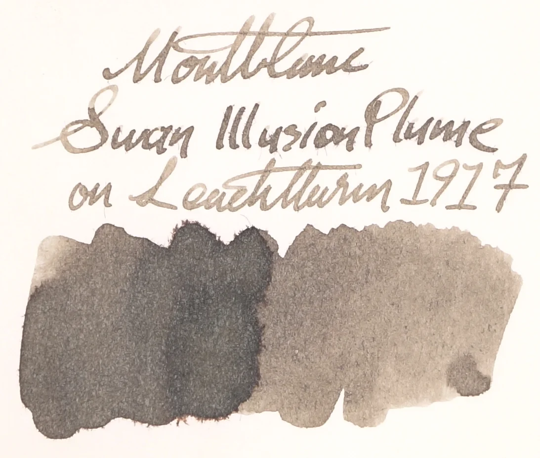
Montblanc Swan Illusion Plume is described by a sticker on the base of the bottle as "taupe" and I think this is a perfect description of they brown-leaning grey ink. This colour can change a bit depending on the paper but in general it's a nice soft grey that has a very noticeable neutral orange-brown tint to it. This is a pretty unsaturated ink, but as it's a grey it works well with less saturation. The ink runs moderately wet and is an improvement over previously released Montblanc inks. Not unusually for Montblanc inks, Swan Illusion Plume takes a extra hit on it's saturation on it's saturation on Tomoe River. paper.

View fullsize Shading Rhodia
Shading Rhodia
View fullsize Shading Tomoe River
Shading Tomoe River
View fullsize Chromatography on bad copy paper
Chromatography on bad copy paper
View fullsize Colour change on Midori
Colour change on Midori

There is absolutely no sheen on this ink in any paper no matter how much ink has been out on the page. This ink has some very contrasting shading and that's where it shines. There might not be a lot of shading on each line (though there's a very decent amount) but the shading from dark to light is quite abrupt and looks quite nice.

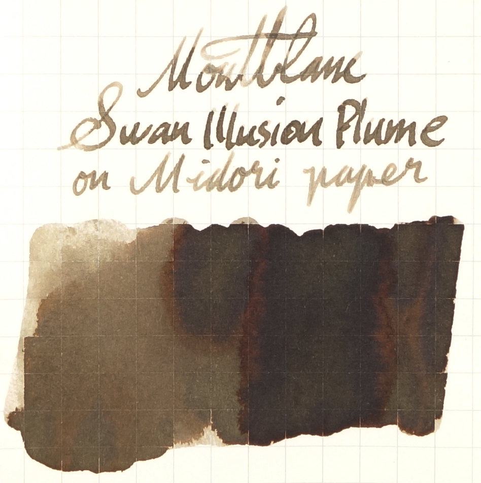
The ink doesn't perform the best on very poor paper. With some copy paper I have it almost turns into a piece of chromatography with the orange bleeding out of the swatch. The colour difference as well between on copy paper (where it's almost a proper neutrally coloured grey), compared to on Midori paper where not only is it much browner with a slight green hint but it also shades a coppery brown. Paper makes quite a difference on this ink.

View fullsize Chromatography
Chromatography
View fullsize Dry time Rhodia
Dry time Rhodia
View fullsize Dry time Tomoe River
Dry time Tomoe River

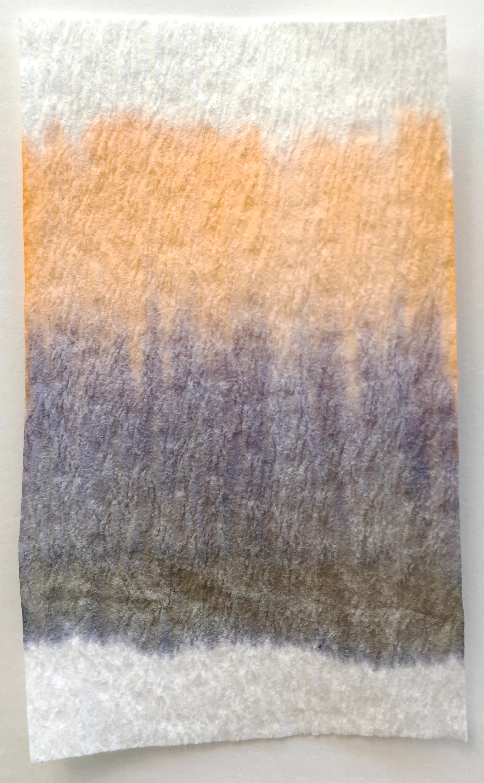
Chromatography is relatively interesting with a dark grey over where the line was drawn that moves to a blue-purple grey and finally a pale orange. Dry time on Rhodia is pretty average and on Tomoe River it's on the slow side of average but still in the middle.

80gsm white Rhodia

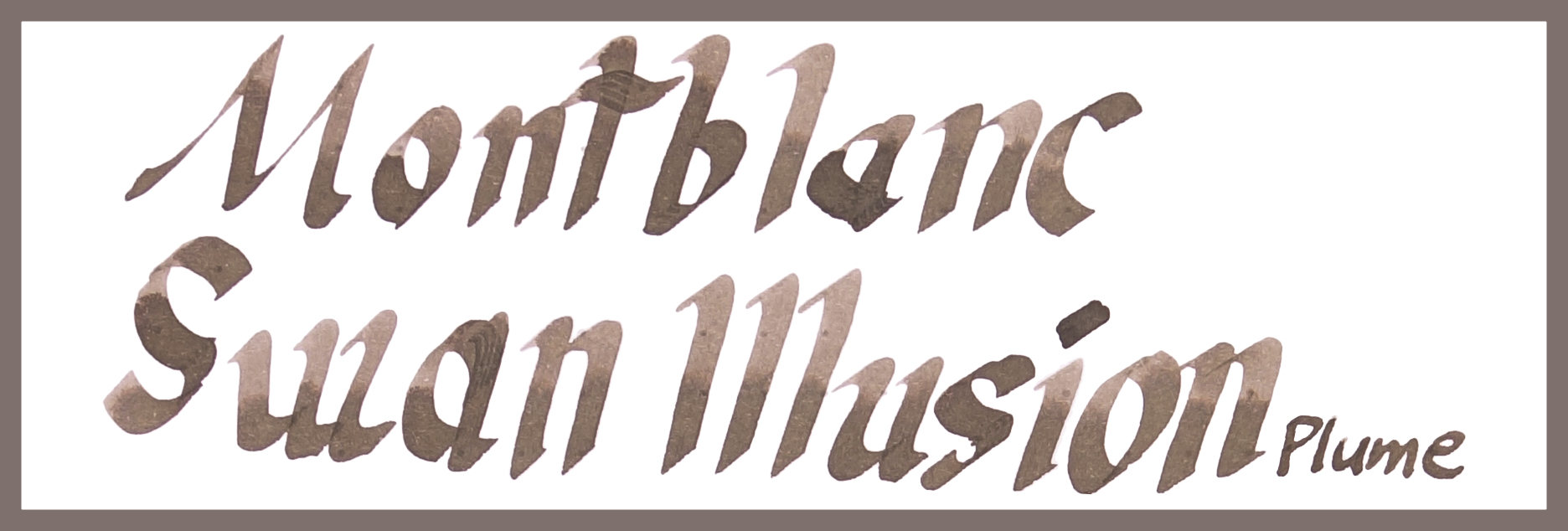
The ink is decently saturated on Rhodia for a grey and the shading is pretty nice. There's no smearing at all but what's interesting is how water resistant this is. When dabbed quickly after a drop has been put on the ink (left test) there's barely any change and even when the drop is left there for a while (right test) the brown disappears but some neutral grey lines underneath remain.

Rohrer & Klingner Sepia is surprisingly similar; it's too dark and a little too red but not too different. Kobe #31 Kaigan Stone Grey is much darker and the subtle brown tint to it is too red. Kirshna Pencil isn't too dark but is more mauve leaning than brown. Montblanc Einstein has a hint of brown to it but is mostly a very neutral grey and is also too dark. Kyo-Iro Stone Road of Gion isn't too dark but is a little too yellow and slightly oversaturated. Montblanc Oyster Grey is very neutral that's a fairly similar brightness. Graf von Faber-Castell Stone Grey is also nice and neutral but too dark.

The outlier is, supposedly, Organics Studio Edgar Allan Poe. Now, this is obviously different from the way Edgar Allen Poe is meant to look which is a nice Burgundy. This was a sample from a shop that had been sent afflicted bottles of Edgar Allen Poe (I grabbed this sample knowing it was different). I've heard, infrequently, reports of the colours of Organics Studio inks being a little volatile in terms of colour and not in the batch variation way that Noodler's has but that there are some bottles that tare just wrong. This is definitely one of them and, coincidentally, is also very similar in every way to Montblanc Swan Illusion Plume. It is by far the closest looking ink; similar hue, similar brightness, similar saturation.

Apart from The Edgar Allan Poe which really is an unfair comparison, Rohrer & Klingner Sepia and Kyo-Iro Road of Gion are the closest.

52gsm Ivory(white) Tomoe River

The brightness is a little higher on Tomoe River and the saturation is lower. Shading isn't bad but isn't as high or contrasting as on Rhodia. There is a lovely strong halo here, however, and no smear which is always good and sometimes a risk on Tomoe River paper. Water Resistance is similarly pretty good.

While Montblanc Swan Illusion Plume has lightened and lost some saturation, Rohrer & Klingner Sepia hasn't so it's now quite a bit darker. Kobe #31 Kaigan Stone Grey is a touch lighter now but is still too dark and leans too red. Krishna Pencil's mauve colour is a little stronger now. Montblanc Einstein is now not too bad. It's brown tint is much subtler than Swan Illusion and it is still a little darker but the differences aren't huge. Kyo-Iro Stone Road of Gion is similar to on Rhoida in that it's similar but too yellow. Montblanc Oyster Grey is far too neutral but this time slightly too light. Graf von Faber-Castell is the same but a little too dark, though not as much as when on Rhodia. The afflicted Organics Studio Edgar Allan Poe is still a very similar ink in every way. Noodler's Lexington Grey is way too dark and while it does lean brown it also, ever so slightly, has a green tint to it.

I quite like this ink. I don't think this an ink for everyone and I certainly don't see this as a hype ink but, especially as a collector, I love how unique this ink is. This ink feels lovely and soft and I think that it would be great for letter writing but I don't see it as a great note taking ink and certainly not a work related ink. I don't think many will hate this but I reckon there will be a fair few that are unimpressed, conversely I think there will be some that like it but I don't believe this will be many peoples' favourite ink. I imagine there will be some apathy towards it as well and at €35,60, AU$50, and US$43, apathy would usually translate to not buying. Still, I like this ink; I find it to be nice and unique, it writes well, and it's a beautifully soft colour.

✒︎ ✑ ✒︎ ✑

As usual, below as the ink on various papers.

I've listed all my inks and all my pens in their respective pages. Please let me know which inks you'd like to review nextvia the comments, Twitter, Instagram, or contact me directly.

For blog updated you can follow @macchiato_man on Twitter, subscribe via email, or like my Facebook page.

I was not compensated for this review and everything here is my own honest opinion. There are no affiliate links.

View fullsize on 68gsm Tomoe River
on 68gsm Tomoe River
View fullsize on 80gsm Ivory Rhodia
on 80gsm Ivory Rhodia
View fullsize on 90gsm Ivory Rhodia
on 90gsm Ivory Rhodia
View fullsize on Clairefontaine
on Clairefontaine
View fullsize on a Composition Book
on a Composition Book
View fullsize on Cream Tomoe River
on Cream Tomoe River
View fullsize on Daiso paper
on Daiso paper
View fullsize on decent Copy Paper
on decent Copy Paper
View fullsize on Franklin-Christoph Firma-Flex
on Franklin-Christoph Firma-Flex
View fullsize on Ivory G. Lalo
on Ivory G. Lalo
View fullsize on Leuchtturm1917
on Leuchtturm1917
View fullsize on Life paper
on Life paper
View fullsize on low quality Copy Paper
on low quality Copy Paper
View fullsize on Midori paper
on Midori paper
View fullsize on Original Crown Mill 100% Cotton
on Original Crown Mill 100% Cotton
Tags: Montblanc Swan Illusion Plume, Swan Illusion Plume, Montblanc, Rohrer & Klingner, Sepia, Kobe #37, Kobe #37 Kaigan Stone Grey, Krisha, Krishna Pencil, Montblanc Einstein, Kyo-Iro Stone Road of Gion, Kyo-Iro, Montblanc Oyster Grey, Graf von Faber-Castell, GvFC, Graf von Faber-Castell Stone Grey
← Ink Review: Montblanc Petit Prince Red Fox Ink Review: Sailor Shumibun Writing Time Jasper Green →
Back to Top

Blog RSS

✉ Email Subscription

☞ Fountain Pens Australia (Facebook Group)

☛ Sailor Pens & Inks (Facebook Group)