• Blog
  • About
    • My Inks (on Fountain Pen Companion)
    • My Pens
  • Archive
  • Contact
Menu

Macchiato Man

  • Blog
  • About
  • My Collection ☟
    • My Inks (on Fountain Pen Companion)
    • My Pens
  • Archive
  • Contact
The @madebyendless Cotton Wallet arrived the other day! I’m a sucker for these sorts of practical inserts for notebooks. The cotton fabric suites the simple style of the Explorer. 
⠀
While I love these and always get them whenever I can I never
First test of the Regalia paper in the Endless Explorer than I was sent by @madebyendless. Really impressed by the paper. Very smooth, nice sheen and nice shading! Finger prints or hand oil seem to affect the writing a little but nothing out of the o
New Pen Review: Esterbrook Camden (Premium Edition) - 𝙻𝚒𝚗𝚔 𝚒𝚗 𝙱𝚒𝚘!

I’ve been eager to try the Camden for a while now. I love my flat end pens and the overall shape of this one is subtly unique. While there are some differences between
New friend from @esterbrook_official! Camden Manitoba Blue. 
⠀
Love flat end pens so looking forward to digging into this (so review incoming).
 
Flat or round ends?✑
⠀
⠀
⠀
⠀
#fountainpen #fpgeeks #fountainpenaddict #fpn #fountainpengeeks  #fountainp
New Ink Review: @birminghampens Antique Sepia (link in bio)
⠀
In line with the recent trend of soft pastel dichromatic inks but Birmingham’s version is an interesting dust grey version with low saturation that I find quite interesting don&rsquo
New Ink Day! Haven’t had one of these for a while but I received these from a friend at the last Perth Pen Meet. 
⠀
All sailor and the first tall bottle in a while (bringing the number of those to 86). 
⠀
Didn’t realise it at the time but
New Ink Review: La Couronne du Comte Vert Sapin (link in bio)
⠀
The final of LCdC’s initial set of four exclusive inks from Diamine. A lovely rich sheeny green-teal.
✑
⠀
⠀
⠀
⠀
#fountainpen #fpgeeks #fountainpenaddict #fpn #fountainpengeeks  #fo
I don’t know if I’ve ever shared this before but my city has a set of five dip nibs as an artwork. 

They are called “Memory Markers” by Anne Neil and represent early-ish colonial stories of the gardens where they are.

We als
⚠️Update: Why I have been so radio silent! 📻🤫 A lot of large personal changes, essentially (read on for details)!

There have been three main reasons for why I haven’t been able to do much here or on my blog. 

1) 🎓 I had to finish of my Mas
Ink Ink Comparison: Discontinued Iroshizuku and New Iroshizuku! Thanks to @penclassics for allowing this to happen. See link in bio!
⠀
The old: Tsuyu-kusa, Tsukushi, and Ina-ho.
The New: Sui-gyoku, Hana-ikada, and Hotaru-bi.
⠀
This is a long review b
NPD: @esterbrook_official LE Estie “Candy” in Oversize with a Kirk Speer Needlepoint nib!
⠀
Thanks to Esterbrook for sending this through to me for review. I’ve reviewed a couple of Esties now and two of the custom nibs (which are a
Out with the old in with the new?

I just received the new Pilot Iroshizuku Inks in the little bottle ink pack from @penclassics for review. I plan on doing an overview review of the three new and the three old ones!

I feel like Ina Ho was quite a u
New Pen Review (see link in bio): Platinum Curidas courtesy of @penclassics (check them out!)
⠀
This is certainly a curiously designed pen with it's quirks but it has bee a delight to write with and a great pen to through in a pocket. I've been using
New Ink Review! @wearingeul_global Kyonghui! See link in bio!

Kyonghui is a vibrant earthy orange from Wearingeul's series on Korean Female Modern Writers. It is also a great performing ink!

Wearingeul's global push is fairly new; has anyone tried
It has been a little while since I posted here so I thought I'd give a little update!

Firstly I think I just needed a little break at the end of the year! It has been a busy year for me. I have been taking my photography more seriously and I also ha

Subscribe

Sign up with your email address to receive news and updates.

We respect your privacy. Unsubscribe at any time.

Thank you!
Blog RSS

☛ Twitter feed

✉ Email Subscription

☞ Fountain Pens Australia (Facebook Group)

☛ Sailor Pens & Inks (Facebook Group)


Sponsors

10% off code: MACCHIATOMAN


Click here for sponsorship information


Featured Posts:

Featured
Ink Review: Pennonia Pokoltuz (Pokoltűz)
Aug 1, 2019
Ink Review: Pennonia Pokoltuz (Pokoltűz)
Aug 1, 2019
Aug 1, 2019
Notebook Review: Pebble Stationery Pocket Tomoe River Notebook
Nov 10, 2018
Notebook Review: Pebble Stationery Pocket Tomoe River Notebook
Nov 10, 2018
Nov 10, 2018
Ink Review: Krishna Brown Pink
Jan 20, 2018
Ink Review: Krishna Brown Pink
Jan 20, 2018
Jan 20, 2018


Archive
  • November 2024
  • October 2023
  • December 2022
  • October 2022
  • June 2022
  • May 2022
  • April 2022
  • February 2022
  • January 2022
  • December 2021
  • November 2021
  • October 2021
  • September 2021
  • August 2021
  • July 2021
  • June 2021
  • May 2021
  • April 2021
  • February 2021
  • January 2021
  • December 2020
  • November 2020
  • October 2020
  • September 2020
  • August 2020
  • July 2020
  • May 2020
  • April 2020
  • March 2020
  • February 2020
  • January 2020
  • December 2019
  • November 2019
  • October 2019
  • September 2019
  • August 2019
  • July 2019
  • June 2019
  • May 2019
  • April 2019
  • March 2019
  • February 2019
  • January 2019
  • December 2018
  • November 2018
  • October 2018
  • September 2018
  • August 2018
  • July 2018
  • June 2018
  • May 2018
  • April 2018
  • March 2018
  • February 2018
  • January 2018
  • December 2017
  • November 2017
  • October 2017
  • September 2017
  • August 2017
  • July 2017
  • June 2017
  • May 2017
  • April 2017
  • February 2017
  • January 2017
  • December 2016
  • November 2016
  • September 2016
  • August 2016
  • July 2016
Logo 1.png

Ink Review: Montblanc Petit Prince Red Fox

May 11, 2018 in Ink Review

Following on from Montblanc's release of the Antoine de Saint-Exupéry Encre Du Desert last year alongside a pen as part of their Writers Edition series Montblanc has now released this ink, Petit Prince Red Fox, based on the fox from Saint-Exupéry's The Little Prince. Another ink released at the same time is Swan Illusion Plume (as part of the Patron of the Arts series) which is named after Ludwig II of Bavaria who is also known as the Swan King, you kind find that review here.

I bought this ink from La Couronne du Comte.

Title.jpg

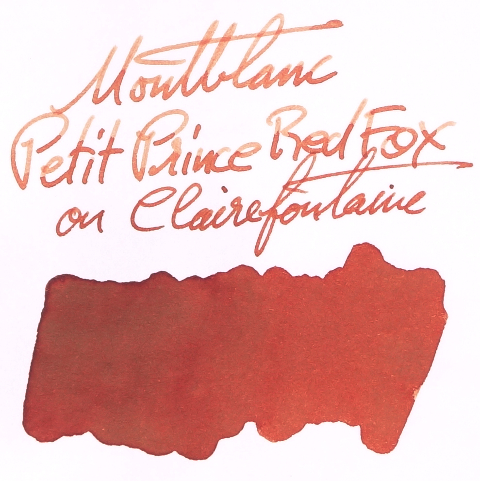
Montblanc Petit Prince Red Fox is described on sticker affixed to the base o the bottle as "Brun-orange" and I think describing the ink as a brown-orange is pretty accurate. The ink, in swatch form, is of average saturation but once you ink it in a pen the ink on paper becomes very watery and unsaturated. This isn't a rich vibrant ink at all. The ink feels wetter than other Montblanc's but it's not a wet ink. It performs well on most papers and well-enough on poor quality paper like Leuchtturm1917, or various copy paper. As with nearly all Montblanc inks (as well as some inks from other brands, including Caran d'Ache and Robert Oster), Tomoe River saps the saturation out of this ink. I'm not sure why this happens, and it does seem to happen to red and oranges more than other hues but it can make the ink look pretty sad. It's not too bad here, however.

View fullsize Sheen on Midori paper
Sheen on Midori paper
View fullsize Sheen on G. Lalo Ivory paper
Sheen on G. Lalo Ivory paper
View fullsize Shading Rhodia
Shading Rhodia
View fullsize Shading Tomoe River
Shading Tomoe River

There is no sheen in any practical sense at all but on Midori and G. Lalo there was some silvery sheen on the swatch where it pooled. This will not, in my experience, translate to sheen in the written line. There is also no sheen on Tomoe River, possibly related to how Tomoe River saps the saturation out of the ink. 

View fullsize Chromatography
Chromatography
View fullsize Dry time Rhodia
Dry time Rhodia
View fullsize Dry time Tomoe River
Dry time Tomoe River

Chromorotraphy shows, plainly, a grey moving to a brown orange. Not the least interesting chromatography but certainly not much going on here. Dry times are very good, especially on Tomoe River. Again, I feel like what ever causes the desaturation on Tomoe River also affects this.

80gsm white Rhodia

On Rhodia the saturation isn't too bad. It's a little watery looking in the written line but it isn't bad. The shading is great here and there is little to no water resistance. There's no smearing and the ink feels nice to write with.

Diamine Terracotta is too dark and brown. Montblanc Leonardo Red Chalk even more so. Sailor Mitsukoshi Danjyurocha is a little too orange and definitely too saturated. Montblanc Carlo Collodi Brown is to yellow and brown. Kyo Iro Moonlight of Higashiyama is too yellow and too saturated. And Diamine Burnt Sienna is too brown as well and a little too saturated. Most of these inks are too saturated and miss out on the slight pinkness of Montblanc Petit Prince Red Fox. Mitsukoshi Danjyurocha and Kyo-iro Moonlight of Higashiyama are probably the closest.

52gsm Ivory(white) Tomoe River

Shading is very good on Tomoe River which tends to flatten inks a little. There's some nice halo going on with the sharp and thin shading right on edged of each written line. Saturation is pretty low on Tomoe River but there is still no smearing.

All three Montblanc inks on the page of lost some saturation compared to when on Rhodia. Diamine Terracotta is still too dark and brown but not also a little too orange. Montblanc Leonardo Red Chalk is a closer saturation now but too yellow or orange. Mitsokoshi Danjyurocha works very nicely in terms of the hue but is way over saturated. As with Red Chalk, Montblanc Carlo Collodi Brown is now a similar saturation level but it's also a similar brightness. Kyo-iro Moonlight of Higashiyama has also dropped a little in saturation and is pretty similar now to Carlo Collodi. Diamine Burnt Orange actually looks fairly similar now but a little too saturated. For me Mitsukoshi Danjyurocha is similar but more saturated (which might be a good thing) and Diamine Burnt orange is similar with the same caveat.

This is a nice colour and the fact that it's a little washed out actually improves the ink for me, as a collector, because it's more unique. Speaking, as a user, however, this somewhat washed-out look doesn't appeal to me (but this is a subjective issue). There's certainly a place for and an appreciation for more pastel-like inks but I'm just not one to have that appreciation (especially for coloured inks).

This isn't a bad ink and inks and I do like how Montblanc inks are getting wetter but this particular ink isn't the type of colour for me and at €35,60, AU$50, and US$43 these inks are much more of an investment than the 30ml ones were in the past and I feel it's a good idea to get an idea of the ink before buying compared back with the 30ml bottles which you could just reliably impulse buy.

✒︎ ✑ ✒︎ ✑

As usual, below as the ink on various papers.

I've listed all my inks and all my pens in their respective pages. Please let me know which inks you'd like to review nextvia the comments, Twitter, Instagram, or contact me directly.

For blog updated you can follow @macchiato_man on Twitter, subscribe via email, or like my Facebook page.

I was not compensated for this review and everything here is my own honest opinion. There are no affiliate links.

View fullsize on 68gsm Tomoe River
on 68gsm Tomoe River
View fullsize on 80gsm Ivory Rhodia
on 80gsm Ivory Rhodia
View fullsize on 90gsm Ivory Rhodia
on 90gsm Ivory Rhodia
View fullsize on Clairefontaine
on Clairefontaine
View fullsize on a Composition Book paper
on a Composition Book paper
View fullsize on Cream 52gsm Tomoe River
on Cream 52gsm Tomoe River
View fullsize on Daiso paper
on Daiso paper
View fullsize on decent Copy Paper
on decent Copy Paper
View fullsize on Franklin-Christoph Firma-Flex
on Franklin-Christoph Firma-Flex
View fullsize on Ivory G. Lalo
on Ivory G. Lalo
View fullsize on Leuchtturm1917
on Leuchtturm1917
View fullsize on Life paper
on Life paper
View fullsize on lower quality Copy Paper
on lower quality Copy Paper
View fullsize on Midori paper
on Midori paper
View fullsize on Original Crown Mill 100% Cotton
on Original Crown Mill 100% Cotton
Tags: montblanc, petit prince red fox, diamine, terracotta, diamine terracotta, montblanc petit prince red fox, montblanc leonardo red chalk, sailor, sailor mitsukoshi, Mitsukoshi danjyurocha, danjyurocha, Montblanc Carlo Collodi Brown, Kyo-Iro, Moonlight of Higashiyama, Diamine Burnt Orange, Sailor Standard 21, Waterman Phileas
← Ink Review: Ink Institute Cut JadeInk Review: Montblanc Swan Illusion Plume →
Back to Top

Blog RSS

✉ Email Subscription

☞ Fountain Pens Australia (Facebook Group)

☛ Sailor Pens & Inks (Facebook Group)