• Blog
  • About
    • My Inks (on Fountain Pen Companion)
    • My Pens
  • Archive
  • Contact
Menu

Macchiato Man

  • Blog
  • About
  • My Collection ☟
    • My Inks (on Fountain Pen Companion)
    • My Pens
  • Archive
  • Contact
The @madebyendless Cotton Wallet arrived the other day! I’m a sucker for these sorts of practical inserts for notebooks. The cotton fabric suites the simple style of the Explorer. 
⠀
While I love these and always get them whenever I can I never
First test of the Regalia paper in the Endless Explorer than I was sent by @madebyendless. Really impressed by the paper. Very smooth, nice sheen and nice shading! Finger prints or hand oil seem to affect the writing a little but nothing out of the o
New Pen Review: Esterbrook Camden (Premium Edition) - 𝙻𝚒𝚗𝚔 𝚒𝚗 𝙱𝚒𝚘!

I’ve been eager to try the Camden for a while now. I love my flat end pens and the overall shape of this one is subtly unique. While there are some differences between
New friend from @esterbrook_official! Camden Manitoba Blue. 
⠀
Love flat end pens so looking forward to digging into this (so review incoming).
 
Flat or round ends?✑
⠀
⠀
⠀
⠀
#fountainpen #fpgeeks #fountainpenaddict #fpn #fountainpengeeks  #fountainp
New Ink Review: @birminghampens Antique Sepia (link in bio)
⠀
In line with the recent trend of soft pastel dichromatic inks but Birmingham’s version is an interesting dust grey version with low saturation that I find quite interesting don&rsquo
New Ink Day! Haven’t had one of these for a while but I received these from a friend at the last Perth Pen Meet. 
⠀
All sailor and the first tall bottle in a while (bringing the number of those to 86). 
⠀
Didn’t realise it at the time but
New Ink Review: La Couronne du Comte Vert Sapin (link in bio)
⠀
The final of LCdC’s initial set of four exclusive inks from Diamine. A lovely rich sheeny green-teal.
✑
⠀
⠀
⠀
⠀
#fountainpen #fpgeeks #fountainpenaddict #fpn #fountainpengeeks  #fo
I don’t know if I’ve ever shared this before but my city has a set of five dip nibs as an artwork. 

They are called “Memory Markers” by Anne Neil and represent early-ish colonial stories of the gardens where they are.

We als
⚠️Update: Why I have been so radio silent! 📻🤫 A lot of large personal changes, essentially (read on for details)!

There have been three main reasons for why I haven’t been able to do much here or on my blog. 

1) 🎓 I had to finish of my Mas
Ink Ink Comparison: Discontinued Iroshizuku and New Iroshizuku! Thanks to @penclassics for allowing this to happen. See link in bio!
⠀
The old: Tsuyu-kusa, Tsukushi, and Ina-ho.
The New: Sui-gyoku, Hana-ikada, and Hotaru-bi.
⠀
This is a long review b
NPD: @esterbrook_official LE Estie “Candy” in Oversize with a Kirk Speer Needlepoint nib!
⠀
Thanks to Esterbrook for sending this through to me for review. I’ve reviewed a couple of Esties now and two of the custom nibs (which are a
Out with the old in with the new?

I just received the new Pilot Iroshizuku Inks in the little bottle ink pack from @penclassics for review. I plan on doing an overview review of the three new and the three old ones!

I feel like Ina Ho was quite a u
New Pen Review (see link in bio): Platinum Curidas courtesy of @penclassics (check them out!)
⠀
This is certainly a curiously designed pen with it's quirks but it has bee a delight to write with and a great pen to through in a pocket. I've been using
New Ink Review! @wearingeul_global Kyonghui! See link in bio!

Kyonghui is a vibrant earthy orange from Wearingeul's series on Korean Female Modern Writers. It is also a great performing ink!

Wearingeul's global push is fairly new; has anyone tried
It has been a little while since I posted here so I thought I'd give a little update!

Firstly I think I just needed a little break at the end of the year! It has been a busy year for me. I have been taking my photography more seriously and I also ha

Subscribe

Sign up with your email address to receive news and updates.

We respect your privacy. Unsubscribe at any time.

Thank you!
Blog RSS

☛ Twitter feed

✉ Email Subscription

☞ Fountain Pens Australia (Facebook Group)

☛ Sailor Pens & Inks (Facebook Group)


Sponsors

10% off code: MACCHIATOMAN


Click here for sponsorship information


Featured Posts:

Featured
Ink Review: Pennonia Pokoltuz (Pokoltűz)
Aug 1, 2019
Ink Review: Pennonia Pokoltuz (Pokoltűz)
Aug 1, 2019
Aug 1, 2019
Notebook Review: Pebble Stationery Pocket Tomoe River Notebook
Nov 10, 2018
Notebook Review: Pebble Stationery Pocket Tomoe River Notebook
Nov 10, 2018
Nov 10, 2018
Ink Review: Krishna Brown Pink
Jan 20, 2018
Ink Review: Krishna Brown Pink
Jan 20, 2018
Jan 20, 2018


Archive
  • November 2024
  • October 2023
  • December 2022
  • October 2022
  • June 2022
  • May 2022
  • April 2022
  • February 2022
  • January 2022
  • December 2021
  • November 2021
  • October 2021
  • September 2021
  • August 2021
  • July 2021
  • June 2021
  • May 2021
  • April 2021
  • February 2021
  • January 2021
  • December 2020
  • November 2020
  • October 2020
  • September 2020
  • August 2020
  • July 2020
  • May 2020
  • April 2020
  • March 2020
  • February 2020
  • January 2020
  • December 2019
  • November 2019
  • October 2019
  • September 2019
  • August 2019
  • July 2019
  • June 2019
  • May 2019
  • April 2019
  • March 2019
  • February 2019
  • January 2019
  • December 2018
  • November 2018
  • October 2018
  • September 2018
  • August 2018
  • July 2018
  • June 2018
  • May 2018
  • April 2018
  • March 2018
  • February 2018
  • January 2018
  • December 2017
  • November 2017
  • October 2017
  • September 2017
  • August 2017
  • July 2017
  • June 2017
  • May 2017
  • April 2017
  • February 2017
  • January 2017
  • December 2016
  • November 2016
  • September 2016
  • August 2016
  • July 2016
Logo 2.jpg

Ink Review: Monteverde Amethyst

June 11, 2018 in Ink Review

Early 2017 Monteverde began what has become a huge expansion to their originally somewhat minimal ink lineup with a Gemstone set comprising of ten inks. They've subsequently added a Noir set and an Emotions set. Some pretty inks in the collection from what I've seen. The inks come in 30ml and 90ml individual bottles or as a full set of the 30ml. Coincidentally, the stone is also my birthstone. Whatever that means!

Title.jpg

First up, apologies if I slip and call Monteverde "Monteverdi" in some places in this review. With my background in classical composition I am conditioned to spell it after the Italian Renaissance/Baroque composer.

For me this is a pretty accurate "Amethyst" colour. It's a soft lavender-like colour that isn't particularly vibrant. It has notable pink and blurple components that, on Tomoe River and some other papers, actually separate a little on the page with some parts looking pinker than other parts. This is much more apparent on a swatch, however.

The ink is not particularly wet and doesn't have the strongest lubrication. This can mean on some paper, such as Rhodia 80gsm, it can feel a little dry. It's not bad but it's not a wet lubricated ink. The ink has some very nice shading (common for less wet inks). On Tomoe River and especially Rhodia there is good contrast and a good amount of shading. The ink performs pretty well on poorer quality paper with not that much bleeding, feathering, or spread.

View fullsize Written Line - Tomoe River
Written Line - Tomoe River
View fullsize Sheen - Tomoe River
Sheen - Tomoe River
View fullsize Sheen - Cream Tomoe River
Sheen - Cream Tomoe River
View fullsize Sheen - Midori
Sheen - Midori

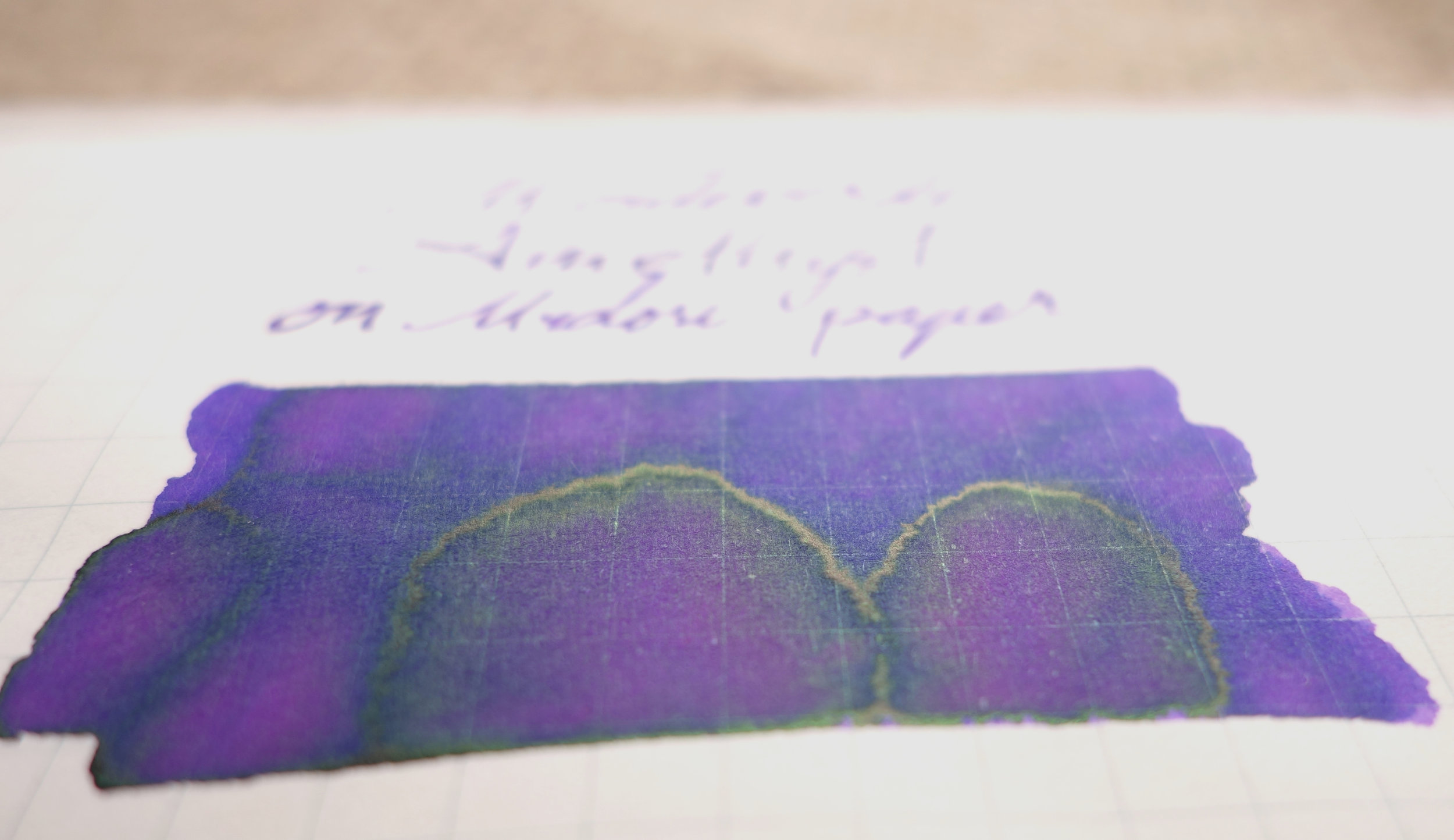
Monteverde Amethyst doesn't really have any practical sheen. On 52gsm Tomoe River there is some green sheen that peeks through where the ink pools on swatches but not really any on the written line. On Midori there the green sheen becomes a less-bright yellow-green sheen but again only on the swatch. In a very wet fat pen you might be able to coax some sheen onto a written line but it is a somewhat dry ink that dries pretty quick so it will have to be very wet.

View fullsize Chromatography
Chromatography
View fullsize Dry time Rhodia
Dry time Rhodia
View fullsize Dry time Tomoe River
Dry time Tomoe River

Chromatography isn't dull but isn't unusual. A slightly dirty pink moving through to a turquoise. Dry times are very good at around 20 seconds on both 80gsm Rhodia and 52gsm Tomoe River.

on 80gsm White Rhodia

There is no smearing on Rhodia and while I wouldn't call this paper water resistant, the pink line left behind might be readable after a water spill. In a swatch this ink's dyes from the Chromatography above separate a little and you can see parts where it's more pink than blue. This affect isn't very prominent on Rhodia but it is still there.

The closest inks from my collection that I have chosen are Sailor Hankyu Sumire (a Sailor Store Exclusive ink), Organics Studio Jane Austin, Krishna Writer's Night, Sailor Fuji-Musume, Robert Oster Viola, and Waterman Tender Purple.

Hankyu Sumire is too bright, blue and is flatter than Monteverde Amethyst. Organics Studio Jane Austen (apologies for incorrect spelling in the review!) is a little too dark and again flat. Krishna Writer's Night is actually nice and close but lacking a touch of saturation. Sailor Fuji-Musume has the odd dye-separation that Monteverde Amethyst and is a similar hue but just much too light. Robert Oster Viola isn't very similar at all but I often have people ask for a comparison to it with other light purples so I thought I'd include it. Waterman Tender Purple is a similar hue but much more saturated.

I feel like Organics Studio Jane Austen and Krishna Writer's Night are the closest to Monteverde Amethyst on Rhodia. Waterman Tender Purple isn't too bad if you like vibrant inks though.

on 52gsm Ivory (white) Tomoe River

No smearing on 52gsm Tomoe River which is very nice. Again little water resistance but might be able to see some pink left after a water spill is dabbed away. The odd dye separation is even more prevalent on Tomoe River with pinker and bluer sections of the swatch.

Hankyu Sumire isn't as different here but is still bluer and also a little softer now. Organics Studio Jane Austen has chances quite a lot on Tomoe River and is even less saturated but now quite light as well. Krishna Writer's Night has become rather blue. Sailor Fuji-Musume is now only a little lighter and the separation of dyes is also more prevalent but the pink colour is more prevent than with Monteverde Amethyst. Robert Oster Viola is also not similar at all. Waterman Tender Purple is still too vibrant but is a touch too blue now as well.

It's more difficult this time but I'd pick either Sailor Fuji-Musume if you don't mind it lighter and pinker, or Waterman Tender Purple if you don't mind a bit bluer more consistently coloured.

View fullsize Comparison sheen 3.JPG
View fullsize Comparison sheen 2.JPG
View fullsize Comparison sheen 1.JPG

Waterman Tender Purple has a similar amount of green sheen to Monteverde Amethyst; it's there, a little, on the swatch but not the written line. Krishna Writer's Night has a lovely gold-copper sheen but also only on the swatch. Jane Austen has a matte-silver sheen (only on the swatch), and Hankyu Sumire also has a swatch-only sheen but this one is a green-silver colour. The only real comparison, sheen-wise, is Waterman Tender Purple.

Monteverde inks are very affordable with the 30ml bottle varieties costing around US$8 from the US so you can't really go wrong with a few of these bottles around. They certainly have some interesting colours and some great colour variety and I think Amethyst in particular is a great representation of it's namesake. 

Not all stores stock the Gem Collection inks, of which Amethyst is one, as individual inks and some don't stock the 30ml, only 90. I've found that Vanness Pens have all options, Cult Pens have both sizes and La Couronne du Comte have the small bottles.

✒︎ ✑ ✒︎ ✑

As usual, below as the ink on various papers.

I've listed all my inks and all my pens in their respective pages. Please let me know which inks you'd like to review nextvia the comments, Twitter, Instagram, or contact me directly.

For blog updated you can follow @macchiato_man on Twitter, subscribe via email, or like my Facebook page.

I was gifted this ink from a friend (who is not associated with Monteverde or a shop that sell Monteverde). I was not compensated for this review and everything here is my own honest opinion. There are no affiliate links.

View fullsize 68gsm Ivory/White Tomoe River
68gsm Ivory/White Tomoe River
View fullsize 80gsm Ivory Rhodia
80gsm Ivory Rhodia
View fullsize 90gsm Ivory Rhodia
90gsm Ivory Rhodia
View fullsize Clairefontaine
Clairefontaine
View fullsize 52gsm Cream Tomoe River
52gsm Cream Tomoe River
View fullsize Daiso paper
Daiso paper
View fullsize Decent Copy Paper
Decent Copy Paper
View fullsize Franklin-Christoph Firma-Flex
Franklin-Christoph Firma-Flex
View fullsize Ivory G. Lalo
Ivory G. Lalo
View fullsize Leuchtturm1917
Leuchtturm1917
View fullsize Life Paper
Life Paper
View fullsize Midori Paper
Midori Paper
View fullsize Poor Quality Copy Paper
Poor Quality Copy Paper
Tags: Monteverde, Monteverdi, Monteverde Amethyst, Hankyu Sumire, Organics Studio, Krishna, Krishna Writer's Night, Sailor, Sailor Fuji-Musume, Robert Oster, Robert Oster Viola, Waterman, Waterman Tender Purple, Pelikan MK10, Franklin-Christoph, Pelikan, Franklin-Christoph Model 45, Model 45 Lavender Pearl, Organics Studio Jane Austen
← Pen Review: OMAS Paragon Arte Italiana Brown Arco Celluloid with Silver TrimPen Review: Nakaya Decapod Writer Aka-tanemuri →
Back to Top

Blog RSS

✉ Email Subscription

☞ Fountain Pens Australia (Facebook Group)

☛ Sailor Pens & Inks (Facebook Group)