• Blog
  • About
    • My Inks (on Fountain Pen Companion)
    • My Pens
  • Archive
  • Contact
Menu

Macchiato Man

  • Blog
  • About
  • My Collection ☟
    • My Inks (on Fountain Pen Companion)
    • My Pens
  • Archive
  • Contact
The @madebyendless Cotton Wallet arrived the other day! I’m a sucker for these sorts of practical inserts for notebooks. The cotton fabric suites the simple style of the Explorer. 
⠀
While I love these and always get them whenever I can I never
First test of the Regalia paper in the Endless Explorer than I was sent by @madebyendless. Really impressed by the paper. Very smooth, nice sheen and nice shading! Finger prints or hand oil seem to affect the writing a little but nothing out of the o
New Pen Review: Esterbrook Camden (Premium Edition) - 𝙻𝚒𝚗𝚔 𝚒𝚗 𝙱𝚒𝚘!

I’ve been eager to try the Camden for a while now. I love my flat end pens and the overall shape of this one is subtly unique. While there are some differences between
New friend from @esterbrook_official! Camden Manitoba Blue. 
⠀
Love flat end pens so looking forward to digging into this (so review incoming).
 
Flat or round ends?✑
⠀
⠀
⠀
⠀
#fountainpen #fpgeeks #fountainpenaddict #fpn #fountainpengeeks  #fountainp
New Ink Review: @birminghampens Antique Sepia (link in bio)
⠀
In line with the recent trend of soft pastel dichromatic inks but Birmingham’s version is an interesting dust grey version with low saturation that I find quite interesting don&rsquo
New Ink Day! Haven’t had one of these for a while but I received these from a friend at the last Perth Pen Meet. 
⠀
All sailor and the first tall bottle in a while (bringing the number of those to 86). 
⠀
Didn’t realise it at the time but
New Ink Review: La Couronne du Comte Vert Sapin (link in bio)
⠀
The final of LCdC’s initial set of four exclusive inks from Diamine. A lovely rich sheeny green-teal.
✑
⠀
⠀
⠀
⠀
#fountainpen #fpgeeks #fountainpenaddict #fpn #fountainpengeeks  #fo
I don’t know if I’ve ever shared this before but my city has a set of five dip nibs as an artwork. 

They are called “Memory Markers” by Anne Neil and represent early-ish colonial stories of the gardens where they are.

We als
⚠️Update: Why I have been so radio silent! 📻🤫 A lot of large personal changes, essentially (read on for details)!

There have been three main reasons for why I haven’t been able to do much here or on my blog. 

1) 🎓 I had to finish of my Mas
Ink Ink Comparison: Discontinued Iroshizuku and New Iroshizuku! Thanks to @penclassics for allowing this to happen. See link in bio!
⠀
The old: Tsuyu-kusa, Tsukushi, and Ina-ho.
The New: Sui-gyoku, Hana-ikada, and Hotaru-bi.
⠀
This is a long review b
NPD: @esterbrook_official LE Estie “Candy” in Oversize with a Kirk Speer Needlepoint nib!
⠀
Thanks to Esterbrook for sending this through to me for review. I’ve reviewed a couple of Esties now and two of the custom nibs (which are a
Out with the old in with the new?

I just received the new Pilot Iroshizuku Inks in the little bottle ink pack from @penclassics for review. I plan on doing an overview review of the three new and the three old ones!

I feel like Ina Ho was quite a u
New Pen Review (see link in bio): Platinum Curidas courtesy of @penclassics (check them out!)
⠀
This is certainly a curiously designed pen with it's quirks but it has bee a delight to write with and a great pen to through in a pocket. I've been using
New Ink Review! @wearingeul_global Kyonghui! See link in bio!

Kyonghui is a vibrant earthy orange from Wearingeul's series on Korean Female Modern Writers. It is also a great performing ink!

Wearingeul's global push is fairly new; has anyone tried
It has been a little while since I posted here so I thought I'd give a little update!

Firstly I think I just needed a little break at the end of the year! It has been a busy year for me. I have been taking my photography more seriously and I also ha

Subscribe

Sign up with your email address to receive news and updates.

We respect your privacy. Unsubscribe at any time.

Thank you!
Blog RSS

☛ Twitter feed

✉ Email Subscription

☞ Fountain Pens Australia (Facebook Group)

☛ Sailor Pens & Inks (Facebook Group)


Sponsors

10% off code: MACCHIATOMAN


Click here for sponsorship information


Featured Posts:

Featured
Ink Review: Pennonia Pokoltuz (Pokoltűz)
Aug 1, 2019
Ink Review: Pennonia Pokoltuz (Pokoltűz)
Aug 1, 2019
Aug 1, 2019
Notebook Review: Pebble Stationery Pocket Tomoe River Notebook
Nov 10, 2018
Notebook Review: Pebble Stationery Pocket Tomoe River Notebook
Nov 10, 2018
Nov 10, 2018
Ink Review: Krishna Brown Pink
Jan 20, 2018
Ink Review: Krishna Brown Pink
Jan 20, 2018
Jan 20, 2018


Archive
  • November 2024
  • October 2023
  • December 2022
  • October 2022
  • June 2022
  • May 2022
  • April 2022
  • February 2022
  • January 2022
  • December 2021
  • November 2021
  • October 2021
  • September 2021
  • August 2021
  • July 2021
  • June 2021
  • May 2021
  • April 2021
  • February 2021
  • January 2021
  • December 2020
  • November 2020
  • October 2020
  • September 2020
  • August 2020
  • July 2020
  • May 2020
  • April 2020
  • March 2020
  • February 2020
  • January 2020
  • December 2019
  • November 2019
  • October 2019
  • September 2019
  • August 2019
  • July 2019
  • June 2019
  • May 2019
  • April 2019
  • March 2019
  • February 2019
  • January 2019
  • December 2018
  • November 2018
  • October 2018
  • September 2018
  • August 2018
  • July 2018
  • June 2018
  • May 2018
  • April 2018
  • March 2018
  • February 2018
  • January 2018
  • December 2017
  • November 2017
  • October 2017
  • September 2017
  • August 2017
  • July 2017
  • June 2017
  • May 2017
  • April 2017
  • February 2017
  • January 2017
  • December 2016
  • November 2016
  • September 2016
  • August 2016
  • July 2016
Logo 3.png

Ink Review: Bungubox Nostalgia

December 03, 2018 in Ink Review

Sailor Bungubox Nostalgia doesn’t get that much love around the the ink review world and as far as I can see it has fallen a bit by the wayside. It’s a nice brown but I mainly bought the ink 2 years ago because of the evocative name and label. The sepia colour is also a very nice fit for the feeling.

Title.png

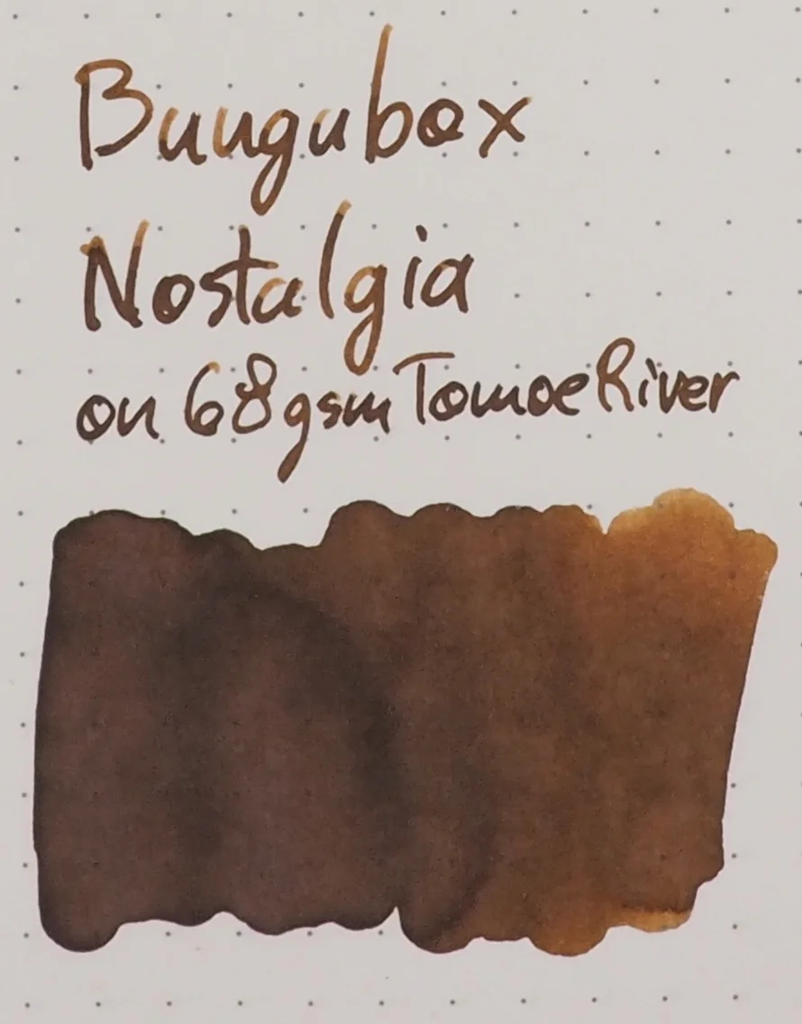
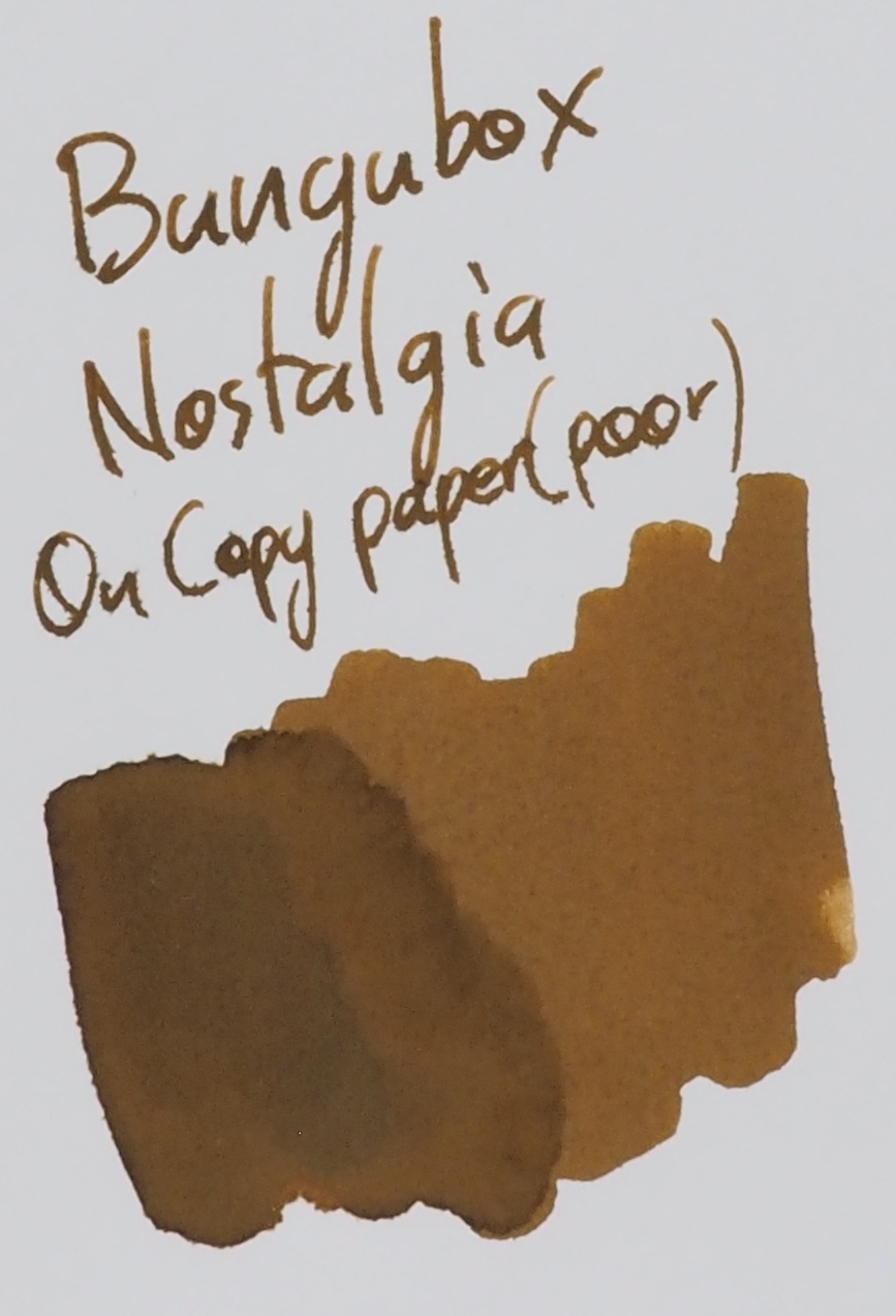
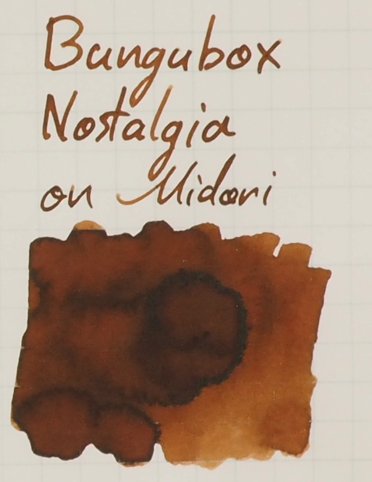
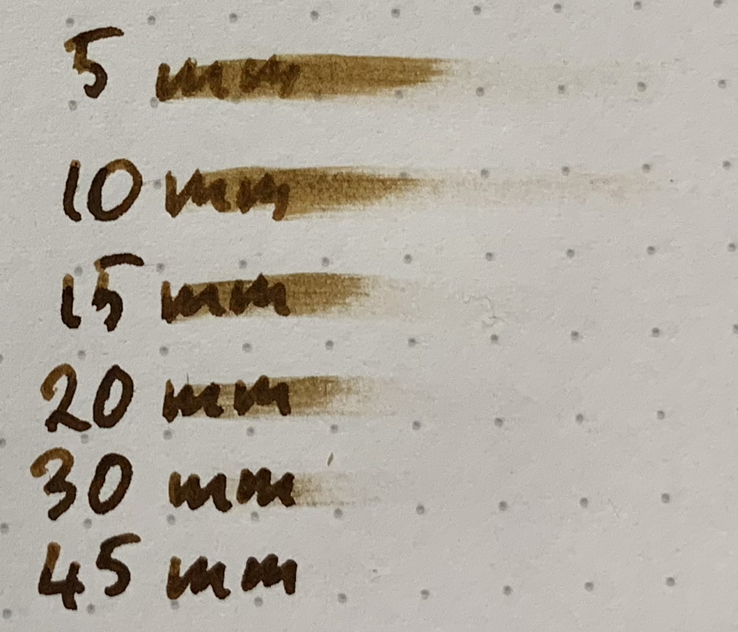
Bungubox Nostalgia is a sepia brown with some variance of saturation depending on the paper. This is one of those inks that looses some saturation on Tomoe River so the ink actually looks a little more like a proper sepia colour on that paper. On cheap or poor quality paper the ink becomes lighter as well. On Rhodia, however, the colour of the ink remains a somewhat saturated yellow brown with a very slight hint of green.

View fullsize IMG_4126.JPG
View fullsize IMG_3619.JPG
View fullsize IMG_2613.JPG

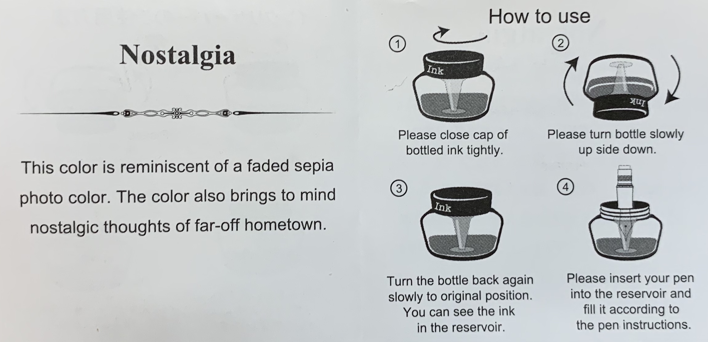
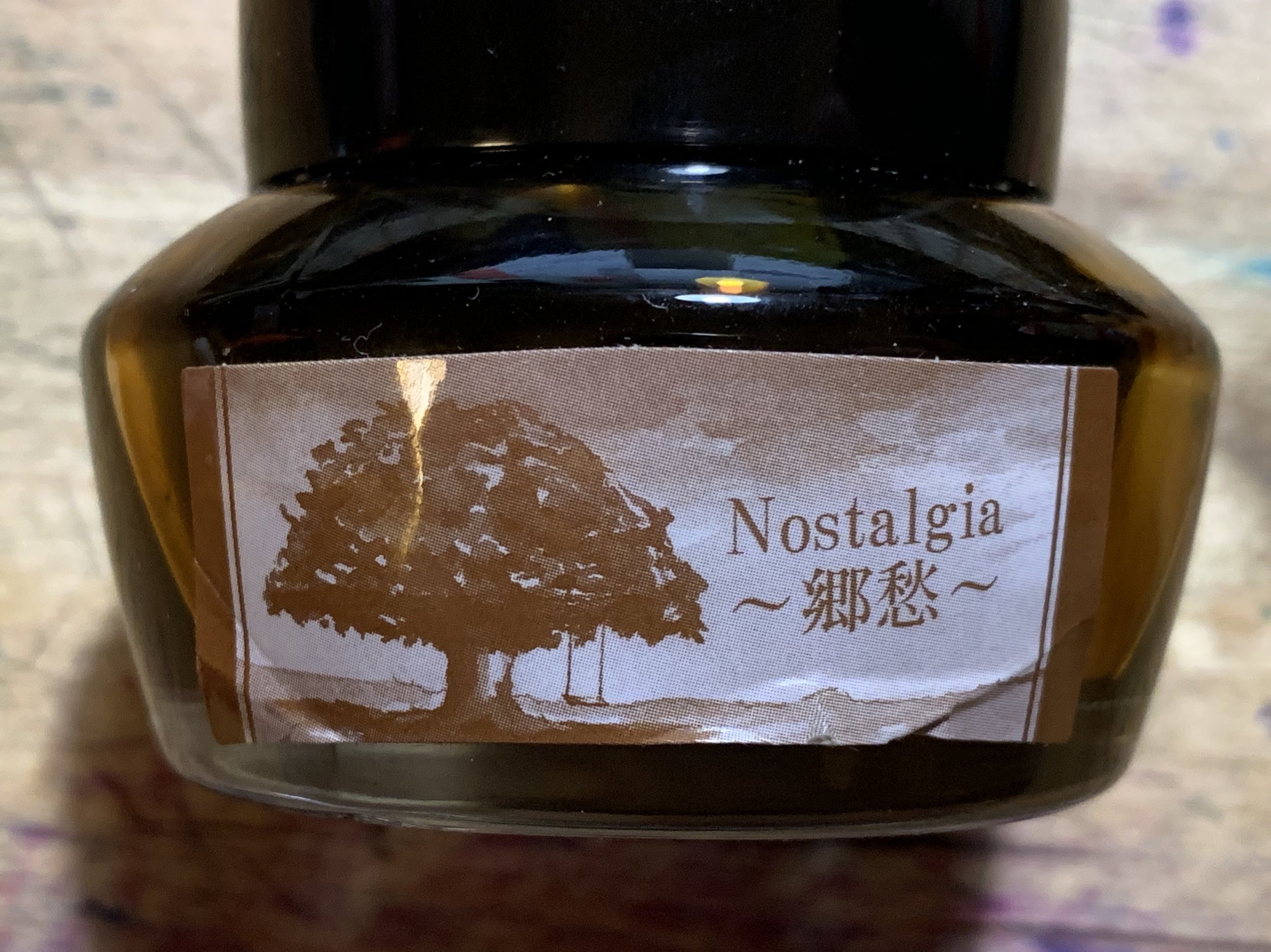
The slip of paper included in the box describes the colour as “reminiscent of a faded sepia photo color. The color also brings to mind nostalgic thoughts of a far-off hometown”. I think the colour and the label of a large tree with a swing on it are certainly evocative of an time long ago. Especially thanks to some nineteenth century photos being naturally sepia in colour really helps evoke the feeling of Nostalgia. Though I can’t say it reminds me of a far-off hometown.

The ink as a smooth lubrication and a wet flow. Nothing unwieldy though. The shading is on the lower side. This ink with more shading would be great and I think would evoke “nostalgia” even more. There’s no real issue with this ink on any paper apart from the expected spreading featuring and bleeding on low quality paper and it certainly isn’t worse than expected.

View fullsize Sheen Tomoe River
Sheen Tomoe River
View fullsize Sheen Tomoe River
Sheen Tomoe River

There is practically no sheen on this ink. On Tomoe River there is the slightest amount of dull silver sheen on a the written line and only a little more on wetter sections. You certainly don’t really notice it until you look for it closely.

View fullsize Chromatography
Chromatography
View fullsize Dry time Rhodia
Dry time Rhodia
View fullsize Dry time TR
Dry time TR

The chromatography is pretty interesting. It starts with a grey, pushing though a magenta then a little bit of light brown, then a bright orange followed by a tiny amount of lime green. The lime green sliver is definitely noticeable in the ink on the paper; you can see a slight green tint.

The dry time is surprisingly similar on both 80gsm Rhodia and 52gsm Tomoe River with it being only a little slower on Tomoe River. It’s quite slow to dry on both papers.

View fullsize Water Resistance Rhodia
Water Resistance Rhodia
View fullsize Water Resistance TR
Water Resistance TR

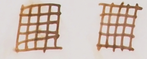
Bungubox Nostalgia has some decent water resistance, surprisingly. Standard Sailor inks aren’t typically that great with water resistance. It’s not perfect as there is some wash and some staining but it’s still perfectly readable.

The colour on Rhodia is quite saturated. There’s still the green hew but there’s still some orange present.

On 80gsm white Rhodia:

  • Bungubox Valentine’s Choco Brown ✒︎ is far too dark and is lacking way too much yellow. This ink is on the red side or browns. This was the second ink I ever reviewed;

  • Krishna Oak ✒︎ This is very similar in colour with the right balance of green, yellow, and red though unfortunately this ink is so wet that it has some performance issues. It’s also a flatter ink;

  • Noodler’s Fountain Pen Hospital Old Dutch Sepia ✒︎ is also decently similar to Bungubox Nostalgia. It’s not quite as yellow but it’s close enough and also has some shading though there is a little more contrast with Bungubox Nostalgia;

  • Kobe #52 Vintage Sepia ✒︎ is more yellow than Valantine’s Choco Brown but the ink is way too dark;

  • Diamine Ochre ✒︎ is way too red. It has some yellow but the red is overpowering;

  • J. Herbin Lie de Thé ✒︎ certainly has the green but too much of it and not enough yellow; and

  • Robert Oster Caffe Crema ✒︎ isn’t bad but is definitely still too orange and saturated.

The closest from this bunch on Rhodia 80gsm I would choose Noodler’s Fountain Pen Hospital Old Dutch Sepia. Krishna’s colour is closer but the perfjoamcne and the flatter look give the Noodler’s an edge for me.

On 52gsm Ivory (white) Tomoe River (and on 68gsm Ivory and 52gsm Cream Tomoe River) the colour is quite faded in swatches and very wet sections like the title. The fading doesn’t hit the written line as much, thankfully.

On 52gsm ivory/white Tomoe River:

  • Bungubox Valentine’s Choco Brown ✒︎ still has darkness and red is quite as too prominent;

  • Krishna Oak ✒︎ on Tomoe River performs much better and the colour is still very close;

  • Noodler’s Fountain Pen Hospital Old Dutch Sepia ✒︎Is a little too saturated but not still pretty decent. It is lacking some green;

  • Kobe #52 Vintage Sepia ✒︎ Is a bit more red here and is still too dark;

  • Diamine Ochre ✒︎ The deep red is now a deep orange and is way too saturated and red;

  • J. Herbin Lie de Thé ✒︎ is practically a grey here. There is some green/blue hue to the grey but the paper has done a number this ink;

  • Robert Oster Caffe Crema ✒︎ noticeably too yellow this time; and

  • Noodler’s #41 Brown ✒︎ a touch too yellow and too dark.

The toss up between Krishna Oak and Noodler’s FPH Old Dutch Sepia is more difficult here. I think Oak is still too flat but the performance is decent on this paper. I’d pick Old Dutch Sepia again but it's definitely less obvious.

It’s a nice nice brown colour. The hint of green really helps it for me. I wish there was more shading and I think the sepia colour a great choice for the evocative “Nostalgia” name. It’s unfortunately one of the inks that takes a little hit on Tomoe River but thankfully the written line isn’t affected too much. The ink comes out of the pen smoothly and nicely. I think this is definitely more interesting than Bungubox Valentine’s Choco Brown for me. The water resistance is a nice bonus for people who need that!

There are a few places in you can Bungubox inks including, recently, Desk Bandit who I believe is the first store outside the US Canada or Japan to stock Bungubox.

✒︎ ✑ ✒︎ ✑

I've listed all my inks and all my pens in their respective pages. Please let me know which inks you'd like to review next via the comments, Twitter, Instagram, or contact me directly.

For blog updated you can follow @macchiato_man on Twitter, subscribe via email, or like my Facebook page.

I was not compensated for this review and everything here is my own honest opinion. There are no affiliate links in this review but Desk Bandit is a sponsor of the blog.

View fullsize Comparison 52 Cream Tomoe River.jpg
View fullsize Comparison 68 Ivory:White Tomoe RIver.jpg
View fullsize Comparison 80 Ivory Rhodia.jpg
View fullsize Comparison 90 Cream Rhodia.jpg
View fullsize Comparison Clairefontaine.jpg
View fullsize Comparison Composition Book.jpg
View fullsize Comparison Copy Paper Decent.jpg
View fullsize Comparison Copy Paper Poor.jpg
View fullsize Comparison Daiso.jpg
View fullsize Comparison FC.jpg
View fullsize Comparison G Lalo.jpg
View fullsize Comparison Leuchtturm.jpg
View fullsize Comparison Life.jpg
View fullsize Comparison Midori.jpg
View fullsize Comparison OCM.jpg
Tags: Bungubox, Bungbox, Bungubox Nostalgia, Bungbox Nostalgia, Valentine's Choco Brown, Krishna Oak, Noodler's, Fountain Pen Hospital, Old Dutch Sepia, Kobe #52, Vintage Sepia, Diamine Ochre, J. Herbin Lie de Thé, Robert Oster Caffe Crema, Noodler's #41 Brown
← Respective: Friday December 7thRespective: Thursday November 21st →
Back to Top

Blog RSS

✉ Email Subscription

☞ Fountain Pens Australia (Facebook Group)

☛ Sailor Pens & Inks (Facebook Group)