• Blog
  • About
    • My Inks (on Fountain Pen Companion)
    • My Pens
  • Archive
  • Contact
Menu

Macchiato Man

  • Blog
  • About
  • My Collection ☟
    • My Inks (on Fountain Pen Companion)
    • My Pens
  • Archive
  • Contact
The @madebyendless Cotton Wallet arrived the other day! I’m a sucker for these sorts of practical inserts for notebooks. The cotton fabric suites the simple style of the Explorer. 
⠀
While I love these and always get them whenever I can I never
First test of the Regalia paper in the Endless Explorer than I was sent by @madebyendless. Really impressed by the paper. Very smooth, nice sheen and nice shading! Finger prints or hand oil seem to affect the writing a little but nothing out of the o
New Pen Review: Esterbrook Camden (Premium Edition) - 𝙻𝚒𝚗𝚔 𝚒𝚗 𝙱𝚒𝚘!

I’ve been eager to try the Camden for a while now. I love my flat end pens and the overall shape of this one is subtly unique. While there are some differences between
New friend from @esterbrook_official! Camden Manitoba Blue. 
⠀
Love flat end pens so looking forward to digging into this (so review incoming).
 
Flat or round ends?✑
⠀
⠀
⠀
⠀
#fountainpen #fpgeeks #fountainpenaddict #fpn #fountainpengeeks  #fountainp
New Ink Review: @birminghampens Antique Sepia (link in bio)
⠀
In line with the recent trend of soft pastel dichromatic inks but Birmingham’s version is an interesting dust grey version with low saturation that I find quite interesting don&rsquo
New Ink Day! Haven’t had one of these for a while but I received these from a friend at the last Perth Pen Meet. 
⠀
All sailor and the first tall bottle in a while (bringing the number of those to 86). 
⠀
Didn’t realise it at the time but
New Ink Review: La Couronne du Comte Vert Sapin (link in bio)
⠀
The final of LCdC’s initial set of four exclusive inks from Diamine. A lovely rich sheeny green-teal.
✑
⠀
⠀
⠀
⠀
#fountainpen #fpgeeks #fountainpenaddict #fpn #fountainpengeeks  #fo
I don’t know if I’ve ever shared this before but my city has a set of five dip nibs as an artwork. 

They are called “Memory Markers” by Anne Neil and represent early-ish colonial stories of the gardens where they are.

We als
⚠️Update: Why I have been so radio silent! 📻🤫 A lot of large personal changes, essentially (read on for details)!

There have been three main reasons for why I haven’t been able to do much here or on my blog. 

1) 🎓 I had to finish of my Mas
Ink Ink Comparison: Discontinued Iroshizuku and New Iroshizuku! Thanks to @penclassics for allowing this to happen. See link in bio!
⠀
The old: Tsuyu-kusa, Tsukushi, and Ina-ho.
The New: Sui-gyoku, Hana-ikada, and Hotaru-bi.
⠀
This is a long review b
NPD: @esterbrook_official LE Estie “Candy” in Oversize with a Kirk Speer Needlepoint nib!
⠀
Thanks to Esterbrook for sending this through to me for review. I’ve reviewed a couple of Esties now and two of the custom nibs (which are a
Out with the old in with the new?

I just received the new Pilot Iroshizuku Inks in the little bottle ink pack from @penclassics for review. I plan on doing an overview review of the three new and the three old ones!

I feel like Ina Ho was quite a u
New Pen Review (see link in bio): Platinum Curidas courtesy of @penclassics (check them out!)
⠀
This is certainly a curiously designed pen with it's quirks but it has bee a delight to write with and a great pen to through in a pocket. I've been using
New Ink Review! @wearingeul_global Kyonghui! See link in bio!

Kyonghui is a vibrant earthy orange from Wearingeul's series on Korean Female Modern Writers. It is also a great performing ink!

Wearingeul's global push is fairly new; has anyone tried
It has been a little while since I posted here so I thought I'd give a little update!

Firstly I think I just needed a little break at the end of the year! It has been a busy year for me. I have been taking my photography more seriously and I also ha

Subscribe

Sign up with your email address to receive news and updates.

We respect your privacy. Unsubscribe at any time.

Thank you!
Blog RSS

☛ Twitter feed

✉ Email Subscription

☞ Fountain Pens Australia (Facebook Group)

☛ Sailor Pens & Inks (Facebook Group)


Sponsors

10% off code: MACCHIATOMAN


Click here for sponsorship information


Featured Posts:

Featured
Ink Review: Pennonia Pokoltuz (Pokoltűz)
Aug 1, 2019
Ink Review: Pennonia Pokoltuz (Pokoltűz)
Aug 1, 2019
Aug 1, 2019
Notebook Review: Pebble Stationery Pocket Tomoe River Notebook
Nov 10, 2018
Notebook Review: Pebble Stationery Pocket Tomoe River Notebook
Nov 10, 2018
Nov 10, 2018
Ink Review: Krishna Brown Pink
Jan 20, 2018
Ink Review: Krishna Brown Pink
Jan 20, 2018
Jan 20, 2018


Archive
  • November 2024
  • October 2023
  • December 2022
  • October 2022
  • June 2022
  • May 2022
  • April 2022
  • February 2022
  • January 2022
  • December 2021
  • November 2021
  • October 2021
  • September 2021
  • August 2021
  • July 2021
  • June 2021
  • May 2021
  • April 2021
  • February 2021
  • January 2021
  • December 2020
  • November 2020
  • October 2020
  • September 2020
  • August 2020
  • July 2020
  • May 2020
  • April 2020
  • March 2020
  • February 2020
  • January 2020
  • December 2019
  • November 2019
  • October 2019
  • September 2019
  • August 2019
  • July 2019
  • June 2019
  • May 2019
  • April 2019
  • March 2019
  • February 2019
  • January 2019
  • December 2018
  • November 2018
  • October 2018
  • September 2018
  • August 2018
  • July 2018
  • June 2018
  • May 2018
  • April 2018
  • March 2018
  • February 2018
  • January 2018
  • December 2017
  • November 2017
  • October 2017
  • September 2017
  • August 2017
  • July 2017
  • June 2017
  • May 2017
  • April 2017
  • February 2017
  • January 2017
  • December 2016
  • November 2016
  • September 2016
  • August 2016
  • July 2016
Logo 2.jpg

Ink Review: Montblanc Heritage Spider Metamorphosis Web Grey

November 01, 2018 in Ink Review

Montblanc Web Grey is the ink from the Heritage Metamorphopsis collection that Montblanc released earlier this year. Montblanc took inspiration from the spider via architects who applied principles of spider webs into their designs. I bought this ink from La Couronne du Comte.

Title.jpg

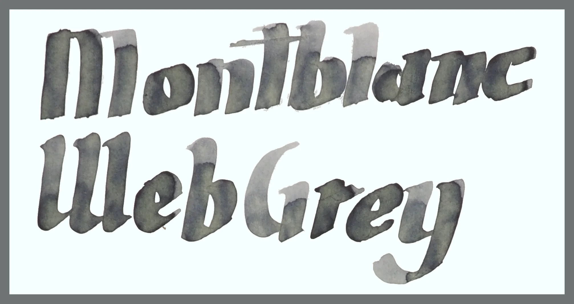
Montblanc Web Grey is a light grey ink that leans slightly yellow and ever-so-slightly green depending on the paper but it can also lean a little blue depending on the paper. Most papers displayed a yellow lean. I would still describe this as a neutral grey, especially due to how light the ink is. The lack of saturation and vibrancy neutralise the already subtle yellow and green or blue leaning to the colour. And this ink is a quite light ink in a pen. A wetter pen will give the ink light to moderate shading but in a pen that is somewhat dry the ink becomes very light.

The ink has decent shading but I have marked it as low-moderate and moderate because while there is frequent shading the contrast of the shading is quite low; that is that the darker shade isn’t that much darker. This is primarily due to the lightness of the ink. There is absolutely no sheen at all.

This ink has good performance in terms of feathering and bleeding which isn’t that surprising given the that it is a dry ink. Montblanc inks I would describe, by today’s standards at least, as generally on the dry side. There is some variation within the lineup but overall I find that they are dryer than many other brands. This ink is on the dryer side of Montblanc’s inks. I categorise this as a dry ink with dry flow and low lubrication.

Dryness.jpg

This dryness, while not something I personally enjoy, did not affect actual performance on all but one paper typer. On Original Crown Mill 100% Cotton paper and in the Montblanc Heritage 1912 the ink struggled with flow. Hard starts and and week lines. The nib is a broad italic nib so downstrokes should be quite wide but you can see in the “t” of Montblanc that it is far from a broad stroke. The “M” in Montblanc also required multiple strokes to get a proper line down. I didn’t have this issue with any other papers and I should note that the nib on the Montblanc is a customised Cursive Italic by Mike Masuyama. The pen is a dry pen and while this is apparent with other inks I haven’t yet had these issues with another ink.

View fullsize Chromatography
Chromatography
View fullsize Dry time Rhodia 80gsm
Dry time Rhodia 80gsm
View fullsize Dry Time Tomoe River 52gsm
Dry Time Tomoe River 52gsm
View fullsize Water Resistance Rhodia
Water Resistance Rhodia
View fullsize Water Resistance Tomoe River
Water Resistance Tomoe River

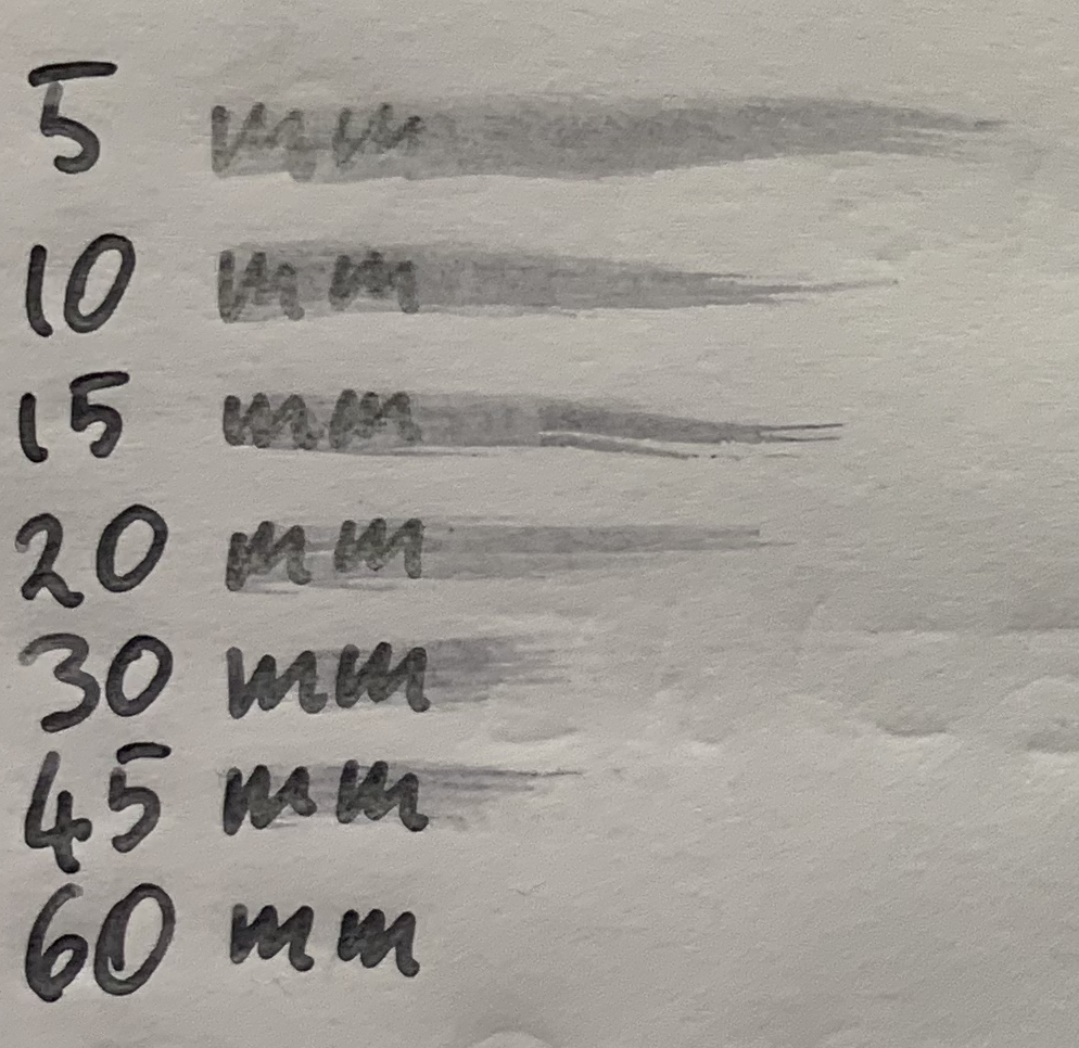
The chromatography, somewhat interestingly due to the yellow and slight green lean on many papers, started with a very neutral grey and moves through to a low saturation royal blue like colour and no visible yellow or green. Dry time is, as expected due to the dryness, very quick on Rhodia; pretty much dry after 5 seconds. A little surprising is long it took to dry on Tomoe River; 60 seconds for an ink this dry is hefty!

The water resistance is a surprise for sure. It isn’t 100% resistant like some inks but water takes very little away from the ink. It remains pretty unaffected by the water.
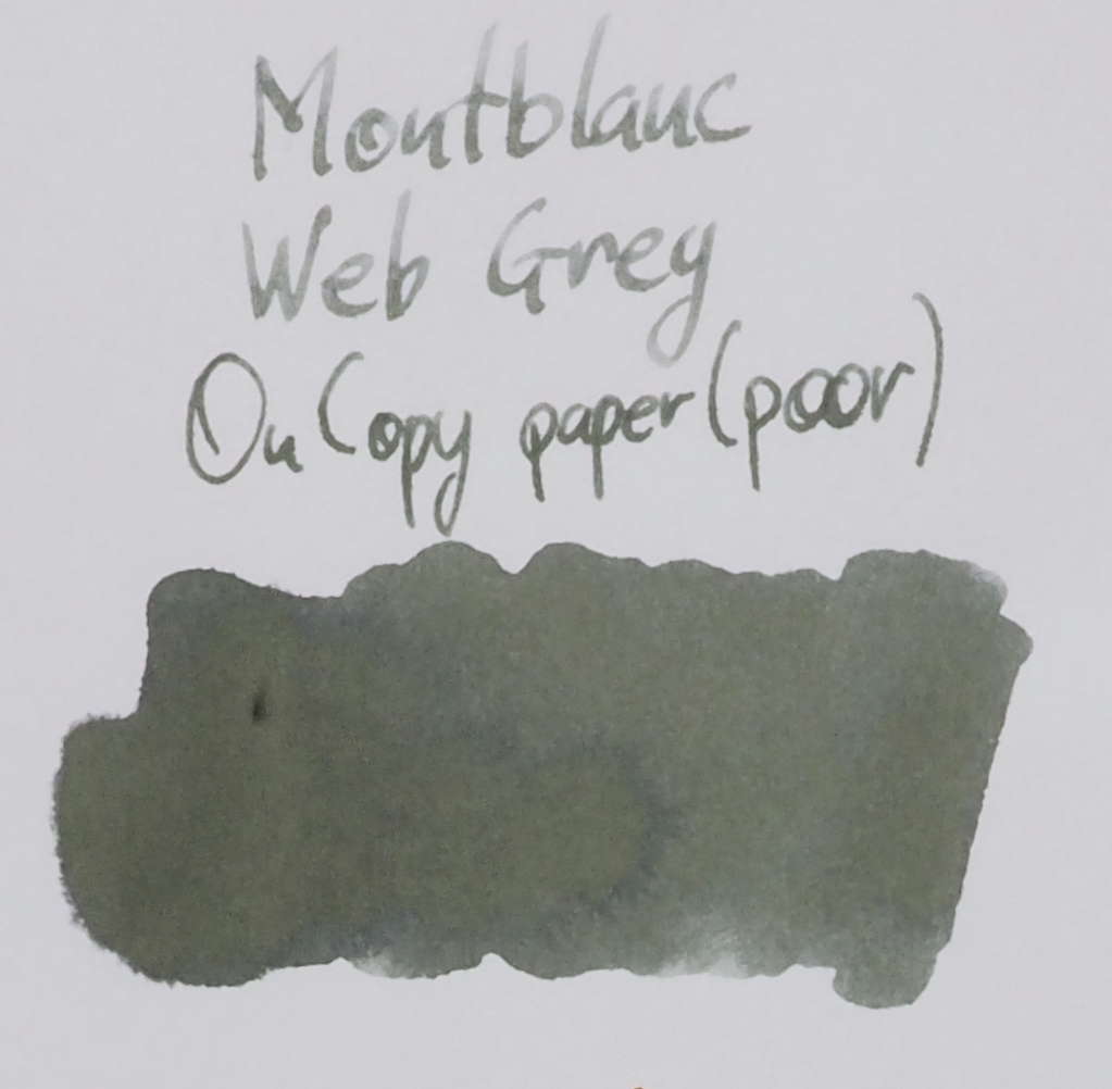
80gsm White Rhodia

The blue present in the chromatography is definitely more present on Rhodia with the ink leaning a little blue here. The ink is still very light here in a pen. The Kaweco fine nib darkens the ink decently well.

On 80gsm white Rhodia:

  • Sailor Gray is not blue enough and has a hint of brown in it;

  • Montblanc Oyster Grey isn’t as blue but still has a slight hit to it. It’s a more neutral colour but quite close. In my experience this ink is also somewhat dry and quite light in a pen as well;

  • Tsutaya Books Cloud this Sailor made ink is much darker and more neutral with no blue and a touch of brown, if anything;

  • Maruzen Athena Hatobanezu Gray another sailor made ink, this has higher saturation of blue and is much too dark;

  • Graf von Faber-Castell Stone Grey is too dark and too neutral with another touch of brown, if anything;

  • Montblanc Einstein is much darker with a very slight green tint;

  • OMAS Grey is a very flat light grey with a strong blue tint to it; it is bluer and flatter than Web Grey; and

  • Kobe #59 Romance Gray is way too dark.

The pick for me is quite easy: Montblanc Oyster Grey is the closest in colour darkness and performance.

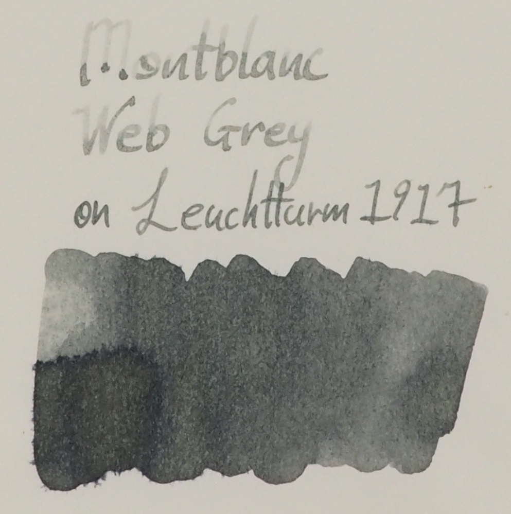
52gsm Ivory(white) Tomoe River

The yellow and green is quite prominent on 52gsm Ivory (which is the whitest) Tomoe River. The difference between the wetter Kaweco Fine nib and the drying Montblanc is less prominent on Tomoe River compared with on Rhodia.

On 52gsm Ivory Tomoe River:

  • Sailor Gray is only a little darker but is too brown;

  • Montblanc Oyster Grey isn’t as similar a hue as it is on Rhodia; it is too neutral leaving no green or yellow on the page;

  • Tsutaya Books Cloud is quite dark and rather too brown;

  • Maruzen Athena Hatobanezu Gray pretty difficult to call this a grey here, more a dark low saturation blue black;

  • Graf von Faber-Castell Stone Grey is very neutral here and not as dark as on Rhodia but still much too dark;

  • Montblanc Einstein very similarly to Stone Grey but with a slight green tint and even darker;

  • OMAS Grey is a very similar to on Rhodia: a very light flat blue leaning grey; and

  • Kobe #59 Romance Gray is still way too dark and barely a grey here (it does have some lovely copper sheen though!)

It’s more difficult to pick an ink here based on colour. Only Einstein leans a touch green but that’s where the similarities, minimal already, end. I would have to pick Oyster Grey again even though the hue is different, the lightness is similar and so is the performance.

I like the colour of this ink. Its mostly neutral and doesn’t lean blue or purple (which I, personally, don’t really like, as much, as a hue to lean for my greys. Unfortunately I don’t like dry inks and for me this is way to dry. I don’t think dark greys are particularly useful as a “grey” ink as they are far too close to a black so I do like some lightness to the ink but for me this is just way too light and I put blame almost entirely on how dry it is. I wish Montblanc made their inks wetter, personally; I’d certainly get more use out of them but if you are going to use this ink especially I recommend only putting it gushers I think finer (but not too fine) nibs would work best. The water resistance was a surprising boon to this ink. If water resistance is important, this ink offers decent protection from water accidents!

I bought this ink from La Couronne do Comte so if you are interested in the ink I recommend checking them out.

✒︎ ✑ ✒︎ ✑

I've listed all my inks and all my pens in their respective pages. Please let me know which inks you'd like to review next via the comments, Twitter, Instagram, or contact me directly.

For blog updated you can follow @macchiato_man on Twitter, subscribe via email, or like my Facebook page.

I was not compensated for this review and everything here is my own honest opinion. There are no affiliate links in this review.

View fullsize Comparison 52 Cream Tomoe River.jpg
View fullsize Comparison 68 Ivory:White Tomoe River.jpg
View fullsize Comparison 80 Ivory Rhodia.jpg
View fullsize Comparison 90 Ivory Rhodia.jpg
View fullsize Comparison Clairefontaine.jpg
View fullsize Comparison Composition Boook.jpg
View fullsize Comparison Copy Paper Decent.jpg
View fullsize Comparison Copy Paper Poor.jpg
View fullsize Comparison Daiso.jpg
View fullsize Comparison FC.jpg
View fullsize Comparison G Lalo.jpg
View fullsize Comparison Leuchtturm.jpg
View fullsize Comparison Life.jpg
View fullsize Comparison Midori.jpg
View fullsize Comparison OCM.jpg
Tags: Montblanc, Heritage Spider Metamorphosis Web Grey, Web Grey, Sailor Gray, Montblanc Oyster Grey, Montblanc Web Grey, Tsutaya Books Cloud, Maruzen Athena Hatobanezu Gray, Graf von Faber-Castell, Stone Grey, Montblanc Einstein, OMAS Grey, Kobe #59, Kobe Romance Gray
← Notebook Review: Pebble Stationery Pocket Tomoe River NotebookRetrospective: Monday November 1 →
Back to Top

Blog RSS

✉ Email Subscription

☞ Fountain Pens Australia (Facebook Group)

☛ Sailor Pens & Inks (Facebook Group)