
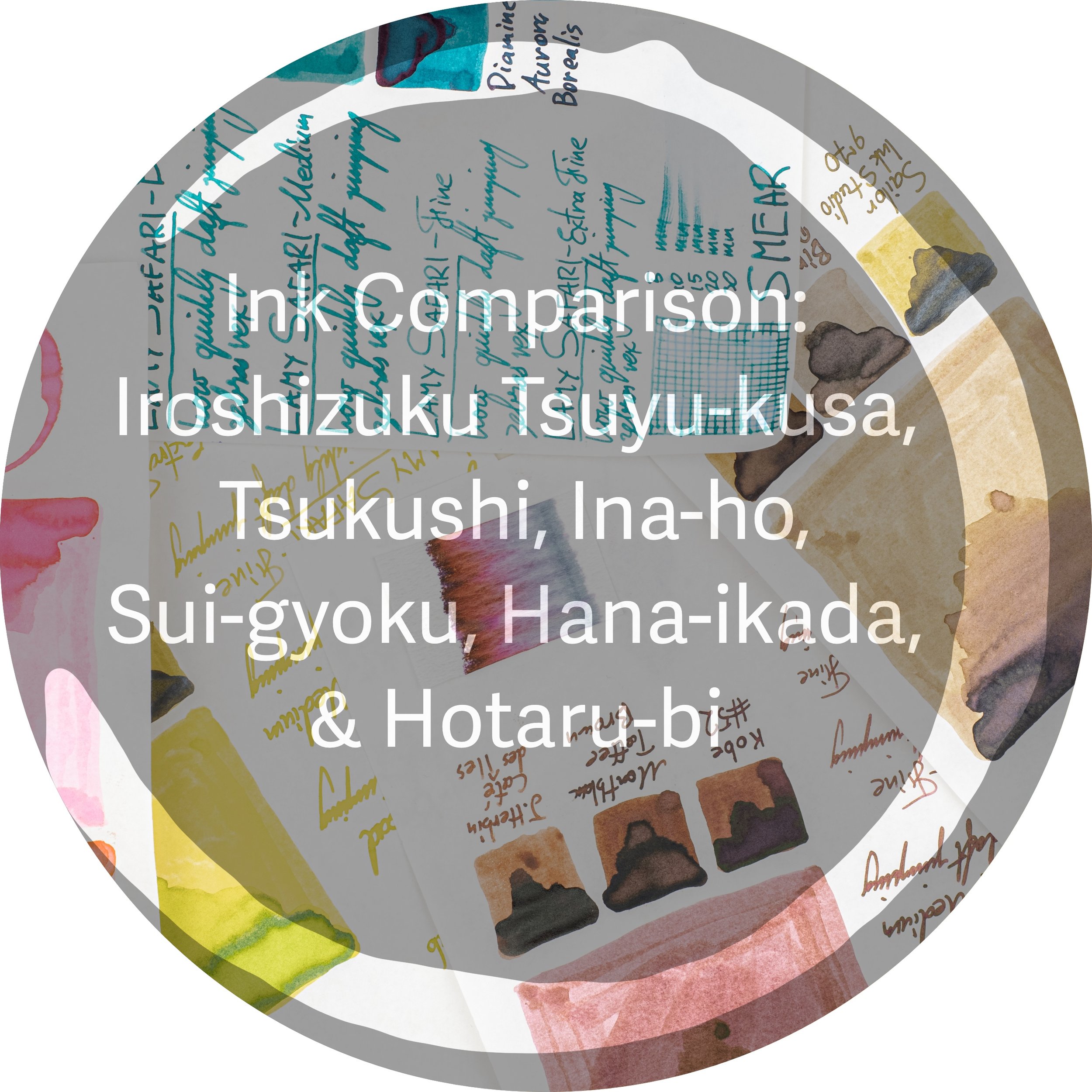
Pilot giveth and Pilot taketh away! In October 2021 we found out that Pilot was discontinuing three inks from their Iroshizuku lineup, Tsuyu-kusa, Tsukushi, and Ina-ho. In November the same year they announced three new inks that will essentially replace the discontinued inks. These new inks are Sui-gyoku, Hana-ikada, and Hotaru-bi. Overall the changes make the Iroshizuku lineup more vibrant and colourful. This is going to be a long post with six comparison reviews (which quite aren’t as extensive as normal reviews) packed into one post.
Thank you to Pen Classics for sending me the new Iroshizuku inks for review here.
I’ve never treated the Iroshizuku lineup as something I need to collect every bottle. They are such a staple of the ink world that if I wanted a bottle I just go and grab it! I can take a five minute walk and grab a bottle. I already had Ina-ho but I was, however, a little late to picking up Tsukushi and Tsuyu-kusa! By the time I went to buy locally (and by locally I mean in Australia) they were dwindling and no one place had both in stock (at least when I looked). The three inks that are on the way out are on the subdued side. A soft and someone generic blue with a couple of browns. The new inks add a soft pink, a very bright yellow-green and somewhat vibrant teal. I’m curious what people think here. Would you prefer to keep the old or the new?


One thing I first noticed, obviously, was that the new small 15ml. The old three-pack box was large and plastic; it took up a lot of room for 45ml of ink! The new box is cardboard with faux-leather and is appropriately more or less the same size as a 50ml Irozhizuku bottle.
Nib and Pen details
I used Lamy Safaris in Blue Macaron, Mango, Aquamarine, Powder Rose, Mint Glaze as well as a Lamy Vista for these reviews and seven different stainless steel Lamy nibs on that pen. The choice of pen (be that Safari, AL-Star, Vista, Joy or Studio) will have little impact in the writing performance. I will not use a Lamy Dialog because there is the rare chance of the nib drying out slightly which might affect the writing performance.
Lamy 1.9 Stub: this is a very wet nib
Lamy 1.5 Stub: this nib is moderately wet to write with (this is used for the brand and ink name title);
Lamy 1.1 Stub: this nib is on the drier side;
Lamy Broad: this is a wet;
Lamy Medium: this is a very wet nib;
Lamy Fine: this nib is moderately dry; and
Lamy Extra Fine: this nib is moderately wet.
I also use a fine JoWo nib attached to a James Finniss Serendipity (from Pensive Pens) for the comparison ink names. This nib’s wetness is moderate but the feed is primed which gives it a wetter character than would be a normal writing experience. This generally as the effect of reducing shading and luminosity, while increasing sheen and saturation. The possibility of feathering and bleeding is also slightly increased. This is still more accurate than a dip pen or a glass pen in my experience.
Out with the Old
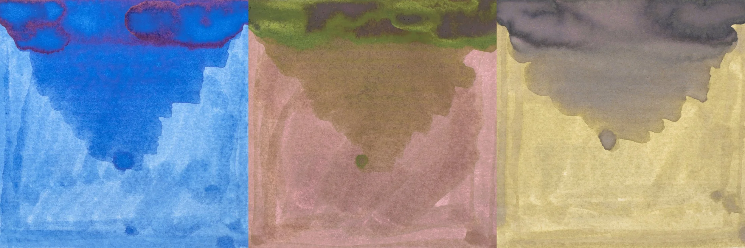
The inks that are being discontinued are Tsuyu-kusa, Tsukushi and Ina-ho. Tsuyu-kusa is a fairly neutral moderate saturation blue, Tsukushi is a pink-red leaning moderate saturation brown and Ina-ho is a somewhat light green-yellow leaning tan-brown ink.
Tsuyu-kusa
Tsuyu-kusa is known in English as as Asiatic Dayflower but the name more directly translates to “dew herb”. From the photos it seems the colour pretty accurately represents the flower!
The i8nk is decently wet and lubricated to write with, especially for the decent dry times that we will see below.
52gsm Ivory (White) Tomoe River
Tsuyu-kusa is fairly consistent in colour or Rhodia and here on Tomoe River paper. It is a moderately light ink and moderately saturated. It isn’t an ink that stands out for me (personally). but sometimes that is the colour you want.
Sailor Ink Studio 143: this dichromatic ink has a similar saturation (though still a little less) but has too much purple/pink;
Pilot Iroshizuku Kon-peki: is clearly more saturated and more teal tinted; and
Diamone Florida Blue: is a similar hue but flatter and more saturated.
There is some shading but it isn’t very strong. Frequency is pretty decent but the contrast is very low and the gradient is almost exclusively smooth.
On Tomoe River there is some low saturated copper-red sheen the swatch and if you look very closely on the wetter nibs it is on the written line as well but it is very subtle.
Water resistance isn’t terrible but it is a bit messy; you can still see the lines, however. The dry time is decently quick and there is no smearing. Chromatography is a fairly flat gradient.
Iroshizuku Kon-Peki has a higher amount of sheen that leads more pink than copper and Florida Blue is even more subtle with its sheen (if you can even claim it has any). Not pictured is Sailor Ink Studio 143 which has none.
80gsm White Rhodia
There is no sheen whatsoever on Rhodia. Not on the swatch or the written line.
The shading, however, is slightly improved from Tomoe River. The frequency is the same but the contrast is higher and the gradient is a little less smooth. This is still not a high shading ink, however.
On Rhodia the colour is quite similar but the ink does present a touch darker. Overall not too big of a difference though.
Sailor Ink Studio 143: this is closer on Rhodia in terms of saturation and brightness but the purple still stands out';
Pilot Iroshizuku Kon-peki: is clearly more saturated and more teal tinted; and
Diamone Florida Blue: is a similar hue (though on Rhodia slightly more purple leaning) but flatter and more saturate and also a little darker.
The water resistance seems slightly better on Rhodia but it is still messy. Dry time is snappy and there is no smearing.
Tsukushi
Tsukushi is based on the Horsetail plant. This edible plant has what looks like buds that grow in the early spring and have a slightly reddish brown colour in some photos I’ve seen.
The ink is quite wet and lubricated which allows for the darker written lines you will see below.
52gsm Ivory (White) Tomoe River
In the swatch Tsukushi looks quite pale but the written lines look noticeably darker. This ink is noticeably pinker or redder on Tomoe River than on Rhodia.
Kobe Nagasaki #52: is more orange and darker
Montblanc Toffee Brown: is more saturated, a little too orange but still with some red to it and too dark; and
J. Herbin Caf´é des Îles: is a similar brightness but less sarutaed and more yellow leaning.
Shading is quite low on Tomoe River for Tsukushi. There is decent consistency but the the contrast is quite low and the gradient is mostly smooth.
On Tomoe River this ink has a decent amount of yellow-green sheen to it. This isn’t a strong sheen but it is seen on all the written liens to various degrees and gives the ink a warmness to it.
Water resistance removes the brown and you are left with a dull magenta behind. It is a little messy but not bad overall. Dry time for a wet ink like this is very good and there is no smearing which is good for an ink with this amount of sheen.
Chromatography starts with a cool grey that slowly picks up magenta before moving to a brown gradient.
Kobe #52’s sheen is very subtle but does have a hint of green to it. Toffee Brown is essentailyl sheenless and the silver sheen on the J. Herbin doesn’t translate much into the written line.
80gsm White Rhodia
The shading is different to Tomoe River but still subtle. The frequency is lower and the contrast is similar but the gradient is less smooth.
There is no sheen anywhere on Rhodia.
The saturation is not as strong on Rhodia, especially with that magenta hue. It is still leaning a little magenta but no where near as strong as on Tomoe River.
Kobe Nagasaki #52: is much too yellow;
Montblanc Toffee Brown: is more saturated and a little darker but closer this time; and
J. Herbin Caf´é des Îles: is much closer with more red showing. It is a little darker and more saturated.
Again the water resistance is decent but quite messy. More of the grey fro the chromatography iis visible on Rhodia. Dry time is very snappy and there is no smearing.
Ina-ho
Ina-ho is named after the rice ears of rice that turn golden before they are harvested. The rice still has some green to it and this colour does an excellent job of recreating a golden colour with a hint of green.
Ina-ho is decently wet but the lubrication doesn’t feel quite as smooth as most Iroshizuku I have used.
52gsm Ivory (White) Tomoe River
Ina-ho has some decent shading. The frequency is relatively high and while the contrast isn’t high it is still distinctive enough. The gradient is decently sudden as well. The ink looks quite nice because of this shading, I believe.
There is no sheen on Tomoe River for this ink.
Ina-ho on Tomoe River is a cool golden colour with a slight hint of green. It is a fairly pale ink. On Tomoe River the ink looks less flat than on Rhodia.
Sailor Ink Studio 970: much more saturated and too yellow;
Birmingham Pen Co. Sandstone: less green, paler, and slightly less saturated; and
Diamone Tobacco Sunburst: darker, more saturated and more orange leaning.
Water resistance washes away all of the colour that this ink actually looks like. It leaves behind a faint blue line that serves to help keep what you wrote but still isn’t very strong water resistance. Dry time is decent and there is no smearing.
Chromatography starts with a light blue that doesn’t change much until it breaks into a pale pink and then finishes with a tan yellow-brown.
Sailor Ink Studio 970 does have a decent amount of silver sheen and is the only ink here that has sheen.
80gsm White Rhodia
As said, Ina-ho is flatter and so the shading doesn’t look as strong here either. The contrast is much lower and the frequency takes a hit too. Even the gradient is smoother.
There is no sheen anywhere on the page for any ink.
On Rhodia the ink is much flatter and there is less colour shift throughout the swatch. It’s just generally flatter. The ink is generally a little darker and a little greener.
Sailor Ink Studio 970: much more saturated and too yellow;
Birmingham Pen Co. Sandstone: less green, much paler, and much less saturated; and
Diamone Tobacco Sunburst: darker, more saturated and more orange leaning.
As with Tomoe River the water resistance leaves behind a faint blue line and none of the tan colour o the ink. Dry time is very quick on Rhodia! Almost dry in five seconds! No smearing.
In with the New
While the discontinued inks where reserved and, by comparison, dull the new inks are bright, fresh and lolly/candy-like They aren’t vibrant and punchy but soft and colourful. Definitely very different to the inks going away!
Sui-gyoku
Sui-gyoku is named after an emerald or jade and definitely well represents the colour of jade. The ink is decently wet and lubricated. Apologies for the misspelling in the review of Sui-gyoku as “Sai-gyoku”. This is the colour family that is not represented well with sRGB colour space or most monitors or displays. Fortunately this ink isn’t so saturated or the wrong actual hue and so it can be displayed somewhat accurately.
52gsm Ivory (White) Tomoe River
On Tomoe River and Rhodia the hue is fairly consistent but the ink is slightly bluer on here. Overall the ink sits pretty mid-way between blue and green. The saturation isn’t that high - fairly moderate - and the brightness is decently high.
Diamine Aurora Borealis: is darker, slightly bluer and a little less saturated;
Diamine Bloody Absinth: is a similar hue but darker and more saturated; and
Robert Oster Marine: is a similar hue, brightness, and saturation. Slightly darker, bluer and more saturated.
The ink has some decent shading but it isn’t high shading. There is some sudden contrast changes but mostly, with some exceptions, the contrast isn’t very high and the frequency is fairly moderate.
There is some low saturation magenta sheen that is very subtle on the written line but it is there.
Water resistance leaves a very pale blue line behind, it might be enough to save you but you wouldn’t want to rely on it. Dry time is decent for Tomoe River and there is no smearing.
Chromatography has a pale blue that breaks into a slightly blue leaning green.
Diamine Aurora Borealis’s sheen is the closest to Sui-gyoku o nthe written line. Quite subtle but still more saturated. Bloody Absinth is a very high sheening ink which doesn’t resemble Sui-gyoku much at all. Robert Oster marine’s sheen is subtle but where it does shoe it is bright and saturated.
80gsm White Rhodia
There is still some shading but it doesn’t present that strongly. Contrast is lower than Tomoe River and the gradient is smoother. The frequency is still the same.
There is a tiny amount of sheen on the swatch but that is all.
Flatter and slightly greener but otherwise this ink presents quite similarly on Rhodia.
Diamine Aurora Borealis: is darker, slightly bluer and a little less saturated;
Diamine Bloody Absinth: is a similar hue but much darker and more saturated; and
Robert Oster Marine: is darker, bluer and slightly more saturated.
The same blue line is left behind on Rhodia as well but it is even lighter here. Dry time is decent and there is no smearing.
Only Bloody Absinth presents with sheen on the written line. In contrast Aurora Borealis and Marine present similarly to Sui-gyoku in that they also show no sheen on the written line!
Hana-ikada
Hana-ikada means flower rafts or flowers floating in water and, I believe, represents sakura that fall onto the bodies of water. Quite beautiful from photos I have seen. This ink is quite a soft pink and so it represents this quite well I think.
For a pale ink the wetness and lubrication on this ink is quite decent.
52gsm Ivory (White) Tomoe River
The ink is quite flat overall. There is some shading and the gradient is somewhat sudden but the contrast is so low that it is difficult to notice.
There is no sheen anywhere.
Hana-ikada is a soft pink. It is fairly neutral in colour but if any direction it leans more warm than cool. On Tomoe River it is slightly cooler in colour than on Rhodia.
Sailor Sakura more: a similar hue but greyer and warmer. As should be expected given it is more or less the same subject matter;
Montblanc Ladies Edition Pearl: much cooler and possibly even paler and less saturated; and
Birmingham Pen Co. Sweetheart: much warmer and slightly more saturated.
The water resistance is not something you would want to rely on. It becomes very pale. Dry time is very snappy and there is no smearing.
Chromatography is a pink gradient that slowly gets stronger before breaking into a yellow and, interestingly, finishes with pink again.
80gsm White Rhodia
Because of the generally slightly darker the contrast in the shading is a little stronger but the gradient is still smooth and the frequency is still average. Fairly flat still
There is, obviously, no sheen here as well.
On Rhodia the ink is still pale and soft but is warmer and ever so slightly more saturated. The comparison inks all have the exact same relationship with Hana-ikada as on Tomoe River.
Sailor Sakura more: a similar hue but greyer and warmer. As should be expected given it is more or less the same subject matter;
Montblanc Ladies Edition Pearl: much cooler and possibly even paler and less saturated; and
Birmingham Pen Co. Sweetheart: much warmer and slightly more saturated.
The water resistance is a little stronger than on Tomoe River but still not great. Water resistance is almost five seconds. Very fast. No smearing.
Hotaru-bi
Hotaru-bi is based on the light of a firefly which is lovely! I’ve never seen a firefly but from what I have seen in videos and photos this seems to be pretty accurate! Explains the bright yellow-green colour perfectly.
The ink, for a bright light colour, is decently wet and lubricated but not as much as others.
52gsm Ivory (White) Tomoe River
Pretty much no shading at all. The contrast is extremely low and the gradient almost always smooth. The frequency isn’t bad but with the first two factors the last doesn’t matter.
There is technically some dull silver sheen on the swatch but none of the written line.
The hue of this ink is very consistent across Rhodia and Tomoe River. It is, however, a little brighter on Tomoe River. This is a fairly saturated ink but it isn’t very high. The combination of brightness and saturation gives it a highlighter quality, almost.
Sailor Ink Studio #970: too yellow, dark and is slightly less saturated;
Ferris wheel Press Honeydew: (yes there is an ink there). Way too pale and too green; and
Rober Oster Sublime: fairly similar but slightly darker and greener.
There is no water resistance. The lines are all gone. Dry time is decent and there is no smearing.
Chromatography is a pale green that moves to a standard yellow and ends with a thin orange-yellow.
Sailor Ink Studio #970 has some strong silver sheen that the rest of the comparison inks don’t have.
80gsm White Rhodia
The darker writing doesn’t increase the contrast on Rhodia so the ink is equally as flat as on Tomoe River. Low contrast, smooth gradient with consistent but meaningless in context.
No sheen!
On Rhodia the ink is very slightly darker but otherwise the same hue. If anything it is slightly greener. The comparison inks all have the exact same relationship with Hana-ikada as on Tomoe River.
Sailor Ink Studio #970: too yellow, dark and is slightly less saturated;
Ferris wheel Press Honeydew: (yes there is an ink there). Way too pale and too green; and
Rober Oster Sublime: fairly similar but slightly darker and greener.
Water resistance is barely better but still practically useless. Dry time is snappy and there is no smearing.
Final Remarks
I asked at the start which of the two sets you’d prefer. I think I’d keep the original three. Removing two browns from the lineup leaves a bit of a gab. That said the soft pink is a nice addition. The bright light green is definitely different but I’m unsure how useful the ink is. While still useable it is very bright. Chiku-Rin is quite another light green but it is still in the same realm as Hotaru-bi. While I don’t care too much, personally, about Tsukushi or Tsuyu-kusa I did like Ina-ho (a fairly unique ink). I think the light pink is a nice addition to the lineup as the other pinks or fuchsias are all very vibrant compared to Hana-ikada (even Kosumosu). Sui-gyoku is, however, another teal and there is already three of those with Ku-jaku, Shin-ryoku, and Syo-ro. They are different but they aren’t that different. What the lineup doesn’t have is a rich green-leaning green. If I were to pick and choose I’d definitely keep Ina-ho and Hana-ikada. I’m not entirely soon about the others!
As is common with Iroshizuku all the inks have good performance. The light inks re wet and well lubricated, there is good dry times, and good performance on Rhodia. As you should expect with Iroshizuku these are excellent inks.
I am still curious about which you’d keep? Which set, or which individual three inks would you keep?
Thank you again for Pen Classics for sending in the set of new inks for me to review!
✒︎ ✑ ✒︎ ✑
Thanks for reading! If you have any questions, comments or suggestions please let me know in a via the comments, Instagram, or contact me directly.
You can find my ink collection here and my pen collection here. Is there something you’d like reviewed? Let me know!
For blog updated you can follow @macchiato_man on Twitter, subscribe via email, or like my Facebook page. Check out the sponsors of this blog as well!
I was not compensated for this review and everything here is my own honest opinion. There are no affiliate links in this review. I was sent these inks for the purpose of an honest review.