
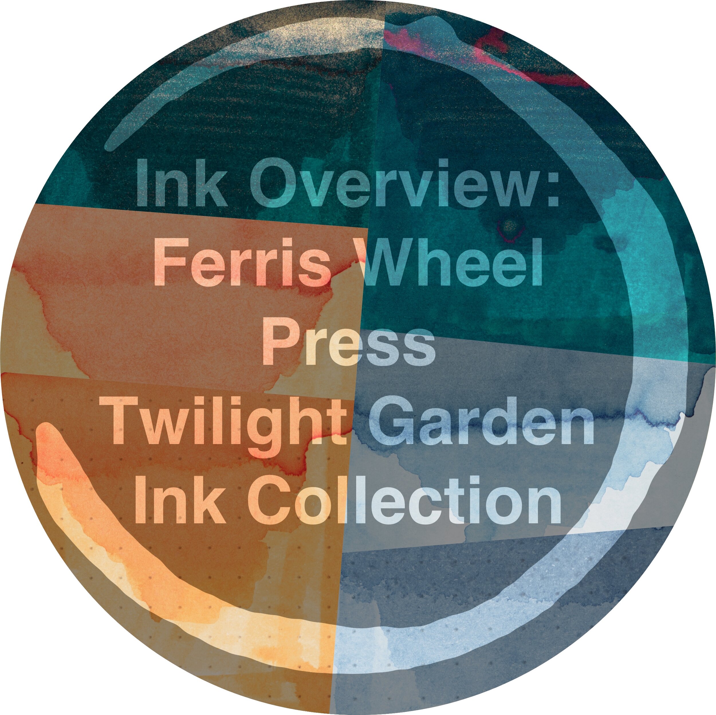
Last month Ferris Wheel Press released a trio of inks, Dusk in Bloom, the shimmery Edward's Gardens, and Main St. Marmalade. These three inks make up Their ‘Twilight Garden’ Ink Collection. Ferris Wheel Press introduce the inks with the following: “bask in the Twilight Garden ink collection this summer with three gorgeous new tones that capture the bright sunny days of the season turned into radiant nights. This collection features a soothing creamy orange, a soft dusted blue, and a scintillating teal with gold sparkling flakes and a mystical light red sheen.”
Thanks to Ferris Wheel Press and Ink’d Pens for arranging these inks be sent in for a review and to be given away!
Ferris Wheel Press, being a Canadian, and more specifically a Toronto based company, often have local-inspired themes for their inks and that the case with two of these inks, Main St. Marmalade and Edward’s Gardens.
The names of their inks are also in French and English but, a surprise to me, is that the French name doesn’t always match the English (according to Google Translate)! I have reviewed Lady Rose in the past and the French name is Thé à la Rose (or Rose Tea) but I also have Beaver Dam Brown which is Barage de Castor (Beaver Dam) and Sweet Honeydew which is Melon Miel Doux (Sweet Honeydew Melon). All three of the inks in the Twilight Garden Ink Collection have alternative names in French which I love!
These bottles are available individually in 38ml bottles (which is what I have for these), individually in the quite large round 85ml bottles and also as a set of three 5ml bottles of each.
Nib and Pen details
I used Lamy Safaris in Blue Macaron, Petrol and Terracotta for these reviews and seven different stainless steel Lamy nibs on that pen. The choice of pen (be that Safari, AL-Star, Vista or Studio) will have little impact in the writing performance. I will not use a Lamy Dialog because there is the rare chance of the nib drying out slightly which might affect the writing performance.
Lamy 1.9 Stub: this is a very wet nib
Lamy 1.5 Stub: this nib is moderately wet to write with (this is used for the brand and ink name title);
Lamy 1.1 Stub: this nib is on the drier side;
Lamy Broad: this is a wet;
Lamy Medium: this is a very wet nib;
Lamy Fine: this nib is moderately dry; and
Lamy Extra Fine: this nib is moderately wet.
I also use a fine Glass nib pen for the comparison ink names. The nib can be either very wet or slightly dry and I try to find the middle area. This generally as the effect of reducing shading and luminosity, while increasing sheen and saturation. The possibility of feathering and bleeding is also slightly increased..
Dusk In Bloom
Fleur-de-nuit
Dusk in Bloom is also called Fleur-de-nuit (Night Flower) and is described by Ferris Wheel Press as “a balanced slate blue that is evenly toned and beautifully layered for artful applications; yet deep and legible for penning your next correspondence”. The ink is a fairly pale and desaturated blue. Such pale colours seem to be very fairly unique to Ferris Wheel Press’s lineup and not many other brands are doing similar colours! This blue leans very slightly to the teal (more so than it does purple, anyway). It reminds me of a light Dove Blue or pale Cornflower or a Pastel Blue.
For a pale ink Dusk in Bloom Dusk In Bloom is decently wet and well lubricated! Often, in my experience, such pale inks are somewhat dry (or actually dry) but not here. These must have a decent among of lubricant in them. This ink isn’t as strong a shader as I expected but it does have some nice shading depending on the nib characteristic.
52gsm Ivory (White) Tomoe River
The ink remains fairly similar on both Tomoe River and Rhodia. It is slightly lighter, slightly less saturated and a hair more teal leaning.
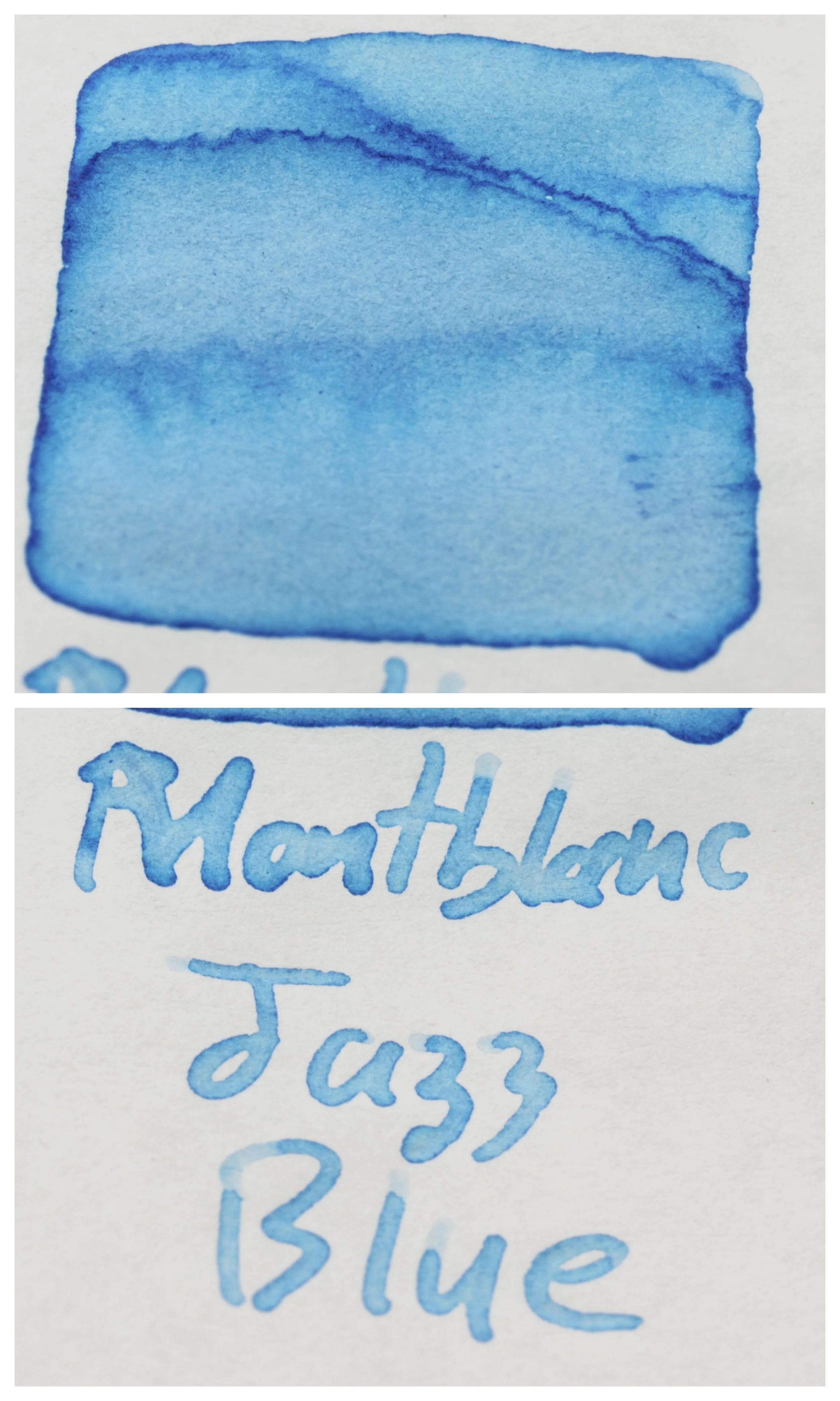
Montblanc Jazz Blue: this ink is quite light but much more saturated and less teal leaning;
Robert Oster Summer Storm: this was the first ink I reviewed! This ink leans a little purple and is on the darker side but has a similar grey-is complexion; and
Robert Oster Grey Seas: is fairly neutral and more saturated but still somewhat grey
This ink has some shading depending on the nib. On the Lamy 1.9 nib there is some higher contrast shading with sharp gradients. The rest of the nibs show mostly low contrast shading and a smooth gradient. The frequency of the shading is pretty middle of the road. There is some decently noticeable haloing at times.
There is no sheen whatsoever on this ink!
The water resistance is surprisingly good! There isn’t much colour to wash away and a lot of it stays! Dry time is on the slower side (which in my experience suggests more lubricant) and there is no smearing.


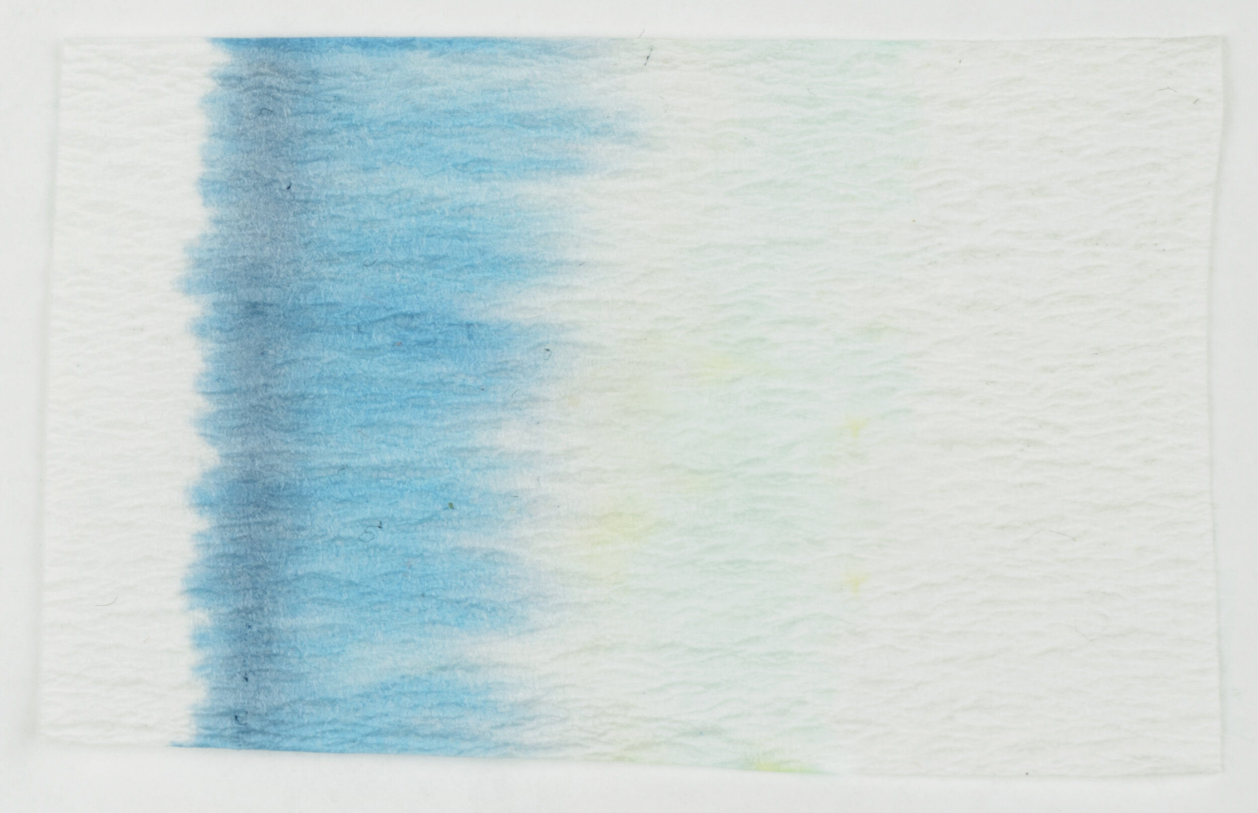
There’s not even any practically noticeable sheen on the swatch! The chromatography is fairly simple with a more grey line where the line was drawn and then a pale blue after that.


I’d argue that like Dusk In Bloom, none of these inks have any practical sheen as well.
80gsm White Rhodia
The ink is just a little bit darker and more saturated on Rhodia and the colour is more neutral. It does still generally lean more teal than purple though!
Montblanc Jazz Blue: this ink is quite light but much more saturated and less teal leaning. It also has some pink that breaks through in the more saturated parts;
Robert Oster Summer Storm: this ink leans a little purple and is noticeably darker; and
Robert Oster Grey Seas: is fairly neutral and more saturated but still somewhat grey.
The shading follows similarly on from Tomoe River but the gradient is even smoother and the contrast slightly less. I would also say the frequency is lower on the on Rhodia. The haloing is mostly not noticeable on Rhodia.
There is still no sheen (not that any should be expected for such a low saturation ink, especially on Rhodia).
Water resistance is the same as on Tomoe River. That is, pretty decent! Water resistance is pretty normal but slower than I would expect for the saturation normally. There is no smearing.


There is no sheening on the swatch of Dusk In Bloom nor on any of the comparison inks when on Rhodia paper. Again not unexpected.
Edward’s Gardens
Jardin Turquoise
Edwards Gardens, also called Jardin Turquoise (Turquoise Garden), is described by Ferris Wheel Press as “a scintillating teal with gold sparkling flakes and a mystical red sheen”. Edward’s Garden is inspired by the Edward’s Garden park in Toronto that also include the Toronto Botanical Gardens. This ink is definitely the richest ink of the set with the shimmer sheen and colour playing well together.
Edward’s Gardens is a slightly blue-leaning teal (that is it leans more towards the blue spectrum than the green). This teal is decently saturated but it isn’t quite what I would call highly saturated. The ink is very wet and has some shading but not a whole heap.
52gsm Ivory (White) Tomoe River
Edward’s Gardens is bluer on Tomoe River compared with Rhodia and a hair less saturated.
J. Herbin Emerald of Chivor: is the obvious comparison! This ink is slightly darker, greener, and more sheeny;
Diamine Enchanted Ocean: noticeably is darker, much less saturated, has silver shimmer and a duller sheen; and
Diamine Aurora Borealis: is obviously not shimmery but has a similar hue albeit a littler darker. The sheen is duller and less strong.
Shading isn’t that strong with low frequency. IT is stronger on the Lamy 1.9mm Stub in the brand title, the 1.5mm Stub in the ink title and the drier fine nib. The rest are fairly flat. The contrast is fairly moderate on the nibs that are showing shading (otherwise quite low) and it is a similar story with the gradient; the nibs that show shading have a more sudden gradient and the nibs that don’t show much are quite smooth. There is some nice haloing that is often accompanied by sheen.
The sheen is quite decent! There is sheen on all the nibs and the shimmer gets quite strong on the water nibs (with the exception of the stubs for some reason). It is a nice combination of sheen, colour and shimmer!
Edward’s Gardens has low to no water resistance a decent dry time for Tomoe River and no smearing.


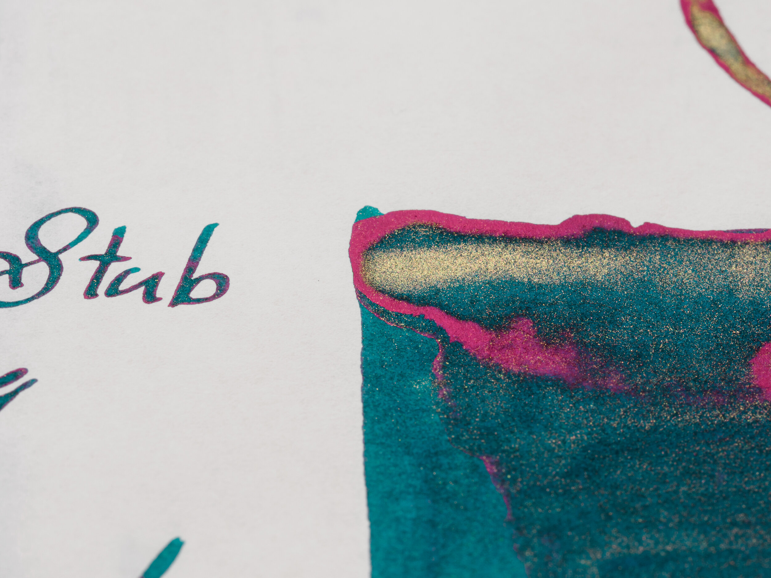
Some shimmering inks handle the shimmer better than others with the sheen rubbing off (or smearing off). This doesn’t happen much for this ink but if you rub the gold with you hand some will be left on your finger! With some shimmer inks it completely rubs off though.
The chromatography starts with a pale neutral blue that gets darker and more saturated before breaking into a yellow-green and finally ending with a rich azure. It also leaves behind the shimmer where the line was written down.


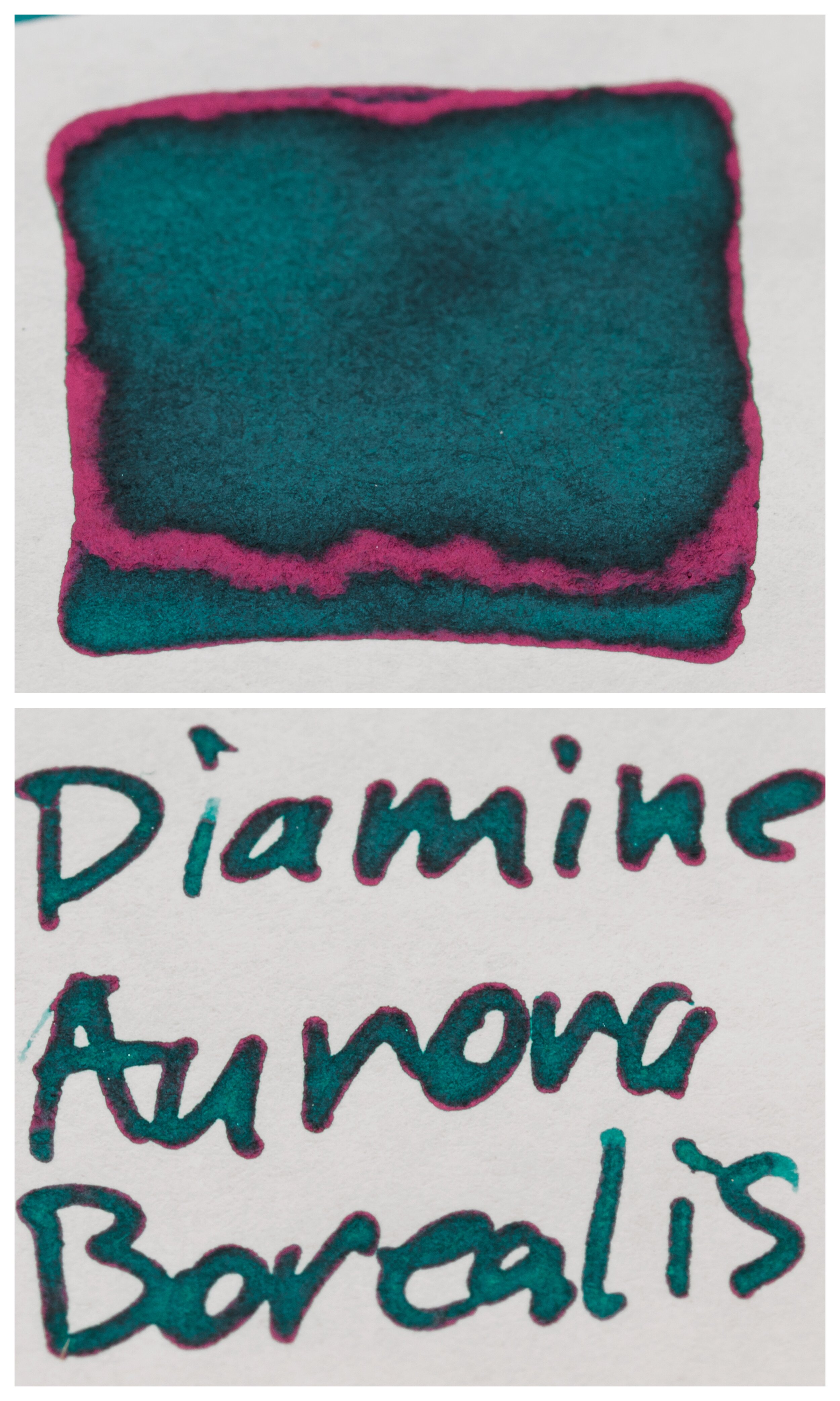
The sheen of Emerald of Chivor is stronger but a similar colour and richness but the shimmer colour is a little yellower and less orange. Enchanted Ocean is much duller and Aurora Borealis is just a bit duller.
80gsm White Rhodia
On Rhodia the ink is a little more green leaning (not much) and a little more saturated.
J. Herbin Emerald of Chivor: Is slightly darker, more saturated and greener;
Diamine Enchanted Ocean: noticeably is darker, much less saturated;
Diamine Aurora Borealis: is obviously not shimmery but has a similar hue albeit a littler darker and greener.
The shading is definitely stronger on Rhodia! The frequency is decent but the contrast is on the low side and the gradient still smooth.
If you look very closely you can see some very dull almost halo-like sheen but practically there is none on Rhodia. I think the shimmer looks a lot nicer in the presence of the sheen but that is just my personal opinion.
Water resistance is improved on Rhodia but is a little messy. Dry time is quite fast and there is no smearing (the shimmer is as on Tomoe River).


Again the slightest hint of a dull sheen in some spots here but nothing practical.


None of the comparison inks show any noticeable sheen on Rhodia either.
Main St. Marmalade
Cremé À L’Orange
Main St. Marmalade, or Cremé à L’Orange (Orange Cream), is described by Ferris Wheel Press as “a soothing creamy orange that is beautifully shaded and perfect for summer highlights”. I think ‘creamy orange’ is an apt description of the colour! It is a pale amber or light pale apricot like colour. It is a light, low saturation yellow-orange with a little bit of brown to the orange. The ‘Main St.’ in the name is related to Main St. Unionville on he outskirts the Greater Toronto Area. You managed to find this building on Main Street that is represented on the box cover art!
This ink, like Dusk in Bloom is quite wet for such a pale ink which makes it quite pleasant to write with. It has limited shading again.
52gsm Ivory (White) Tomoe River
On Tomoe River this ink is noticeably more unsaturated and lighter than on Rhodia. Overall it has less contrast as well.
Birmingham Pen Co. Luna Park Marmalade: has a similar amber-redness to it but is more saturated and darker;
Stipula Saffron: is more yellow and more saturated; and
Robert Oster Peach: is dirtier, more saturated and more orange.
This is probably the best of the three for shading. It still isn’t strong because the contrast is low but the frequency is higher and the gradient is often sudden rather than smooth. Even the broad and medium nibs show some shading! There is a nice halo as well but it isn’t that strong.
There is no sheen, unsurprisingly. Water resistance is non-existent with the ink completely washed away. Dry time is decent for Tomoe River paper and there is no smearing.


No sheen even on the swatch and the chromatography is simply a coral orange gradient that breaks into a neutral orange before ending with a golden yellow.


There is no sheen on any of these inks although the shading on the Stipula is interesting and there is some haloing on the swatch of the Robert Oster.
80gsm White Rhodia
As mentioned the contrast is higher on Rhodia with almost some red coming out in the swatch. The orange is more saturated and it is a little darker as well.
Birmingham Pen Co. Luna Park Marmalade: is much closer but flatter and a little more saturated;
Stipula Saffron: is richer and more yellow'; and
Robert Oster Peach: is darker, richer and has more brown in it.
The shading is fairly similar to on Tomoe River but with a slight increase in frequency. The contrast is still low and the gradient is still often (but not always) more sudden. No sheen!


Still no sheen (surprise)!
Still no water resistance and no smearing but the dry time is excellent with this one.


There’s no sheening with these inks but there is some chromatic changes around where the haloing would be (including some strong haloing on the Robert Oster Swatch).
Unfortunately for me these inks will not be staying in my collection with the inks being sent off in a giveaway for Australian audiences very soon! I mentioned at the start that Ferris Wheel Press is one of the few companies releasing such pale inks (and certainly the only one that does it consistently). That doesn’t mean that they don’t make vibrant inks (as pale inks aren’t for everyone), of course (just look at Edward’s Gardens) but I like that they doing this. It is very difficult these days to have a visibly recognisable ink catalogue but I think Ferris Wheel Press is one of the few that has one. Not only that but they have approached it thoughtfully with one of the main problems with pale inks being how dry they often are but these inks are not dry (especially for a pale ink). They are decently wet and lubricated so these pale inks are lovely to write with. That these have less shading is also not necessarily a down side because either the ink would need to be less pale or would become too pale in parts. These inks aren’t flat but they keep their pale look. Creamy orange Main St. Marmalade is easily visible on paper, a little less so with Dusk In Bloom but it still a nice ink to use (albeit maybe not on professional documents)! Edward’s Gardens is my favourite type of shimmer ink; one that interplays with sheen and base ink colour. While very similar to J. Herbin Emerald Of Chivor it is still different (in shimmer colour and base colour) which differentiates it somewhat.
These inks (and other Ferris Wheel Press inks) are is AU$29.95 for the 38ml, AU$54.95 for the 85ml, and AU$24.95 for a 5ml(ea) set of all three inks at Ink’d Pens. From Ferris Wheel Press they are US$20, US$36, and US$15 respectively. Slightly on the upper echelon of the price scale but not too extreme and for me worth the money. I feel quite content with my 38ml bottles as well, a nice balance for me.
Thanks to Ferris Wheel Press and Ink’d Pens for sending these inks for review, go check them out and see what you like and also follow Ferris Wheel Press on and Ink’d Pens on Instagram! Use code I LOVE MACCHIATO MAN for 10% off on Ink’d Pens!
✒︎ ✑ ✒︎ ✑
Thanks for reading! If you have any questions, comments or suggestions please let me know in a via the comments, Instagram, or contact me directly.
You can find my ink collection here and my pen collection here. Is there something you’d like reviewed? Let me know!
For blog updated you can follow @macchiato_man on Twitter, subscribe via email, or like my Facebook page. Check out the sponsors of this blog as well!
I was not compensated for this review and everything here is my own honest opinion. There are no affiliate links in this review. I was sent this ink for the purpose of an honest review.