
Recently, Esterbrook released their initial set of inks. This set of nine inks I have split into two overview posts this first post has a rather traditional set of inks; they have a vintage feel and wouldn't be out of place in a vintage Esterbrook lineup. This first part has Cobalt Blue, Ebony, Evergreen, and Scarlet. The next part will have some more modern feeling inks with Aqua, Simmer Aqua, Shimmer Lilac, Tangerine and Shimmer Tangerine.
Thanks to Desk Bandit and Esterbrook for sending in these inks for review. I received samples and a bottle of Cobalt Blue.
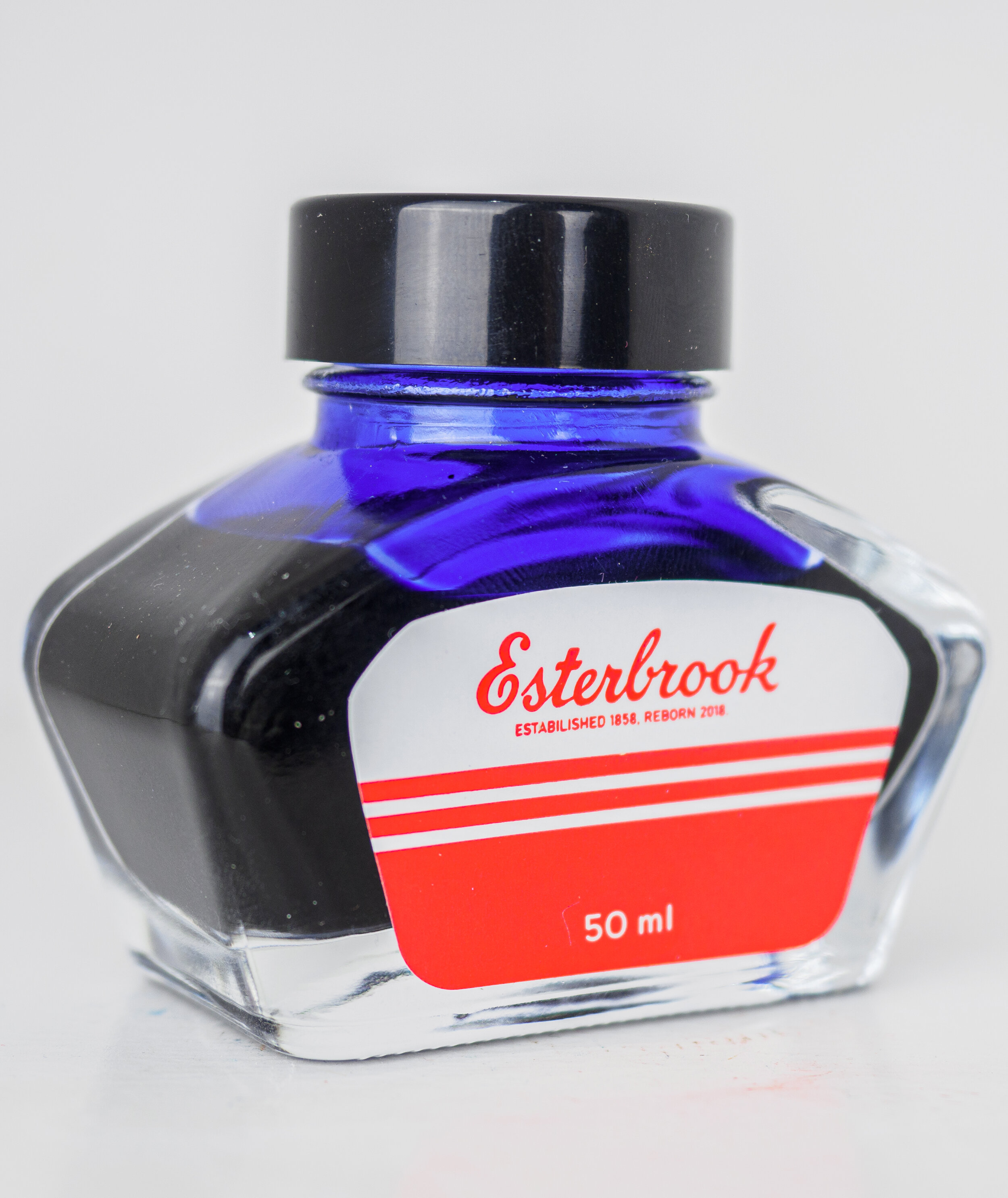
Bottle for Cobalt Blue
These three inks, as I mentioned have a very vintage feel. The only thing missing from the classic set of inks that you might find in the 1950s is a blue-black! The blue leans a little teal, the blue a little purple and the red isn’t neutral. Classical ink colours (or close to it)!
The bottle is fairly standard, similar to standard Pelikan bottles, Kaweco bottles. or Berlin Notebook bottles and others. This bottle should be familiar to many. The label again is a very vintage style simplicity with red on white. the box has a similar design with off-white and red. You will want to keep the box for these bottles (as you should anyway) as the bottle doesn’t have any indication as to which ink it is. There is a coloured sticker on the box and a sticker with a barcode and the ink name but none of this is on the bottle itself.
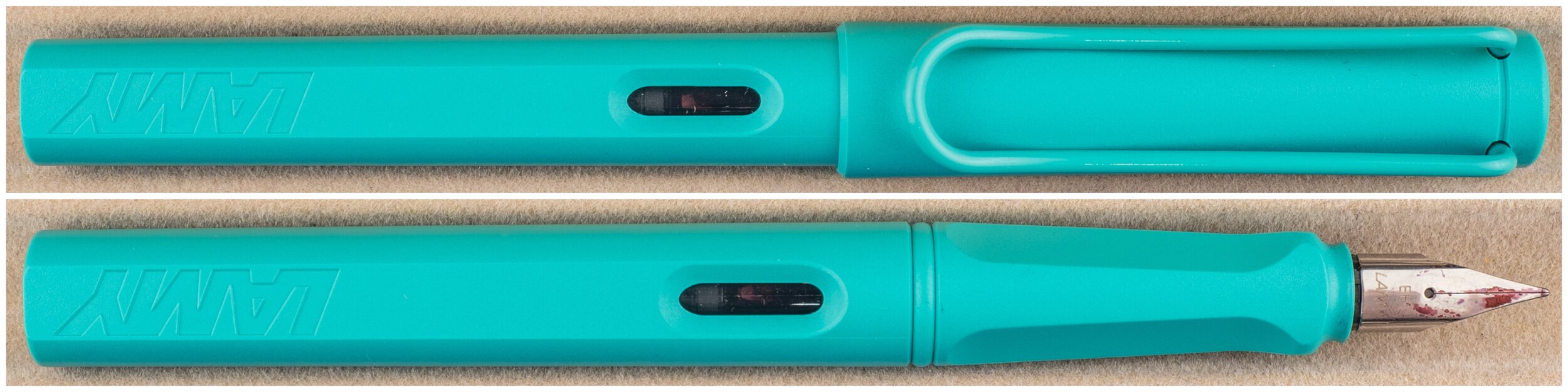
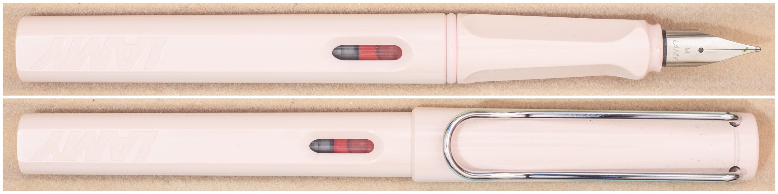
Nib and Pen details
I used Lamy Safaris in Blue Macaron, Rose Powder and Candy Aquamarine as well as a Lamy Joy for these reviews and seven different stainless steel Lamy nibs on that pen. The choice of pen (be that Safari, AL-Star, Vista, Joy or Studio) will have little impact in the writing performance. I will not use a Lamy Dialog because there is the rare chance of the nib drying out slightly which might affect the writing performance.
Lamy 1.9 Stub: this is a very wet nib
Lamy 1.5 Stub: this nib is moderately wet to write with (this is used for the brand and ink name title);
Lamy 1.1 Stub: this nib is on the drier side;
Lamy Broad: this is a wet;
Lamy Medium: this is a very wet nib;
Lamy Fine: this nib is moderately dry; and
Lamy Extra Fine: this nib is moderately wet.
I also use a fine Glass nib pen for the comparison ink names. The nib can be either very wet or slightly dry and I try to find the middle area. This generally as the effect of reducing shading and luminosity, while increasing sheen and saturation. The possibility of feathering and bleeding is also slightly increased..


Cobalt Blue
Cobalt Blue is a traditional royal-blue like colour. It is slightly lower saturation and on the darker side but not quite a blue-black colour (and a classic blue-black would be iron gall). This ink is quite wet (most of these Esterbrook inks are). Indeed it is very wet. This gives it a good lubricated flow.
52gsm Ivory (White) Tomoe River
Cobalt Blue remains fairly similar in colour on both Tomoe River and Rhodia paper being only a little darker and more saturated on Tomoe River.
Diamine Kensington Blue: is similarly saturation but a little lighter and less purple leaning;
Parker Quick Blue: is lighter and much more saturated and not quite as purple leaning; and
Diamine Tudor Blue: is darker, more purple leaning and slightly less saturated.

There is some shading on Cobalt Blue but it isn't strong. The contrast is low, try gradient is smooth and the frequency is fairly moderate. All the nibs fair pretty similarly with more shading, slightly, on the finer nibs. There is a tiny amount of halo visible on the wetter inks but it is quite subtle. There is no sheen visible on the written line on this ink.
There is no water resistance and the dry time is fairly normal on Tomoe River. There's no smear!


There is, technically, some sheen on the swatch but this is barely visible and is the very matte grey type sheen that barely qualifies!
The chromatography has a pink colour moving to a darker neutral blue before ending with a bright turquoise.
As Cobalt Blue has no sheen the closest is Kensington Blue which is also sheenless. Parker Quick Blue has a fairly strong sheen and Tudor Blue has almost no sheen but what is there is a dull matte gold.
80gsm White Rhodia
On Rhodia the ink looks flatter and is a little lighter. If anything the hue is slightly less purple leaning but is still quite similar to on Tomoe River. Rhodia doesn't handle concentrated amounts of ink that well these days so on the wet swatch and the 'coffee stain' there is some feathering but there is no feathering on the writing.
Diamine Kensington Blue: is a hair more saturated and lighter and is still less purple leaning;
Parker Quick Blue: is a much closer colour here, still less purple (but only a little) and a little more saturated; and
Diamine Tudor Blue: is a similar darkness and saturation but is much more purple.
Shading is fairly similar to Tomoe River as it isn't strong on Rhodia either. It is a little strong in frequency but not much and the contrast is lower while the gradient is still smooth.
Obviously, given no sheen on Tomoe River, there's no sheen here either.
Water Resistance does leave some of the line behind but it is mess and there isn't much visible. I wouldn't call this water resistant but it is better than on Tomoe River. Dry time is super quick! Close to 10 seconds only. There is no smearing.

No sheen even on the swatch.
Parker Quick Blue has a halo that technically shows some sheen but none of these have any practical sheen.
Ebony
Ebony is what I would call a dark grey. It isn't quite dark enough for my liking to be a proper black. It isn't far off and there are certainly inks out there similarly 'grey' that do call them selves 'black'; this ink doesn't though! It is quite neutral but does approach this dark grey from warmer colours. Ebony is very wet. A lot of ink gets put onto the page.
52gsm Ivory (White) Tomoe River
The ink is quite flat on both paper types here but it is a little darker on Tomoe River and a little less neutral though with a similar brightness.
Aurora Black: is darker and a little bluer;
Noodler's Black: darker still here and with bits of brown in it;
Lamy Black: is quite blue and only a hair darker.
There is some shading (which is not what I personally look for in a black but in a grey or dark grey I don't mind). The shading is very faint with very low contrast low frequency and a smooth gradient.
There is no sheen on the written line.
Water Resistance is decent. It leaves behind a noticeable grey line and isn't too messy. Dry time is on the slower side but not by an extreme amount. There is no smearing.


Technically there is a tiny amount of matte grey sheen on the swatch but this is pretty much meaningless.
Chromatography shows where the warmth comes from with a tan-grey leading to a dark grey that breaks into a dark purple before ending with a low saturated reddish brown-purple.
Aurora Black has a strong copper sheen and Lamy Black has a decent brass-like sheen. Noodler's Black has a strange silver like sheen but is the least of the batch. The Noodler's also seems less dark from the side and similarly warmness to Ebony can be seen as well.
80gsm White Rhodia
On Rhodia Ebony is a bit flatter with a little less contrast and a brighter grey overall. It also isn't quite as warm on Rhodia. This ink, on Rhodia, does spread a little. That is the written line becomes thicker than it would on some other papers (such as Tomoe River). This is similar to feathering but not as ugly.
Aurora Black: is flatter on Rhodia, like Esterbrook Ebony, but also still darker. Aurora Black is also showing some of that ‘spreading’ that Ebony also has;
Noodler's Black: is still darker but retains a lot of brown colour in it; and
Lamy Black: is cooler and darker but quite flat.
Because Ebony is flatter on Rhodia there is practically no sheen on Rhodia. There wasn't much on Tomoe River but there is almost none here. As should be expected there is no sheen on the written line either.
Water resistance is a little messier on Rhodia but again fairly decent resistance and the dry time is impressive! You write a word down and it is practically dry by the time you finish! No smearing as should be expected with such a quick dry time.


No sheen on the swatch.
There is no sheen in any of the comparison inks on Rhodia.
Evergreen
Evergreen isn't quite as as wet as the Cobalt Blue but is still decent lubrications and wetness. The colour is fairly neutral but leans towards a cooler green more than it does towards a warmer green. It is, again, a fairly classic fountain pen ink colour. It is a lighter green and is around moderate saturation.
52gsm Ivory (White) Tomoe River
On Tomoe River Evergreen is brighter, less saturated and with lower contrast than on Rhodia. It is also a hair more teal leaning. You do see on the wettest part of the swatch where the ink suddenly loses a lot of its saturation. You see that with some inks on Tomoe River and sometimes it is such a strong effect that you can notice it in the writing but fortunately not here.
Diamine Tropical Green: is a similar hue but darker and a little more saturated;
Robert Oster Emerald: is a little warmer and more saturated but only a little darker; and
Robert Oster Evergreen: quite a bit warmer and a touch darker but it does share a name!
Shading isn't strong but it has sharper gradients than what we have seen thus far. The contrast is still fairly low on that though and the frequency isn't high. There is a little bit of halo that shows but it isn’t strong. Every now and then you see a hint of a dark, low saturation matte red sheen on the writing but it is very subtle and doesn't really come up in the photos.
Water resistance is non existent and dry time on Tomoe River for Evergreen is fairly normal (if not on the slower side). There is no smearing.


You can almost see some of the dark matte red sheen on the swatch and the ink stain but again very little.
Chromatography starts with a light purple-is grey that moves to a bright warm apple green before ending with a saturated azure.
Robert Oster Evergreen has the closest sheen in that it has the least and it is a low saturation matte sheen; but there is still too much! Diamine Tropical Green and Robert Oster Emerald also have more sheen.
80gsm White Rhodia
There is a lot more contrast and the ink is darker and more saturated on Tomoe River with some warmth creeping into the green.
Diamine Tropical Green: is a similar hue but darker and a little less saturated this time;
Robert Oster Emerald: is a hair warmer but a lot closer on Rhodia in terms of hue and only slightly more saturated but it is more noticeably darker; and
Robert Oster Evergreen: is a bit warmer and a touch darker and also flatter.
Esterbrook Evergreen has some decent shading on Rhodia! There is some decent contrast, there is a higher frequency and the gradient is sharper. There's no sheen on Rhodia.
Water resistance is better on Rhodia but still quite low leaving only a faint green line behind. Dry time is decent and there is no smearing.

No sheening here.
Nor any sheening here.
Scarlet
Scarlet is a warm red that isn't too far away from being an orange but you'd still call it a red. It is fairly light and I'm glad it has that warmth because otherwise it would feel more pink. The saturations is rather moderate as well. Esterbrook Scarlet has is on the upper side of moderate wetness and lubrications.
52gsm Ivory (White) Tomoe River
On Tomoe River Scarlet is slightly less saturated and a bit lighter but has more complexity of colour with some parts appearing more orange and some more red.
Kingdom Note Cynops Pyrrhogaster (Sailor): is a similar orange-red hue but is much more saturated and much darker;
Camel Scarlet Red: has a similar vintage red-like feel to it like Esterbrook Scarlet (and shares a bit of the name) but is much more pink than Esterbrook Scarlet; and
J. Herbin Corail des Tropiques: is more a low saturation orange leaning pink than an orange-red and is quite flat.
The shading is again fairly low here. There is some more sudden gradients but most are smooth and the contrast and frequency are fairly low. There is a little haloing but not much.
The water resistance leaves a very subtle pink line behind but you wouldn't want to have to rely on this I don't think. Dry time is pretty average for Tomoe River and there is no smearing.


There is practically no sheen on the swatch or the ink 'stain'.
Chromatography has a pink colour leading to a brown-leaning orange ending with a brilliant pure yellow.
Camel Scarlet has some matte-gold sheen in the swatch but not really any on the written line and J.Herbin Corail des Tropiques has none so they are similar to Esterbrook Scarlet but Kingdom Note Cynops Pyrrhogaster has way too much how saturation green-gold sheen.
80gsm White Rhodia
You can see that on Rhodia Scarlet is a lot warmer and more saturated but also are more homogenous colour. I'd say as well that it feels more orange than when on Tomoe River.
Kingdom Note Cynops Pyrrhogaster (Sailor): is more red and more darker and more saturated;
Camel Scarlet Red: looks quite vibrant and pink here! Certainly higher saturation and less orange; and
J. Herbin Corail des Tropiques: is still a low saturation orange leaning pink and is quite flat.
You do see some feathering creeping in on Rhodia which I more attribute to Rhodia these days but it is worth pointing out. It is very subtle feathering though. The shading is even lower on Rhodia with less frequency and contrast and a completely smooth gradient.
I think I left the water droplets a little too long on the page because it is very messy but there is still some lines left behind that you can see. Dry times very fast and there is no smearing.


No sheen here.
Note sheen here (apart from a tiny amount one the Kingdom Note)
Conclusion

This first part of inks has some old school colours in it which suites the brand which has so much history they are clearly playing on this history with a lot of the aesthetic of the company and its logos and designs. If this was the full set of inks released it would be a little bland but the rest of the release is much more modern. The reason I chose to batch these four together in the review is precisely because they feel vintage to me and because the other set are either shimmer or have shimmering versions (such as Aqua and Shimmer Aqua). Cobalt Blue is a nice classical darker Royal Blue and Evergreen is a good strong green that is cool but without moving into a teal colour. Scarlet has some complexity on it in Tomoe River and I like that it doesn't just look like a pink like a few older reds do resemble. It is difficult to get excited about a black, to be honest, but thinking of Ebony as a grey makes it more interesting (to me anyway)! I look forward to sharing Aqua, Shimmer Aqua, Shimmer Lilac, Tangerine and Shimmer Tangerine sometime soon!
These inks are on the pricier side but unfortunately I feel like this is just now fountain pen prices are going lately. We're seeing a lot of pricing increases. Personally I’d like to see a slightly lower price. These inks are AU$45 at Desk Bandit in Australia (+AU$4.65 for shimmering inks) and US$30 (+US$5 for shimmering inks) from Esterbrook in the US. These aren’t low prices.
✒︎ ✑ ✒︎ ✑
Thanks for reading! If you have any questions, comments or suggestions please let me know in a via the comments, Instagram, or contact me directly.
You can find my ink collection here and my pen collection here. Is there something you’d like reviewed? Let me know!
For blog updated you can follow @macchiato_man on Twitter, subscribe via email, or like my Facebook page. Check out the sponsors of this blog as well!
I was not compensated for this review and everything here is my own honest opinion. There are no affiliate links in this review. I was sent these inks for the purpose of an honest review.