

I believe it was this blog post that started widespread panic in the fountain pen community world wide! Tomoe River paper has become a staple amongst the community for its unique characteristics and notable friendliness to fountain pen ink. From its distinctive crinkly crackle, to its proclivity to long dry times; from its high sheen capabilities, to its glossy look Tomoe River has been used in countless loved fountain pen stationery products. To hear that it will be changing is quite troublesome! Hopefully this comparison between new and old 52gsm Ivory (off white) and Cream Tomoe River Paper will be helpful. There are also some alternatives presented.
A huge thank you to Desk Bandit for getting me samples of these papers as soon as they have!
Comparison between New and Old Tomoe River
NEW Ivory Tomoe River
NEW Cream Tomoe River
OLD Ivory Tomoe River
OLD Cream Tomoe River
There are two types of Tome River paper, cream and Ivory (off white). All the Tomoe River Paper in this review is the 52gsm variety. There are certainly notable differences between new and old… let’s get that out of the way. They look and feel different. The question is how different and in what ways, naturally.
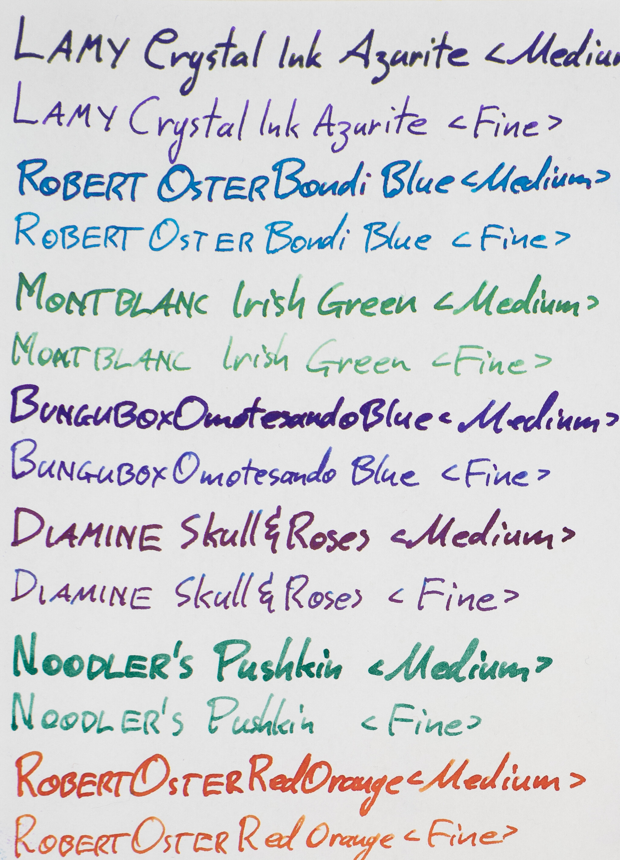
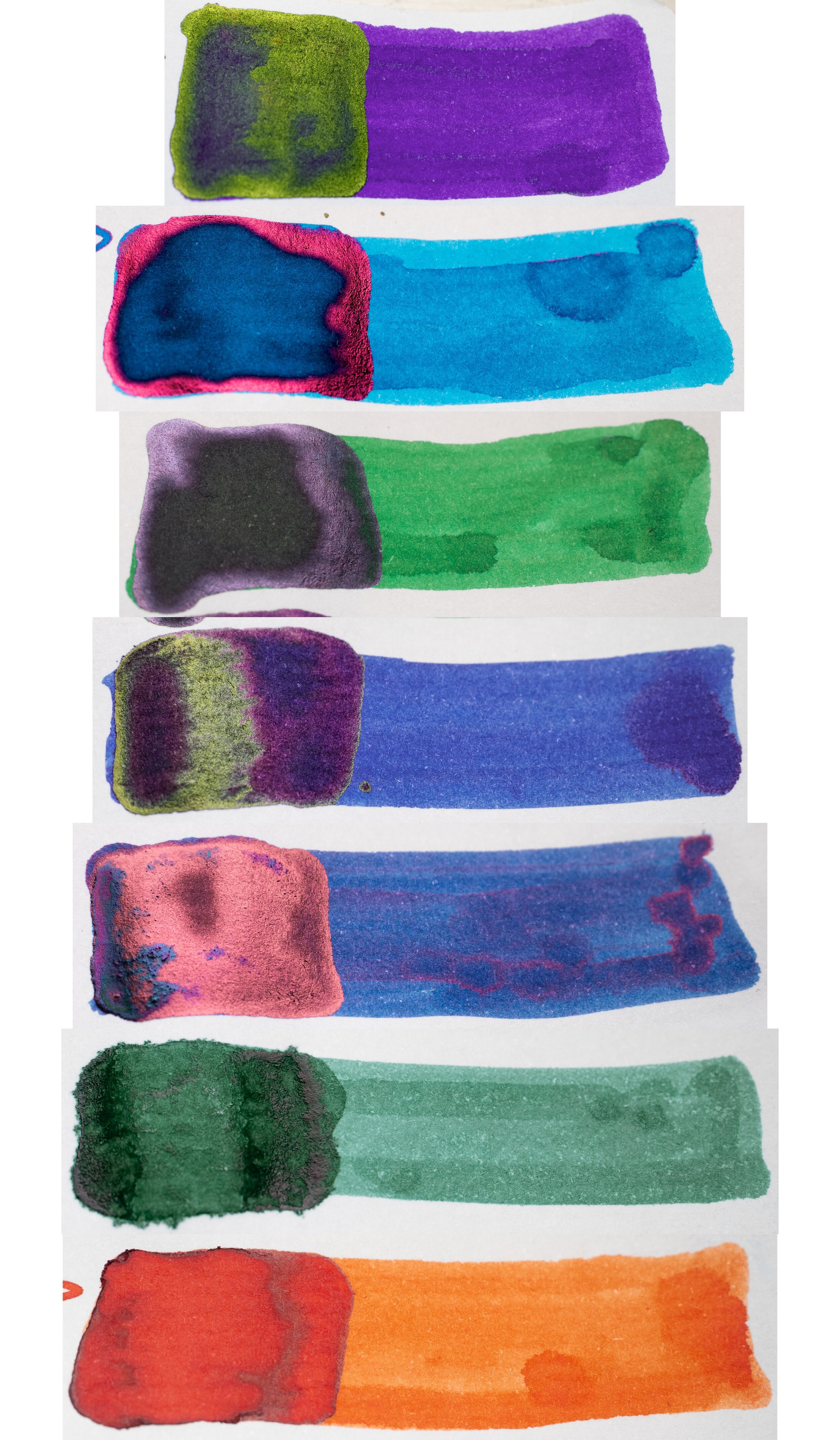
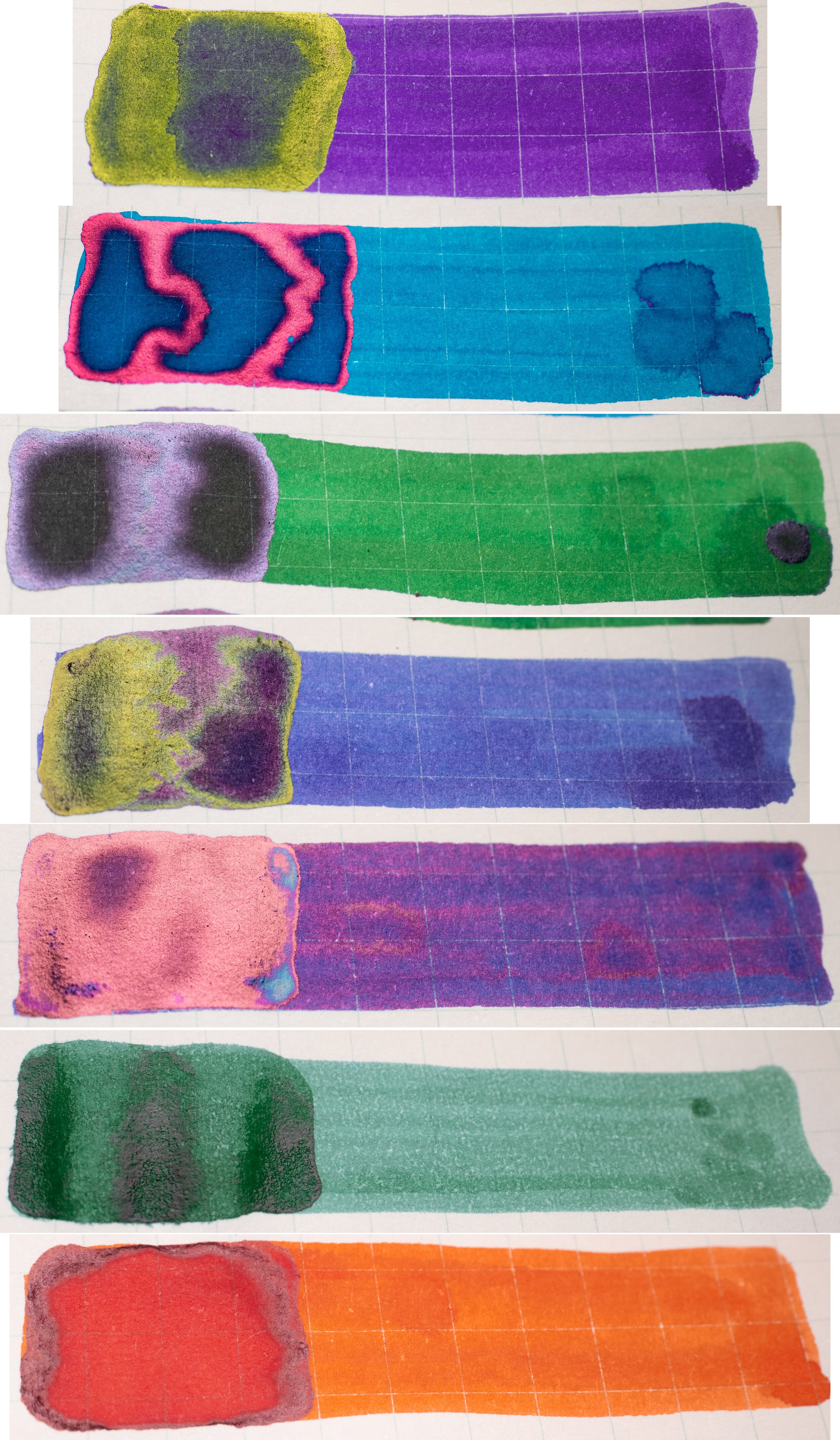
The inks used in this comparison and the general characteristics are:
Lamy Crystal Ink: This ink is high saturation wet ink that presents with a moderate amount of sheen;
Robert Oster Bondi Blue: This ink is a moderate saturation and moderately wet ink with good lubrication that presents with a low moderate amount of sheen that occurs at the edge of where the ink pools and can show with various degrees of saturation. It can present with decent shading in the right conditions;
Montblanc Irish Green: This is a dry ink with low moderate saturation that can show with good shading and no sheen (apart from on the swatch);
Bungubox Omotesando Blue: Is a moderate sheen Sailor wet ink with little shading that is quite dark and moderately saturated that is very wet and can show dual sheen;
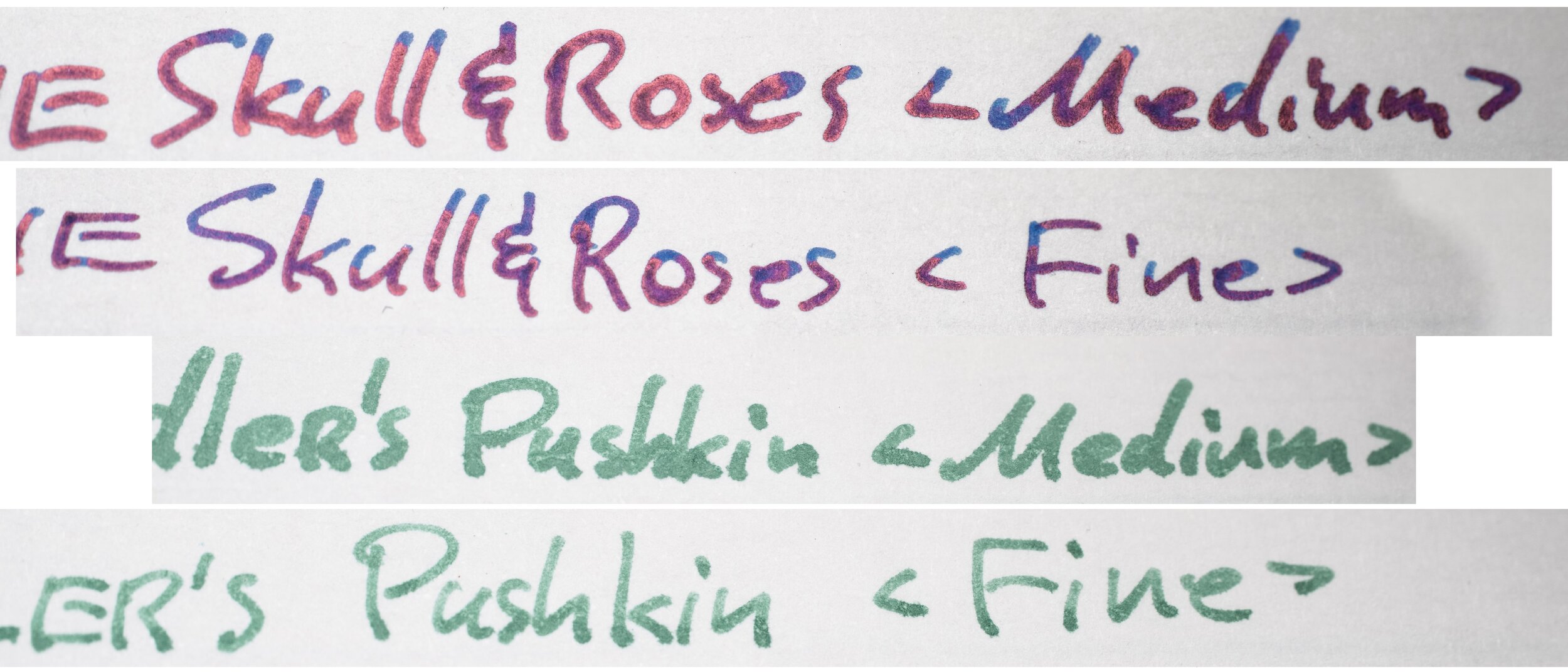
Diamine Skull & Roses: Is a super sheening wet ink with limited shading and high saturation;
Noodler’s Pushkin: is a poor performing ink. It nearly always feathers and bleeds and displays as quite faded and splotchy;
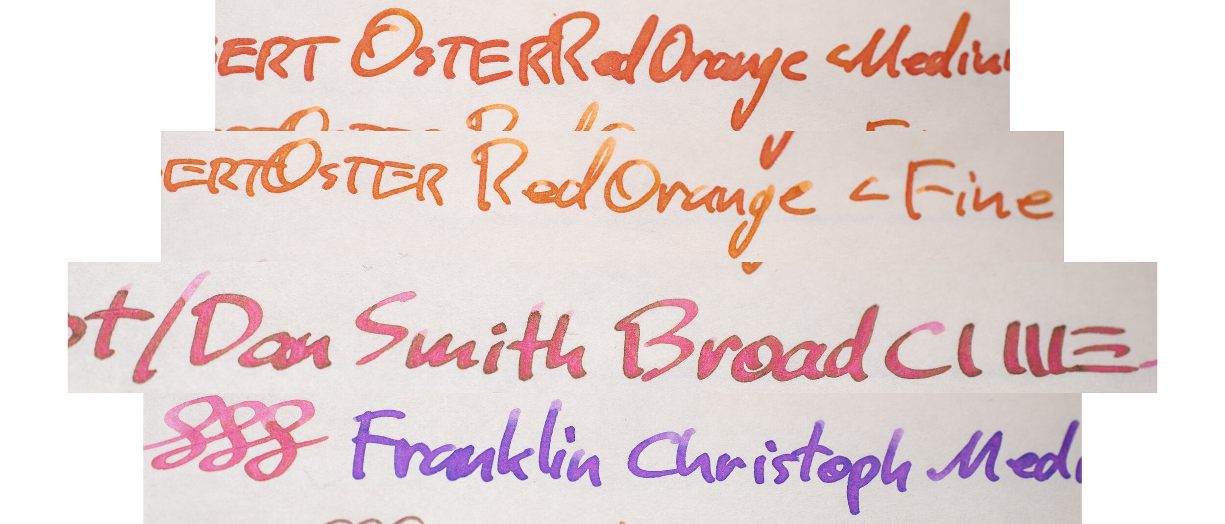
Robert Oster Red Orange: Is a high saturation slightly dirty orange ink that can illicit a faded look on Tomoe River.
The writing at the bottom of the review was for me to test out different nibs and inks I am familiar with to assist in me making the comparison. These inks, which haven’t been mentioned, were not colour corrected in editing with the exception of the Pilot Broad CI and the Franklin Christoph Medium Sig which I wanted to show for the purpose of displaying an ink that Halo’d and an ink that showed dichromaticism in lavender and blue.
Some general changes are that the the NEW paper presents inks very slightly darker than the OLD. The colour isn’t all that different in its presentation, for the most part. The paper also has a more parchment look to it (more later on that). Tomoe River nearly always shows ink in a glossy, almost plastic-like look to it. This look is no longer present in the NEW Tomoe River. The inks look much like it would on any fibrous paper. I was quite a fan of this look and it was a unique characteristic of Tomoe River paper that is disappointing (to me!) that this is gone. The NEW Tomoe River also feels thicker than the OLD; I don’t have any way to test this but it feels thicker to me.
On OLD Tomoe River some inks, often in the burgundy, red or orange colour range, from Montblanc and from Robert Oster (among others but these are most common), especially when a lot of ink is put onto the page from a wet swab or wet nib, become faded and dull. This occurs, mostly, as mentioned, when the ink pools and takes a while to dry, and not as much when the ink is thinner (such as the lighter part of a shaded written line or a lighter swatch). The NEW Tomoe River handles these inks, represented in the tests here by Robert Oster Red Orange better than the OLD. If you look at the saturated part of the swatch (the left hand side of the swatch) you can see on the OLD Tomoe River that this is somewhat faded and dull. On NEW Tomoe River these inks are handled better with the same part of the swatch being comparatively more saturated and less dull - but not as much as non-Tomoe River papers!
Noodler’s Pushkin, being an ink that generally performs poorly, performs well on both. The ink is, however, more saturated on the OLD Tomoe River and is ever so slightly bluer on the NEW as well as more splotchy.
One good news is that the NEW paper is still crinkly! It’s even louder than it is on OLD paper. It’s possible not everyone liked, that, but I really enjoyed that characteristic.


In terms of writing characteristics, this has also changed a bit.
Regarding how things look, the OLD Tomoe River also characteristically shows Halos rather prominently, these Halos are more tamed in the NEW Tomoe River. The writings are also darker, as mentioned. The shading is just as prominent but there is less contrast in the shading on the NEW compared to the OLD.
The feel is probably the most notable difference - though that doesn’t mean it’s a big difference. Super smooth nibs, like the Franklin-Christoph Medium SIG and the Pelikan M805 Medium (photos of these are above but the image doesn’t portray how the nibs feel to write with) are still super smooth regardless of which paper they are on. Indistinguishable. However, when the nib has feedback to it (and I’m talking about pleasant feedback, not scratchiness) then you can definitely feel the paper a little more on the NEW Tomoe River paper compared to the OLD. Very fine nibs like the Sailor Extra Fine, and Franklin Christoph Needlepoint (not pictured) do tend to catch very slightly on the NEW paper. The two Broad Cursive Italics I used in the tests (one by Dan Smith and one by Mike Masuyama) are both smooth on normal use but rotating the pen caused them to catch very slightly more on the NEW paper also. Similarly the other nibs with feedback - the Pelikan M400, the Sailor Mediums, and the Aurora Medium - all have a perceptibly stronger amount of feedback felt when writing. The NEW paper is definitely rougher and more textured than the OLD paper. This rougher texture is compared to OLD paper, I would still consider the NEW paper a relatively smooth paper.
One thing I didn’t have the ability to test was water resistance and dry time. From observations only, it seemed that the NEW Tomoe River might dry quicker but I can’t confirm that.
Another writing characteristic of the OLD paper is how soft and supple the paper is to write on. This has the unintended benefit of assisting with nibs that have a slight baby’s bottom. Because the paper is so supple and soft it melds around the nib shape and mitigates the baby’s bottom to a certain extent. The NEW paper is noticeably less supple and soft so this effect isn’t present. At least as much.


There is a little less smearing as well on the NEW Tomoe River paper. There’s still some and other times you will get even more than what is shown here but there is a little less.


Of note in the written line of the above Robert Oster Red Orange ink is again how the NEW paper is more saturated and how the OLD paper shows the ink more dull and desaturated. The Halo is also more prominent on the OLD paper.
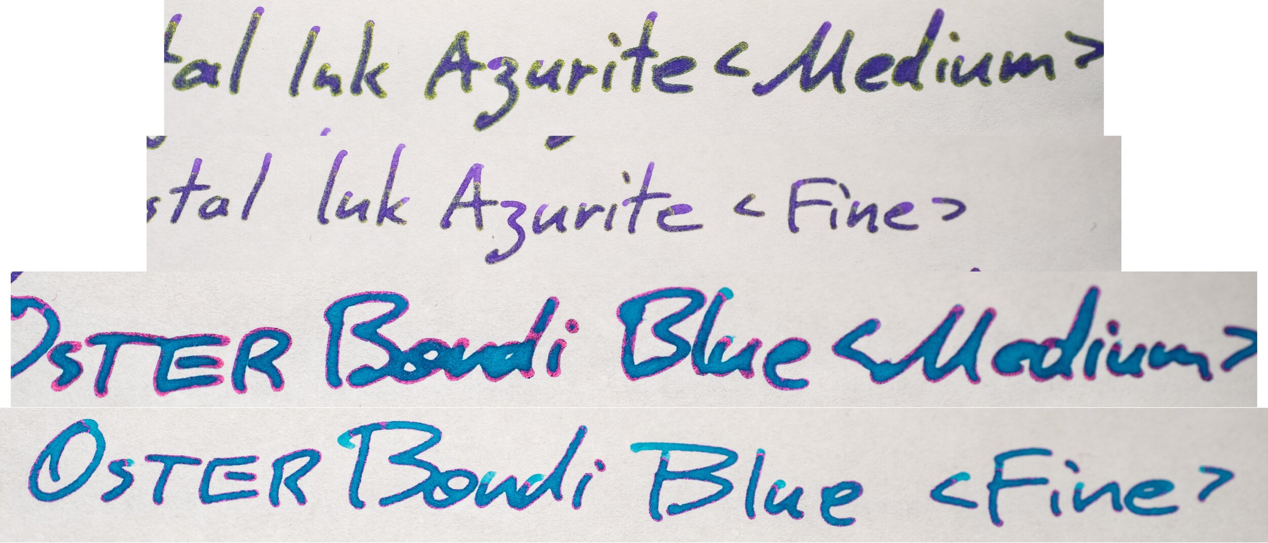
Another visible difference between the papers is how textured the ink is. The edges of the written line on the NEW paper is noticeably rough whereas the OLD is smooth. This roughness is definitely not feathering. It is just due to the fact that the NEW paper is less smooth. A similar and more prominent roughness can be seen in papers like Original Crown Mill 100% Cotton and Ivory G. Lalo paper.
This is zoomed in quite a bit. To get a good understanding of how this looks in normal use, please compare this photo to the writing photo above and the full review photo above that for a more complete understanding of how much of an effect this rough edge might have.
NEW Ivory Tomoe River Reverse
NEW Cream Tomoe River Reverse
OLD Ivory Tomoe River Reverse
OLD Cream Tomoe River Reverse
Another improvement of the NEW paper is that it is even more resistant to bleeding. I think this is a universal that everyone would agree is an improvement to the paper. The OLD paper has a lot more show-through as well, or “ghosting”. This could be seen by some as an improvement over the old paper as well (but I know of some who like the ghosting; and I’m partial to the aesthetic of it as well).


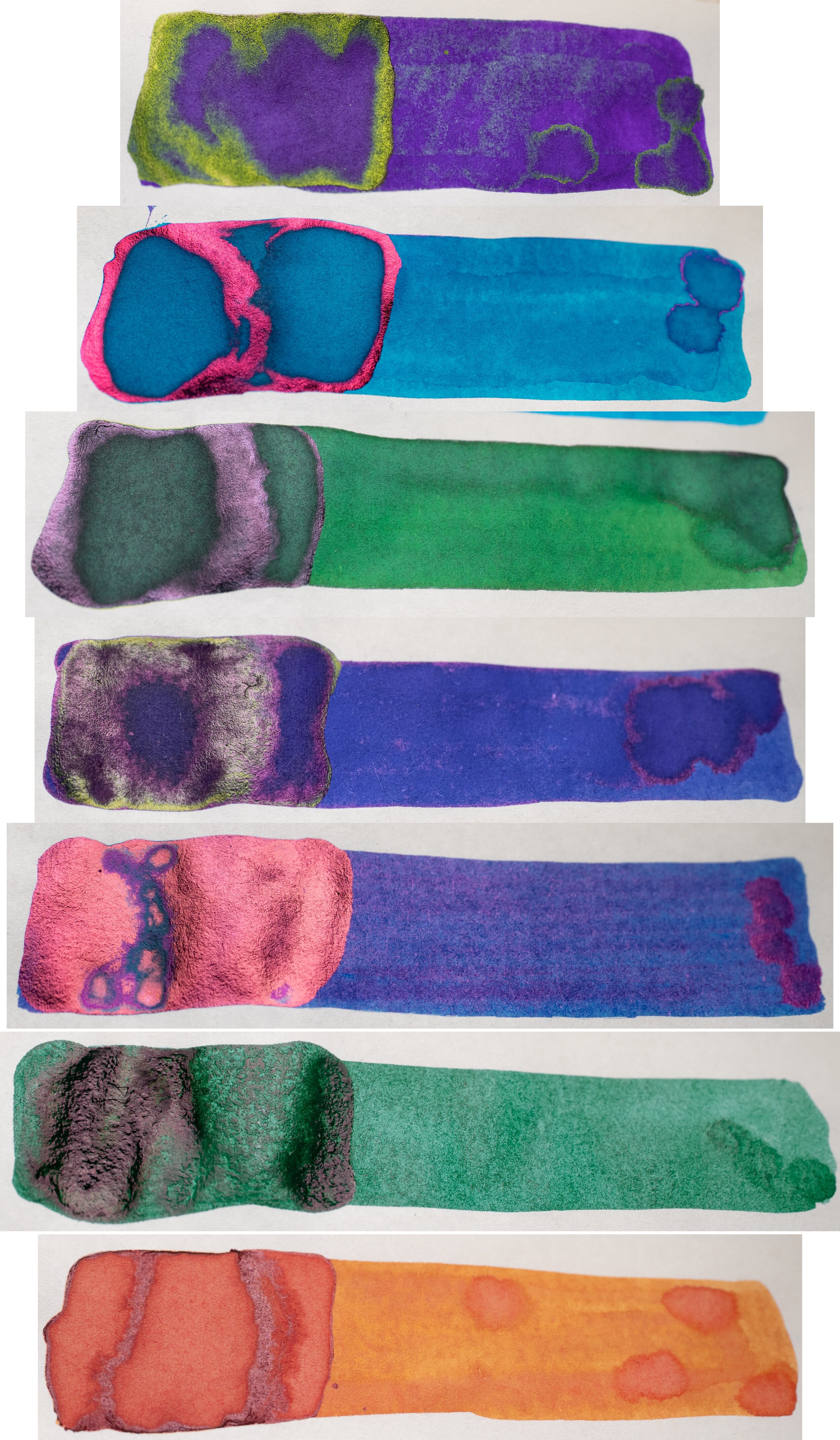
Moving on to sheen, one of the more important characteristics of Tomoe River paper, the NEW Tomoe River still shows a generous amount of sheen. There is slightly less, however, than the OLD. This can be seen with how the less saturated part of the swatch (to the right on the swatch) of the Lamy Azurite swatch showing green sheen on the OLD but very little on the NEW. The Robert Oster Red Orange also shows stronger hints on the OLD. The Sheen on Montblanc Irish Green is also stronger. The rest are mostly comparable. I don’t think this is a big downgrade but it is less.
Please ignore the blue and yellow reflections in the Pushkin swatches above. That is just the LED light I use to light the inks to capture the sheen on camera. Unfortunately Pushkin didn’t want to dry that quickly (this was a whole day later).


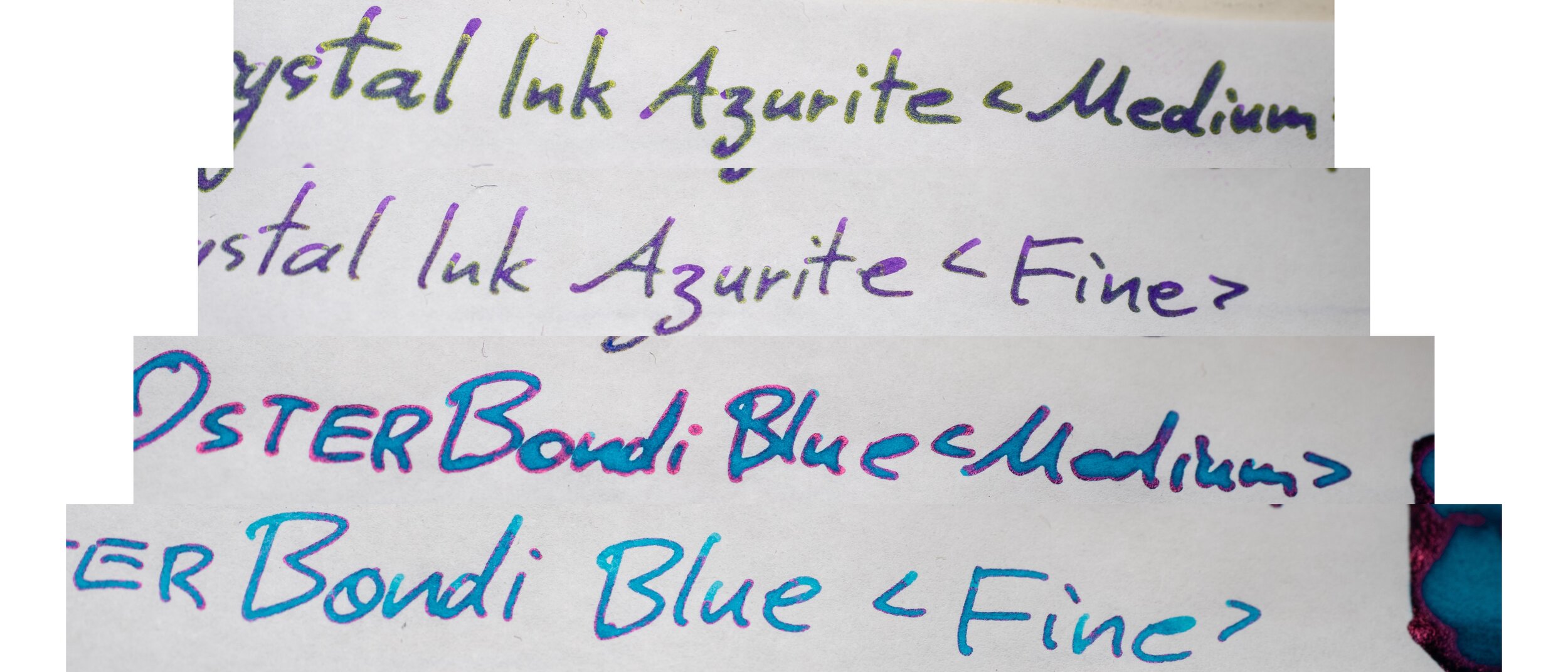


It’s is the same trend with the written line, but it is a little more apparent here. The edge sheen of Robert Oster Bondi Blue its less prominent, there is less green sheen on Lamy Azurite, and there is even less sheen on Skull & Roses (barely). The sheen of Bungubox Omotesando Blue is less saturated on the NEW paper as well. The dichromatic ink in the Franklin Christoph Medium SIG shows a little more contrast between the colours in the NEW ink which I consider an improvement.


It has already been mentioned that the NEW Tomoe River paper feels like it has more texture to it and makes inks look a little rougher but you can also see it in the paper. Individual fibres are easily visible, even to the naked eye if you look close enough. These fibres aren’t visible on the OLD Tomoe River paper and the paper just looks a lot smoother overall. The fibres also catch the light a bit more making some of the fibres reflect a light more. This makes the OLD paper seem both smoother and also a little duller


The whole of the NEW paper also reflects light more than the OLD. It is perhaps a little difficult to see in this but it’s almost as if there is a coating to the paper similar to Rhodia. Clairefontaine paper can also have a similar reflection.
Alternative paper to Tomoe River
Life Paper
Midori Paper
I’m not saying that Tomoe River has been irreparably ruined or anything of the worts but I thought I’d show some alternatives that I think perform comparably to Tomoe River paper.
Life paper, is a bright white paper that is decently resistant to poor performing inks like Noodler’s Pushkin. It also is decent at preventing feathering and bleeding. The paper shows sheen pretty well and is very smooth to write on; smoother than the NEW Tomoe River for me. It does show highly saturated colours as well. Like Rhodia paper, Life paper seems to be susceptible to hand oils affecting the paper which can mean feathering in these parts.
Midori paper is a cream coloured paper with decent resistance to poor performing inks (a little better than Life paper) and resists feathering and bleeding. The paper has some feedback to it so you can definitely feel the paper underneath the nib. The sheen is decent though still less than NEW Tomoe River. The colours are still vibrant but slightly lighter than other papers. Robert Oster Red Orange is slightly duller (but not in the same way that afflicts Tomoe River).
Neither of these papers present Robert Oster Red Orange in the same desaturated dull way as Tomoe River, especially OLD Tomoe River do.


Shading is very strong on Life paper with good contrast. Noodler’s Pushkin does have limited feathering but it also has spreading as well (so a medium line looks more like a broad etc.). The paper is ver smooth to write with, almost as smooth as OLD Tomoe River paper. It’s also a lot stiffer than OLD Tomoe River.
Shading is fairly strong on Midori and the contrast is decent as well. Midori’s resistance to inks like Pushkin is better than Life paper though there is still spreading. The paper is also stiffer than OLD Tomoe River.
Life Paper Reverse
Midori Paper Reverse
Both of these papers handle bleeding well with only Pushkin breaking through (which didn’t happen with the writing on any Tomoe River - it just had stronger ghosting with those papers). The wet swatch on both papers did go through to the paper below it, more so on Life paper. Ghosting is relatively low but slightly higher on Midori.
Midori, definitely shows some generous sheening on all the papers. In the swatch it is comparable Tomoe River. Life paper is a bit less, less than the NEW Tomoe River but it is still present where you would expect it on a sheening paper.


The sheen on the written line is a little less than you’d expect from looking at the swatches. The sheen on the writing of Bungubox Omotesando Blue and Robert Oster Bondi Blue is on the more subtle side for Life paper. Same with Midori for Bondi Blue.
Japanese Milled 64gsm paper
OK Fools 81.4gsm Japanese paper
Spica Bond 49gsm Japanese Paper
Desk Bandit were also kind enough to send through some other papers as a comparison., Japanese Milled 64gsm paper, OK Fools 81.4gsm Japanese paper, and Spica Bond 49gsm paper. Japanese Milled and OK Fools are the most fountain pen friendly with some feathering coming from the swatches of Spica Bond. OK Fools handled Noodler’s Pushkin fairly well, better than Japanese Milled, which it self did OK itself. All of the papers produce well saturated colour but none are strong sheeners. Japanese Milled would be the strongest regarding that which Desk Bandit have in some of their notebooks!
Conclusion
There have been a lot of changes to 52gsm Tomoe River paper. Most of these, for me, have not been positive changes. The better handling of bleeding is a positive, as is the handling of inks that would otherwise become muted. The small decrease in sheen, the slightly rougher surface and rougher presentation of ink in a written line; the visible paper fibres and the more parchment like and less glossy look to the ink; the lower amount of haloing and the muted shading… all of these, to me, are not positive changes. For me, personally, the most disappointing change is the rough edge to the written lines; for me this makes the writing a little ugly. The changes are not huge changes, however; the paper is still fountain pen friendly and high quality at that, but it’s lost some of the unique characteristics that make Tomoe River stand out for me. This NEW Tomoe River feels like a better (ore even excellent) version of a generic paper. It doesn’t stand out any more (apart from the crinkliness!).
This is still excellent paper that would still be a celebrated paper had we not known of the original but it’s lost it’s distinctiveness and novelty. This is a shame but one I believe we can live with.
I think it might be helpful to break the changes down:
Louder crinkles
Slightly less sheen
Darker presentation of the ink
Less contrast in the shading
Rougher feel
Rougher edges of the written lines
Visible paper fibres
Shinier paper
More parchment-like look to the ink (less glossy)
Less haloing
More resistant to bleeding
More resistant to certain inks that normally become dull on Tomoe River paper
Less ghosting/see through
Thicker paper
Slightly improved smear resistance
Less supple or soft
Again, thank you heaps to Desk Bandit for getting these samples to me ASAP! Check them out!
✒︎ ✑ ✒︎ ✑
I've listed all my inks and all my pens in their respective pages. Please let me know which inks you'd like to review next via the comments, Twitter, Instagram, or contact me directly.
For blog updated you can follow @macchiato_man on Twitter, subscribe via email, or like my Facebook page.
I received these stationery items free of charge for the purpose of giving an honest review. I was not otherwise compensated and everything here is my own honest opinion. There are no affiliate links.