Taccia have a series of inks based on Japanese Ukiyo-e artists and selections of their works. The first two series are based on four works from Hukusai Katsushika which are predominantly landscape works and the other series is on four works from Sharaku Tōshūsai which are portrait works. The inks take inspiration from specific colours in each of the works.
Taccia has now released two more sets and the themes are the same, but the muse is different. The new eight-ink set can be split into the portrait works of Kitagawa Utamaro (this review) and the landscape works of Hiroshige.
Thanks to Desk Bandit for generously providing samples of 16 of these inks.
Images of the artwork of Hiroshige I found online
While Sharaku created portraits of mostly kabuki actors and portrait those actors with a variety of emotions and characteristics, Kitagawa Utamaro’s portraits were primarily of beautiful women of various professions, not uncommon for Ukiyo-e artworks, with rather simple facial expressions.
Ukiyo-e prints are woodblock prints where a publisher commissions, and promotes a work from an artist which is then carved into wood by woodworkers, and pressed onto paper by printers. This printing process, and the possibilities for variation at the printing end of the process explains why there are different images of the artworks available with some different colours as well.
Ukiyo-e means “picture of the floating world” and was often used to depict indulgent entertainments of various standards.
Taccia describe the inks as follows:
“The Ukiyo-e is a Japanese printing established in the Edo-period(17th century) to feature the life style, trend and play by the people of the time.
Those colors used for Ukiyo-e are too delicate to be expressed in a single word.
Our product Ukiyo-e ink reproduce these colors and will expand your enjoyment of drawing with fountain pens.
All inks are made of safe raw materials and all colors were supervised by the color consultant in Japan.
These ink collections were also produced by the stationery expert and manufactured by our factory.”
The Utamaro set of four inks are warmer than the Hiroshige colours but are, with one exception, not high saturation. Again, lacking from all 16 inks is an ink you could comfortably call a green (or subset thereof). The colours are fairly consistent on Rhodia and Tomoe River.
Utamaro – “Hokkoku Goshiki-zumi - Geigi”
Aomurasaki is based on “Geigi” from the “Hokkoku Goshiki-zumi” series and takes it’s colour from robe of the “geigi” (geisha).
Minireview on 52gsm Ivory Tomoe River (Old paper)
Aomurasaki is relatively dark desaturated blue-leaning purple grey. The name, Ao (blue) murasaki (purple) doesn’t really convey that this ink is primarily a grey but a dry with a blue-purple hue. The ink is possibly the driest of the Utamaro set but it’s not a dry ink, just moderately dry. There is no bleeding or feathering, the dry time is decent for Tomoe River and the water resistance is pretty poor but there is some light lines left behind.
Aurora Blue Black is is more blue and less purple, almost leaning more green. Diamine Regency Blue is much more saturated and is darker. Montblanc Midnight Blue is similarly purple and grey on Tomoe River but with much less shading.
Sheen
Shading
There’s a tiny amount of of silvery gold sheen on the writing but it’s very subtle. The Haloing is also fairly subtle. The Shading, is quite decent though with decent frequency, contrast while the gradient is rather smooth.
Aurora Blue Black is too sheeny and red. Similarly, Regency Blue is also too coppery. Midnight Blue is fairly comparable in colour and subtleness.
Minireview on 80gsm White Rhodia
The colour on Rhodia is fairly similar but is quite noticeably darker. (Please exclusive the slashes of water). The dry time, which was decent on Tomoe River, is barely quicker on Rhodia which is a bit of a surprise. The water resistance is comparable to on Tomoe River; not great but some light lines left behind.
Chromatography has a grey line that introduces some low saturation magenta that then gets darker before turning to a tan colour that jumps to a light blue that gets a little darker.
On Rhodia, Aurora Blue Black is quite a bit greener and more saturated. Diamine Regency Blue is also way too dark and saturated. Montblanc Midnight Blue is much less purple on Rhodia but more of a grey-blue. Still the closest of the three.
Sheen
Shading
There’s no sheen whatsoever on Rhodia! There’s pretty much no haloing. The shading has more contrast because the darker parts are darker on Rhodia. The gradient is sharper than on Tomoe River as well.
Sheen Comparison
Quite simply none of the inks show sheen on Rhodia! (Maybe a hint on Aurora?)
Utamaro – “Girl blowing Vidro”
Benizakura get’s it’s bright red from the checkered red robe of the girl “blowing a vidro” in the appropriately named “Girl blowing Vidro” artwork.
As for as I can very loosely tell through Google Translate of this page Vidro is Portuguese for glass and the name was used in Japan in the Edo period (at least), which is when a lot of Ukiyo-e art was made, to name a glass toy that makes a sound (popping?) when you blow through it.
Minireview on 52gsm Ivory Tomoe River (Old paper)
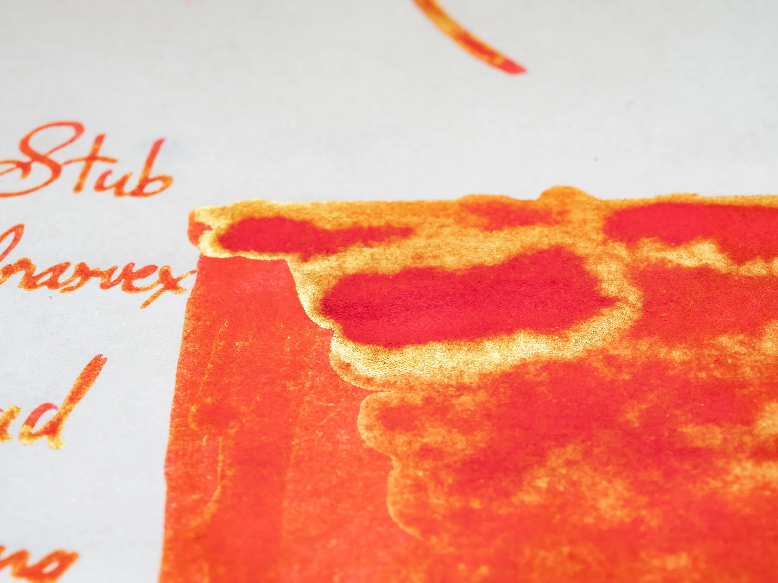
Benizakura is a very red extremely highly saturated ink.It mostly leans orange but when it is very light (which it rarely is) it can seem rather pink. You can see this in the smudge on the 1.1 Stub writing, some parts of the swatch and the water resistance and dry time smear. This type of red is very common among Sailor inks as well and I like to call it “Japan Red”because it isn’t far off the “156” official colour from 1995 here and it’s common amongst Sailor inks which is obviously Japanese. I wouldn’t over thin it… The ink is very wet, a gusher, and very smooth. There’s no bleeding or feathering. The dry time is pretty decent for such a wet ink on Tomoe River. The ink runs a lot with water and is completely non-resistant to water. Pink everywhere!
Diamine Wild Strawberry really doesn’t like Tomoe River; it’s quite strange! It’s almost as if the paper becomes hydrophobic; as if I’m writing on a non-absorbent plastic. Regardless! The colour of Wild Strawberry is too dark and too traditionally red (even if a little orange leaning). Sailor Ink Studio 730, Sailor Irori, and Kobe #11 are all almost the same as each other and Benizakura… Kobe #11 is a little more orange, Irori a little more pink and dark? It’s difficult to pick between Irori and 730 but probably 730.
Sheen
Shading
The sheen is very high! Not quite a super sheener but not far off! There’s a brilliant gold sheen on almost every part of the ink.
Only the drier “fine” nib shows any hint of shading. You can also see the pink peaking through here. Not a great shading ink though and no haloing.
Sheen Comparison
Diamine’s spotty sheen is a silvery-green sheen and is'n’t that similar. The three Sailors are all very similarly brilliantly gold. Irori possibly has the strongest sheen, and is probably the most similar because of that, a little behind 730.
Minireview on 80gsm White Rhodia
On Rhodia the ink is more plainly a brilliant orange-leaning red. Still Extremely saturated in colour. Still no feathering or bleeding and the water resistance still washes pink. Dry-time is decently moderate.
The chromatography shows the pink and orange colours that you can see in the ink at times. It starts with a pink that progresses to a red with bits of orange streaks.
Diamine Wild Strawberry is much is orange and still darker. Ink Studio 730 is very similar. Irori is a touch pinker and Kobe is a touch more orange - just as we suspected on Tomoe River but was difficult to tell because of all the sheen!
Sheen
Shading
Very little sheen on on Rhodia and what is there isn’t very shiny. It almost looks like orange parts of the ink itself rather than a sheen.
Still almost no shading. Possibly even less and only in the drier “fine” nib.
Sheen Comparison
Surprisingly, Diamine Wild Strawberry is the strongest sheener on Rhodia! Though there really isn’t much. All the sailors sheen (or lack there of) similarly to Benizakura.
Utamaro – “Portrait of Naniwaya Okita”
Ume murasaki takes its colour from the clothing of Okita who worked in the Naniwaya teahouse (and is clearly holding tea).
Minireview on 52gsm Ivory Tomoe River (Old paper)
Ume murasaki means plum purple. Plums here in Australia a much darker looking! The colour is a pink brown/beige/taupe. It reminds me of not-particularly-clean rose quartz. Easily my favourite from the set and a unique colour. The ink is moderately dry that leans wetter than drier - pleasant to write with. No feathering or bleeding. Water resistance is absolutely non-existent. Nothing there! Dry time is moderate for Tomoe River.
J. Herbin Rouille d’Ancre is a similar colour but lighter, less shading and more saturated. Robert Oster Hippo Purple is darker and a little more purple but has nice shading. Colourverse Hubble Zoom is darker, more purple and saturated.. J. Herbin the clear winner.
Sheen
Shading
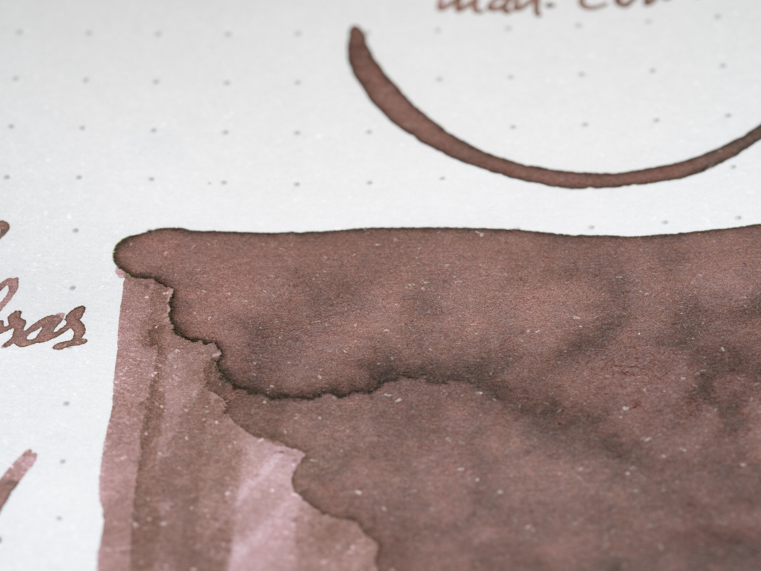
Technically there’s some dull green sheen on the swatch but in reality there’s no sheen present. The shading, however, is excellent and the haloing is amazing! The contrast isn’t super high but the frequency is and there’s a mix of sharp and smooth gradients. The haloing is very visible with the edges of many lines having a easily noticeably dark edge; love it!
Sheen Comparison
Little sheen on any of these, non on Rouille d’Ancre which would again make it the winner. Hippo Purple has a gull grey sheen (not very shiny sheen). Colourverse is also a rather dull sheen but a little more shiny and more noticeable.
Minireview on 80gsm White Rhodia
This ink probably presents the most differently between papers. On Tomoe River the ink shows much more pink but on Rhodia more yellow comes out and the ink is more tan looking as well as a little darker. Still no feathering or bleeding. Water resistance is slightly better? A hint of a line visible but I’d still classify this as non-resistant. Dry time is on the faster side.
Chromatography shows the pink of the ink at the start that progressively gets darker and dirtier before moving to a green-yellow and ending with a light saturated blue - a nice chromatography.
Rouille d’Ancre is much too pink and saturated but all the inks are too saturated on Rhodia! The purples are really coming out on Hippo Purple and Hubble Zoom. J. Herbin would have to be the choice but it’s quite different on Rhodia.
Sheen
Shading
There’s no sheen on Tomoe River and there’s, expectedly, no sheen on Rhodia. Shading, however, is still excellent with the same frequency and type of gradient as on Tomoe River but now the contrast is higher! Haloing is still lovely as well and very noticeable though not quite as much as on Rhodia.
Sheen Comparison
Essentially no shading on any of these!
Utamaro – “Three Beauties of the Kwansei Period”
Like Ume murasaki Usuzumi is based on the clothing of Naniwaya teahouse waitress Okita. Also in the photo is geisha Tomimoto Toyohina and Takashima Hisa. From the Three Beauties set of individual portraits and this three-person portrait.
Minireview on 52gsm Ivory Tomoe River (Old paper)
Utazumi is a a dark and deep colour with little colourful saturation. What colour is there is a teal colour with a lot of brown coming from the sheen making it a complex colour to see but I’d classify this as a black, just not a pure black. The ink is quite wet and nicely smooth to write with. No feathering or bleeding, as should be expected by now! The Dry time is very quick for Tomoe River and the water resistance is quite good with just some darkness washed away leaving a lighter but more colourful line.
Rohrer & Klinger Leipziger Schwarz is much too colourful and a little too bright but the hue isn’t that far off. Sailor Ink Studio 024 is a very similar ink but a little more saturated and green leaning. Kyo-no-oto No. 1 Nureba pro is a dark black that approaches that blackness from a blue colour - not that you can see this here. It’s all sheen. 024 would be the obvious pick here.
Sheen
Shading
The sheen is quite strong and is visible on most of the written lines. It is a coppery sheen that is a bit silvery.
There is a little shading which is nice to see. Not high contrast and the gradient is smooth but there’s shading even on the wetter nibs.
Sheen Comparison
Leipziger Schwarz has a little copper sheen but very little. Sailor 024 has a similar amount of sheen but is brighter and more silvery. Kyo-no-oto is all sheen! Again, 024 is the easy choice.
Minireview on 80gsm White Rhodia
On Rhodia the ink becomes darker, less saturated and more blue leaning. Still no feathering or bleeding (on any of the 16 inks from the Ukiyo-e collection!). The Dry time is again quick and the water resistance is still strong, even stronger than on Tomoe River.
Chromatography has a low saturation teal line with a dark line where it was written on. It gets less saturated and lighter and starts to introduce a low saturation pink that’s quite subtle. The edge of this is quite dark before ending in a vibrant turquoise.
Leipziger Schwarz is much darker on Rhodia and much less saturated. Not too far off but a little too dark and more green leaning. 024 quite similar again but a little more green leaning. You can see some of the blue in Nureba iro but it is much too dark. 024 again the obvious choice.
Sheen
Shading
This would have to be on of the sheeniest inks on Rhodia from either set. The coppery sheen, while subtle, is present on most written lines even the drier fine nib.
Shading is stronger on Rhodia with more contrast and frequency. The gradient is now a mix of sharp and smooth.
Sheen Comparison
Neither Leipziger Schwarz nor Ink 024 have much sheen to speak about on Rhodia though there’s a little more on 024. Nureba Iro has a similar amount of comparable sheen which would be the pick when going by sheen only!
Swatches of 52gsm Ivory Tomoe River (Old paper)
Swatches on 80gsm White Rhodia
The boxes for these inks are pretty large given the 40ml size of the ink and the correspondingly smaller bottle sizes. However, it shows off the artwork nicely so there isn’t too much to complain about! There’s a lovely aesthetic about all of these inks and packaging.
There’s a nice variety of more subtle colours, Benizakura notwithstanding, in this set. I’m a big fan of Ume murasaki with it’s lovely shading, strong haloing and a nice unique colour. I’m not a huge fan of Benizakura but I think I have a bias against it because of how often Sailor make similar coloured reds! I like Usuzumi as an alternative to a black (it’s almost a black). Similarly with Aomurasaki, which is more a dark grey, even if the colour isn’t for me personally. A nice set with a little more variety to it than the Hiroshige set.
Check out the overview of the first Ukiyo-e series based on Sharaku Tōshūsai here and Hokusai here with Hiroshige from this set here.
Thank you again to Desk Bandit for sending samples of these inks for review!
✒︎ ✑ ✒︎ ✑
I've listed all my inks and all my pens in their respective pages. Please let me know which inks you'd like to review next via the comments, Twitter, Instagram, or contact me directly.
For blog updated you can follow @macchiato_man on Twitter, subscribe via email, or like my Facebook page.
I received these stationery items free of charge for the purpose of giving an honest review. I was not otherwise compensated and everything here is my own honest opinion. There are no affiliate links. Nota bene: Desk Bandit are also a sponsor of this blog.


