

The Pilot Custom Heritage 91 is the middle of Pilot’s mid-range range of pens (and they have a pretty huge range) sitting between the Custom 74 and the Custom Heritage 92. Pilot somewhat recently revamped the colours of this line of pens with new colours. It’s a pen that should be one of the staple gold-nibbed mid-range cartridge converter pens but you don’t see it stocked as often as the 74 or 92!
Thanks to Bookbinders Design for sending this pen for review (and the other colour options for photos). I’ll be giving this pen away for Australians in the Fountain Pens Australia facebook group.
The previous colours of the Custom Heritage 91 were based on Iroshizuku inks: Tsuki-yo, Yama-budo, and Yama-guri as well as a Black and had the same colour throughout the pen. The revamped models have only three colours now with the two new Orange and a deep Blue. The Black (which is most of this review) has remained unchanged (at least in terms of colours). The Orange and Blue now also have black finials and sections. Usually I’m not that fond of this look (in particular on Sailor’s standard Pro Gear line) but it works nicely here, especially, in my opinion, on the blue!
Speaking of the Sailor Pro Gear, it is the pen that most closely resembles and competes with the Custom Heritage 91. Both are cartridge converter, gold nibbed pens with flat ends. As we’ll see the Custom Heritage 91 is longer than the full size Pro Gear but it’s also as thin as the Pro Gear Slim. Curiously, by default, the nibs available on the Orange and Blue Custom 91 are limited and more vanilla compared to the black as they only are intended to be available in F, FM, M, and B while the Black Custom 91 is available in those plus EF, SF, SFM, SM, and BB. Fortunately, Bookbinders Design, who sent this pen, are offering all the nibs on all the Custom 91 colours.
The Blue is a deep blue which leans more green than purple. It reminds me a little of Iroshizuku Shin-kai but possibly more saturated. The Orange isn’t a vibrant orange and is a little subdued and almost pink leaning. It’s more of a coral-orange than a mandarin-orange. All the pens come with only silver trim and the nibs are all silver trim (with no gold highlights).


The cap design, like the rest of the pen, is fairly traditional and it looks like a simple professional fountain pen. The cap has two bands, one thinner than the other, with “Custom Heritage 91 Pilot Japan” written around the thicker band. The clip attaches to another thin band before the flat finial. The clip itself is a what I’d describe as a diamond shaped droplet with PILOT written vertically at the top. There is also a metal band below the threads of the body where the metal part of the inside of the section allows the body to screw onto it.
The flat finial of both the cap and the barrel has a black plastic ’medallion’ that sits flat on top and inside the cylinder of the finial. This is a different approach to other flat ended pens which often have a single cup-shaped piece of plastic as the whole finial.
The filling mechanism is the unexciting cartridge/converter mechanism. The Custom Heritage 92 has a piston filler at a higher price. With the way I use fountain pens I appreciate the cartridge/converter system the most. I like to change inks often (I don’t always completely fill the converter; even these small con-50 converters!) so converters make it really efficient to clean the pen with a bulb syringe to be ready for the next ink. The obvious downside to a converter is the lower capacity but if that isn’t a requirement for you then I think the converter is the better system.
The Soft-Medium-Fine was the winner of a poll I put on my Instagram stories as well as on Fountain Pens Australia. I asked people which nib they were most interested in and these were the results:
SFM - 23%
SM - 22%
BB - 21%
SF - 12%
FM - 9%
EF - 4%
M - 4%
F - 3%
B - 1%
Almost no love for EF, M, F and B! Not surprising because many people know these nibs so the Soft nibs and the BB are more foreign and thus more interesting. A photo finish between the SFM, SM, and BB.
The Soft-Medium-Fine 14k nib is Pilot #5 nib (n.b. this is Pilot’s nib-size number scheme not the more standard #5 found in Bock or JoWo made nibs). It’s decently smooth but still has some very acceptable feedback to it. I don’t believe the nib should not be thought of as a ‘flex’ nib’. It does flex a little and does offer some line variation but I’d be cautious to push it far as it feels to me like a nib that would be a little easy to push it too far. Where the soft works to great affect is with the bounce you get when writing. The softness makes the writing experience really pleasant with each stroke. This is what you should expect from a Pilot Soft nib. I got no hard starts or any other issues with this nib.
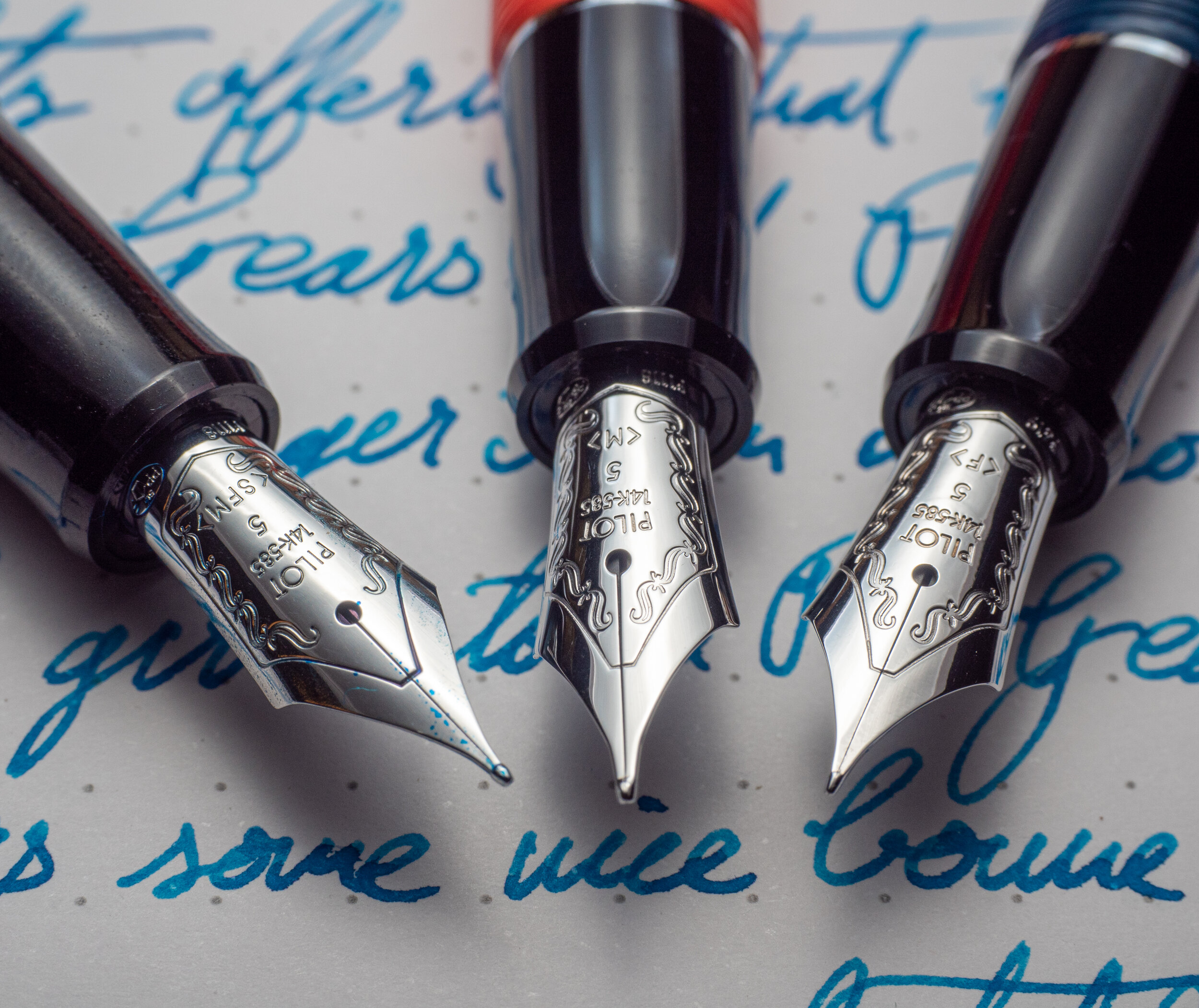
The nib is missing two etchings compared to the non-soft nibs close to the tip. I presume this is because the metal is thinner to allow the softness and having the etching as well as thinner metal might cause a weekness in the nib.
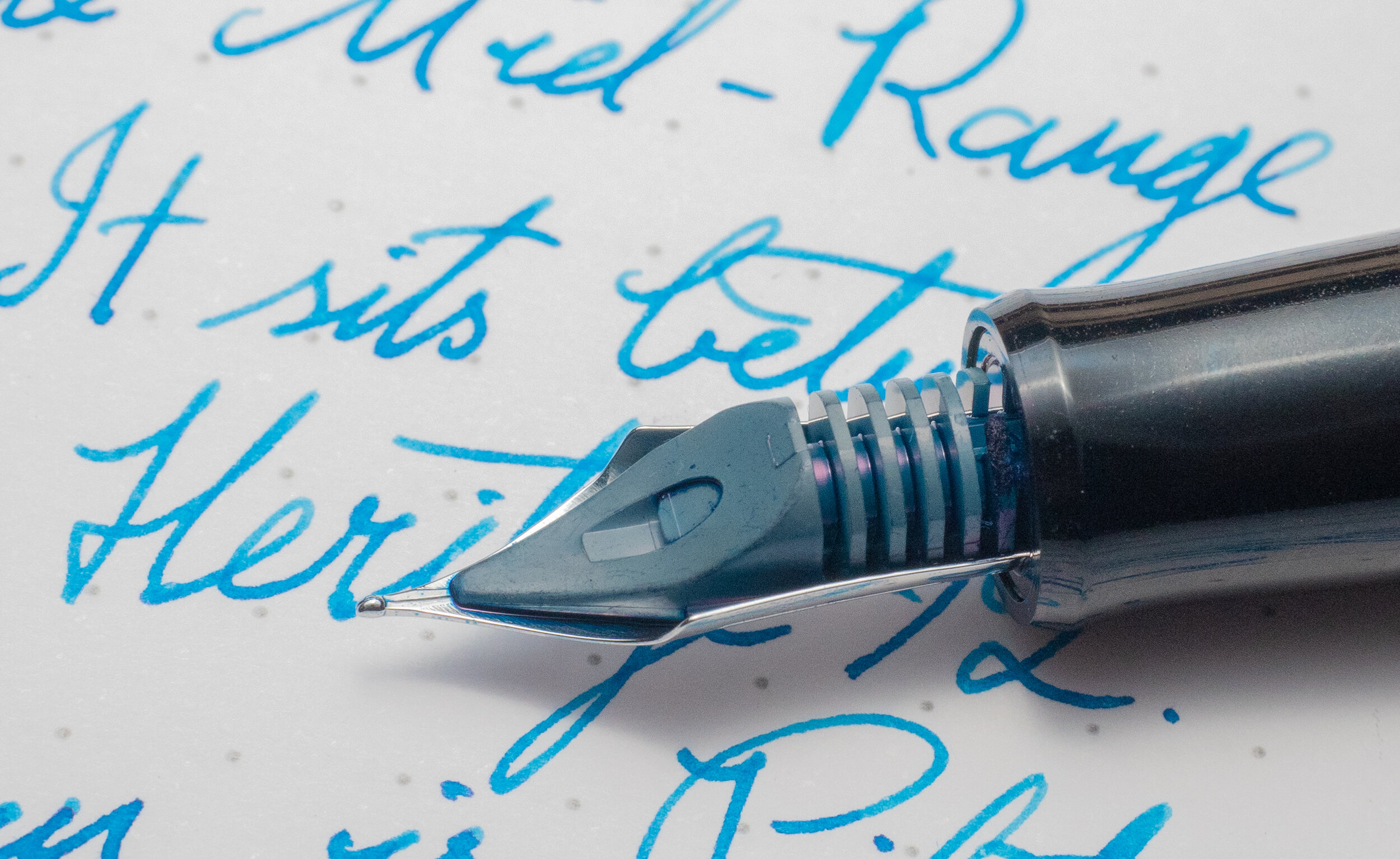
The feed is relatively uninteresting standard Pilot #5 nib feed. It’s a bit chunky, especially the fins. I’ve had some Pilot pens feel a little ink starved (all have been Broad nibs) but this pen is very pleasantly wet and there’s no bottle neck or starvation; just good flow.
I don’t have a Pilot Medium nib to compare but the Custom Heritage 91’s SFM nib (without any extra writing pressure) is a little thinner than the Myu 701 FM that I have and noticeably thicker than the Pilot Fermo’s F (expectedly). It’s comparable to the middle of the three Sailor Pro Gear MFs (the other two being a little thinner) as well as the Lamy Safari. It’s definitely thinner than the Aurora Optima M. When some pressure is added the SFM definitely bumps to something closer to a broad.
The pen feels relatively long but also relatively thin. The whole pen, including the section has a girth variance of only 2.1mm so while it is a relatively thin pen it’s fairly flat and, I think importantly, the section isn’t too thin and remains comfortable to hold. I find, for example, the Parker Duofold International’s 8.7mm section (at it’s thinnest point) to just be too thin in my hand but this 9.7mm is not (also the dip is more gradual on the Custom Heritage 91 compared with the Parker).
| Capped | Uncapped | ||
|---|---|---|---|
| Pilot Custom Heritage 91 | 18.5g | 11.5g | |
| Sailor Pro Gear | 24-25.9g | 15.7-16.4g | |
| Sailor Pro Gear Slim | 19.6g | 12.4g | |
| TWSBI Eco | 20.8g | 12.3g | |
| Lamy Safari | 20g | 11g | |
| Lamy 2000 | 26g | 17.1g | |
| Platinum Century #3776 | 25g | 14g | |
| Montblanc 146 | 29.8g | 19.9g |
| Capped | Uncapped | ||
|---|---|---|---|
| Pilot Custom Heritage 91 | 13.6cm | 12.3cm | |
| Sailor Pro Gear | 13cm | 11.6cm | |
| TWSBI Eco | 14cm | 13.2cm | |
| Lamy Safari | 14cm | 13cm | |
| Platinum Century #3776 | 14.1cm | 13.2cm | |
| Montblanc 146 | 14.3cm | 13cm |
Left to right: Pelikan M805, Pilot Custom Heritage 823, Pelikan M200, Sailor 1911 Slim, Pilot Custom Heritage 91, Sailor Pro Gear, Lamy Safari, Montblanc 146, Lamy 2000, TWSBI Eco.
Left to right: Pelikan M805, Pilot Custom Heritage 823, Pelikan M200, Sailor 1911 Slim, Pilot Custom Heritage 91, Sailor Pro Gear, Lamy Safari, Montblanc 146, Lamy 2000, TWSBI Eco.
At 13.6cm capped and 12.3cm the pen is longer than the Pro Gear (and feels longer even though the difference is only 7mm) and shorter than the TWSBI Eco and Lamy Safari. These are thicker and bulkier pens as well. The Platinum Century #3776 is also longer but this pen has the rounded finals that add length which the Pilot Custom Heritage 91 doesn’t have.
The Custom Heritage 91 is also surprisingly light. It’s as much as 7.4g heavier than the shorter Sailor Pro Gear and even lighter than the shorter and comparably thin Pro Gear Slim. This pen is a bit of a featherweight!
I chose Pilot Iroshizuku Kon-peki to review the pen with because it really is a staple of inks in general and the Iroshizuku line more specifically. Plus the inks should definitely work best with the pen!
The pen is a traditional looking pen with a slender and light figure. It has a good variety of nib options (by default only on the black, but Bookbinders Design is offering that variety over all three colours). The simplified colours work well with the black accents and silver trim (I don’t think gold would look as nice with these colours and my normal preference is for gold trims!). If you like Sailor’s slim pens then this pen should feel just right for you. My personal preference is for pens with a little thicker girth so for me I love the Pilot Custom Heritage 823 but I don’t find this uncomfortable at all. The price of these pens is also fairly affordable (and cheaper than the comparable Sailor Pro Gear or Pro Gear Slim). As of this writing they are on sale at Bookbinders Design for AU$216 (US$146/€132) and are usually AU$288 (US$195/€177).
Thanks again to Bookbinders Design for sending this pen for review (and the Blue and Orange pen for photos). If you are based in Australia (sorry to everyone else!) be sure to check out and keep an eye out within Fountain Pens Australia on Facebook to enter the competition to win this excellent pen!
✒︎ ✑ ✒︎ ✑
I've listed all my inks and all my pens in their respective pages. Please let me know which inks you'd like to review next via the comments, Twitter, Instagram, or contact me directly.
For blog updated you can follow @macchiato_man on Twitter, subscribe via email, or like my Facebook page.
I received this pen free of charge for the purpose of giving an honest review. I was not otherwise compensated and everything here is my own honest opinion. There are no affiliate links. This pen will be given away in a competition.