• Blog
  • About
    • My Inks (on Fountain Pen Companion)
    • My Pens
  • Archive
  • Contact
Menu

Macchiato Man

  • Blog
  • About
  • My Collection ☟
    • My Inks (on Fountain Pen Companion)
    • My Pens
  • Archive
  • Contact
The @madebyendless Cotton Wallet arrived the other day! I’m a sucker for these sorts of practical inserts for notebooks. The cotton fabric suites the simple style of the Explorer. 
⠀
While I love these and always get them whenever I can I never
First test of the Regalia paper in the Endless Explorer than I was sent by @madebyendless. Really impressed by the paper. Very smooth, nice sheen and nice shading! Finger prints or hand oil seem to affect the writing a little but nothing out of the o
New Pen Review: Esterbrook Camden (Premium Edition) - 𝙻𝚒𝚗𝚔 𝚒𝚗 𝙱𝚒𝚘!

I’ve been eager to try the Camden for a while now. I love my flat end pens and the overall shape of this one is subtly unique. While there are some differences between
New friend from @esterbrook_official! Camden Manitoba Blue. 
⠀
Love flat end pens so looking forward to digging into this (so review incoming).
 
Flat or round ends?✑
⠀
⠀
⠀
⠀
#fountainpen #fpgeeks #fountainpenaddict #fpn #fountainpengeeks  #fountainp
New Ink Review: @birminghampens Antique Sepia (link in bio)
⠀
In line with the recent trend of soft pastel dichromatic inks but Birmingham’s version is an interesting dust grey version with low saturation that I find quite interesting don&rsquo
New Ink Day! Haven’t had one of these for a while but I received these from a friend at the last Perth Pen Meet. 
⠀
All sailor and the first tall bottle in a while (bringing the number of those to 86). 
⠀
Didn’t realise it at the time but
New Ink Review: La Couronne du Comte Vert Sapin (link in bio)
⠀
The final of LCdC’s initial set of four exclusive inks from Diamine. A lovely rich sheeny green-teal.
✑
⠀
⠀
⠀
⠀
#fountainpen #fpgeeks #fountainpenaddict #fpn #fountainpengeeks  #fo
I don’t know if I’ve ever shared this before but my city has a set of five dip nibs as an artwork. 

They are called “Memory Markers” by Anne Neil and represent early-ish colonial stories of the gardens where they are.

We als
⚠️Update: Why I have been so radio silent! 📻🤫 A lot of large personal changes, essentially (read on for details)!

There have been three main reasons for why I haven’t been able to do much here or on my blog. 

1) 🎓 I had to finish of my Mas
Ink Ink Comparison: Discontinued Iroshizuku and New Iroshizuku! Thanks to @penclassics for allowing this to happen. See link in bio!
⠀
The old: Tsuyu-kusa, Tsukushi, and Ina-ho.
The New: Sui-gyoku, Hana-ikada, and Hotaru-bi.
⠀
This is a long review b
NPD: @esterbrook_official LE Estie “Candy” in Oversize with a Kirk Speer Needlepoint nib!
⠀
Thanks to Esterbrook for sending this through to me for review. I’ve reviewed a couple of Esties now and two of the custom nibs (which are a
Out with the old in with the new?

I just received the new Pilot Iroshizuku Inks in the little bottle ink pack from @penclassics for review. I plan on doing an overview review of the three new and the three old ones!

I feel like Ina Ho was quite a u
New Pen Review (see link in bio): Platinum Curidas courtesy of @penclassics (check them out!)
⠀
This is certainly a curiously designed pen with it's quirks but it has bee a delight to write with and a great pen to through in a pocket. I've been using
New Ink Review! @wearingeul_global Kyonghui! See link in bio!

Kyonghui is a vibrant earthy orange from Wearingeul's series on Korean Female Modern Writers. It is also a great performing ink!

Wearingeul's global push is fairly new; has anyone tried
It has been a little while since I posted here so I thought I'd give a little update!

Firstly I think I just needed a little break at the end of the year! It has been a busy year for me. I have been taking my photography more seriously and I also ha

Subscribe

Sign up with your email address to receive news and updates.

We respect your privacy. Unsubscribe at any time.

Thank you!
Blog RSS

☛ Twitter feed

✉ Email Subscription

☞ Fountain Pens Australia (Facebook Group)

☛ Sailor Pens & Inks (Facebook Group)


Sponsors

10% off code: MACCHIATOMAN


Click here for sponsorship information


Featured Posts:

Featured
Ink Review: Pennonia Pokoltuz (Pokoltűz)
Aug 1, 2019
Ink Review: Pennonia Pokoltuz (Pokoltűz)
Aug 1, 2019
Aug 1, 2019
Notebook Review: Pebble Stationery Pocket Tomoe River Notebook
Nov 10, 2018
Notebook Review: Pebble Stationery Pocket Tomoe River Notebook
Nov 10, 2018
Nov 10, 2018
Ink Review: Krishna Brown Pink
Jan 20, 2018
Ink Review: Krishna Brown Pink
Jan 20, 2018
Jan 20, 2018


Archive
  • November 2024
  • October 2023
  • December 2022
  • October 2022
  • June 2022
  • May 2022
  • April 2022
  • February 2022
  • January 2022
  • December 2021
  • November 2021
  • October 2021
  • September 2021
  • August 2021
  • July 2021
  • June 2021
  • May 2021
  • April 2021
  • February 2021
  • January 2021
  • December 2020
  • November 2020
  • October 2020
  • September 2020
  • August 2020
  • July 2020
  • May 2020
  • April 2020
  • March 2020
  • February 2020
  • January 2020
  • December 2019
  • November 2019
  • October 2019
  • September 2019
  • August 2019
  • July 2019
  • June 2019
  • May 2019
  • April 2019
  • March 2019
  • February 2019
  • January 2019
  • December 2018
  • November 2018
  • October 2018
  • September 2018
  • August 2018
  • July 2018
  • June 2018
  • May 2018
  • April 2018
  • March 2018
  • February 2018
  • January 2018
  • December 2017
  • November 2017
  • October 2017
  • September 2017
  • August 2017
  • July 2017
  • June 2017
  • May 2017
  • April 2017
  • February 2017
  • January 2017
  • December 2016
  • November 2016
  • September 2016
  • August 2016
  • July 2016
Logo 3.png

Sailor Ink Studio Overview (100 inks) (Updated 2020)

January 30, 2019 in Paper Review, Ink Comparison

I purchased my set of Sailor Ink Studio inks (all 100) from Pen Classics in New Zealand. These Ink Studio 100 are based on the Ink Studio custom inks blended by Ishimaru that are held at events around Japan throughout the year. These 100 are chosen, somehow, from the the the thousands of custom blends that people have asked the inkmeister at these events to make for them. As for the numbering, there is certainly patterns about them and they aren’t randomly numbered.

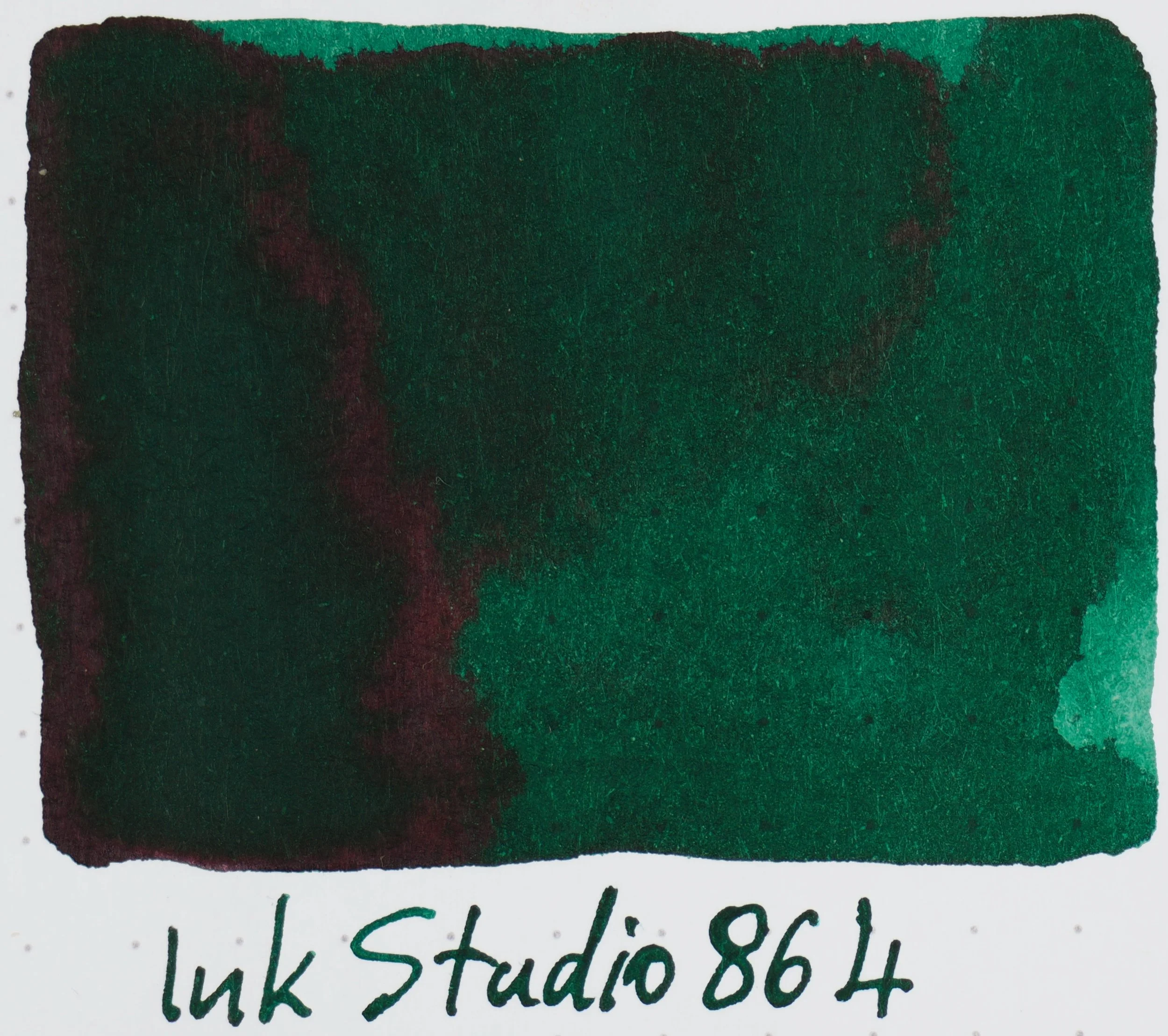
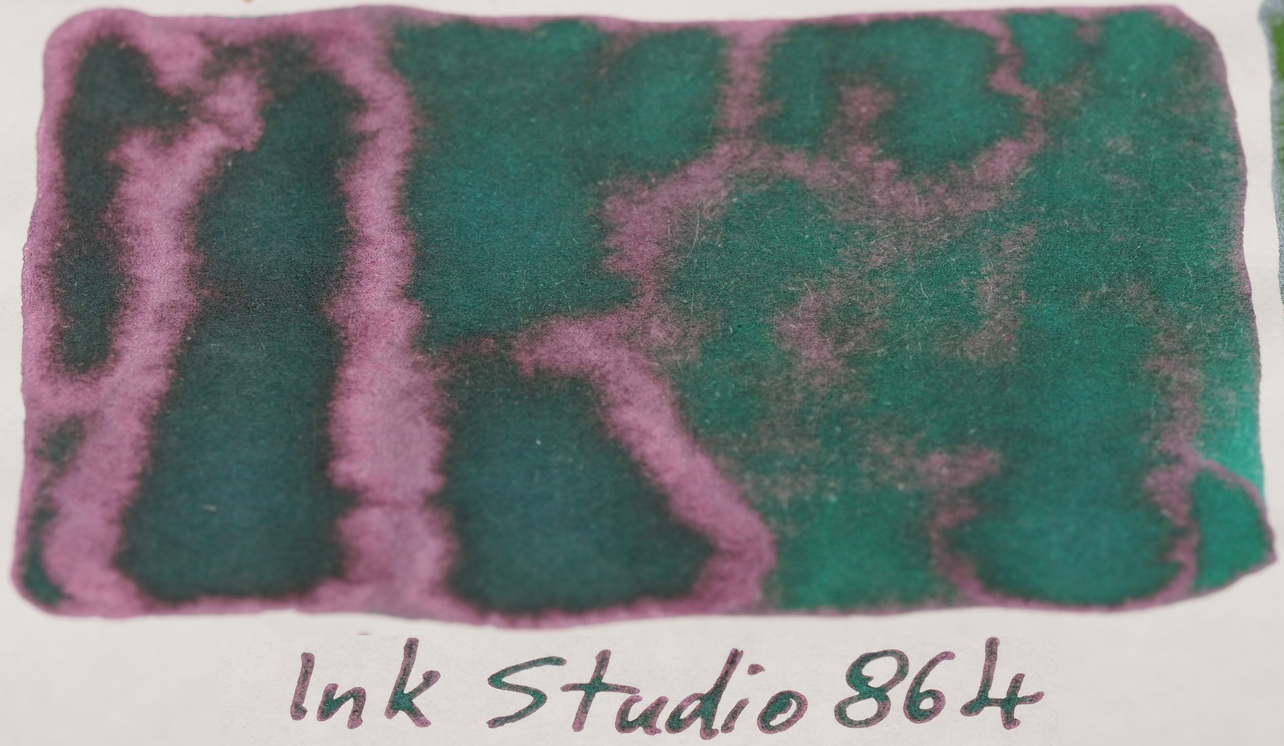
UPDATE: Sailor has retired Ink Studio Nos. 543, 531, and 864. They have replaced these three with new Nos. 224, 252, and 280 (now included)

023-973

402 photos were taken for this overview and I had to adjust nearly every ink swatch and writing sample so this overview has probably taken the most hours to produce of anything on here. I would like to state the the full-page photos (like the one immediately bellow) are not quite as accurate nor are they as high a quality photo as that of the individual photos of each ink. While I will be using the full page photos for commentary I recommend looking at the individual photos of inks you are interested in. Also, photos of sheen have not been edited for ink colour accuracy (so only use the individual swatch photos for that). Swatched have been done for each ink on 52gsm Ivory (white) Tomoe River paper and 80gsm White Rhodia paper.

In 2020 Sailor retired Ink Studio Nos. 543, 531, and 864 and replaced them three with new Nos. 224, 252, and 280 (included below).

Curiously each ink comes with a sticker, the purpose of which is to stick on and wrap around a converter (which you can see in the third picture on Sailor’s landing page for the inks). Obviously this means I need 100 Sailor Pens, right? 88 to go I guess…

Number patterns and colours

Each ink is represented by a 3 digit number ranging from 023 to 973. There are of course 899 numbers missing from a linear range of numbers and this is presumably due to that the 100 were subjectively chosen (of the 999 presumably available numbers) and that there is certainly a pattern involved in the numbering.

While I’m not completely sure what the first number actually represents (or any with complete specificity) in effect it generally represents saturation and dye content. I do not believe it represents sheen or darkness but depending on the colour being represented, a higher saturation of dye content in the ink will often translate to a darker ink with higher sheen. An exception for this seems to be the “0” number range which only accounts for three inks all of which are somewhat black (so are naturally have to be highly saturated with dye).

As for the first digit there are:

  • Three “0”s

  • Twelve “1”s (these are easily the palest)

  • Eleve “2”s

  • Seven “3”s

  • Fourteen “4”s

  • Seven “5”s

  • Ten “6”s

  • Sixteen “7”s

  • Eight “8”s (I can’t help but imagine the eight “8”s was deliberate!)

  • Twelve “9”s (each iteration from “1”s have consistently become less pale and more saturated in colour

As for the second digit, “0” and “1” aren’t used at all and neither is “9”. The following is my own interpretation of the patterns (which do seem to become a little arbitrary towards the latter pages): “2” seems to represent blacks and grey-is colours (of various base colours); “3” seems to be reds, pinks and magentas as well as magenta leaning purples; “4” is consistently blues; “6” is greens and teals; “7” is oranges, yellow or orange browns, and yellows; and 8 is only used for 680 and 683 which are dark browns that approach brown from a redder base.

Some of these numbers are more consistent than others for example #40, #41, and #43 (where # represents different first digits) are consistently a more neutral blue, a slightly teal leaning blue and a slightly purple leaning blue, respectively. #64 is consistently a teal to some degree, #60 is a neutral green, and #67 is a yellow green of some sort. #30 is consistently redder in colour than #31 but each instance of each of these two colours has some variation in it; they aren’t just more saturated; for example 531 has noticeably more blue in it than other iterations of the #31 colour and 530 is noticeably more orange than other iterations of the #30 colour.

As for the third digit, I’m not entirely sure what this is. I’m not sure what the pattern is here but as mentioned above with #40, #41, and #43 there are consistencies and there is certainly a vague pattern. ##0 might represent a neutral version of that general colour as #30 seems to mostly represent a more neutral red like colour, #40 seems to mostly represent a more neutral blue like colour and #60 does represent a mostly neutral green colour. But while ##3 represents a purple leaning blue in #43  in #73 they seem to vary quite a lot. I’d definitely be interested in hearing if anyone has any theories for the third digit.

So how many of each colour? This obviously is a little subjective where you put what but this is what I came up with:

  • Black/Grey - 6

  • Blue - 14 (-1 2020 update)

  • Light Blue - 6

  • Dark Blue - 3

  • Teal - 8 (-1 2020 update)

  • Green - 11

  • Light Green - 3

  • Dark Green - 1

  • Yellow - 3

  • Brown - 7

  • Orange - 3

  • Red - 4

  • Deep red - 3

  • Pink - 7

  • Magenta - 2 (-1 2020 update)

  • Purple - 7

  • Light Purple - 3

  • Dark Purple - 5

  • Dual-colour - 4 (+3 2020 update)

That’s 23 “blue” inks out of 100 and that’s not counting teals or purples that lean blue. There are a few greens but overall this is heavily dominated by blues (which is fine by me as I love blue!) and they are all different at least.

Tomoe River 52gsm Ivory (white) paper

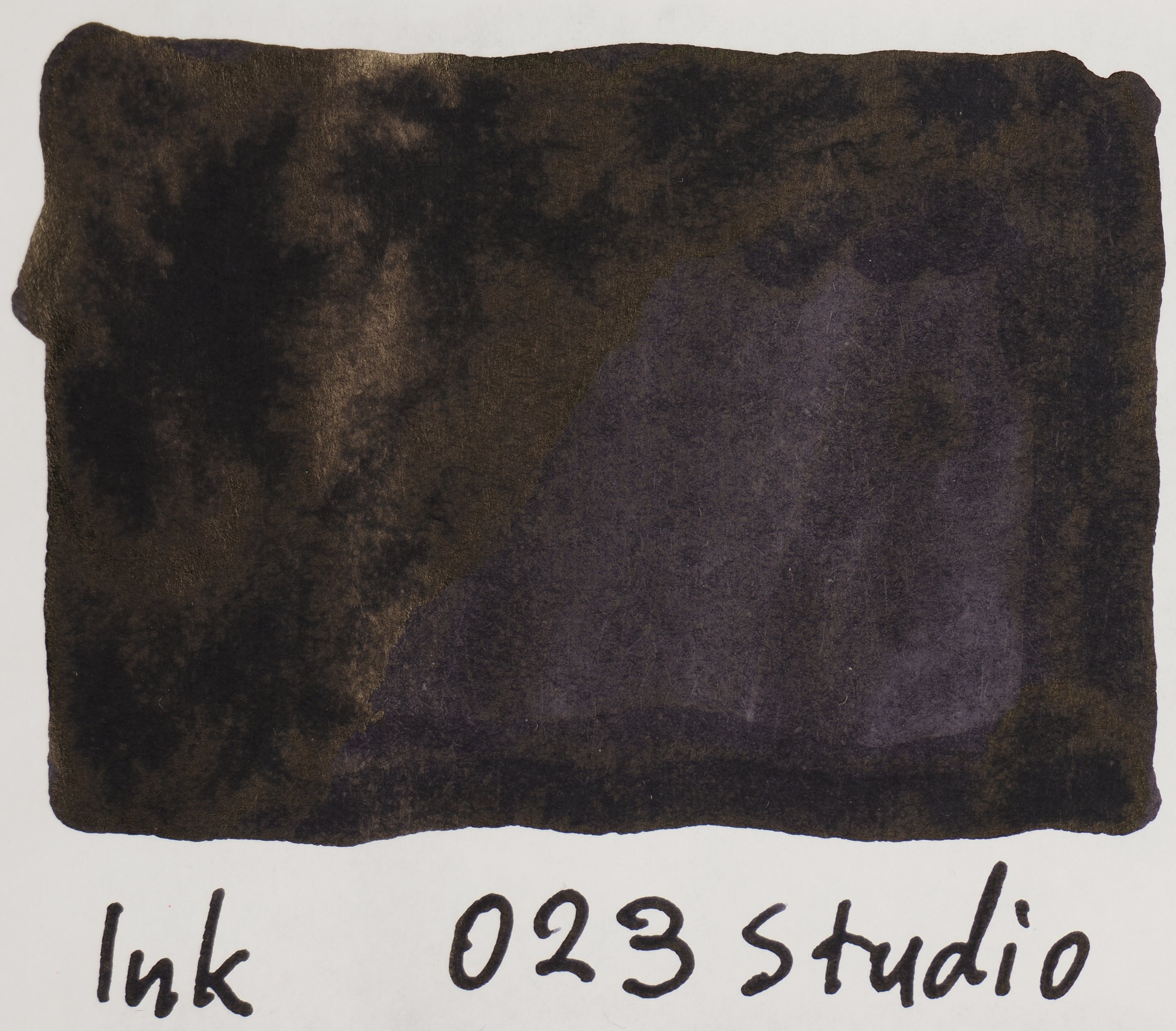
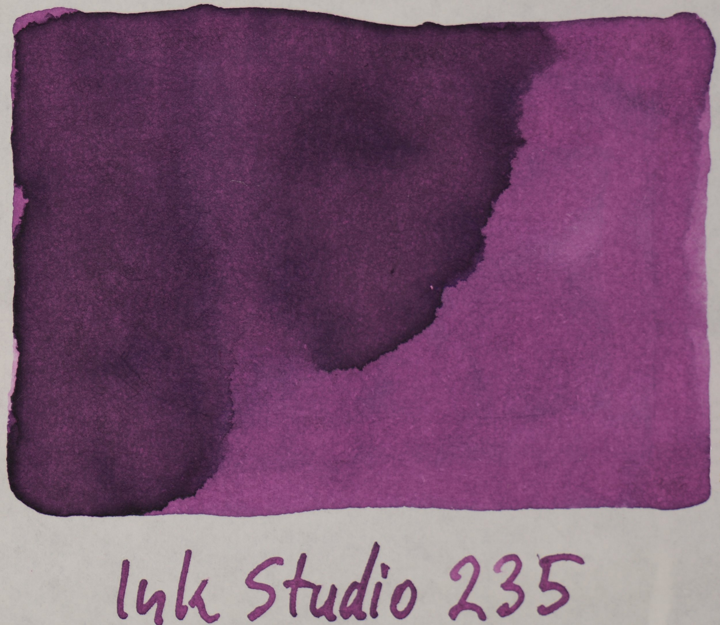
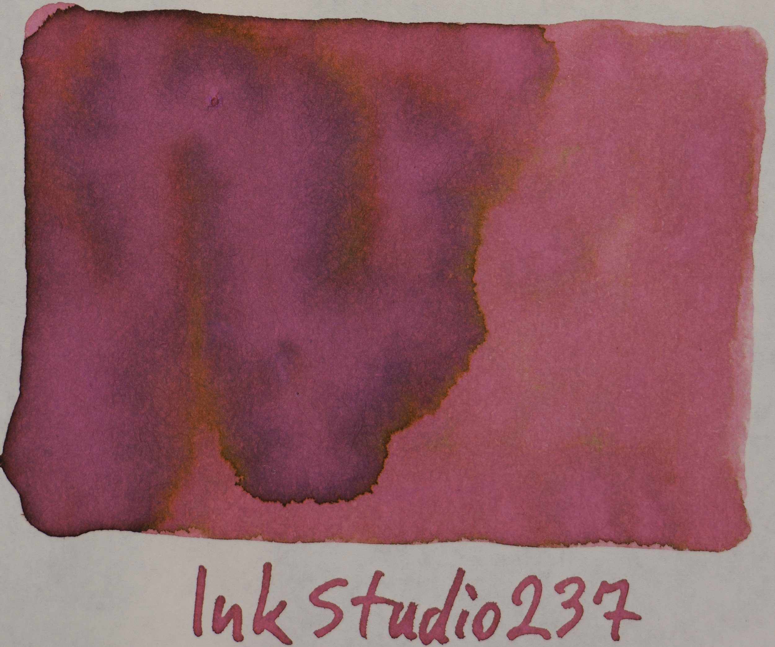
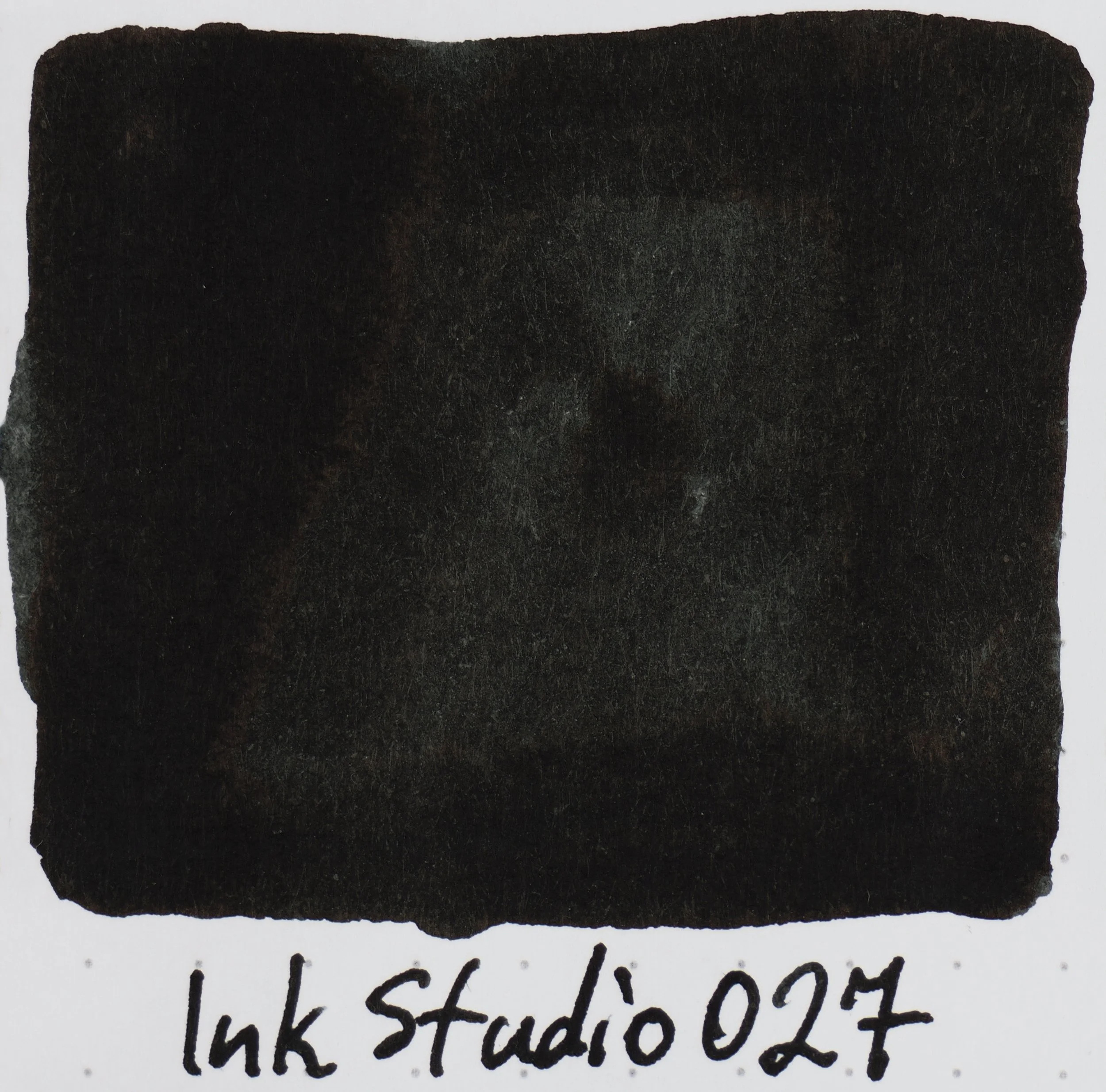
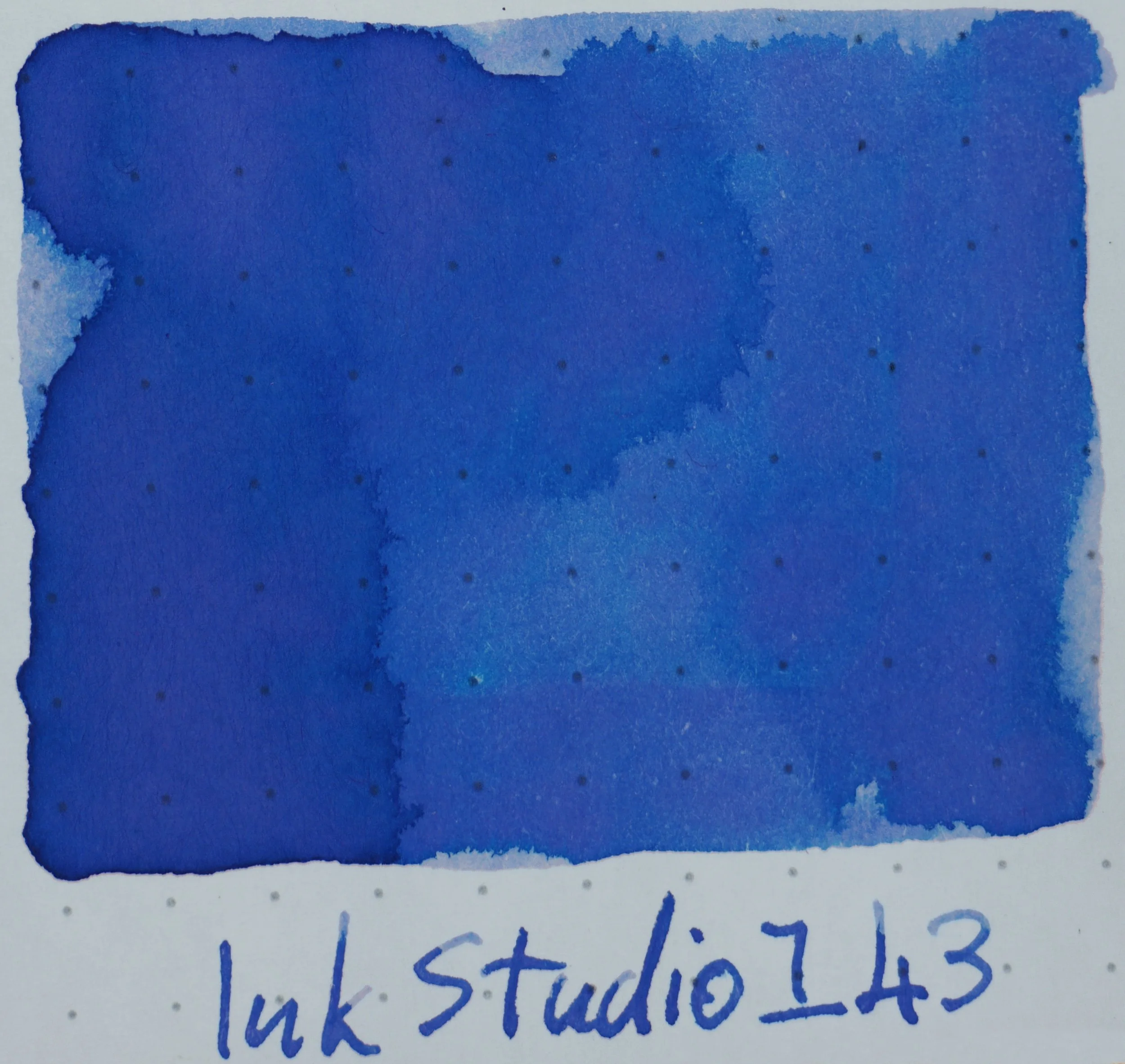
Tomoe River Ivory(white) 52gsm 023-237

On the first page you get the only three “0” inks. Three “black” inks that approach black from a purple, blue and green base colour. Within this first page we get most of the inks that have the now famous dual-colour affect to them. 123 is a pinkish grey ink with green highlights and 162 is a greenish grey ink with pink highlights. 223 is a dark grey greenish ink with pink highlights. 237 is a pink with brown parts to it and 173 is a pink ink with orange highlights. 150 is a lavender with some blue highlights and 143 (and to a lesser extent 140) are blues with a subtle pink undertone. There is only a hint of gold sheen on 130 as well as some silvery sheens on the “0” inks but otherwise this is a pastel-like page with limited saturation and sheen.

The 2020 additions

UPDATED: The 2020 additions to the set are all dual-colour inks. 224 is a pink ink with green edges, 252 is a more saturated pink ink with a teal edge. 280 is a brown-orange-yellow ink with lovely green edges! The dual-colour characteristics is much more prominent on Tomoe River and the inks change colour a little on Rhodia. There is no sheen on Tomoe River

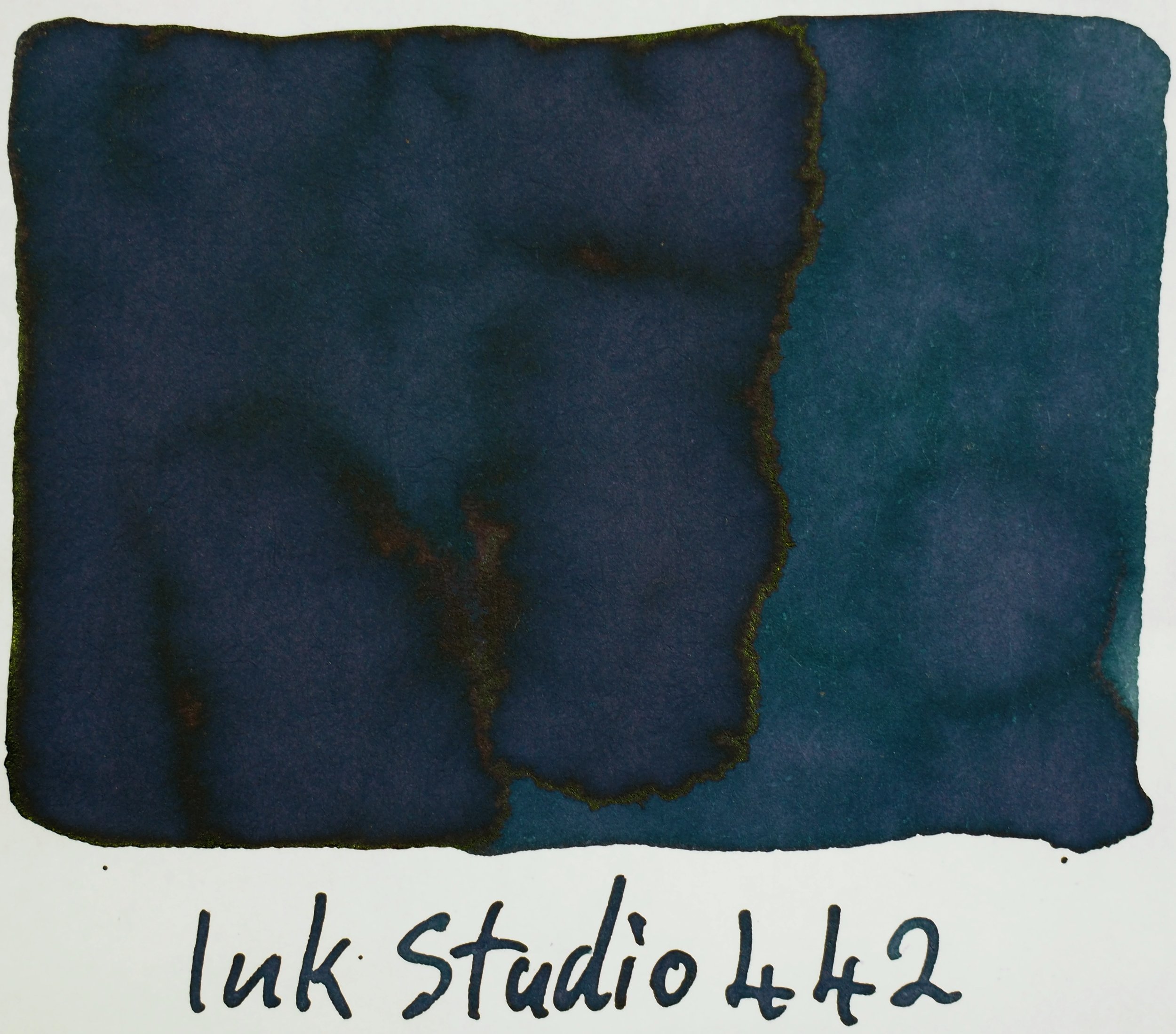
Tomoe River Ivory(white) 52gsm 240-443

The inks on page two are darker and clearly have a higher dye content but aren’t very vibrant and are on the greyer duller side. 264-373 are all somewhat dull inks whereas the first page were pastel-like inks. 431 onwards are certainly starting to quickly get ore vibrant!

273 is an interesting tan coloured ink more yellowy-brown in some areas but with pink hints in others. 373 is similar but with some green in there. 425 is a lovely rich magenta leaning purple.

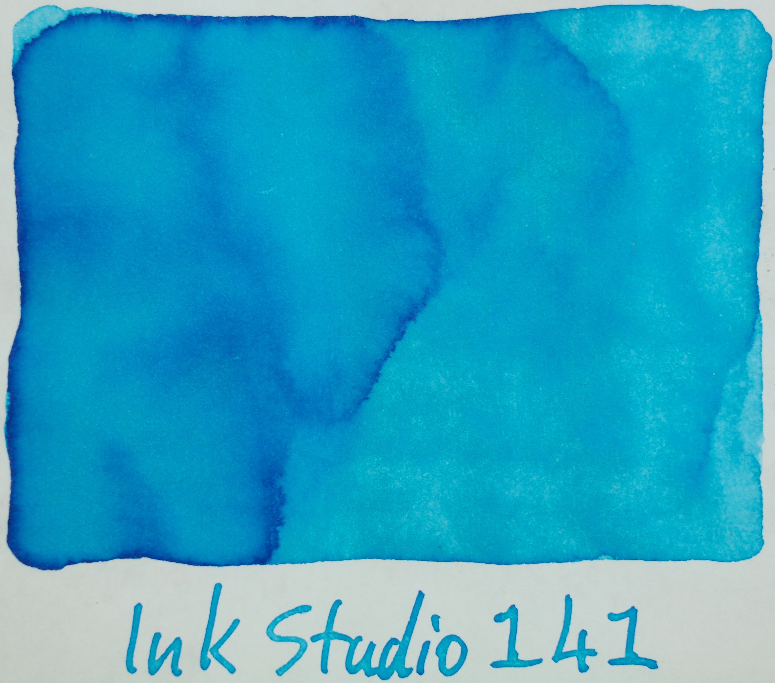
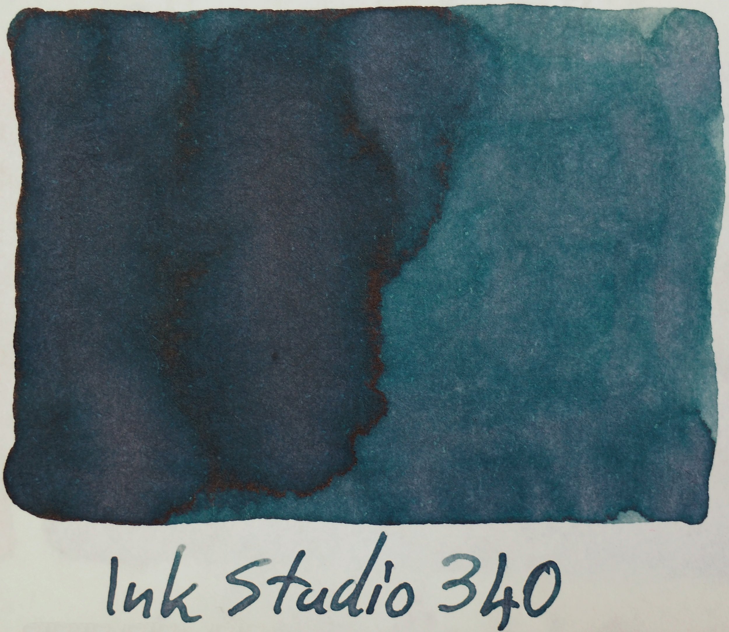
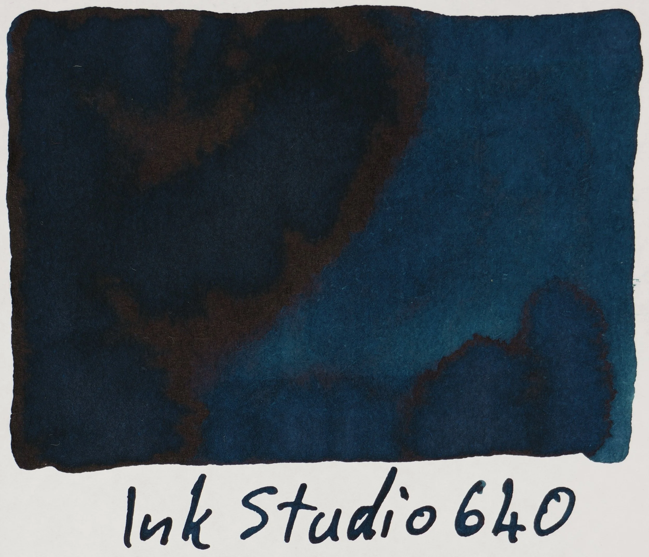
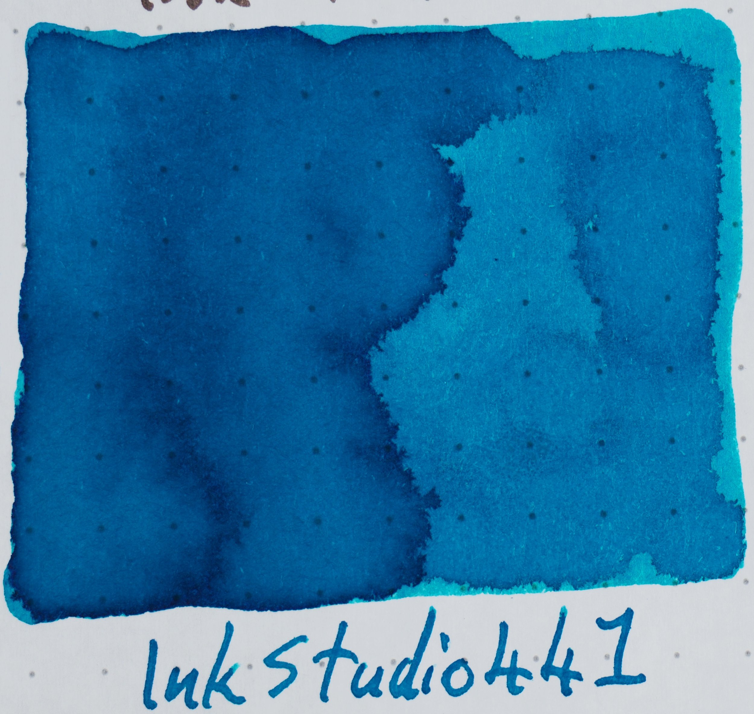
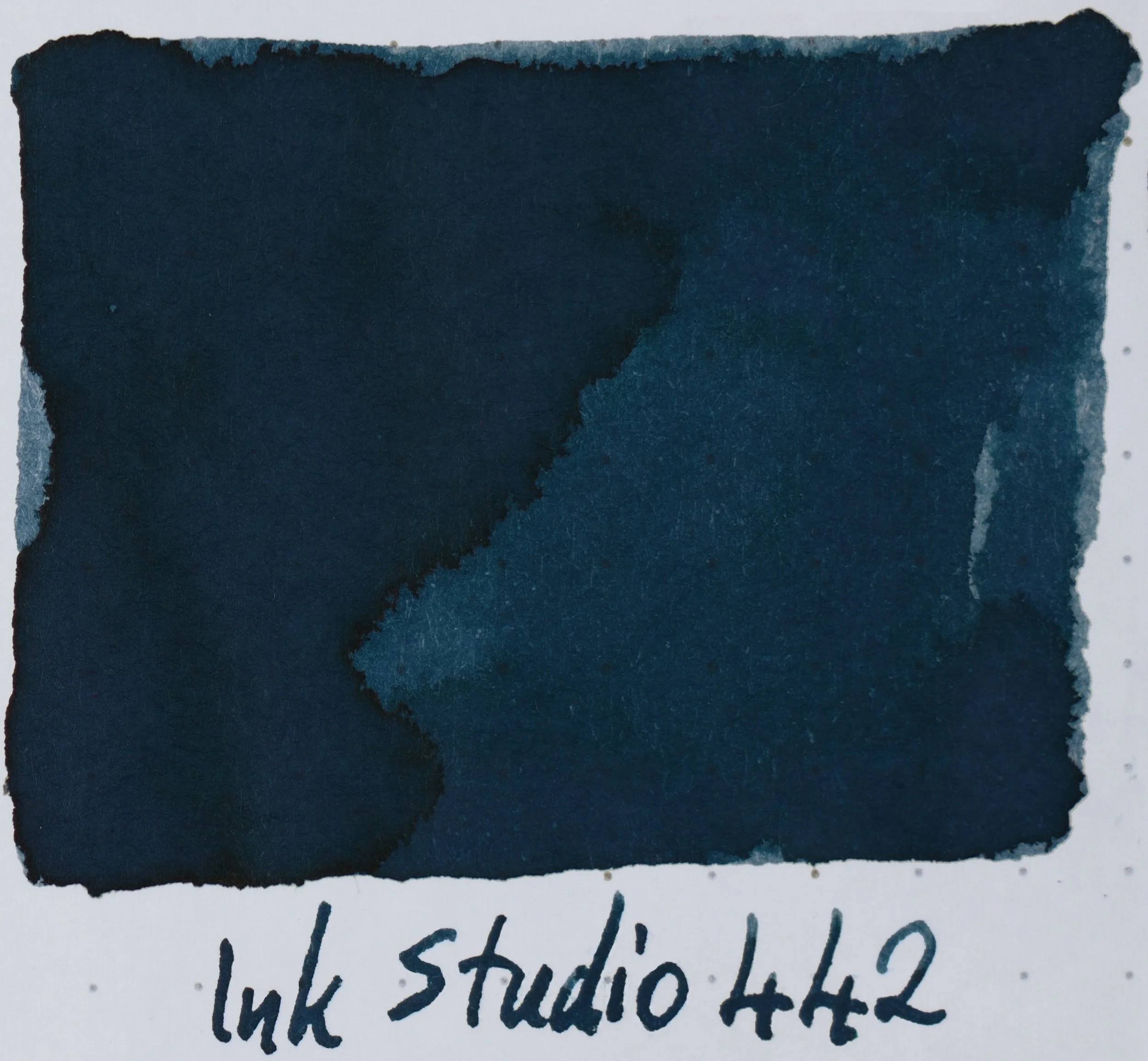
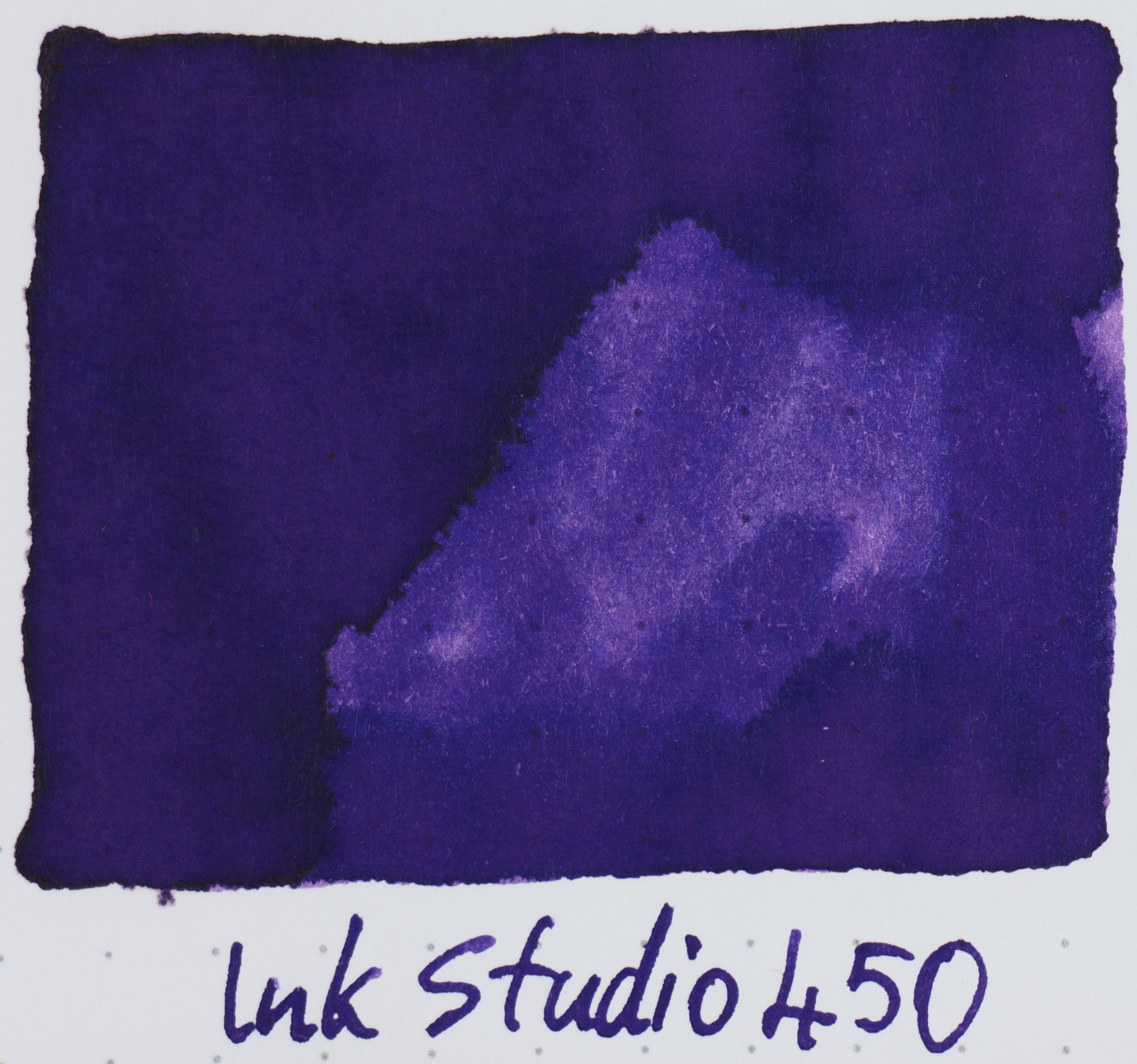
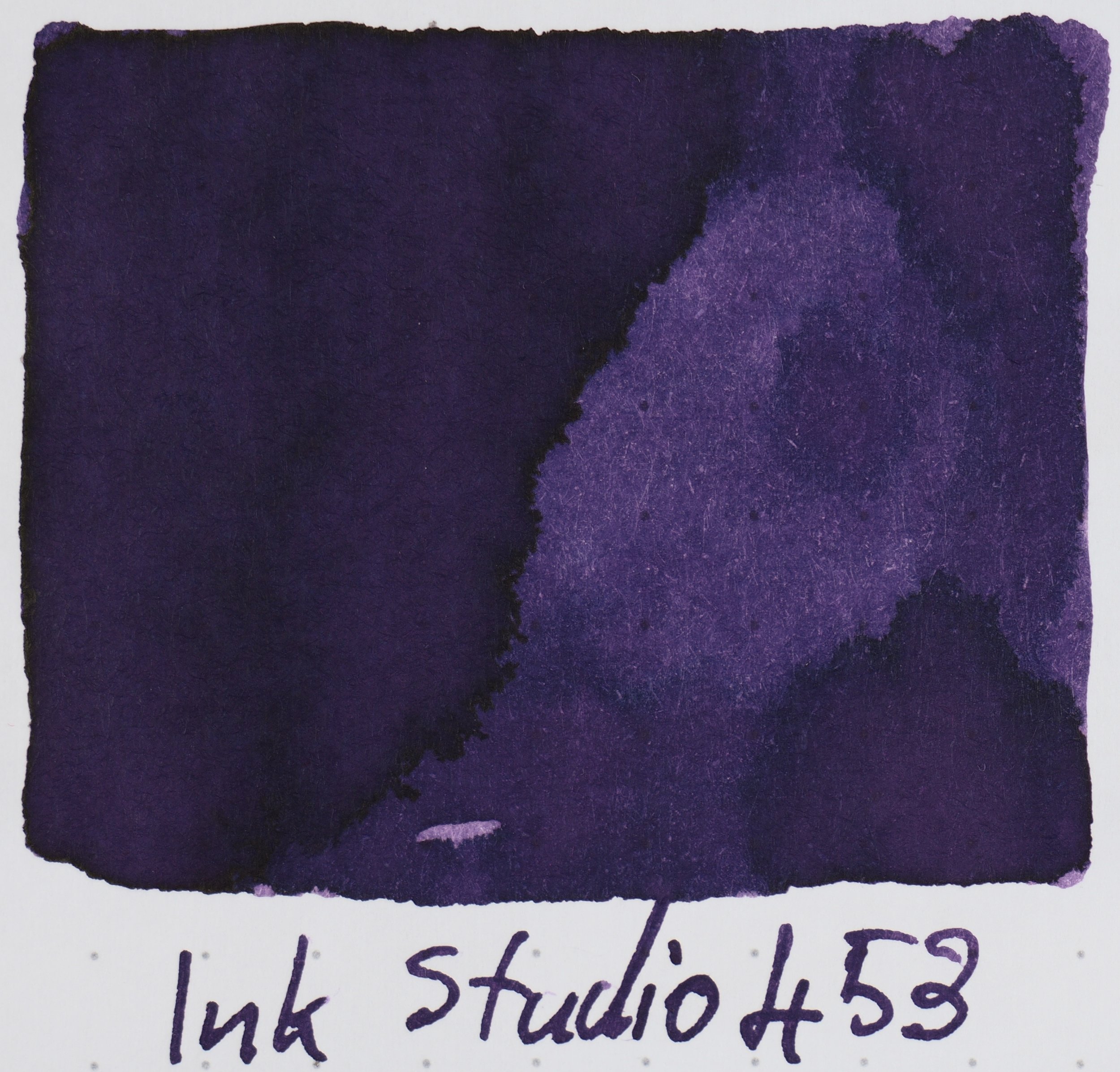
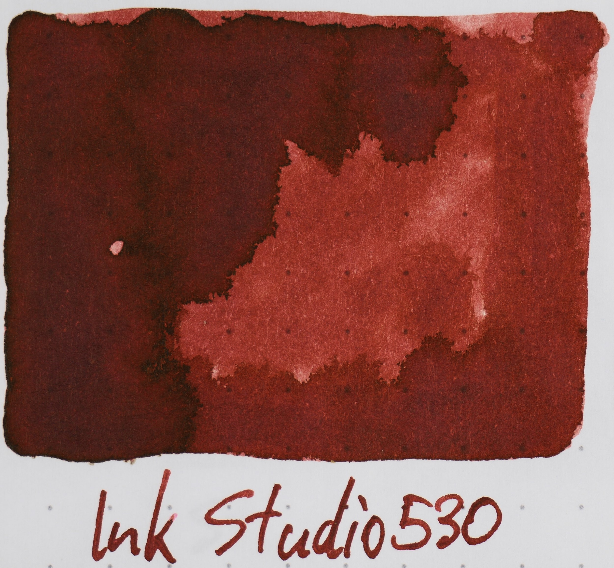
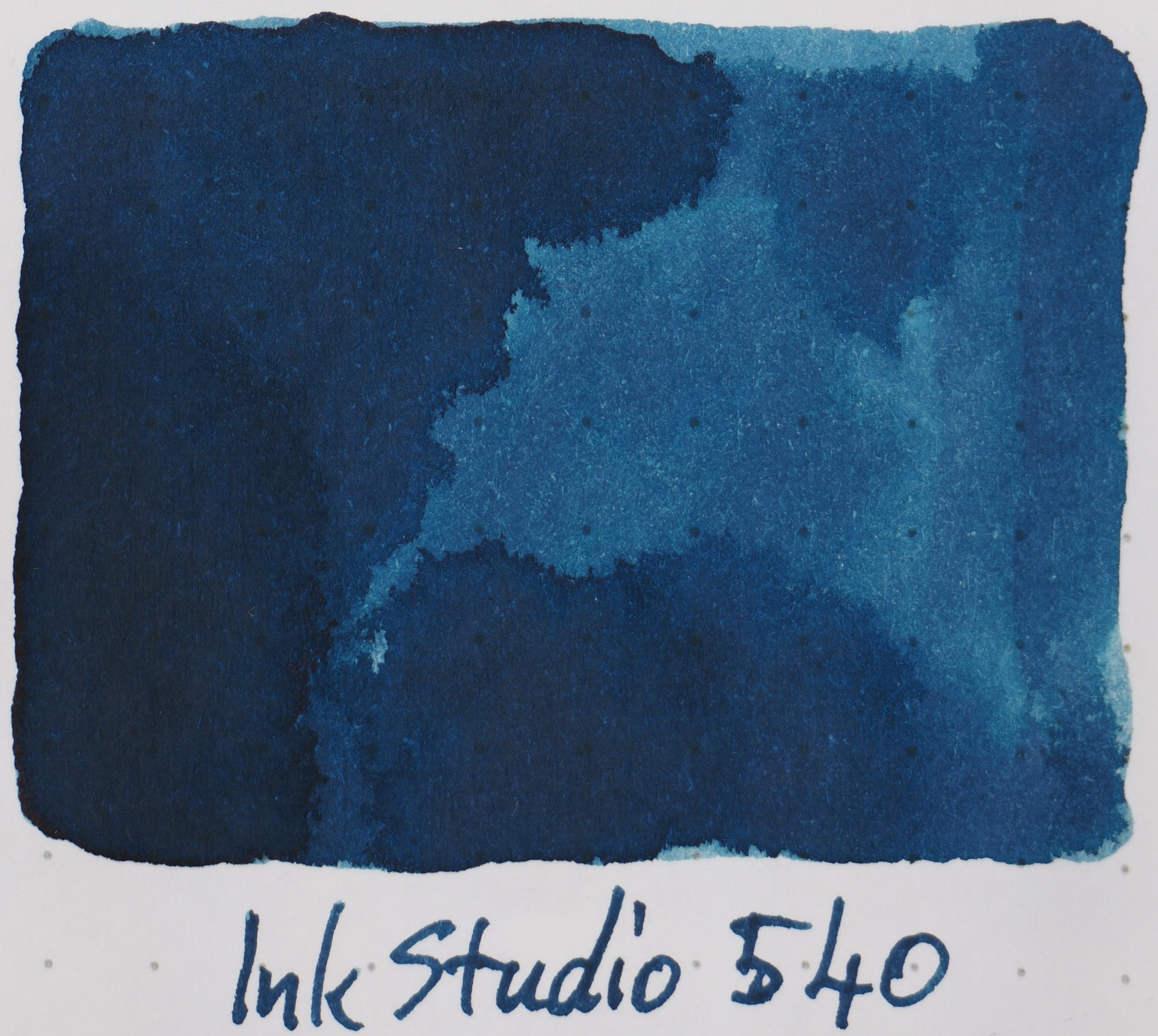
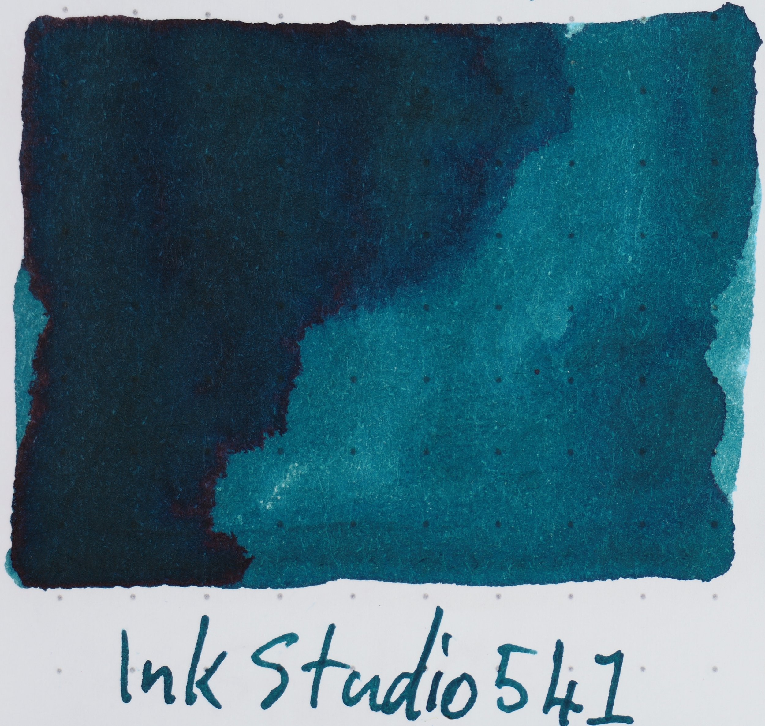
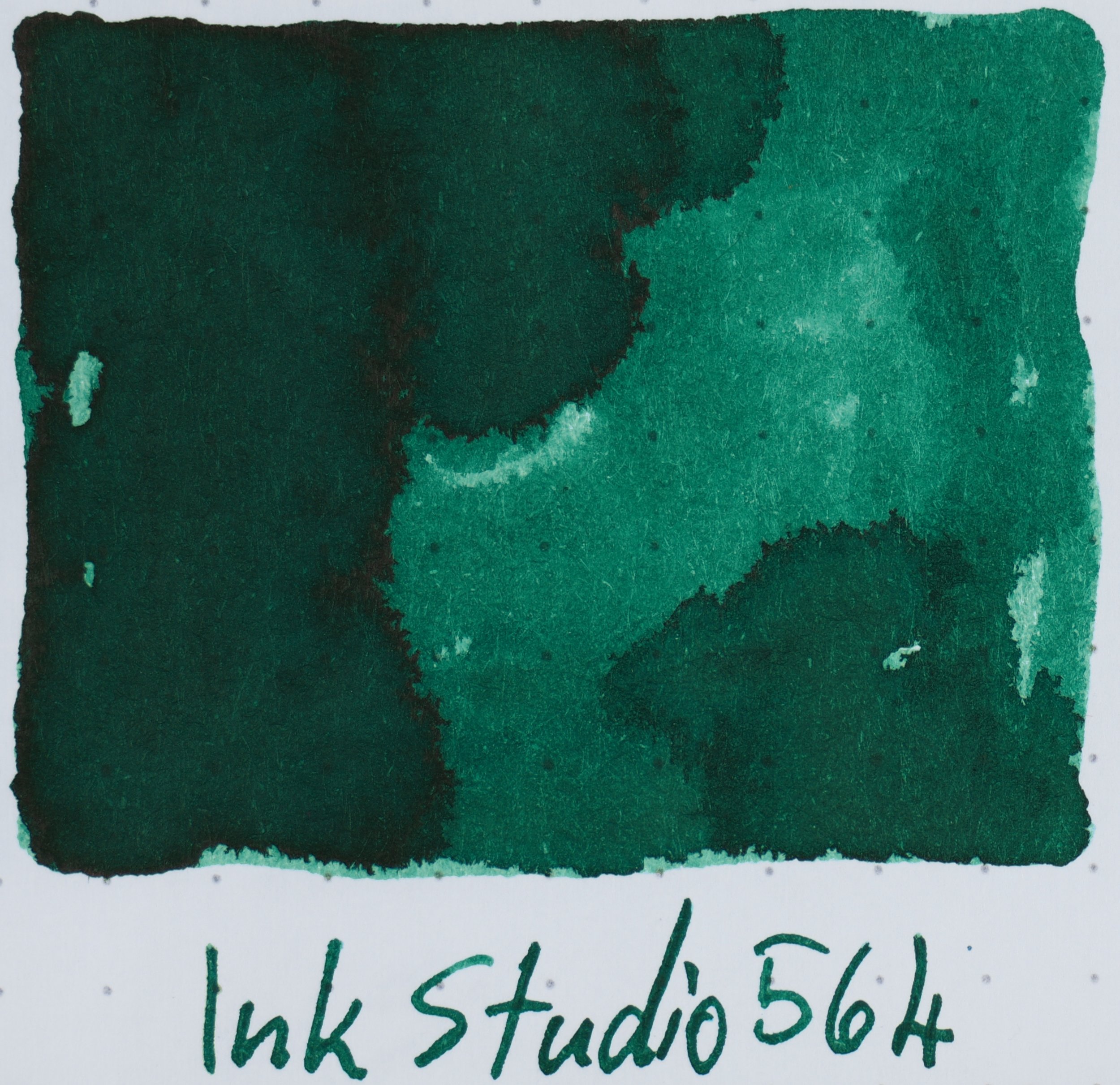
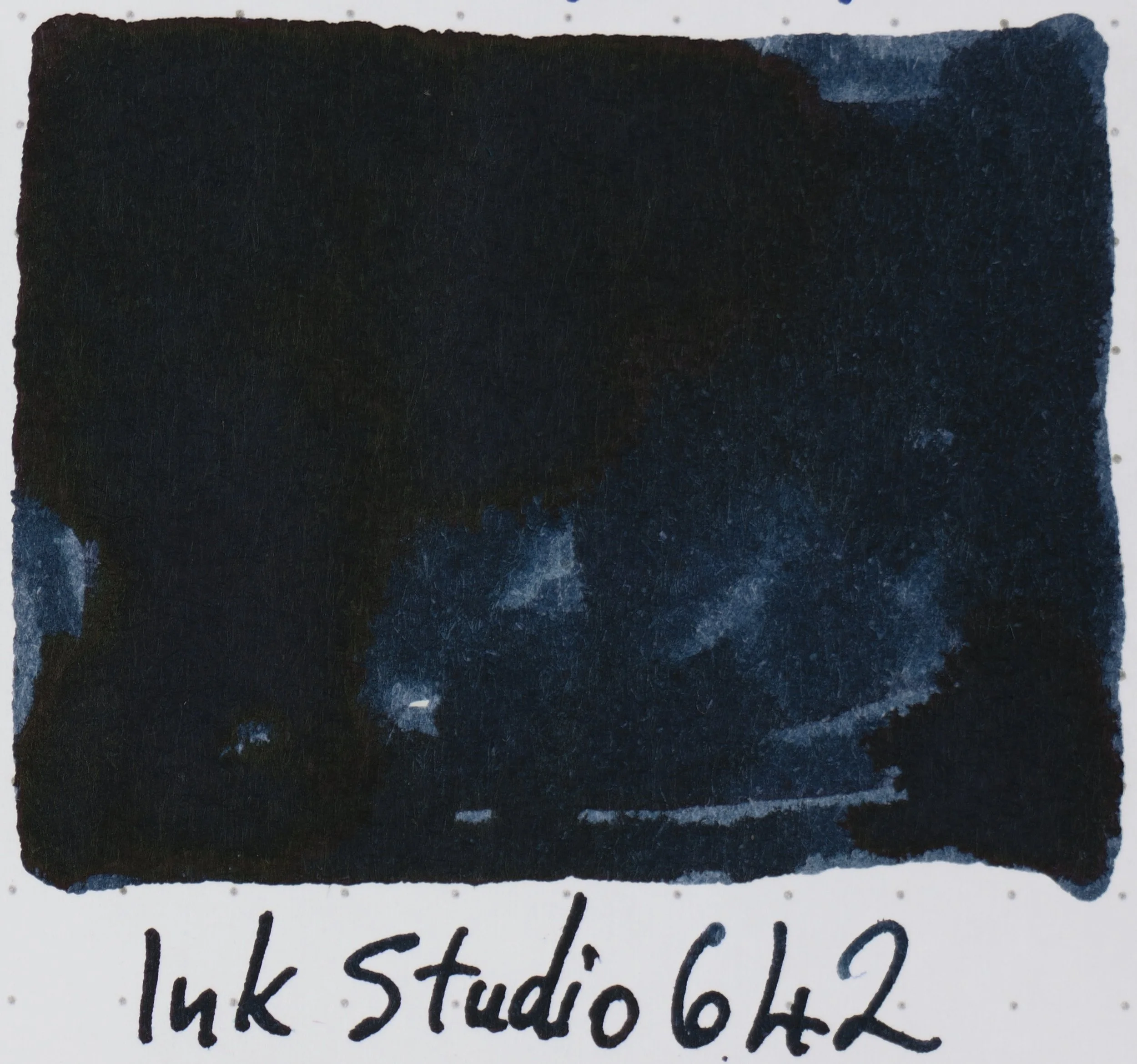
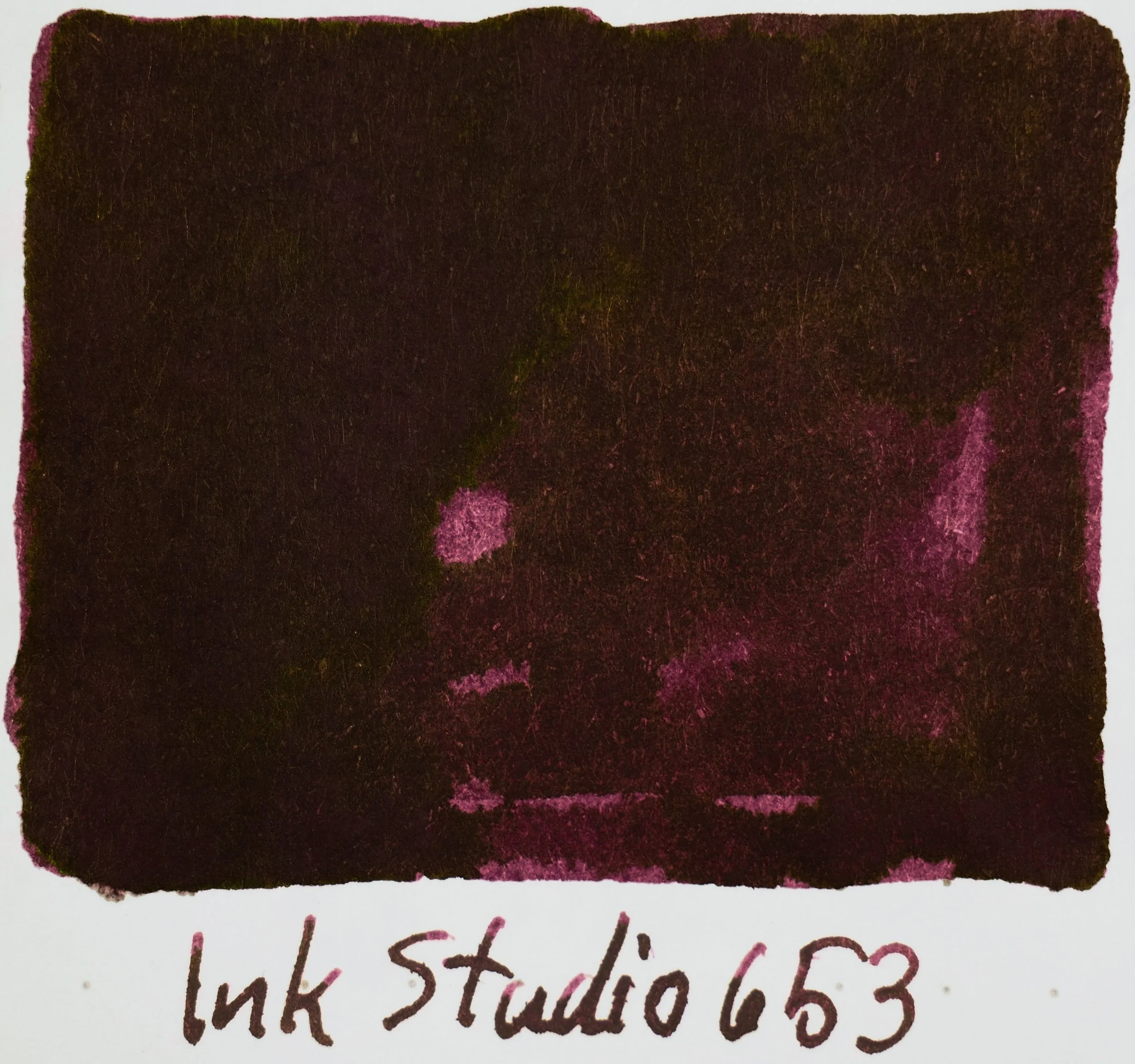
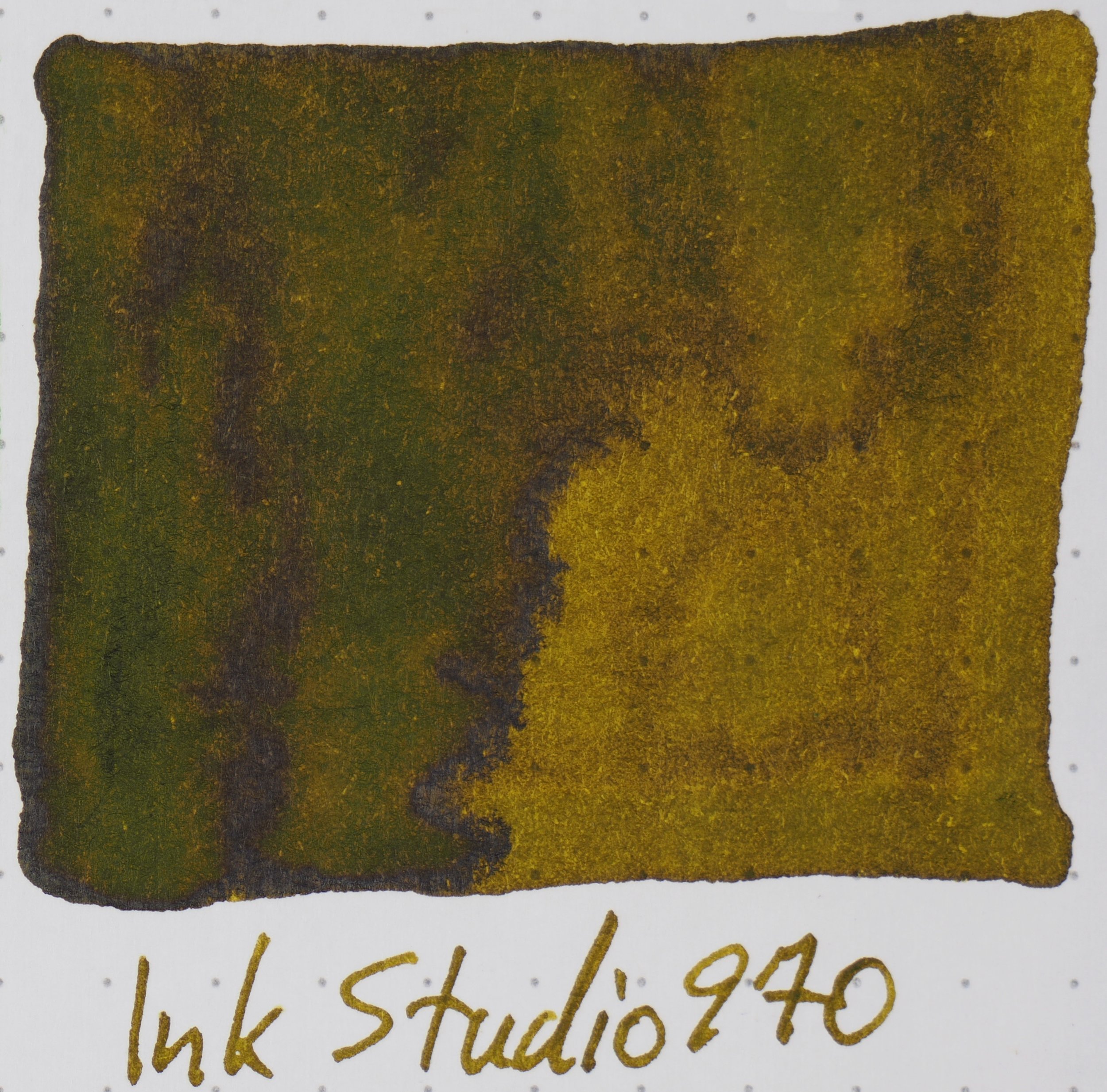
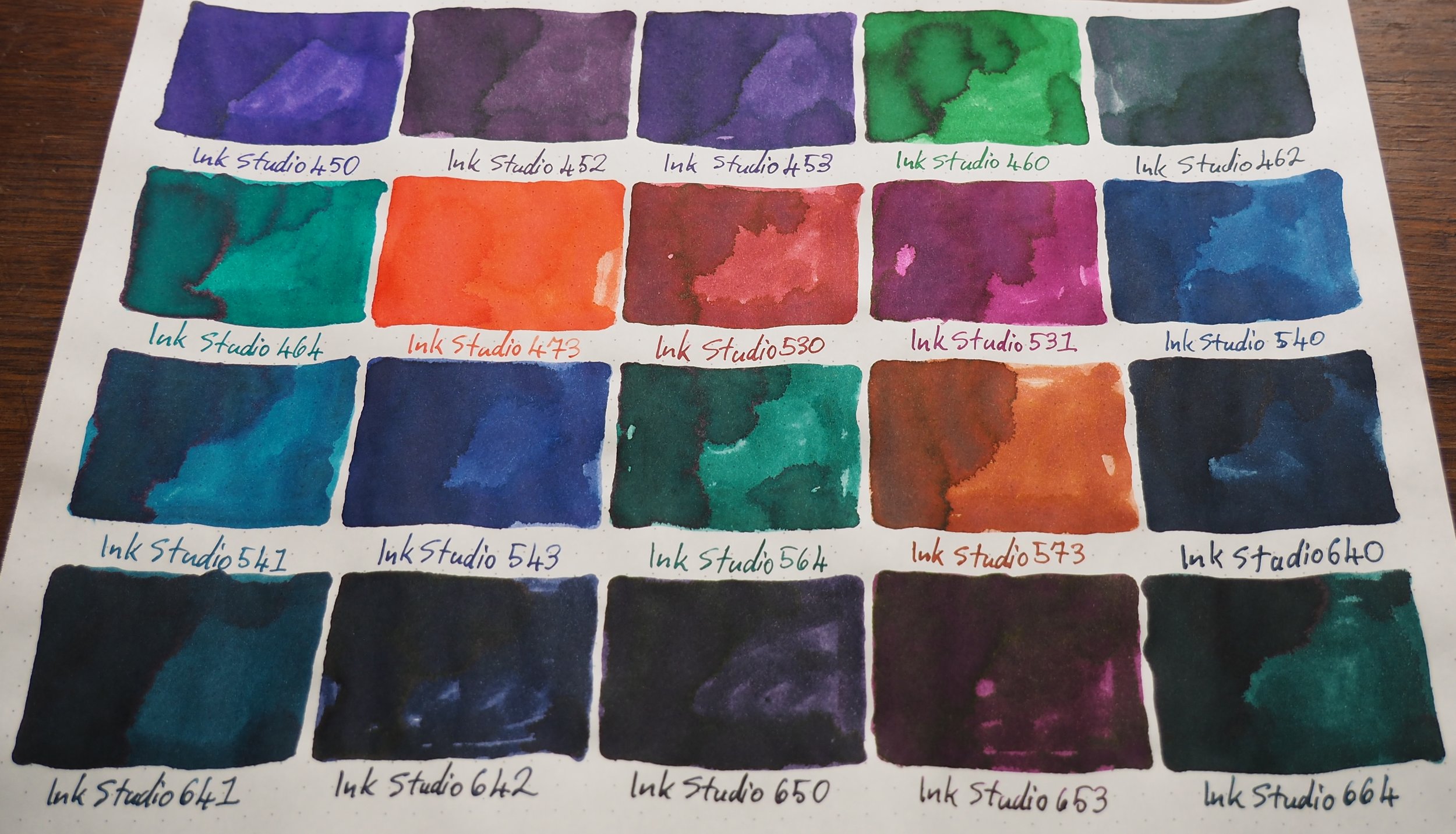
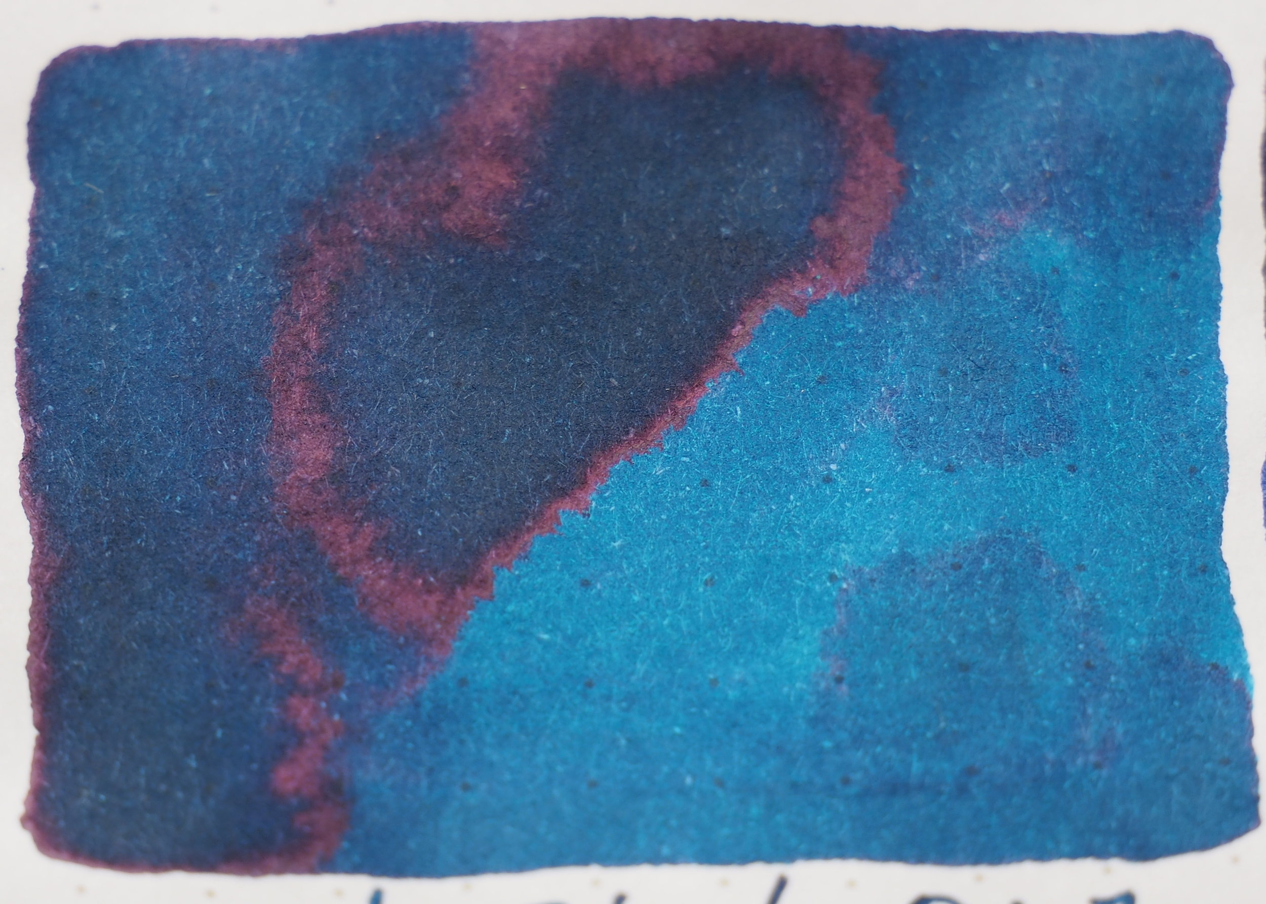
Tomoe River Ivory(white) 52gsm 450-664

Definitely getting a lot more vibrant and richly coloured page three (and it stays like this for the rest of the pages). 462 is another multi-coloured ink, this one with a green base and some subtle pink hints. I’m a big fan of the rich ness of 642 and 653. 530 and 573 remind me of slightly more vibrant versions of Montblanc Red Chalk and Cards Collodi.

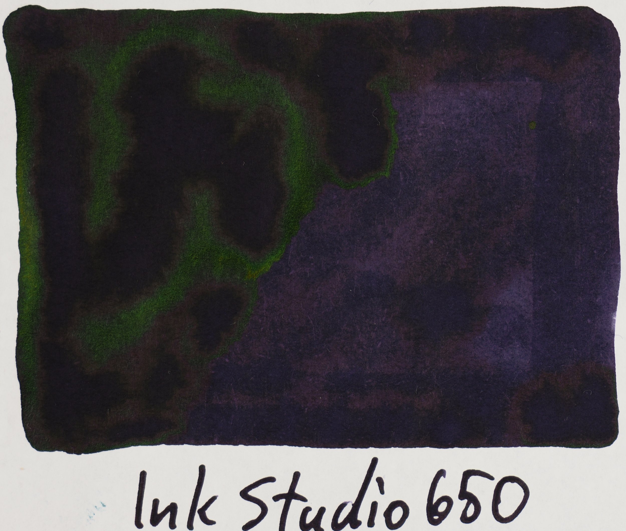
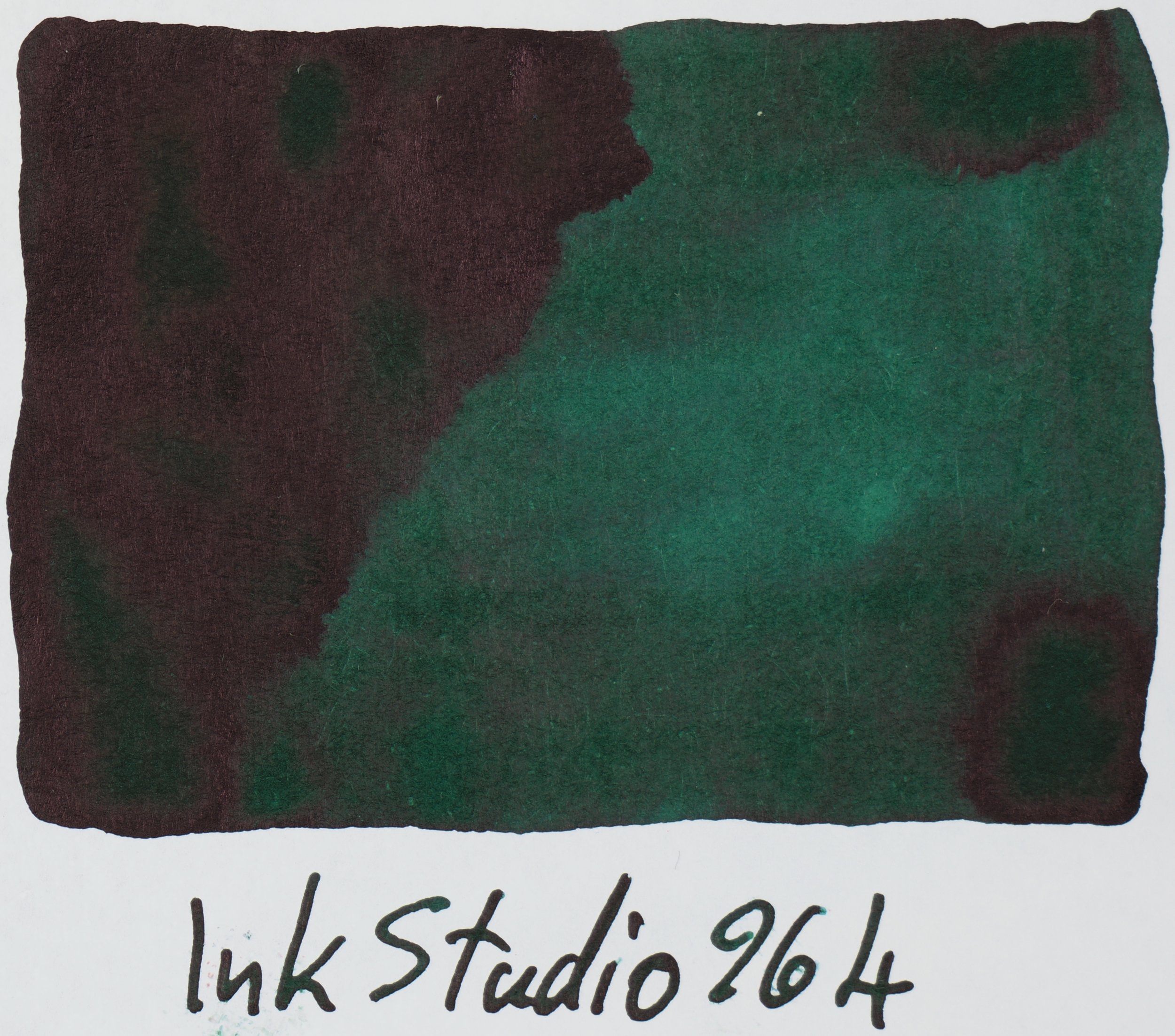
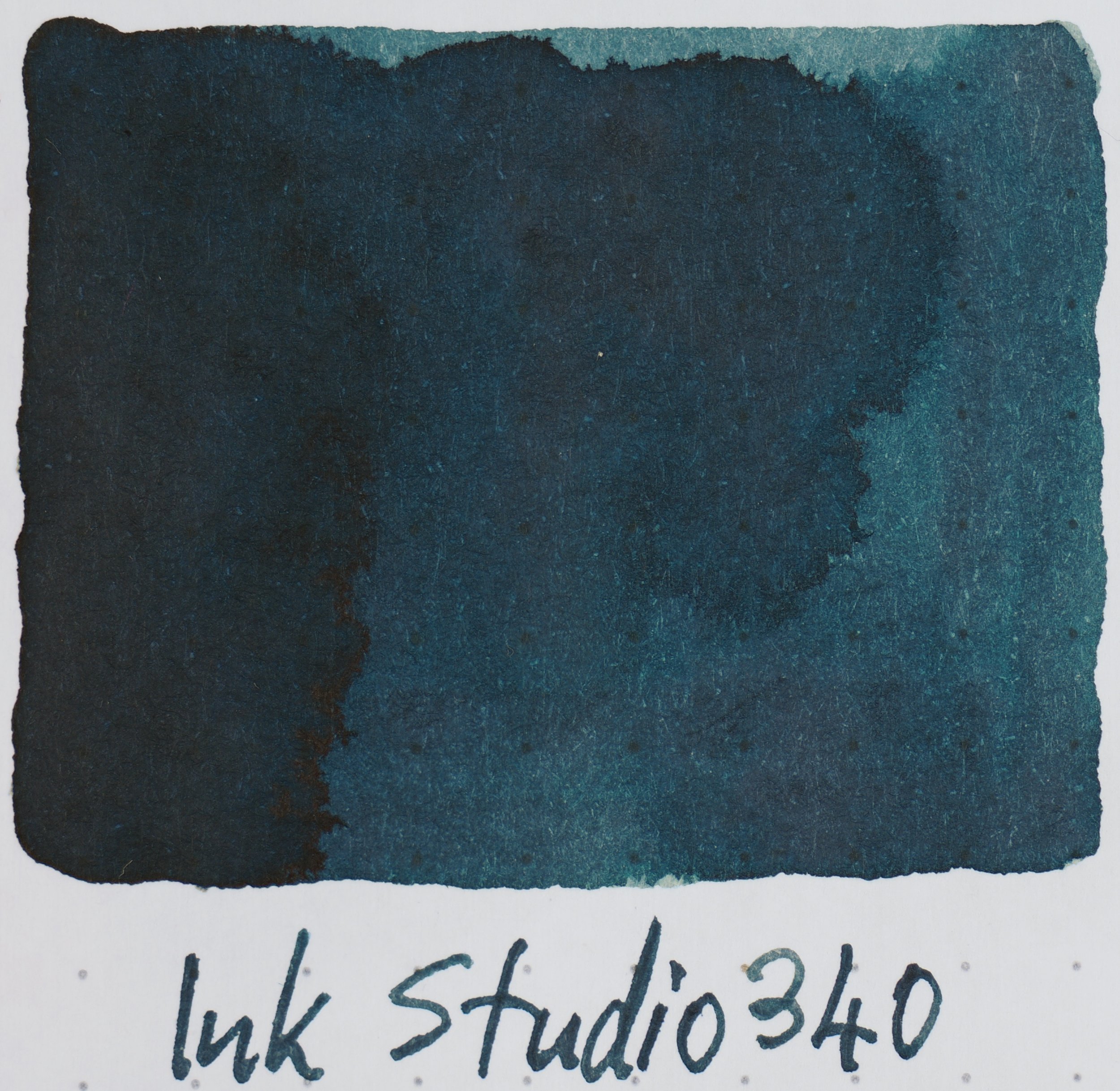
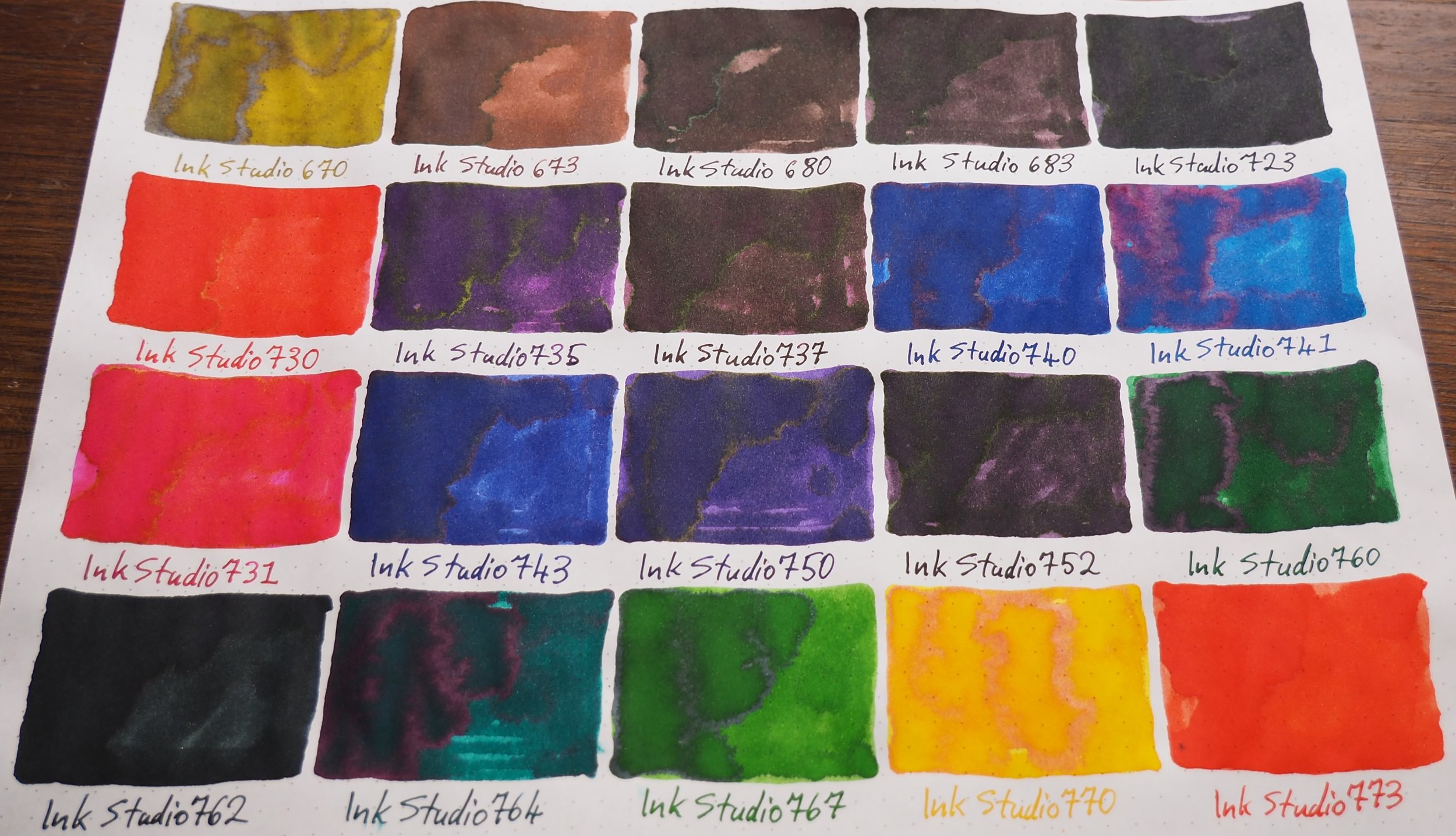
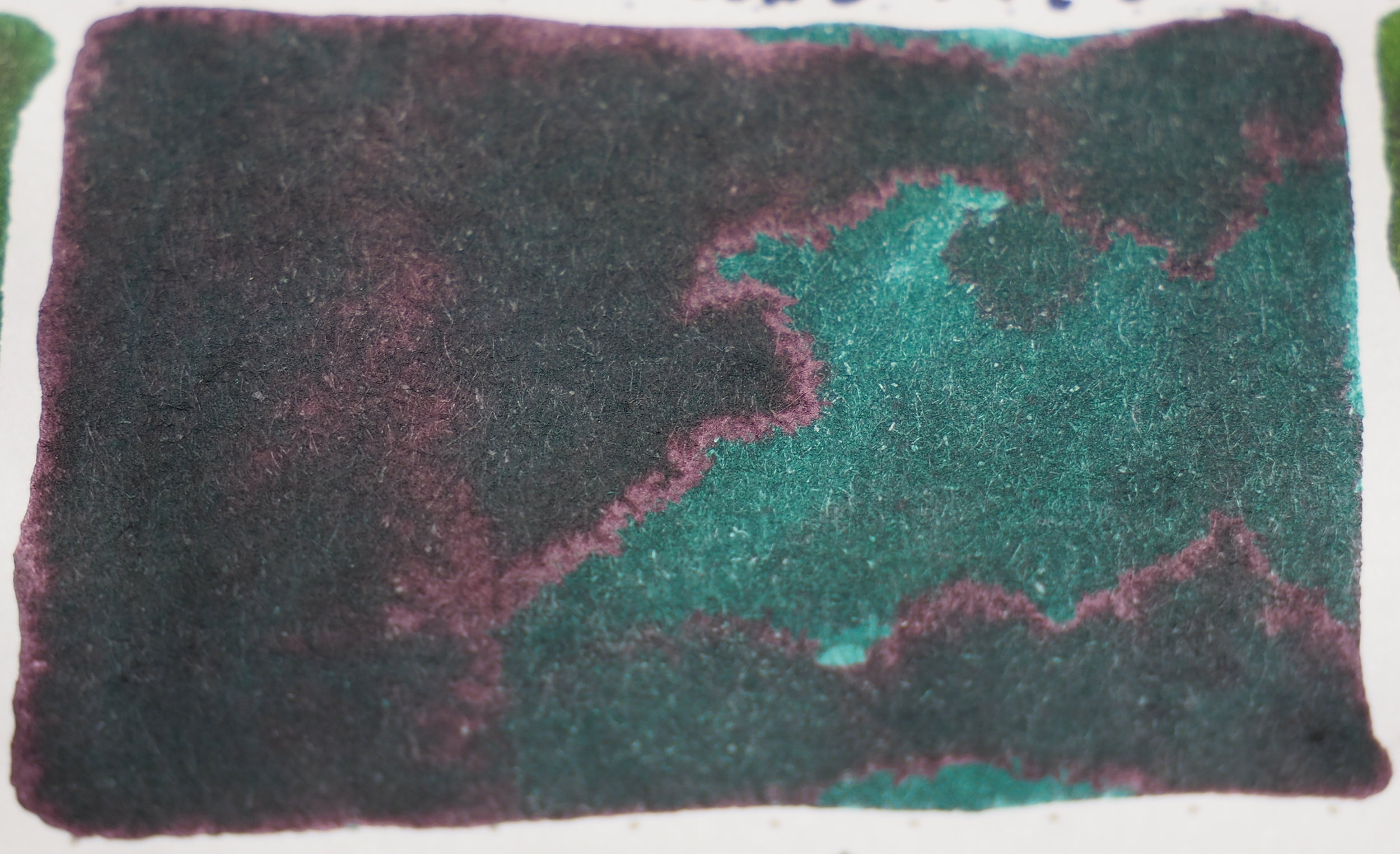
Tomoe River Ivory(white) 52gsm 670-773

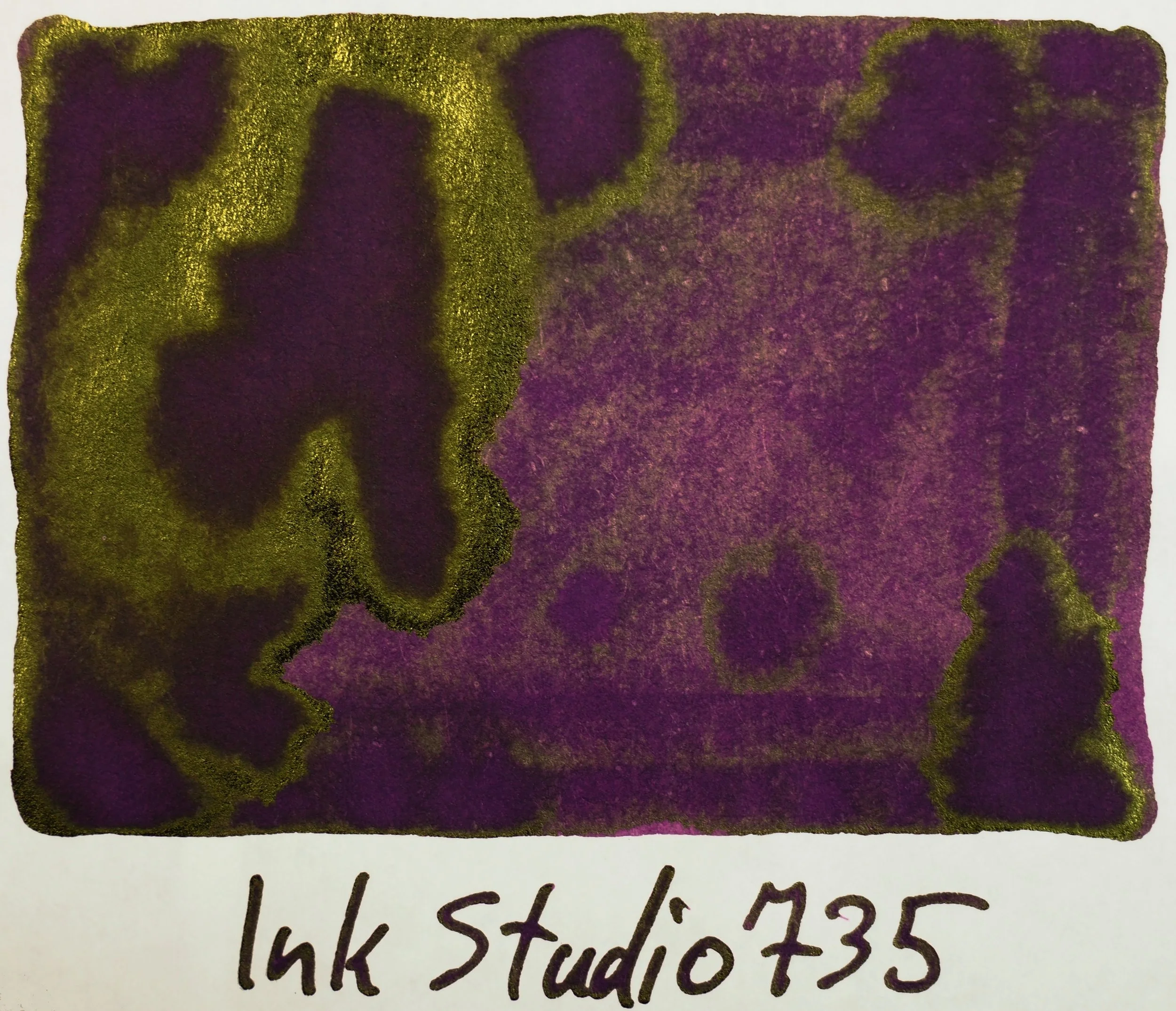
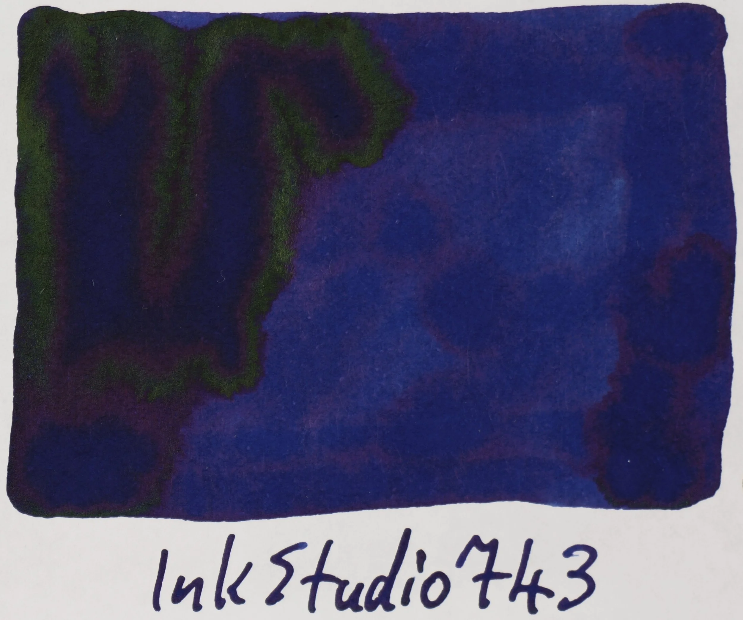
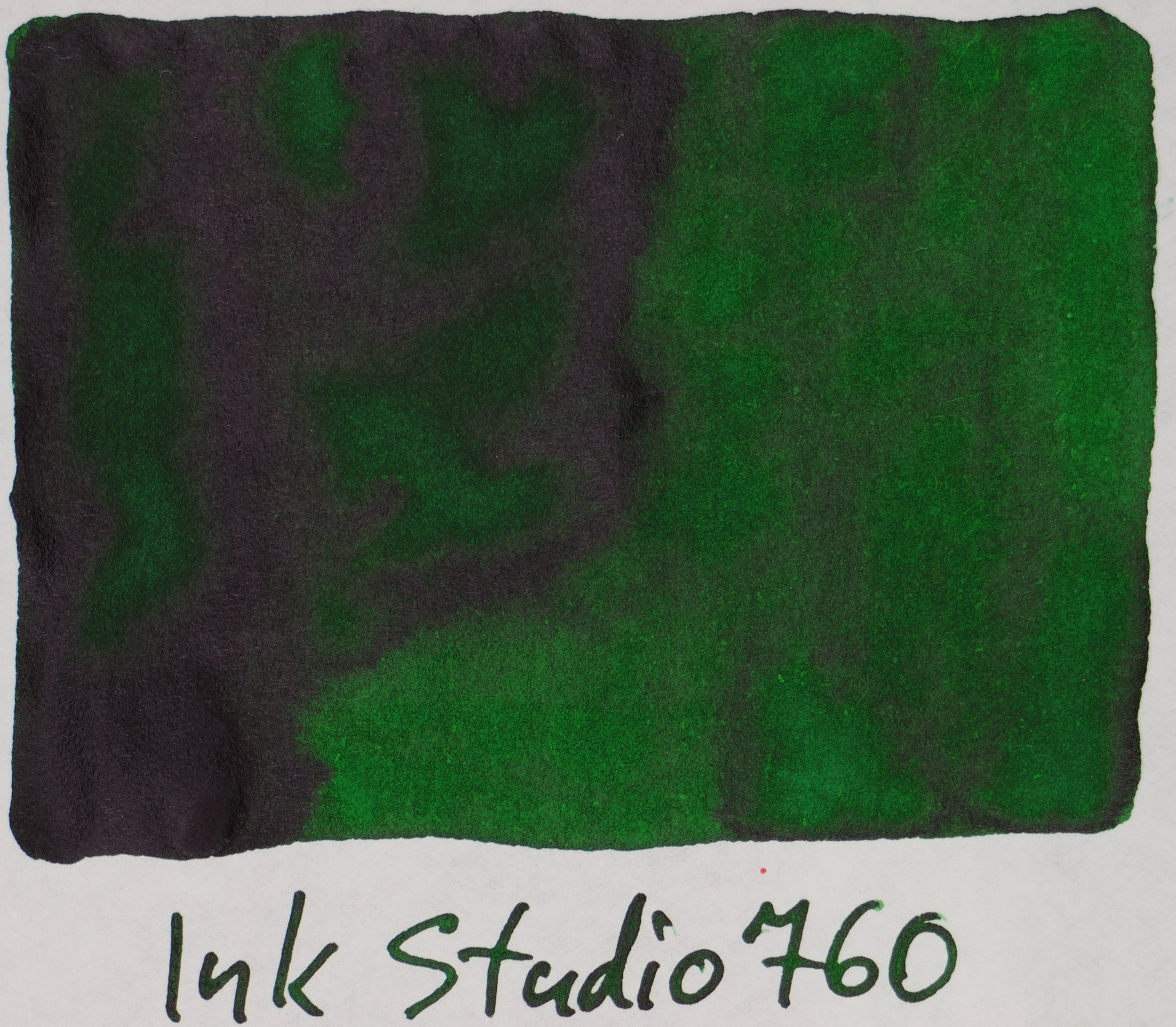
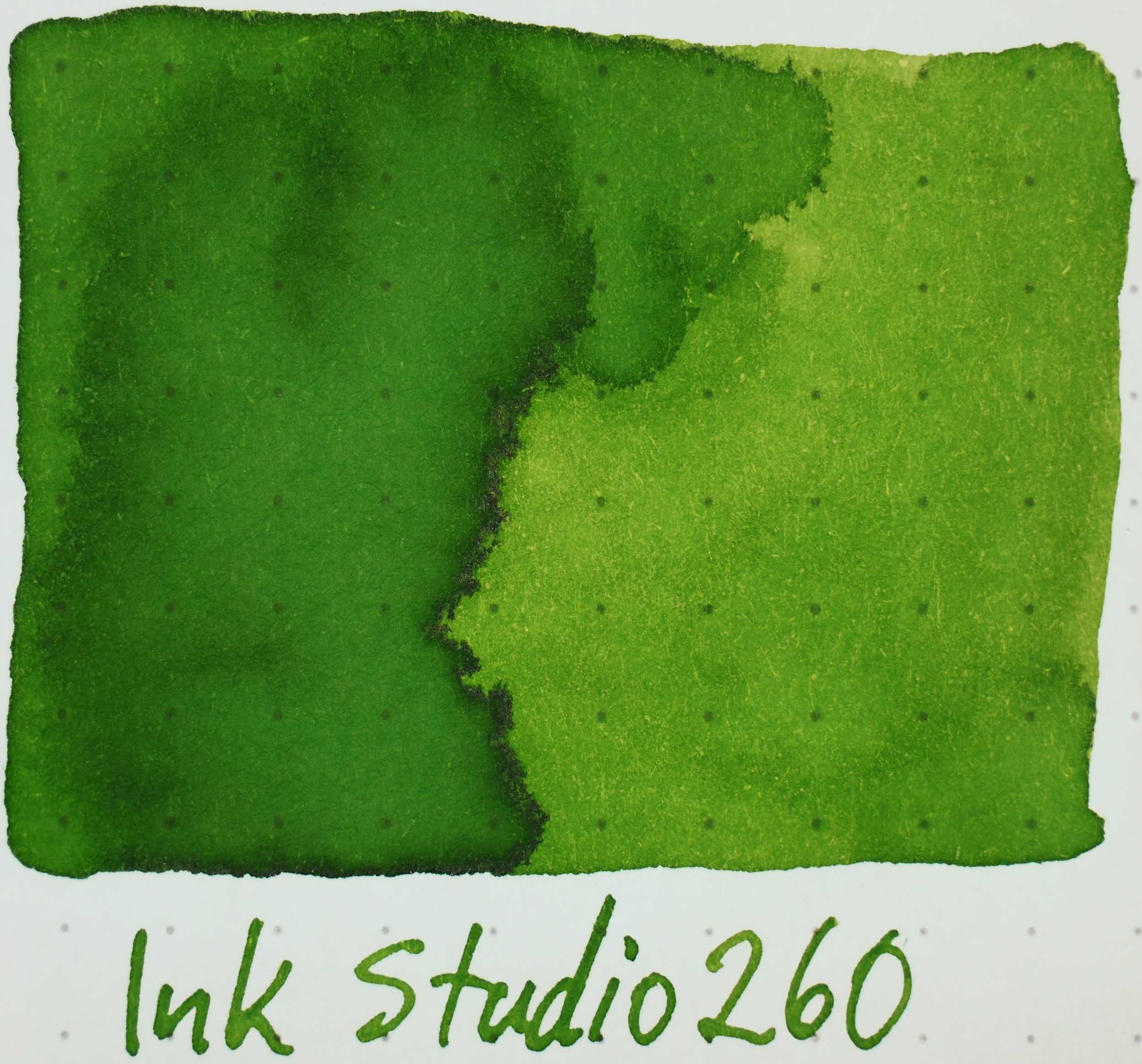
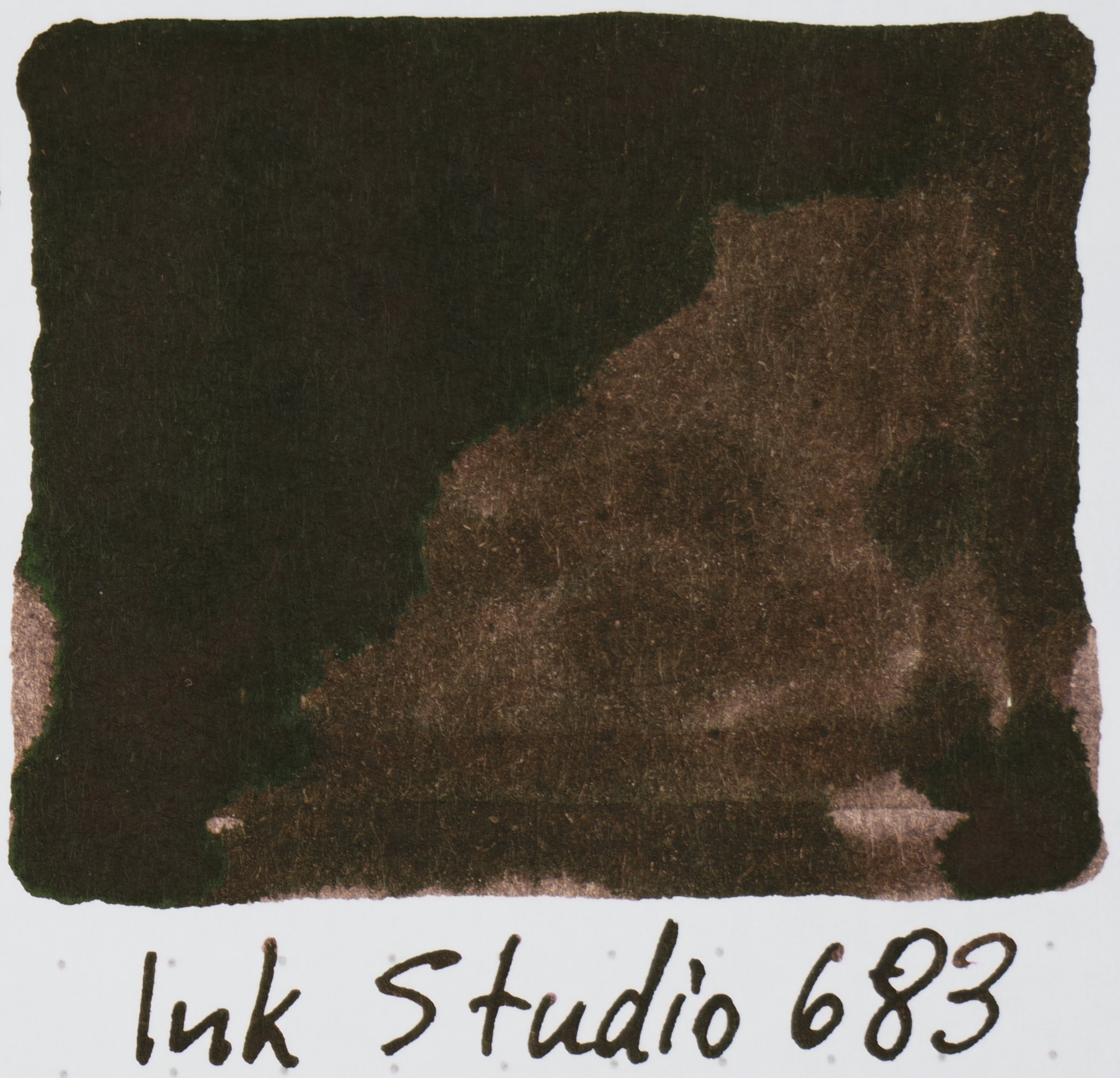
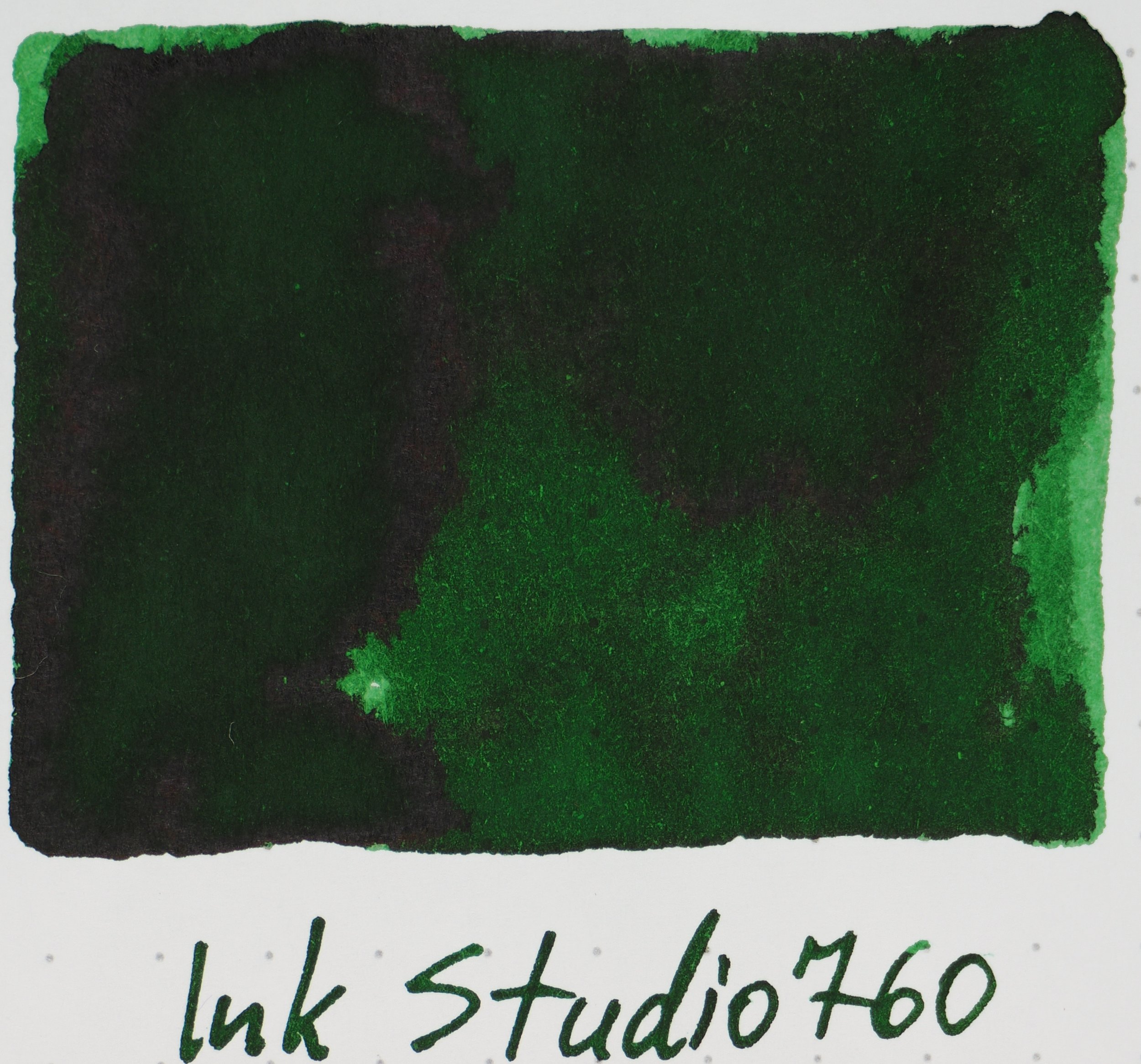
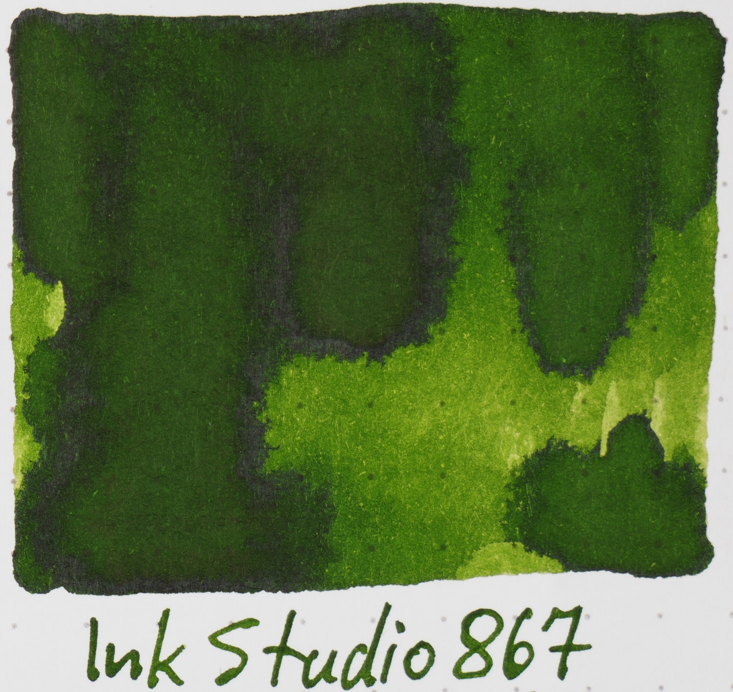
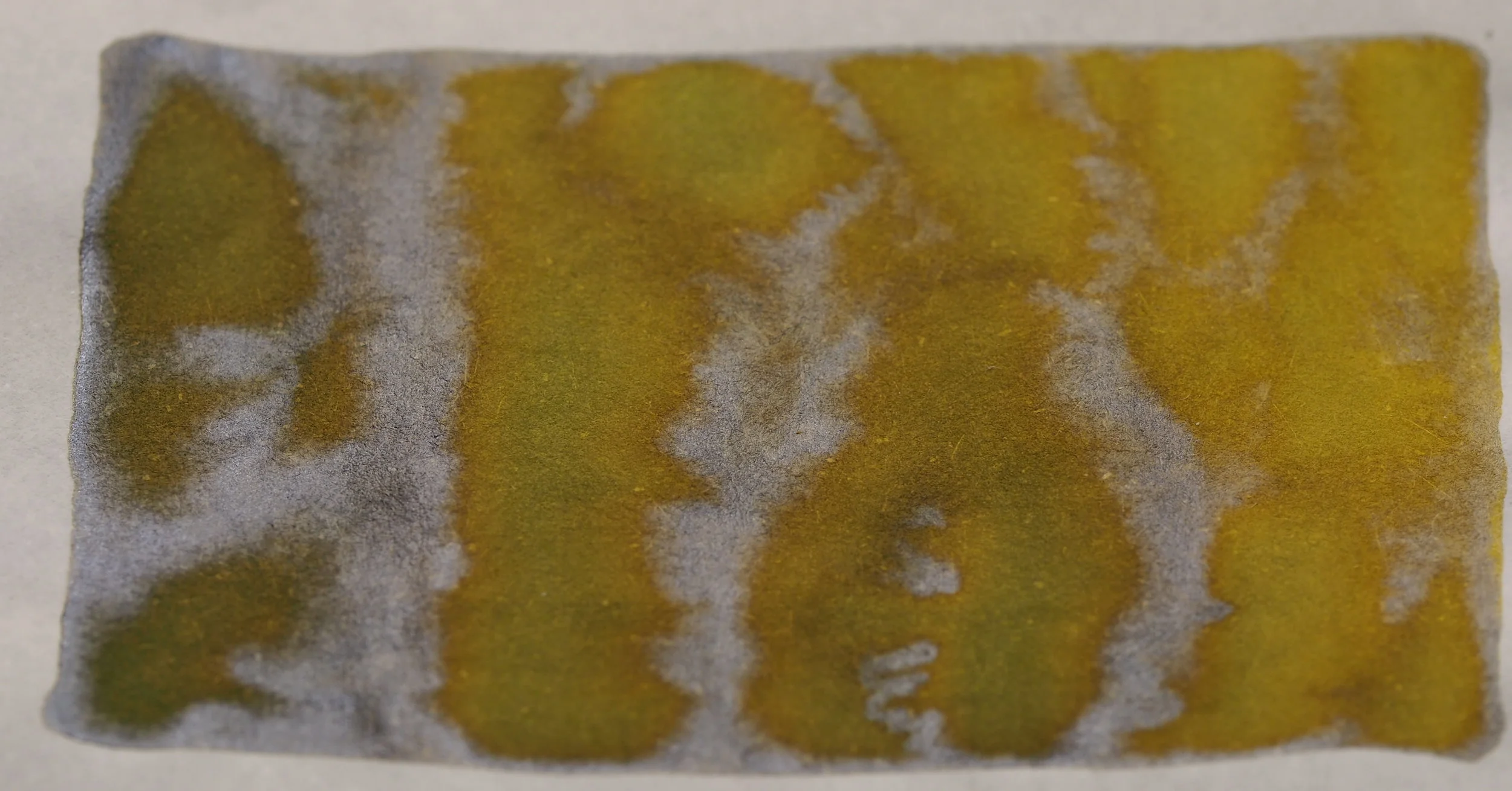
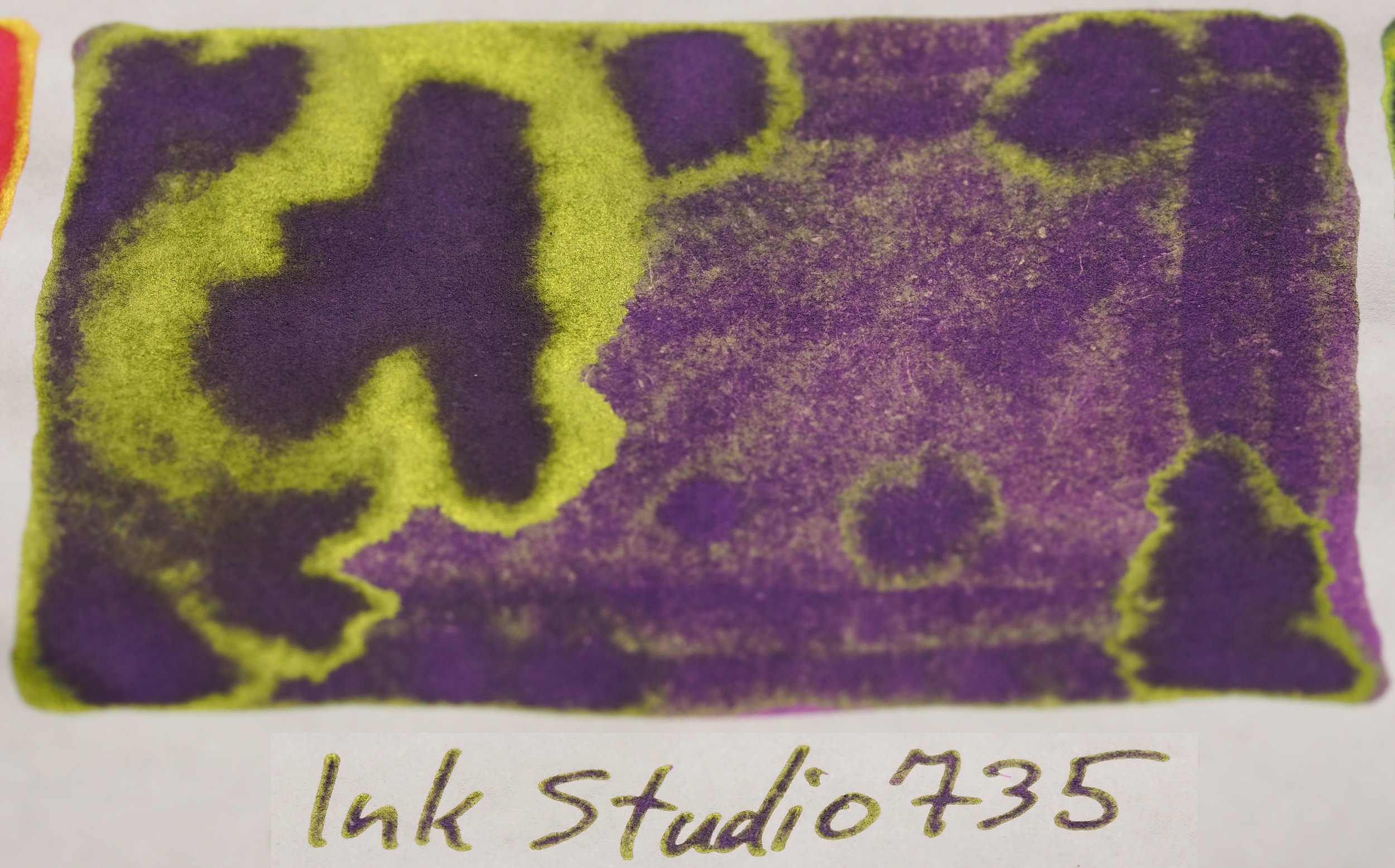
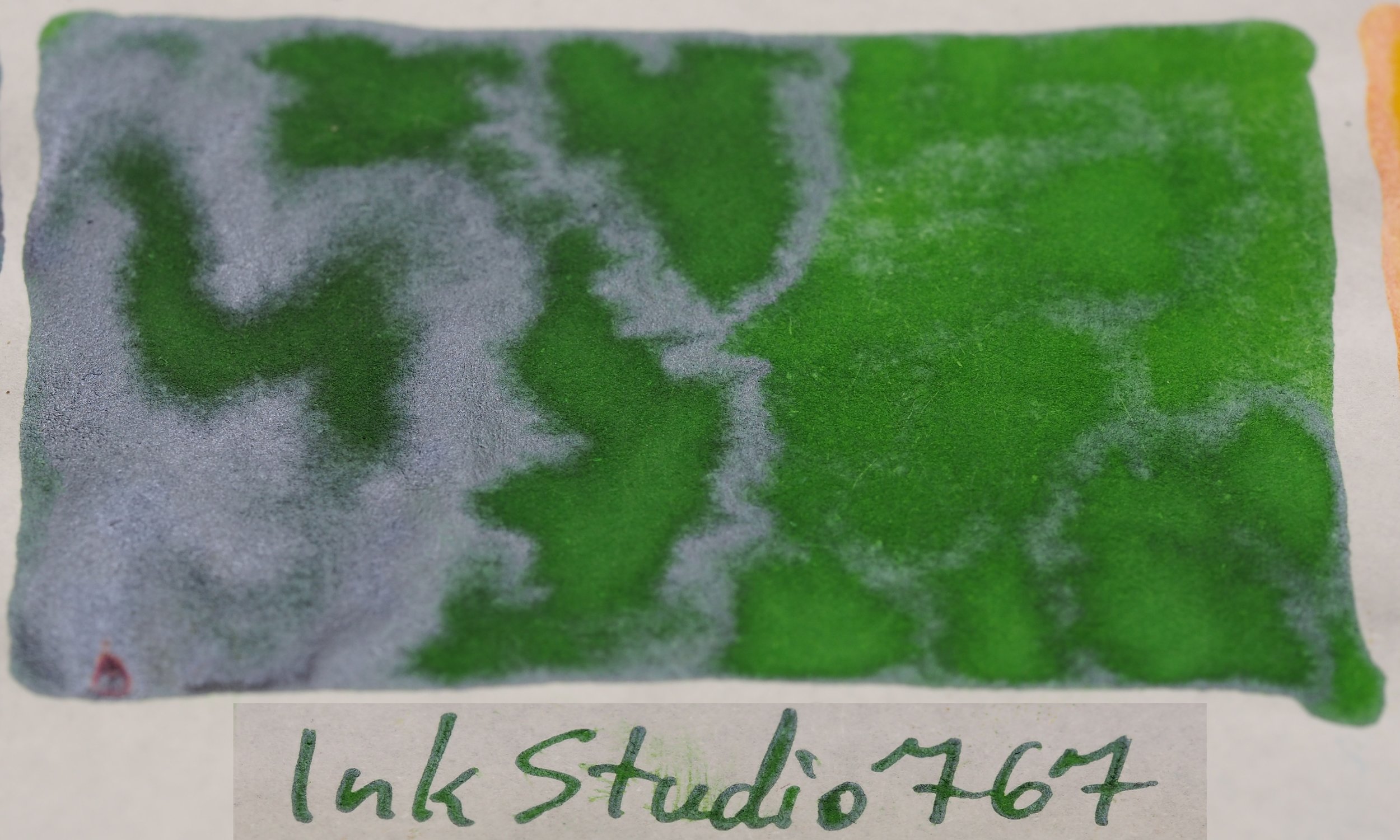
Starting to get a lot of sheen in these inks even visible from above. Lots of warm colours and browns on this page (4). 670 is one of the standout colours for me in this set. I love the rich yellow with just a slight hint of green and some subtle orange-brown highlights and also some silver sheen. 735 is a lovely purple, 737 is a lovely red-brown with green sheen. 740-750 are all vibrant and rich with green sheen. 762 is a strange dark green and 760 and 767 are great greens. Even 770 is a great yellow! I’m a big fan of this page.

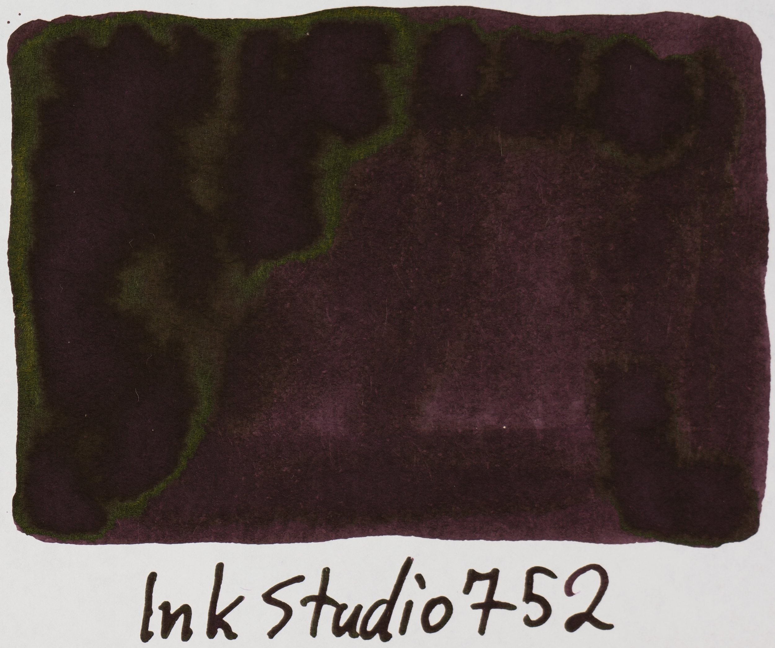
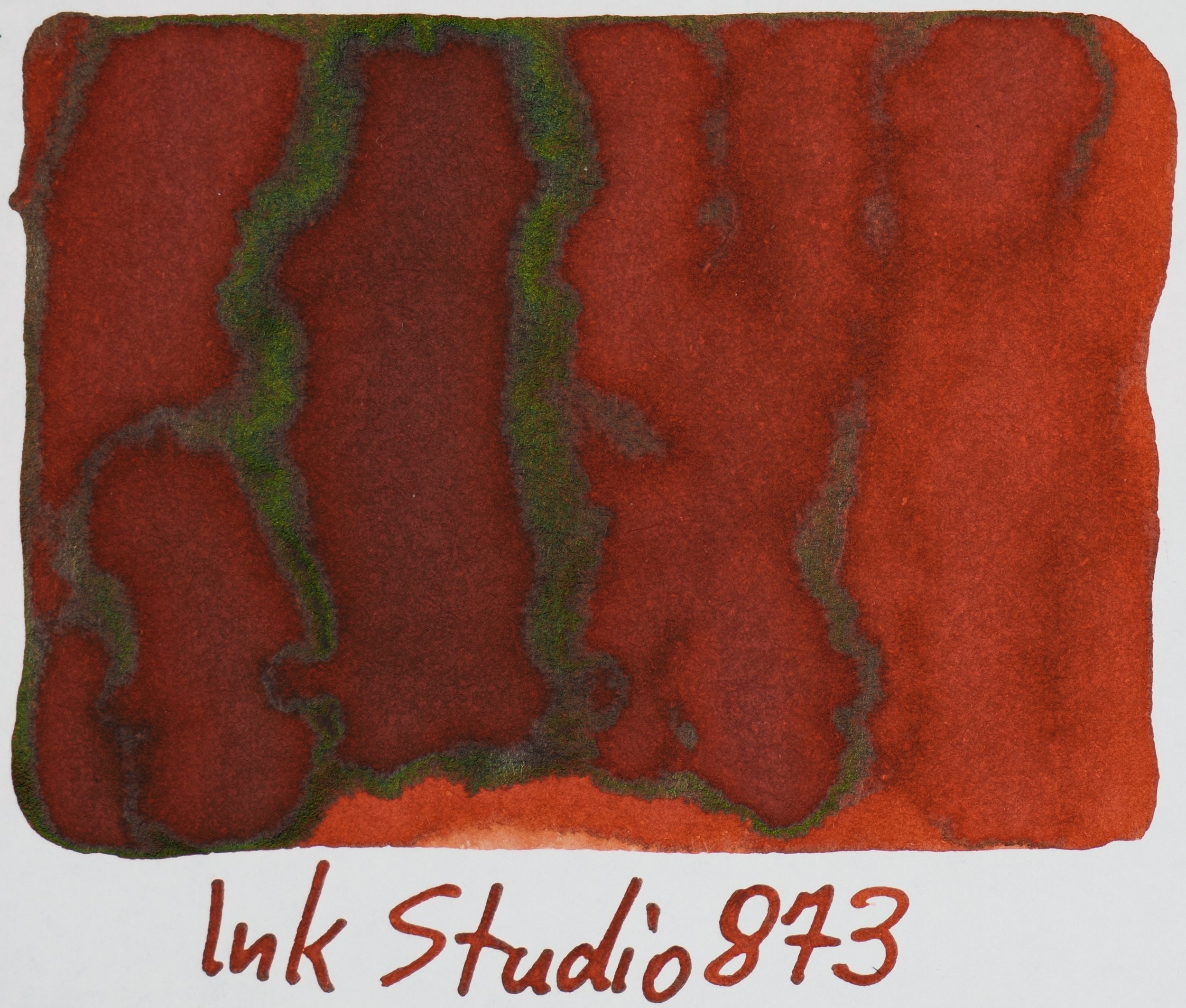
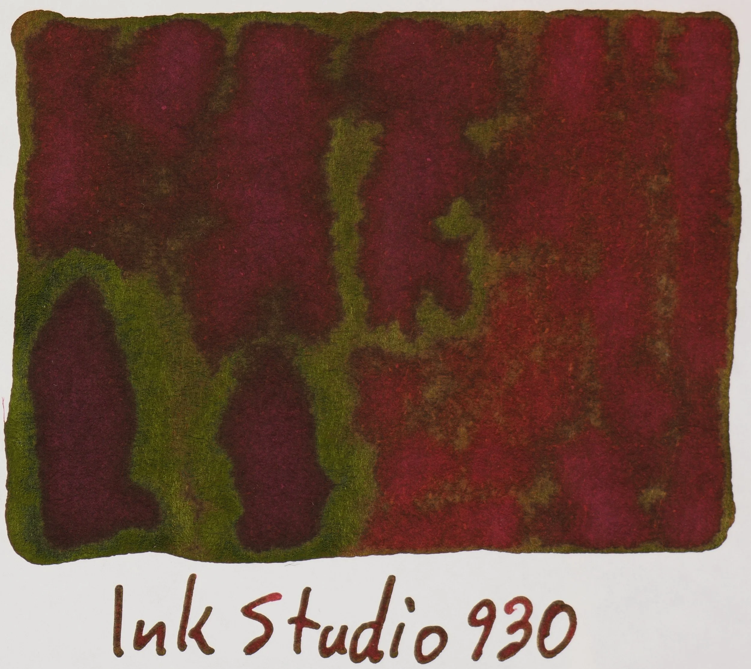
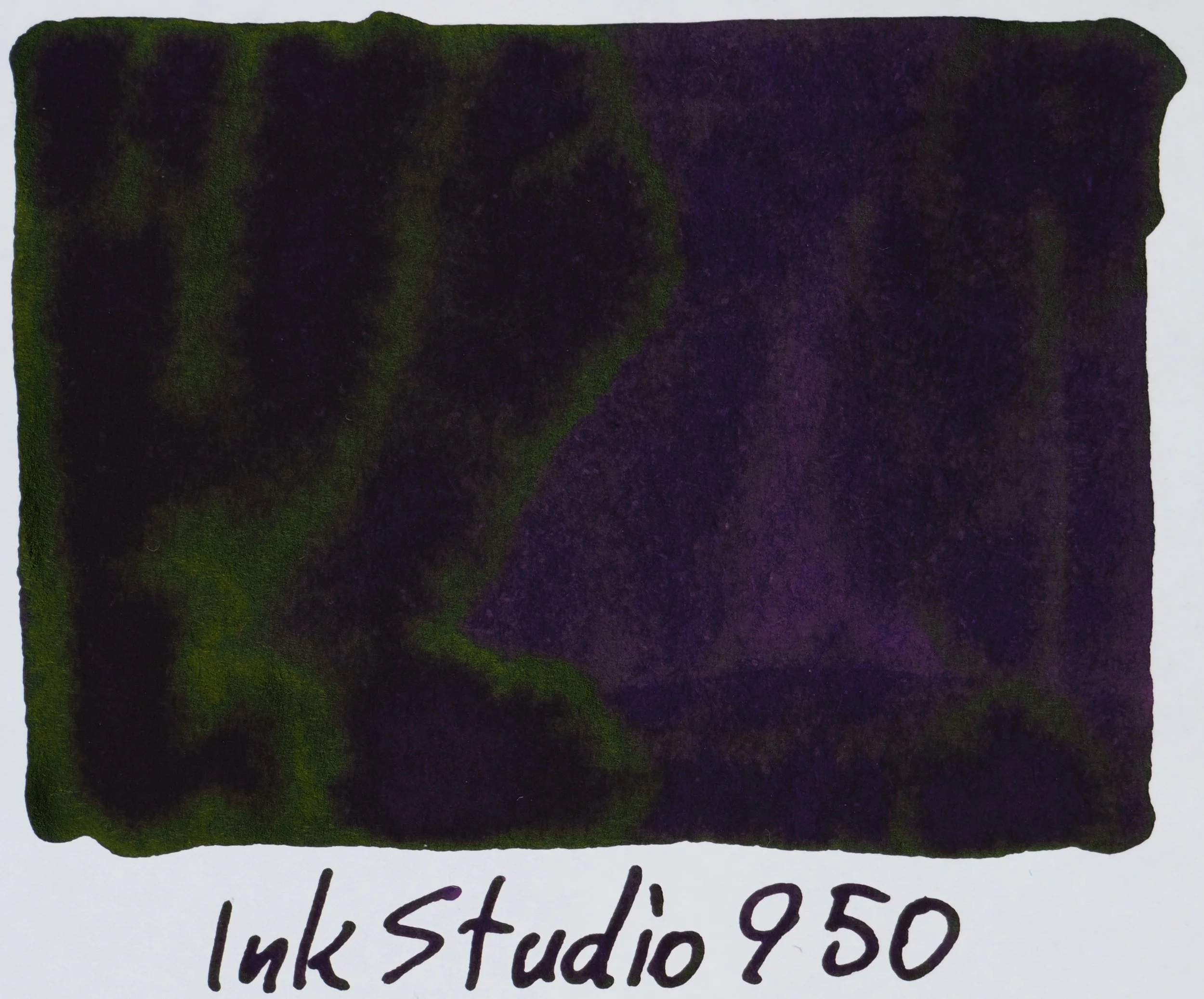
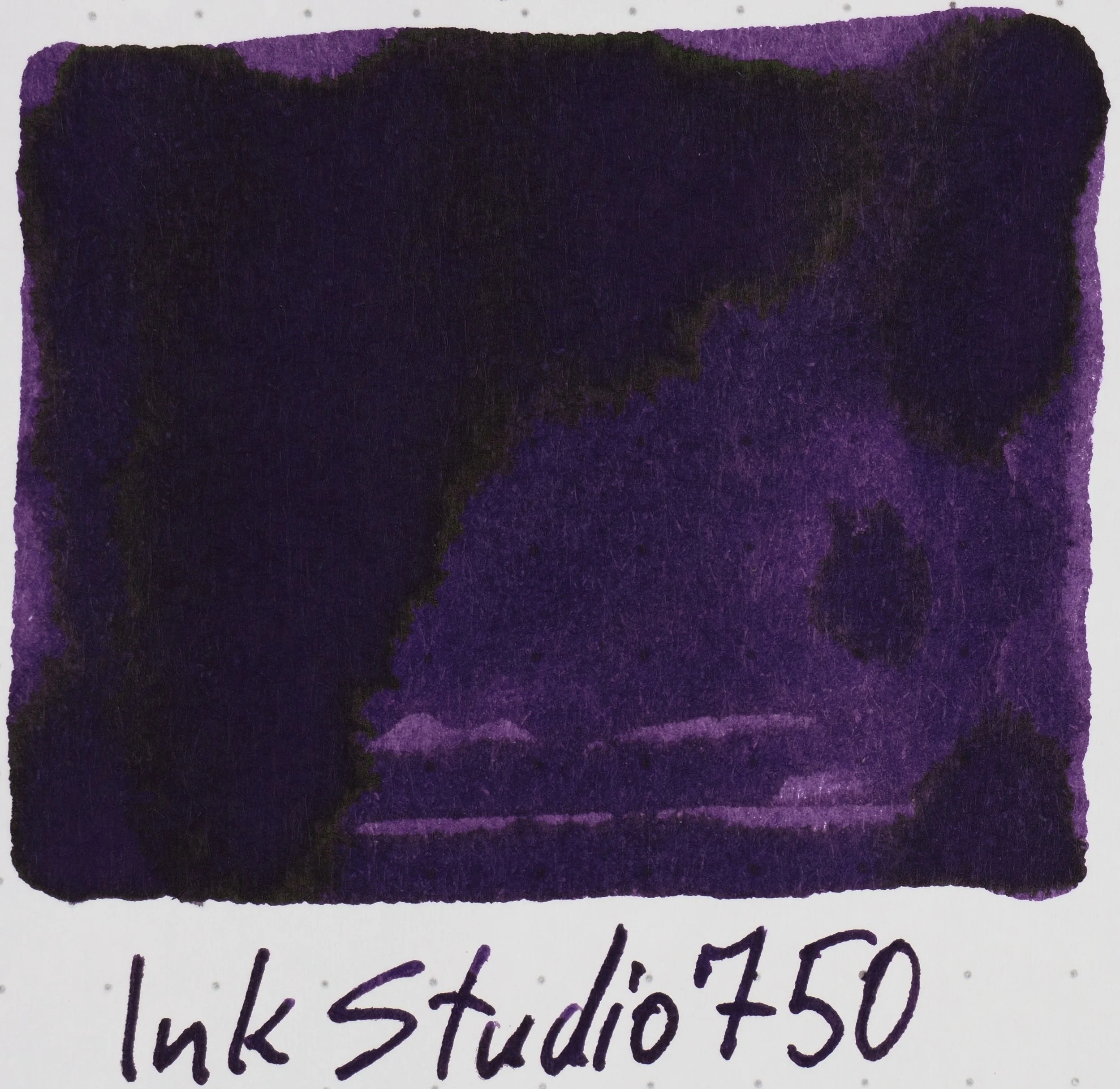
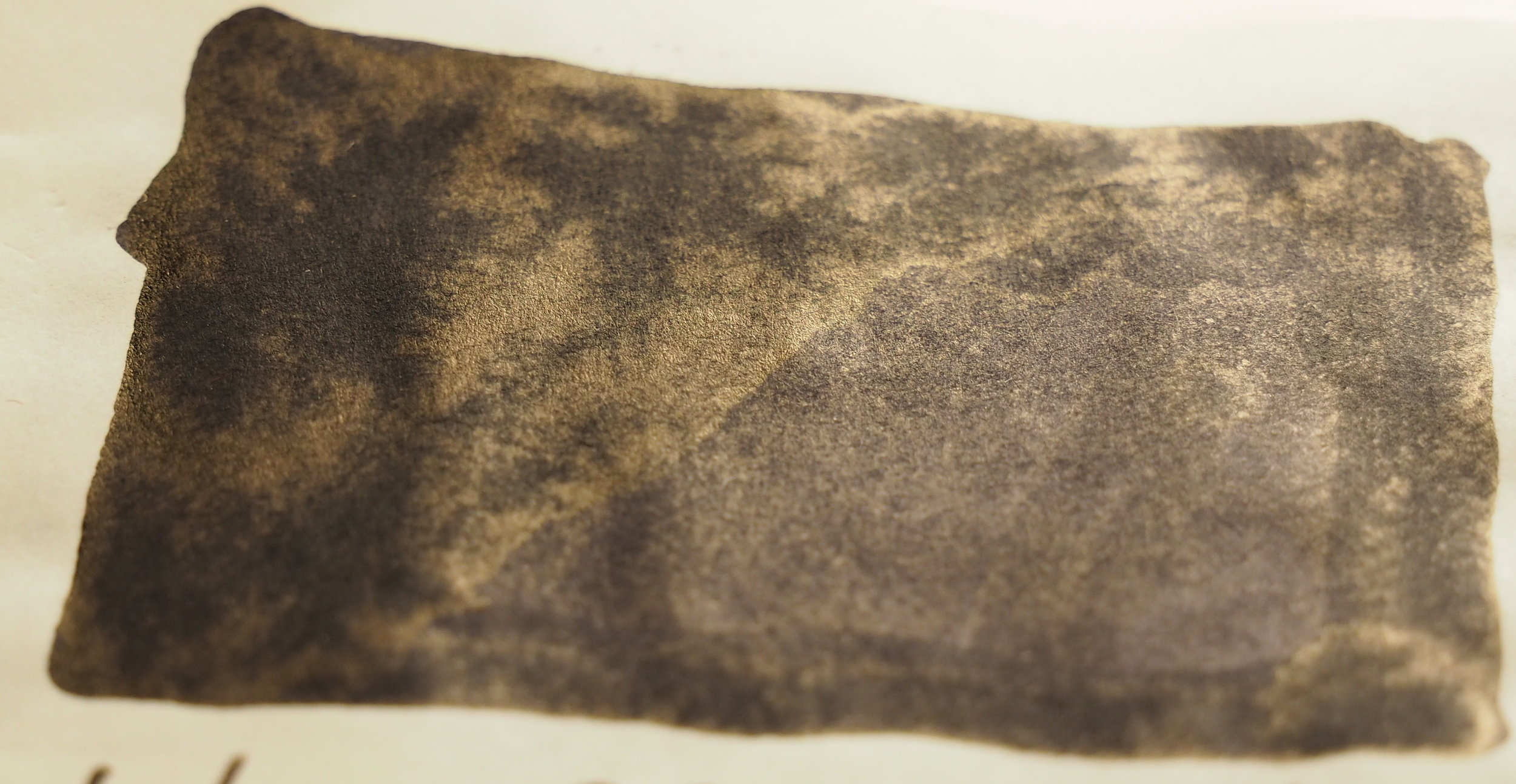
Tomoe River Ivory(white) 52gsm 830-973

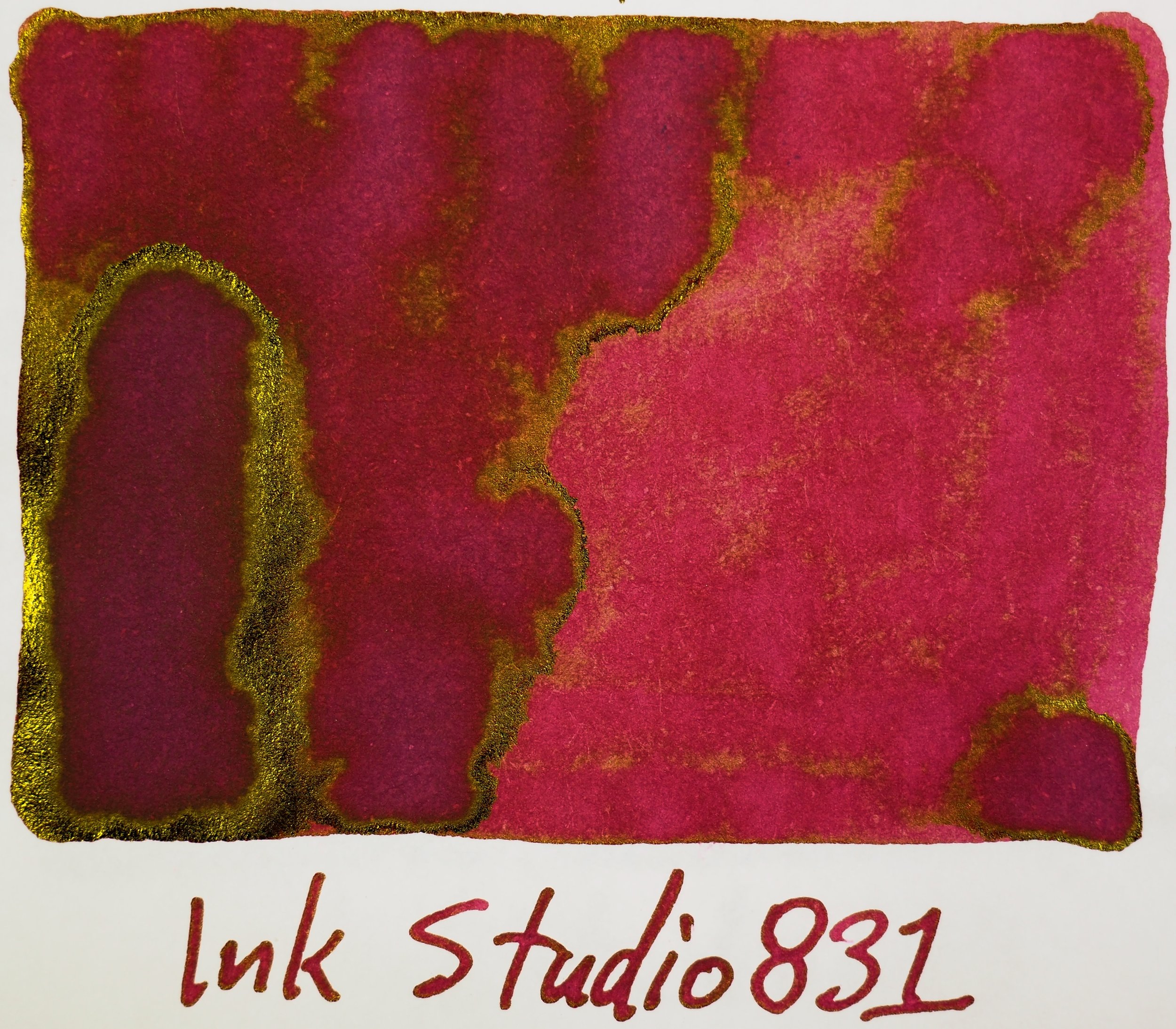
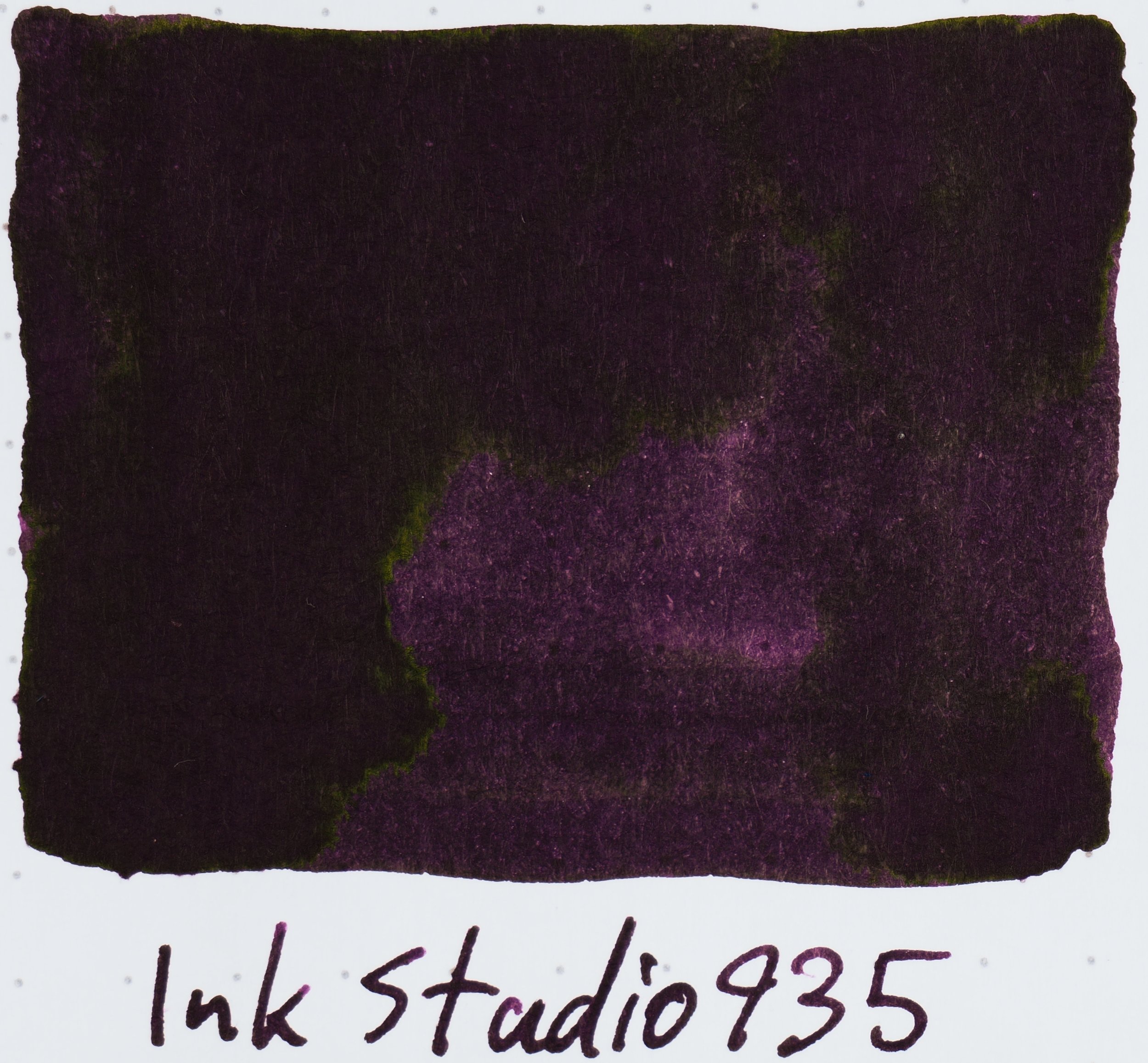
The reds and greens shine on the final page 5. Some much glorious richness of colour! The reds are just velvety and luxurious, and the greens are leafy and luscious. 935 is a decent alternative (but definitely not a dupe) to Lamy Dark Lilac (review coming soon!).

View fullsize 023.jpg
View fullsize 024.jpg
View fullsize 027.jpg
View fullsize 123.jpg
View fullsize 130.jpg
View fullsize 131.jpg
View fullsize 135.jpg
View fullsize 140.jpg
View fullsize 141.jpg
View fullsize 143.jpg
View fullsize 150.jpg
View fullsize 160.jpg
View fullsize 162.jpg
View fullsize 167.jpg
View fullsize 173.jpg
View fullsize 223.jpg
View fullsize 230.jpg
View fullsize 231.jpg
View fullsize 235.jpg
View fullsize 237.jpg
View fullsize 240.jpg
View fullsize 241.jpg
View fullsize 243.jpg
View fullsize 260.jpg
View fullsize 264.jpg
View fullsize 273.jpg
View fullsize 335.jpg
View fullsize 340.jpg
View fullsize 341.jpg
View fullsize 343.jpg
View fullsize 350.jpg
View fullsize 370.jpg
View fullsize 373.jpg
View fullsize 431.jpg
View fullsize 435.jpg
View fullsize 437.jpg
View fullsize 440.jpg
View fullsize 441.jpg
View fullsize 442.jpg
View fullsize 443.jpg
View fullsize 450.jpg
View fullsize 452.jpg
View fullsize 453.jpg
View fullsize 460.jpg
View fullsize 462.jpg
View fullsize 464.jpg
View fullsize 473.jpg
View fullsize 530.jpg
View fullsize 531.jpg
View fullsize 540.jpg
View fullsize 541.jpg
View fullsize 543.jpg
View fullsize 564.jpg
View fullsize 573.jpg
View fullsize 640.jpg
View fullsize 641.jpg
View fullsize 642.jpg
View fullsize 650.jpg
View fullsize 653.jpg
View fullsize 664.jpg
View fullsize 670.jpg
View fullsize 673.jpg
View fullsize 680.jpg
View fullsize 683.jpg
View fullsize 723.jpg
View fullsize 730.jpg
View fullsize 731.jpg
View fullsize 735.jpg
View fullsize 737.jpg
View fullsize 740.jpg
View fullsize 741.jpg
View fullsize 743.jpg
View fullsize 750.jpg
View fullsize 752.jpg
View fullsize 760.jpg
View fullsize 762.jpg
View fullsize 764.jpg
View fullsize 767.jpg
View fullsize 770.jpg
View fullsize 773.jpg
View fullsize 830.jpg
View fullsize 831.jpg
View fullsize 840.jpg
View fullsize 841.jpg
View fullsize 843.jpg
View fullsize 864.jpg
View fullsize 867.jpg
View fullsize 873.jpg
View fullsize 930.jpg
View fullsize 931.jpg
View fullsize 935.jpg
View fullsize 940.jpg
View fullsize 941.jpg
View fullsize 943.jpg
View fullsize 950.jpg
View fullsize 960.jpg
View fullsize 964.jpg
View fullsize 967.jpg
View fullsize 970.jpg
View fullsize 973.jpg
View fullsize High Res - New Ink Studio (07-12-2020) - 6.jpg
View fullsize High Res - New Ink Studio (07-12-2020) - 5.jpg
View fullsize High Res - New Ink Studio (07-12-2020) - 4.jpg

Rhodia 80gsm White paper

Tomoe River tends to make inks look either desaturated and sad or bubbly and fun (in my opinion). Some reds and oranges from Montblanc can lose a lot of their colour on Tomoe River. Shading is often a little understated on Tomoe River as well. I consider Tomoe River (if it’s not making inks dull which fortunately isn’t the case here for any ink!) often highlights the best parts of an ink (sometimes exaggerating them) but Rhodia represents a more neutral representation of the ink.

Rhodia 80gsm White 023-237

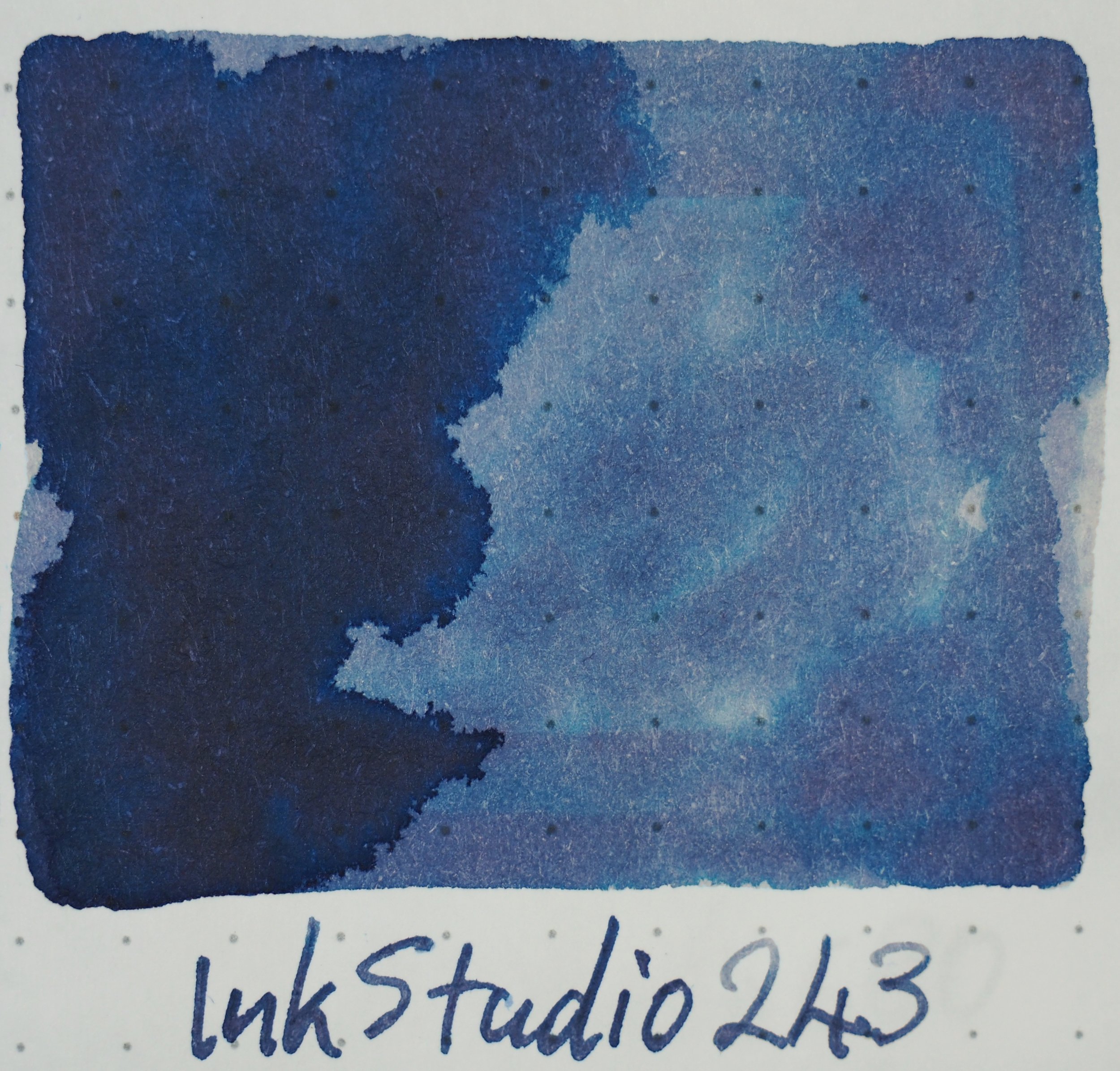
As unexpected the colour trajectory from page one to page five is pretty much the same as when on Tomoe River. It starts with pastels on page one. However, the dual-colour inks are more subtle now. 123 and 162 barely offer any pink and the green is far more prominent on both. Similarly with 130, 173 and especially 237 there is still dual-colours but it is less present than on Tomoe River. Oddly the dual-colour of 150 is slightly more prominent! 231 and 235 are noticeably more vibrant here.

The 2020 additions

UPDATED: On Rhodia 224 is similar but more muted. 252 is pinker but more orange leaning. 280 is noticeably yellower and saturated. There is no sheen on Rhodia.

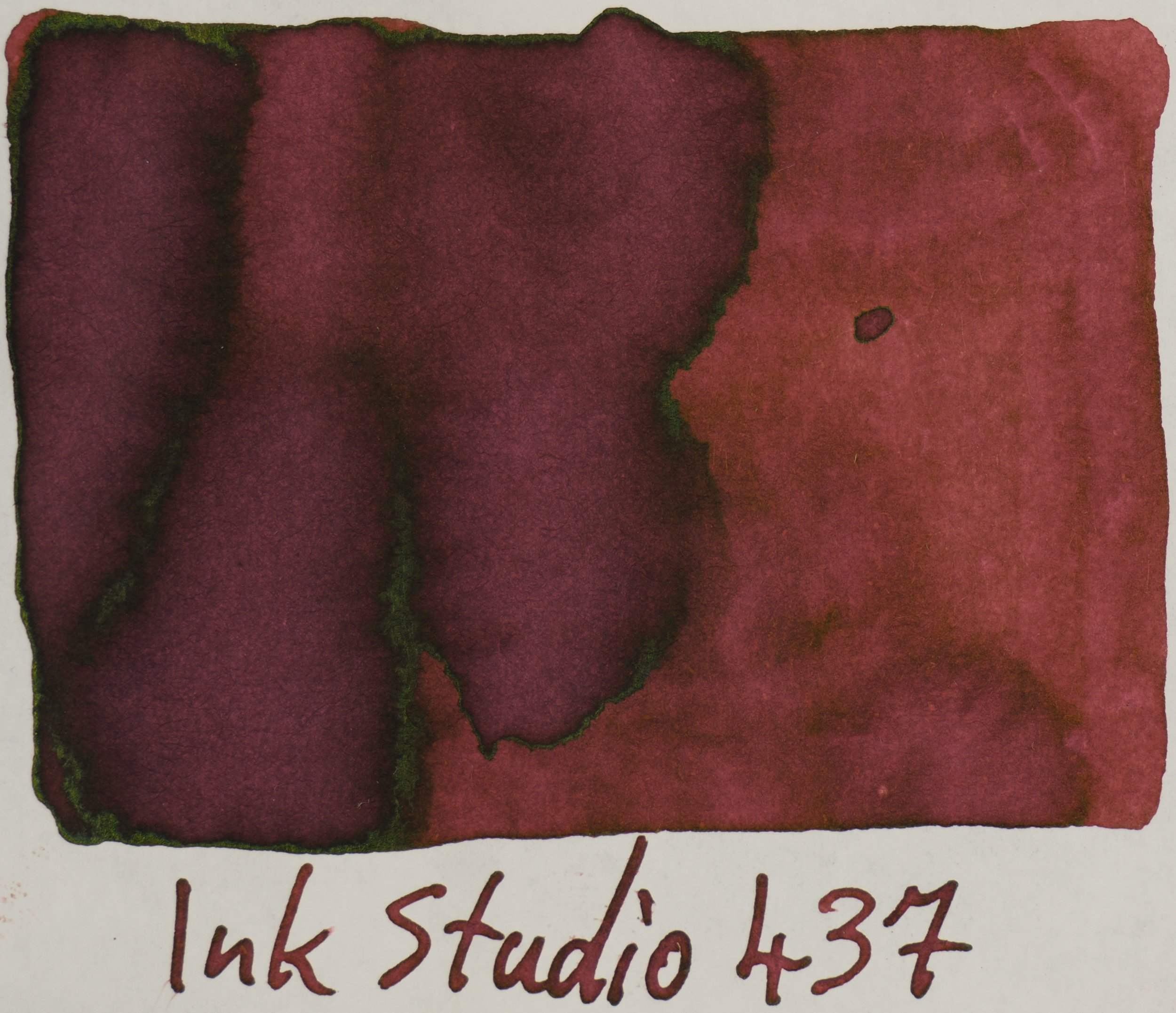
Rhodia 80gsm White 240-443

While still dull I find that these are not as dull as on Tomoe River. 437 is an interesting pink-brown-red colour on Rhodia but 237 and 373 I find a little less interesting. 370 is quite camouflage-y!

Rhodia 80gsm White 450-664

653 looks rich and dark here and 530 and 573 still remind me of the Montblanc inks. I feel the inks on this page on Rhodia feel a little more generic than the other pages.

Rhodia 80gsm White 670-773

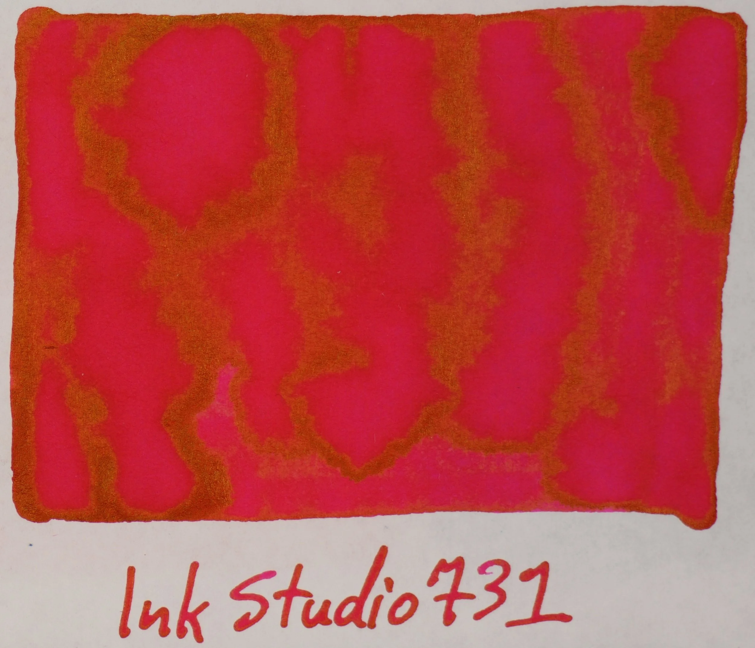
Starting to get some sheen and some real vibrancy to the inks on Rhodia here. 741 and 764 have noticeable amounts of sheen and the silver from 670 and 770 is quite nice. 760, 735, 750 are also starting to sheen. 731 is a nice super vibrant but still a slightly soft pink.

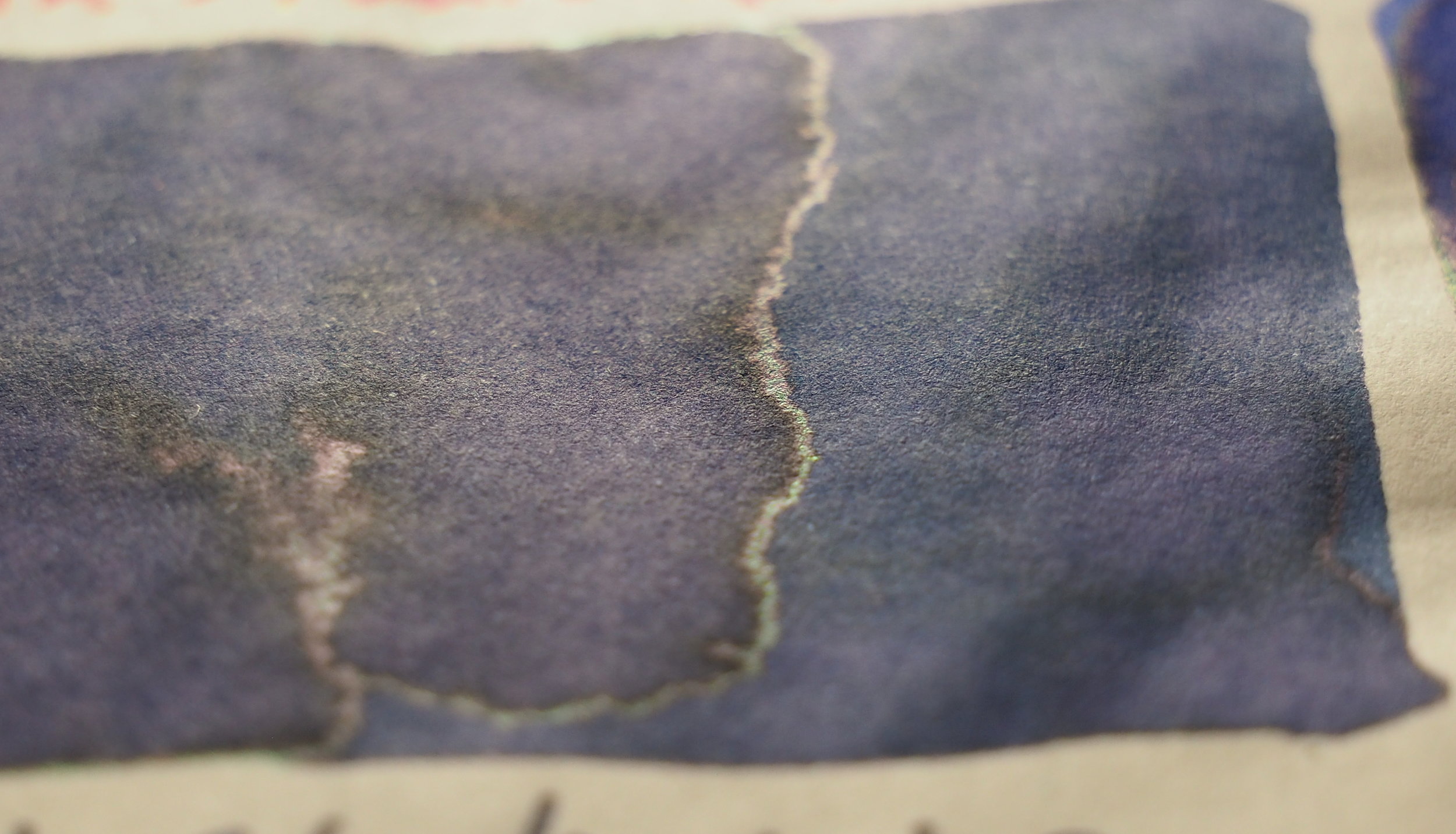
Rhodia 80gsm White 830-973

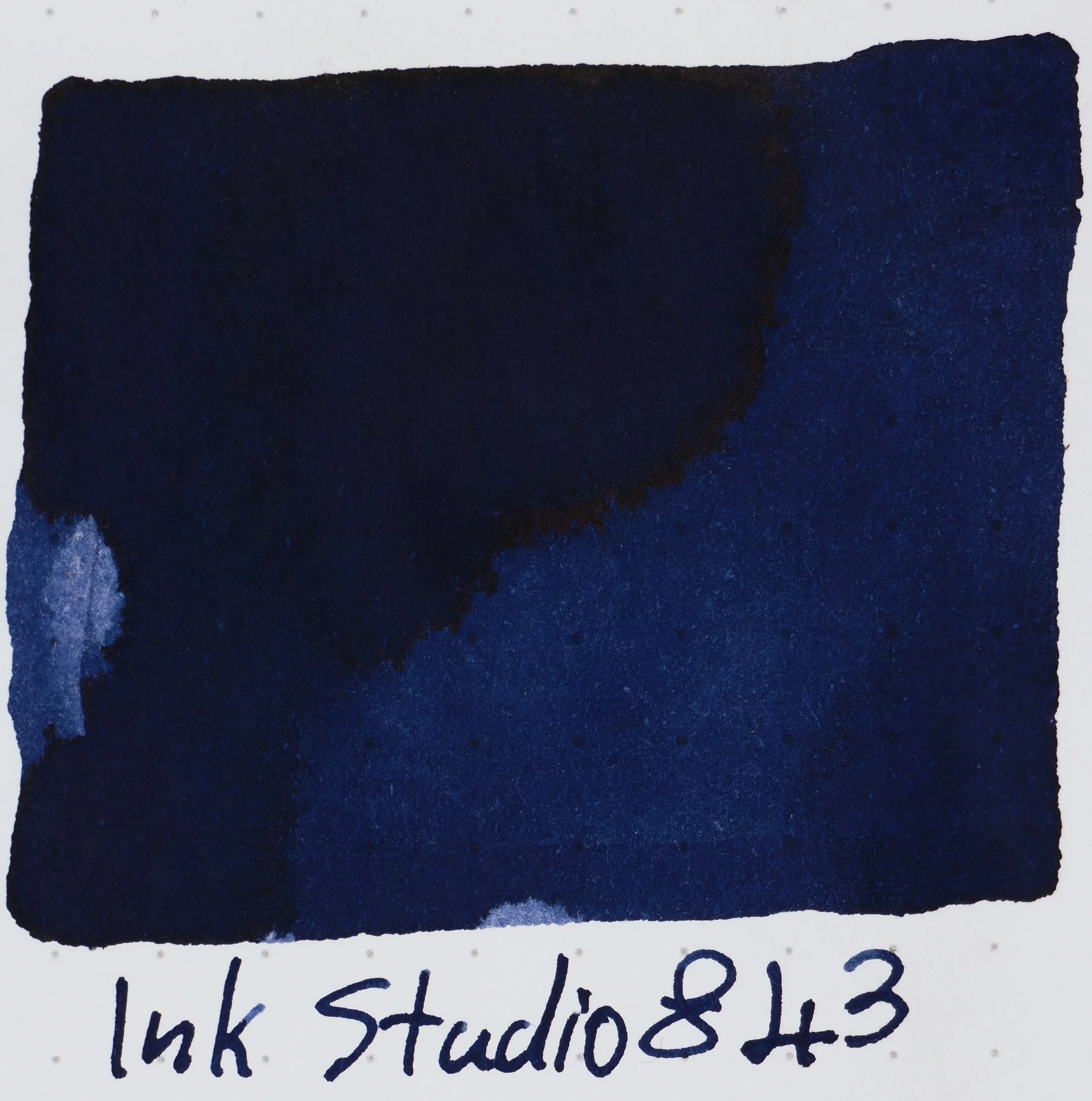
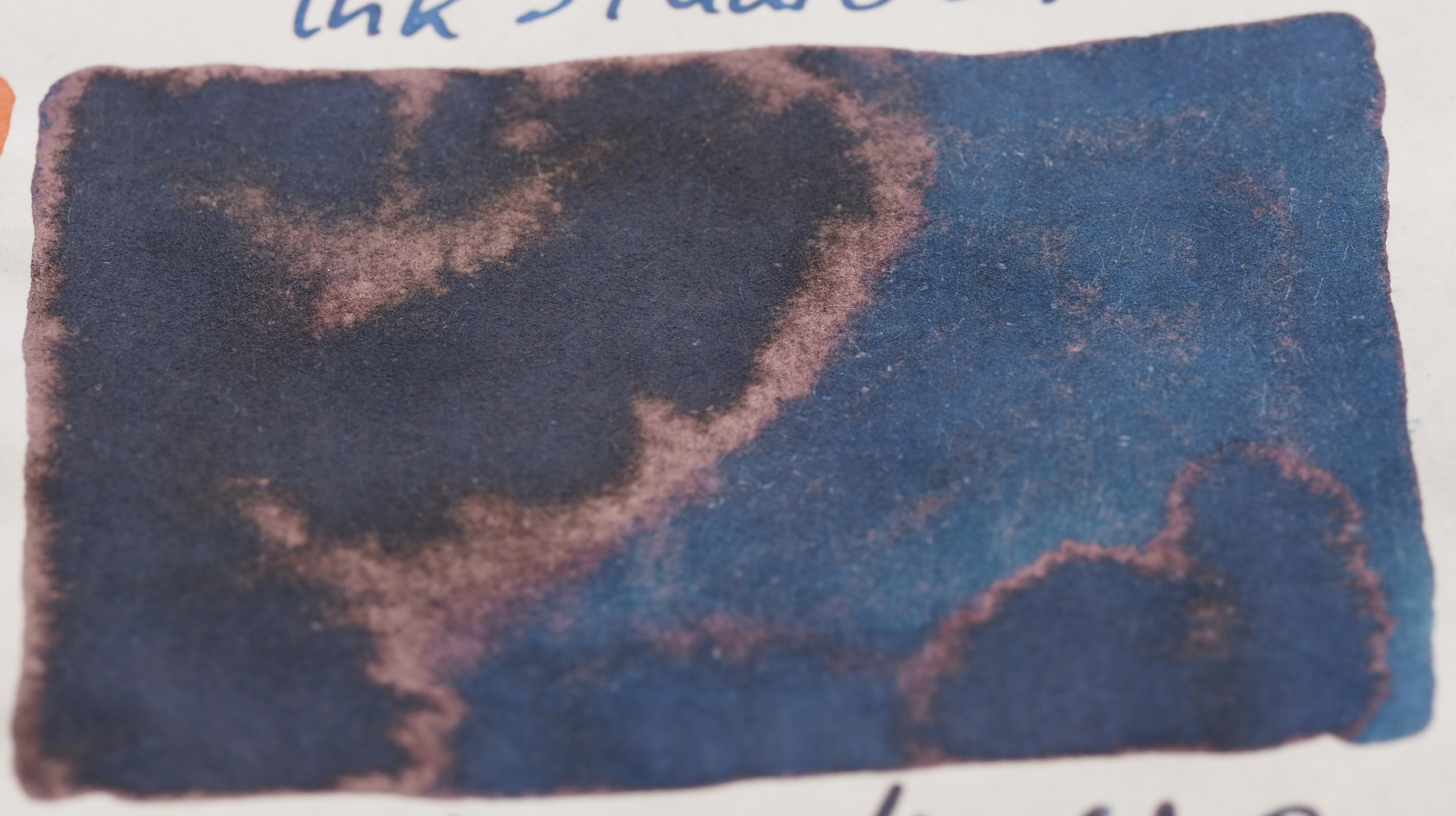
The darker blues of the final page five really leap out for me. With Tomoe River it was the Reds and Greens (which are still great here) but the complicated blues look great on Rhoda and also have some sheen. 941 is lovely rich dark blue. 967 is still great here with the darker areas almost picking up a warm sheen of some sort.

View fullsize 023.jpg
View fullsize 024.jpg
View fullsize 027.jpg
View fullsize 123.jpg
View fullsize 130.jpg
View fullsize 131.jpg
View fullsize 135.jpg
View fullsize 140.jpg
View fullsize 141.jpg
View fullsize 143.jpg
View fullsize 150.jpg
View fullsize 160.jpg
View fullsize 162.jpg
View fullsize 167.jpg
View fullsize 173.jpg
View fullsize 223.jpg
View fullsize 230.jpg
View fullsize 231.jpg
View fullsize 235.jpg
View fullsize 237.jpg
View fullsize 240.jpg
View fullsize 241.jpg
View fullsize 243.jpg
View fullsize 260.jpg
View fullsize 264.jpg
View fullsize 273.jpg
View fullsize 335.jpg
View fullsize 340.jpg
View fullsize 341.jpg
View fullsize 343.jpg
View fullsize 350.jpg
View fullsize 370.jpg
View fullsize 373.jpg
View fullsize 431.jpg
View fullsize 435.jpg
View fullsize 437.jpg
View fullsize 440.jpg
View fullsize 441.jpg
View fullsize 442.jpg
View fullsize 443.jpg
View fullsize 450.jpg
View fullsize 452.jpg
View fullsize 453.jpg
View fullsize 460.jpg
View fullsize 462.jpg
View fullsize 464.jpg
View fullsize 473.jpg
View fullsize 530.jpg
View fullsize 531.jpg
View fullsize 540.jpg
View fullsize 541.jpg
View fullsize 543.jpg
View fullsize 564.jpg
View fullsize 573.jpg
View fullsize 640.jpg
View fullsize 641.jpg
View fullsize 642.jpg
View fullsize 650.jpg
View fullsize 653.jpg
View fullsize 664.jpg
View fullsize 670.jpg
View fullsize 673.jpg
View fullsize 680.jpg
View fullsize 683.jpg
View fullsize 723.jpg
View fullsize 730.jpg
View fullsize 731.jpg
View fullsize 735.jpg
View fullsize 737.jpg
View fullsize 740.jpg
View fullsize 741.jpg
View fullsize 743.jpg
View fullsize 750.jpg
View fullsize 752.jpg
View fullsize 760.jpg
View fullsize 762.jpg
View fullsize 764.jpg
View fullsize 767.jpg
View fullsize 770.jpg
View fullsize 773.jpg
View fullsize 830.jpg
View fullsize 831.jpg
View fullsize 840.jpg
View fullsize 841.jpg
View fullsize 843.jpg
View fullsize 864.jpg
View fullsize 867.jpg
View fullsize 873.jpg
View fullsize 930.jpg
View fullsize 931.jpg
View fullsize 935.jpg
View fullsize 940.jpg
View fullsize 941.jpg
View fullsize 943.jpg
View fullsize 950.jpg
View fullsize 960.jpg
View fullsize 964.jpg
View fullsize 967.jpg
View fullsize 970.jpg
View fullsize 973.jpg
View fullsize High Res - New Ink Studio (07-12-2020) - 2.jpg
View fullsize High Res - New Ink Studio (07-12-2020) - 3.jpg
View fullsize High Res - New Ink Studio (07-12-2020) - 1.jpg

Sheen

View fullsize Rhodia Sheen Overview 023-237
Rhodia Sheen Overview 023-237
View fullsize Rhodia Sheen Overview 240-443
Rhodia Sheen Overview 240-443
View fullsize Rhodia Sheen Overview 450-664
Rhodia Sheen Overview 450-664
View fullsize Rhodia Sheen Overview 670-773
Rhodia Sheen Overview 670-773
View fullsize Rhodia Sheen Overview 830-973
Rhodia Sheen Overview 830-973
View fullsize TR Sheen Overview 023-237
TR Sheen Overview 023-237
View fullsize TR Sheen Overview 240-443
TR Sheen Overview 240-443
View fullsize TR Sheen Overview 450-664
TR Sheen Overview 450-664
View fullsize TR Sheen Overview 670-773
TR Sheen Overview 670-773
View fullsize TR Sheen Overview 830-973
TR Sheen Overview 830-973

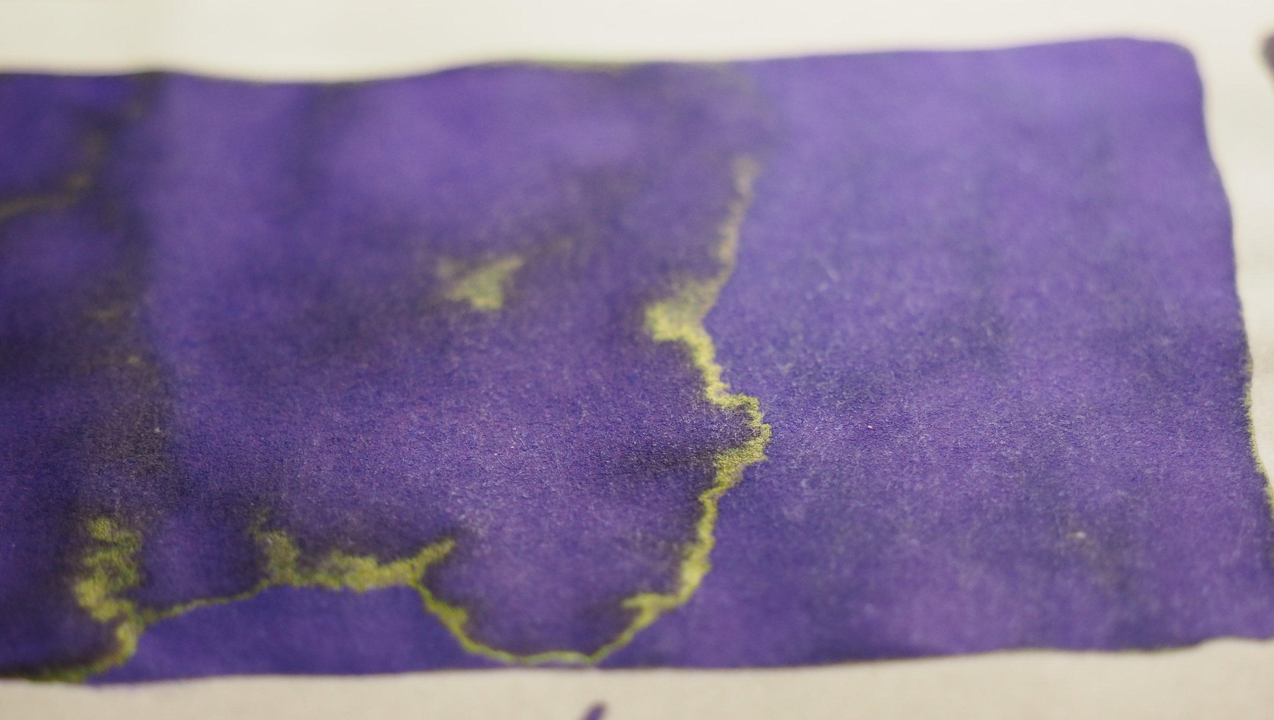
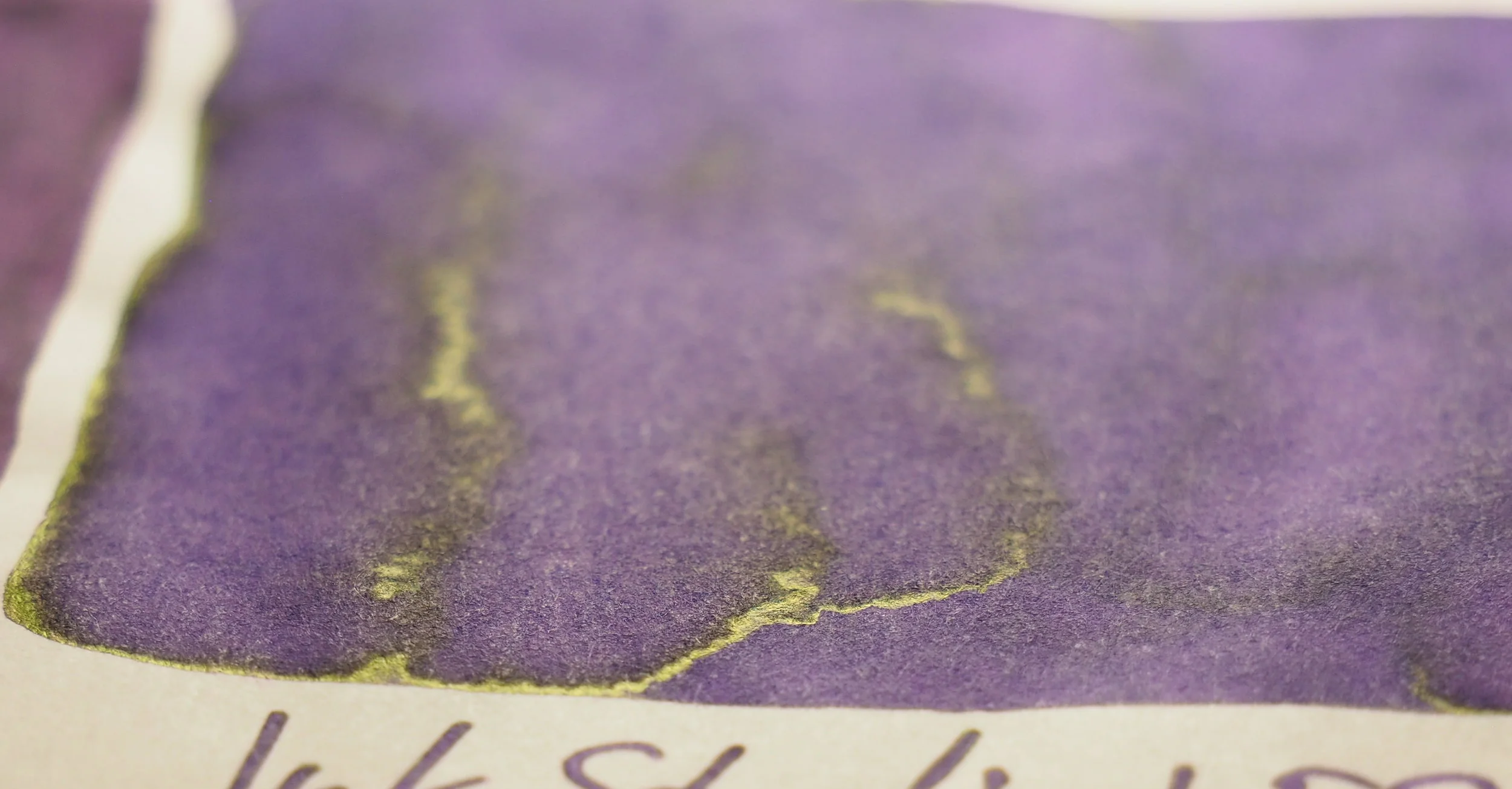
The sheen from the last two pages of Tomoe River is insane! So much colour on each page. 940 is showing reddish sheen green sheen and the blue base as is 743. Even the browns have a strong silvery-green sheen. They are impressive pages of colour. It’s not unexpected that Rhodia doesn’t produce the same sheen nor does it produce anything close to the same amount of sheen.

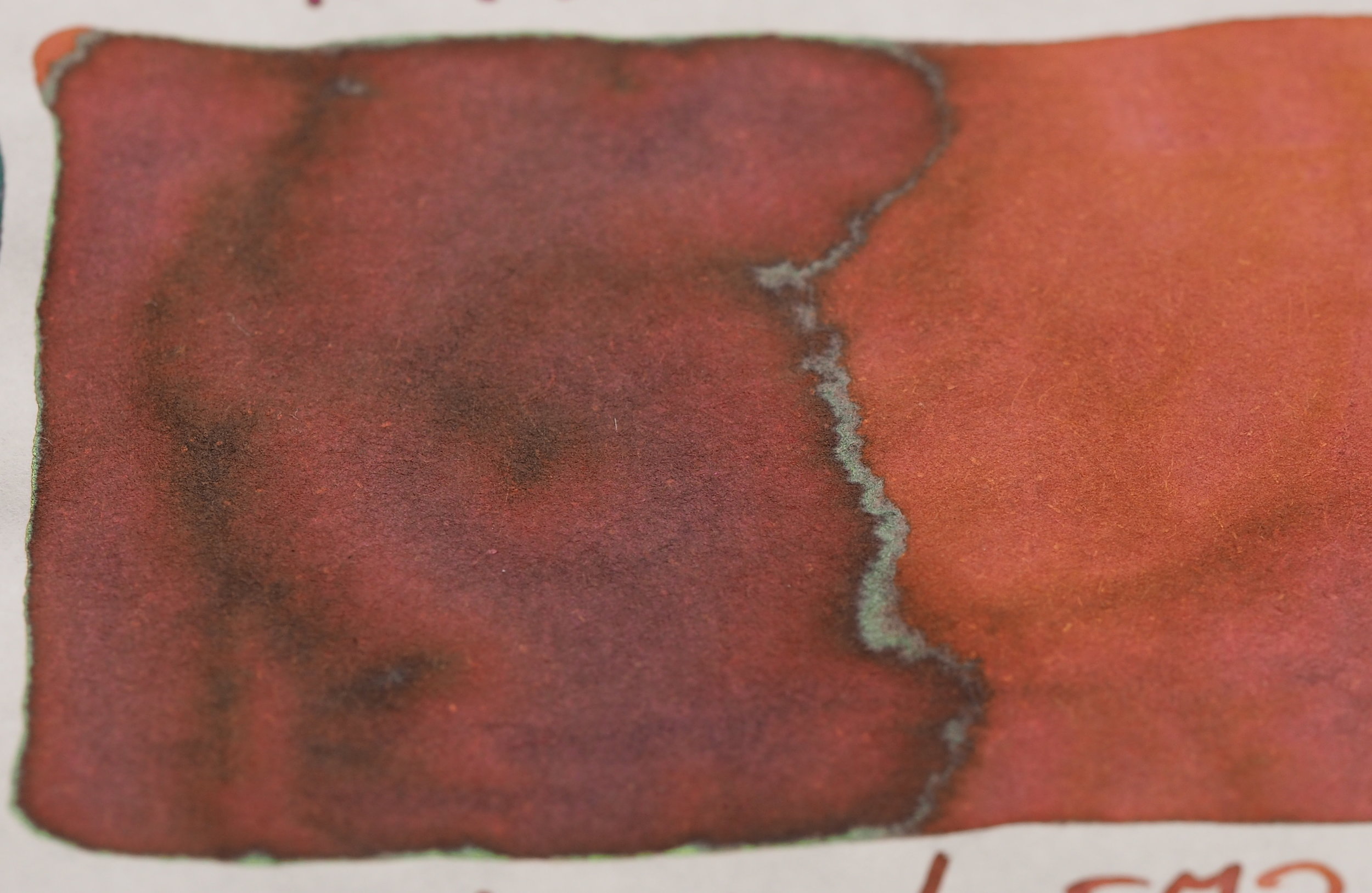
On Rhodia the standout inks (for me) with regards to sheen are: 741 for its amount of sheen; 670 and 770 for the glossy silver sheen and 930 for the subtle green-gold sheen over the red base colour.

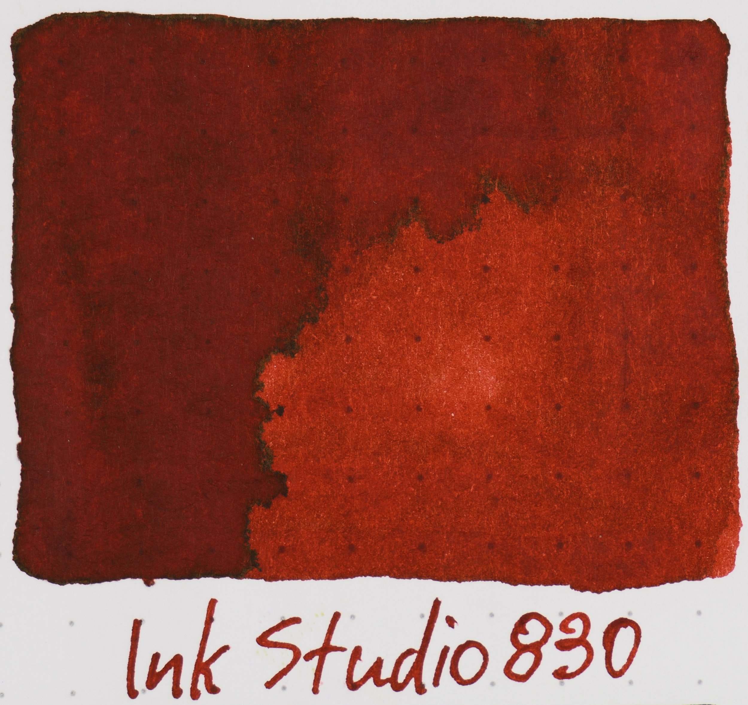
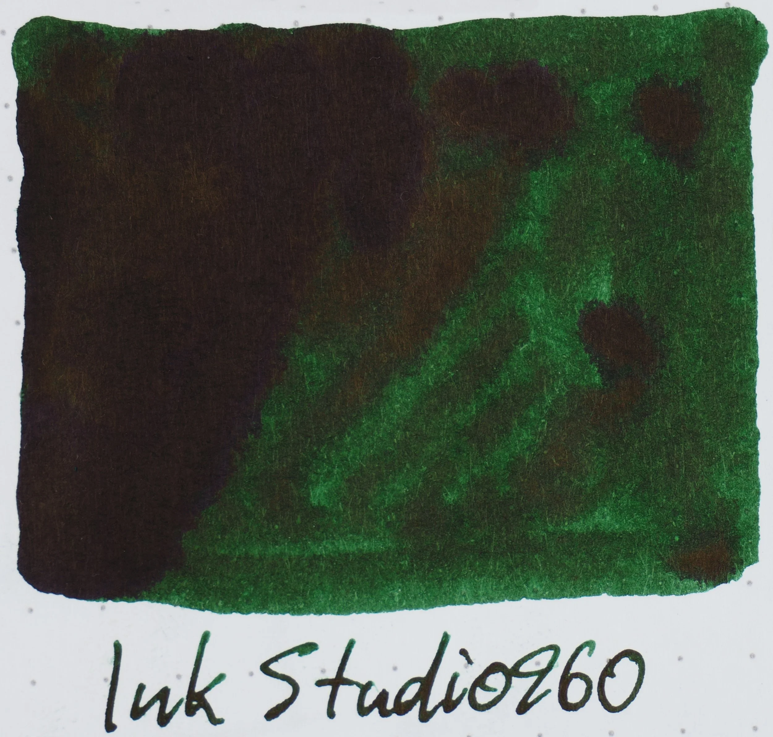
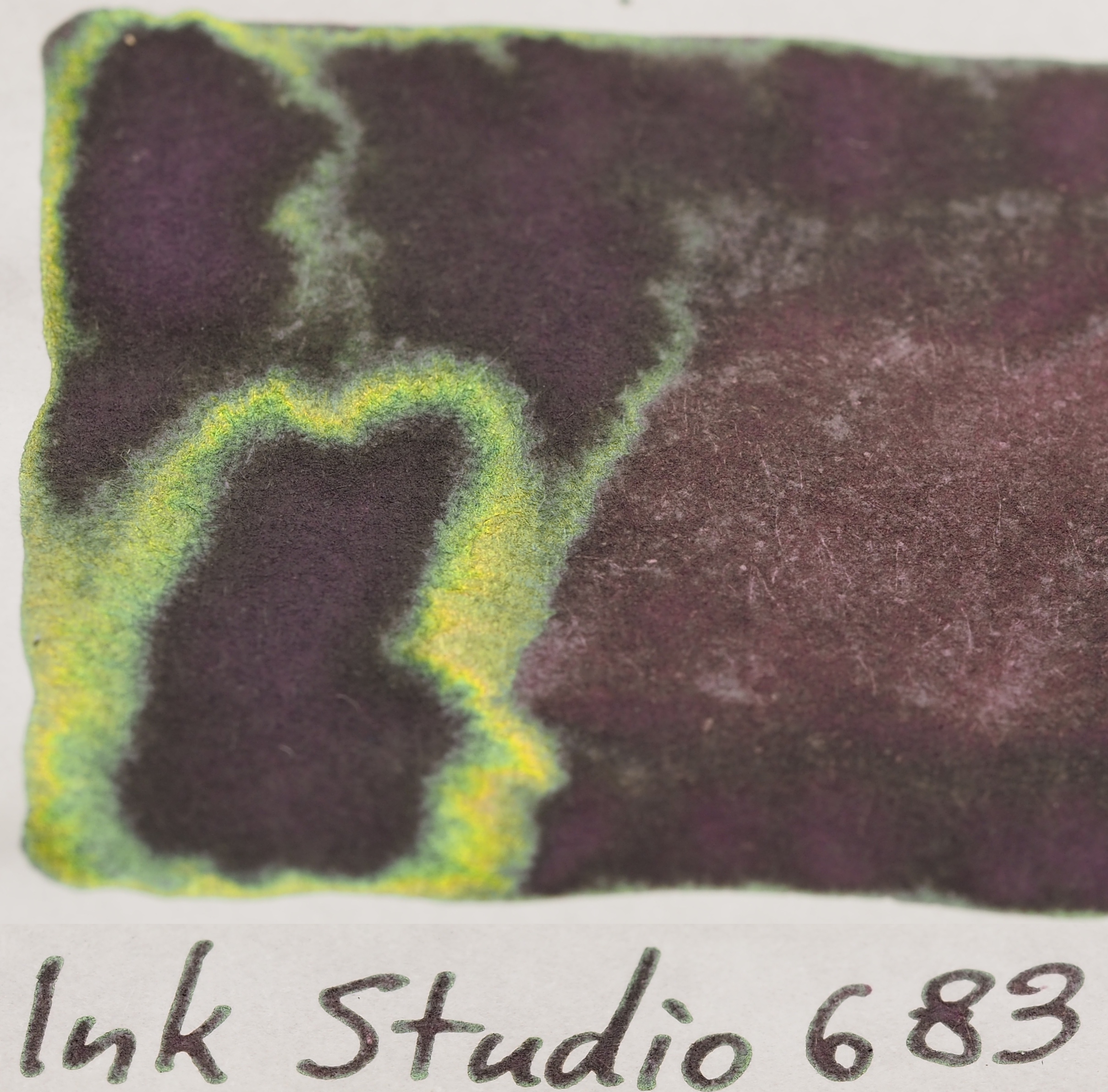
On Tomoe River there is obviously a lot more to choose from! First a shoutout to the double shiners (a pink sheen with a green sheen): 642, 650, 740, 743, 840, 843, 940 and 943. The silver gloss of 670, 770 and 970 are still great and I love the browns and reds with strong sheen (683, 830, 930, 973). Finally the silver sheen on the greens of 767, 867 and 967 really remind me of rain on leaves.

View fullsize 670 Sheen on Rhodia 80gsm
670 Sheen on Rhodia 80gsm
View fullsize 731 Sheen on Rhodia 80gsm
731 Sheen on Rhodia 80gsm
View fullsize 735 Sheen on Rhodia 80gsm
735 Sheen on Rhodia 80gsm
View fullsize 741 Sheen on Rhodia 80gsm
741 Sheen on Rhodia 80gsm
View fullsize 760 Sheen on Rhodia 80gsm
760 Sheen on Rhodia 80gsm
View fullsize 764 Sheen on Rhodia 80gsm
764 Sheen on Rhodia 80gsm
View fullsize 767 Sheen on Rhodia 80gsm
767 Sheen on Rhodia 80gsm
View fullsize 770 Sheen on Rhodia 80gsm
770 Sheen on Rhodia 80gsm
View fullsize 841 Sheen on Rhodia 80gsm
841 Sheen on Rhodia 80gsm
View fullsize 831 Sheen on Rhodia 80gsm
831 Sheen on Rhodia 80gsm
View fullsize 935 Sheen on Rhodia 80gsm
935 Sheen on Rhodia 80gsm
View fullsize 941 Sheen on Rhodia 80gsm
941 Sheen on Rhodia 80gsm
View fullsize 964 Sheen on Rhodia 80gsm
964 Sheen on Rhodia 80gsm

This isn’t all the shining ink for Rhodia 80gsm but it is the most sheening ones and the others are unlikely to show much of the already subtle sheen in writing.

View fullsize 023 Sheen on Tomoe River 52gsm
023 Sheen on Tomoe River 52gsm
View fullsize 024 Sheen on Tomoe River 52gsm
024 Sheen on Tomoe River 52gsm
View fullsize 027 Sheen on Tomoe River 52gsm
027 Sheen on Tomoe River 52gsm
View fullsize 260 Sheen on Tomoe River 52gsm
260 Sheen on Tomoe River 52gsm
View fullsize 431 Sheen on Tomoe River 52gsm
431 Sheen on Tomoe River 52gsm
View fullsize 435 Sheen on Tomoe River 52gsm
435 Sheen on Tomoe River 52gsm
View fullsize 437 Sheen on Tomoe River 52gsm
437 Sheen on Tomoe River 52gsm
View fullsize 440 Sheen on Tomoe River 52gsm
440 Sheen on Tomoe River 52gsm
View fullsize 441 Sheen on Tomoe River 52gsm
441 Sheen on Tomoe River 52gsm
View fullsize 442 Sheen on Tomoe River 52gsm
442 Sheen on Tomoe River 52gsm
View fullsize 443 Sheen on Tomoe River 52gsm
443 Sheen on Tomoe River 52gsm
View fullsize 450 Sheen on Tomoe River 52gsm
450 Sheen on Tomoe River 52gsm
View fullsize 452 Sheen on Tomoe River 52gsm
452 Sheen on Tomoe River 52gsm
View fullsize 453 Sheen on Tomoe River 52gsm
453 Sheen on Tomoe River 52gsm
View fullsize 460 Sheen on Tomoe River 52gsm
460 Sheen on Tomoe River 52gsm
View fullsize 464 Sheen on Tomoe River 52gsm
464 Sheen on Tomoe River 52gsm
View fullsize 473 Sheen on Tomoe River 52gsm
473 Sheen on Tomoe River 52gsm
View fullsize 530 Sheen on Tomoe River 52gsm
530 Sheen on Tomoe River 52gsm
View fullsize 531 Sheen on Tomoe River 52gsm
531 Sheen on Tomoe River 52gsm
View fullsize 540 Sheen on Tomoe River 52gsm
540 Sheen on Tomoe River 52gsm
View fullsize 541 Sheen on Tomoe River 52gsm
541 Sheen on Tomoe River 52gsm
View fullsize 543 Sheen on Tomoe River 52gsm
543 Sheen on Tomoe River 52gsm
View fullsize 564 Sheen on Tomoe River 52gsm
564 Sheen on Tomoe River 52gsm
View fullsize 573 Sheen on Tomoe River 52gsm
573 Sheen on Tomoe River 52gsm
View fullsize 640 Sheen on Tomoe River 52gsm
640 Sheen on Tomoe River 52gsm
View fullsize 641 Sheen on Tomoe River 52gsm
641 Sheen on Tomoe River 52gsm
View fullsize 642 Sheen on Tomoe River 52gsm
642 Sheen on Tomoe River 52gsm
View fullsize 650 Sheen on Tomoe River 52gsm
650 Sheen on Tomoe River 52gsm
View fullsize 653 Sheen on Tomoe River 52gsm
653 Sheen on Tomoe River 52gsm
View fullsize 664 Sheen on Tomoe River 52gsm
664 Sheen on Tomoe River 52gsm
View fullsize 670 Sheen on Tomoe River 52gsm
670 Sheen on Tomoe River 52gsm
View fullsize 680 Sheen on Tomoe River 52gsm
680 Sheen on Tomoe River 52gsm
View fullsize 683 Sheen on Tomoe River 52gsm
683 Sheen on Tomoe River 52gsm
View fullsize 723 Sheen on Tomoe River 52gsm
723 Sheen on Tomoe River 52gsm
View fullsize 730 Sheen on Tomoe River 52gsm
730 Sheen on Tomoe River 52gsm
View fullsize 731 Sheen on Tomoe River 52gsm
731 Sheen on Tomoe River 52gsm
View fullsize 735 Sheen on Tomoe River 52gsm
735 Sheen on Tomoe River 52gsm
View fullsize 737 Sheen on Tomoe River 52gsm
737 Sheen on Tomoe River 52gsm
View fullsize 740 Sheen on Tomoe River 52gsm
740 Sheen on Tomoe River 52gsm
View fullsize 741 Sheen on Tomoe River 52gsm
741 Sheen on Tomoe River 52gsm
View fullsize 743 Sheen on Tomoe River 52gsm
743 Sheen on Tomoe River 52gsm
View fullsize 750 Sheen on Tomoe River 52gsm
750 Sheen on Tomoe River 52gsm
View fullsize 752 Sheen on Tomoe River 52gsm
752 Sheen on Tomoe River 52gsm
View fullsize 760 Sheen on Tomoe River 52gsm
760 Sheen on Tomoe River 52gsm
View fullsize 762 Sheen on Tomoe River 52gsm
762 Sheen on Tomoe River 52gsm
View fullsize 764 Sheen on Tomoe River 52gsm
764 Sheen on Tomoe River 52gsm
View fullsize 767 Sheen on Tomoe River 52gsm
767 Sheen on Tomoe River 52gsm
View fullsize 770 Sheen on Tomoe River 52gsm
770 Sheen on Tomoe River 52gsm
View fullsize 773 Sheen on Tomoe River 52gsm
773 Sheen on Tomoe River 52gsm
View fullsize 830 Sheen on Tomoe River 52gsm
830 Sheen on Tomoe River 52gsm
View fullsize 831 Sheen on Tomoe River 52gsm
831 Sheen on Tomoe River 52gsm
View fullsize 840 Sheen on Tomoe River 52gsm
840 Sheen on Tomoe River 52gsm
View fullsize 841 Sheen on Tomoe River 52gsm
841 Sheen on Tomoe River 52gsm
View fullsize 843 Sheen on Tomoe River 52gsm
843 Sheen on Tomoe River 52gsm
View fullsize 864 Sheen on Tomoe River 52gsm
864 Sheen on Tomoe River 52gsm
View fullsize 867 Sheen on Tomoe River 52gsm
867 Sheen on Tomoe River 52gsm
View fullsize 873 Sheen on Tomoe River 52gsm
873 Sheen on Tomoe River 52gsm
View fullsize 930 Sheen on Tomoe River 52gsm
930 Sheen on Tomoe River 52gsm
View fullsize 931 Sheen on Tomoe River 52gsm
931 Sheen on Tomoe River 52gsm
View fullsize 935 Sheen on Tomoe River 52gsm
935 Sheen on Tomoe River 52gsm
View fullsize 940 Sheen on Tomoe River 52gsm
940 Sheen on Tomoe River 52gsm
View fullsize 941 Sheen on Tomoe River 52gsm
941 Sheen on Tomoe River 52gsm
View fullsize 943 Sheen on Tomoe River 52gsm
943 Sheen on Tomoe River 52gsm
View fullsize 950 Sheen on Tomoe River 52gsm
950 Sheen on Tomoe River 52gsm
View fullsize 960 Sheen on Tomoe River 52gsm
960 Sheen on Tomoe River 52gsm
View fullsize 964 Sheen on Tomoe River 52gsm
964 Sheen on Tomoe River 52gsm
View fullsize 967 Sheen on Tomoe River 52gsm
967 Sheen on Tomoe River 52gsm
View fullsize 970 Sheen on Tomoe River 52gsm
970 Sheen on Tomoe River 52gsm
View fullsize 973 Sheen on Tomoe River 52gsm
973 Sheen on Tomoe River 52gsm

There are 69 sheening inks on Tomoe River 52gsm which means more than two thirds of the inks from the set sheen (to various degrees) on Tomoe River. That’s a lot of sheen! Meanwhile very few of inks sheen on Rhodia (especially in any meaningful way).

Conclusion

So should you get the whole set? Probably not. It’s a very sizeable ink investment. The inks are NZ$34.99 (which is around US$24 as of late January 2019) at Pen Classics. But I have seen prices ranging from US$17-US$19. This is the higher end of the ballpark normal price for Sailor these days (unfortunately). They are definitely cheaper from Japan (At US$12/¥1,296) but Japan can be expensive to ship from and also they are getting strict with shipping their (requiring an MSDS). If you are traveling to Japan and want some of these I recommend taking advantage of your proximity! There’s a lot of variation in hues, saturation, vibrancy, and brightness. I’d wager for most people not every ink would be an ink they would normally choose. It isn’t for me. 160 is a colour I very much dislike, for example, and I don’t really have a need for 023, 024, and 027. My recommendation for everyone is to, very simply, pick and choose a few but if you have a favourite type of ink you can also buy a batch of inks based on the first digit; If you like Pastels 100s and 200s are great for that; 300s are good for greyer inks and if you want rich and sheeny Thant 800s and 900s are your go. I do recommend getting one of the unique dual-colour inks though.

There are a lot of blues here. Almost 25% are some sort of blue. Too many? Possible. I think there could be more variety with the greens and browns as well as more oranges and there are no greys.

In my State of the Union I generally bemoaned Sailor’s hidden price increase but I was more critical of dropping the volume to 20ml which I think is just too small. Given that this is a specific set with 100 bottles, however, I think it’s OK. This is not a normal standard line ink (though it isn’t limited); it’s a whole set of 100 related inks. 30ml would be ideal but 20ml is fine for this.

I am glad I have the whole set. There are lot of colours here that I really like or at least find interesting. The point of this was not really to review the inks and as I’ve inked very few of them that wouldn’t really be possible. The purpose was to provide an overview to help with selecting an ink (or a few) to purchase as approaching 100 inks can be a little overwhelming. Hopefully it helps with that!

As mentioned I bought these inks from Pen Classics in New Zealand. They are one of the first few non-Japanese stores to sell these inks.

✒︎ ✑ ✒︎ ✑

I've listed all my inks and all my pens in their respective pages. Please let me know which inks you'd like to review next via the comments, Twitter, Instagram, or contact me directly.

For blog updated you can follow @macchiato_man on Twitter, subscribe via email, or like my Facebook page.

I was not compensated for this review and everything here is my own honest opinion. There are no affiliate links in this review but Desk Bandit is a sponsor of the blog.

I purchased these ink with my own money but it was at a discounted price the purpose of giving an honest overview. I was not otherwise compensated and everything here is my own honest opinion. There are no affiliate links.

Tags: Sailor, Ink Studio
← Respective: Friday February 22ndPen Mega-Review: Sailor Pro Gear →
Back to Top

Blog RSS

✉ Email Subscription

☞ Fountain Pens Australia (Facebook Group)

☛ Sailor Pens & Inks (Facebook Group)