

Montblanc released the Heritage 1912 in 2013 as a homage to their safety pens of the early 20th century. The 1912 is a piston filler with a retractable nib and a small profile (when capped) but a normal well weighted pen when uncapped. This is a bit of a different review as the pen isn't a stock pen from the manufacturer; the nib has been modified by Mike Masuyama.
The Montblanc Heritage 1912 is a mostly flat-top pen that is a curious hybrid between a pocket pen when capped, and a normal pen when uncapped. The pen has resin with a brass interior giving the pen a very decent amount of heft to it. It has platinum coated fittings on the cap and a rhodium plated 14k nib. The barrel is almost completely uniformly thick but does slowly widen to the piston grip at the back of the pen before tapering a little quicker to the finial.
The Heritage 1912 is a homage to old Montblanc Safety Filler pens which are similar in that they have a retractable nib but different in that they are eye eye droppered into where the nib sits when retracted (the nib sits in the ink).
Packaging and paraphernalia

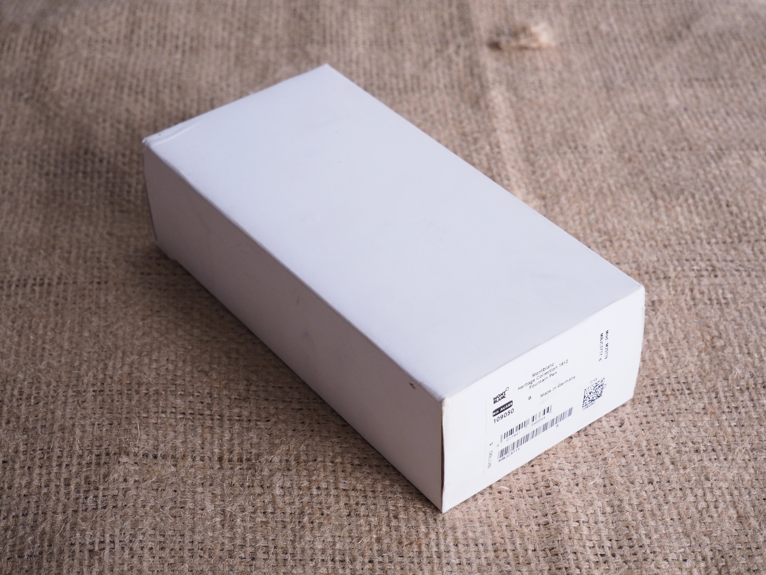


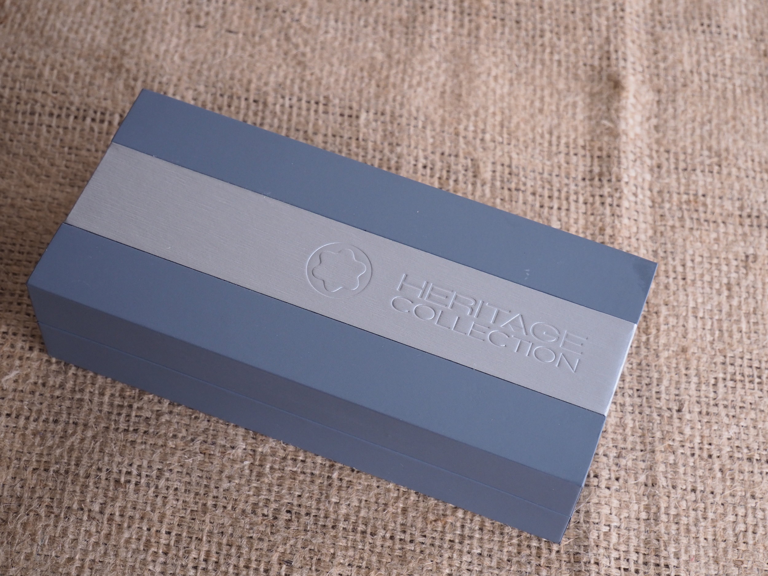
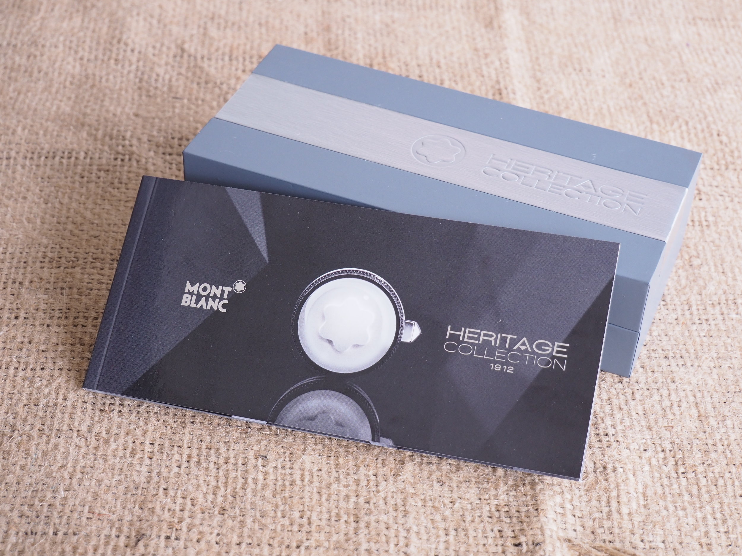

The pen comes in a simple white cardboard outer box which (thankfully) has the nib size on it. Inside that is another thin cardboard box, that is, this time, not plane white but bears the Montblanc insignia as a greyscale design for the Heritage 1912. Within this box is a third box and a booklet. Thankfully this is the last box made and is made of a harder and thicker cardboard and is where the 1912 rests on a soft grey padded fabric. There's a fair amount of packaging here.


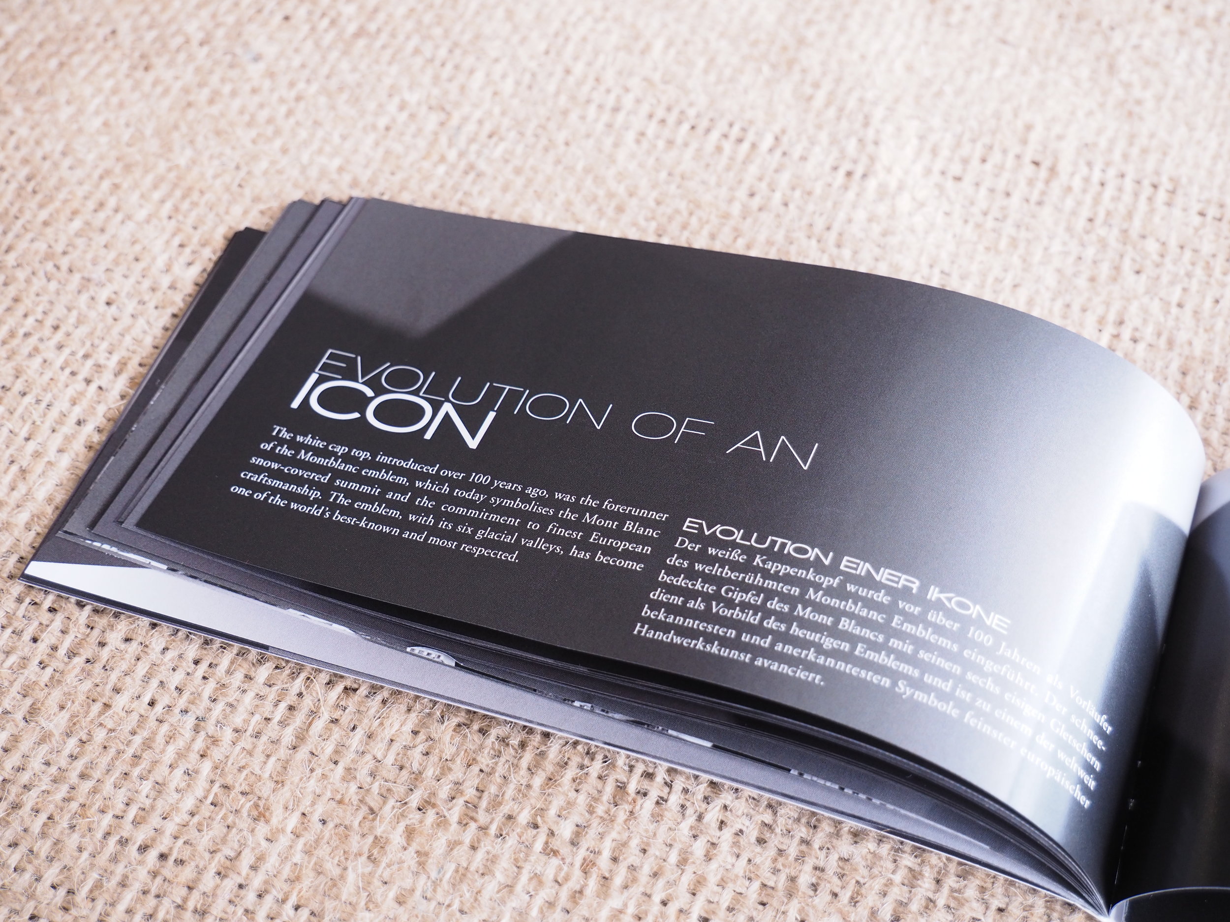
The booklet features some somewhat hyperbolic marketing jargon. "Divine the future", "setting standards of ingenuity", "uncompromising by design", "thinking beyond technology", "redefining the refine", "evolution of an icon"… This is a beautifully designed pen with a fun and interesting mechanism but to me the excessive buzzwords almost undermine the beautiful design and the interesting mechanisms.
Cap


The platinum-plated clip which extends and wraps around the end of the cap is relatively unadorned with only a slight ark and and a soft ridge as a spine. The clip divides into two bands that wrap around the cap and then join on the other side to provide space for a debossed Montblanc mountain-top insignia. Stamped on the top divided band is the serial number for the pen and underneath the clip is "Made in Germany". Past the platinum bands is a small grip-like strip that doesn't seem to serve a functional purpose but may be there to balance, visually, with the grip on the piston on the barrel. The finial of the cap is a large shallowly rounded dome. Inside the dome is a raised mother-of-pearl lacquer Montblanc mountain top encased in some sort of plastic. This is a particularly unique and beautiful render of the Montblanc logo that doesn't actually stand out all that much as the actual star shape is only subtly discernible from the mother-of-pearl lacquer it is raised out of. I'm a big fan of this design and because of the convex lens nature of the plastic encasing, the mountain top logo is refracted when viewed from the side; a nice effect.
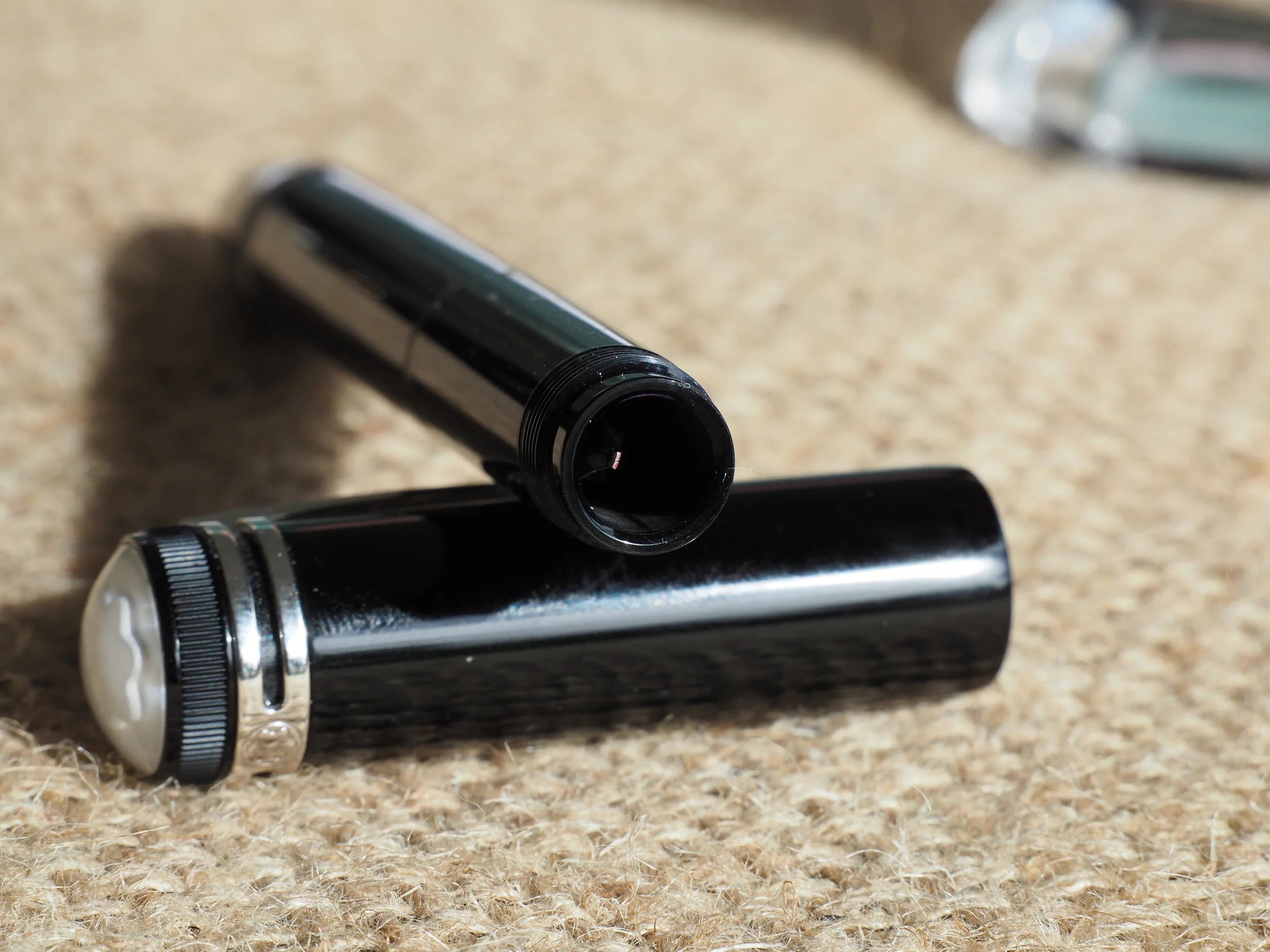
The cap doesn't post. At all. This is a little unfortunate given that you have to remove the cap, place it somewhere, and then unscrew the nib. A handy place would be the end of the pen (not that I ever post my pens). This is exactly how Montblanc Bohème pens work (and indeed the cap is used to twist the nib-extender. I understand, however, that this might make the pen very back heavy when writing, however.
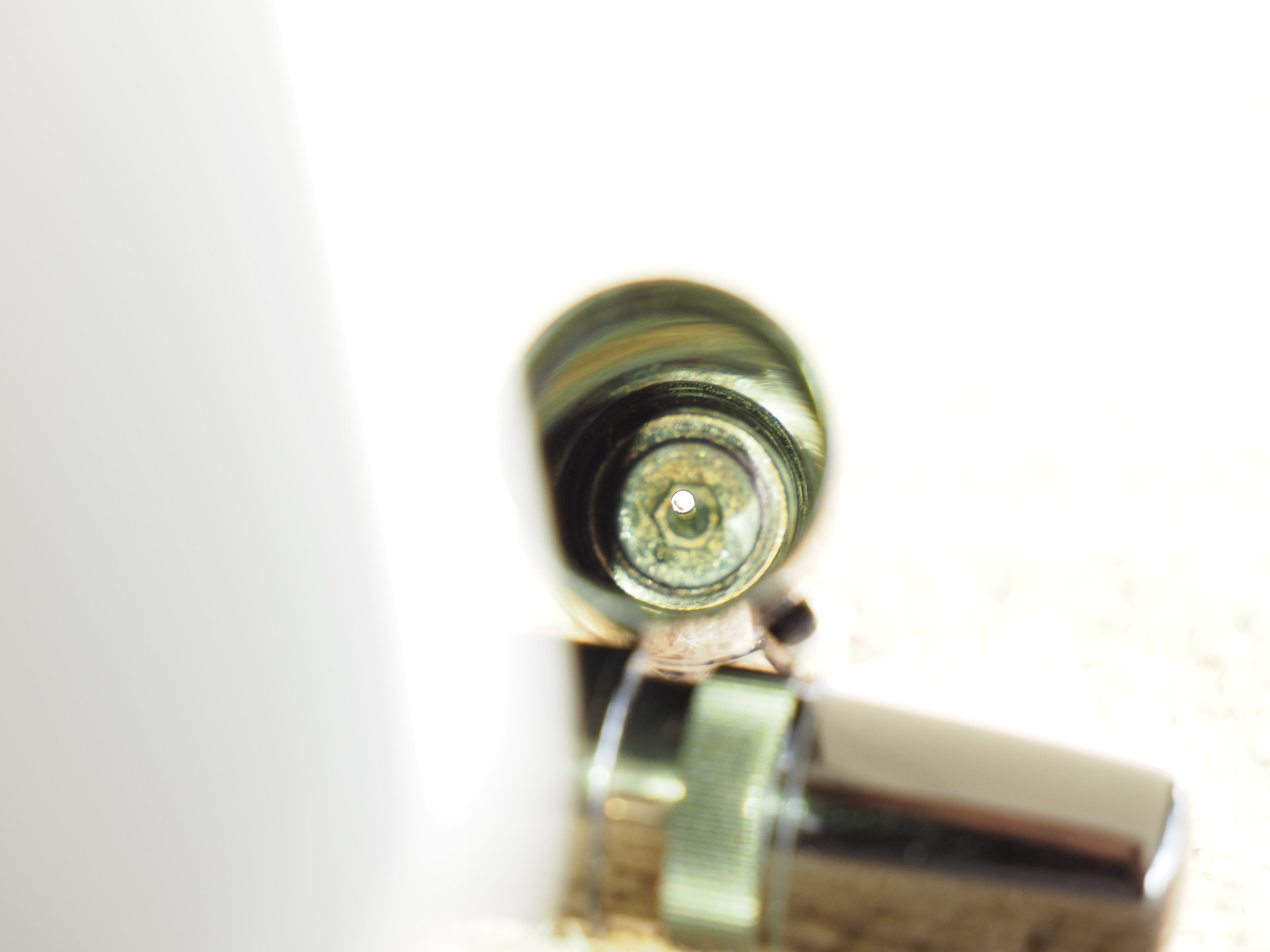

Inside the cap is a blunt metal nail. The point of this nail is the prevent damage of the nib if you accidentally attempt to screw the cap on before retracting the nib. It fits into an indented section on the plastic feed to stop the nib from touching the end of the cap.

A flaw of this pen is that the nib creates a mark on the barrel. This is something universally reported by owners. It seems to be rumoured that Montblanc fixed this at some point and I've also read that the marking is due to a metal ring in the cap but my cap has a rubber ring in the cap so it's possible that it was adjusted. Nevertheless, my Heritage 1912 does have a ring mark from the cap. Mine looks more like a smudge than a scratch compares to what definitely looks like a scratch here but some light polishing doesn't affect it at all.
Filling and nib extension mechanism


The filling mechanism, which is a piston filler, of the pen is definitely fascinating because it is tied into the retraction mechanism. Most pens that have a nib-retraction mechanism are cartridge converters (Visconti Pininfarina, Lamy Dialog 3, Pilot Vanishing Point, Pilot Fermo, or Montblanc's own Bohème line of which some even only hold a converter) but the Montblanc Heritage 1912 builds the Piston into nib-retraction mechanism. With the piston flush with the rest of the barrel, turning it will extend and retract the nib. If you pull on the piston and extent it you engage the filling mechanism. Turning it now will push down and pull up the piston. This pen doesn't have the biggest ink capacity and this is possibly due to the resin and brass barrel material and the mechanism needing to fill two rolls. At 0.8ml this is around the size of a cartridge or a converter and not in line with the filling capacities of most piston fillers (Pelikan M600 has 1.3ml; Lamy 2000 has 1.2ml; TWSBI Eco, 1.8ml; and TWSBI Diamond 580, 2ml).
Nib


There isn't really a grip section top this pen unless you want to call the ≈4mm flat section before the threads a grip section (which I don't). The threads aren't sharp so there's no issue holding the pen over them or half over them and half over the 4mm flat section before it, for me at least, but I believe the pen was meant to be held further back past the threads.
The nib has a slightly reserved design to it without any baroque ornamentation and a rather straight forward nib shape. Even the breather whole has a modern feeling to it as it is a sharp-cornered triangle.
The nib feel is very nice and soft. As it's a broad nib already it's difficult to determine whether the softness provides much line variation but I don't believe it would. This softness is a nib-feel softness rather than a written-line feature. The nib doesn't write all that wet; I wouldn't call it dry but it's definitely not wet. A wet ink, while not necessary, is more pleasant to me in this pen than a dry ink.
The nib is not a stock nib. It started as a Broad nib from Montblanc but was sent to Mike Masuyama to turn it into a Broad Cursive Italic. A Cursive Italic is meant to be sharper than stub nib and generally provides greater line width variation between the vertical and horizontal strokes with the horizontal strokes being very thin. A Cursive Italic is less sharp than a Formal Italic and provides slightly less vertical and horizontal line width variation. Rotating a Cursive Italic too much (which is easier to do than with a stub and a lot easier than with a regular round nib such as a medium) will often mean the corners of the Cursive Italic grind will dig into the paper. the nib catching a little gives a very sharp feel to the nib, which can be pleasant, but sometimes if you rotate too much and the nib catches too much then it isn't pleasant at all. You definitely need to try and keep the flat part of the nib flat agains the paper. This isn't an issue for me but if you are someone who routinely rotates the nib this might be an issue (though fortunately there are Oblique nibs for this very reason). The nib does it's job very nicely with some crisp thin horizontal lines and fatter vertical lines. If you remain perfectly flat with no rotation this nib is beautifully smooth and the bounce from the softer nib emphasises it. The nib on this pen is very nice and this is something I hear from other other owners of stock nib 1912s as well but the Mike Masuyama Cursive Italic grind is the cherry on top.
The nib doesn't dry out when uncapped and with the nib extended (within reason) which is good given that this is a pen that lends itself to being uncapped for extended periods.
Top to bottom: Franklin-Christoph steel #6 nib with Masuyama Broad Cursive Italic, Lamy Safari 14k Gold Safari nib with Masuyama Broad Cursive Italic Visconti 23k palladium nib with stock 1.3 Stub grind, Montblanc Heritage 1912 14k gold nib with Masuyama Broad Cursive Italic, Lamy Safari steel nib with stock 1.5 stub, and TWSBI ECO steel nib with stock 1.1 grind.
I have three Masuyama ground nibs, including this one on the Montblanc Heritage 1912. One of them is a steel #6 nib direct from Franklin-Christoph and the other is a 14k gold Lamy Safari nib. All of them are broad, coincidentally. The feel of the 14k Lamy is fairly similar to that of the Montblanc; very smooth without any rotation. The Lamy is a little broader on the vertical stroke and a little thinner on the horizontal stroke than the Montblanc and possibly a touch wetter. The Franklin-Christoph is noticeably thinner on the vertical and also a bit drier.
I mention above that that Cursive Italics are meant to have more line variation than stubs especially with the thin horizontal line but my steel stock Lamy 1.5 stub is fairly thin on the horizontal stroke. The TWSBI Eco 1.1 stub as well is not too bad. They both, however, don't quite have the crisp feeling to them that Cursive Italic nibs give but also have more leeway regarding rotation. The crisp feeling is probably a prominent love it or hate it feature of a cursive italic. For me this crisp feeling of the nib giving some feedback on slight rotations is pleasant but others might not like this.
Dimensions, weight, and feel
The curious thing about this pen is that it is actually longer when uncapped (and the nib extended) than it is when capped! This means the pen is very much in the pocket pen size capped but a normal size pen when uncapped. And that's without the need to post the cap which most pocket pens need before they are the size of a normal pen.
Where this pen is not a pocket pen is with its weight. It's heavier than the quite-large OMAS Paragon. The cap alone (11.7g) is heavier than an uncapped Lamy Safari (11g). This is why even if the pen was able to post it might be too back heavy to be practical.
The pen is also very evenly balanced from front to back but this means that it feels somewhat back heavy. Many pens are heavier towards the nib but because this is even it feels different. I don't consider this uncomfortable or unbalanced but it's definitely you can feel.
| Capped | Uncapped | ||
|---|---|---|---|
| Montblanc Heritage 1912 | 49.4g/1.74oz | 37.7g/1.33oz | |
| OMAS Arco Paragon | 49g/1.73oz | 35g/1,23oz | |
| Lamy Safari | 20g/0.70oz | 11g/0.39oz | |
| Lamy 2000 | 26g/0.91oz | 17.1g/0.60 | |
| Platinum Century #3776 | 25g/0.88oz | 14g/0.49oz | |
| Sailor Pro Gear | 24g/0.84oz | 15g/0.53oz |

Left to right: Pilot Custom 91 (Tsuki-yo), TWSBI Eco (white), Pelikan M805 (Ocean Swirl), Lamy 2000, Lamy Safari (Dark Lilac), Montblanc Heritage 1912, Montblanc Le Grand 146, Visconti Homo Sapiens (Bronze Age), Platinum Century #3776 (Rhodium Chartres Blue), and Sailor Pro Gear (Wancher Maldives).

Left to right: Pilot Custom 91 (Tsuki-yo), TWSBI Eco (white), Pelikan M805 (Ocean Swirl), Lamy 2000, Lamy Safari (Dark Lilac), Montblanc Heritage 1912, Montblanc Le Grand 146, Visconti Homo Sapiens (Bronze Age), Platinum Century #3776 (Rhodium Chartres Blue), and Sailor Pro Gear (Wancher Maldives).
Uncapped the pen is out of place amongst other regular sized pens. The only pen that comes close is the Sailor Pro Gear. Uncapped, however, the pen absolutely holds its own. It's longer than the Montblanc 149, Pilot Custom 91, Lamy 2000, Platinum Century #3776, and Sailor Pro Gear.


Compared to a Franklin-Christoph Model 45 (Lavender Pearl) and a Kaweco AL Sport (the only pocket pens I have) the Montblanc Heritage 1912 is a little longer when capped. Uncapped, however, it's noticeably longer than the Kaweco and a decent amount longer than the Franklin-Christoph. When posting the Kaweco and the Franklin-Christoph the Montblanc falls to the shortest pen immediately behind the Kaweco. The pen is very much heavier, however.


| Capped | Uncapped | ||
|---|---|---|---|
| Montblanc Heritage 1912 | 49.4g/1.74oz | 37.7g/1.33oz | |
| Montblanc Heritage 1914 | 102g/3.6oz | ||
| Montblanc Heritage 1912 | 122mm/4.8" | 127mm/5" | |
| Montblanc Heritage 1914 | 156mm/6.14" | 206mm/8.11" |
An interesting comparison I was able to make was due to a fellow pen collector in my home town who brought this pen to a pen meet and graciously let me photograph it for a comparison. I was a little rushed as I didn't want to take too long so the photos aren't to my standard but they should offer a perspective. That perspective is that the Montblanc Heritage 1914 is absurdly humongous. It's over 20cm/8 inches long uncapped and with the nib extended and over 100g capped. It feels more like a weapon than a pen (which really lends more credibility to this pen being mightier than a sword). Form factor wise the pens are almost identical. The main differences that the Montblanc logo on the cap band of the 1914 is cut through rather than pressed like on the 1912, the threads and quasi-section are metal, and the Montblanc mountain top star on the cap is now simply mother-of-pearl moulded into cap. Fascinating pen but ridiculously massive.
Written review and Conclusion
I really like this pen. The nib has a great feel and the Masuyama Broad Cursive Italic is superb. The modern design is sleek, and the mechanism is fun. The balance is different but I like it and the weight is definitely heavy but the smaller size (relative to it's weight) makes it more wieldy. The act of opening the cap, placing it somewhere safe, extending the cap and beginning writing has some respectable ritual to it. Because of that, however, this is not a pen you take with you and use as a note taking pen while out and about. It's not without it's flaws, however, with the smudges or scratch marks from the cap on the barrel, and the very tiny 0.8ml ink capacity so that definitely is something to think about. I don't know of many people who don't like using or writing with this pen so if you find this pen at a good price I recommend snapping it up! As for the Mike Masuyama I can't comment on the process of getting a nib ground (because all my Masuyama ground nibs have come from either Franklin-Christoph or second hand so I've never sent a pen to him - though this will change!) but I am a huge fan of the end result. These cursive italics are a delight to use.
Great pen, with some caveats that don't bother me that much, and a great grind.
✒︎ ✑ ✒︎ ✑
I've listed all my inks and all my pens in their respective pages. Please let me know which inks you'd like to review next via the comments, Twitter, Instagram, or contact me directly.
For blog updated you can follow @macchiato_man on Twitter, subscribe via email, or like my Facebook page.
I was not compensated for this review and everything here is my own honest opinion. There are no affiliate links.


