Noodler's Blue Straits of Malacca isn't really a sequel to "Noodler's Pacific Dawn at the Golden Gate" as the theme, although water based like Pacific Dawn loosely is, is appropriately related to Singapore rather than San Fransisco this time. Like Pacific Dawn, again, Blue Straits of Malacca is exclusive to Straits Pen in Singapore (who kindly sent me a sample of this ink for review).

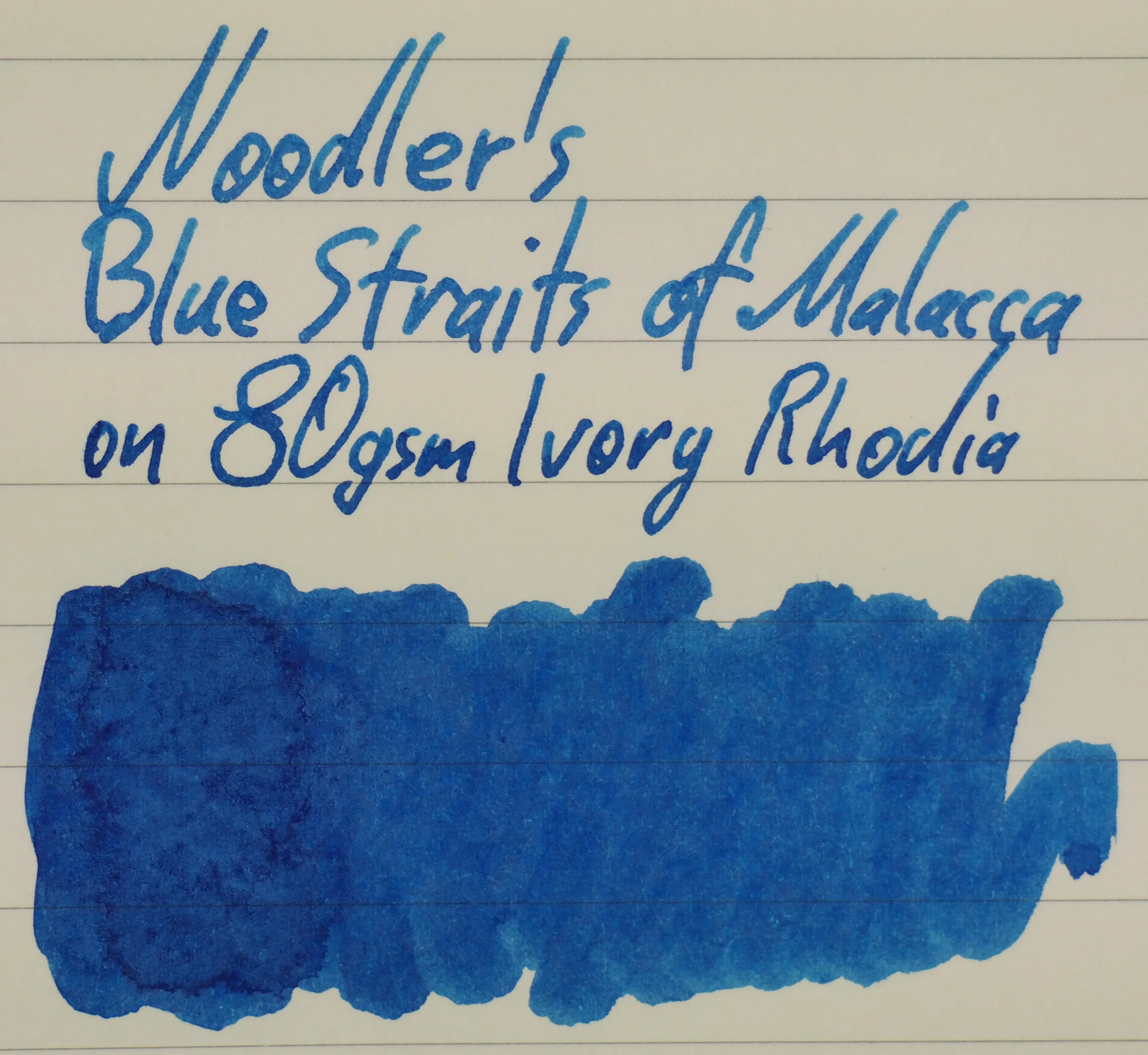
The Strait of Malacca is the body of water between the Malay Peninsula (where Singapore sits) and the Indonesian island of Sumatra. I can't comment on the accuracy of this colour to the water here but I doubt any comparison would be reliable as I'm sure the colour changes throughout the strait. Another similarity of this ink to Pacific Dawn (and indeed many newer Noodler's inks) is how the ink performs so differently on Tomoe River compared to 80gsm Rhodia. The colour varies quite dramatically depending on how wet the pen is as well. In a very wet pen on Tomoe River the ink is almost Navy in colour. Quite rich and with some darkness. With a generally wet nib its a more neutral blue and with a drier pen it's more of a less saturated light blue. On Rhodia the ink is, in the wettest pen, a low saturation neutral blue and in a light pen is low saturation light blue. The ink is fairly neutral but does lean ever so slightly more teal than purple.
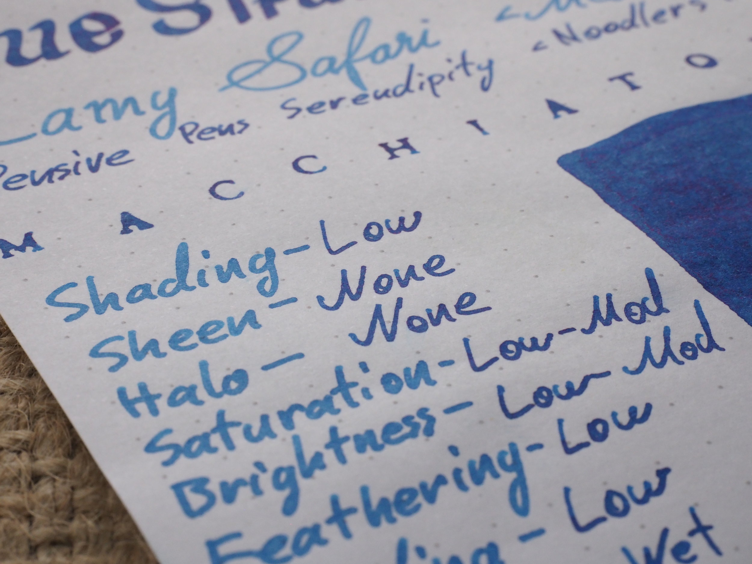
The ink isn't super wet but I'd place it wetter than average. One caveat, however, is that this is regarding flow not colour because as mentioned above you need need a very wet nib to get more than a light colour out of it. Shading is pretty minimal; this is a mostly flat ink.
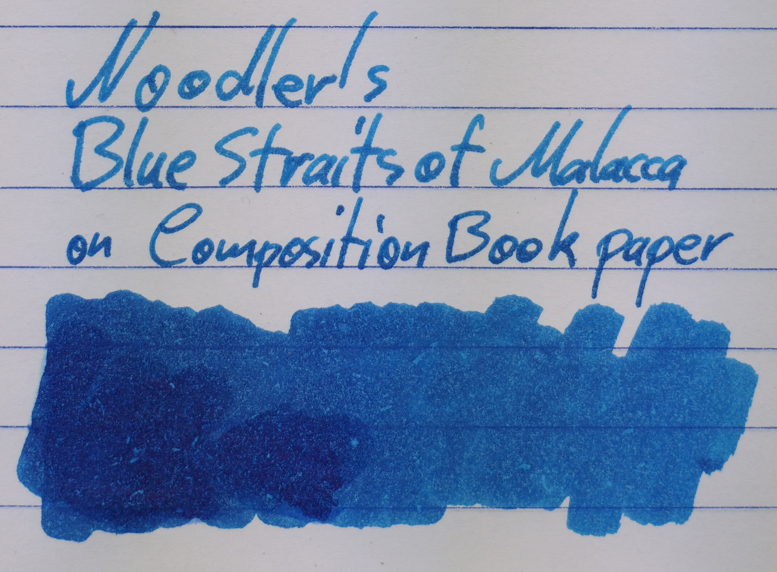
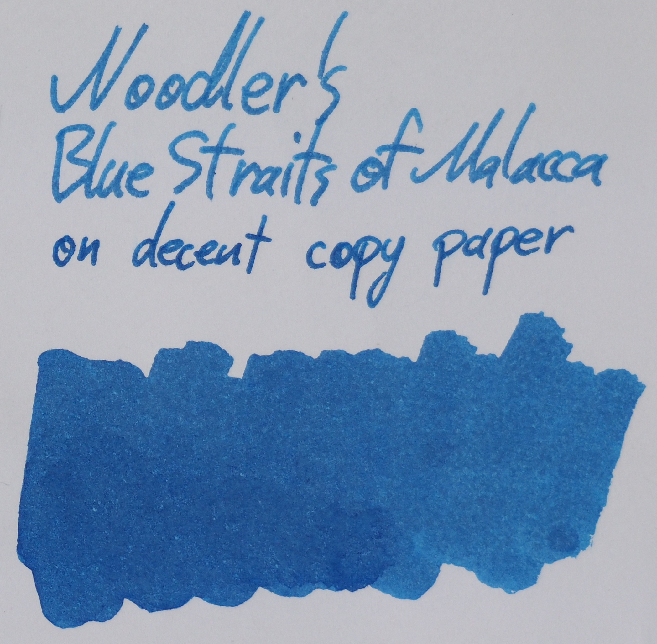
The performance is curious with this. I consider this a poorer performer on Rhodia and a good performer on Tomoe River. But! This ink performs only marginally worse than Rhodia on poorer quality papers and non-Fountain Pen Friendly paper which I think isn't too bad. Papers like Leuchtturm1917 which I'm hesitant to call fountain pen friendly perform very well and certainly better than on Rhodia; the ink is less flat and has more character and saturation on Leuchtturm1917. Even the higher density 90gsm Rhodia performs better than the 80gsm variant. It's a curious ink that may or may not perform that great on your paper of choice. That said, while I think the character of the ink is lost on Rhodia with the ink becoming flatter and desaturated that doesn't mean there's excessive feathering or bleeding, in fact there is little to none. There is some spread (that is the written line is wider than would be expected from the nib), however. Considering how widespread Rhodia usage is, however, I feel this might be an issue to some. Of course, while I consider the ink to have less character on Rhodia others might not. This is a subjective determination. Objectively, the ink is flatter and less saturated but you must make the decision as to whether that is good or bad for you!
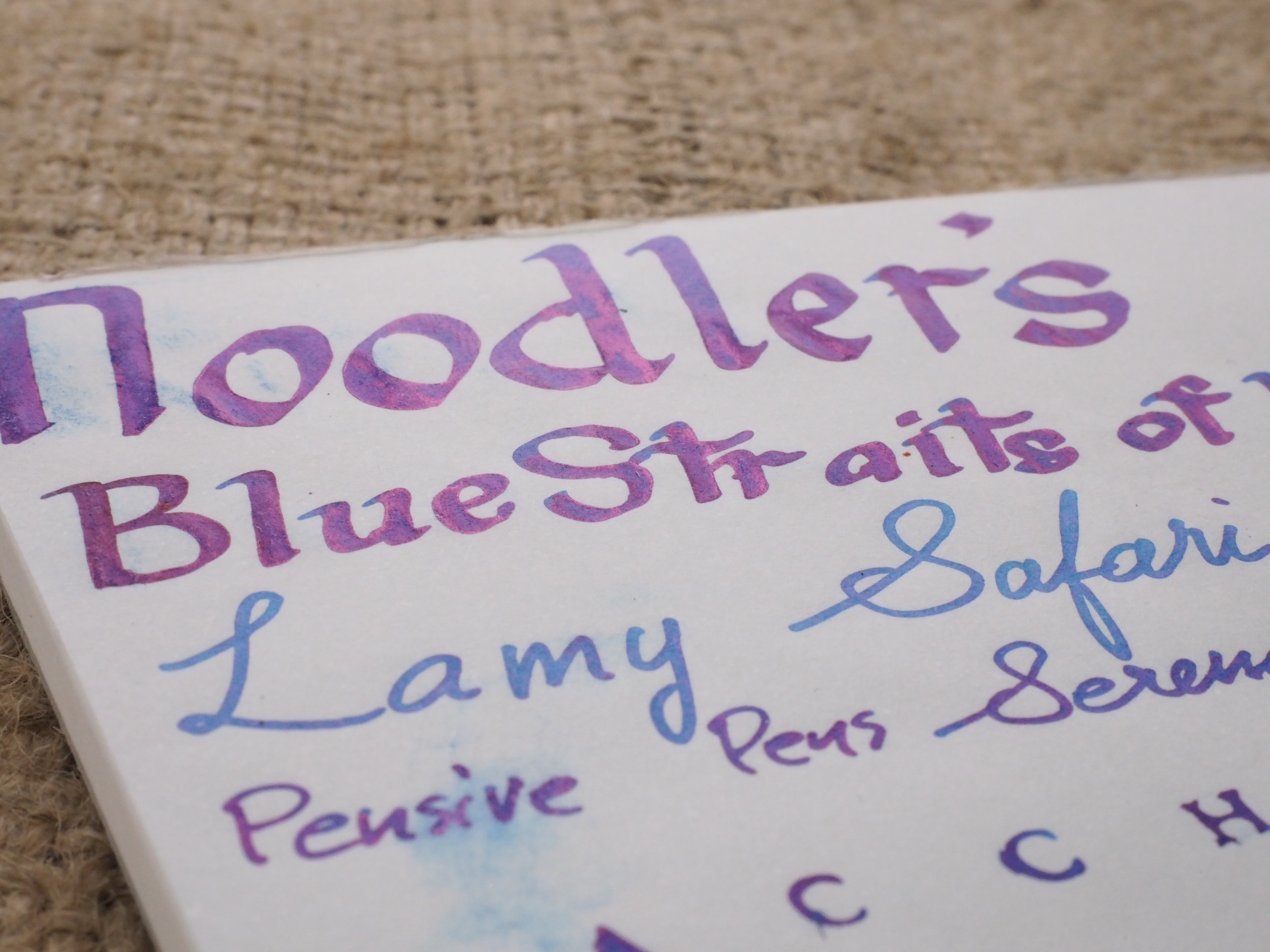


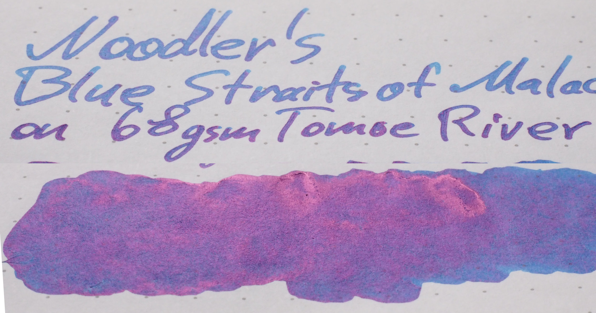


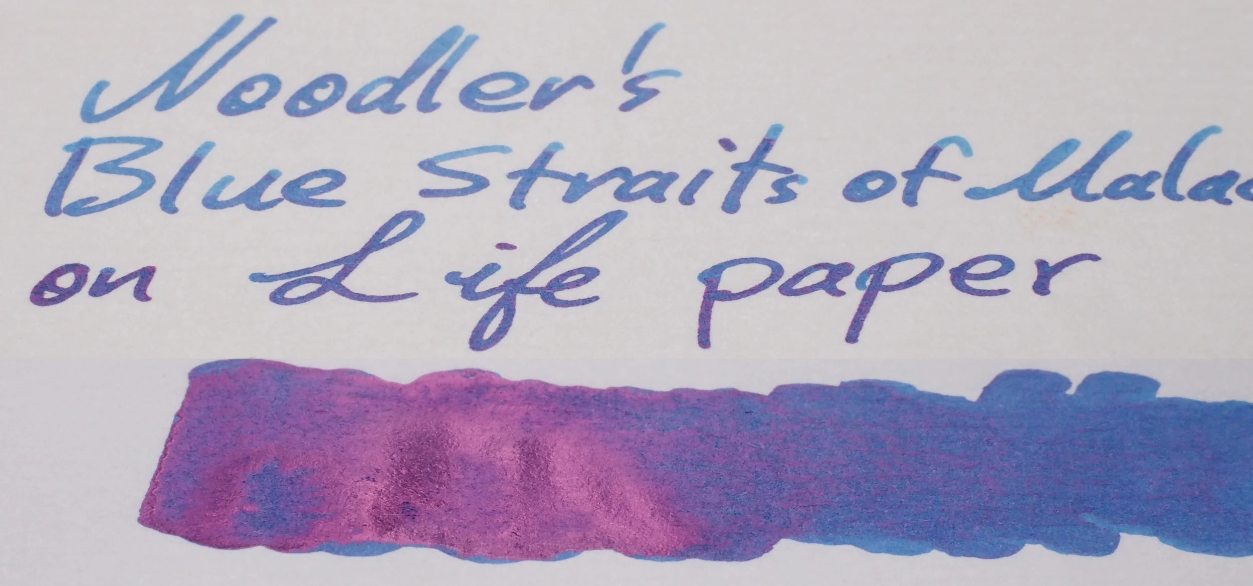


Unusual for Noodler's inks this ink has some sheen to it. With the exception of some black inks and Baystate Blue (on Tomoe River) Noodler's standard lineup of inks generally do not sheen. There have been some shop exclusives and Limited Editions that do. Blue Straits of Malacca is quite noticeable in its sheen on the right paper in the right pen. The standard sheen requirements exist; you need to get the ink to pool and to extend the dry time. A wet and and more resistant paper will generally achieve this. Because of how this ink is affected by Rhodia paper there is no sheen here. But there is certainly sheen on Tomoe River and a few other papers even, very surprisingly, Leuchtturm1917; Clairefonaine; and, in a swatch, Composition Book paper. The sheen does present in a very Noodler's way. It's a little patchy and not completely uniform in it's shininess. It's a mostly soft pink sheen but it can get shiny on Life Paper and my Card Stock for example.


Chromatography is uninteresting; just the ink colour itself gradually fading out. Dry time on Rhodia is surprising given how the ink is affected on that paper (which I'd instinctively associate with a very quick dry time). On Tomoe River the dry time is quite slow.
The water resistance is very good. The water doesn't run at all. Apart from the paper looking a little shabby you wouldn't know that there was any water at all.
Like several Noodlers inks the ink is practically opaque and reminds me of a paint. It doesn't *look* water based. I don't know whether this is indeed bad but I always find it off putting as it leads me to worry about staining and clogging. There was no clogging issues at all and I should point out that I hadn't touched the pen for a week or two and it wrote perfectly immediately without any issues. Cleaning was also painless in terms of washing the ink out of the pen but that brings me to…

Lamy converter post simpler water cleaning.
I was also warned that this ink has a propensity to stain. This is why I have put it in a single converter-filled pen and a Serendipity pen (to mitigate potential damage). As you can see, however, the converter of my Lamy was stained at least too much for a normal water wash to clean it. I have not tried bleach, or ammonia, or rubbing with a cotton tip so I don’t no fully how stained this is but it’s definitely something to consider.
80gsm White Rhodia
As mentioned, several times now, Blue Straits of Malacca loses it's saturation and becomes flatter on Rhodia. This is also true of two of the compared Noodler's Inks!
There is no smearing and the water resistance is perfect on Rhodia 80gsm.
The inks I've chosen, from my collection, that are similar or I believe are useful to compare are: Montblanc BMW Blue, Robert Oster Bondi Blue, Krishna Sailor's Blue, Kobe #17 Shioya Blue, Iroshizuku Kon-peki, Noodler's North Star Liberator (prior Limited Edition for a pen show; discontinued), Noodler's Revolution Blue (exclusive to Goldspot Pens), and Noodler's Civilization's Blue (also a prior Limited Edition for a pen show; discontinued).
On 80gsm White Rhodia :
- Montblanc BMW Blue is a little less green leaning and is darker and richer;
- Robert Oster Bondi Blue is much too green leaning and is a little richer in saturation;
- Krishna Sailor's Blue is much too dark and rich in saturation and isn't quite as green leaning;
- Kobe #17 Shioya Blue much less green leaning but only slightly darker and slightly more saturated;
- Iroshizuku Kon-peki is more saturated and a little darker and barely greener leaning;
- Noodler's North Star Liberator is noticeably less saturated and even lighter;
- Noodler's Revolution Blue is likewise noticeably less saturated and even lighter but also gas some strange feathering where the ink has pooled; and
- Noodler's Civilization's Blue is much richer with higher shading and is also quite darker.
For Rhodia I'd pick Either Kobe #17 Shioya Blue which would have nicer performance overall, or Noodler's Revolution Blue for the Noodler's feel (this edges out North Star Liberator only because it's available for purchase).
52gsm Ivory (white) Tomoe River
On 52gsm Tomoe River the ink is more saturated and less flat. This is still a somewhat flat ink, however. Especially in the dryer Safari compared to the primed nib of the Serendipity pen.
There is no smearing and water resistance is still flawless.
The same inks are compared here as on Rhodia.
On 52gsm Ivory (white) Tomoe River:
- Montblanc BMW Blue isn't too different in swatch form here but is darker in the written line;
- Robert Oster Bondi Blue is still much too green leaning;
- Krishna Sailor's Blue is a little too dark still and has more green to it here;
- Kobe #17 Shioya Blue like with Rhodia is similarly low in saturation and brightness but not quite enough;
- Iroshizuku Kon-peki noticeably green leaning here but is slightly brighter than on Rhodia;
- Noodler's North Star Liberator is now darker but otherwise quite similar;
- Noodler's Revolution Blue is now pretty close if barely darker; and
- Noodler's Civilization's Blue is still much richer with higher shading and is also quite darker.


Left to right: Montblanc BMW Blue, Robert Oster Bondi Blue, Krishna Sailor's Blue, Kobe #17 Shioya Blue, Iroshizuku Kon-peki, Noodler's North Star Liberator (prior Limited Edition for a pen show; discontinued), Noodler's Revolution Blue (exclusive to Goldspot Pens), and Noodler's Civilization's Blue (also a prior Limited Edition for a pen show; discontinued).
Only the Noodler's inks share the slightly patchy uniform sheen that Noodler's Blue Straits of Malacca has. Civilization's Blue is a little sharper but North Star Liberator and Revolution blue are soft. The other inks also have a sharper sheen than the softer sheen of Blue Straits of Malacca. Montblanc BMW Blue, Robert Oster Bondi Blue, Krishna Sailor's Blue, and Iroshizuku Kon-peki have an edge sheen (that is the sheen appears on the edge of where the ink pools not over the line). Kobe #17 Shioya Blue is a little more consistent in how it covers the ink but is still mostly an edge sheen.
This is a pretty blue, on the right paper, with flawless water resistance and decent to good performance on less fountain pen friendly paper. These are unique and positive characteristics. Unfortunately the performance isn't great, in my opinion, on the common Rhodia 80gsm paper; and the ink also can stain so I'd avoid putting it in demonstrators! A lot of my more important writing is done on Tomoe River and Midori so that's good my my use case but I do use Rhodia for a lot of throw-away junk notes and I find this ink uninteresting to use on that paper. I don't have a pressing need for water resistance but it's certainly not a bad thing! One thing I absolutely love about Noodler's is the label designs I have a sample but you can see the bottle here and this is not exception. Really pretty label. You also do get the typically generous 90ml/3oz of inked filled all the way to the rim!
If water resistance is important to you this is absolutely an ink you should consider. Noodler's does water resistance really well. You can buy this ink exclusively from Straits Pen.
✒︎ ✑ ✒︎ ✑
As usual, below as the ink on various papers.
I've listed all my inks and all my pens in their respective pages. Please let me know which inks you'd like to review next via the comments, Twitter, Instagram, or contact me directly.
For blog updated you can follow @macchiato_man on Twitter, subscribe via email, or like my Facebook page.
I received this ink free of charge for the purpose of giving an honest review. I was not otherwise compensated and everything here is my own honest opinion. There are no affiliate links.