• Blog
  • About
    • My Inks (on Fountain Pen Companion)
    • My Pens
  • Archive
  • Contact
Menu

Macchiato Man

  • Blog
  • About
  • My Collection ☟
    • My Inks (on Fountain Pen Companion)
    • My Pens
  • Archive
  • Contact
The @madebyendless Cotton Wallet arrived the other day! I’m a sucker for these sorts of practical inserts for notebooks. The cotton fabric suites the simple style of the Explorer. 
⠀
While I love these and always get them whenever I can I never
First test of the Regalia paper in the Endless Explorer than I was sent by @madebyendless. Really impressed by the paper. Very smooth, nice sheen and nice shading! Finger prints or hand oil seem to affect the writing a little but nothing out of the o
New Pen Review: Esterbrook Camden (Premium Edition) - 𝙻𝚒𝚗𝚔 𝚒𝚗 𝙱𝚒𝚘!

I’ve been eager to try the Camden for a while now. I love my flat end pens and the overall shape of this one is subtly unique. While there are some differences between
New friend from @esterbrook_official! Camden Manitoba Blue. 
⠀
Love flat end pens so looking forward to digging into this (so review incoming).
 
Flat or round ends?✑
⠀
⠀
⠀
⠀
#fountainpen #fpgeeks #fountainpenaddict #fpn #fountainpengeeks  #fountainp
New Ink Review: @birminghampens Antique Sepia (link in bio)
⠀
In line with the recent trend of soft pastel dichromatic inks but Birmingham’s version is an interesting dust grey version with low saturation that I find quite interesting don&rsquo
New Ink Day! Haven’t had one of these for a while but I received these from a friend at the last Perth Pen Meet. 
⠀
All sailor and the first tall bottle in a while (bringing the number of those to 86). 
⠀
Didn’t realise it at the time but
New Ink Review: La Couronne du Comte Vert Sapin (link in bio)
⠀
The final of LCdC’s initial set of four exclusive inks from Diamine. A lovely rich sheeny green-teal.
✑
⠀
⠀
⠀
⠀
#fountainpen #fpgeeks #fountainpenaddict #fpn #fountainpengeeks  #fo
I don’t know if I’ve ever shared this before but my city has a set of five dip nibs as an artwork. 

They are called “Memory Markers” by Anne Neil and represent early-ish colonial stories of the gardens where they are.

We als
⚠️Update: Why I have been so radio silent! 📻🤫 A lot of large personal changes, essentially (read on for details)!

There have been three main reasons for why I haven’t been able to do much here or on my blog. 

1) 🎓 I had to finish of my Mas
Ink Ink Comparison: Discontinued Iroshizuku and New Iroshizuku! Thanks to @penclassics for allowing this to happen. See link in bio!
⠀
The old: Tsuyu-kusa, Tsukushi, and Ina-ho.
The New: Sui-gyoku, Hana-ikada, and Hotaru-bi.
⠀
This is a long review b
NPD: @esterbrook_official LE Estie “Candy” in Oversize with a Kirk Speer Needlepoint nib!
⠀
Thanks to Esterbrook for sending this through to me for review. I’ve reviewed a couple of Esties now and two of the custom nibs (which are a
Out with the old in with the new?

I just received the new Pilot Iroshizuku Inks in the little bottle ink pack from @penclassics for review. I plan on doing an overview review of the three new and the three old ones!

I feel like Ina Ho was quite a u
New Pen Review (see link in bio): Platinum Curidas courtesy of @penclassics (check them out!)
⠀
This is certainly a curiously designed pen with it's quirks but it has bee a delight to write with and a great pen to through in a pocket. I've been using
New Ink Review! @wearingeul_global Kyonghui! See link in bio!

Kyonghui is a vibrant earthy orange from Wearingeul's series on Korean Female Modern Writers. It is also a great performing ink!

Wearingeul's global push is fairly new; has anyone tried
It has been a little while since I posted here so I thought I'd give a little update!

Firstly I think I just needed a little break at the end of the year! It has been a busy year for me. I have been taking my photography more seriously and I also ha

Subscribe

Sign up with your email address to receive news and updates.

We respect your privacy. Unsubscribe at any time.

Thank you!
Blog RSS

☛ Twitter feed

✉ Email Subscription

☞ Fountain Pens Australia (Facebook Group)

☛ Sailor Pens & Inks (Facebook Group)


Sponsors

10% off code: MACCHIATOMAN


Click here for sponsorship information


Featured Posts:

Featured
Ink Review: Pennonia Pokoltuz (Pokoltűz)
Aug 1, 2019
Ink Review: Pennonia Pokoltuz (Pokoltűz)
Aug 1, 2019
Aug 1, 2019
Notebook Review: Pebble Stationery Pocket Tomoe River Notebook
Nov 10, 2018
Notebook Review: Pebble Stationery Pocket Tomoe River Notebook
Nov 10, 2018
Nov 10, 2018
Ink Review: Krishna Brown Pink
Jan 20, 2018
Ink Review: Krishna Brown Pink
Jan 20, 2018
Jan 20, 2018


Archive
  • November 2024
  • October 2023
  • December 2022
  • October 2022
  • June 2022
  • May 2022
  • April 2022
  • February 2022
  • January 2022
  • December 2021
  • November 2021
  • October 2021
  • September 2021
  • August 2021
  • July 2021
  • June 2021
  • May 2021
  • April 2021
  • February 2021
  • January 2021
  • December 2020
  • November 2020
  • October 2020
  • September 2020
  • August 2020
  • July 2020
  • May 2020
  • April 2020
  • March 2020
  • February 2020
  • January 2020
  • December 2019
  • November 2019
  • October 2019
  • September 2019
  • August 2019
  • July 2019
  • June 2019
  • May 2019
  • April 2019
  • March 2019
  • February 2019
  • January 2019
  • December 2018
  • November 2018
  • October 2018
  • September 2018
  • August 2018
  • July 2018
  • June 2018
  • May 2018
  • April 2018
  • March 2018
  • February 2018
  • January 2018
  • December 2017
  • November 2017
  • October 2017
  • September 2017
  • August 2017
  • July 2017
  • June 2017
  • May 2017
  • April 2017
  • February 2017
  • January 2017
  • December 2016
  • November 2016
  • September 2016
  • August 2016
  • July 2016

Ink Review: Noodler's Pacific Dawn at the Golden Gate

September 18, 2016 in Ink Review

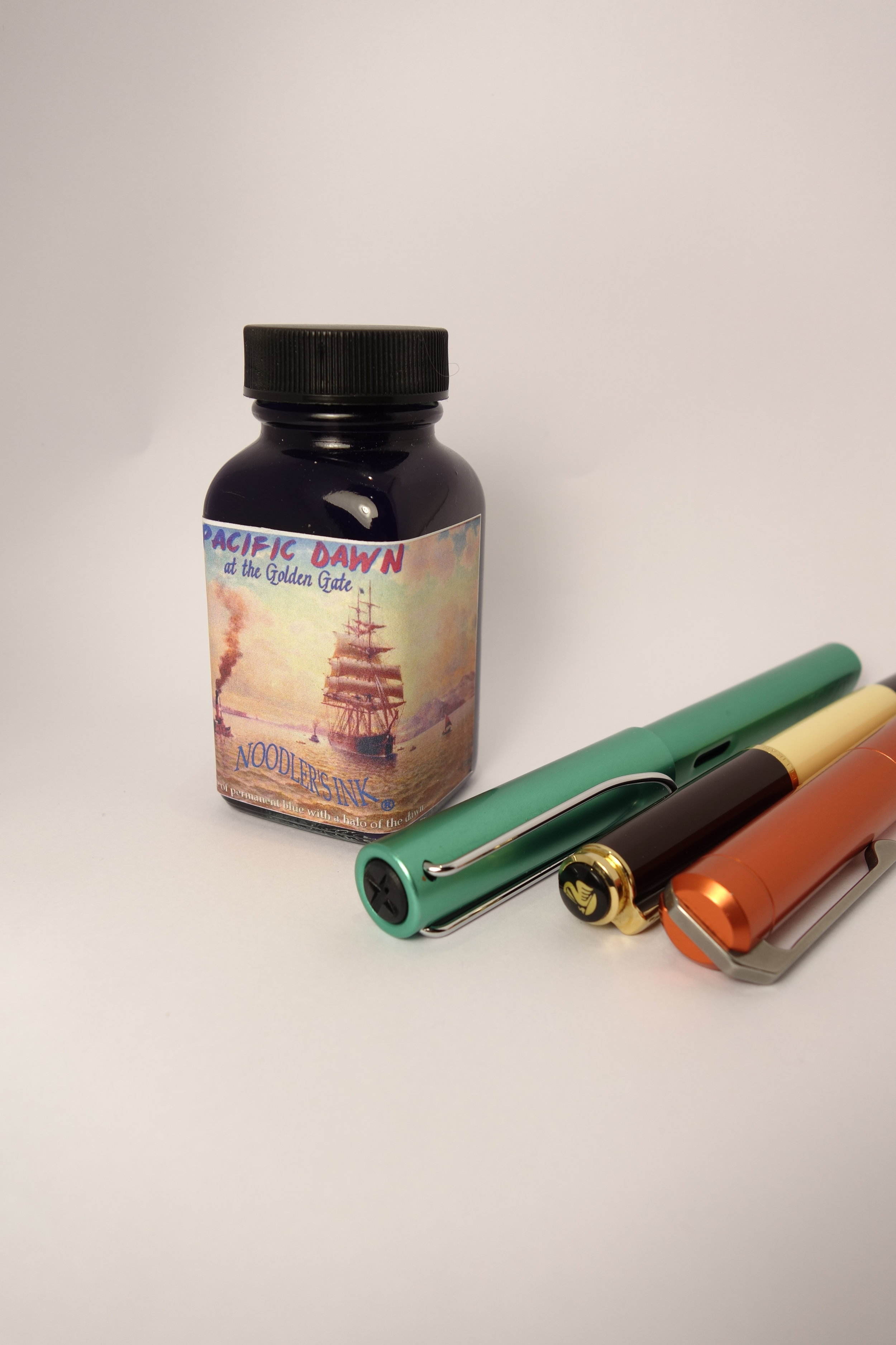
Made for the San Fransisco Pen Show but curiously exclusive to Straits Pens in Singapore this ink is both very disappointing but also very nice and quite interesting. The ink tries to include red in a blue ink without becoming purple. It's moderately successful.

So far all my reviews have been performed on Rhodia paper (with short tests on other papers). This ink, however, performs so dramatically different on Rhodia (and Clairefontaine and Copy Paper) compared to Tomoe River that I needed to make a full review on both papers. The ink is very wet. It gushes out of pens that aren't particularly wet with other inks (though I wouldn't describe them as dry pens either). The ink, on Tomoe River (where the ink performs and looks best) is a blue-black with subtle hints of green. It doesn't feather and it doesn't bleed. Spread is also pretty minimal. It dries very quickly with dry-times on Tomoe River that compare to dry-times for many inks on Rhodia. It has a bright red sheen that, unlike many sheeny inks, doesn't just collect where the ink pools at the edges of the line but rather covers the whole line in sheen. On this paper the ink shades decently 

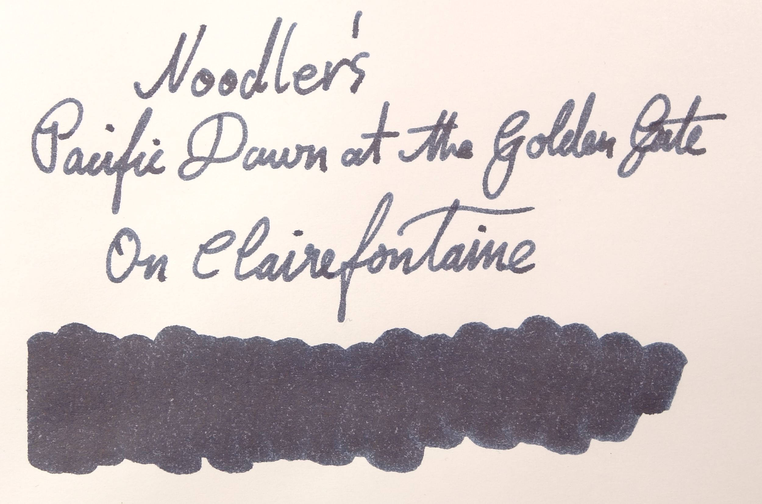
On Rhodia, the ink is a very bland grey with hints of blue. It feather pretty badly on both Rhodia and Clairefontaine but amazingly feathers less on cheap copy paper! Shading is pretty low and while sheen can sometimes be seen is pretty rare. Pacific Dawn also bleeds through the page on most letters. The dry-time is very quick where the ink quickly soaks into the paper. This would explain the feathering and bleeding, I imagine.

View fullsize Chromatography
Chromatography
View fullsize Sheen
Sheen
View fullsize Tomoe River - After delaying before dabbing the water away
Tomoe River - After delaying before dabbing the water away
View fullsize Rhodia - After delaying before dabbing the water away
Rhodia - After delaying before dabbing the water away
View fullsize Tomoe River - After immediately dabbing the water away
Tomoe River - After immediately dabbing the water away
View fullsize Rhodia - After immediately dabbing the water away
Rhodia - After immediately dabbing the water away

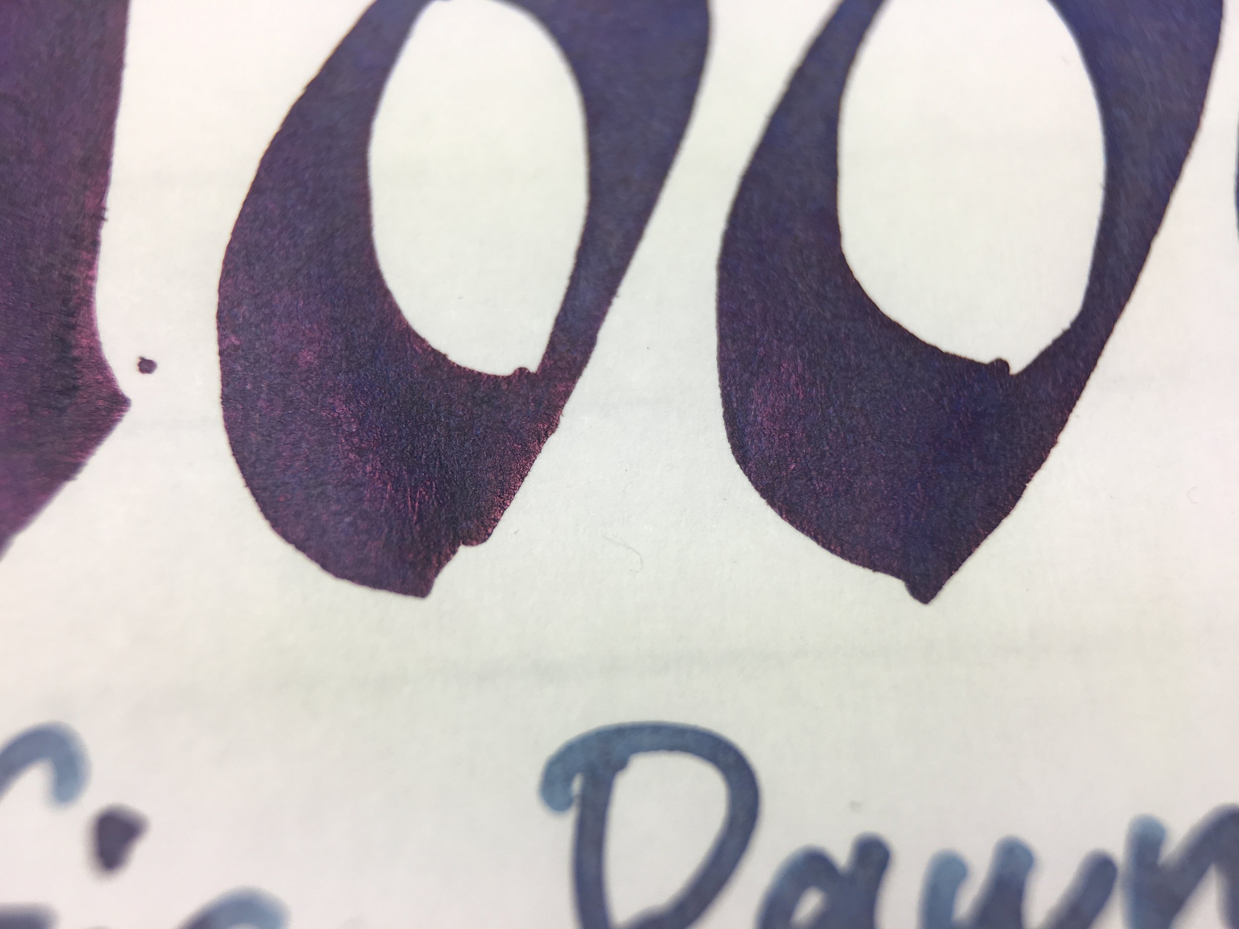
Where the ink gets really interesting is the Chromatography. Such a veritable rainbow of colour; starting with a mauve, moving through a bright blue, a grey-purple, green, yellow, orange, and finally, pink. Looking at the grey on Rhodia you would never have guessed. As for water resistance, the ink has a somewhat interesting feature whereby when water is splashed over the ink, when on Tomoe River at least, the water will suck some red out of the ink leaving behind a more brilliant blue. If you dab the water with a tissue immediately the pinky-red doesn't stay on the page, but if you leave it soak for a while, the red stays. The ink is very water-resistant and the blue colour actually gets brighter with water.

On Rhodia you don't get the red as much and when you let the water soak, the ink feathers something fierce and somehow a brown colour starts leaking from the ink. This brown can also be seen in the bleeding on the inversed side of the paper.

Drying on Tomoe River (GIF; might take a while to load)

Drying on Tomoe River (GIF; might take a while to load)

The ink goes on the Tomoe River paper as a vibrant blue and dries a little greyer in colour. You can see how the sheen covers most of the line and not just the edges of the line.

On Tomoe River (left to right): 1) Iroshizuku Shin-kai; 2) Bungubox 4B; 3) Diamine Oxford Blue; 4) Caran d'Ache Magnetic Blue; 5) Papier Plume Midnight Blue; and 6) Noodler's Kung Te-Cheng.

Because the ink is so very different on Tomoe River compared to Rhodia I had to do different comparisons to other inks for each paper. For Tomoe River the closest ink is Definitely Bungubox 4B; it shared the slightly green hue and the sheen that covers the whole line. Caran d'Ache Magnetic Blue has a similar tone to it but doesn't have the green. Noodler's Kung Te-cheng has a similar texture to Pacific Dawn, but more paint-like and more blue in colour. Papier Plume Midnight Blue, Diamine Oxford Blue and Iroshizuku Shin-kai are all too blue and lack the green undertone of Pacific Dawn.

On Rhodia (left to right): 1) Montblanc Midnight Blue*; 2) Sailor Blue Black; 3) Bookbinder's Online Ground Rattler; 4) Pen + Message Saku; 5) Kobe #51 Kano Cho Midnight; and 6) Pelikan Edelstein Tanzanite.

* My sample of this was unlabelled but I do believe this is indeed Montblanc Midnight Blue.

It was difficult to find an ink that looks similar to Pacific Dawn on Rhodia. It seems like a combination of Bookbinders Online Ground Rattler and Pen + Message Saku. Sailor Blue-Black and what I believe is Montblanc Midnight Blue are still too saturated, and both Kobe #51 and Pelikan Edelstein Tanzanite are too dark and too blue. It's seems to be a somewhat unique colour on Rhodia. It's just not a colour I enjoy.

Tomoe River

Rhodia

I can only recommend this ink if you primarily use Tomoe River. The dry-time of this ink on Tomoe River certainly makes that easier. On Rhodia though, unless you like a drab blue-grey that performs poorly, I can't recommend it. It's just not a good ink for papers that aren't like Tomoe River. If you frequently splash water on your Tomoe River paper, it can look… interesting? I use a lot of Tomoe River paper so I don't mind keeping this in a pen but I'd flush it out if I was just using Rhodia or similar.

I've listed all my inks and all my pens in their respective pages. Please let me know which inks you'd like to review next via the comments, Twitter, Instagram, or contact me directly.

I was not compensated for this review and everything here is my own honest opinion. There are no affiliate links.

View fullsize Bottle.JPG
View fullsize Clairefontaine.png
View fullsize Copy Paper.png
Tags: inkreview, noodler's, pacific dawn
← Double Ink Review: Bookbinders Emerald Boa and Eastern BrownInk Comparison: Oranges →
Back to Top

Blog RSS

✉ Email Subscription

☞ Fountain Pens Australia (Facebook Group)

☛ Sailor Pens & Inks (Facebook Group)