• Blog
  • About
    • My Inks (on Fountain Pen Companion)
    • My Pens
  • Archive
  • Contact
Menu

Macchiato Man

  • Blog
  • About
  • My Collection ☟
    • My Inks (on Fountain Pen Companion)
    • My Pens
  • Archive
  • Contact
The @madebyendless Cotton Wallet arrived the other day! I’m a sucker for these sorts of practical inserts for notebooks. The cotton fabric suites the simple style of the Explorer. 
⠀
While I love these and always get them whenever I can I never
First test of the Regalia paper in the Endless Explorer than I was sent by @madebyendless. Really impressed by the paper. Very smooth, nice sheen and nice shading! Finger prints or hand oil seem to affect the writing a little but nothing out of the o
New Pen Review: Esterbrook Camden (Premium Edition) - 𝙻𝚒𝚗𝚔 𝚒𝚗 𝙱𝚒𝚘!

I’ve been eager to try the Camden for a while now. I love my flat end pens and the overall shape of this one is subtly unique. While there are some differences between
New friend from @esterbrook_official! Camden Manitoba Blue. 
⠀
Love flat end pens so looking forward to digging into this (so review incoming).
 
Flat or round ends?✑
⠀
⠀
⠀
⠀
#fountainpen #fpgeeks #fountainpenaddict #fpn #fountainpengeeks  #fountainp
New Ink Review: @birminghampens Antique Sepia (link in bio)
⠀
In line with the recent trend of soft pastel dichromatic inks but Birmingham’s version is an interesting dust grey version with low saturation that I find quite interesting don&rsquo
New Ink Day! Haven’t had one of these for a while but I received these from a friend at the last Perth Pen Meet. 
⠀
All sailor and the first tall bottle in a while (bringing the number of those to 86). 
⠀
Didn’t realise it at the time but
New Ink Review: La Couronne du Comte Vert Sapin (link in bio)
⠀
The final of LCdC’s initial set of four exclusive inks from Diamine. A lovely rich sheeny green-teal.
✑
⠀
⠀
⠀
⠀
#fountainpen #fpgeeks #fountainpenaddict #fpn #fountainpengeeks  #fo
I don’t know if I’ve ever shared this before but my city has a set of five dip nibs as an artwork. 

They are called “Memory Markers” by Anne Neil and represent early-ish colonial stories of the gardens where they are.

We als
⚠️Update: Why I have been so radio silent! 📻🤫 A lot of large personal changes, essentially (read on for details)!

There have been three main reasons for why I haven’t been able to do much here or on my blog. 

1) 🎓 I had to finish of my Mas
Ink Ink Comparison: Discontinued Iroshizuku and New Iroshizuku! Thanks to @penclassics for allowing this to happen. See link in bio!
⠀
The old: Tsuyu-kusa, Tsukushi, and Ina-ho.
The New: Sui-gyoku, Hana-ikada, and Hotaru-bi.
⠀
This is a long review b
NPD: @esterbrook_official LE Estie “Candy” in Oversize with a Kirk Speer Needlepoint nib!
⠀
Thanks to Esterbrook for sending this through to me for review. I’ve reviewed a couple of Esties now and two of the custom nibs (which are a
Out with the old in with the new?

I just received the new Pilot Iroshizuku Inks in the little bottle ink pack from @penclassics for review. I plan on doing an overview review of the three new and the three old ones!

I feel like Ina Ho was quite a u
New Pen Review (see link in bio): Platinum Curidas courtesy of @penclassics (check them out!)
⠀
This is certainly a curiously designed pen with it's quirks but it has bee a delight to write with and a great pen to through in a pocket. I've been using
New Ink Review! @wearingeul_global Kyonghui! See link in bio!

Kyonghui is a vibrant earthy orange from Wearingeul's series on Korean Female Modern Writers. It is also a great performing ink!

Wearingeul's global push is fairly new; has anyone tried
It has been a little while since I posted here so I thought I'd give a little update!

Firstly I think I just needed a little break at the end of the year! It has been a busy year for me. I have been taking my photography more seriously and I also ha

Subscribe

Sign up with your email address to receive news and updates.

We respect your privacy. Unsubscribe at any time.

Thank you!
Blog RSS

☛ Twitter feed

✉ Email Subscription

☞ Fountain Pens Australia (Facebook Group)

☛ Sailor Pens & Inks (Facebook Group)


Sponsors

10% off code: MACCHIATOMAN


Click here for sponsorship information


Featured Posts:

Featured
Ink Review: Pennonia Pokoltuz (Pokoltűz)
Aug 1, 2019
Ink Review: Pennonia Pokoltuz (Pokoltűz)
Aug 1, 2019
Aug 1, 2019
Notebook Review: Pebble Stationery Pocket Tomoe River Notebook
Nov 10, 2018
Notebook Review: Pebble Stationery Pocket Tomoe River Notebook
Nov 10, 2018
Nov 10, 2018
Ink Review: Krishna Brown Pink
Jan 20, 2018
Ink Review: Krishna Brown Pink
Jan 20, 2018
Jan 20, 2018


Archive
  • November 2024
  • October 2023
  • December 2022
  • October 2022
  • June 2022
  • May 2022
  • April 2022
  • February 2022
  • January 2022
  • December 2021
  • November 2021
  • October 2021
  • September 2021
  • August 2021
  • July 2021
  • June 2021
  • May 2021
  • April 2021
  • February 2021
  • January 2021
  • December 2020
  • November 2020
  • October 2020
  • September 2020
  • August 2020
  • July 2020
  • May 2020
  • April 2020
  • March 2020
  • February 2020
  • January 2020
  • December 2019
  • November 2019
  • October 2019
  • September 2019
  • August 2019
  • July 2019
  • June 2019
  • May 2019
  • April 2019
  • March 2019
  • February 2019
  • January 2019
  • December 2018
  • November 2018
  • October 2018
  • September 2018
  • August 2018
  • July 2018
  • June 2018
  • May 2018
  • April 2018
  • March 2018
  • February 2018
  • January 2018
  • December 2017
  • November 2017
  • October 2017
  • September 2017
  • August 2017
  • July 2017
  • June 2017
  • May 2017
  • April 2017
  • February 2017
  • January 2017
  • December 2016
  • November 2016
  • September 2016
  • August 2016
  • July 2016
String Logo 1.png
Brane Logo 1.png

Double Ink Review: Colorverse String and Brane

April 10, 2018 in Ink Review

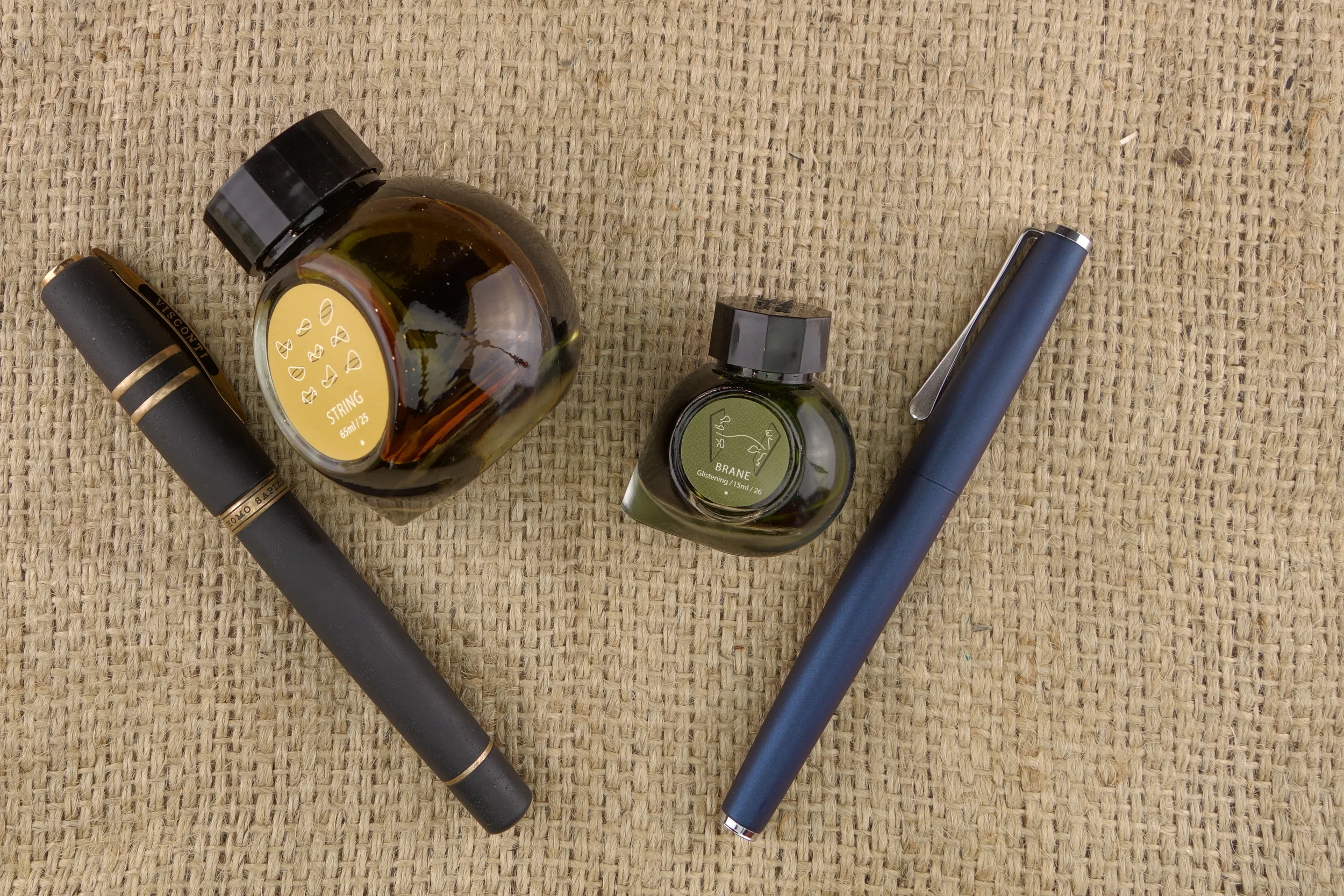
Colorverse String and Brane are the pair of inks from Season 3 "Multiverse" series of inks that I, personally, thought was the most interesting pairing. A nice golden brown and a soft olive green. Brane, which comes in the small 15ml bottle, as opposed the String's 65ml bottle, is also a shimmering ink but is much subtler than many shimmering inks out there.

Title.png

Colorverse String is one of the more impressive shaders I've seen. Huge change in colour and brightness. At it's darkest it's a yellow bronze colour and at it's lightest it's a soft gold-yellow colour. Very impressive. There is the slightest hint of green but it isn't strong. It's a very wet ink. It takes a while to dry on Rhodia and Tomoe River but it's nice and smooth to write with at the same time. There's no sheen on the written line but where the ink pools on a very heavy ink swatch there is a slight silvery sheen. In these same spots where it pools very heavily the ink also brings out a rusty red colour somehow.

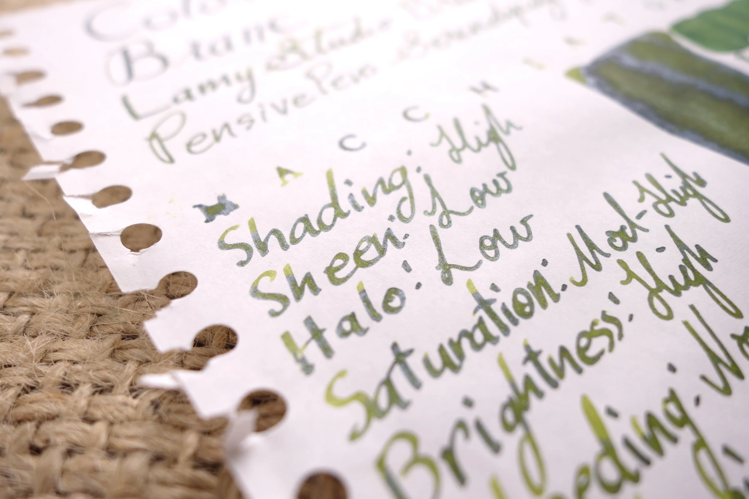
Colorverse Brane is an olive green ink with a nice amount of saturation to it. It's a happy vibrant ink. There's some nice shading with this ink; not as much as with String but still very capable in it's own right even on 52gsm Tomoe River which tends to flatten inks a little. There's a subtle silver sheen that's visible on Tomoe River even on the written line that compliments the blue and/or green (it's difficult to tell!) shimmer that is in the ink. The shimmer itself is also fairly subtle; it's much less prominent than the shimmers of Diamine or J. Herbin. The shimmer here is also not silver or gold but slightly blue and/or green which works surprisingly well with the yellow-green base ink colour. The ink isn't nearly as wet as String and in general I wouldn't call it very wet. More neutral (so wetter than Montblanc or Pelikan).

View fullsize String Sheen 1.JPG
View fullsize String Sheen 2.JPG
View fullsize Brane Sheen:Shimmer TR 1.JPG
View fullsize Brane Sheen:Shimmer TR 2.JPG
View fullsize Brane Sheen:Shimmer TR 3.JPG
View fullsize Brane Sheen:Shimmer Rhodia 1.JPG
View fullsize Brane Sheen:Shimmer Rhodia 2.JPG

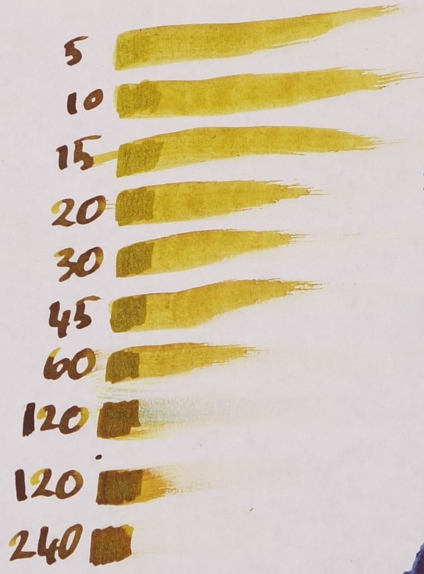
The chromatography of String is interesting because it's difficult to see where the dark brown comes from. There is a low-saturation grey-green that moves to a yellow-orange and finally to just a yellow. At 60 seconds for Rhodia and 240 seconds for Tomoe River this ink is extremely slow to dry. In an EF nib it might be more respectable but certainly not in any nib with heft.

The chromatography of Brane starts with a pale green moves eventually to a darker "proper" green and then finishes abruptly with a straight turquoise. Interestingly dry time was the same on Rhodia and Tomoe River (so slightly slow for Rhodia and slightly quicker for Tomoe River).
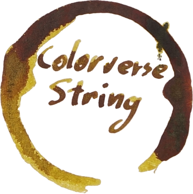
View fullsize Chromotography String.jpg
View fullsize Drytime Rhodia String.jpg
View fullsize Drytime TR String.jpg
View fullsize Chromotography Brane.jpg
View fullsize Drytime Rhodia Brane.jpg
View fullsize Drytime TR Brane.jpg

Colorverse String

The fat wet 1.3 stub nib of the Visconti Homo Sapiens really brought out the shading in the ink. There's still shading with the JoWo Fine nib but not as much. This is interesting because in my experience wetter nibs tend to shade less. There's some grey visible under the water resistance tests but not in any meaningful way. (The left is dabbed with a tissue fairly quickly and the right test was left for a short amount of time).

Louis Vuitton or Audacieux is less saturated and less yellow and has very little shading. Noodler's Golden Brown is very similar but still noticeably flatter and the performance isn't great though it does share the golden colour with Colorverse String. KWZ Honey is greener, darker and has less shading. Toucan Sienna is too orange. Robert Oster Caffe Crema is too dark and orange-red. Kingdom Note Chrysaora helvola is too bright and orange and Akkerman #22 Hopjesbruin is also too orange. Noodler's Golden Brown is definitely the closest here.

The shading of the JoWo is a little more prominent here and the shading from the Visconti is also still rather high which is good for Tomoe River. Louis Vuitton has had it's saturations sapped from it like Tomoe River sometimes does with inks. Golden Brown's yellow has become more orange/ KWZ is Darker with less shading. Toucan Sienna hasn't changed much. Robert Oster Caffe Crema has some nice shading now but still not as much as Colorverse String. Kingdom Note Chrysaora helvola is way too bright and orange as is Akkerman #22 Hopjesbruin.

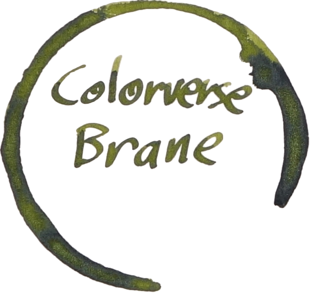
Colorverse Brane on Rhodia

There is comparable shading between the gold-nabbed broad italic (ground by Mike Masuyama) and the Fine JoWo nib. There is very little left of the ink after a water resistance test. Nothing remotely water resistant here. (The left test is dabbed with a tissue fairly quickly and the right test was left for a short amount of time).

Robert Oster Jade is far to green. Diamine Safari is darker and less saturated. Maccha Yokan is a similar hue but way too dark. Montblanc Defoe Palm Green is fairly similar but not quite as saturated. Kobe Chaska is too brown and dark. Rohrer & Klinger Alt-Goldgrün is slightly less saturated and a little too light. Kyo-no-oto Kokeiro is much lighter but a similar hue. Tanna Japonensis is a similar hue again but too dark. The closest would have to be a combination between Rohrer & Klingner Alt-Goldgrün representing the lighter shaded areas of Colorverse Brane and Kingdom Note Tanna Japonensis representing the darker shaded areas.

On Tomoe River the shading isn't quite as strong though it does still shade nicely. A little more shading with the Masyuama Broad Italic on the Lamy.

Not many changes from on Rhodia. Montblanc Defoe Palm Green had a little of the saturation stolen away by Tomoe River as has Rohrere & Klingner Alt-Goldgrün and Kingdom Note Tanna Japonensis to small degrees. But overall the comparisons mentioned above apply here still.

I'm quickly becoming a fan of Colorverse inks. They are nice a wet which is what I love, the sheen (though not these that much), and their use of shimmer, which I rarely ink a pen with, is subtle, nice and unique. String is showing the variety you can get out of Colorverse with it's super shading qualities which contrasts to the other offerings from the brand such as high sheen or a flatter ink with little or no sheen. Plenty of colours as well. The dry time of String could be a bit of a worry to some but the shading is very impressive. The colour of Brane isn't hugely unique but it's a good execution and the shimmer is subtle and unique which I appreciate.

Colorverse ink are available many international shops these days. I bought these bottles from The Desk Bandit in my home town (they do ship internationally, have a free shipping threshold and a 15% off code for new subscribers to their newsletter).

I've listed all my inks and all my pens in their respective pages. Please let me know which inks you'd like to review next via the comments, Twitter, Instagram, or contact me directly.

For blog updated you can follow @macchiato_man on Twitter, subscribe via email, or like my Facebook page.

I was not compensated for this review and everything here is my own honest opinion. There are no affiliate links.

Bottles.jpg
Tags: colorverse, shimmer, shimmering, blue shimmer, olive green, green, golden brown, brown, Louis Vuitton, or audacieux, Noodler's Ink, Noodler's, KWZ, KWZI, Honey, Toucan, Sienna, Robert Oster, Robert Oster Signature Ink, caffe crema, Kingdom Note, Chrysaora helvola, Akkerman, No. 22 Hopjesbruin, Hopjesbruin, Colorverse Season 3, Colorverse Brane, Colorverse String, Brane, String, Louis Vuitton or Audacieux, Noodler's Golden Brown, KWZ Honey, Toucan Sienna, Robert Oster Caffe Crema, Kingdom Note Chrysaora helvola, Akkerman #22 Hopjesbruin, Robert Oster Jade, Diamine Safari, Voice Maccha Yokan, Montblanc Defoe Palm Green, Kobe Chaska, Rohrer & Klingner Alt-Goldgrün, Kyo-no-oto kokeiro, Kingdom Note Tanna Japonensis
← Ink Review: Sailor Shumibun Writing Time Jasper GreenInk Review: Sailor Pen's Alley Shaker Green →
Back to Top

Blog RSS

✉ Email Subscription

☞ Fountain Pens Australia (Facebook Group)

☛ Sailor Pens & Inks (Facebook Group)