Noodler’s Dromgoole’s Banker’s Tan (that is a lot of apostrophes) is a Noodler’s ink that was until recently exclusive to the Dromgoole’s store in Texas which is where I bought my bottles from. It is now also purchasable from Vanness Pens. The bottles were originally made in 2015 for the Dallas Pen Show for Dromgoole’s. Unfortunately, this ink, while a unique colour and characteristics has some pretty glaring performance issues.

Ink Characteristics
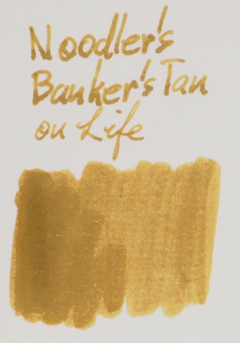
My bottle was bought last year along with the rest of the set of Noodler’s inks for Dromgoole’s. It’s a unique and interesting colour that reminds me of the colour of paper in vintage books. A brown-ish yellow tan. The colour is related to the “Texas redback” or the currency of the Republic of Texas. The label on the bottle is a $500 Texas bill. The quality of the ink used the bills made many of the bills appear to be a burnt orange colour.
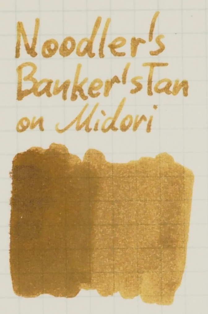
The amount of ink you put on the paper can change the colour from a somewhat insipid tan-yellow to a richer darker tan with some green and red peeking through on the swatch and title. I’m a big fan of the colour.
The ink is fairly wet out of the pen but because the ink is absorbed into some papers fairly quickly it can feel dryer on those more absorbent paper. There is little shading and the ink is fairly flat out of a pen.


Performance of Noodler’s Dromgoole’s Banker’s Tan is a massive let down. The ink performs relatively terribly on every piece of paper. Even Tomoe River. It feathers on every piece of paper, it bleeds on every piece of paper and there is lots of spread on every piece of paper. The bleeding is so bad that the ink bled through two pieces of 52gsm Tomoe River and onto a third. Granted most of this was from the wetter swatches and the title but some of the normal writing did bleed through one page and onto the second. This is pretty shocking for Tomoe River! Tomoe River does have a lot of show through and often show through that is almost bleeding (with swatches) but never with normal writing and certainly never so much that the swatch goes all the way through two pieces of Tomoe River paper or normal writing that goes through onto the second page. Interestingly, Rhodia seems a little better though it is certainly still there.
Feathering is present on all paper as well; yes, even Tomoe River. The feathering on 52gsm is quite minimal but the fact that there is any at all is somewhat extreme. 52gsm Tomoe River is extremely resistant to feathering and this is the first time I have ever seen it. The feathering is pretty noticeably bad on 80gsm Rhodia and 68gsm Tomoe River as well. There is spread on all paper including Tomoe River so it’s pretty difficult to get a fine line as they always turn into a medium at least.


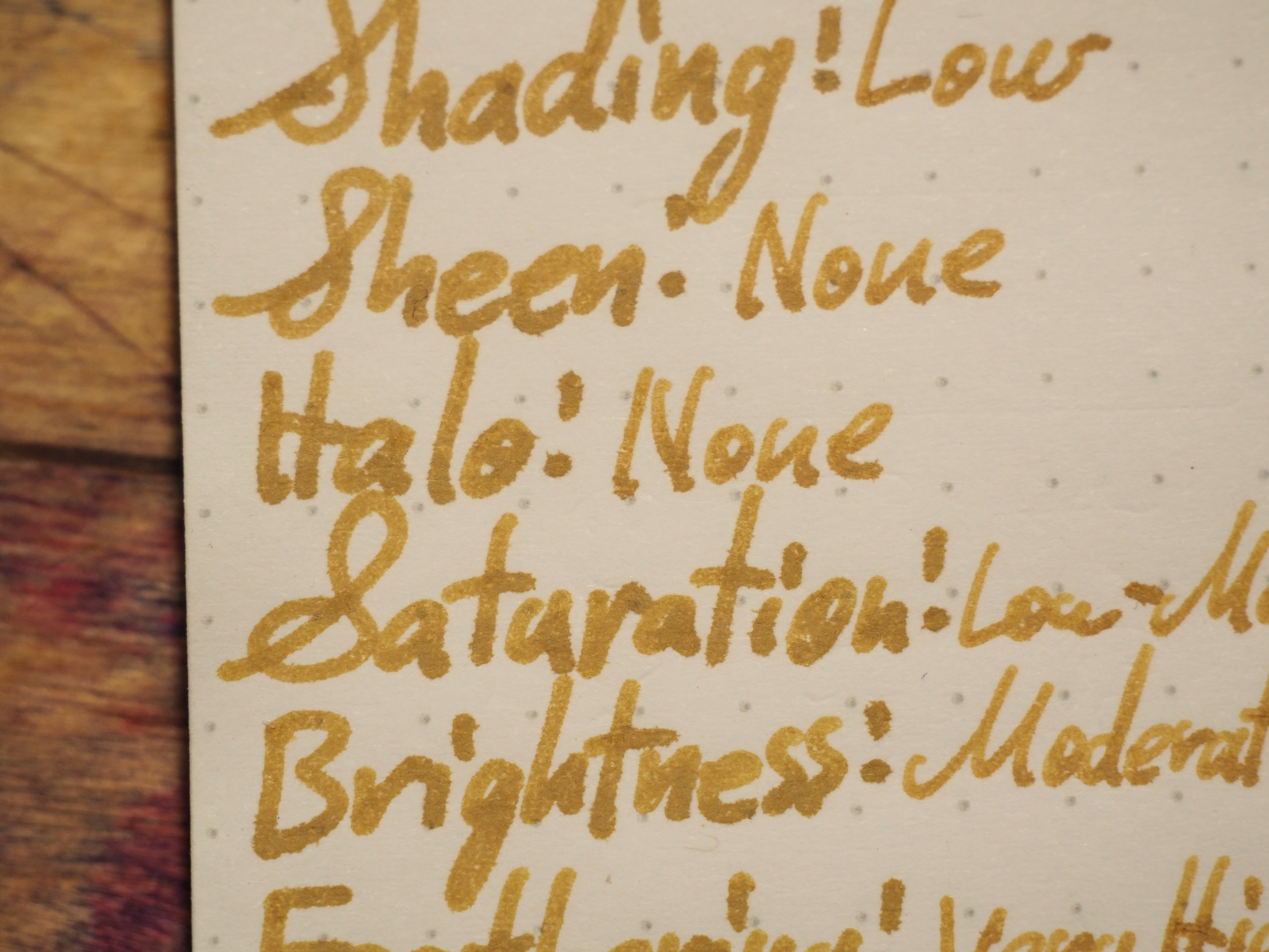
There is no sheen on the written line at all. But there is a some amount of silver sheen where the ink pools in the swatch and the title on 52gsm Tomoe River.


The chromatography is pretty basic. A more orange yellow line where the ink is put onto the sheet and a paler yellow after that. Dry time is extremely quick on 80gsm Rhodia at close to 5 seconds. Tomoe River is noticeably higher at 45 seconds.
Water resistance is perfect with this ink. You can’t even tell it had water on it! The ink Is, according to the Noodler’s website, Bulletproof (UV resistant, bleach resistant, etc), Eternal (Archival, fade-resistant), Forgery-Resistant (Impervious to lasers, alcohols, solvents - ideal for security documents), and fully water resistant.
Reviews

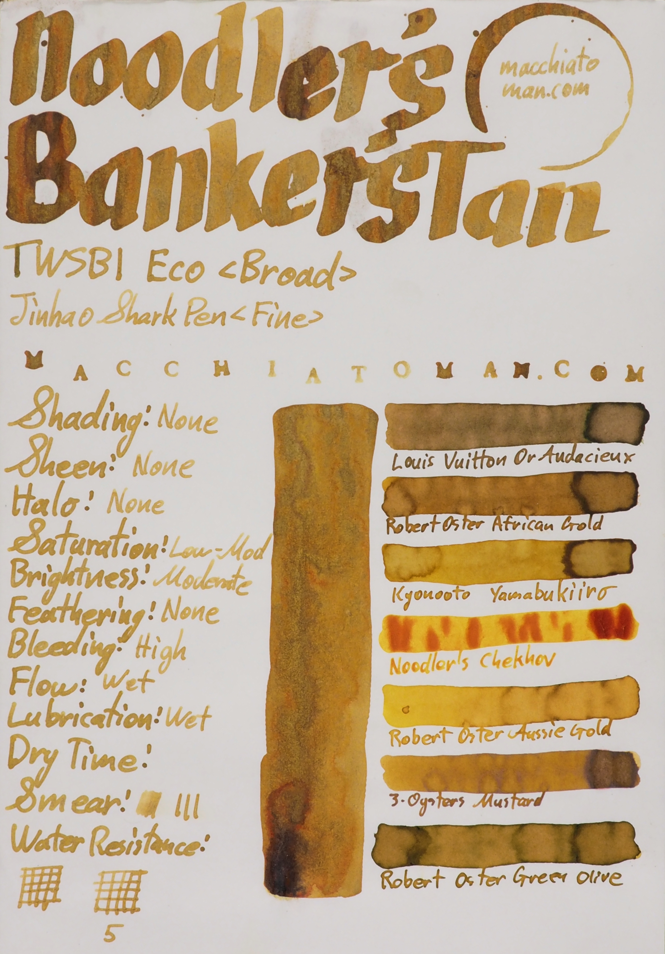
Just look at that feathering (can you call it feathering any more?) on the ‘N’ and the ‘e’ I the title! Of course this isn’t normal writing but that’s still really quite poor. For this review I used a TWSBI Eco (that had Noodler’s Baystate Blue in it previously) in Broad and a Jinhao Shark Pen in Fine. I was wary early on about putting this in a nice pen.
The ink is flatter here on Rhodia than it is on Tomoe River. There is no smearing at all.
I don’t really have a colour that is that similar to Noodler’s Dromgoole’s Banker’s Tan on Rhodia paper. It’s much less saturated than everything else I have.
On 80gsm White Rhodia:
Louis Vuitton Or Audacieux is too saturated, too red and too dark;
Robert Oster African Gold is much too red and saturated and a little too dark;
Kyonooto Yamabukiiro is too green and too saturated but a similar darkness;
Noodler’s Checkhov (original batch not 2018 rerelease) is way too saturated, is far too yellow but is a similar darkness;
Robert Oster Aussie Gold very similar to Checkhov but also has a touch too much green in it;
3•Oysters Mustard maybe a hair too much green but definitely too dark and saturated; and
Robert Oster Green Olive too green and too saturated and a touch too dark.
Difficult to pick a winner here as they aren’t that similar at all on Rhodia 80gsm but if I were to pick it would be Louis Vuitton Or Audacieux (which doesn’t help that much as it is a discontinued and much pricier ink).
Iroshizuku Ina-ho on 80gsm Rhodia
Additional comparison that I didn’t think about but read some people compare Banker’s Tan to. I don’t think they are that comparable; Ina-ho is noticeably greener and also darker.
On 52gsm Tomoe River the ink comes alive a lot more. A lot more complexity coming out off the swatches and the writing as well is at least a little more interesting.
Again no smearing with this ink.
The colours a closer comparison on 52gsm Tomoe River than they were on Rhodia. With many of the colours flattening a bit and losing their saturation a bit.
On 80gsm White Rhodia:
Louis Vuitton Or Audacieux is actually less saturated here but a tad too dark;
Robert Oster African Gold is very similar but a hair too orange and too dark;
Kyonooto Yamabukiiro has lost a lot of it’s green but is now too light and also the smallest hair too green;
Noodler’s Checkhov (original batch not 2018 rerelease) not even close and it’s a pools strangely. It’s a straight yellow with bits of strange orange;
Robert Oster Aussie Gold too light and too yellow without enough red in it. Similar saturation though;
3•Oysters Mustard Very very similar indeed;
Robert Oster Green Olive too green to and a tiny amount too dark but the right saturation.
Tough pick again but this time because Robert Oster African Gold and 3•Oysters Mustard are so close! The writing of Kyonototo Yamabukiiro is also closer to the writing of Banker’s Tan than Mustard of African Gold. My pick would be 3•Oyters because it isn’t quite as dark as African Gold and is slightly closer in the writing because of it.
Iroshizuku Ina-ho on 52gsm Tomoe River
Not as much green on Tomoe River but no where near enough yellow and way too dark again. Not very similar for me.
Conclusion

Beautiful bottle on this one with a wrap of the $500 Texas redback around the glass. The ink is a unique and interesting colour that’s quite nice and evocative. Unfortunately the ink just performs horrendously. Your only chance of using this ink without headache, in my opinion, is Tomoe River as while there is feathering and bleeding and spread it isn’t as visible (at least for feathering) as on other papers. I simply can’t recommend this ink unless you are a collector (as the bottle and label are great).
That said, if you have a particular need for a light tan ink that is Bulletproof, Eternal, Forgery-Resistant, and Water Resistant then this is the perfect ink for you! All one of you!
As usual, below is the ink on various papers.
✒︎ ✑ ✒︎ ✑
I've listed all my inks and all my pens in their respective pages. Please let me know which inks you'd like to review next via the comments, Twitter, Instagram, or contact me directly.
For blog updated you can follow @macchiato_man on Twitter, subscribe via email, or like my Facebook page.
I was not compensated for this review and everything here is my own honest opinion. There are no affiliate links in this review..