• Blog
  • About
    • My Inks (on Fountain Pen Companion)
    • My Pens
  • Archive
  • Contact
Menu

Macchiato Man

  • Blog
  • About
  • My Collection ☟
    • My Inks (on Fountain Pen Companion)
    • My Pens
  • Archive
  • Contact
The @madebyendless Cotton Wallet arrived the other day! I’m a sucker for these sorts of practical inserts for notebooks. The cotton fabric suites the simple style of the Explorer. 
⠀
While I love these and always get them whenever I can I never
First test of the Regalia paper in the Endless Explorer than I was sent by @madebyendless. Really impressed by the paper. Very smooth, nice sheen and nice shading! Finger prints or hand oil seem to affect the writing a little but nothing out of the o
New Pen Review: Esterbrook Camden (Premium Edition) - 𝙻𝚒𝚗𝚔 𝚒𝚗 𝙱𝚒𝚘!

I’ve been eager to try the Camden for a while now. I love my flat end pens and the overall shape of this one is subtly unique. While there are some differences between
New friend from @esterbrook_official! Camden Manitoba Blue. 
⠀
Love flat end pens so looking forward to digging into this (so review incoming).
 
Flat or round ends?✑
⠀
⠀
⠀
⠀
#fountainpen #fpgeeks #fountainpenaddict #fpn #fountainpengeeks  #fountainp
New Ink Review: @birminghampens Antique Sepia (link in bio)
⠀
In line with the recent trend of soft pastel dichromatic inks but Birmingham’s version is an interesting dust grey version with low saturation that I find quite interesting don&rsquo
New Ink Day! Haven’t had one of these for a while but I received these from a friend at the last Perth Pen Meet. 
⠀
All sailor and the first tall bottle in a while (bringing the number of those to 86). 
⠀
Didn’t realise it at the time but
New Ink Review: La Couronne du Comte Vert Sapin (link in bio)
⠀
The final of LCdC’s initial set of four exclusive inks from Diamine. A lovely rich sheeny green-teal.
✑
⠀
⠀
⠀
⠀
#fountainpen #fpgeeks #fountainpenaddict #fpn #fountainpengeeks  #fo
I don’t know if I’ve ever shared this before but my city has a set of five dip nibs as an artwork. 

They are called “Memory Markers” by Anne Neil and represent early-ish colonial stories of the gardens where they are.

We als
⚠️Update: Why I have been so radio silent! 📻🤫 A lot of large personal changes, essentially (read on for details)!

There have been three main reasons for why I haven’t been able to do much here or on my blog. 

1) 🎓 I had to finish of my Mas
Ink Ink Comparison: Discontinued Iroshizuku and New Iroshizuku! Thanks to @penclassics for allowing this to happen. See link in bio!
⠀
The old: Tsuyu-kusa, Tsukushi, and Ina-ho.
The New: Sui-gyoku, Hana-ikada, and Hotaru-bi.
⠀
This is a long review b
NPD: @esterbrook_official LE Estie “Candy” in Oversize with a Kirk Speer Needlepoint nib!
⠀
Thanks to Esterbrook for sending this through to me for review. I’ve reviewed a couple of Esties now and two of the custom nibs (which are a
Out with the old in with the new?

I just received the new Pilot Iroshizuku Inks in the little bottle ink pack from @penclassics for review. I plan on doing an overview review of the three new and the three old ones!

I feel like Ina Ho was quite a u
New Pen Review (see link in bio): Platinum Curidas courtesy of @penclassics (check them out!)
⠀
This is certainly a curiously designed pen with it's quirks but it has bee a delight to write with and a great pen to through in a pocket. I've been using
New Ink Review! @wearingeul_global Kyonghui! See link in bio!

Kyonghui is a vibrant earthy orange from Wearingeul's series on Korean Female Modern Writers. It is also a great performing ink!

Wearingeul's global push is fairly new; has anyone tried
It has been a little while since I posted here so I thought I'd give a little update!

Firstly I think I just needed a little break at the end of the year! It has been a busy year for me. I have been taking my photography more seriously and I also ha

Subscribe

Sign up with your email address to receive news and updates.

We respect your privacy. Unsubscribe at any time.

Thank you!
Blog RSS

☛ Twitter feed

✉ Email Subscription

☞ Fountain Pens Australia (Facebook Group)

☛ Sailor Pens & Inks (Facebook Group)


Sponsors

10% off code: MACCHIATOMAN


Click here for sponsorship information


Featured Posts:

Featured
Ink Review: Pennonia Pokoltuz (Pokoltűz)
Aug 1, 2019
Ink Review: Pennonia Pokoltuz (Pokoltűz)
Aug 1, 2019
Aug 1, 2019
Notebook Review: Pebble Stationery Pocket Tomoe River Notebook
Nov 10, 2018
Notebook Review: Pebble Stationery Pocket Tomoe River Notebook
Nov 10, 2018
Nov 10, 2018
Ink Review: Krishna Brown Pink
Jan 20, 2018
Ink Review: Krishna Brown Pink
Jan 20, 2018
Jan 20, 2018


Archive
  • November 2024
  • October 2023
  • December 2022
  • October 2022
  • June 2022
  • May 2022
  • April 2022
  • February 2022
  • January 2022
  • December 2021
  • November 2021
  • October 2021
  • September 2021
  • August 2021
  • July 2021
  • June 2021
  • May 2021
  • April 2021
  • February 2021
  • January 2021
  • December 2020
  • November 2020
  • October 2020
  • September 2020
  • August 2020
  • July 2020
  • May 2020
  • April 2020
  • March 2020
  • February 2020
  • January 2020
  • December 2019
  • November 2019
  • October 2019
  • September 2019
  • August 2019
  • July 2019
  • June 2019
  • May 2019
  • April 2019
  • March 2019
  • February 2019
  • January 2019
  • December 2018
  • November 2018
  • October 2018
  • September 2018
  • August 2018
  • July 2018
  • June 2018
  • May 2018
  • April 2018
  • March 2018
  • February 2018
  • January 2018
  • December 2017
  • November 2017
  • October 2017
  • September 2017
  • August 2017
  • July 2017
  • June 2017
  • May 2017
  • April 2017
  • February 2017
  • January 2017
  • December 2016
  • November 2016
  • September 2016
  • August 2016
  • July 2016
Logo.jpg

Ink Comparison: Parker Penman Emerald

April 05, 2017 in Ink Comparison

In November last year I did a comparison of Parker Penman Sapphire an ink that a few other ink makers had either tried to copy or drew inspiration from. Parker Penman Emerald only has Bungubox Norwegian Wood (or Bungubox Emerald) that drew inspiration from it. Penman Emerald is the perfect green for me. I'm not a huge fan of greens in general (and generally avoid greens that lean blue) and this is the perfect, for me, balance of yellow and blue; it's slightly on the yellow side. It's got some sheen and shading which are other characteristics I am drawn to. Like the rest of the Parker Penman ink series, it was discontinued in 2000 which is around 17 years ago as of this comparison.

To avoid confusion, although Bungubox Emerald is probably the inks most well-known name I will be using its alternate name 'Norwegian Wood' to distinguish it from Parker Penman Emerald

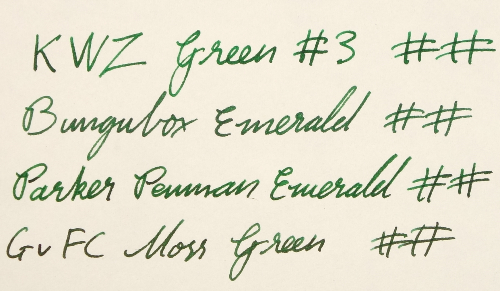
Unlike with Penman Sapphire, I haven't made any concerted effort to collect Emerald alternatives but it just happens that I had collected a few of the suggested alternatives! I have swatched a few of these and some additional greens from my collection and those that have been the most similar I inked into medium nibbed pens for a better comparison.

On 80gsm Rhodia

On white 52gsm Tomoe River

Emerald is a pretty wet ink and it holds up well with Bungubox Norwegian Wood (Sailor inks, of course, being, generally, very wet inks). KWZ Green #3 and GvFC Moss Green are all decently wet inks as well. In general, all the inks performed fairly similarly in terms of wetness, lubrication, daytime and water resistance. None of the inks had a halo, and none of them feathered on friendly paper nor did they bleed. Good performers all round. Shading was moderate to high across the range with KWZ Green #3 having a decent amount of shading on every line. As mentioned above, the amount of shading was less in the Penman Emerald but the contrast of what shading was there was pretty high, and probably the highest of all the inks.

Parker Penman Emerald is a highly saturated green that leans slightly yellow. It shades moderately but the contrast can be very high. All the inks are pretty saturated, but Penman Emerald is definitely the highest. Although the ink can get pretty dark (especially when left in a pen), which somewhat obscures the colour, the green colour is a highly vibrant green (when the shading permits the green to shine through). By comparison, Norwegian Wood has less green and slightly less vibrancy and Moss Green takes it a step further being noticeably less yellow and vibrant than Penman Emerald. Green #3 has a similar yellow base colour but misses out on the darkness of Penman Emerald.

View fullsize KWZ Green #3
KWZ Green #3
View fullsize KWZ Green #3
KWZ Green #3
View fullsize Bungubox Norwegian Wood
Bungubox Norwegian Wood
View fullsize Bungubox Norwegian Wood
Bungubox Norwegian Wood
View fullsize Parker Penman Emerald
Parker Penman Emerald
View fullsize Parker Penman Emerald
Parker Penman Emerald
View fullsize GvFC Moss Green
GvFC Moss Green
View fullsize GvFC Moss Green
GvFC Moss Green

The inks did differ with their sheen with Penman Emerald offering a somewhat subtle amount of, but still visible, red sheen. Here is where Bungubox Norwegian Wood takes a major turn away from Penman Emerald in that it's offers a decent amount of silver sheen. Moss Green also offers a red sheen like Penman Emerald and the sheen a little more prominent as well. KWZ Green #3 also offers a silver sheen like Norwegian Wood, but it's much less visible.

View fullsize KWZ Green #3
KWZ Green #3
View fullsize Bungubox Norwegian Wood
Bungubox Norwegian Wood
View fullsize Parker Penman Emerald
Parker Penman Emerald
View fullsize GvFC Moss Green
GvFC Moss Green
View fullsize Dry Times
Dry Times
View fullsize Water Resistance
Water Resistance

Interestingly, the chromatography shows a lot of yellow in the Norwegian Wood but that yellow doesn't come out as strongly as it does with the Penman Emerald (which shoes a rather flatter chromatography). All the inks have blue separating in from the green. Penman Emerald and Green #3 share a similar order with the blue coming out above the green - Green #3 shows a similar hue to Penman Emerald as well but is lighter in every way. Moss Green and Norwegian Wood have the blue more prominent and has the green breaking away from the blue above.

All the inks take around thirty seconds to dry on Rhodia 80gsm paper. That's a decent amount of time but not abnormally slow. Penman Emerald seems to be the most readable after water has been spilled. In the top crosshatch the water is dabbed away quickly and in the lower is is left for a minute to soak before being dabbed away. You can clearly still identify the lines in both examples of Penman Emerald but I wouldn't describe it as resistant. The Moss Green is barely identifiable but none really I wouldn't classify it has water resistant at all. Neither with Norwegian Wood nor Green #3.

Left to right: Diplomat Excellence A 'M' (KWZ Green #3), OMAS Arte Italiana Paragon Arco Celluloid 'M' (Graf von Faber Castel Moss Green), Lamy 2000 'M' (Bungubox Norwegian Wood/Emerald), and Parker Duofold International 'M' (Parker Penman Emerald).

I really do love Parker Penman Emerald. More than Penman Sapphire even. I'm not huge fan of green inks in general but this is high on my favourite inks list (if that existed).  I feel like with Penman Sapphire the alternatives are decent enough to not need the original but with Emerald, and much like Lamy Dark Lilac, accepting an ink as an alternative really relies on which compromises you abide by. If you want the colour to me similarly yellow leaning, but don't mind the ink being lighter perhaps KWZ Green #3 is a viable option, if you don't mind the colour people a little different but the sheen to be comparable, Graf von Faber-Castell Moss Green might the best option. And if the darkness and richness of the ink is the most important feature, perhaps the Penman Emerald inspired Bungubox Emerald (Norwegian Wood) is best. For me I'm just relieved that I don't have to make such a compromise. If forced to, I'd probably pick KWZ Green #3 simply because I do prefer yellower greens. If you ever see Parker Penman Emerald within your price range, I highly recommend picking it up.

Bellow I have included these four inks on various papers and some extra swatches. At this point I'd like to also comment on Diamine Sherwood Green. This ink is definitely leaning more blue than Penman Emerald and when wet is rather dull and much bluer. This is often an ink that is recommended as an alternative. KWZ Iron Gall Green #3 is also an ink that might be comparable (but is not included in this comparison) it dries darker (due to oxidisation of the Iron Gall element of the ink) than the standard KWZ Green #3 and is still yellow leaning.

I've listed all my inks and all my pens in their respective pages. Please let me know which inks you'd like to review next via the comments, Twitter, Instagram, or contact me directly.

You can follow @macchiato_man on Twitter for blog updates.

I was not compensated for this review and everything here is my own honest opinion. There are no affiliate links.

View fullsize Clairefontaine
Clairefontaine
View fullsize Composition Book
Composition Book
View fullsize Copy Paper 1
Copy Paper 1
View fullsize Copy Paper 2
Copy Paper 2
View fullsize Original Cotton Mill Pure Cotton
Original Cotton Mill Pure Cotton
View fullsize G. Lalo Ivory Paper
G. Lalo Ivory Paper
View fullsize Leuchtturm 1917
Leuchtturm 1917
View fullsize Tomoe River
Tomoe River
View fullsize Yellow Rhodia
Yellow Rhodia
Tags: inkcomparison, comparison, parker, Parker Penman Emerald, bungubox, Bungubox Emerald, Bungubox Norwegian Wood, Bungbox, Bungbox Emerald, Bungbox Norwegian Wood, GvFC, Graf von Faber Castel, GvFC Moss Green, Graf von Faber Castel Moss Green, KWZ, KWZ Green #3, Montblanc Irish Green, Montblanc, Diamine, Diamine Sherwood Green, Penman Emerald, Penman, Blackstone, Blackstone Daintree Green, Daintree Green, Sherwood Green, caran d'ache, CdA Amazon, caran d'ashe amazon
← Site updateInk Review: Organics Studio Nitrogen Royal Blue →
Back to Top

Blog RSS

✉ Email Subscription

☞ Fountain Pens Australia (Facebook Group)

☛ Sailor Pens & Inks (Facebook Group)