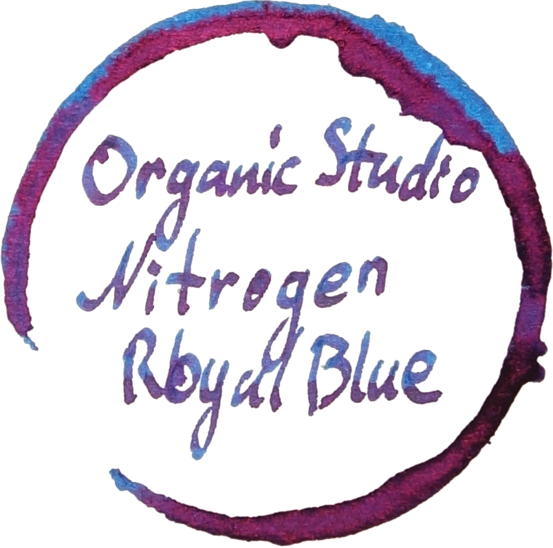
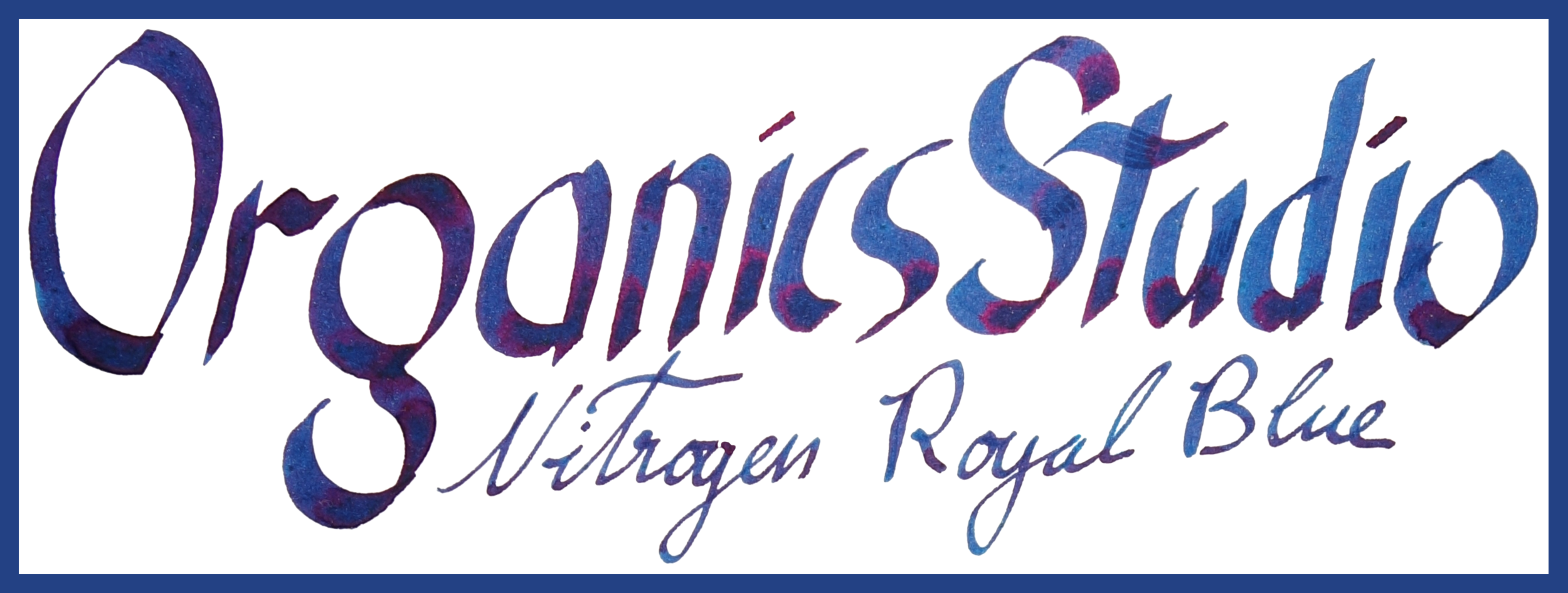
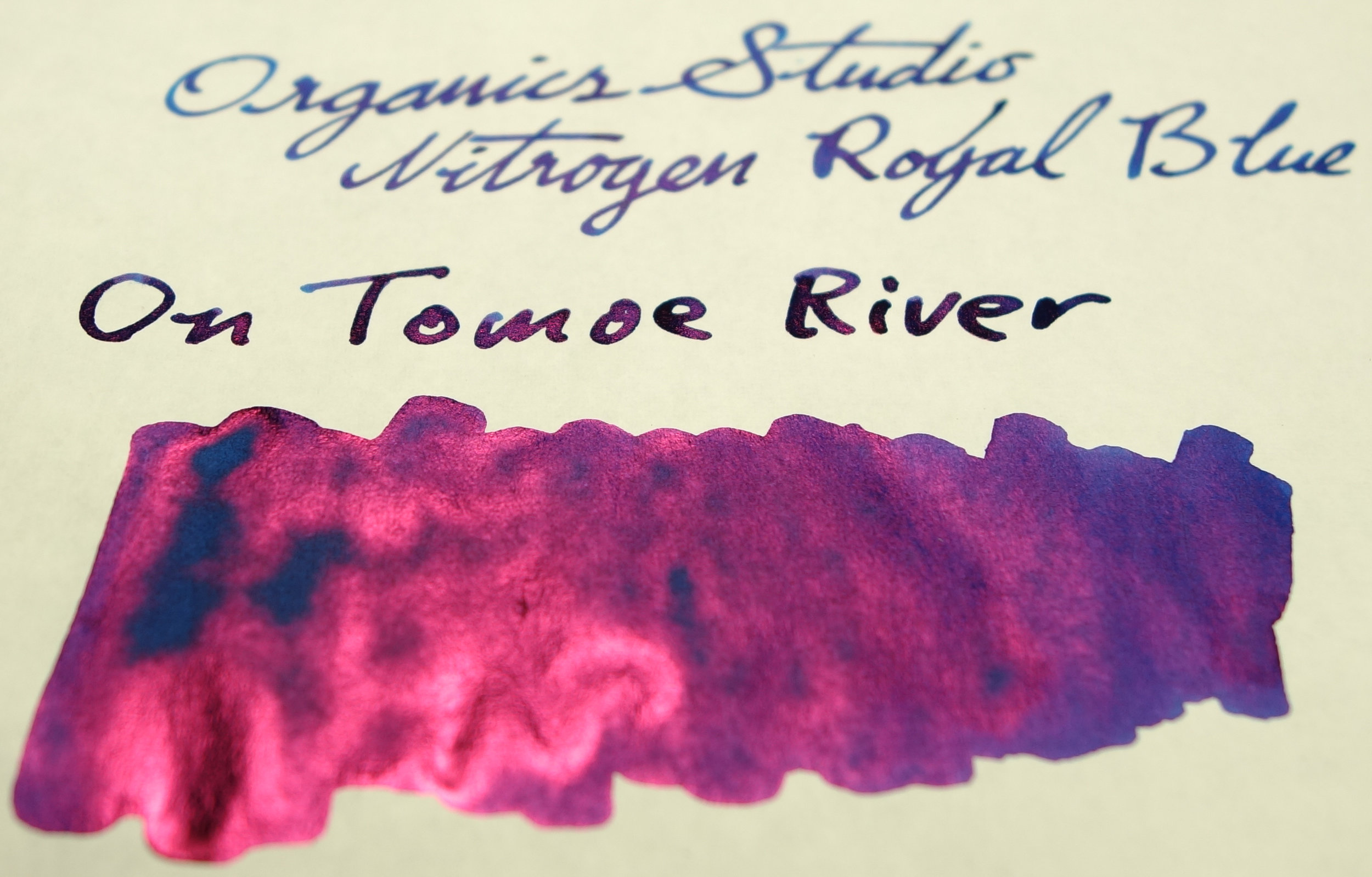
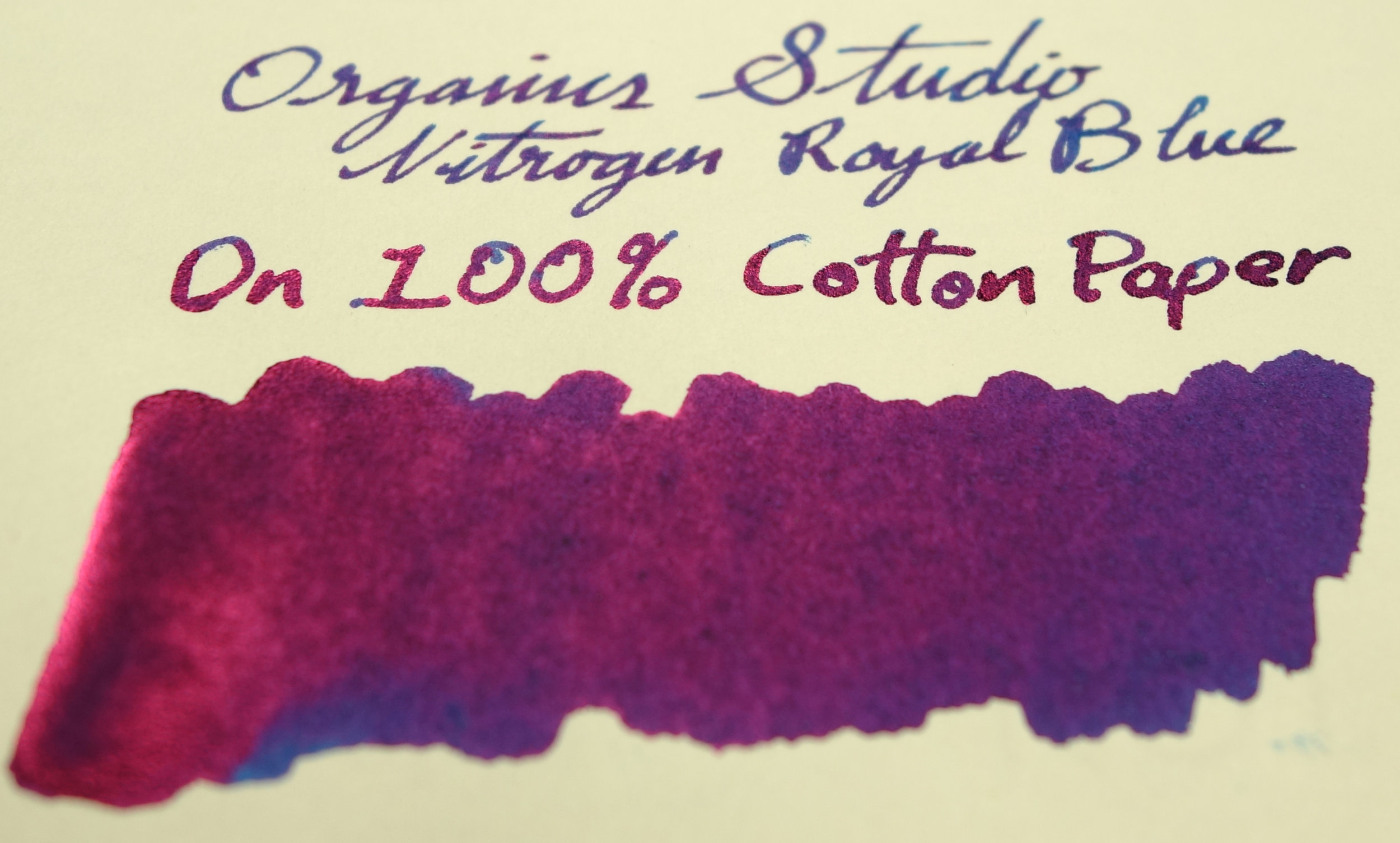
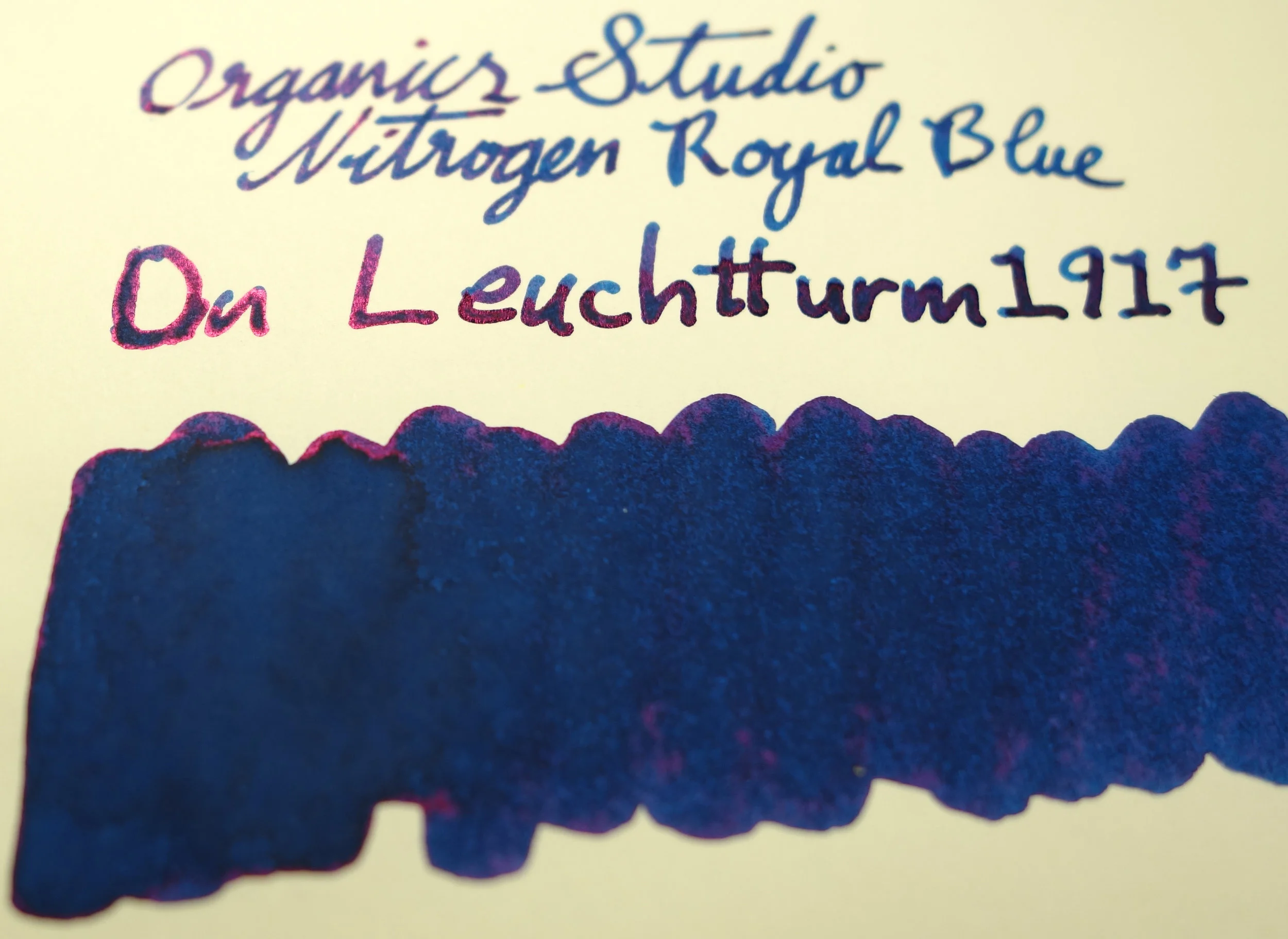
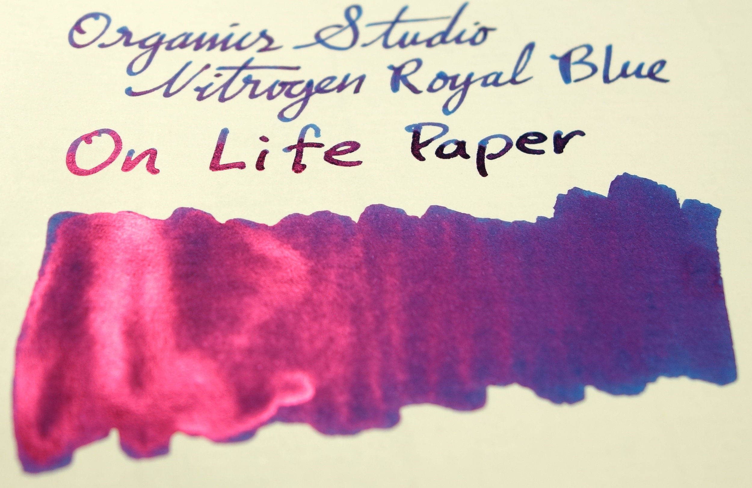
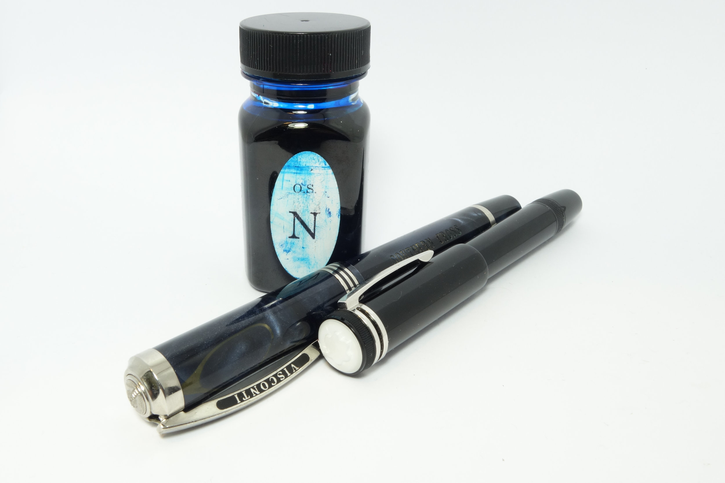
I picked up Organics Studio Nitrogen Royal Blue late last year and it is one of the most astonishing inks I have ever used. The sheen on this ink is like nothing else, the name of the ink is odd and the for some strange reason the ink just gets everywhere but I'm willing to overlook that given the absurd levels of sheen that this inks makes.
I'm not a fan of Royal Blue inks but this ink is unlike any other Royal Blue named ink. I don't believe the name suites it at all! Most Royal Blues lean slightly purple but this ink leans slightly green; most Royal Blues are somewhat tame and boring (to me) but this is far from tame or boring. This ink is very well lubricated and very wet. It glides out of the pen and puts down a thick line. The ink sheens more than any other ink I have ever seen. Even Diamine Majestic Blue doesn't sheen as much as Organics Studio Nitrogen Royal Blue. But I'll cover sheen more bellow.
The ink fair very well on cheap paper; there is very little feathering on the two types of copy paper I have and and only some bleeding on the very wet Visconti Broad nib. This ink smudges a lot even after leaving the ink for a while. It's similar to Diamine Majestic Blue in this regard; even after it dries it smudges. The ink also magically gets everywhere. If I open the lid and place the lid on the table (wet side up, of course) there is somehow already ink… on my fingers, splashed on the table and on the topside of the lid! How on earth did it get there! After doing these swatches bellow my hands were covered in the ink even though I was being careful!
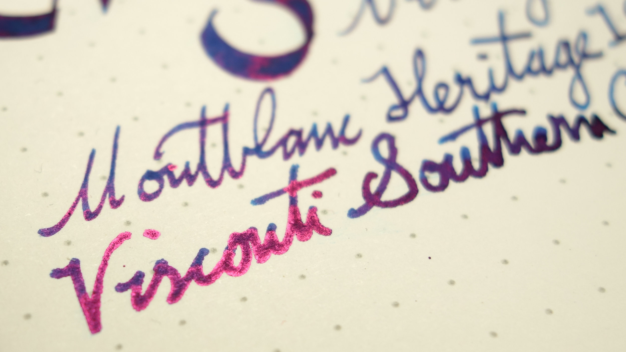
The sheen! On some paper think ink is more pink than blue. Tomoe River, G. Lalo, Life Paper and even 100% Cotton Paper the swatch is almost entirely pink (from almost all angles too!). On Rhodia paper the sheen is less distinct on the swatch but still very prominent on the written line. On Clairefontaine and Leuchtturm there is distinctly less sheen but these papers rarely produce sheen at all in my experience. There is also the barest amount of sheen on the edges of the lines on copy paper. Pretty amazing.
Due to the ink being the messiest ink I've ever used, I also discovered that the ink sheens on ceramic coffee cups, human skin and varnished wood. Normally sheen is visible only from a certain angle where the light bounces off and into your eye or camera lens and you you find an angle where you see only the ink's colour (in this case blue). With Nitrogen Royal Blue, however, on some paper I could not find an angle where the pink wouldn't show. The ink was effectively completely pink in those areas.
The ink has absolutely no water resistance at all. Completely washes off. While the ink does smudge it also dries relatively quickly given how sheeny the ink is (often when sheeny inks pool and dry slower, such as on Tomoe River, they show more sheen. Conversely, when they dry quickly, such as on cheap paper, they don't show sheen).
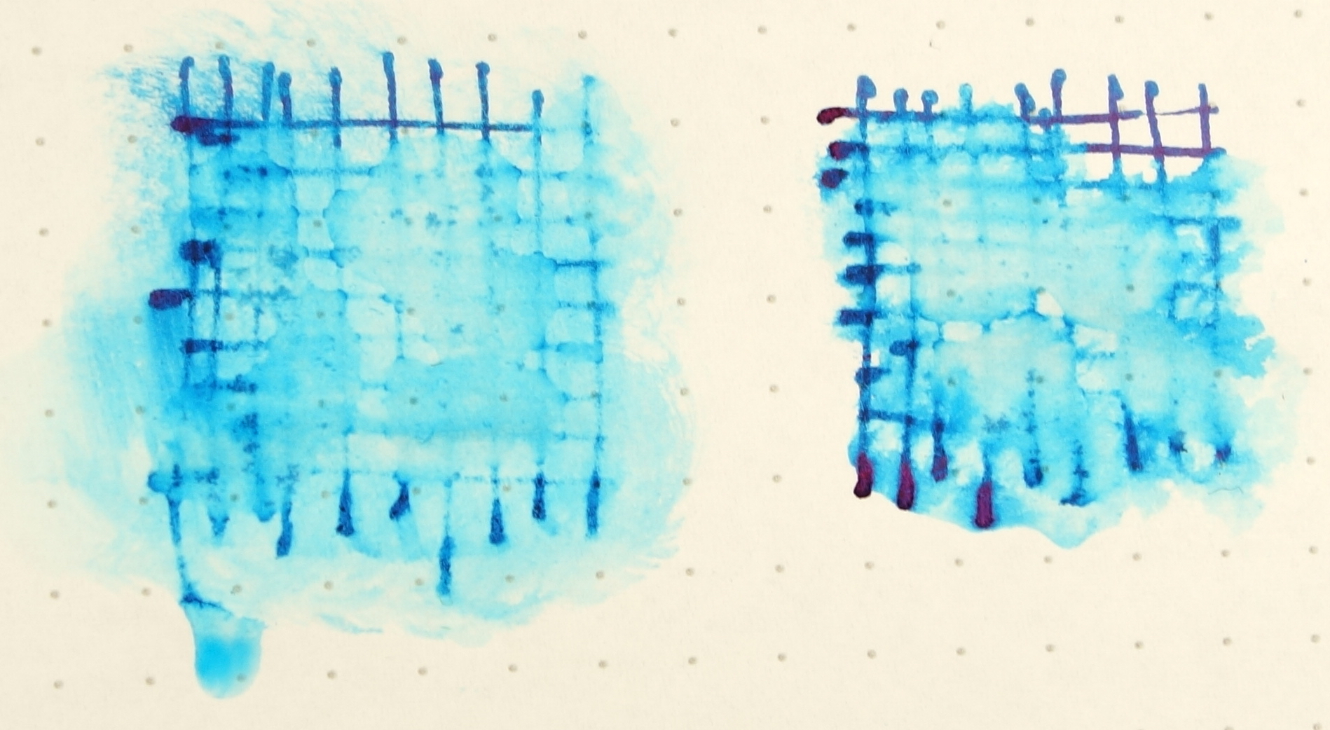
The chromatography is relatively unremarkable. It simply goes from a light to dark in the same hue.
Comparison on Rhodia
Ink-colour wise the the ink contains a smidgen of green to it and I didn't have many inks that closely matched. KWZ Azure #3 didn't have the green tinge, Robert Oster Bondi Blue was too light, Robert Oster Blue Sea was too light and too green leaning, and Blackstone Barrier Reef Blue was a little lighter and more vibrant. Bungubox Sapphire was fairly similar but Noodler's Ottoman Azure is the closest ink which, ironically, it has no sheen! Bellow there are two extended comparisons.
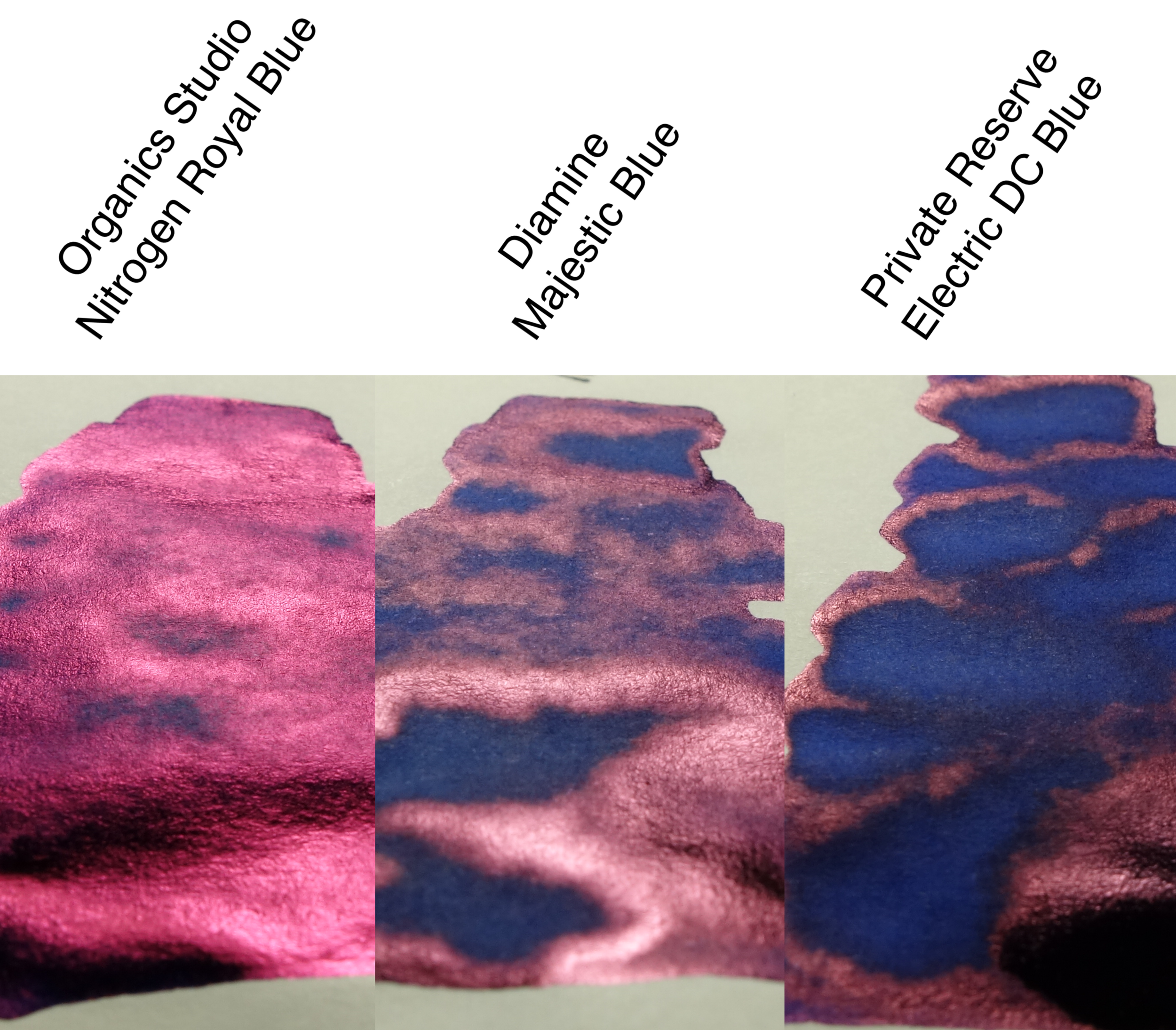
The colour of the ink isn't visible all the time so a sheen comparison is also relevant with this ink. The colour of the ink is a fluorescent pink. Of my more sheenier blue inks (I didn't include very sheeny inks that aren't blue such as Iroshizuku Yama Budo or Diamine Bilberry) Sailor Sky High has a similar coloured sheen but isn't anywhere near as sheeny. Magestic Blue, a famously sheeny ink, is a more muted pink and it is very sheeny but still isn't as extreme as Nitrogen Royal Blue. Private Reserve Electric DC Blue has a similar sheen to Majestic Blue but mostly pools on the edges. Both Sailor Blue and Bungubox 4B are very strongly sheening inks (especially the latter) but the colour of the sheen is copper rather than pink (and the inks are much darker).
I have drastically extended the paper examples in this review to eleven different papers. Bellow are written and swatched examples on Clairefontaine, Composition Notebook, two different, Copy Papers, 100% Cotton Paper, G. Lalo, Leuchtturm1917, Life Paper, and Yellow Rhodia. This is in addition to the usual Rhodia the review is written on.
This is an amazing and unique ink that isn't without it's issues. An ink that smears and it not water-resistant in the slightest might and these characteristics might dissuade some people from buying the ink, and while I love sheeny inks they aren't for everyone and I can appreciate why someone might want their blue ink to look, well, blue and not fluorescent shiny pink! I, however, love this ink. It's so stunningly sheeny; no other inks really compare. The blue, when visible, is a very pleasing blue as well. I'm definitely getting myself a second (or third‽) bottle.
I bought the ink from Vanness Pens in the US but is available from some other US retailers.
I've listed all my inks and all my pens in their respective pages. Please let me know which inks you'd like to review next via the comments, Twitter, Instagram, or contact me directly.
You can follow @macchiato_man on Twitter for blog updates.
I was not compensated for this review and everything here is my own honest opinion. There are no affiliate links.
