
Reader, Alex, asked me to compare Diamine’s Oxford Blue to some other related dark blue Diamine inks so I’ve done just that! I have interpreted this not in terms of Diamine’s Blue-Black inks but in terms of their darker rich blues. This means that I have skipped the much darker blues such as the 150th Anniversary 1864 Blue Black, Blue Black, and Midnigt. I have also tried to not include lighter inks such as Blue Velvet or Asa Blue, and I’ve also skipped the low saturation Denim and the much more purple Imperial Blue. The inks in this comparison are Tchakovsky, from the Music set; Tudor Blue, from the second 150th Anniversary set; Majestic Blue; Oxford Blue; Lapis Blue, a Philippines exclusive; Regency Blue, from the first 150th Anniversary set; Sargasso Sea; and Blue Pearl, Blue Flame and Shimmering Seas, all from the Shimmertastic series. I’ll admit it’s a little arbitrary, but I believe these inks are an interesting comparison.
The main inks I want to focus on are Oxford Blue, Lapis Blue (which I sometimes see written as Lapiz Blue), and Majestic Blue. For all the swatches and written parts, with the exception of my swatch cards, I didn’t shake the Shimmertastic bottles; this means that the shimmering particles, that are not sheen, didn’t get mixed with the ink and so the ink displayed is the base ink colour.
80gsm Rhodia
Rhodia White 80gsm
On this white Rhodia paper, Oxford Blue and Blue Pearl are fairly similar with yet Oxford Blue being less saturated. Lapis is a little brighter and more vibrant than Oxford Blue and with a little more red to it. Majestic Blue has a hint of green to it and is lighter than Oxford and Lapis. Tudor and Regency Blue and noticeably purpler than any of the other inks with Regency being very dark. Tchaikovsky which has a dusty look to it, and Shimmering Seas, which looks a little cold, are both lacking in saturation compared to the others, more so in the latter, with Shimmering Seas also have a hint of green. Blue Flame look rather ‘Royal Blue’ here and also leans slightly purple. Sargasso Sea is easily the most vibrant and most saturated of the inks and leans rather neutrally in between leaning green or purple. N.B. I’m not saying that these are green-blues or blurples, just that they lean one way or the other compared to each other.
Sargasso Sea, Majestic Blue and Blue Pearl offer the best shading with much of the rest being rather flat. Oxford Blue and Regency Blue look very dark in the written line. Lapis Blue and Shimmering Seas also look rather dark. The shimmering inks, not shaken, feel a little dry. I suspect there is some lubrication that sinks to the bottom with the particles that may be lacking.
90gsm Cream Rhodia
Rhodia Cream 90gsm
There isn’t much of a difference between the inks on white 80gsm Rhodia versus cream 90gsm Rhodia. The main difference is that the yellower paper colour seems to accentuate the green of Majestic Blue and Shimmering Seas and Tchaikovsky. Shimmering Seas also seems a little more colourful. Regency Blue is also a touch darker.
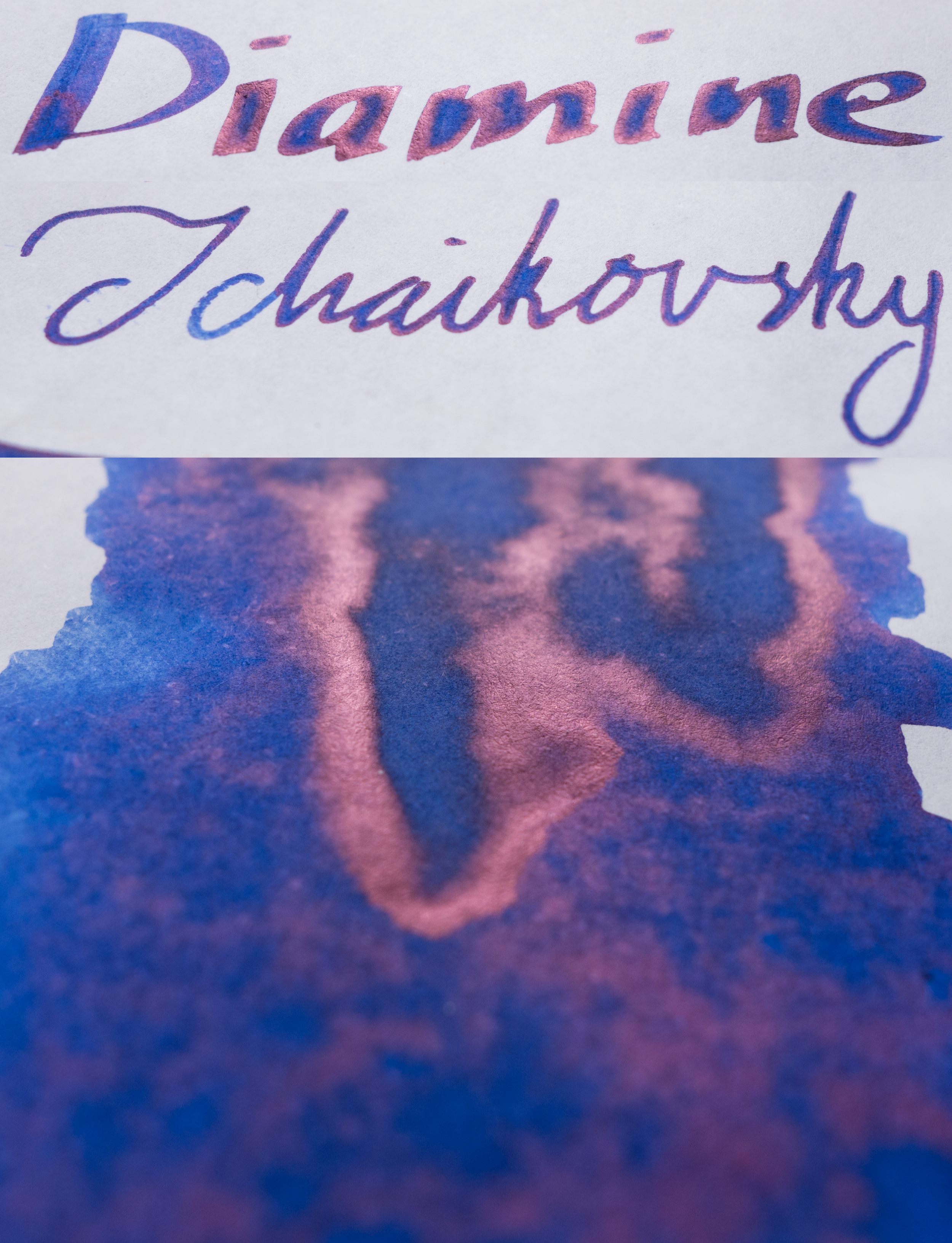
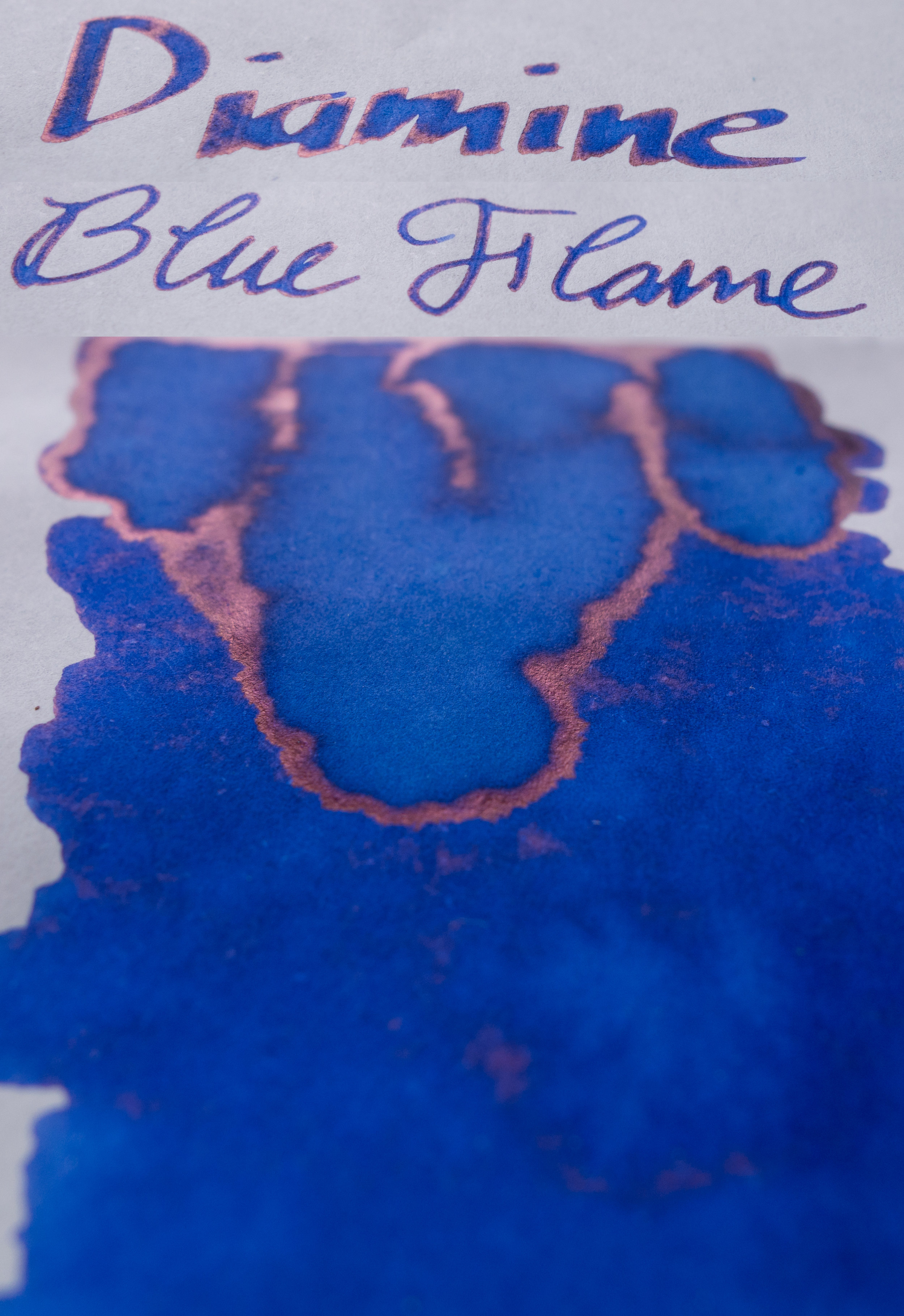
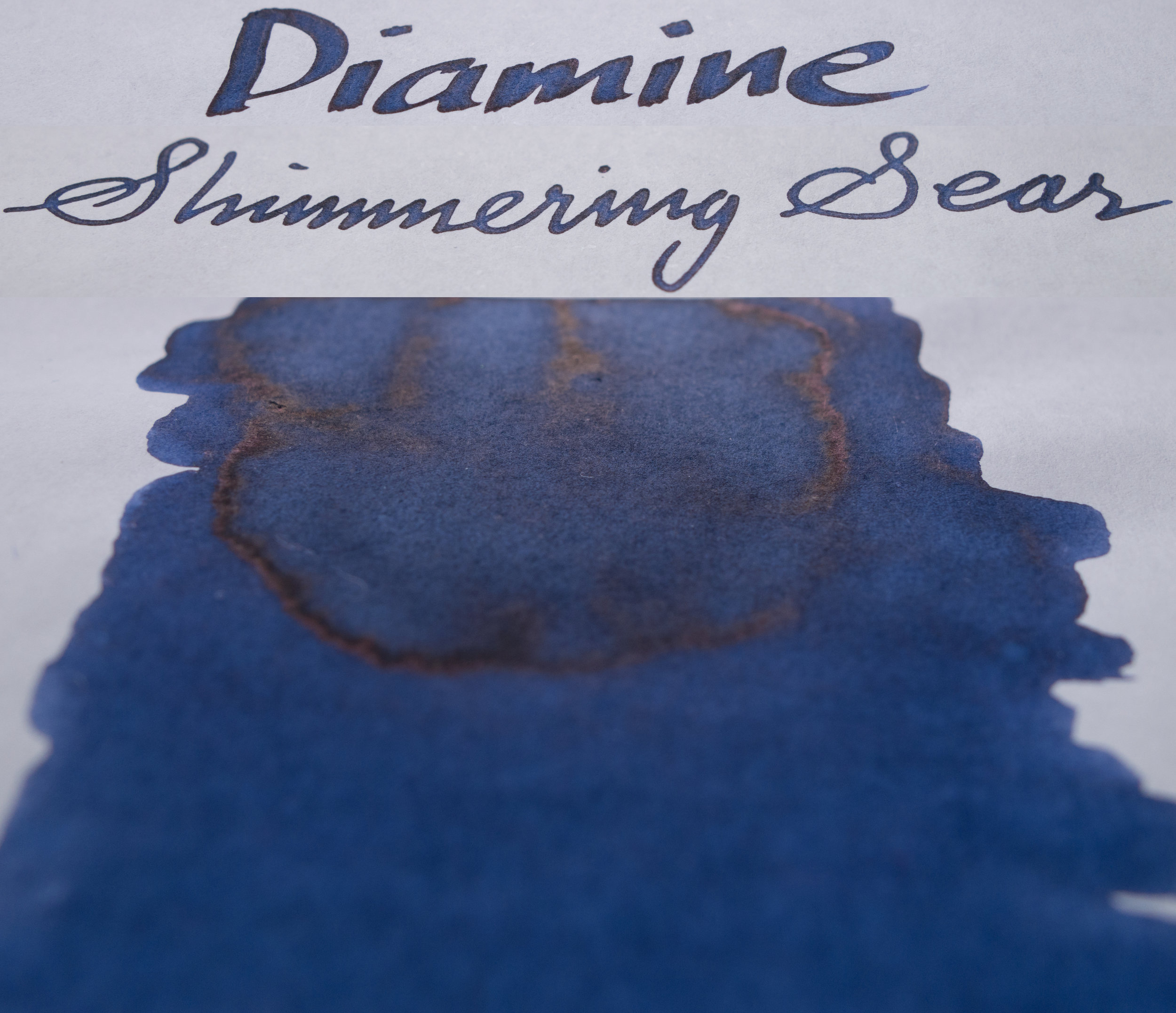
Tomoe River Ivory (white) 52 GSM
Tomoe River can drastically change the colour of an ink when compare to, for example, on Rhodia. It also increases dry time and produces more sheen. It’s also more prone to smearing, and sheening inks are additionally more prone to smearing than other inks. Here, not pictured, Tchaikovsky, Majestic Blue, Oxford Blue all smeared after several days of the ink drying when I brush my finger over the written lines. Surprisingly Shimmering Seas and Tudor Blue also smeared. Regency Blue did not (though I did smear it early on when I made the swatchs!). Also surprisingly, Sargasso Sea did notsmear. I’d like to point out that with the exception of possibly Majestic Blue the smearing wasn’t that noticeable but it was still there.
Colour wise, Tudor Blue, Blue Pearl, Oxford Blue, Lapis Blue and Regency Blue all become lighter; and Blue Flame and Majestic Blue become more vibrant. Shimmering Sea’s and Tchaikovsky do not change that much and for the most part the inks remain comparable to when they were on the white Rhodia. White much of the shading disappears form the written lines, there is still some nice shading with Tchaikovsky.
Swatch Cards
Swatch Cards
These Swatch Cards are my Sumo Hi Bulk (in 240 or 230 g/m²) paper I reviewed here. The colours here are very similar to the colours of the inks on Tomoe River, but the brightness is closer to Rhodia with Oxford Blue, Regency Blue, and Lapis Blue but being dark like on Rhodia. The Shimmertastic inks’ particles obscure much of the ink colour and the gold particles in Shimmering Seas really make the ink’s green lean more prominent still.
Chromotography
Majestic Blue and Tchaikovsky are fairly similar here, with more vibrancy to the former, and are also pretty uniform in their composition along with Sargasso Sea, Blue Flame, and Shimmering Seas; very what you see is what you get. Blue Pearl and Oxford Blue also look rather similar here as they did in the swatches as both contain some magenta dyes coming through. Lapis Blue, too, along with Regency Blue have this and it is quite prominent with Regency Blue taking up much of the chromatography. Tudor Blue is surprisingly light coloured though the pink in the ink is not a surprise given the purple lean to the ink, but the turquoise in the chromatography stands out.
Sheen
Majestic Blue, and then Tchaikovsky are by far the most sheeny with Sargasso Sea coming in third. Shimmering Seas has more of a halo-sheen hybrid with a very matte sheen, and Tudor Blue barely squeezes out a reddish-silver sheen. Lapis Blue, Oxford Blue, Regency Blue and Blue Flame all have respectable sheens but Blue Pearl’s sheen is rather subtle.
Majestic Blue and Lapis Blue’s sheen is a bright pink with Tchaikovsky, Blue Flame and Oxford Blue having a more copper-red sheen. Regency Blue’s sheen is even more coppery, and Sargasso Sea’s sheen is a copper-gold.


Conclusion
There isn’t much to conclude here as this is where I usually try and put any subjective elements. I like all these inks, Tudor and Shimmering Seas probably the least due to them being less saturated and less vibrant (I like my vibrant inks!). Oxford Blue is a lovely rich blue and so is Lapis Blue. Majestic Blue is obviously a classic but it has a propensity to smear (which doesn’t bother me too much). It also looks stunning on Tomoe River with a massive amount of sheen and a rich vibrant blue base. Sargasso Sea reminds a lot to Noodler’s Baystate Blue, not in colour, but in vibrancy; it really steals your eyes when you look at a page of swatches! I do think the shimmering inks look better with the shimmer, but it’s also good to see them without it.
Most of these inks are purchasable throughout much of the world but Lapis Blue is exclusive to the Philippines. I bought mine from here.
Thank you, Alex, for the request! Please, if anyone else would like to see a comparison please let me know and I'll see what I can do!
P.S. I have upgraded my photography setup to try and have more consistent lighting but I'm still learning how to improve. Hopefully this is more consistent and more accurate (I believe it is!) but I believe I can still get better!
I've listed all my inks and all my pens in their respective pages. Please let me know which inks you'd like to review next via the comments, Twitter, Instagram, or contact me directly.
You can follow @macchiato_man on Twitter for blog updates.
I was not compensated for this review and everything here is my own honest opinion. There are no affiliate links and all inks were purchased with my own funds.