According to Robert, this ink has been pretty popular in the US. It was on his eBay store early on but was taken down for a while (requests for the ink, however, didn't stop, I'm told). The ink can be bought from several shops around the world which can be found here.
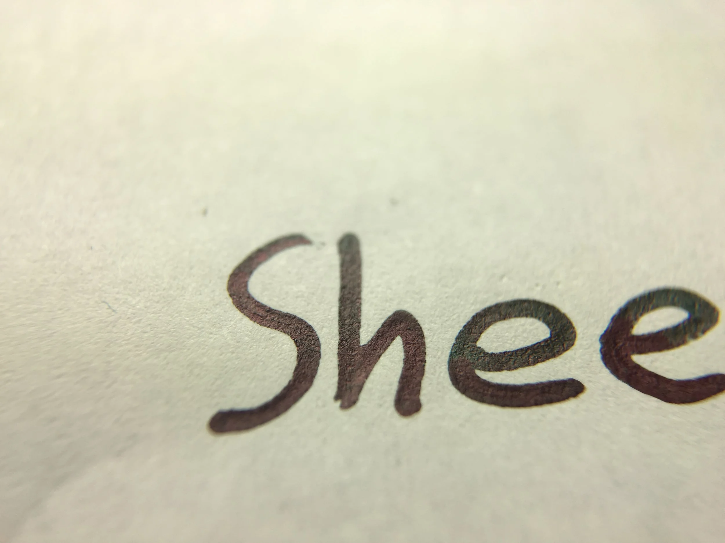
Like all the Robert Oster inks that I've put in a pen, the ink is well lubricated with a smooth feel on the page and comes out of the pen decently wet. It's a slightly green-blue dark grey with some muted red sheen. The ink is quite difficult to describe but it is definitely pretty dark on the page. The shading isn't particularly high, especially with wetter pens, but even so, the green-tinge to the colour is still visible in the darker lines. Dry-times aren't particularly fast taking 30 seconds to dry on Rhodia paper but the ink doesn't feather and does't bleed. Even on copy paper it only has a less-than-crisp line (not really true feathering) and on the heavy swatch it only very barely bleeds through. The ink performs very well!
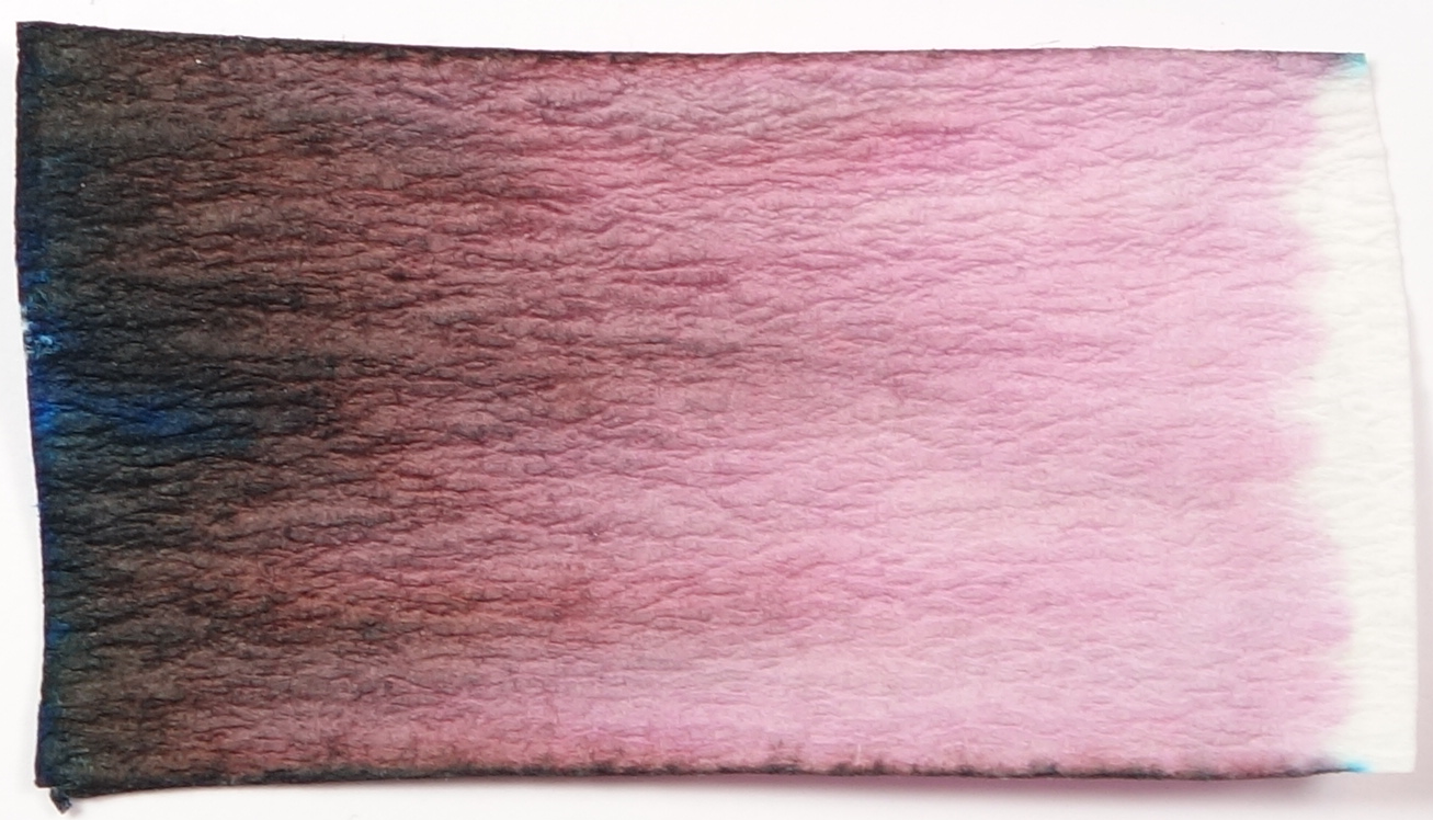
The sheen on this ink is somewhat muted. There's definitely a coppery-red sheen but it doesn't shine very much in the light. As such, it's a rather subtly sheening ink and you have to look for it to see it. The Chromatography is pretty interesting with this ink because it's difficult to find where the actual green-blue tinge comes from. Most of the chromatography is pink (which isn't really visible in the ink when on paper), there's some dark grey towards the end, and only the barest amount of a bright blue right at the tip. But where's the green‽ Some of the blue seems to come out more on Tomoe River paper as can be seen in the images in the gallery at the end of this review. Much of the dark is washed away in both drip and smudge water tests. You might still be able to pick up what you wrote as the pink tends to stay behind a little, but this ink is not all that water resistant.
1) Diamine Salamander; 2) Noodler's Zhivago; 3) Robert Oster Grün Schwarz; 4) Noodler's Prime of the Commons; 5) Noodler's El Lawrence; 6) Noodler's Catalpa.
The comparisons are pretty Noodler's heavy. The closest ink would actually Robert Oster's own Grün-Schwarz (formerly Black) with the main difference being darker with more green and more sheen. Diamine Salamander, similarly with Noodler's Zhivago, also have more green and is a similar level of darkness to Graphite. Prime of the Commons, El Lawrence and the discontinued Catalpa are all lighter and more saturated than Graphite and while Prime of the Commons and El Lawrence are bluer and greener, respectively; Catalpa is actually a fairly similar hue to Graphite.
Overall this is a professional looking ink that on a quick glance might appear somewhat black but there's more going on under the hood than that quick glance might suggest. Darker inks usually aren't something I particularly enjoy but when there's shading, a tinge of colour and a subtle amount of sheen with good performance even on cheap paper, it takes a boring somewhat unsaturated black and makes it much more interesting while keeping it sharp and professional.
I've listed all my inks and all my pens in their respective pages. Please let me know which inks you'd like to review next via the comments, Twitter, Instagram, or contact me directly.
I received this ink free of charge for the purpose of giving an honest review. I was not otherwise compensated and everything here is my own honest opinion. There are no affiliate links.


